Tuesday, June 30, 2009

Fred Ludekens on Clarity and Content

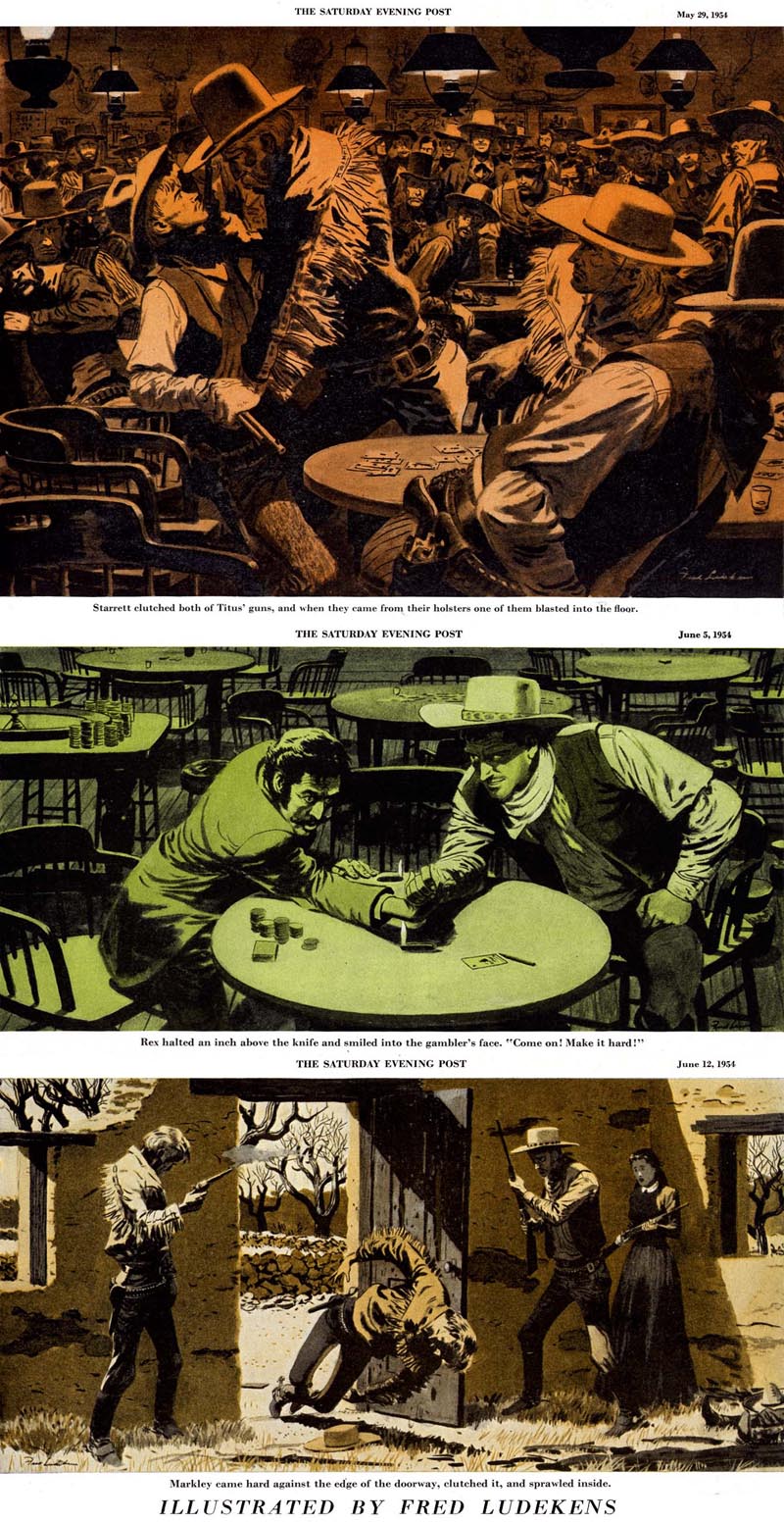
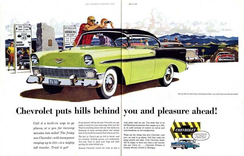
Fred Ludekens was both a renowned illustrator and co-creative director of one of the world's most prominent ad agencies, FCB. He was also a founding faculty member of the Famous Artists School. In the following interview excerpt from the Summer 1964 issue of Famous Artists Magazine Ludekens shares his expertise - advice and learned opinion that would benefit both illustrators and art directors today every bit as much as it was intended to benefit creatives nearly 50 years ago...

Q: What is the most important element in a good advertising illustration?

A: I believe that the basic picture requirement is clarity, and simultaneously, the right content. Clarity and content are synonymous. It little matters how beautiful, compelling and interesting the surface of a picture might be if it does not say the right thing and say it clearly.
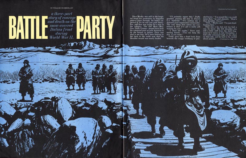

The volume of advertising is tremendous. The differences in most products minute. Attention is a major problem. Any time you can "write copy" in a picture using three quarters of the space - or in television clearly demonstrate or explain the idea visually - you are way ahead. You get attention and you get it centered right on the idea.


This takes illustration beyond its role of illustrating words. It becomes a language in itself. It can however only be "successful" if the picture maker is sympathetic, knowledgeable, and objective in his thinking in order to fulfill the requirements of the problem. He is interested primarily in communicating to his audience clearly and convincingly - the promise and benefit of the idea. The means by which he does it should always be planned to do only this, not to dilute the idea.

Q: What, in your opinion, is the value of the picture to the total creative effort in advertising?

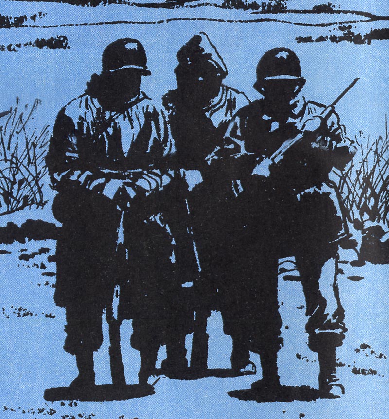
A: Offhand I would say it is the instant communication of the idea. In advertising, the picture should be good copy. I believe it should do more than illustrate. It should appeal to the mind and have something to say of substance and meaning.
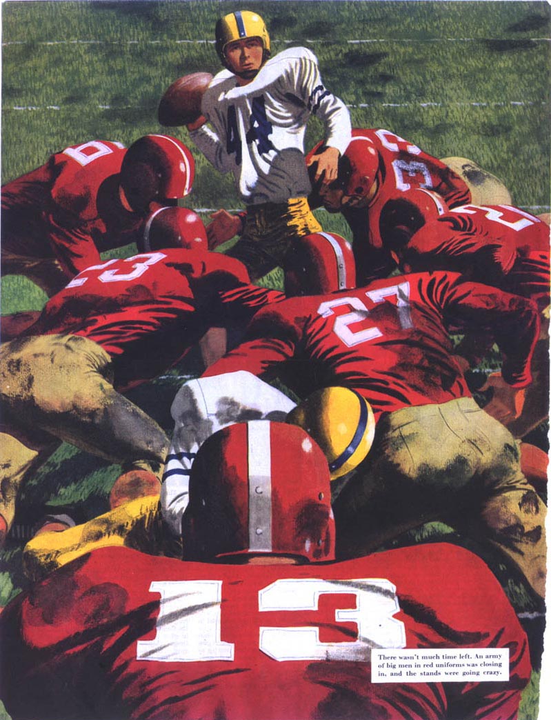

Often text is written describing the picture, usually saying what the picture has already said. In advertising, I think the picture has a job to do and the text should only say what the picture cannot - the reason, the benefit, the price, and so on.

Q: What contribution does a good illustration make to an advertisement?

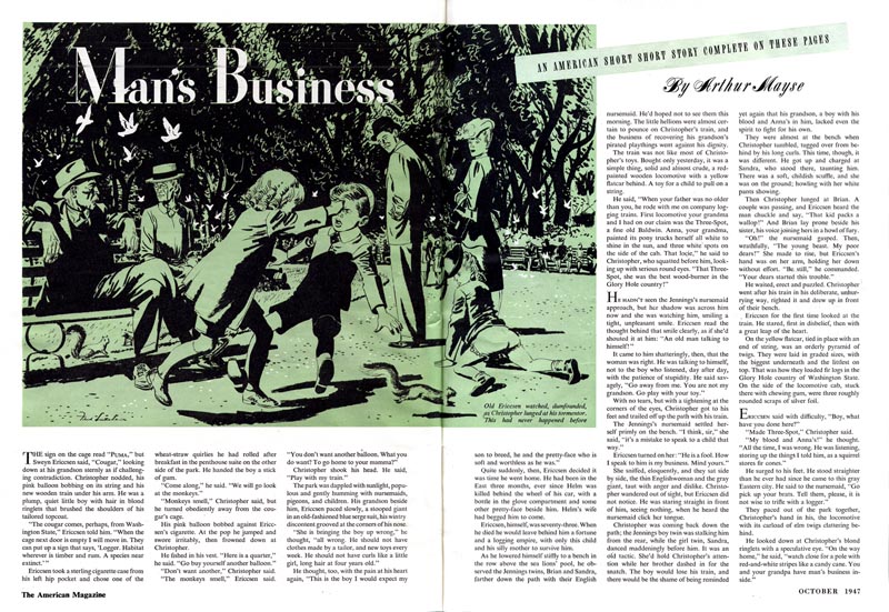
A: Content! Content is what you are drawing. That is more important than how you draw. I observe that at this time we are on a "technique jag," which gets in the way of clear communication.
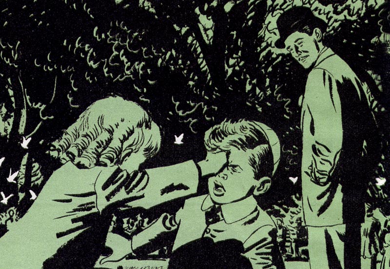

Q: How much of the fundamental copy job rests on the picture?

A: As much as possible. I believe the right picture can be very clear and convincing in setting up sales proposition and interesting people. For the average product little text is necessary. People in advertising are basically copy minded and their idea of a picture is something to illustrate their words. A good picture man with advertising sense can make an outstanding contribution to advertising.


Continued tomorrow.

* My Fred Ludekens Flickr set
Monday, June 29, 2009

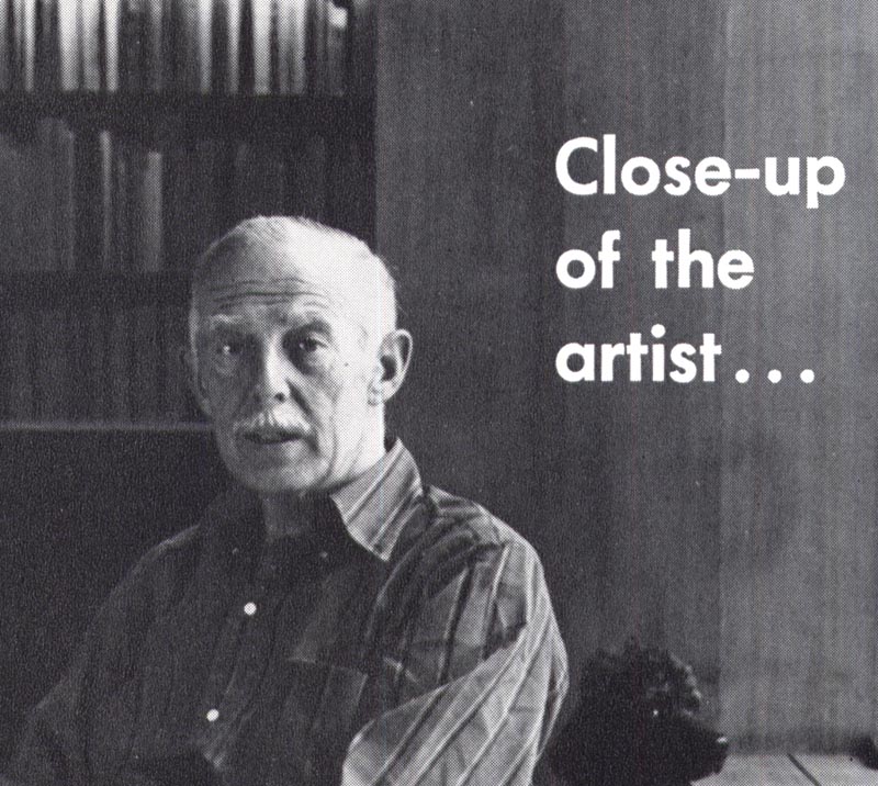
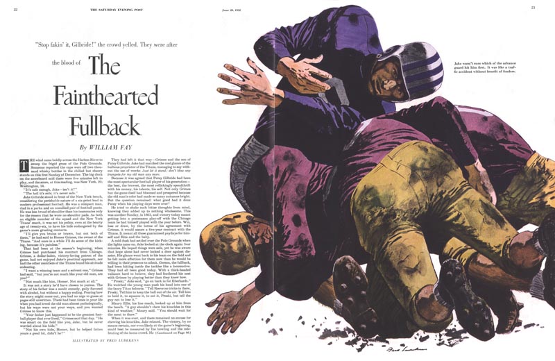
Fred Ludekens, Close-up

The Summer 1964 issue of Famous Artists Magazine contains an extensive interview with Fred Ludekens (1900-1982), a member of the Famous Artists School's founding faculty.


Ludekens was born in Huoneme, California on May 13, 1900. When his father died the family moved to Canada and the artist grew up there, in Victoria, BC. After returning to California as a young man, Ludekens took a night class in art at the University of California Extension School. This would be his only formal training. Ludekens enjoyed drawing but was unsure of his ability to pursue commercial art as a profession - so he never submitted a single drawing until the last day of the class. His teacher, Otis Shepard, praised it highly, and this gave Ludekens the confidence to try free-lancing.


Ludekens worked for San Francisco ad agency, Foster and Kleiser painting billboards. In 1931 he joined another SF agency, Lord and Thomas, as an art director and moved in 1939 to that agency's New York office.


He returned to San Francisco in 1945 and devoted himself to illustration for the next period of his career.


He later became co-creative director of one of the most prestigious advertising agencies in the world, Foote, Cone and Belding (FCB).


With his extensive understanding of both the free-lancer's and the art director's perspective on advertising art, Ludeken's interview in Famous Artist Magazine provides the reader with some remarkably astute advice - as relevant today (dare I say, even more so) than when the interview was conducted nearly half a century ago.


This week, let's listen to what Fred Ludekens had to say about commercial art and artists. Along the way we will learn a little about this most distinguished mid-century illustrator - and about ourselves as well.

* My Fred Ludekens Flickr set.

Friday, June 26, 2009

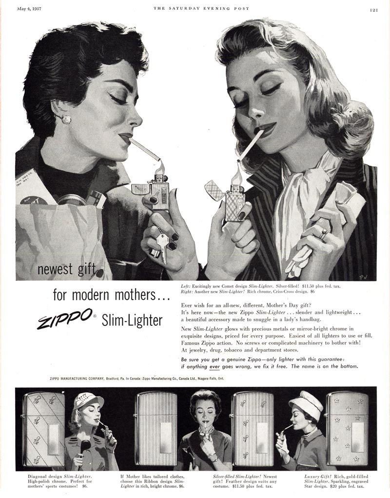
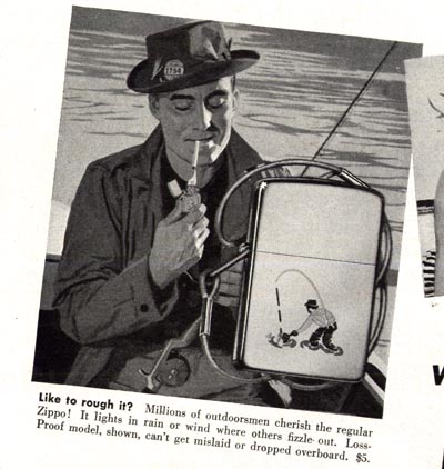
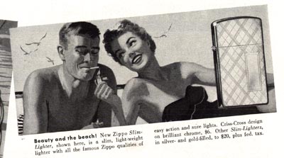
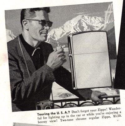
Zip, Zip, Zippo!

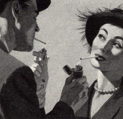
"The Newest Gift for Modern Mothers" - I guess they mean the lady we saw in that Joe De Mers illustration on Tuesday.


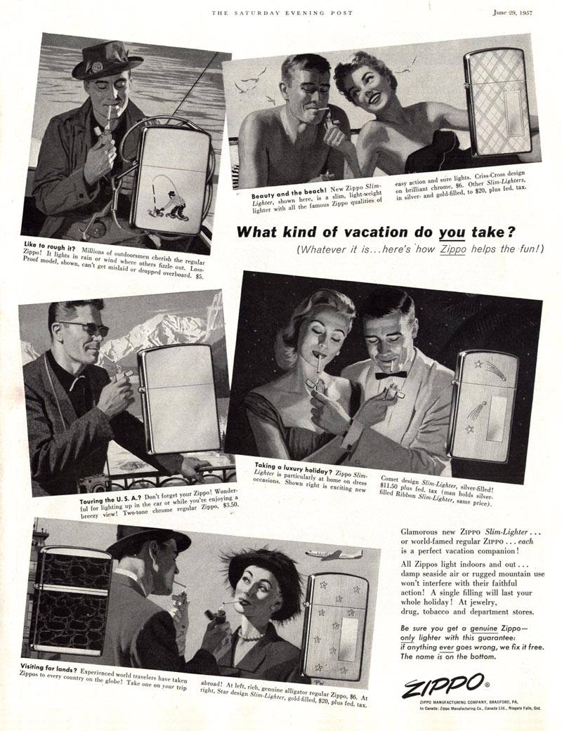
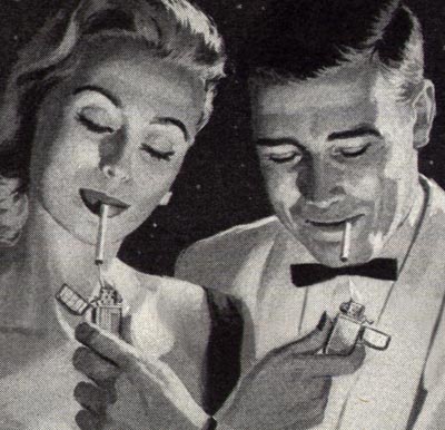
I love these ads... everyone studiously lighting up with their shiny new Zippo lighters.


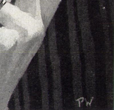
Both of these ads from the middle of 1957 were illustrated by "P.W."


I'm stumped by who that might be. But if you think you might know, please drop me a line.


As I wrote in a previous post, I love my Zippo. I quit smoking five years ago... but I still enjoy carrying my Zippo - especially when I go on my annual summer fishing trip up north.


There's just something really satisfying about the substantial weight of a Zippo... the metallic *schlik* of the lid flipping open, the smell of lighter fluid and the crunchy resistance of the flint against that little sparking wheel...


No wonder all these people look so content.

Seriously, if you've never used a Zippo, you have no idea what a pleasant little ritual it provides in the act of fire-making.


Oh, and one last thing: this whole "lighting-each-other's-cigarette" thing may look very romantic. But believe me...


Its a good way to get the tip of your nose burned.


Voice of experience.

* My "Smoking!" Flickr set.

Thursday, June 25, 2009

Pall Mall 1941-1962: What did we learn?

Ladies, when a man shows you his cigarette is longer, what's he really suggesting?


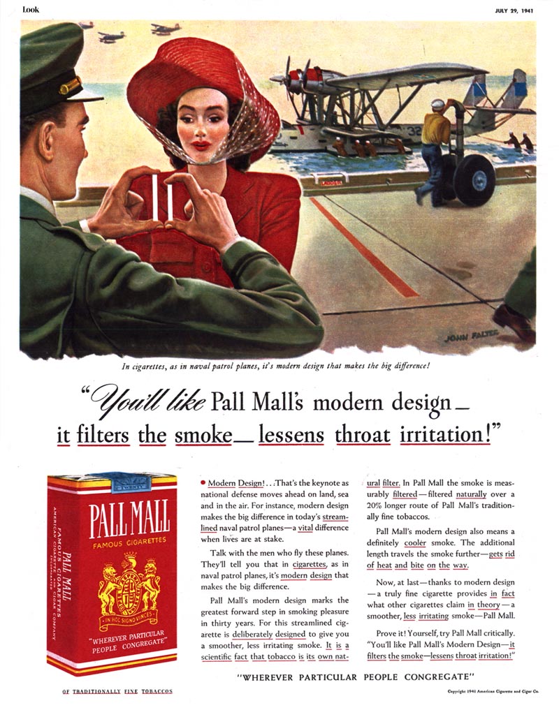
Well, if he's your co-star in a Pall Mall ad, he's simply telling you Pall Mall's modern design allows smoke to travel a 20% longer route - and that means a smoother, cooler, less irritating smoke.

See? Sometimes a cigarette is just a cigarette.


With the exception of the 1941 Pall Mall ad above, I can't say what the cigarette manufacturer's campaign strategy was for most of the 1940's. That one ad is the only example I have.

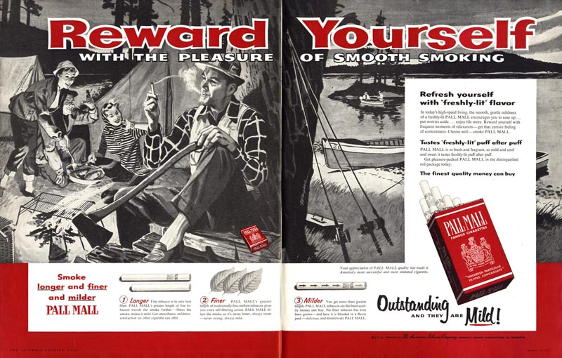
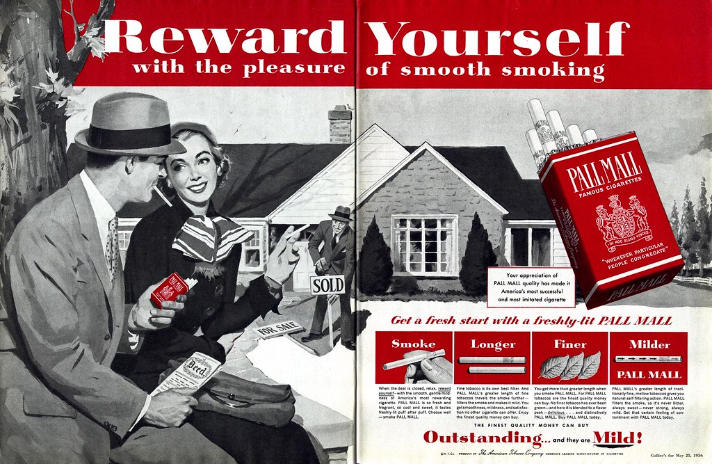
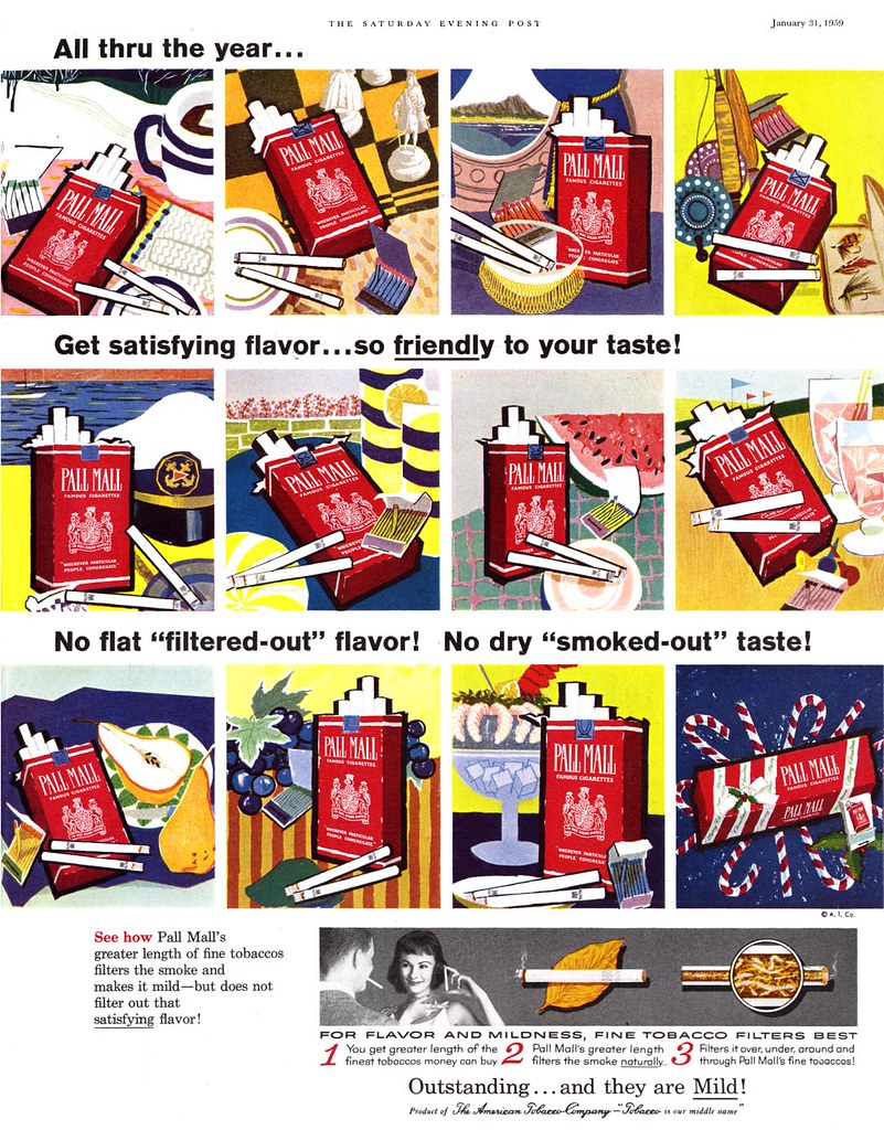
But for the 50's decade - wow - Pall Mall was to smokes what Pepsi was to soda pop. Pall Mall's decade-long campaign was a consistent, focused strategy, appearing regularly and frequently, employing the best Cooper studio artists (and other's of equal calibre) and defining the Pall Mall smoker as sociable, physically active, young, good looking, urban, sophisticated, independent and the centre of attention.

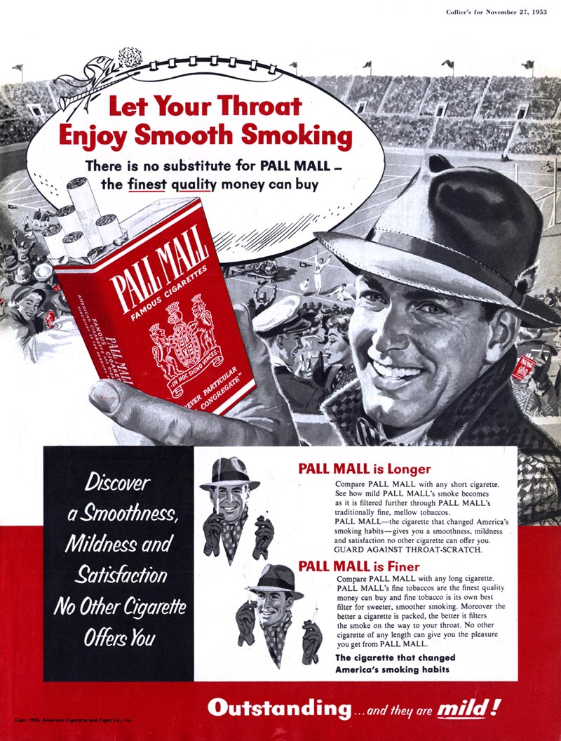
1952 - 53.

The Pall Mall "hero smoker" is very definitely front and centre.


But each ad is designed with a detailed crowd scene to reinforce that everyone smokes Pall Mall's (the effect is almost comical - but then that's why advertising is always so consistently absurd).


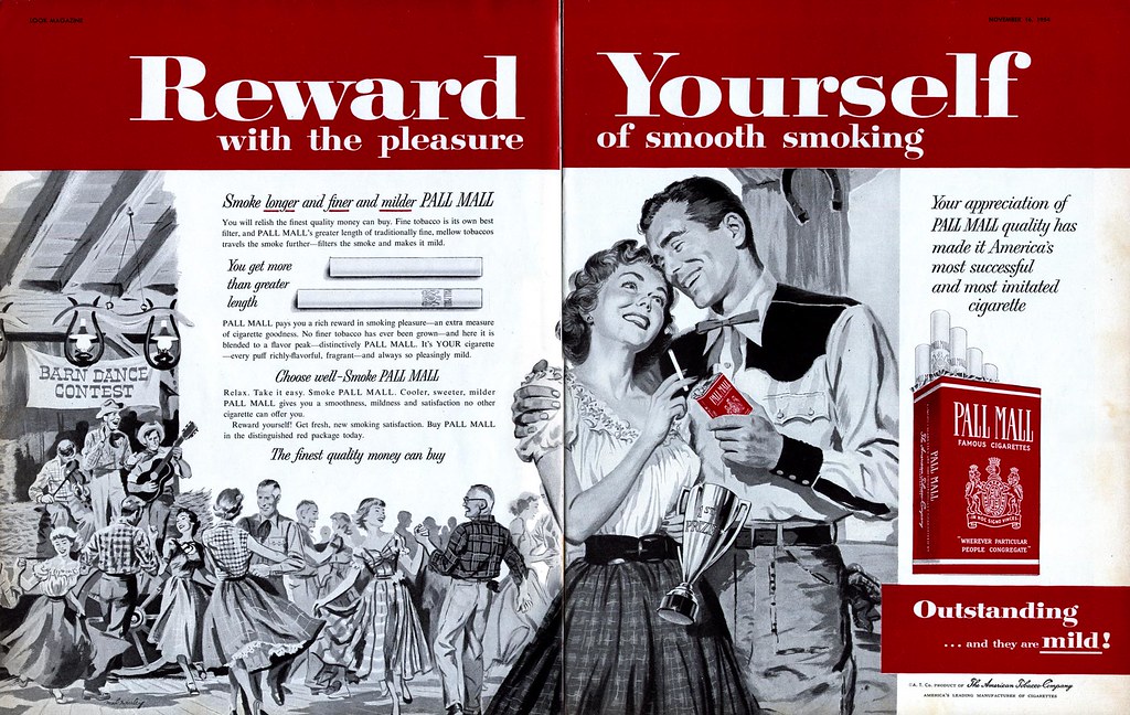
1954.

The execs at Pall Mall decide to go full bore. Ads are now huge DPS scenes of large groups of people engaged in fun, energetic activity. Our Pall Mall hero smokers are still front and centre, but the super close-ups have been replaced with a more middle-distance p.o.v.


1955.

Pall Mall continues to commission gorgeous huge DPS's - but there's a subtle change of emphasis. Our Pall Mall hero smoker is now truly heroic. Previously the background crowd scenes were simply there to show that everyone and his brother smokes Pall Mall. Now the strategy shifts to turn all eyes on our hero smoker.


Pall Mall has its illustrators put them quite literally "in the spotlight."


In 1956, just as the Pepsi Sociables did, the Pall Mall hero smokers settle down in a nice suburban backsplit.


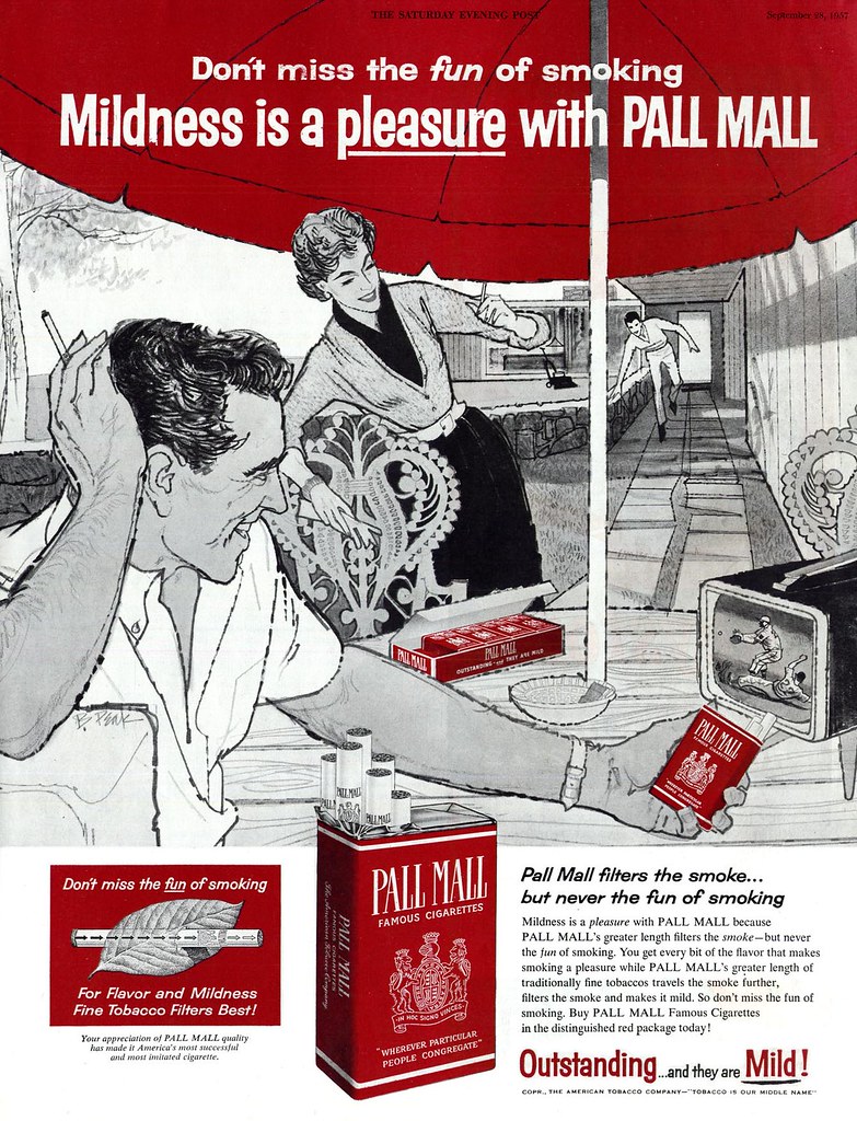
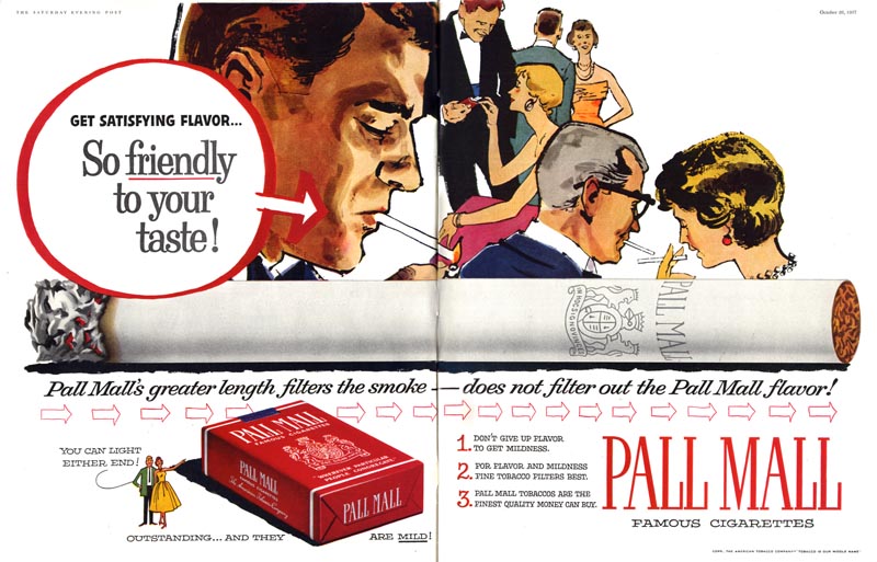
1957.

Another parallel with Pepsi: reinforcing the idea that they are the brand of the hip and sophisticated, Pall Mall seeks out hot young illustrators with a bit of stylistic flair. In fact, Pall Mall's astute art directors get bonus points for tapping Bob Peak two years before Pepsi did.


Stylized realism like this might not seem like a giant step forward from today's perspective, but for a major 1950's advertiser like Pall Mall, it must have been quite a stretch.


1958-59.

Pall Mall takes the plunge, producing easily the most avante garde ads of any cigarette maker. The group shot ad below collects what had previously been an inundation of colourful, nearly abstract single page ads executed (you may be surprised to learn) by much beloved children's book and Disney artist, Mary Blair and appearing week to week and month to month throughout 1958.


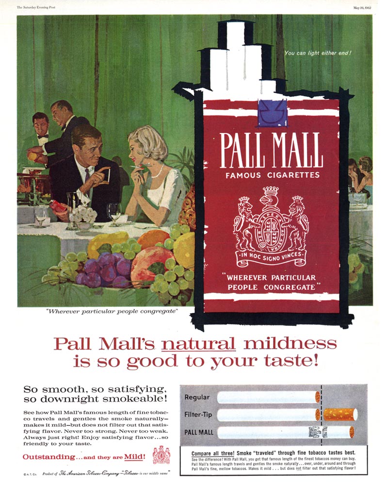
1962.

Times have changed. Or have they? The Pall Mall hero smokers have been through an awful lot since they first met; two young kids caught up in the chaos of W.W.II.

Pall Mall and the art directors who shepherded its ad campaign through the 50's get much respect from me. While other cigarette manufacturers zigzagged between illustration and photography and tried a wide variety of strategies to lure in new customers, Pall Mall stuck to its guns - and more importantly - consistently favoured illustration for its relentless presentation of the Pall Mall smoker heroes.

So after twenty years, two wars and a decade-long unwavering strategy featuring countless Pall Mall smokers "rewarding themselves", what did we learn...?


"Size matters."


* My "Smoking!" Flickr set.

*Addendum* Ger Apledoorn has posted a wonderful set of 1960's Pall Mall ads by Playboy cartoonist Eldon Dedini

Wednesday, June 24, 2009

Smokes During Wartime: Hellcats, Kittens, Kisses... and Kools

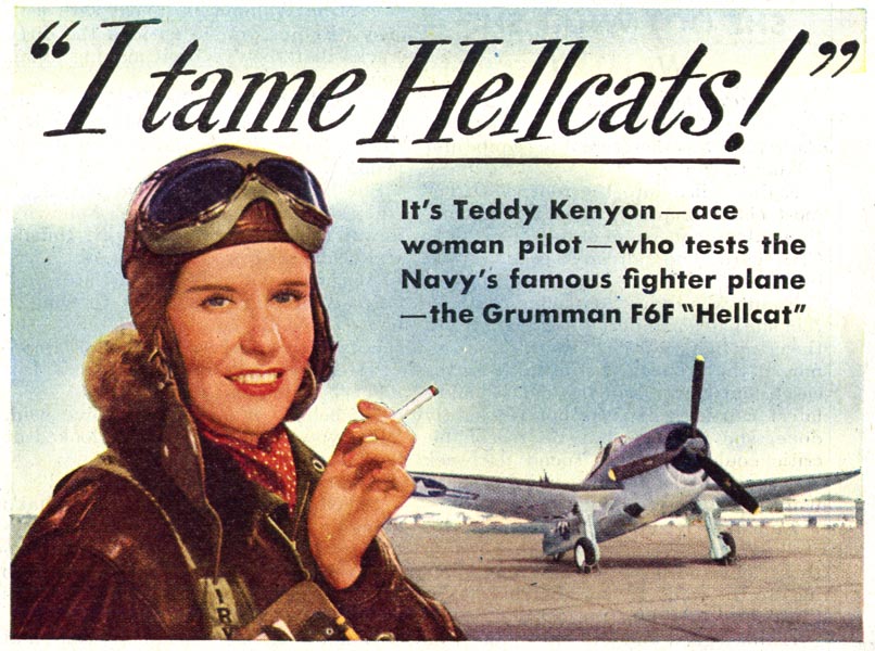
W.W.II must have been a cigarette marketer's dream. Who wouldn't want to be like Teddy Kenyon, Camel-smokin' Hellcat pilot?


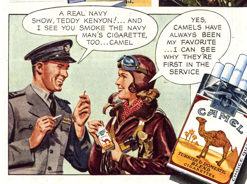
And I know newspaper comic strips were tremendously popular with all ages back in the 1940's, but Camel's comic strip ads must have been particularly alluring to the younger set...


This bit of copywriting below made me smirk. Camels chose a strong female as their celebrity endorser for this ad, but pointedly reinforced that their product is "the Navy man's cigarette." We wouldn't want all those tough-guy smokers out there thinking that Camels are for dames!


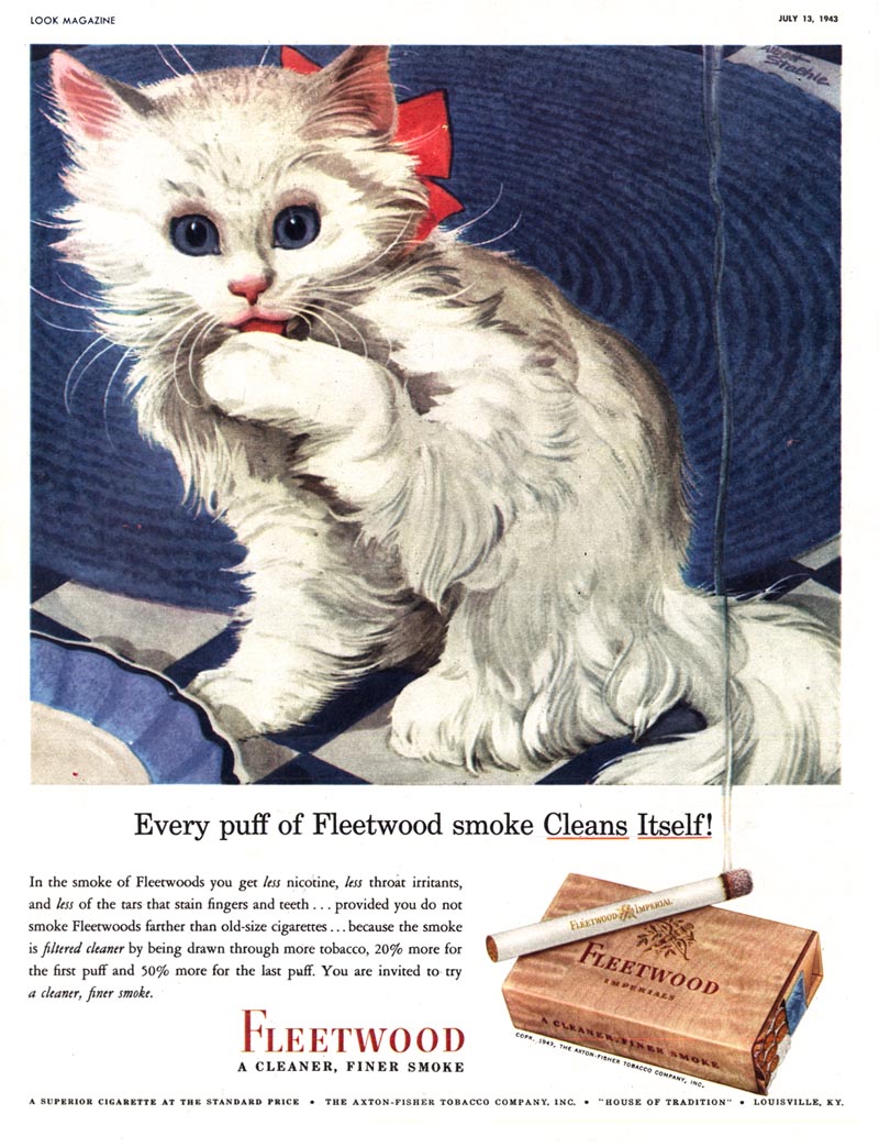
By contrast, you'd never know there was a war going on from the looks of Fleetwood Cigarettes ad campaign.


Old Gold ran an amusing series of ads always featuring servicemen and their gals engaged in "I Love Lucy" - style comedic hijinks. Though usually unsigned, a previously presented Old Gold ad by Dorothy Monet can be seen here.


And let's not forget "Willie" the Kool Penguin. Willie wore many hats during his long career as a product mascot... and during "the good war" he pitched in to sell war bonds as did most every cartoon character from Mickey Mouse to Bugs Bunny.


Willy survived the war - but not the "Summer of Love". By the 1960's Willie's ever-diminishing role in Kool ads blinked out. I wrote a humorous post about Willie's demise back in 2006 .

* My "Smoking!" Flickr set

* Speaking of W.W.II pilots, our own Charlie Allen has a brand new CAWS posted over at Charlie Allen's blog. be sure to check it out!

Tuesday, June 23, 2009

Smokes for Mom!

This one's a gimme, right? Quick - I say "smoking", you say...

"New born baby!"

Huh?


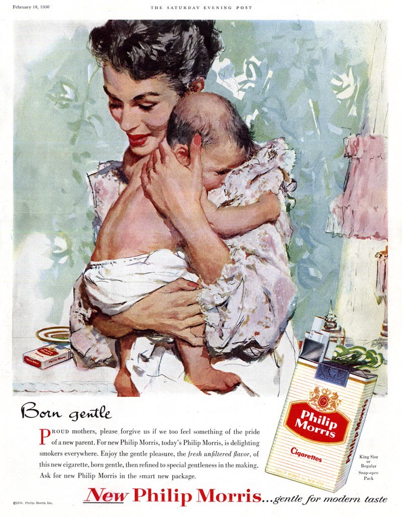
Never has an illustration of mother and child looked so right ... and a concept for a cigarette ad looked so horribly wrong as in this Phillip Morris ad, beautifully executed by Joe De Mers.

Here's a passage from a long-ago correspondence with Barbara Bradley (who occupied the studio next door to De Mers at Cooper's):

Joe de Mers ( Incidentally, Joe pronounced his name de Marz)... My take is that his work previous to Cooper's had been so very different that, as it evolved, it became closer to Coby [Whitmore's]'s for a while. Then, his style began to reflect more and more his watercolor background, the paint became more transparent and the brushwork looser.

As for advertising work, I don't think he minded at all. Joe always seemed so jovial, casual, and laid-back. Any time an advertiser selected one of the "big boys" it was because their illustrative style was wanted so it wasn't such a great jump. Quite a few of them did ads for Pall Mall [and Phillip Morris] Cigarettes. One of Joe's, which I often show my students, (as a study in social history as much as art), features a mother holding her baby in the nursery. On the child's dresser is the ash tray and cigarette. The heading reads, "Oh so Gentle". That's hard to believe today.

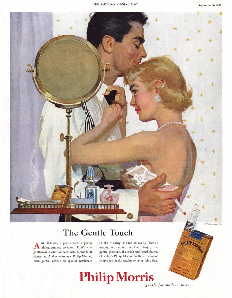
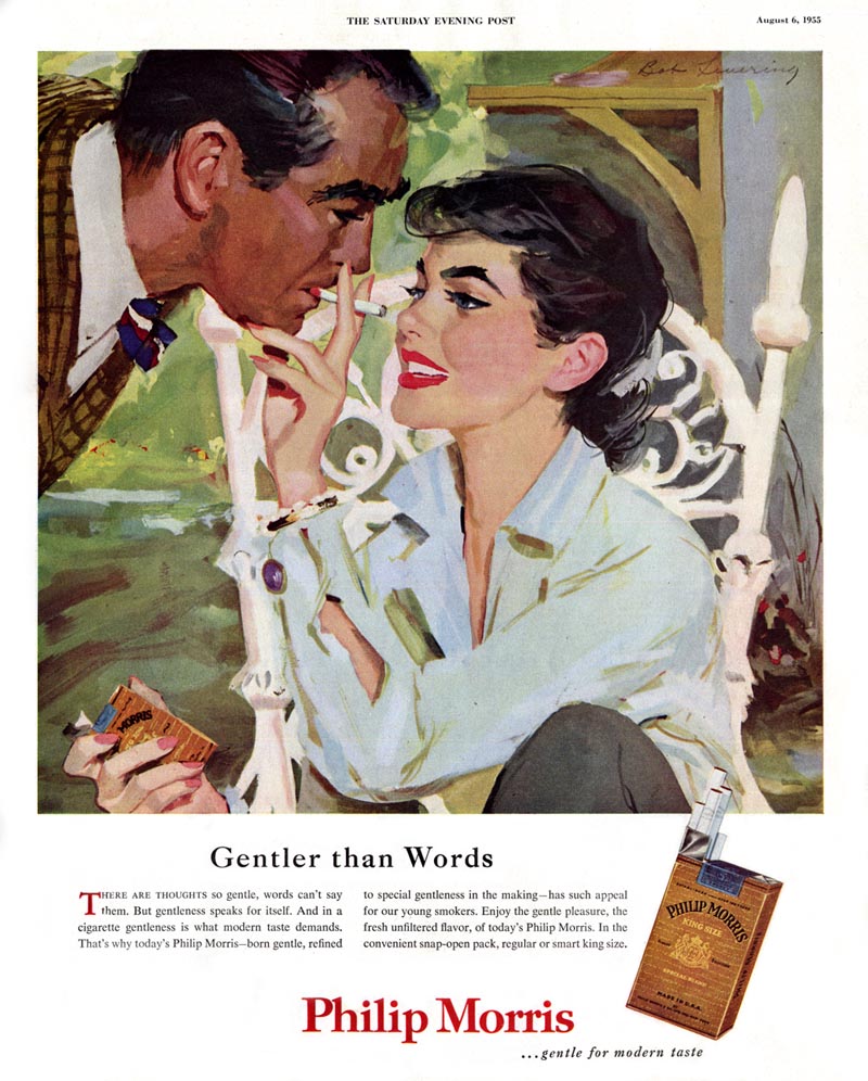
Below, another Phillip Morris "Gentle" ad (this time, thankfully, sans baby!) I think this is by another cooper Studio giant - Joe Bowler.


In the same email excerpted above, Barbara wrote:

Now, Coby's work changed a great deal, I think far more than Joe de Mers', but Joe Bowler's also changed tremendously. During my years at Cooper's, Joe Bowler's work was very similar to Coby's: in genre, composition, technique, procedure, and in the loveliness of their women. Bowler had been very young when he was hired as an apprentice at Coopers and Coby must have been his mentor. They became great friends. After I left, I followed their work and saw a growing divergence.

His technique changed, as his medium changed. He had an exciting green period and another golden period when loose stroke filled washes covered most of a page. The biggest change came with his McCall's series of portraits of the Kennedy women and of children in fashion. They were gorgeous and led to his eventual FA work of portraits and commissioned work.


To round out this grouping, another Phillip Morris "gentle" ad, this one by Bob Levering, also of Cooper Studio.

Monday, June 22, 2009

Smokes for Dad!

A day late but -- Happy Father's Day!

Have a carton of smokes! Or two. Or three... or four...?


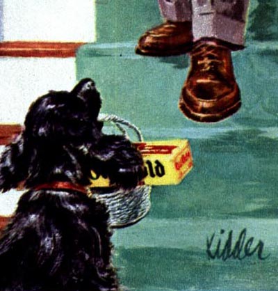
Times sure have changed, haven't they? I can't believe how absurd this looks from our modern day perspective. I've actually been on the planet long enough that (had my parents been smokers) I'd have considered this perfectly acceptable as a kid. In fact, a great gift idea! I certainly witnessed plenty of little kids buying cigarettes back in the 70's with no more than a "they're for my dad."
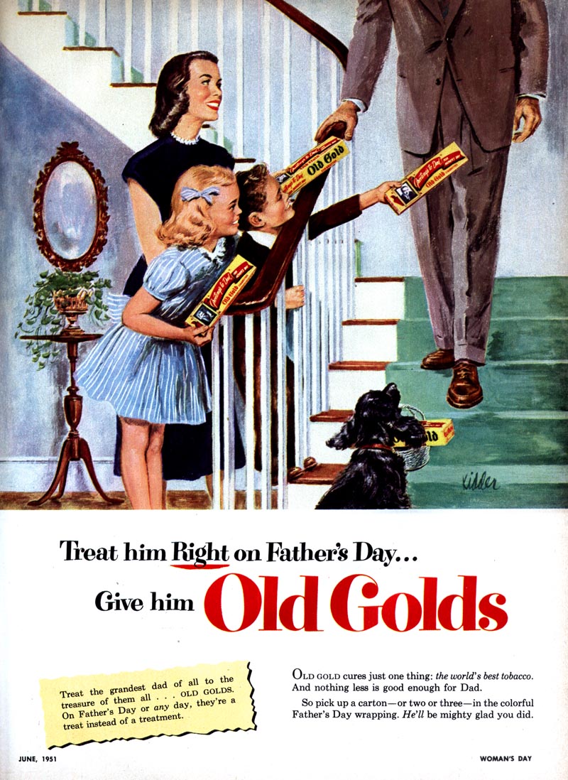

But this ad is beyond hilarious. Even Scraps, the dog is getting in on the act. I get the feeling this guy's family is hoping to cash in his life insurance policy - and soon! "Here dad, smoke your brains out. Mom's got State Farm on speed dial."


Its summer... I'm feeling lazy... and I love old cigarette ads. This week we'll dig out another batch and enjoy a chuckle or two.

* My "Smoking" Flickr set.

* Wanna see what I got for Father's Day? Click here and see why I have the coolest kids.

Friday, June 19, 2009

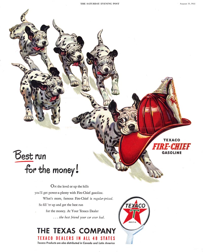
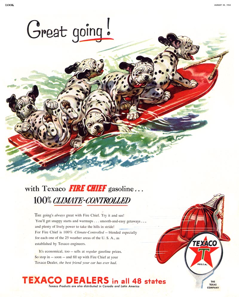
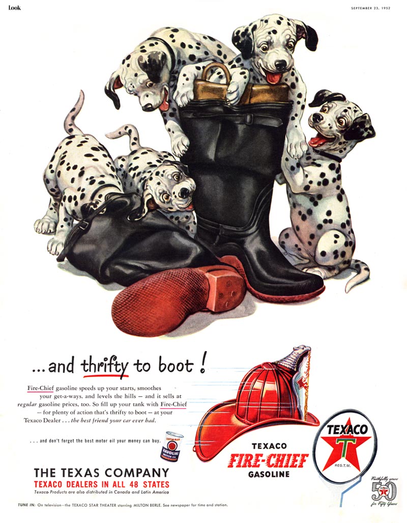
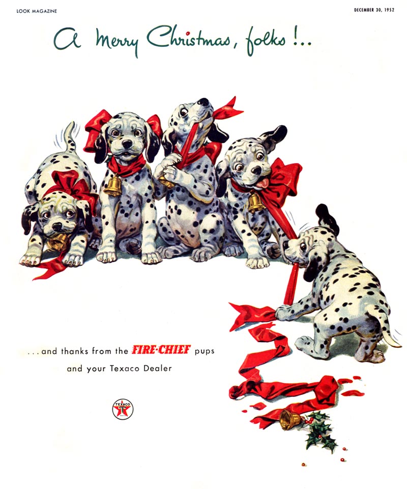
Keith Ward's Texaco Fire Chief Pups

I hadn't really thought about it before but Keith Ward might be able to attach his name to more cartoon product mascots than any other mid-century illustrator.

During W.W. II it was Ward who brought us the "Prophylactic Pigs" (no, I'm not kidding).


A few years later Ward's cigar-chomping, hat-wearing cartoon rhino became the thick skinned spokesbeast for Armstrong Tires...


... and he has long been credited with creating Borden's Elsie the Cow. Although Ward probably illustrated a multitude of Elsie ads (and may even have had a hand in her design), Elsie is actually the creation of David Reid, according to his obituary.


For several years in the early 50's Keith Ward produced a long series of ads for Texaco featuring "The Fire Chief Pups".


Depending on the time of year, Ward's rambunctious litter of Dalmatian puppies regularly appeared in all the major magazines, tirelessly engaged in seasonally appropriate activities.


Pau Medrano (who has provided so many of this week's scans) has a theory that Keith Ward's Texaco Pups may have been of some inspiration for the 1961 animated Disney film, 101 Dalmatians. In fact, he believes that Ward might have been connected with Disney in some manner.


Supporting Pau's theory is a really intriguing post put together by California cartoonist Will Finn on his blog, Small Room, where he shows examples from a 1945 book illustrated by Keith Ward that seem to have greatly influenced the look of the 1973 Disney version of Robin Hood.


So much about Keith Ward's career remains a mystery... but this remarkably talented and versatile artist deserves recognition for his long association with a variety of memorable cartoon product mascots.

* Many thanks to Pau Medrano Bigas for providing so many of this week's scans, as well as all sorts of interesting information.

* My Keith Ward Flickr set.