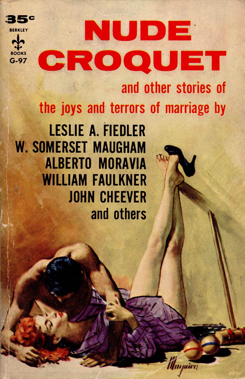
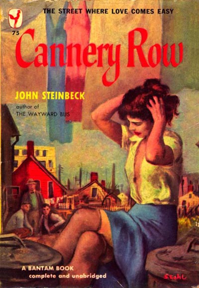
Jacket illustrations, by and large, are a mélange of sex and violence.
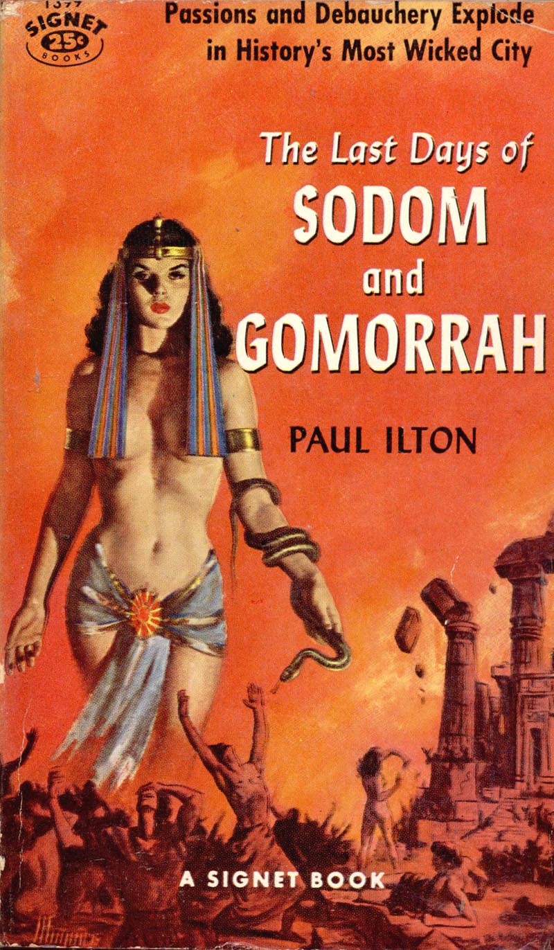
A sort of jargon has arisen to distinguish plain sexy covers from "situation sex" (implied rather than overt) and from the few "down-sexed" or "un-sexed" covers. Some manage to squeeze both sex and sadism into the same picture.
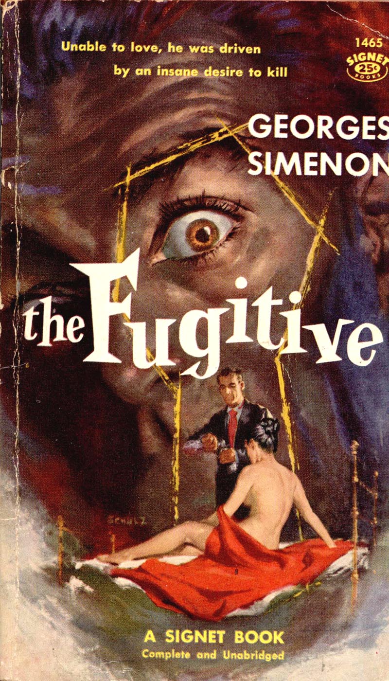
The demands of the machine have led the paper-bound publisher to rely on the sure-fire salability of sex and sadism - and that involves him with the problem of censorship.
Retailers agree with publishers that for quick-quantity sale, the best book can be sold by its cover. "The worse the titles are the more they'll sell. Just what the censors object to is the kind of books the public is looking for. That's the way people are, and the only thing you can do is give them what they want."
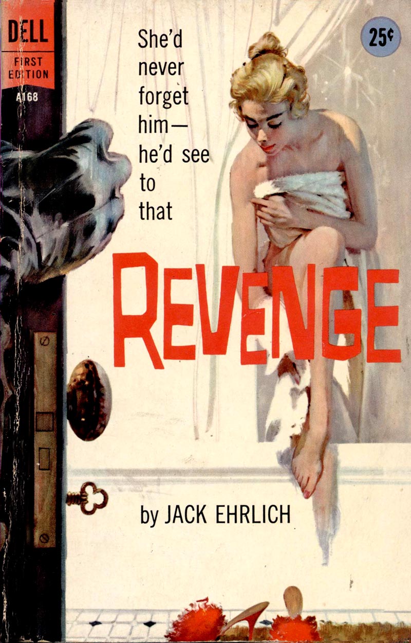
"Decent literature" groups in scores of communities visit retailers to persuade them to clean up their racks, usually with the implied threat of boycott. Chief among these groups is the National Organization for Decent Literature, which publishes a list of disapproved books and a manual of instruction for local chapters.
The decent-literature campaign itself demonstrates that the paper-bounds have stimulated a new awareness of books in the mass market.
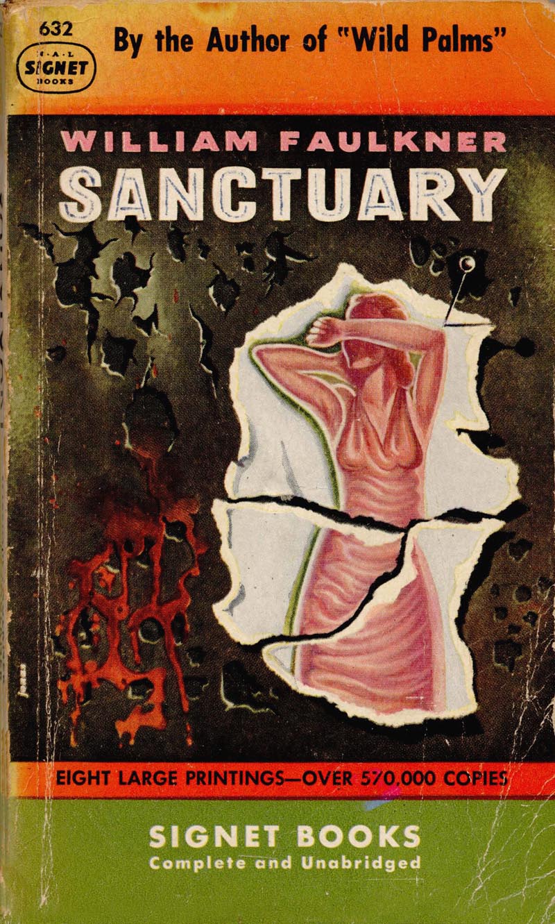
Books that have been on sale in hard covers for several years are coming under organized attack for the first time. In Brooklyn, decent-literature groups sought to ban, among others, three three William Faulkner titles (Sanctuary, Soldier's Pay, and The Wild Palms).
In Cleveland the titles that ran into the most trouble were Freud's General Introduction to Psychoanalysis, The Golden Ass of Apuleius, Somerset Maugham's Cakes and Ale...
... Lucy Freeman's story of a psychoanalysis, Fight against Fear, and John Steinbeck's The Wayward Bus.
In Denver an independent distributor pulled thirty-seven titles out of circulation, ranging from Sexual Feelings in Married Men and Women and Here Is My Body to Zola's Nana.

In defense, paper-bound publishers, besides crying "freedom of the press," point to what they call "bookish" accomplishments such as the New American Library's Mentor non-fiction line and its New World Writing series. Pocket Books has brought to market titles like Thomas Mann's Buddenbrooks, Immortal Poems of the English Language, and A Tale of Two Cities. Some of these issues, including also the English Penguin books... are more trade books than like ordinary paper-bounds.

Their distribution is more specialized and centers, for the most part, around colleges and what N.A. L.'s Weybright calls "more sophisticated communities."
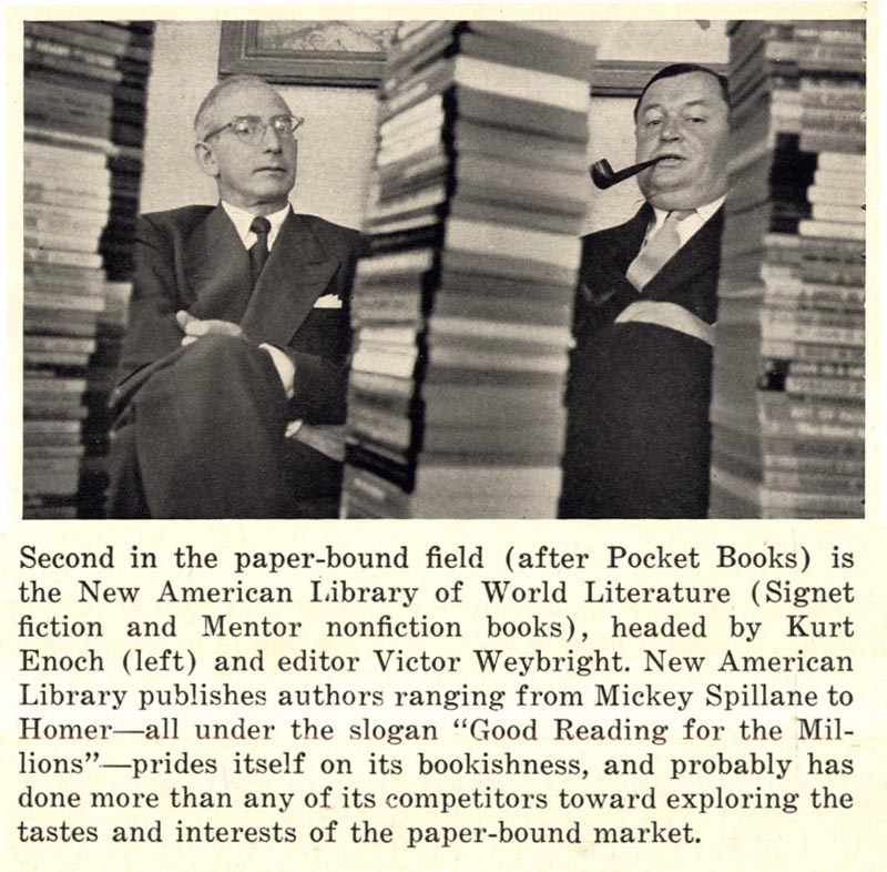
But these form a relatively small and unsubstantial part of paper-bound publishing. The bread and butter is still the big, fast seller. New American library is a good example of this. Its Mickey Spillane titles last year sold more than six million copies, which, Fortune estimates, accounted for about a sixth of its total Signet volume. They are all sex and sadism.
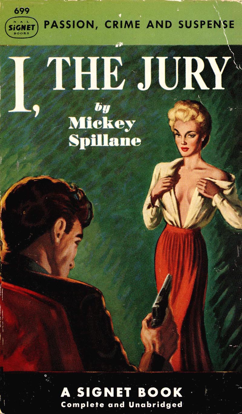
Weybright, who prides himself on N.A.L.'s bookishness, becomes impatient when Spillane is mentioned and thinks perhaps too much attention is being devoted to him. "The Spillane books," says Weybright, "are a unique form of 'Americana,' a new kind of folklore, and therefore come within the ken of N.A.L.'s slogan, 'Good Reading for the Millions.' I won't apologize for Spillane."
* Accompanying this week's excerpts from the Fortune article are a broad sampling of mid-century paperback cover scans generously provided by one of my contacts on Flickr, UK Vintage. Many thanks Uilke!
I'm not sure if this TI post is about increased sexually explicit cover illustrations for low budget magazines, or if it's some kind of a cultural statement about the 50's. Those cover illos look awfully tame to me, compared to today's stuff in the movies, on the internet and in porno novelty stores. But hey, this is really about illustration.. isn't it? And, what struct me is the relatively good quality of illustration for such cheesy produced magazines. It must have been a matter of which illustration and title caught your attention over the others, because I doubt that the majority of the people who bought and read those delightful stories of sex, violence and sadism, probably didn't give a rat's rear end who illustrated the covers. And, I doubt they knew if it was a quality illustration or not. So, was this the bottom of the barrel for some illustrators who were earning their stripes, and perhaps the top of the barrel for those that were satisfied with staying at that client level? And, how many illustrators said, "No way, I'm not doing that kind of garbage?" Or, did they say, "This is an opportunity to get reproduced, and get turned on at the same time!" I can honestly say that from the 60's on, no one asked me to illustrate sex or violence or not even sadism. Damn, I must have been a decade too late! ;-)
ReplyDeleteTom Watson
Tom;
ReplyDeleteTo clarify, this post is not about magazine illustrations, low budget or otherwise - its about paperback cover illustrations.
As well, movies, the Internet, and porno video stores are places we choose to go to to get visual material... transit terminals, hotels, variety stores and supermarkets - the places these covers were displayed - are places the general public goes every day. That's where these covers were displayed: in everyday public view. Comparing variety stores to porno video stores sounds like apples and oranges to me... but maybe things are different down there in the States than they are here in Canada. ;^)
Based on our previous correspondences, I know this topic ("things are so much worse today than they were back in my day") is a sensitive one for you, but that really isn't the point I'm trying to get at this week. The topic IS about how a technological and marketing change had a massive impact on the illustration industry - something we are once agin going through - and the point of showing visual examples alongside excerpts from the Fortune article text is to provide insight, context, inspiration AND admittedly, amusement.
Hope this doesn't cause you or others who enjoyed that genteel era first hand too much discomfort.
Not at all my friend, just having a little fun with the "dark" side of the 50's. I recall seeing some of those racy covers in the 50's, on the newsstands in the seedy areas of San Francisco, but as I recall, very little in the business and shopping areas. I worked at a small town drug store as a teenager in the 50's, and they had a very large assortment of popular magazines and paperback books, but I never saw any of the sex, violence or sadism displayed on the sidewalks in front of, or in the locally owned downtown stores. I think in every town there were places, usually in the crummy areas, where you could find those books and magazines and probably even total nudity, etc., but you could find that in the Victorian era as well.
ReplyDeleteAnyway, my question is, what motivated the illustrators to choose to illustrate those less than "genteel" cheap paper back books? And, at the time was it considered bottom of the barrel assignments, or a non judgmental opportunity to be published? Maybe it was just the money? Perhaps one of your readers with first hand knowledge, could shed some light on that aspect.
In the meantime, it is glaringly obvious to me and most people I know, including young people, that today we have become more desensitized to blatant sex, violence and sadism, etc. It may be argued that it started in the 50's, but it received a major blast of fuel injection during the 70's. And, you don't have to hunt for it to find it today. Check out the raunchy art on some of the T-shirts that are worn every day.
Tom Watson
The technology and the market were there. Covers could be printed on strong paper and became colorful and extravagant on a high artistic level. There has always been a battle between symbolic (e.g. Robert Jonas/penguin) and realistic (e.g. Robert Stanley and James Avati) Like Movies and television the paperback covers changed according to the public tast. Publishers noticed that more blatant sex meant more impressive sales. The realistic covers won the battle and the influence of the art director too. This change was in favour for artists like Mitchell Hooks, Bob Abbett, James Bama, Clark Hulings, Robert Maguire, Charles Binger, Harry Schaare, Lou Marchetti and leter Robert McGinnis and Richard Powers.
ReplyDeleteAren't they great, though? ;-)
ReplyDelete