Paper-bound publishers say their market is made up mostly of people who used to read only magazines, who are intimidated by the forbidding air of a bookstore, and who can afford perhaps a small fraction of the price of most new hard-cover books.
They buy and read on the move, picking books off a rack or newsstand to read while commuting or traveling or during a frenzied day of changing diapers and making meals. They are impulse buyers who pick books at point of sale, and after reading them, throw them away or pass them on to someone else. Few paper-bound buyers, say the publishers, want to keep the books as personal possessions or "furniture."
Like the trade publishers, the paper-bound publisher spurns market research and puts his trust in the seat of his pants, or "editorial flair" as it is called in the trade. A paper-bound editor [says], "We've got enough 'questionaires' out in the form of our books. Why should we ask them what they want when they already tell us by what they buy?"
The paper-bound publisher's listening post is the display rack. And the vivid packages thereon will show that there isn't much confusion in the publisher's mind about the buying impulses of most paper-bound readers.
The aim of the package design is to capture the darting eye and interest of the man in motion. Primary components are the jacket illustration, the title, and the "skyline" (blurb above the title). The blurb may promise: "Vengeance and passion in exotic Malaya:; "A savage novel of forbidden love." On Voltaire's Candide: "He chased a virtuous maiden through Europe's most bawdy age."

To stay on the newsstands, the paper-bound publisher has to supply titles that sell and sell fast. The publisher generally has to agree with Fawcett's editorial director, Ralph Daigh, that a "book is usually a good book if the public buys it in quantity" - but with the added proviso that it be bought in a hurry.
Says one wholesaler: "For places like terminals and hotels where there is constant traffic, it doesn't matter. But in the small neighborhood store, the same people go in day in and day out. If its not what they want the first week, they'll never read it. It seems like the little guy wants new books every day."
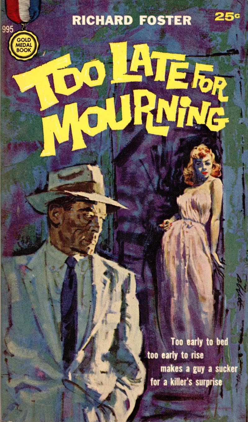
* Accompanying this week's excerpts from the Fortune article are a broad sampling of mid-century paperback cover scans generously provided by one of my contacts on Flickr, UK Vintage. Many thanks Uilke!
This is wonderful (as well as what you showed before).
ReplyDeleteOh, I love those pulpy paper-bounds covers! Here's a couple of mine:
ReplyDeleteIn a Deadly Vein: cover by Bob McGinnis.
Girl in 304: cover by Walter Brooks.
Man Who Got Even With God: no credit given.
"Why should we ask them what they want when they already tell us by what they buy?"
ReplyDeleteBrilliant!
Hah -- I'm glad I'm not alone in my appreciation for that line, Larry. ;^)
ReplyDeleteActually, I find the entire body of the text so fascinating... just replace "books" with "blogs" and "paper-bound publishers" with "content providers" and you begin to see what I'm getting at.
Ward; those are great covers! I stand by my original comment on the McGinnis scan: Woof!
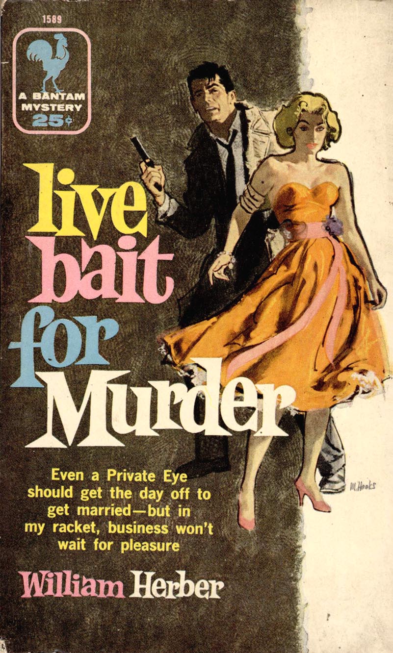
ReplyDeleteI'm still learning a lot about these great illustrators by visiting your site regularly, Leif. While I've known about guys like Robert McGinnis for some time, it's only due to this excellent blog that I'm being introduced to other pocketbook talents like Mitchell Hooks. I see he illustrated the "Live Bait For Murder" cover, but is it possible he's also the illustrator behind "Sweet Cheats" in your previous blog entry, Leif? I was also happy to find out that Mitch was the guy who illustrated that wonderful movie poster for "Gigi", one of my favourite films.
ReplyDeleteThe illustrations are great, of course, but, putting them aside for a minute, check out all that beautiful hand-drawn lettering! So much more exciting that set type for this sort of thing, don't you think?
ReplyDeleteHuw Evans
EYECATCHER Graphics
Pete; I can't tell you how happy I am to have introduced you to Mitchell's work. Having spent an hour on the phone with him, i can assure you he's not only incredibly talented, he's also a genuinely wonderful person. My admiration for Mitchell Hooks knows no bounds.
ReplyDeleteAs for your question - you're thoughts are along the same line as mine were, but no, that cover is the work of Ernest Chiriaka ( signing as "Darcy", his pseudonym). I can't help but think that the talented Mr. Chiriaka was taken by Mitch Hooks' style of the time and did his own version of it... because there are a lot of examples by him in this style, and this is nothing like the look he used when working for "the slicks" like the Saturday Evening Post and Good Housekeeping.
Huw; thanks for pointing that out. I specifically chose five covers with gorgeous hand-drawn type for today's post. I was hoping there would be some type aficionados who would share my appreciation for these awesome titles! :^)
ReplyDeleteSo if we are talking paperback covers, how about a shout out to "Jaws". That was a paperback by Roger Kastel. One of maybe 50 he did that year. "Just another job" he said. Yet it sold $1M in hardback, 10M copies of paperback and sold the Spielberg/Universal movie.
ReplyDeletethese paperback covers had legs...and teeth!
Great images, Leif! In terms of America's visual and popular culture, it becomes clear how pervasive these sorts of images were of America in the 1950s and 60s. You only have to think of the public personna of the members of Rat Pack, their TV presence and their movies to see how broad and deep these paper-bound type images ran. While not as explicit, except between the covers of Playboy, varients of these images ran rampant through periodical pages too. What an exhibit this would make! Thanks.
ReplyDeleteI love how all the illustration are essentially composed of flat graphic colors, but because they are done roughly with a brush, and with so much flair, they look very organic. It's brilliant strategy for working quickly because there are fewer colors to mix. Of course you have to have tremendous talent at envisioning the final image before you lay down the paint.
ReplyDeleteAlso the hand-drawn type is incredible. I love how that angular, flared-serif font is used. It was used in a more serious way back then. Now it's only used to evoke a retro vibe and ti's always tongue and cheek. But at the time it was part of the vernacular, so it was used more earnestly. "Of course, what other typeface would I use for a book title?"
ReplyDeleteIt's sort of like all the digital looking fonts used in the 90s. Today they are just cheesy, but then they were the obvious choice to look cutting edge.
@larry Yes that is a wise remark in regards to customer data. Most times what people answer in surveys differs wildly from their actual behavior, especially when it comes to shopping. So much of the marketing in unconscious, so people tend not to realize how it affects their decision making anyway. So in essences sales data is much more reliable than opinion anyway.
ReplyDeleteLove the look of these covers and the titles are hilarious!
ReplyDeleteThe Mitch Hooks piece is stunning, thanks Leif.
ReplyDeleteThis chap who painted the first two illustrations here; i'd call him a "lighting virtuoso". How the light wanders upon those perfectly drawn figures.
ReplyDeleteIn the "Sweet Cheat" and "Witch Finder" illus from the preceding TI-entry i find the very same hand at work, or at least fancy.
If not mistaken, the pocket book covers were, and possibly still are, the longest lasting source for illustrators....primarily back east. There were zillions of them. When the magazines began to fade mainly due to TV, many of the best eastern illustrators found a substitute with the covers. Even back in the 50's, they were a good source of work. In those days, the covers didn't pay enough for the western illustrators to pursue that market, although some did. One of P&H's good illustrators ( a good friend and model in many of my ads) switched careers to a high tech job in Southern California. Later left that for the east, then south, and painted dozens of pocket book covers mostly for one publisher. Last, why did the fine examples in your blog, Leif, and hundreds of others, have more freedom, dramatic impact, excellent and inventive illustrative styles, pizzaz, et al, than work done for ads and editorial illustration sources? And I agree, let's hear it for the lettering guys!
ReplyDeleteLeif, I love it. These covers are awesome, always love seeing new mitchell hooks work too! Show us more, these are great!
ReplyDeleteI love your blog ... My older brother have this collection ... he have very careful with it because this is a super classic ... thanks for the info ... I will send the link to my brother...
ReplyDeleteMaria
dirty phone sex
good!!!!
ReplyDelete