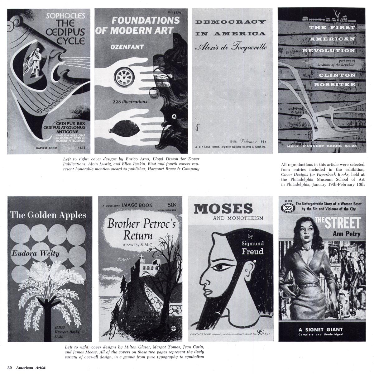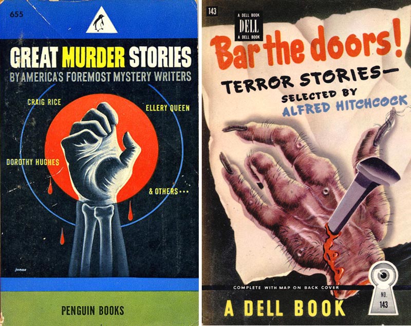
So begins Henry C. Pitz's article on "The Design of the Paperback Book" in the March 1957 issue of American Artist magazine. It provides an interesting counterpoint to the 1953 article from Fortune magazine we looked at all last week. Though not even five years had passed since Fortune examined the phenomenon of the "paper-bounds" one could safely say that a massive evolution in how America consumed popular culture was well under way. How this shift affected the illustration industry is evident in Pitz' article.

"The renaissance of the paperback in this country began less than twenty years ago," wrote Pitz. "It was a spectacular thing, a publishing area that grew to giant size over night. The artist was involved in it from the beginning and hundreds of paintings and drawings ranging from excellent to poor were commissioned."

"However, it must be admitted that the design world did not think of paperback cover design with admiration until a few years ago. A new impulse appeared when several of the publishers, notably Doubleday and Company, through their Anchor series, began to issue serious and scholarly works, which had been dormant in sales, in paperback form. The experiment was an instant success."


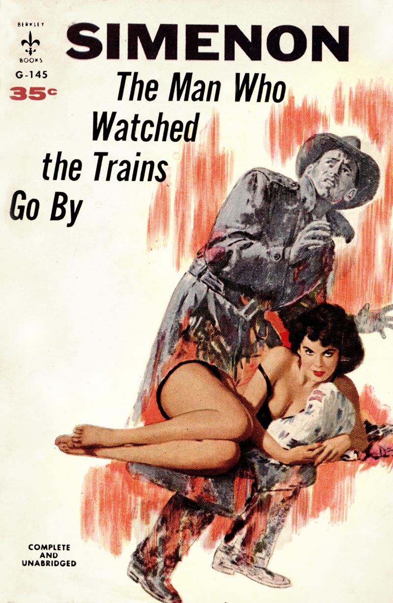
"The recent excitement may tend to make us forget that the real paperback renaissance began seventeen or eighteen years ago. For a while there was a mad scramble among eager opportunists... it is their product which has created the dominant image of the paperback in the American mind. They found outlets in places that never before had thought of handling books. We have seen them hundreds of times in drugstores, on newsstands and cigar counters, and even in many more unlikely places. It is not altogether our fault if we muster up an image of a salaciously realistic cover enclosing an innocuous content."

"It is by no means a fair image but the publishers must bear the blame for it, for many times they resorted to suggestive pictorial appeal in order to sell books of even superior content."


"This stage is passing rapidly."
* Accompanying this week's excerpts from the American Artist article are a broad sampling of mid-century paperback cover scans generously provided by one of my contacts on Flickr, UK Vintage. Many thanks Uilke!
* Thanks also to The Woman in the Woods for the final scan in today's post.
Great stuff. I love the Robert Jonas covers ("Great Murder Stories", maybe "Foundation of Modern Art") -- very unusual style he had. I have about 20 of his covers, and the mostly unreadable books that his covers grace. He's not in demand or even much commented about, but a clever, somewhat surreal artist. I wish you could find more about him.
ReplyDelete