Henry Pitz writes: [Paperback publishers] have felt the nudge of competition from the books of newer design...
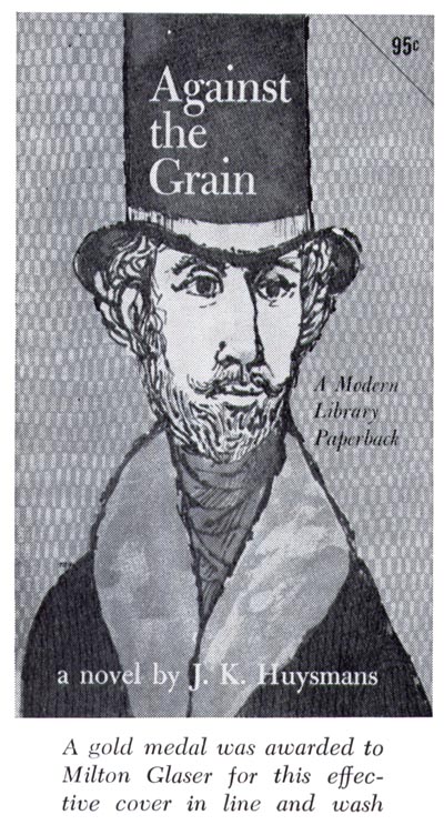
... and they are abandoning the old clichés and experimenting with fresh approaches.
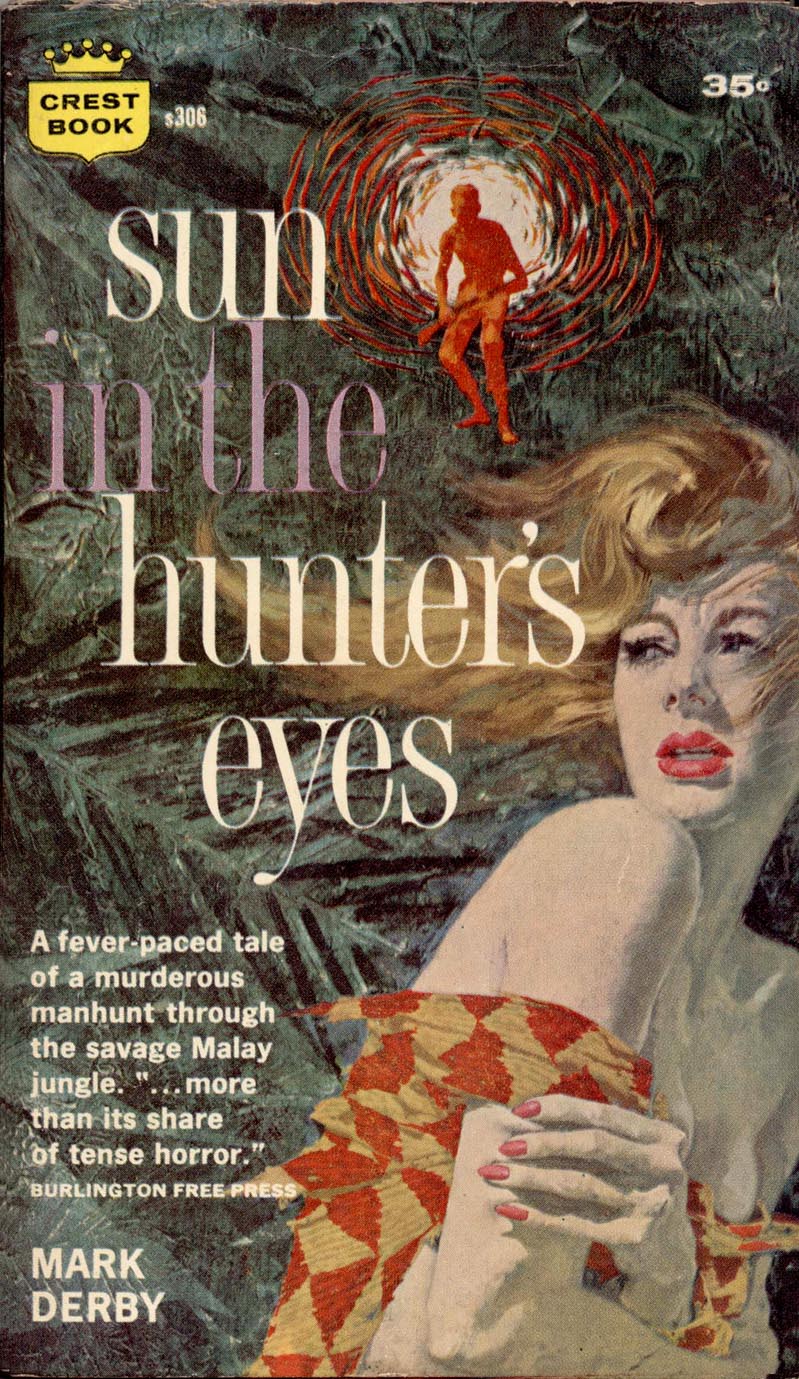
It is only fair to point out that in addition to dozens of mystery and suspense stories,

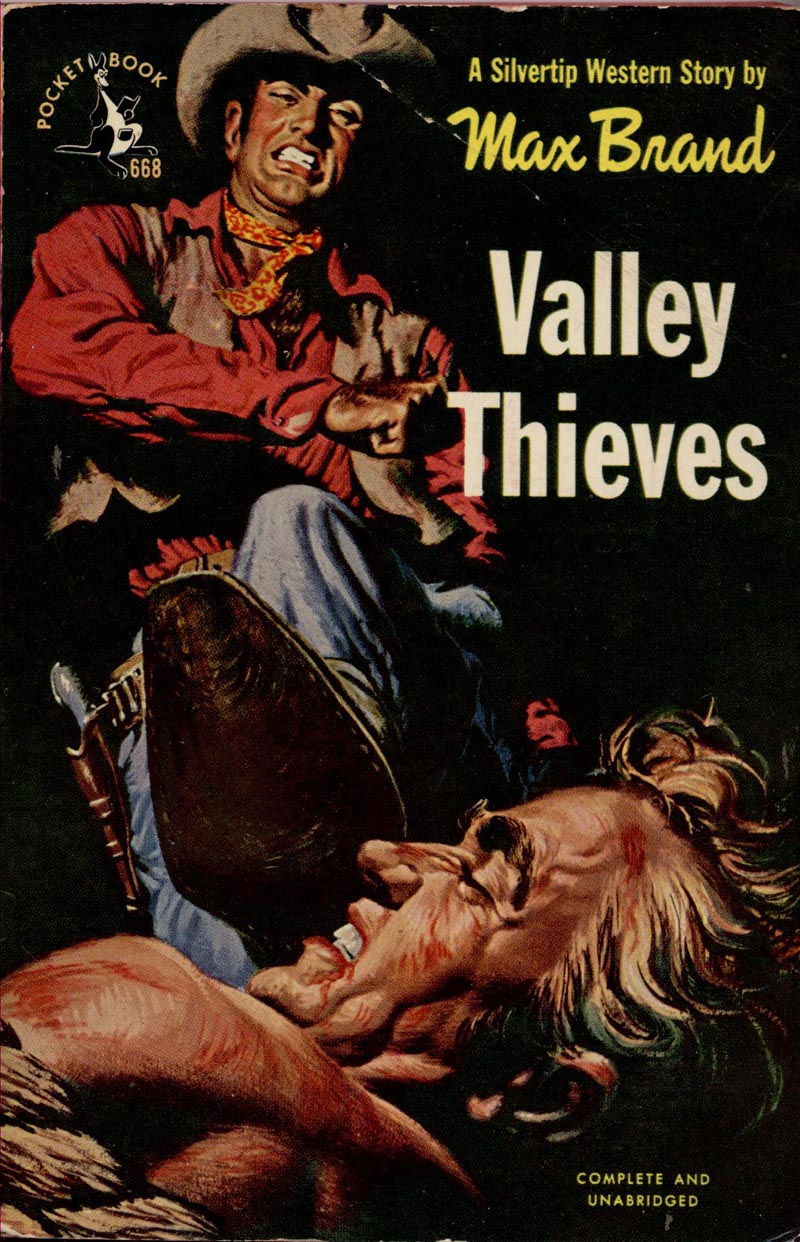
adventure tales, westerns,
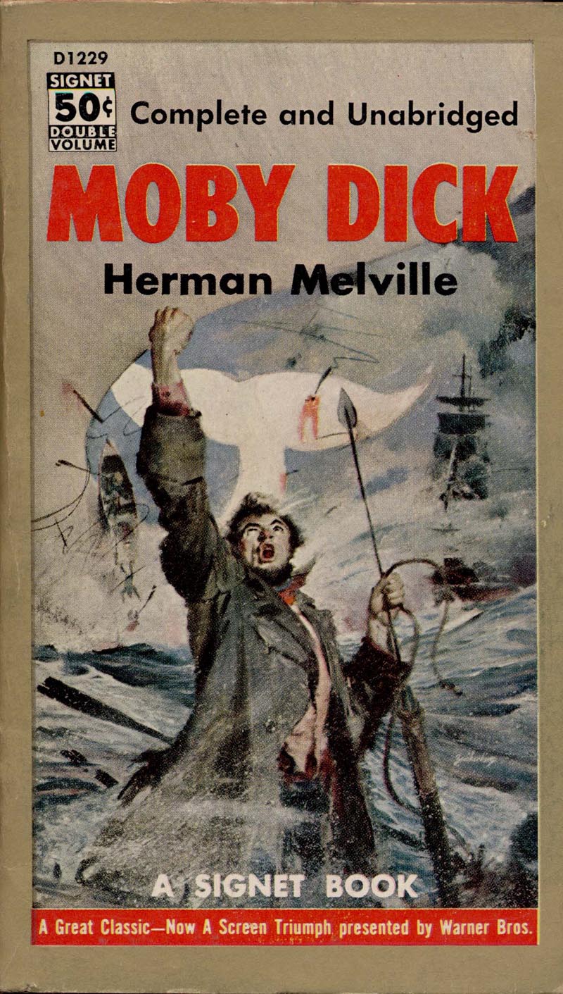
and popular novels which may not be literature but have a legitimate place in our scheme of reading, there are on their lists, in fiction, such names as Dostoevski, Tolstoi, Balzac, Zola, Thomas Wolfe, D.H. Lawrence, and Melville...
... and, among living writers, Rosamond Lehmann, Thornton Wilder, Ernest Hemingway, Aldous Huxley, Robert Penn Warren, Eudora Welty, Robert Graves, John Marquand, and James Michener.
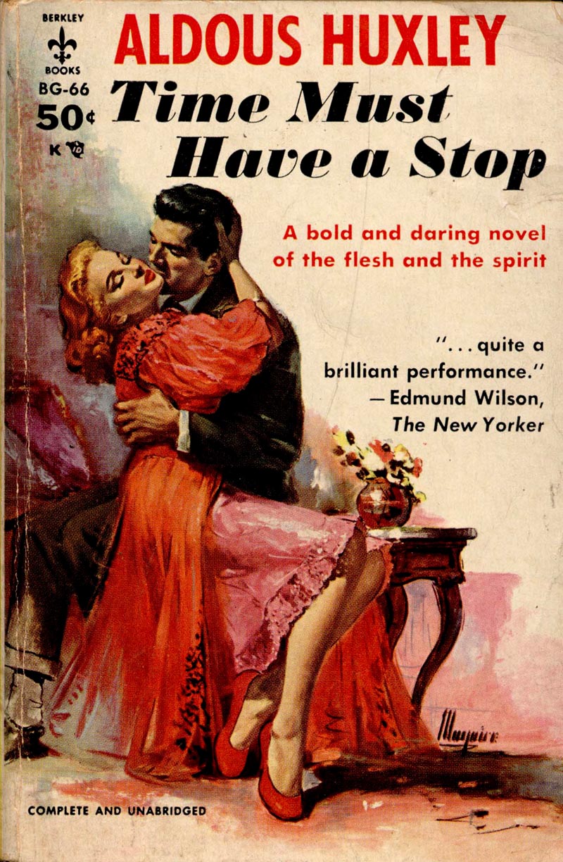
Sol Immerman, vice-president of Pocket Books describes the company's marketing strategy...
"If we constantly realize that the great masses of the American public are, for the most part, just plain folks, we are immediately influenced in our thinking in regards to our approach."

"Each book (by means of its cover) must be its own salesman, advertisement, and direct contact with the buying public. Of course, the basic principles of good selling must govern our thinking. these are : 1. Attract attention; 2. Create interest; 3. Stimulate the desire to purchase."

"Each book is, and must be considered as, a packaging problem of its own. No two books are alike. No set formula can be laid down for all books. What works for one book cannot be expected to work for another."
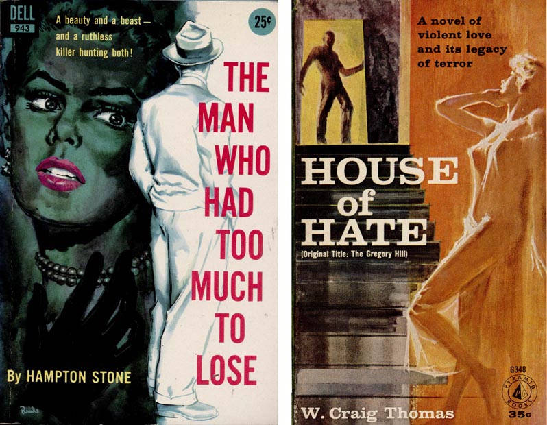
"Trickiness will not do. It might attract attention, but surely will not fulfill our other two basic requirements.
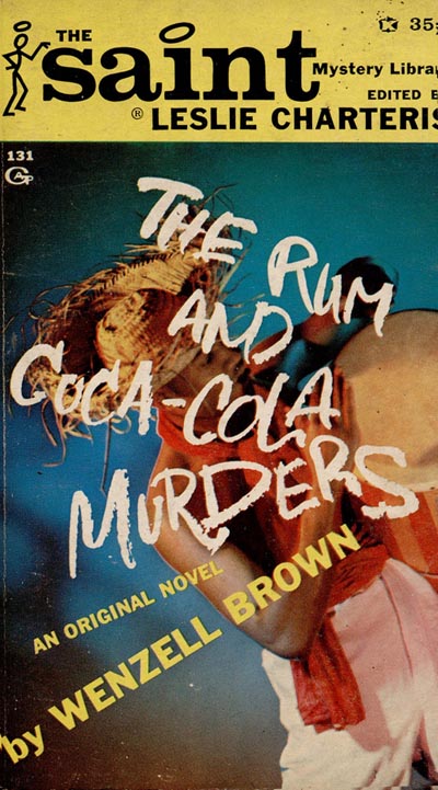
Busyness - our readers do not have time to study and figure out what we are trying to say. We must reach them quickly, directly, and forcefully. All three sales principles can be lost here."

"Simplicity - if overdone - will not attract attention and so the ability to create interest and stimulate purchases will be lost."

"Bad Taste will offend our consumer. The experience gained in our seventeen years of publishing and selling paperbound books to the great masses of readers throughout the world has given us a fairly accurate picture of our markets, reading habits, tastes, likes and dislikes. This applies not only to what these readers like to look at, but also to the kind of books they like to read."
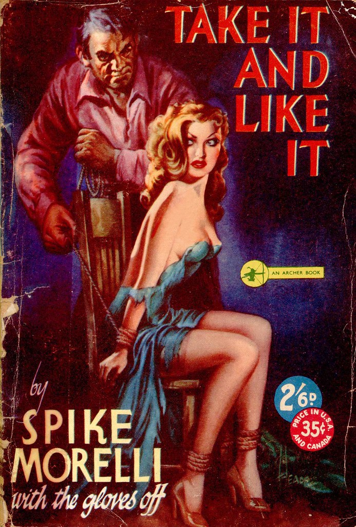
1. "What is our objective? To sell the most copies of each book we publish. 2. To whom do we wish to sell these books? To the greatest number of people in what we call America's mass market."
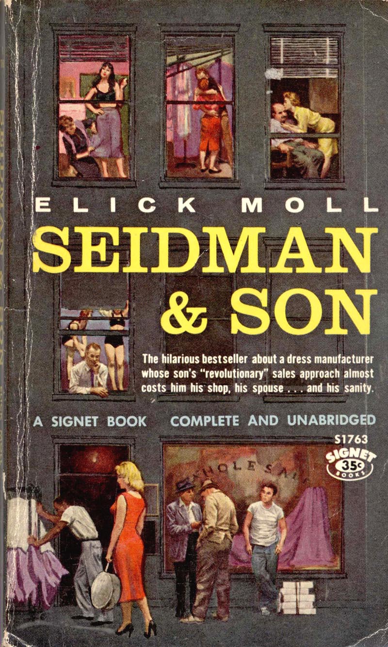
This ultimate goal for each book is sought after with the watchwords of the founders of our company - "To reach the greatest number of readers with the best books, for the least money."
* Accompanying this week's excerpts from the American Artist article are a broad sampling of mid-century paperback cover scans generously provided by one of my contacts on Flickr, UK Vintage. Many thanks Uilke!
I have to compliment you leif on the past weeks insight into the paperback market. Your choice of covers and quotes have hit their mark.
ReplyDeleteHi Leif,
ReplyDeleteThanks for lowering your sights a bit and featuring some of the lurid, lowbrow stuff that characters of my ilk enjoy. You sir, are a Great Canadian!
Happy Easter too, BTW.
Huw
http://www.eyecat.com/
It is interesting that these books were for the purpose of rapid mass sales, to be read but were not marketed to be collected and valued as high quality literature. Yet, the cover illustrations are, in many cases, well thought out esthetically, dramatically lit, and skillfully rendered with as much care and talent as a hard bound classic novel in the finest collections. I would venture to say that the quality of the illustration of many, were on the same level as the slick woman's magazine covers and editorial stories of the day. In spite of today's changed market, I can't help but think that human nature still responds to illustrations in advertising, magazines and books, as well as fine art paintings that are traditionally well designed and rendered, just as it always has. Perhaps, the cart is now leading the horse.
ReplyDeleteTom Watson
Thanks guys - your comments made it all worthwhile. Be sure to visit my friend Uilke's (aka UK Vintage) Flickr collection - without his generosity I wouldn't have been able to "illustrate" the text so effectively. Hope everyone has a pleasant Easter weekend! :^)
ReplyDeleteLEIF....Great week, and totally entertaining. Love 'em all....the good, bad, tawdry....whatever. They're, for the most part, well designed, drawn, painted, dramatic, and it was SUCH a market!! Hundreds, probably thousands of books...aimed at the mass market, which today is no doubt into digital everything, TV soaps or junk programing....but hey, it's our entertainment culture. And as said before, a big venue for 'needy' artists, actors, writers and creative folks. Thanks again, cheers, and hopefully a relaxing Easter weekend.
ReplyDeleteSAS Assignment Help In Australia
ReplyDeleteUML Assignment Help in Australia
Perl Assignment Help in Australia
Accounting Assignment Help In UK
MATLAB Assignment Help In Australia
Entrepreneurship Assignment Help In Australia
CourseWork Help in Australia