Art directors and brand managers; why why why won't you invest yourselves in seeking out today's Bob Peaks and assigning them to major national ad campaigns like this? Why the same old photo solution as all your competitors again and again and again? Isn't the idea to stand out from the crowd and grab the public's attention?

Today's Inspiration isn't just for illustrators to learn about the history of their industry... my hope is always that our clients also will see potential in these examples for whatever they happen to be working on today. I know many of you read this blog... it would be interesting to get your perspective on this situation. I invite you to take a good long serious look and then leave a comment.

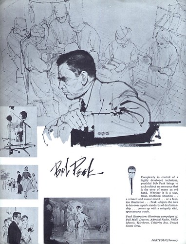
Bob Peak - "the envy of many an old hand"
By the time the ad below appeared in a Fredman-Chaite Studio promo pamphlet in January 1954, Bob Peak's art had already graced campaigns for Pall Mall, Dacron, Admiral radio, Philip Morris, Telechron, Celebrity Bra and United Steel.
At that point the young artist, just 27 years old, had been in New York for less than one year.
In his article in Illustration magazine #6, Thomas Peak, the artist's son, writes about his father's determination to make it in 'the big time'. Peak had just married his art school sweetheart, Lucille Tedesco, in 1952. The two had met and fallen in love while they were both attending Art Center School in Los Angeles.
Barbara Bradley, who attended Art Center School in the years just before Peak, remembers, "One of our scholarship jobs at Art Center was to re-pack portfolios that had been submitted for acceptance. [I was] on duty when we packed one that was so outstanding, we took note of the name. Sure..it was Bob Peak’s. Even pre- Art Center, he packed everything into a piece. I still remember one about Hollywood or Hollywood Blvd... that was probably composite-like. And that became the Peak who so successfully did movie posters, packed with everything!"
But long before he would produce those well known iconic movie posters for Apocolypse Now, Roller Ball, Star Trek, Superman and so many other, this young Bob Peak was attempting to distinguish himself in the most competitive illustration market in America.

Tom Peak writes, "my dad spent three solid months assembling a sizeable portfolio of his work while my mother worked a full-time job to support them. He took the satchel with him when they left for New York City in 1953."
"Armed with little more than self-confidence and ambition when he arrived in New York, Bob was able to land a job at the [Fredman] Chaite Studios. Though he made very little money, he was working in the company of a number of other fine illustrators."

Its those early years of Bob Peak's career that most interest me, so this week let's look at the artist Fredman-Chaite described as the "youthful Bob Peak... envy of many an old hand."
* I have many people to thank for assisting me with this week's topic: Barbara Bradley, Charlie Allen, David Apatoff, Tom Watson for their advice, opinions, information and scans, and Dan Zimmer for allowing me to excerpt passages from Tom Peak's article in Illustration magazine, which are ©2003, 2008 by Tom Peak, Dan Zimmer and The Illustrated Press, Inc., and all artwork © The Estate of Robert Peak.
There is much, much more on the artist at Bob Peak.com
* This was Part One of a previously presented series on Bob Peak. If you'd like to read the entire series, here's Part 2, Part 3, Part 4, Part 5 and Part 6
My Bob Peak Flickr set.
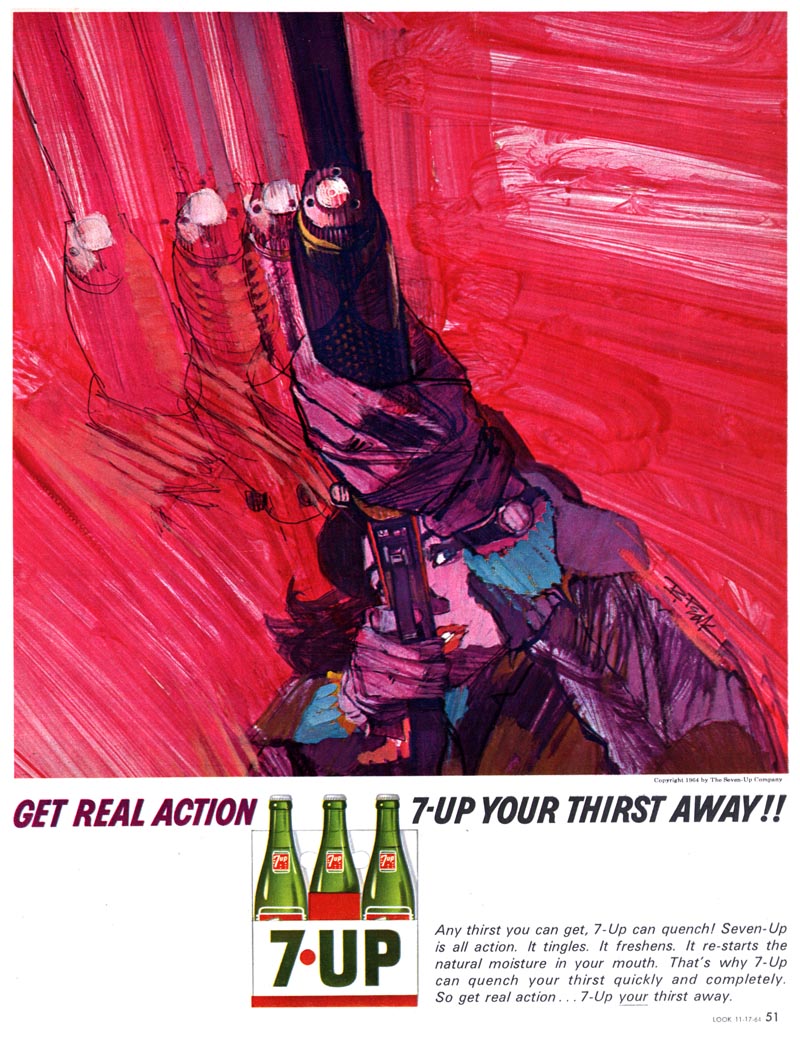
Leif, it's interesting to note the range of quality in those 7up ads. That ad with the girl and the rifle is absolutely stunning, while that ad with the hand on the bowling ball is dreadful. Peak was inventing this stuff on the spot, nobody else had done it before, so the results were sometimes erratic. I like the fact that no one had a formula for this stuff yet and that Peak took huge chances.
ReplyDeleteAt the illustrators workshop a long time ago Peak showed a portrait of Mother Teresa that was just great. It was not the one on the Time cover.
ReplyDeleteThe painting he showed, although wonderful was not good enough for him. He did another one that he said he did a number on.
Holy Christmas. These are wonderful. Bob Peaks is the man. Thanks for this great post.
ReplyDeleteI posted two of his TWA Getaway covers last year:
ReplyDeletehttp://tatteredandlostephemera.blogspot.com/2009/06/bob-peak.html
and the Camelot image on a post card:
http://tatteredandlostephemera.blogspot.com/2009/06/romance-of-bob-peak.html
Lief, I just wanted to add a little comment about AD's seeking out the Peaks of today. I've been illustrating for a while now and one thing I've noticed is that illustration is seen as a luxury item. As in "Gee if we only had the time/money…" or " We can't ask him/her, they might want too much money or time." Illustration is that neat cool thing over there, not a necessity or tool to use on real, current, ongoing projects. THere's more (I'm sure!) but I have to get to my deadlines.
ReplyDeleteI don't remember exactly when I saw my first Bob Peak illustration as an art student in the late 50's, but his color and flair was what set him apart from the rest of the illustrators at that time. He put together beautiful innovative color combinations that nobody else were doing. And, when he started using acrylics, he turned his stylish drawings into energetic high drama pictures, like no one else. I agree with Dave A, that the quality was hit and miss in the earlier years, but when he was on, his work shined like a bright star. I was told by a reliable source that he often did as many as three different FINISHED illustrations for one assignment, instead of a color rough for one idea. That gave the AD his choice and he used the other two as samples for his portfolio. I think his willingness to experiment on the spot, came from his enormous self confidence as an illustrator. I knew of quite a few illustrators during the 50's and 60's, that took several months off after art school to build a serious portfolio of their work. I think one common denominator for most successful illustrators was their untiring ambition. Leif, I dido your comments about why illustrations should be used in advertising today. They worked then, and will work today with the right illustrators.
ReplyDeleteTom Watson
Quel admirable travail... Et surtout quelle élégance dans la ligne et la composition... Superbe!
ReplyDeleteWell said! Unfortunately, today's art directors and brand managers are more interested in social media, crowd-sourcing and stock library shots. It's just the way this business is going these days. Which is a shame.
ReplyDeleteDon't worry, what goes around....Slightly off message but BBC tv in UK is using graphic style of Tron movie in a trailer for Moto GP superbike races. Bob Peak was maybe the first illustrator to exploit the new medium of acrylic paints on hot pressed illustration board normally used for finished artwork. I found them a bit strange to use at first back in the 60's but they have improved beyond all recognition. Some of early paintings by David Hockney have started to disintegrate because, like all paints, they are unstable.
ReplyDeleteI was turned on to Peak's art by one of my Digital Media Design instructors. In the 7-up ads I'm amazed at their...their...well, the only term I can come up with is 'aggression'. In the other pieces I'm amazed by both their simplicity and their clarity...I must have more!
ReplyDeleteI love all those ads with their daring and provocative styles. That wonderful line work, exciting color. Man, that stuff sang and Bob Peak's work sang among the loudest and best.
ReplyDeleteAnd while it's the artist, not the tool, looking at this wonderful art sometimes makes me wish photoshop had never been invented...
Hi Guys, Its nice to come across articles on my dad! Thanks for posting. I am working on 2 new sites relating to him: http://BobPeak.net this is the main Bob Peak site. I'm including video clips relating to the projects along with the art.
ReplyDeleteand http://SanguinFineArt.com an online gallery carrying his originals and some limited editions. Also looking for other illustration work to carry.
Please keep me posted if you find any other info about my dad...thanks Matthew Joseph Peak
Leif, Great information about my father Bob Peak. I am his son Thomas Peak and director of the NEW BOOK ON THE ART OF BOB PEAK available this FALL 2011. The Hard-Cover 300 Page Coffee-Table Book will cover his 40 year career with many never before seen illustrations along with his iconic illustrations for the Movies, Major Periodicals, National Ad Campaigns, Time Magazine Covers, TV Guide Magazine Covers, Fashion Advertising, Sports Advertising, and more. Log onto the WWW.BOBPEAK.COM website for information includimng a "PRE-RELEASE SPECIAL PRICE OFFER."
ReplyDelete