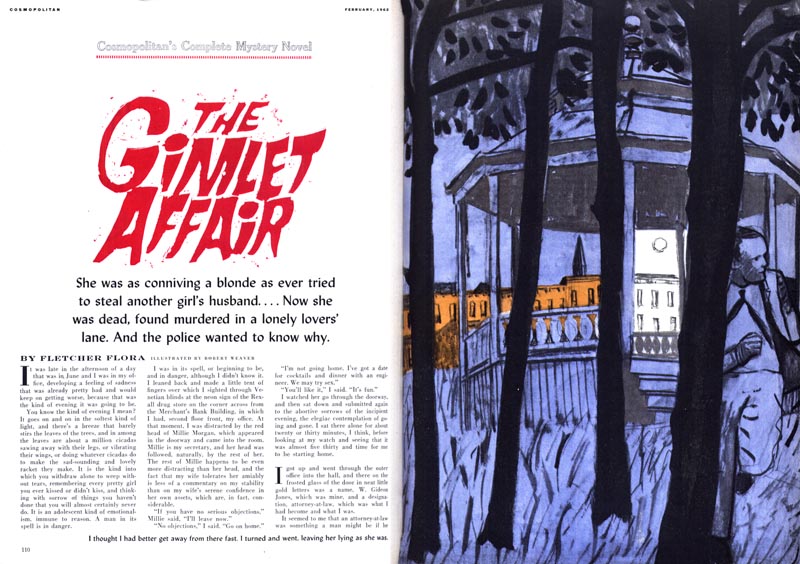
In an interview published years later, Weaver said, "I liked working for Cosmo, before Helen Gurley Brown took it over and ruined it. I did... a lot of detective stories, which I enjoyed doing, but even that kind of fictional illustration grew out of the real. I used real data."

"First, I had some kind of image in my mind. I sort of knew what I wanted to get. But you see, I based my Cosmo work on a lot of sketches of real situations. I was telling a fictional story, but using real life people in the interest of credibility."
"I always had two pages, sometimes three. That was the nice thing about working for them. The magazine was filled with illustrations. Sequences allowed me to share more information with the viewer, rather than reducing a complex notion to a simplistic symbol."
"In the early days... I saw illustration as a real calling. I felt that everything I needed to say could be said in illustrations. In other words, I would find within a manuscript some way of putting myself into an illustration - there was plenty of room to roam around. Now illustration has become very constricting."
"Illustration assignments provided an outlet. I saw illustration as an end in itself. I began to see it as a real calling and not just a way to make money. I was certainly lucky. There were some very good art directors around who would let me do it my way."
"But... I have grown up, and illustration is a young man's art form. I think one eventually gets tired of that kind of illustration where you have to make up solutions that are essentially simplistic. If you really do have an interest in art or in ideas, you need some way of letting that come out, and you can't do it in illustration alone, unless you're given a lot of paper and a lot of time and freedom."
* My Robert Weaver Flickr set.
* Many thanks to Daniel Zalkus, who passed along the interview from which I quoted today's passages. Unfortunately the date and publication were unavailable to Daniel - who had only photocopies, not the original magazine in which the interview appeared. We can only determine that this interview took place after 1976 since Weaver mentions it in one of his comments.
He's right about the pre-Helen Gurley Brown Cosmo. In the 1950's every issue was a feast for the eyes, especially the illustrations for the fiction. After she took over in '65, it slowly started disappearing.
ReplyDeleteLooking at Weaver's work in today's post, It finally occurred to me what was lacking in his illustrations, and it is ironic since he repeats the word "real" over and over in his interviews. His people are not real to me. I mean they look like human beings, but they have no real identity. I can't feel warmth, compassion, sympathy, admiration or even hate towards them. His illustrations are all about experimental compositions, texture and avant-garde design, but little real humanity. That was something that Whitmore, Bowler, Fuchs, Parker and other popular mid century illustrators did not ignore, and I could relate to their people.. real people, average people, glamorous people or interesting characters. To be frank, the couple kissing (the only clinch scene I have ever seen by Weaver), looks like a preliminary rough sketch submitted by any number of other illustrators of the day.. and I am a big admirer of a sensitive, loose, spontaneous drawing styles. But, if it was important for Weaver to make his illustrations about the "real world" and not fantasy or idealism, I need to relate to his figures, and so does the reader.. real figures that connect with their readers. I think that is where he missed the boat, trying too hard to throw out the traditional approach, and pioneer a revolution without following some of his own advice. Leif, did he mention in those interviews, what specific illustrators he admired?
ReplyDeleteTom Watson
Tom,
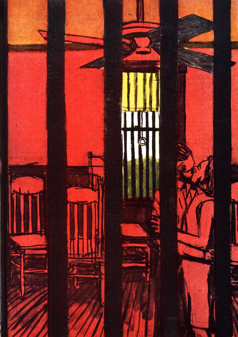
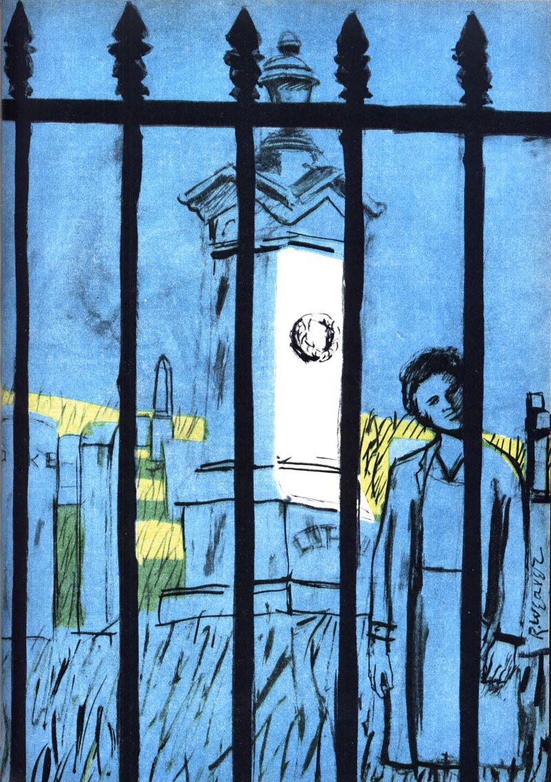
ReplyDeleteI like the repeated motif of the bars. I think the people look real enough. They do not look photographic, which is the only thing I don't like about a lot of the illustrators you mention. Also, I think Degas was a big influence on Weaver. If you look at some of his paintings of women ironing and his figures' candor, you might see it.
Here are some links:
http://www.meltonpriorinstitut.org/bilder/pictorials/2010/Jan/5/pictorial_50/80.JPG
http://www.meltonpriorinstitut.org/pages/kuk_diashow.php?pictorial=50 (image number 7)
I think it really comes down to what people like. I find a lot of the pretty illustrations cold. Like Peak, his work feels very staged, very unfeeling and calculated. It just feels cold to me. Mark English on the other hand has a tremendous amount of humanity in his work, even at its most photographic.
It is really the posed nature of a lot of the other illustrators work that turns me off. I agree with you on the lack of reality in those people as compared to say, the boy in the car, but I think he was going for something else.
Best,
Bill
In my opinion Weaver and many of that era ignored craft and had a real disdain for the industry, but were incapable of leaving it or transcending it. I remember talking to an illustrator from that time who hated the industry, wanted to be a fine artist but couldn't make enough money. I think that kind of attitude shows in the work no matter what field your in.
ReplyDeleteThe mistake of that time was in catering to the youth movement that sought to distance itself from the earlier generations of their parents and grandparents. If I can use a music analogy, like Madonna or Brittney Spears you shock or titillate when you lack the ability to perform on a higher level. It doesn't matter they sell more records to twenty year olds than Brahms, they won't be remembered in a hundred years and neither will Weaver. When the fad for innovation faded, illustrators like Weaver quickly become a footnote in history and end up representing the time, a thing they fought against.The ones that survive do so because of their respect for craft which is the basis for all great art in any genre.
Bill,
ReplyDeleteThanks for your informative and welcome response, and attaching those samples. I fundamentally understand your point of view, and relate to most of it. When you refer to photographic realism in illustration, we may have an interpretation difference. Although most of the early 50s' illustrators were more literal and rendered in an academic realistic manner, I never considered them photographic. They injected their taste, personality and stylistic flair, which could not effectively be done with a photo. Robert Weaver, Phil Hays, Tom Allen, Bob Gill and others had an unpolished even primitive look to their work, which became part of the avant-garde movement in the late 50s' and 60s'. Most of the leading illustrators of the early and mid 50s' became more stylized and graphic in their later illustrations, including Whitmore and Bowler. I think much of Bernie Fuchs' tremendous success was due to his strong academic background in drawing and painting, which he blended beautifully with a flat painterly expressionistic style, and forceful dynamic compositions. Weaver had the dynamic compositions and expressionistic paint application, but didn't show a lot of strong academic skills for my taste. Incidentally, unusual compositions were used by Henri Cartier Bresson, and other creative black and white photographers, well before Weaver's time. Degas' paintings were also a popular influence on many other 50's illustrators and photographers, usually for his unusual compositions and glowing colors in his later pastels.
The Fortune examples you attached are more effective in my opinion, because they are done in a sketch-book manner, as though he were touring the plant and doing fast color drawings of the various activities. The portrait on the Fortune cover is a good example of when Weaver blended more accurate drawing with his primitive expressionistic painting style. The quality of drawing in his figures seem to vary. As you wrote, it's about personal preference, but I will add that in reading quotes from Weaver's interviews, it's hard to separate the man from his illustrations.
Tom Watson
Armand,
ReplyDeleteVery well put.. your astute analysis makes a lot of sense to me.
Tom Watson
I wonder what Weaver meant by adding "real life" to these illustrations for Cosmopolitan. Does it mean he used models? Or went out and sketched people on the street?
ReplyDeleteI don't think he used models like many illustrators before or after him. I got the sense that whenever possible he went out and drew directly on the street (until he started losing his eyesight). But I can't imagine that working for every assignment, especially the ones in this post.
Anyone know?
Weaver always claimed to draw on the streets; he never hired actual models as far as I know. He was not above amending scenes, though, if he had too to tell the story better.
ReplyDeletePS - the unattributed interview you mention was by Steven Heller, in his book on innovative American illustrators, from about 1984 - going by memory here.
ReplyDelete