Another very diverse, eclectic, group of ad illustrations....continuing the odd, but good, clips from the venerable old file. But first, a dinosaur chuckle to lighten the day.
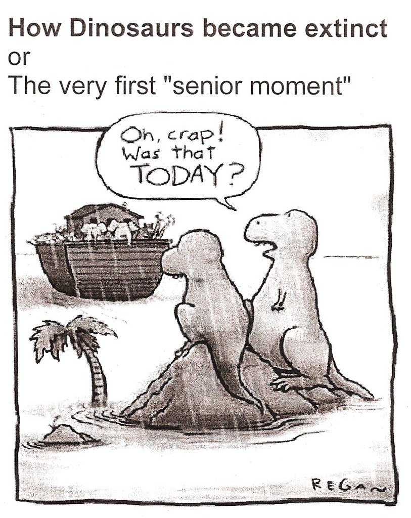
First illustration, in this case a very different cartoon style and I thought you'd appreciate.
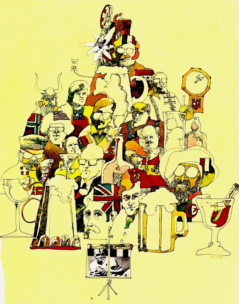
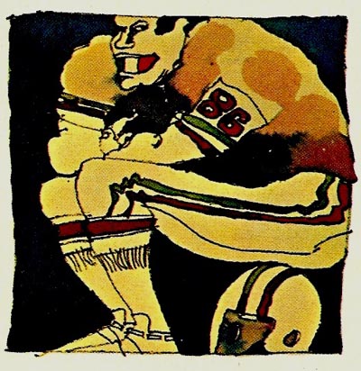
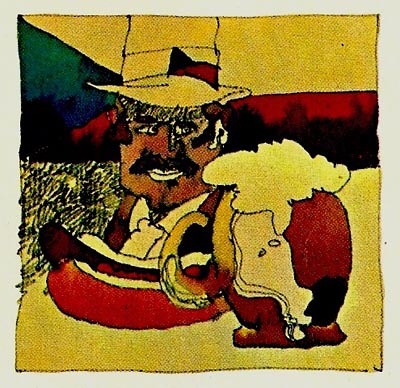
The name is 'Weber' or 'Weker'....don't know. A football article, and no idea from what magazine or publication.

Second, a Honda motorcycle ad, frequent and ubiquitous in the magazines of the 60's. I'll call it 'illustration lite', almost all done by the same illustrator.... I don't know who. The reason I think it's good....the colors are always bright and cheerful....the low power modern Honda bikes looked simple and appealing....the draftsmanship was excellent....all in all, very effective advertising.
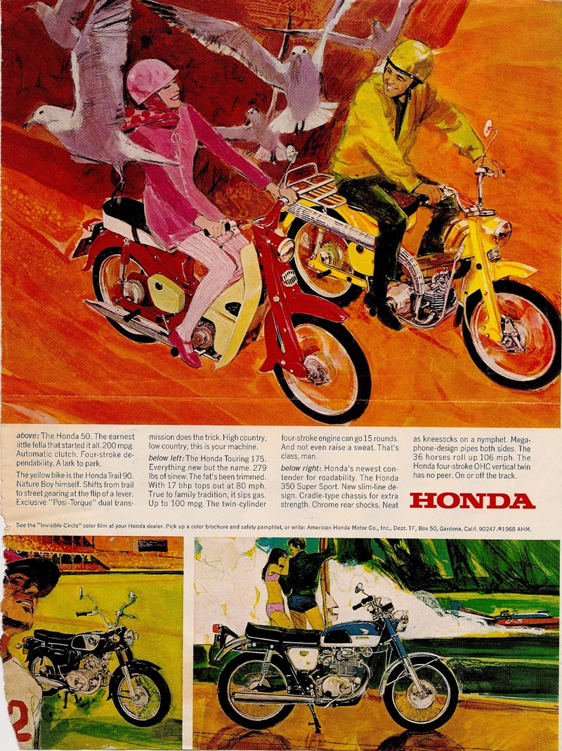
Honda was changing motorbike sport and transportation, formerly dominated by the 'burly' Harley crowd. Honda made biking a middle class, desirable, acceptable way to get around. The ads so effective, I spent several afternoons doing trial runs, mainly at the dealer's lot, trying out a 50cc bike. Never got one, to my regret, but maybe furthering my safety and extension of the illustrator biz!
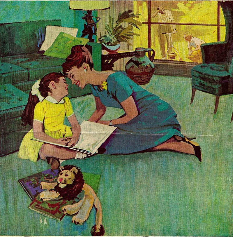
Next ad, a natural gas magazine illustration by Al Muenchen....an illustrator about my age whom I met a few times. He came out from the east to check the western 'scene'. Always competant....and sometimes, (in the Sat. Eve. Post) exceptionally good editorial illustration.
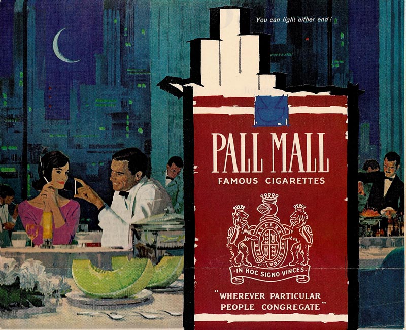
Next, a Pall Mall ad, artist unknown, but definitely one of the many 'Fuchs School' illustrators. Again, very slick, competent work.
Following that, a wine ad that's beautifully drawn and rendered. Loose, relaxed, excellent drawing, et al. I want to say Mitchell Hooks, but I'm probably way off on the artist. (Charlie is correct, this is by Mitchell ~ L)
This was a series as I remember.

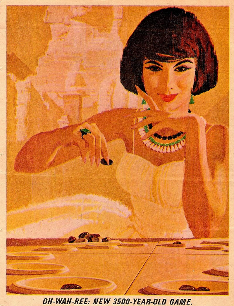
Finally, a simple strong game ad, again the Fuchs School....but effective and attractive.
Hey, enough for now. Thanks, I think, for the TI 'old file' blog! These things are definitely not seen these days.
Cheers...... Chas.
Thanks for the cool collection of images! The cartoony stuff is Don Weller-who like so many illustrators from that era are now doing beautiful gallery work.
ReplyDeletehttp://www.donweller.com/
Steve is right, the first stuff is by Don Weller. He's an old friend of mine and now only does occasional illustration since he and wife Cha Cha gave up designing Park City Magazine last year. His watercolors are fantastic and show off his immaculate sense of design and color. He also enjoys working his cutting horses on his Oakley, Utah ranch. His website is well worth a look.
ReplyDeleteI see Greg and Steve beat me to the Don Weller call!
ReplyDeleteLove the Don Weller.
This is a terrific series, Mr. Allen! Thanks! Keep 'em coming!!
I saw a lot of obvious early Fuchs influence in many illustrator's work, especially in the 1960s' and into the 70s'. But, as competent as some of those illustrators were, Fuchs had his own elegant taste in the way he posed his models and grouped them together, his exquisite subtle jewel like color combinations and his loose free-flowing brushwork, that gave a special energy to his work. I think he had a very instinctive sophisticated sense of taste that few illustrators achieved before or since.
ReplyDeleteThese are definitely some of the better examples of the Fuchs look, as Charlie has pointed out, but I sure saw a lot of cheap Fuchs imitations popping up in magazines at that time,.
I knew of illustrators that purposely followed Fuchs' career footsteps.. working first for the Detroit studios in the car advertising industry, before moving on to the "big apple" or another large city. Fuchs was a trail blazer for a lot of mid century illustrators.
I think I read somewhere that Don Weller was one of the few nationally known illustrators working out of L.A. at that time. His work was always distinctively creative.
Tom Watson
I thought the dinosaur cartoon was great, a real "that would've been ME!" moment. I'd never heard of Don Weller before, but I checked out his web site and just fell in love with his watercolors. It's one of the few times in my life that I've looked at art and actually heard music, like a symphony in the far distance.
ReplyDeleteBrilliant! Just brilliant choice:
ReplyDeleteLooking at "More Old Stuff" right now in the evening...so I can't very well say "you made my day", also with this dinosaur cartoon. But tomorrow is next day. You shall have made that for me as well!
Thanks for the assorted images.The natural gas ad seems like a perfect compromise between a flat,graphic style and a painted impressionistic style.
ReplyDeleteI have the Oh-Wah-Ree board game image in my clip file also.My dad worked at 3M company,and was given free samples of the 3M board games(like Battleship).Never played it,but I had to save the cover art.Always wondered who did it.
To Steve and others....thanks for the Don Weller web address. Wow! The guy is amazing....and handles watercolor in such a competent and unusual way. Impeccable sense of design, and of emphasizing and subordinating his backgrounds and figures. A little weak on 'photo distortion'....proportions of figures, horses, etc. He obviously uses reference....but the artist must draw, edit, interpret that reference....always. With ad illustration it was a constant element in the struggle to do professional work.
ReplyDelete