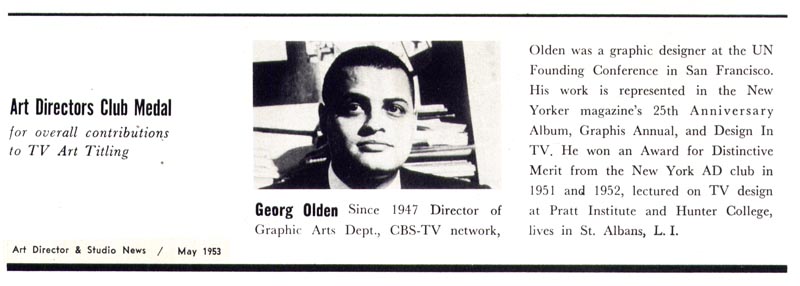
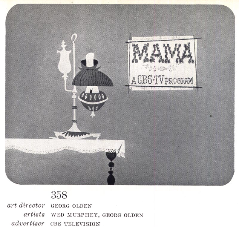
There's an awful lot that's interesting about Georg Olden. His biography at the AIGA website is a fascinating read. For our purposes however, Olden is noteworthy because he was such a singularly passionate advocate for the use of illustration on television during those early days. Among his credits, Georg Olden supervised the visual identities of programs such as "I Love Lucy", "Lassie" and "Gunsmoke."
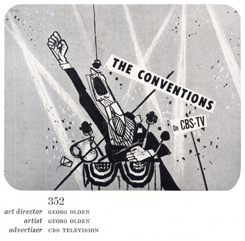
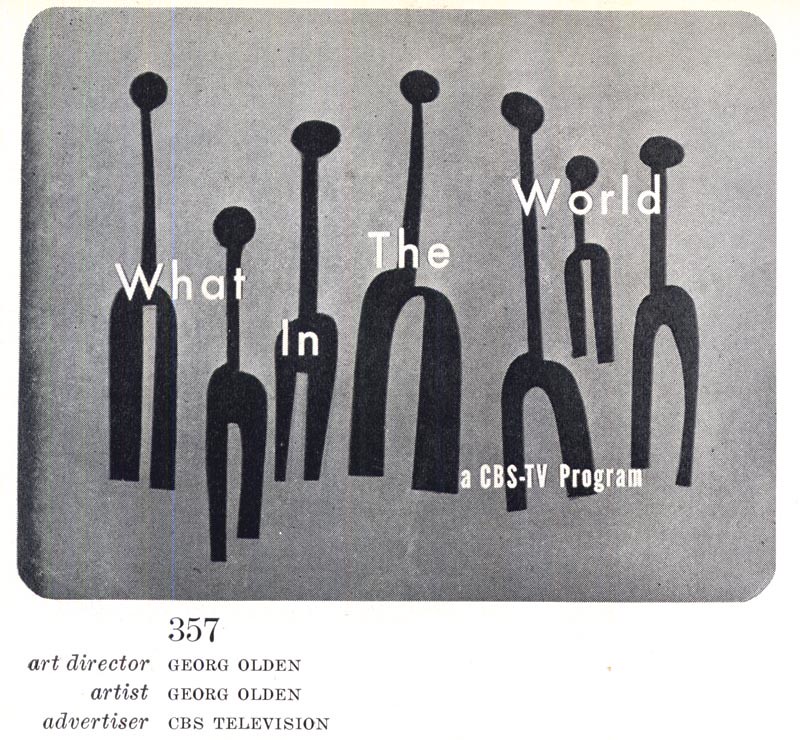
Although known principally as a designer and art director, Olden was also a pretty terrific illustrator, as you can see below. (Maybe that's why he was so supportive of the idea of using illustration on tv)
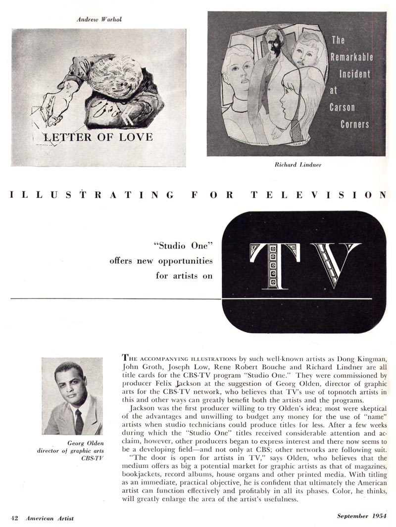
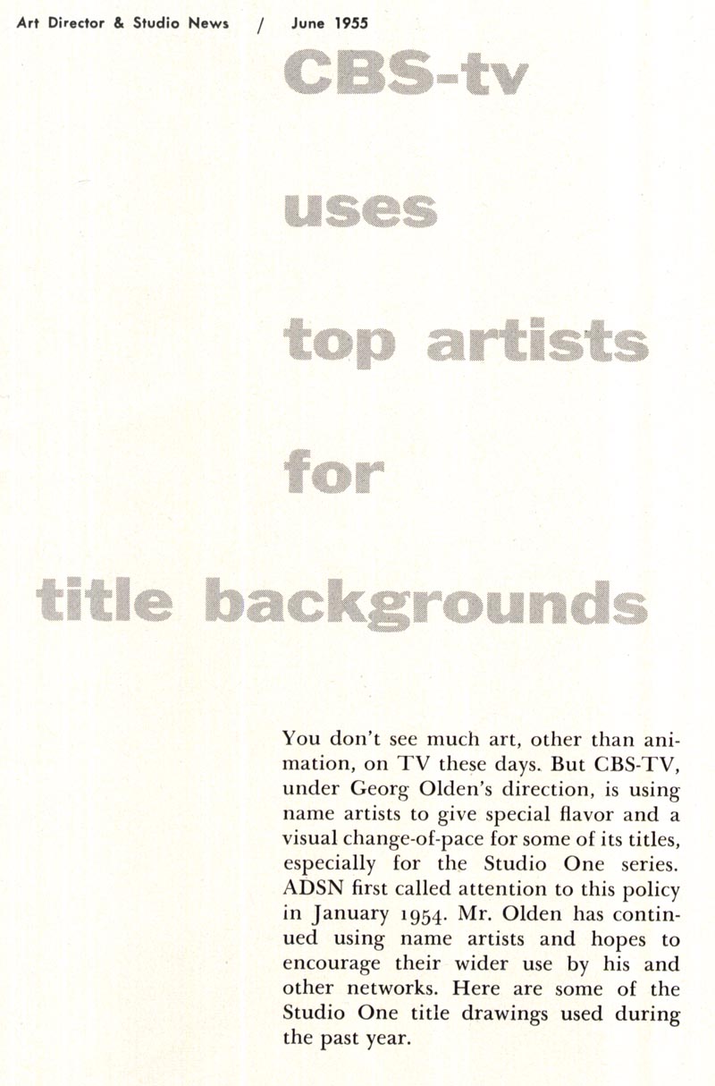
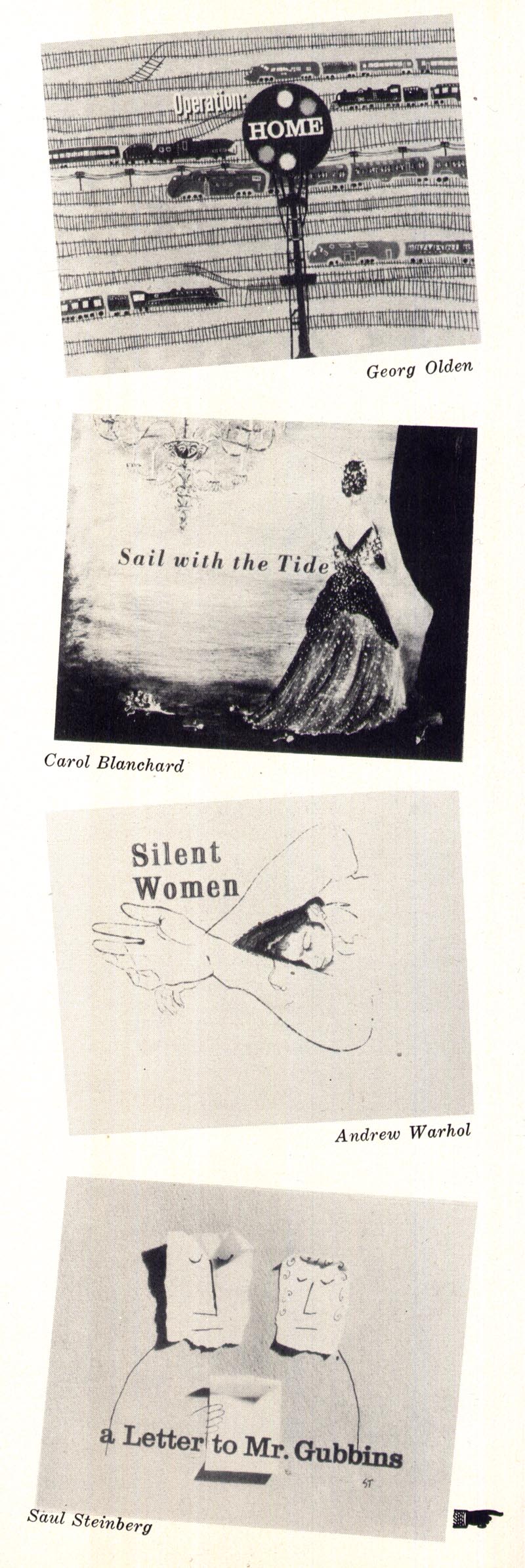
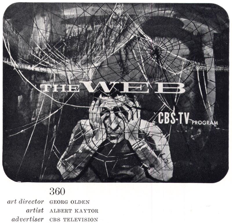
The article below describes how, in his role as director of graphic arts for the CBS Television network, Olden convinced skeptical show producers to budget for the commission of title cards illustrated by both well-known illustrators...
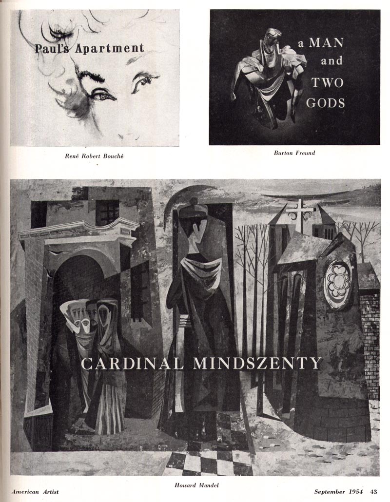
... and notable new comers.

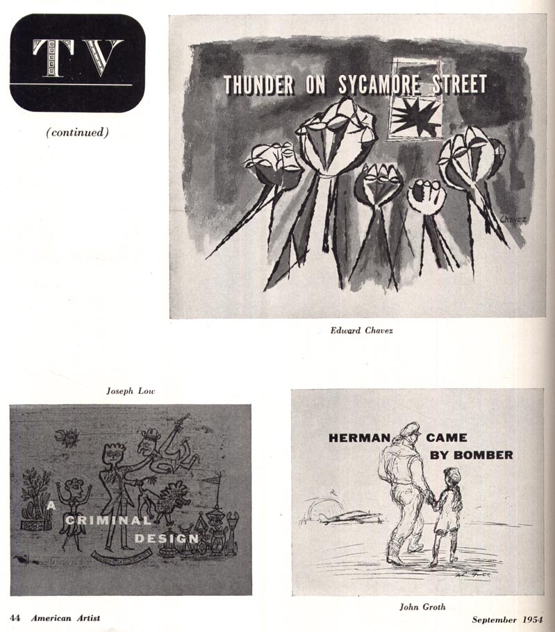
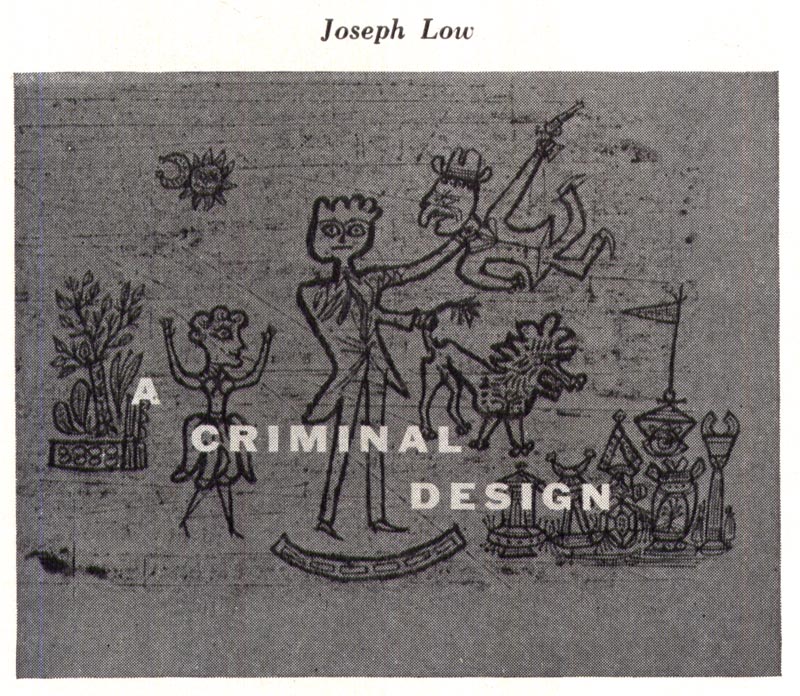
Whether Olden was successful in his mission is hard to say from my limited understanding of this esoteric niche market. If other television networks were convinced to follow Olden's lead, their efforts are not much in evidence in the industry publications of the day (at least not any publications that I have access to).
In the 1952 NY Art Directors Annual for instance, nearly every piece presented has Olden's name attached to it as either illustrator or art director.
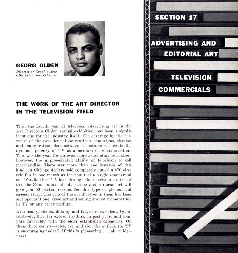
Read the introduction to this 1955 article from Art Director & Studio News and it sure seems like Olden was a one man band in this regard.
But I'm fascinated by the thought of someone like Georg Olden, who clearly loved illustration, being in a position to incorporate it into this emerging new medium...
It brings to mind these times we live in - and the (relatively) recent emergence of another new medium - the Internet - and those of us who have lived through the transition from print to web. Its been a long strange trip...
... and I'm not sure we've arrived at a destination.

Maybe Georg Olden's fervent belief that illustration had a place on television was misguided. As a child of the '60s I don't recall ever seeing much in the way of illustrated title cards. I would guess that by the time my generation started watching television, Olden's experiment had ended in failure.
Maybe there really never was a place for the static image in a medium of constant motion.

But as a community we illustrators owe George Olden a debt of gratitude for his unwavering belief in our chosen discipline. And we ought to think seriously about what we ought to be doing to remain relevant in a post-print era.
* my Art for TV Flickr set.
You're losin' me here, Leif! A long, strange trip from print to web....and....not sure about the destination. It seems a shorter trip in my career, but....the point is....there IS no destination. Creativity is endless and will continue to prevail in all kinds of human communication, as well as in all other forms of human endeavor. We're born that way.
ReplyDeleteComing from a provincial illustrator background and mood, i'm obviously less interested in the entire cartooning presence in the print media....and even less in the myriad uses of cartooning in TV and movie worlds. I appreciate and enjoy greatly the talents employed....but it's another creative category. Even just in print, it's apples and oranges. Each does a job....but with different requirements and goals.
And....where does it stop with the cartooning? Are the New Yorker and other print publications one-liner funny cartoons included? That's an old and a very large field. Are the equally old and prolific areas of political cartoons considered? There are great talents, and countless gems have been produced in both of those fields. And where do the immensely popular animated cartoons and figures come in? Can all of that fit....in a blog?
Well, it is titled Today's Inspiration....so maybe so!
Leif, A very insightful and sensitive blog. I doubt few have ever thought much about the graphics used in the early years of TV were much to think about, but your posting shows how interesting and varied these were. As one who grew up on 1960's TV, they had a very pleasant nostalgia about them.
ReplyDeleteLeif, those cards by Georg Olden reminded me a lot of some cards (accompanied by limited animation) that I've seen used in old kinescopes from local TV stations like WJW in Cleveland. In some way, shape, or form they certainly did influence at least local artists there through 1965 - 1966.
ReplyDeleteCharlie; thanks for sharing your thoughts on the subject - sorry I lost you on this one. Actually, I don't think we're that far apart on the subject. I agree that the journey of one's career as an illustrator ought never arrive at a destination... but it would be nice if there was an occasional rest stop! That doesn't seem to be the case right now. I'm perhaps more attuned to it currently because I'm teaching what will hopefully be the next generation of graphic arts professionals and I see clearly the skills, technology, and marketing challenges they will have to overcome to be successful... and it concerns me.
ReplyDeleteI see many parallels in the way the industry changed during the '50s w/ the arrival of new technology like television and faster film photography. This post and the preceding ones are about exploring those parallels - though perhaps not spelled out to the degree I would have liked to - if only I were a better communicator! - which is probably why i lost you so, my apologies.
Regarding cartooning and its many permutations and their relationship to illustration - I'm afraid our positions differ dramatically. I don't see the compartmentalization you do - to me they are all part of the same graphic language of the (commercial) artist, and all connected very closely in purpose.
Can a blog do justice to the documentation and analysis of those many components? Its been five years and over 1,250 posts so far... and I feel like we have barely scratched the surface!
Anonymous and Michael; thanks for your thoughts on this topic. I was a kid in the '60s as well (a little kid, mind you) and I don't have any memory of title cards like this... I certainly recall the ones at the beginning of all the Warner Bros. cartoons they showed on tv - and I loved those!
ReplyDeleteBut what Georg Olden attempted in the '50s fascinates me... and I marvel at the thought of all those illustrators producing artwork that appeared so fleetingly on a flickering screen... and has no doubt been lost forever ( with the exception of these few reproductions we see here today ). I am also intrigued by the thought of how, briefly, illustrators of that time might have thought that a new market was opening up for them... it really brings to mind what's happening currently with illustration on the Net, and how the future of illustration seems (to me at least) really unclear - as it must have back then as well.
I think, in the main, Olden made the wrong choice of illustrator for this medium.In choosing what you might call high-brow illustrators you substitute immediacy for prestige.
ReplyDeleteMost of these cards lack the strong graphic impact we saw in the tv animations for fiddly line conceptual illustrations that would need the kind of study you could give on the printed page, not fleetingly on the tv screen.
That's an excellent point, Remo - I can't disagree. I'm not sure it would have made a difference in the long run, but among the examples shown, the clean, simple, graphic pieces are certainly the most effective ones for the job at hand. Thanks!
ReplyDeleteThank you for making me aware of not only another graphic talent, but also one that happened to be black. Your post encouraged me to learn more about this trailblazing talent. Thanks!
ReplyDeleteThis Mr.Olden, whom I didn't know before, in my opinion definitely has a Picasso touch.
ReplyDeleteMs. Krause; its a pleasure. I had never heard of Olden before but I'm so impressed I want to know more about him as well. If you find any details beyond the bio on the AIGA website and decide to blog about Olden, drop me a line! :^)
ReplyDeleteThat's an interesting comment, Rich - how do you mean...?
ReplyDeleteCould that Andrew Warhol be a young Andy Warhol? I know he did some illustration work and commercial art in the 40's.
ReplyDeleteAs to the Picasso:
ReplyDeleteSorry, mistook that Chavez illustration as well as another one for Olden.
Should have put my goggles on.
Joel; I would think that Andrew Warhol was one and the same as Andy Warhol. I have a few more pieces I found here and there in my old magazine collection which I'll post one of these days. What I find so interesting about this early example(actually there is another Warhol further down) is that the young Warhol seems to have been influenced by David Stone Martin's work.
ReplyDeleteI clearly see the Martin, ( another artist worthy exploring), influence in these early Warhol works.
ReplyDeleteThis has been an interesting posting on many levels. Thanks for responding and look forward to more great posts.
Wonderful post, thank you.
ReplyDeleteI love illustration for many reasons, and one of the odder reasons is the idea of brilliant, amazing work being produced by people who remain, to this day, totally obscure. I see work like that displayed in your post and I want to shout: Your work is not forgotten, and by it, you have made the world a better place whether people know your name or not!!
Don't know if these would qualify as TV "cards," but your post made me think of the illustrations that ran behind the closing credits of some late 50's, early 60's TV westerns: Maverick, Wagon Train, Bonanza, etc. The old private eye series Peter Gunn also employed a very cool graphic when it broke for a commercial.
Just a great blog-- thanks again!