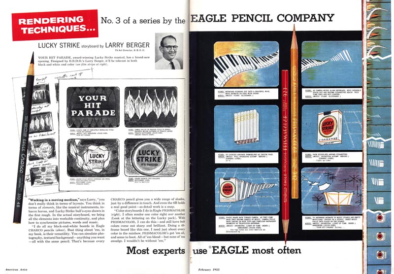
Not wanting to miss out on an emerging market, the Eagle Pencil Company jumped on the bandwagon by extolling the virtues of its coloured pencils for creating presentation - quality storyboard drawings.
Here's an interesting article from the October 1953 issue of Art Director & Studio News.
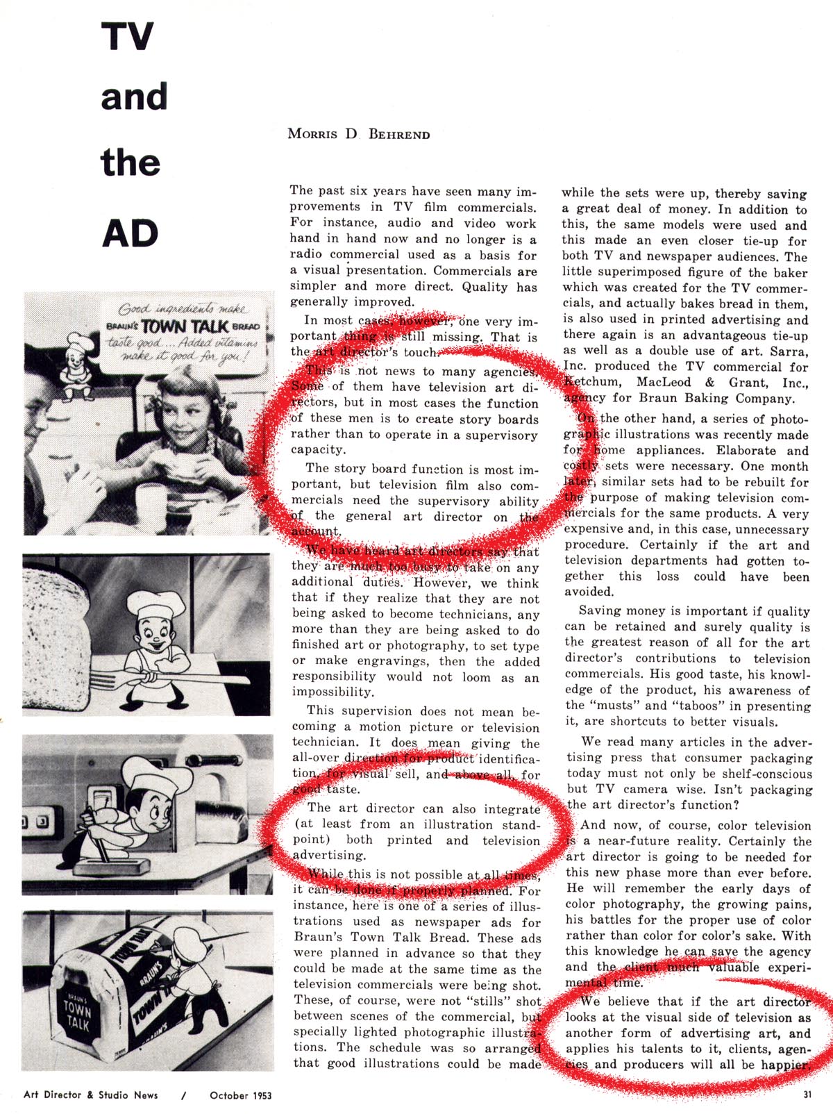
Not only does it reference the growing significance of the storyboard as a visual aid in the process of making TV commercials...

... it highlights a trend in print advertising design that began to appear in the early '50s: the story board as print ad.
Its a trend I noticed over the years as I looked through thousands of pages of mid-century ads and articles in my old magazine collection. But I never really put two and two together until this latest series of posts.
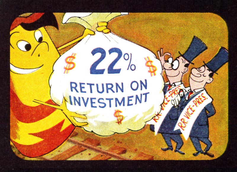
In the introduction to the Television section of the 1952 NY Art Director's Annual, William Strosahl writes, "The quality of commercials is improving constantly and Art Directors are a big factor in raising the standards of TV advertising. It is big business and may well represent 65% of total billings in the next two years."
That's a massive chunk of revenue for a medium so new that it was, in 1952, only being included as a category in the NYAD Annual for the third time. It made me think, if agencies and their clients were beginning to devote the majority of their time, money and creative effort to producing television commercials, wouldn't they want to reinforce their broadcast message in print? The AD&SN article seems to confirm this strategy...
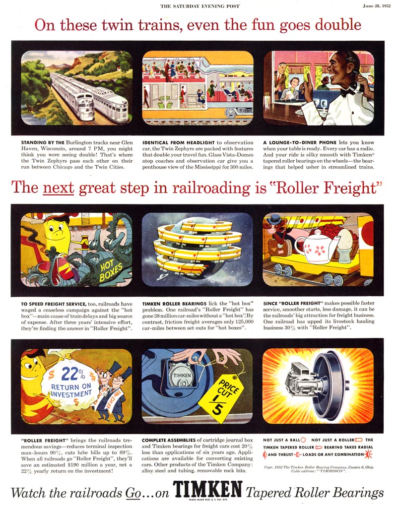
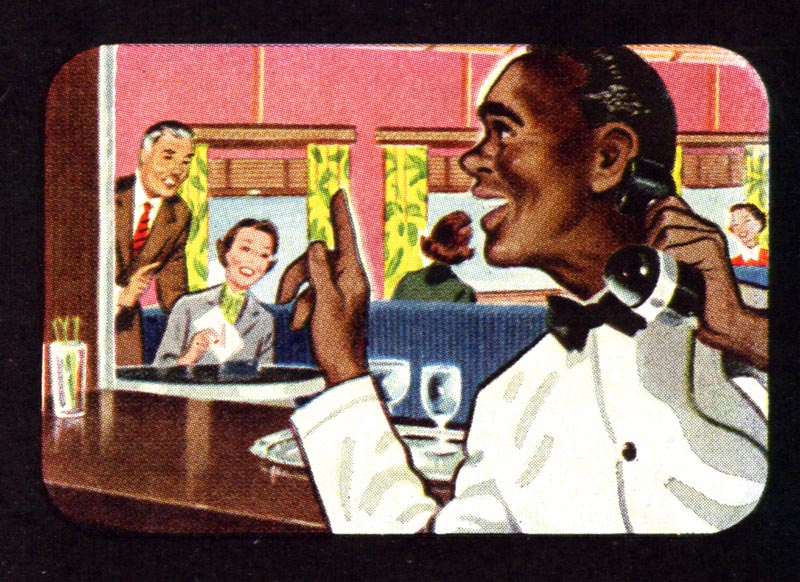
So it shouldn't be surprising to see print ads that look like a comic strip version of a TV commercial -- right down to the curved corners of the classic cathode ray television tube. Though the general public was undoubtably unfamiliar with the term, they were - half a century ago - seeing their first television storyboards.
Was new artwork created for these print ads...
... or did agencies simply reuse the illustrations commissioned for the TV commercial? I'm really not sure.
But the AD&SN article suggests at least some reuse. In the commercial cited in the article the author mentions that "the little superimposed figure of the baker, which was created for the TV commercials, and actually bakes bread in them, is also used in printed advertising and there again is an advantageous tie-up as well as a double use of art."
I don't want to suggest that the TV-storyboard-as-print-ad became a huge component of all print advertising - far from it - but its existence (and persistence) simply once again underscores how the game had changed. For the ad business... for the advertiser... and very definitely for the illustrator.

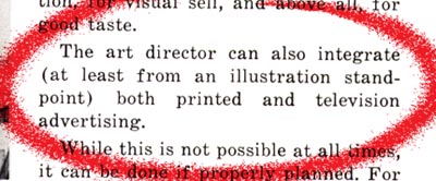
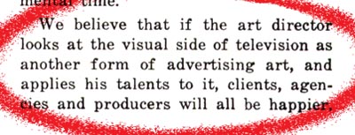
A final quote from the article to conclude the thought ( and this latest series of posts):
* My Art for Tv Flickr set.
* Also, Bruce Hettema has a new post up about illustrator Frank Hoffman on his P&H Creative blog
* And if you've yet to visit (and perhaps participate in) Toby Neighbors' fabulous "collaborative illustration" blog, illostribute.com, this might be a great time to jump in: Toby's latest 'tribute' is to pulp artist Norm Saunders - what fun!
* Finally, be sure to drop by the NCS blog for the latest NCS Spotlight on... Eric Gurney!
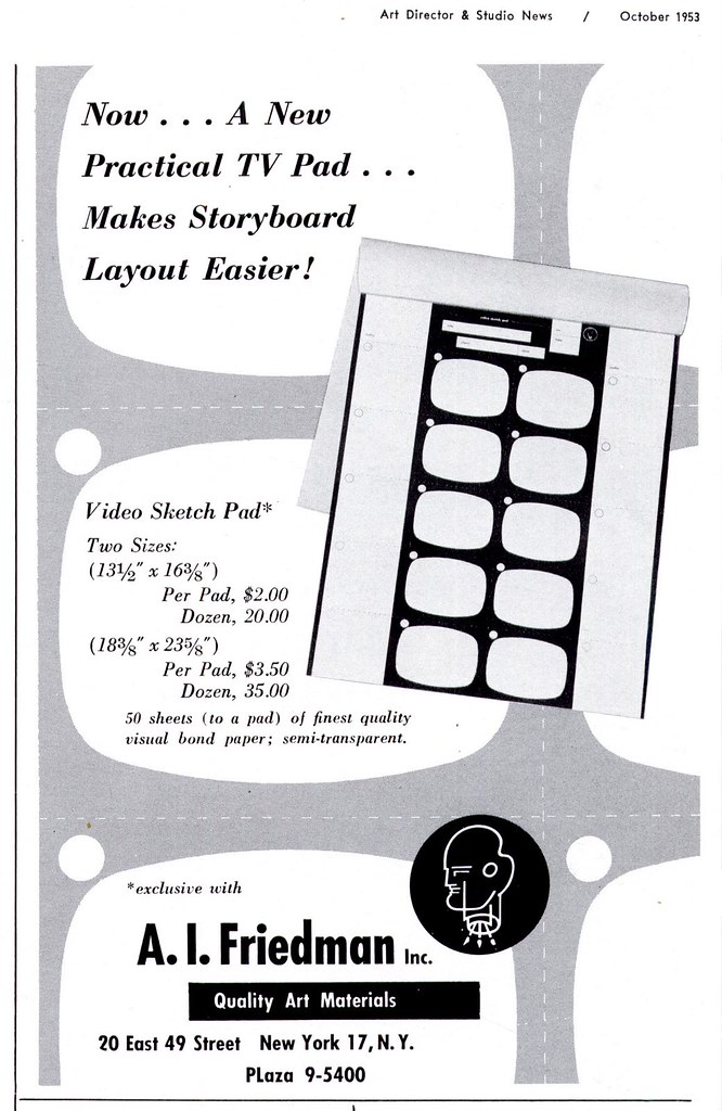
Geez, I remember trying to draw in those little pads. Now with Flash and other digital software the boards are turned into animatics with color, motion and effects. Most are so tight they are broadcast quality.
ReplyDeleteSort of coming full circle, eh? Interesting...
ReplyDeleteHey Leif, Thanks for the note on illostribute! Great
ReplyDeletework too–Toby
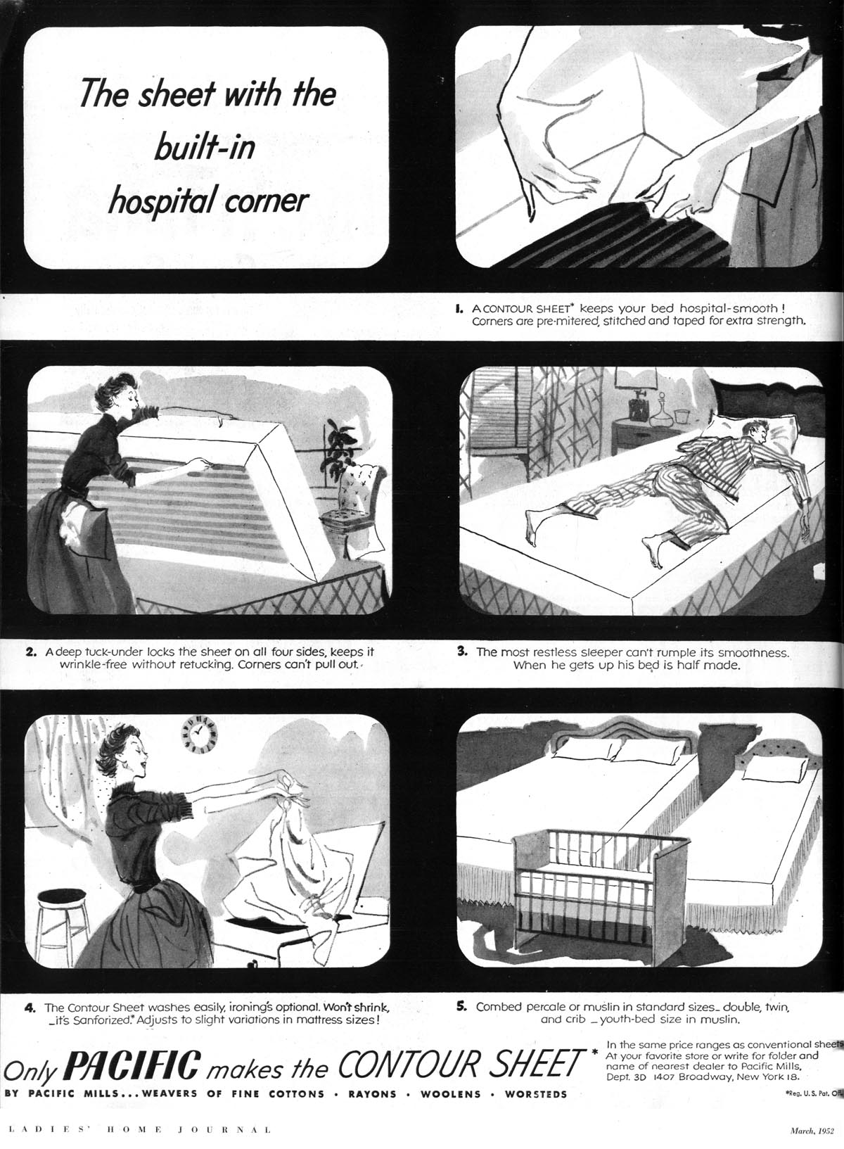
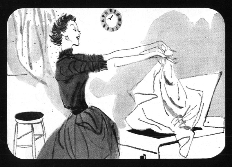
Gasp! The figure drawings on the ad for Contour Sheets are just breathtaking. Thanks for sharing all this great artwork.
ReplyDeleteI'm embarrassed to admit that I don't know much about the history of illustration. Very cool!! Thanks for sharing!!
ReplyDeleteSherm;
ReplyDeleteThose drawings are by an illustrator named Jane
Miller. You're not alone in admiring them... they were selected for inclusion in the 1952 New york Art Directors Show and annual. :^)
My pleasure, Kristen. If you want to learn more just dig through the archives. There's a ton of art and information here about the 'golden age' of our industry.
ReplyDeleteI never liked the pads. (still there in the 80s!) We usually used one of the cut out 5x8 frames, traced it off on tracing paper,then sketched with maybe 1 clean-up drawing, then B&W copier, then markers for color. Before alcohol markers (about '85, as I recall) you had to ink your drawings on marker paper and then color with the old xylene (toxic) markers to keep the linework from bleeding. Fun fun.
ReplyDeleteLeif, One of the pleasures of your website -- apart from the great art -- is your particular appreciation of the "prosaic" art that we all have seen, experienced, enjoyed and loved even as we considered it in service to commerce. Many people still consider illustration as a lesser form of real art, and do not take it as seriously as the art that hangs unseen in mostly empty museums. Your particular appreciation of commercial art is unique and extremely intelligent. Even those of us that are not illustrators can learn much from your musings. This last series was very insightful. I was reminded of the experience of reading Simon Schama's works while reading these last few posts. Keep up the good work and keep bringing us the remarkable art you find. Very inspirational. thanks
ReplyDeleteWow, many thanks, Wes - I don't feel worthy of such fine compliments... but I'll certainly continue to do my best to present mid-century art and stories that everyone will hopefully find both interesting and inspiring. :^)
ReplyDeleteLet alone the illustrations and drawings, i just can't get enough of the LAYOUT of the spots -there is something about the arrangement of space that NAILS the time period. Everyone raves about the work of the Eames and other big deal designers form the sixties, but it is present, IN SPADES, in even these "prosaic" ( great term!) examples..
ReplyDeleteWe tried to get some of that into Incredibles, but I don't think we nailed it.
Very interesting point - thanks for that, Scott :^)
ReplyDeleteThoptv download is the best alternative of Netflix, Hotstar, Jio tv and many more apps. Thoptv apk” is very useful app .
ReplyDelete