Henry C. Pitz wrote about Ben Stahl in the September 1950 issue of American Artist and made a point of reinforcing this aspect of Stahl's work by providing a step-by-step demonstration of an illustration assignment Stahl had recently completed for Today's Woman magazine.
"[Ben Stahl] uses models infrequently," wrote Pitz. "He draws with great ease from his imagination and usually his pictures grow from a series of quickly executed sketches. When the experimental sketches result in an exciting solution, he enlarges the sketch freely onto the board or canvas and begins to paint directly."
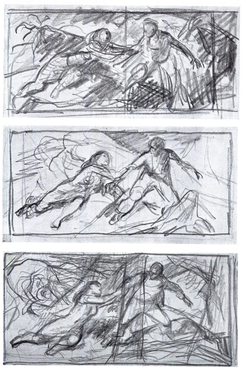
Stahl said, "I keep a picture flexible all the way to its completion. This permits changes and additions during the progressive stages of painting that, to me, result in better pictures. The problem of injecting life or spirit into a picture is difficult. But by keeping yourself free to change and modify the physical forms in a picture you will find the spiritual values and the life of the creation entering subtly, almost subconsciously into your composition."
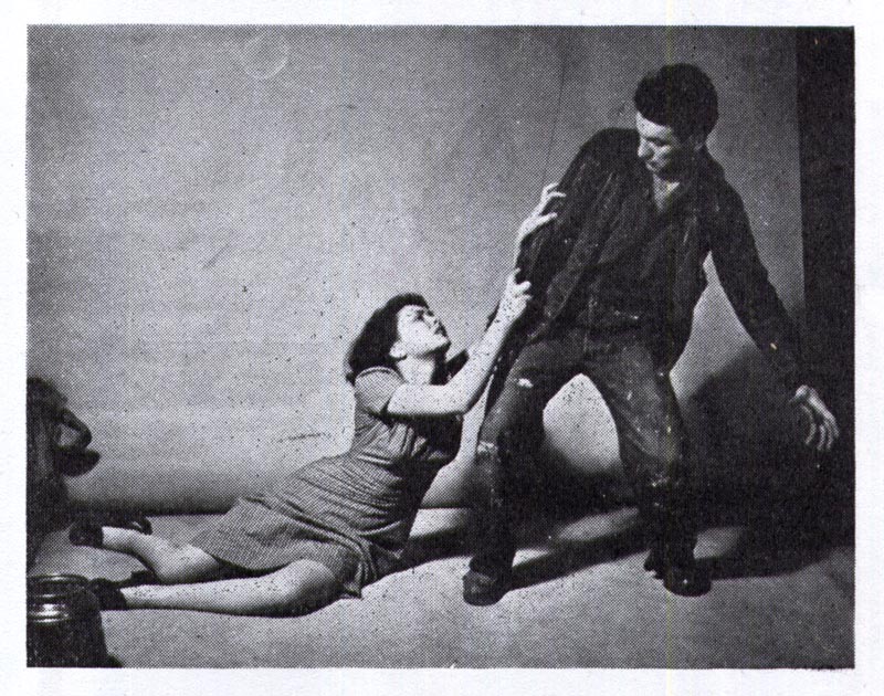
Of course Ben Stahl understood that photo reference of models had its merits. As we can see, he had models pose for this particular assignment. But to qualify his intentions he wrote, "The photo shown here is one of a number used in this illustration. They were not much help through no fault but my own. I took these photos knowing full well what I wanted and no model could possibly get into the preconceived poses I had in mind. I did use small parts, such as a hand here, a fold there."
This next exploratory sketch speaks volumes about Ben Stahl's problem solving process when making a picture. The art director had asked Stahl to emphasize the girl's frustration in attempting to hold the man back. Stahl said that "this sketch was made to more clearly demonstrate that it is the abstract forms of the illustration which project drama and mood, with a minor helping hand from diagrammatic action and the reportorial aspects. The sketch could be even more abstract and still carry the story."
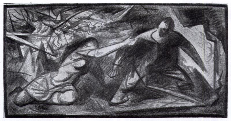
Stahl was intently interested in creating mood through strong composition, form and lighting and the sketch above was key to his analysis of the problem. He added, "I wish to point out how form serves two purposes: the creation of strong architectural structure and at the same time the creation of a mood."
"The mood," wrote Stahl, "is the result of certain structures and arrangements of form as is aesthetic spirit."
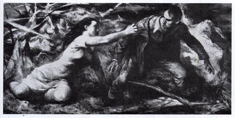
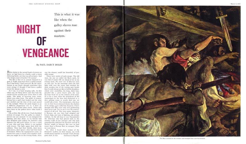
Unfortunately I don't have a full colour scan of the piece presented in the demonstration, but below is another Ben Stahl illustration that might serve as a relative example of the conclusion of Stahl's illustrative process.
* My Ben Stahl Flickr set.
Leif-
ReplyDeleteGreat to see Stahl's sketches and read a bit about his process.
Also interesting to note is that American Artist Magazine used to interview well known illustrators. When is the last time they did that today?
This is very interesting. I'm drawn to the idea that the girl's frustration should be conveyed by her posture and not reliant on her facial expression. However, I'm not convinced that her anatomy looks right, her arm looks too long and there's something not quite right about the head and shoulder structure.
ReplyDeleteBut I like this fine art approach, you can see it in some of the best illustrators of the previous era- in particular Saul Tepper.
Yes; anatomical correctness has its value, no doubt.
ReplyDeleteI think the vast majority of the reading public will be very forgiving for a slight anomaly here and there, if the mood has been created successfully. As obviously is the case here: As a novel reader I couldn't ask for more.
I don't see it as a major problem, but the proportions of the girl in the reference photo have been lost in the painting. I think a combination of Fawcett's accuracy with Stahl's visceral dynamics would be a great combination.
ReplyDeleteI think it is important to compare the photo and the illustration. The photo is staged like two actors posing on stage for the audience, frozen for the camera.. and it visually conveys that feeling. The illustration is full of energy, and I can feel the action of the two figures as I look at it. It is full of human emotion and artistic decisions. N.C. Wyeth was quoted that an illustrator has to feel the strain in his body, while illustrating an action scene. I think Stahl was focusing on the subjectivity of the scene.. how both figures felt, emotionally and physically. The girl is straining and stretching toward the man much more in the illustration than in the photo. The man's pose is more fluid than the model in the photo, and the background heightens the sense of high energy.
ReplyDeleteWhen I was an illustration student, I mentioned to my instructor that a hand was poorly drawn and painted in an Edgar Degas art book we were looking at. The teacher said, If Degas felt it was important to paint the hand anatomically accurate and realistic, he was more than capable. He left it rough and unfinished because he wanted the attention entirely on the face, and he wanted an immediate spontaneous feel to the painting. Degas was being selective by merely suggesting the hand. I think Ben Stahl made similar decisions, and like Degas, the more confident and mature he became as an artist, the more he felt confident in simplify and exaggerate the figures. Even Robert Fawcett's later (1960s) illustrations were often simplified, looser and even distorted, to convey his objective.
Tom Watson
That's a delicate balance because you need the viewer to suspend disbelief and buy into your illusion, if something jars because it is not correct-in essence- then that can diminish the strength of the picture.
ReplyDeleteThat is a different thing from 'selective focus' where a hand could be proportionally correct but deliberately loosely rendered.
If you look at Stahl's first sketches {particularly the third} you'll see they look a lot less stilted than the final picture.Both in terms of anatomy and expressive movement.It's like he worked all the life out of them as the picture progressed.
I must say, I like his color palette.
Remo-
ReplyDeleteI think the changes he made end up being a matter of personal taste. Not everyone is going to see anatomy problems like you do.
What I found odd is that he made her grab the guy with one hand instead of two. IMO it gives the action less impact.
He also bulked the woman up and she reminds me of a tough farmer. Not sure if that was part of the story but she's definitely not the model he photographed!
Daniel and Remo, the viewer does not have the photo reference to compare to the finished illustration, therefore it's the end product that is important. Set aside your personal preferences and taste, and look at the man's qualifications and accomplishments. He was one of the top mid century illustrators along side giants like Al Dorne, Norman Rockwell, Robert Fawcett, Austin Briggs, Al Parker, etc. He was a founding member of the original Famous Artists School, which was a very prestigious honor, and he won many awards for his illustrations.. not to mention a very successful fine art career, after the decline of the illustration market. My point being, it's easy to play Monday Monday morning quarterback (over a half decade later) from our easy chair, but Stahl earned his accolades in the trenches. He didn't rise to the top by making a lot of bad artistic decisions. Therefore, I cut him a lot of slack on the small stuff, and try and learn from his very qualified assets as an illustrator.
ReplyDeleteTom Watson
Tom-
ReplyDeleteI'm not questioning Stahl's accomplishments, he was great, all I was responding too was that sketch.
Like I said in my previous post I thought his choices were a bit odd but it's a matter of personal taste. I also don't know the story he was illustrating. It could be a case where he changed things to better tell the story.
Correction, I ment to say 'half a century later', not 'half a decade later'.
ReplyDeleteDaniel, I understand your point, and agree to a certain extent that the difference between one top illustrator and another, can be personal taste. When I was teaching at the Academy of Art in S.F., occasionally a student would say to me, "Isn't it a matter of personal taste", after I would critique his or her assignment. My answer was usually, "If it were just a matter of personal taste, you wouldn't need your assignment's critiqued".. actually we wouldn't need art schools. The point of Stahl's sketches was to show how most illustrators, and specifically Ben Stahl arrives at a solution for a finished illustration.
Tom Watson
Tom-
ReplyDeleteI think you might be confusing my posts. I was specifically responding to Remo when he said: "That's a delicate balance because you need the viewer to suspend disbelief and buy into your illusion, if something jars because it is not correct-in essence- then that can diminish the strength of the picture."
I do think the changes Stahl made end up being a matter of personal taste and that not everyone will see the anatomy flaws that Remo did.
I certainly don't see that as a distraction and pointed out the things I thought were odd. But that's why it's great to see these things. We get to look inside Stahl's thought process a bit when it comes to making pictures.
As for taste and school I don't think you can compare the two. A student saying "Isn't it a matter of personal taste" after a critique is different than a person looking at paintings on a website (or at a museum).
However I do agree with you about teaching. There's more too it than simply a matter of personal taste.
Don't get me wrong. I think Stahl was good and I'm glad to see the posts this past week. I didn't know a lot about his work and it was great to learn more and see samples.
Daniel, I think we are both on the same page, and your points are well taken. Thanks for your polite and well articulated response. I think one of the assets of TI is that we can exchange our thoughts, ideas and insight.
ReplyDeleteTom Watson
Tom-
ReplyDeleteI agree.
It's great that there's a place like Today's Inspiration where we can talk about all this stuff.
cDid you know that Stahl owned a copy of Robert Fawcett's Famous Artist's advanced program? That suggests to me that he was maybe aware of something Fawcett did that he {Stahl}, didn't.Accurate drawing was Fawcett's strongest suit.Credit to Stahl, though, for recognising a weakness and attempting to improve it.
ReplyDeleteUnlike a lot of things in art which are subjective, correct anatomy is not.