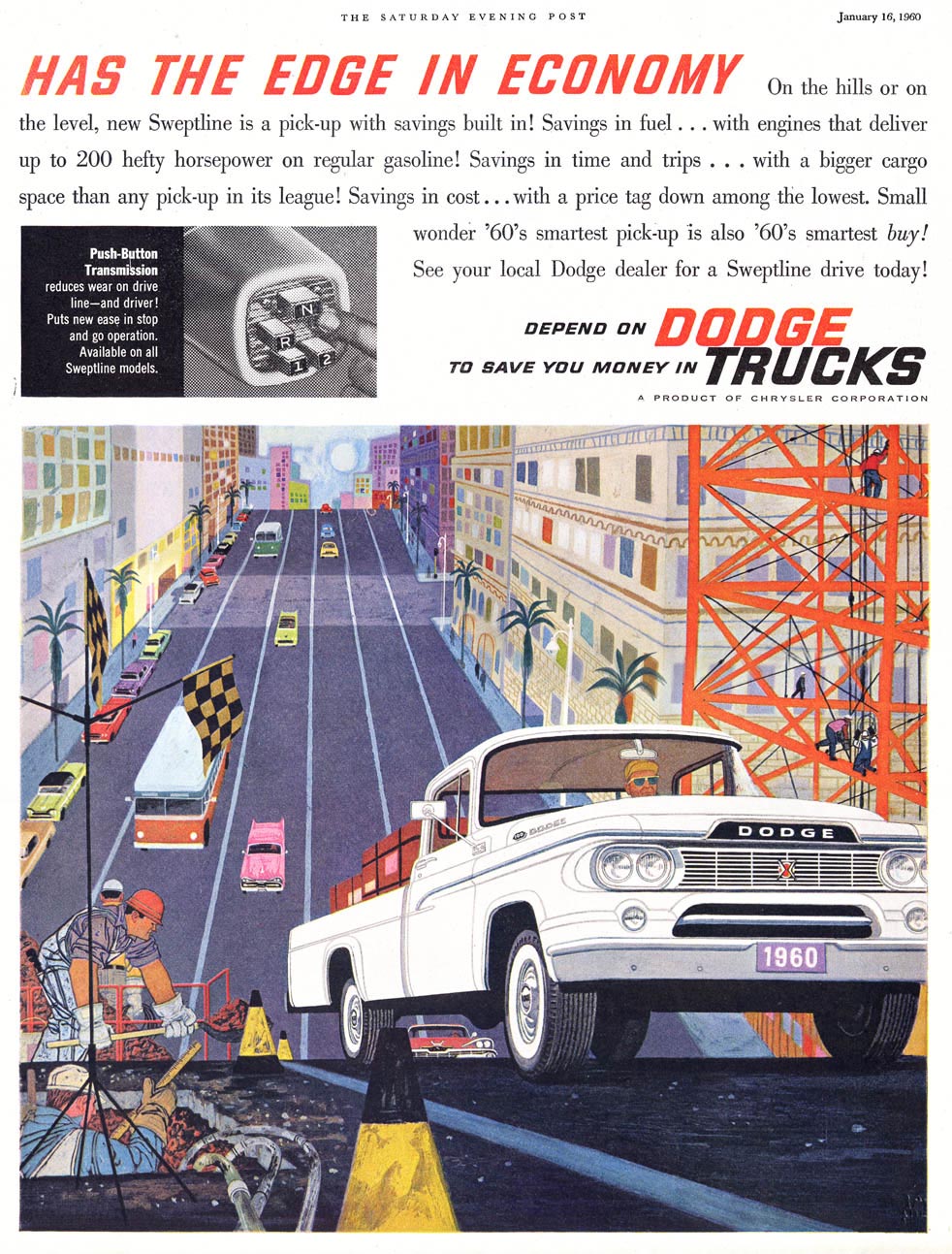
Kudos to the art director who sold the client on this approach - and to Dodge for going out on a limb by agreeing to such a unique presentation of their product line! This must surely have been a risky decision.
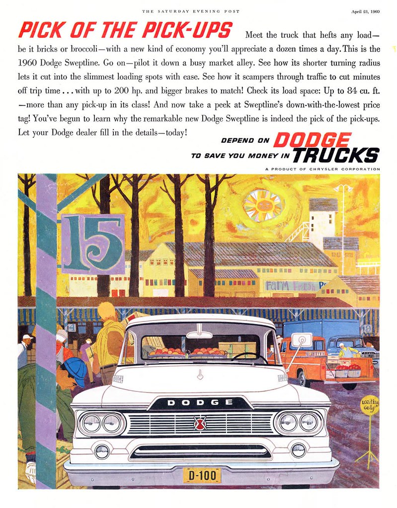
Risky because the style of these illustrations - as beautiful as I think it is - doesn't strike me as terribly appealing to what I imagine as the typical 1950s truck purchaser.
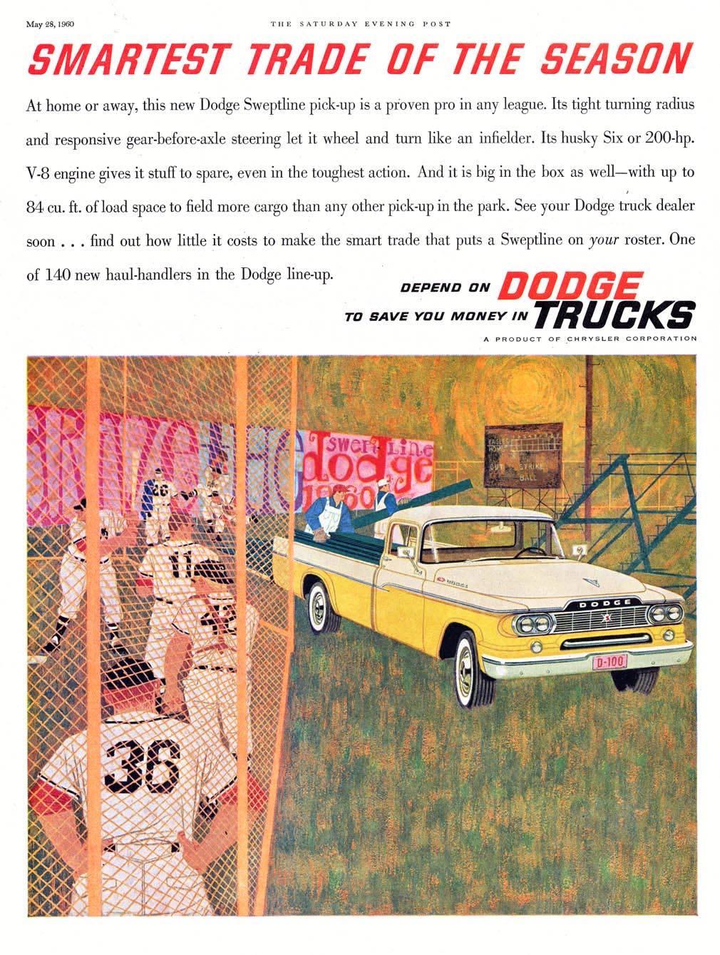
The three ads above were previously presented here on Today's Inspiration. Recently I unearthed two more of these gorgeous, innovatively executed ads.
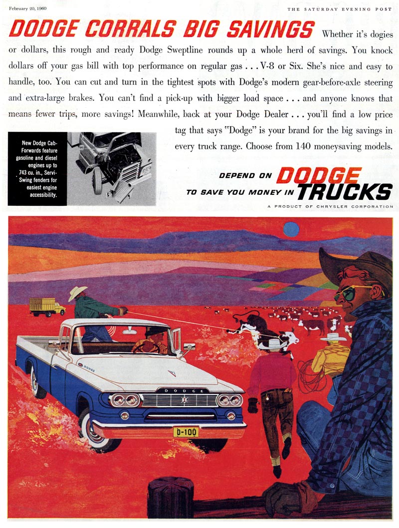
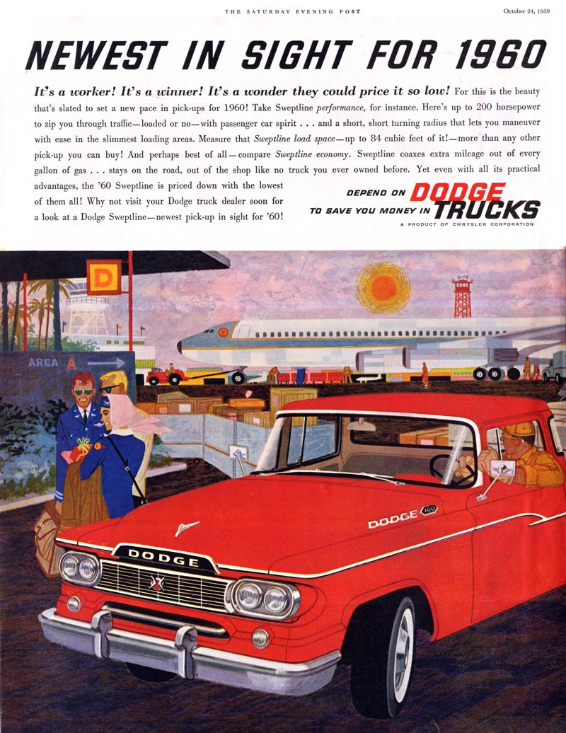
Seeing that there was in fact a fairly large group of these ads, I searched online and discovered scans of even more images from the series!
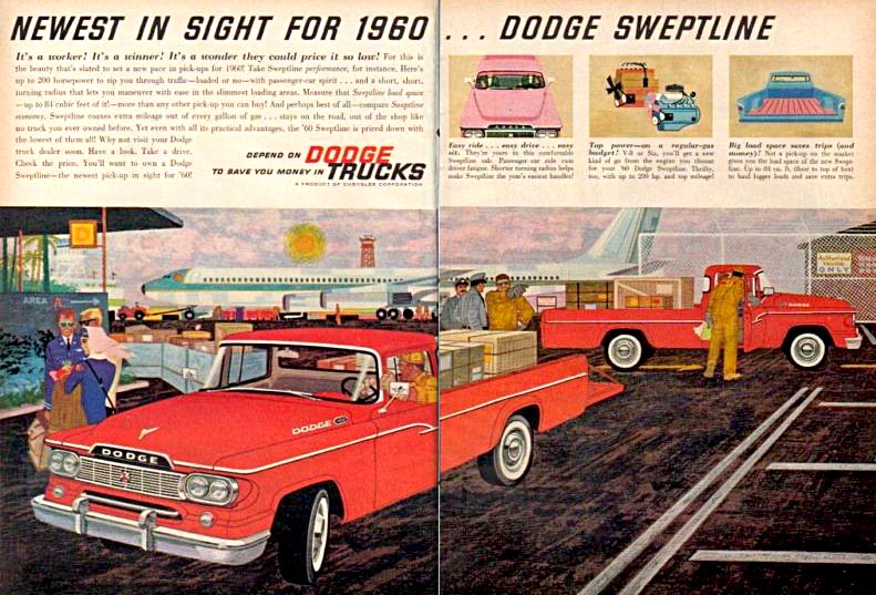
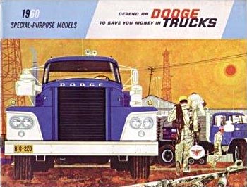
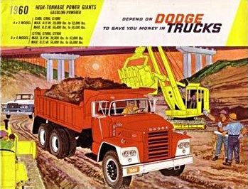
What a spectacular series.
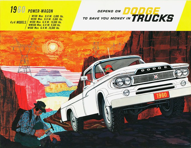
And what a beautiful and distinctive style!

And yet I have never come across it anywhere else... who could this mysterious artist have been?
And then I recalled the work of Albert Pucci, whom we recently looked at.
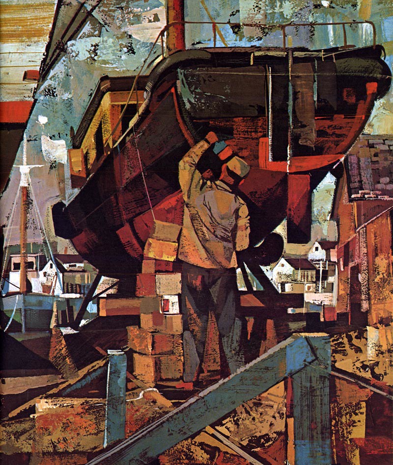
Could Pucci have been the artist behind the 1960 Dodge trucks campaign?
* Thanks to Flickr members Alden Jewell and thisisengage for providing the last two Dodge Trucks scans in today's post!
Wow! The colors, textures and compositions of these are amazing.
ReplyDeleteLeif, I agree these are truly prescient work. I would never have guessed that they were from 1959. We think that all the action took place in the 1960s, but you can tell from examples like these that things had already picked up speed in the late '50s.
ReplyDeleteIn comparison to Bingham's wonderful realistic work before, these pictures here might be called "Expressionist Ads".
ReplyDeleteThe artist is Charles Wysocki
ReplyDeletewho last I heard was doing fine art.
There were two brothers who worked in a similar style charles and Harry Wysocki. Both artists painted
ReplyDeleteamericana & have prints for sale.
It was Charles or Harry who did the Dodge ads.
Great stuff! I'm usually not into tight rendered car ads but these are well done.
ReplyDeleteThe colors feel very much of their time.
Maybe it's good to ask Mr Borgman about that Dodge- Pucci theory... He worked in Detroit doing car ads, and surely every studio knew what the competency was doing... Just an opinion...
ReplyDeleteI found this bio of Charles Wysocki:
ReplyDeletehttp://www.charleswysocki.com/custom.aspx?id=3
Anyone have any samples of other illustration work that the did?
There are elements of Charles Wysocki's work evident here. If they were indeed done by Charles as harald suggests, then mystery solved. Wysocki went on to a successful career in fine art prints and puzzles with his distinctive folk art inspired style. He passed away too young at 73 in 2002. The book I have on his later work is a good one and still available: http://www.amazon.com/Heartland-Charles-Wysocki/dp/1885183054
ReplyDeleteLeif, Those are certainly great ads. They look like the work of Chuck Wysocki. I worked with Chuck at McNamara Brothers studio before I went to Campbell Ewald. He had a great sense of color and design as you can see from these illustrations. He probably didn't paint the trucks as normally ads like these were done by two artists, a figure/ background illustrator and an automotive artist. The deadlines on these types of ads were usually pretty tight.
ReplyDeleteLovely work.Were the ads successful saleswise?
ReplyDeleteLeif, I'm going to contact some of my friends, salesman and artists, that worked at McNamara's to see if we can find out who the art director was on those Dodge truck ads. It certainly was a very gutsy approach for truck ads. Not many of the guys are still around, so it may be kinda tough. I think that Harry Wysocki is still around, I'll try to contact him also.
ReplyDeleteI remember those Wysockie illos, while still in art school. They knocked the socks off all of us, and at the time we were frustrated not knowing who did them at first. Maybe Harry Borgman can answer why they usually didn't let the signature show in the illustrations, and no by-line either. It seems that it would indicate the importance of using a quality illustrator. His sense of color was amazing.. a blue sun and combinations that were virtually unused before in illustration. Was Bob Peak influenced by those colors or the other way around? Or, did they just coincidently happen to come up with similar "Expressionistic" color combinations at the same approximate time? Regardless, how could it not be a huge inspiration to students and seasoned illustrators alike. My illustration teacher Bob Foster, who became a popular scifi pocketbook cover illustrator in the 60s' and early 70s', was no less impressed and caught up in the excitement and enthusiasm of those eye catching Wysockie illos.
ReplyDeleteTom Watson
This comment has been removed by the author.
ReplyDeleteSo beautiful trucks
ReplyDeleteWow, I'm so glad to see my excitement over these ads confirmed by all these enthusiastic comments - thanks everyone! :^)
ReplyDeleteHarald, thanks for ID'ing the artist and Harry, thanks for offering to do the detective work to confirm the ID.
These were the work of Chuck Wysocki, then a Detroit studio artist, at Fairchild Groeneveld Studio if I remember right. After these he moved out to L.A. and became the renouned New England artist, famed for his calendars and magazine art.
ReplyDelete