Thursday, September 11, 2008

Mitchell Hooks: The 'Slicks' - at Last!

When Mitchell Hooks was just a teenager at CAS Technical High School in Detroit he'd pour through the pages of the Saturday Evening Post and dream about the day when his work might appear in those pages, above the credit line "Illustrated by..."

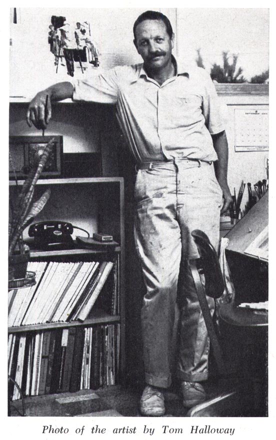
Coming to New York and working in one of the top commercial art studios didn't make that dream a reality. His work was competent enough... but as he told me when we talked about his first years in New York, "The city was teeming with illustrators, which was fine, because the magazines were packed from cover to cover with illustrations - story and advertising." But in that superheated marketplace, Mitch was just one more illustrator working in a literal style, jockeying for position against dozens of other, better established competitors.

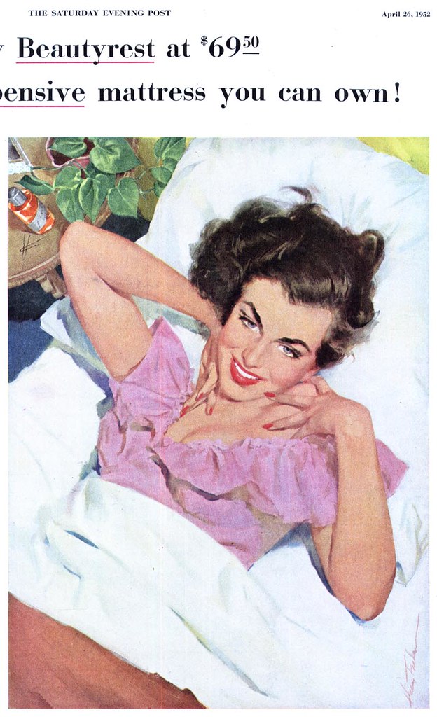
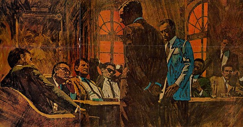
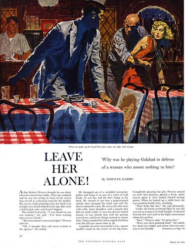
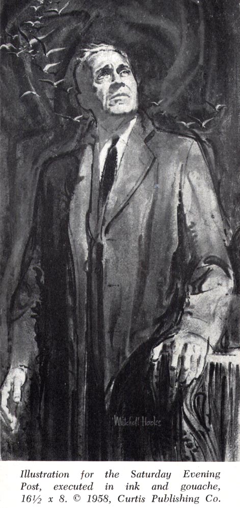
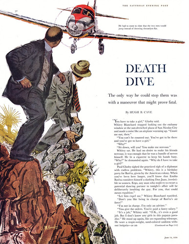
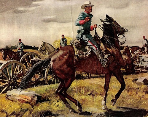
By blazing a trail in book cover illustration instead of following in the footsteps of others, Mitch was at last noticed by the magazine art directors. In the late 50's, his work began appearing in the pages of The Saturday Evening Post.

It wasn't everything he'd hoped for.


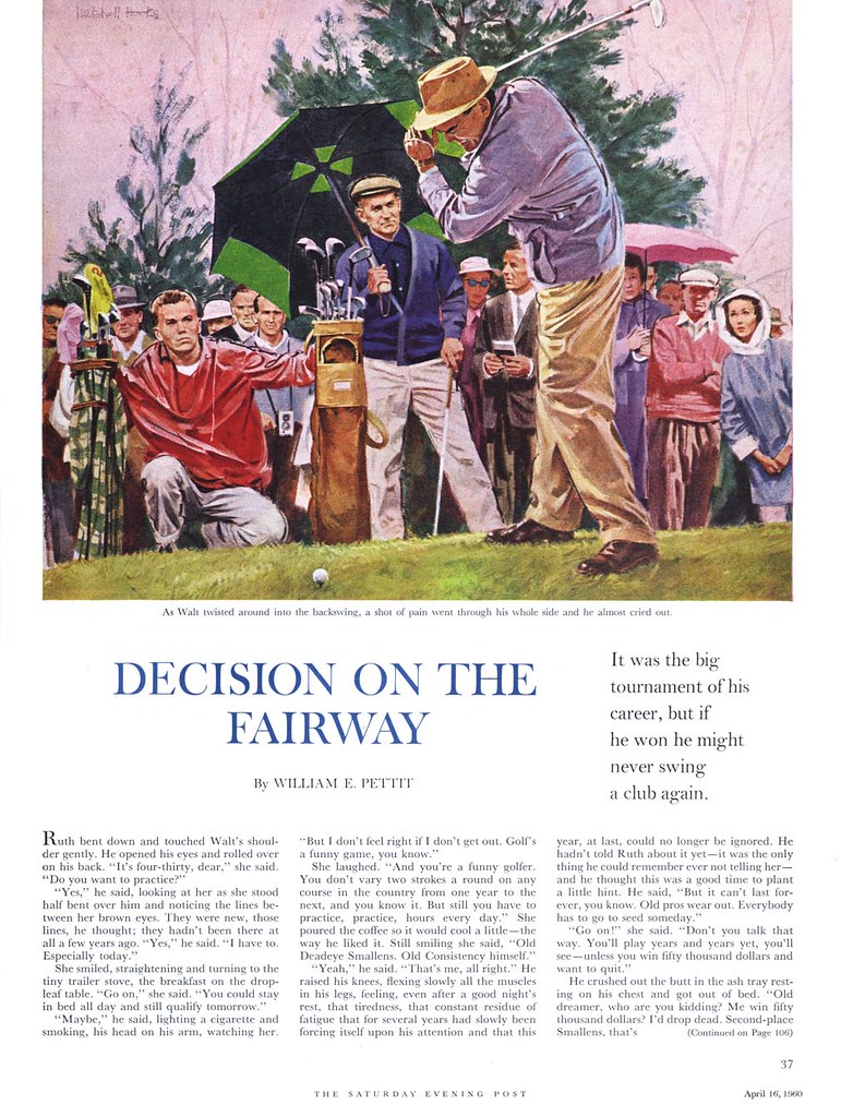
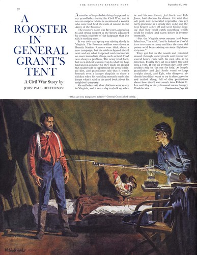
When I asked him about working for the The Post, surely the pinnacle of achievement for any illustrator in the 50's, his response was less than enthusiastic.

"They paid very poorly, considering their stature. About $300 for a full page illustration - the same as what I was getting for a paperback cover. And they acted like you should be honoured they'd chosen you."


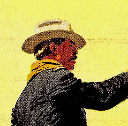
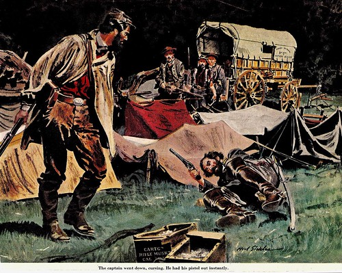
While Mitch's Post work is always top notch and eye catching, I suggested to him that, compared to what he was doing elsewhere, it seemed a bit... restrained.

"That's an astute observation," he replied. "They didn't encourage too much experimentation at The Post. They'd say, 'Remember, we're a family magazine.' "


I also mentioned that I'd found advertising art from around the time he began doing magazine illustration - something I hadn't seen earlier on.


I suspect that the strategy Charles E. Cooper had employed throughout the 50's - encourage your artists to do plenty of high-profile editorial art because it brings them to the attention of advertisers - was working for Mitch as well. I asked him if it would be fair to say that ad art paid as much as ten times what the editorial did, and he said that sounded about right.

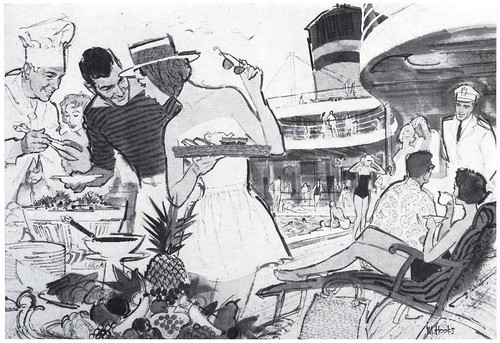
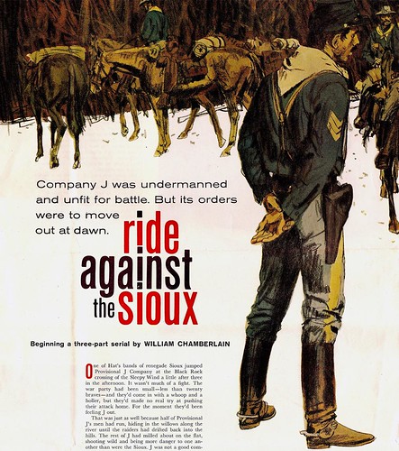
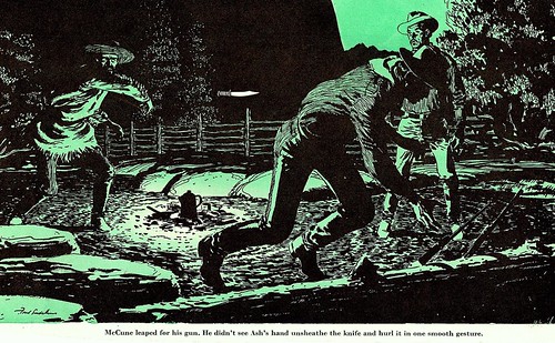
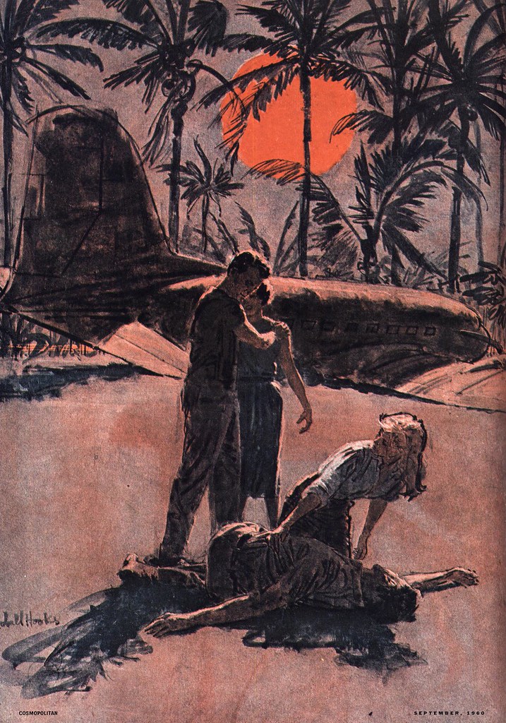
But while assignments from The Post might have been somewhat lacklustre, that was hardly true of Mitch's work for Cosmopolitan magazine during the same period. When I mention Cosmo AD, Robert C. Atherton, Mitch lights up...


For Atherton, Mitch reserves the highest praise: "Of a handful of truly exceptional art directors I've worked with in my career," says Mitch, "Atherton was the tops. He was an aesthete."


I talk about how I've noticed that many of the same artists who did fine work for The Post seem to have pushed themselves much further when working for Atherton at Cosmo... that their work - and Mitch's as well, seems much more experimental and energized. Mitch concurs and says, "Atherton insisted upon it."

"In fact, he rejected one early assignment I turned in, saying I could do better... take it farther."


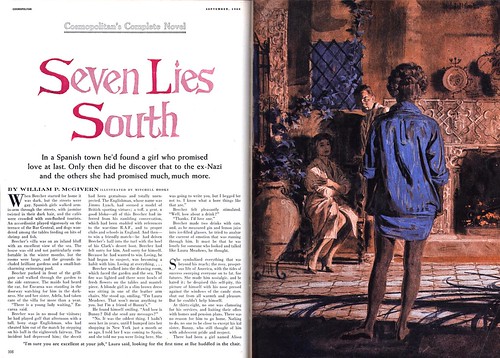
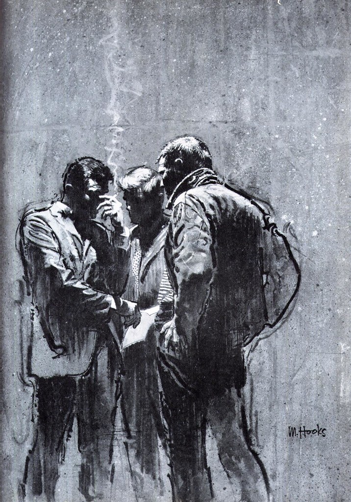
In his interview in American Artist from 1960, Mitch said, "The magazine art directors I work with encourage invention and personal expression. I find that this freedom usually stimulates work and results in a picture that pleases the artist as well as the art director. He is happy to have art that is not an imitation of the current popular 'School of Illustration' ."

Considering the time of that interview, I can only imagine that Mitch was talking about Robert C. Atherton. Just compare these pieces for Cosmo with the ones above for The Post, all done around the same time, and the conviction of his words becomes self-evident.


I ask Mitch how long he worked for Cosmo and he says, "Not very long... I don't know why they stopped calling me, but it was only a few years."

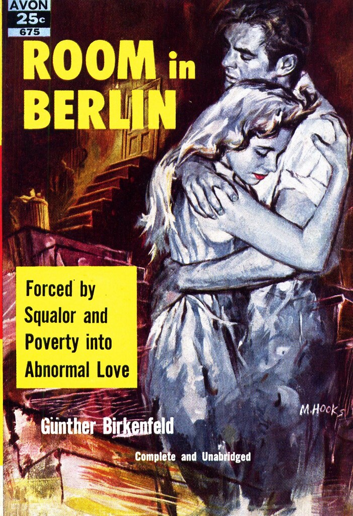
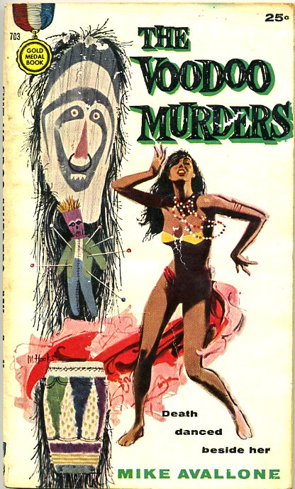
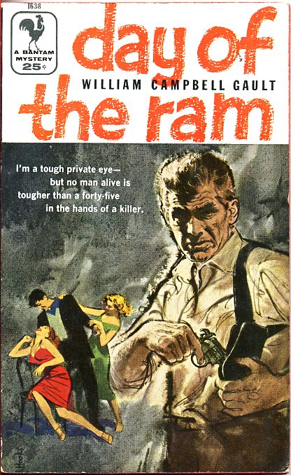
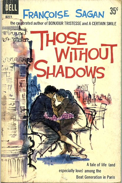
I suggest it was the times: that period around 1960 when all the magazines began drastically cutting back on illustration -- and when many artists left New York in search of greener pastures. Mitch agrees, saying, "Luckily for me I had my book covers to fall back on. You know, I'd always looked down on paperbacks, but when times got tough for everyone, I had plenty of work, thanks to them."

As well, a new, exciting and lucrative market was emerging for Mitch.

Tomorrow: The Movies and Beyond

My Mitchell Hooks Flickr set.

Wednesday, September 10, 2008

Mitchell Hooks, Fredman~Chaite, and the Transition to Paperbacks

T.J. Peters was not happy that the kid from Detroit he's put on salary was doing so much freelance work on the side for Al Chaite at Trager/Phillips. But with WWII heating up, Trager had landed a lot of lucrative work producing training manuals for the military, and young Mitchell Hooks was taking all the assignments he could get.

Happily, the conflict was resolved when Peters agreed to change Mitch's arrangement. He would now be paid by the job instead of the hour, and use T.J. Peters' studio as a base of operations while continuing to do jobs for Al Chaite.

When Mitch returned to New York after the war, his space at Peters and the old arrangement was waiting for him. But Al Chaite, a sort of 'journeyman studio manager' had found a new partner in one Harry Fredman, and their new studio, Fredman~Chaite would soon lure Mitch away.


Harry Fredman, recalls Mitch, was "a tremendously talented (and wildly successful) illustrator who had the uncommon touch of imitating the style of the time." Confirming Mitch's assessment is the example by Fredman, above. This 1952 ad piece could easily pass for the work of Joe de Mers or Coby Whitmore, two of the hottest commodities of the day at rival Charles E. Cooper's studio.

Fredman Chaite, though not as lavish or expansive as Cooper according to Mitch's description, was nonetheless a huge player in the commercial art business of 1950's New York City. It occupied a six-story townhouse at 62 West 47th Street, and was "a great big bustling building full of illustrators, most sharing offices in groups of two or three."

"There were always more arriving during the day," says Mitch, "and the place was open until 10 or 11 o'clock, so you'd see all sorts of freelancers there all the time working late into the night."


This is where Mitch refined his abilities to illustrate in the popular literal style of the day. "I was inspired by Al Parker, Austin Briggs and all the others. We all were," says Mitch, who shared his space at F~C with two other artists, Joe Little and Darrel Greene.


"But these were work friends," says Mitch. "I didn't really socialize much with the people at Fredman~Chaite. And there were other floors I never visited, so I don't really know who was working on those other floors."

The ad below gives a pretty good idea of some who might have, though, to name a few: Harry Kane (who did the 'Back To School' illustration we looked at last week) David Attie, Mary Mayo, Frank McCarthy and most famously perhaps, Bob Peak. "A few people had their own offices, and Bob Peak was definitely one of them," says Mitch. "Right from the start he was a hot commodity... everyone understood that. But in general, it was a socially egalitarian place. There was no distinction of anyone being 'better' than anyone else. I used to play cards with Al Chaite and some of the other guys."


But Fredman-Chaite wasn't landing Mitch the big advertising assignments he had been working towards, and the nature of the artwork in demand wasn't really satisfying his need for personal growth as an artist.

In a 1960 article in American Artist magazine, Mitch told interviewer Jules Perel, "I decided to take what for me was a large gamble. I quit all the commercial work I had been doing to concentrate soley on the paperback field. I wanted to experiment and develop a personal viewpoint."

Mitch talks about how at that time paperback covers had a sort of lurid, "come-on" quality to them. This early piece below perhaps reflects some of that older-style approach...


But sales were slipping and the publishers had decided to undertake a drastic change: they now would insist on an honest interpretation of the content of the book, good art and design, and happily for Mitch, they gave the artist all the freedom he wanted.

"For the next couple of years," says Mitch in the AA article, "I did almost nothing but book covers, and my gamble began to pay off."

Mitch describes how he would approach a typical book cover assignment:

"The... problem, aside from the constant aim of trying to make a good picture, is to find an original picture device that is inspiraed by the subject. This could be an unusual bit of action taken from the story, unrealistic use of color to emphasize a mood, or interesting props or background used as a strong part of the design."


These examples from the mid-50's certainly demonstrate how effective Mitch's strategy was, and represent a period of important growth for the artist. Its no wonder that he became one of the most sought-after illustrators in the paperback market. Mitch discovered that while he had never intended to settle down as a book cover artist, he was able to make a living at it, and he "found book work generally exciting and a lot of fun."


All the while though, he had another, greater goal in mind, and the artwork he was creating for book covers was part of his larger plan. "I wanted to do story illustrations for the women's magazines. I had always aspired to doing major magazine illustration."


You can see the accomplishment of that aspiration in, for example, this 1958 piece below for Redbook magazine. In the space of a few years, Mitch had found his own distinct and exciting 'look'. His work would begin appearing with increasing frequency in such high-profile publications as The Saturday Evening Post, McCall's and Cosmopolitan.


And more, he would be recognized for his distinction and creativity: The Society of Illustrators included his piece 'The Snatch', a Dell book cover, in their annual, Illustrators '59. It was only the first of 24 notations in eleven SoI annuals.


Tomorrow: Cosmopolitan and The Post

* My Mitchell Hooks Flickr set.

* Many thanks to 5m@5hYdez for allowing me to blog several of the scans in her excellent Mitchell Hooks Cover set.

Tuesday, September 09, 2008

Mitchell Hooks: "I always drew..."

Mitchell Hooks was born in 1923 in Detroit. He didn't come from a particularly artistic family, though he did have an uncle whom he describes as 'quite a good self-taught artist' who encouraged his interest in art. Says Mitch, "I always drew."


His earliest influences were the adventure strips in the newspaper, especially Alex Raymond's Flash Gordon, Jungle Jim and Secret Agent X-9. "As a boy, I followed Raymond's work avidly," chuckles the artist today, "even to the point of clipping out the strips and keeping them in a scrapbook. I'd meticulously cut out the figures of Flash, Dale and Dr. Zarkov."

"I've always had an affinity for anatomical drawing and, in retrospect, I can attribute my abilities to the long hours spent studying Raymond's beautiful drawings."


Mitch attended CAS Technical High School in Detroit, "A marvelous school," that had been created for those city kids who really had no hope of ever attending college. "The way we grew up,' says Mitch, "we didn't even know how to spell 'college'. CAS was loaded with professional illustrators, designers and such, just great people, who taught us everything we needed to know to get a job in the profession."

"I was thrown in with a bunch of kids who were really enthusiastic about illustration. We all knew what was going on out there in the magazines... knew about Al Parker and the Cooper guys and all that, and CAS prepared us to go out in the field - and we did - we all went out and got jobs in the field, straight out of high school!"

"CAS was where I made my big leap from Alex Raymond to wanting to be a professional illustrator, and I knew I wanted to be in New York."


When Mitch graduated from CAS he first found a job at General Motors. The war was on, GM had been converted to supplying the American army with equipment, and Mitch was assigned to take two dimensional blueprints and convert them to three dimensional drawings. "It was important work", says Mitch, "and I hated it."

Hated it so much that just a couple of years later, when he joined the army, he made sure they knew nothing about his artistic abilities. "I was so afraid that they'd assign me to do more of those drawings that I intentionally flunked any tests that might reveal my skills." Mitch decided he's rather risk the shooting war than get stuck doing any more dreaded blueprint drawings! He became an infantryman in 1944 - and served as a second lieutenant with the U.S. occupation forces in Germany after the war ended.


Upon his return to the States, he made his way to New York. He had freelanced in Detroit for a year or so after leaving GM, and had diligently prepared a portfolio of samples he hoped would land him the sort of work he wanted to do. A previous visit to the the Big Apple before his army service had resulted in an opportunity with a minor studio called T.J. Peters. "Peters had a small bullpen of artists and I got on staff there," says Mitch. But all the while he was looking for something bigger, and that came in the form of freelance work done on the side for Al Chaite.


Chaite would go on to form, with artist Harry Fredman, one of the major players in the New York commercial art scene: the high-profile Fredman/Chaite Studios... but for now he was managing a smaller operation called Trager-Phillips. Mitch, while working at Peters, found plenty of freelance opportunities with Trager-Phillips, and "it caused a small conflict with my boss at T.J. Peters."


What became of that conflict is where we'll continue tomorrow.

* All of today's scans were generously provided by Charlie Allen, who presents a new CAWS, over at Charlie Allen's Blog.

Charlie writes, "Hooks was something else.....no doubt! Had no idea he was my age....his work seemed to come a bit later. Hooks, Peak, Fuchs, plus the already big illustrative guns in the 50's, inspired, caused, hatched, incubated, and produced a veritable explosion of sharp, creative illustrators in the 60's and 70's. There were so many.....and their work showed up from all over the country, not just the New York scene. And...sadly....all this talent arrived just as the print media was fading out like yesterday's bouquet."


*My Mitchell Hooks Flickr set.

Monday, September 08, 2008

Mitchell Hooks: A "vibrant, descriptive line"

On Saturday I spent an hour speaking with a legend. Thanks to Mark Korsak of the Society of Illustrators, who provided me with the contact info, I enjoyed a thrilling hour on the phone with 1999 SoI Hall of Fame recipient, Mitchell Hooks.


What a gentleman.

I can't begin to tell you how gracious Mitch was about answering my many questions. He told me the details of his early career, and about the illustration business in New York during the 50's. He provided an insider's view of the Fredman/Chaite art studio: the place that was really Charles E. Cooper's main competition back then, and the place where Mitch, Bob Peak, Robert McGinnis and many other great mid-century illustrators first made their mark in 'the big time'.


While I had no recording device to capture every detail of our meandering discussion, I jotted notes frantically, and Mitch agreed to a follow-up call to clarify anything I might have missed.


I'm looking forward to sharing the details of that conversation with you... and to showing you more of Mitch's distinctive, energetic artwork.


As well, a recently acquired 1960 issue of American Artist magazine containing an extensive article on Mitch will provide valuable technical details and some excellent quotes.

So this week, let's look at what that article describes as "vividly colourful and strident [work]" and a "vibrant, descriptive line... seen at its best". Let's look at the art and life of Mitchell Hooks.


* My Mitchell Hooks Flickr set.

Friday, September 05, 2008

Some Personal History about Fred Ludekens

As I attempt to complete my porch-building project (now I know why I became an illustrator - I'm no handyman!) Charlie Allen shares another batch of historical illustrations, this time with a personal connection: all are by Fred Ludekens, with whom Charlie worked at Patterson & Hall in San Francisco. Charlie writes...

"One last set of the old west, etc......then I'll back off."


"Had to send a couple of more Ludekens."


"And... by the way... if you want to know what Ludekens looked like, he posed for the short CO ripping off rank and insignia from one of his officers."


"I think that illustration is my favorite of his. Fred literally fit the role....he could have done that in real life! A demanding, feisty guy."


* We'll be taking a week-long look at the art of Fred Ludekens some time soon - many thanks to Charlie Allen, who has his own excellent blog, for sharing his personal experience with the artist, as well as for providing the great scans!

My Fred Ludekens Flickr set.

Thursday, September 04, 2008

A History Lesson with Charlie Allen

As I begin Day 2 of my porch-building adventure, Charlie Allen once again comes to the rescue with a batch of incredible historical illustrations by some of the masters of the mid-century. Many thanks, Charlie! Take it away...

"Yesterday looked through several historical folders in my ancient collection of stuff.. Wish I hadn't folded all those clips in the old days.....never considered their use or value years hence! I'm sure I have more Dunns... but found just this Paul Revere subject for Hancock Insurance."


"Not a good scan, for some reason, and you probably have a better one. Harvey Dunn was one of those giants of illustration... he and and Noel Sickles,"


"Harold Von Schmidt,"


"Donald Teague, and others before..."


"...not to mention the Fawcetts, Briggs, Smiths, Parkers, etc.,etc... reminded me why this mud turtle stayed on his log on the far side of the pond! I deservedly felt like a flea among giants in those days. Can't complain... had a lot of fun and success splashing around down at our end of the marsh. From an old file titled 'Civil War and Pioneers'... some more fine illustrations."

"Fred Otnes was a fine illustrator....just not in a class with Sickles. But then... who is?"


"Had to include Fred Ludekens....never a slick draftsman, but what a sense of drama and design!"


Be sure to drop by Charlie Allen's Blog for the most recent CAWS -- posted just yesterday -- and let Charlie know how much we appreciate his hard work!

Wednesday, September 03, 2008

Nothing to see here, Johnnie!

I'm taking the day off to build a new porch on the front of the house, but Charlie Allen has a fantastic new CAWS post that will delight every one of you who might normally visit Today's Inspiration.


So move along, Johnnie, nothing to see here. That's it, show's over... move it along!


Go to Charlie Allen's Blog for CAWS #10

Tuesday, September 02, 2008

Back to School with Republic Steel

Yes its 'back to school' here in Canada, and especially here at Today's Inspiration Central Headquarters, where three of four staff members have abandoned their posts to return to the those 'halls of higher learning' - also known as 'jail'.

Back in 1955 Republic Steel ran this entertaining ad extolling the virtues of (then) modern schools made, it would seem, almost entirely of steel. (And you laughed at my jail reference).

"Willie seldom plays hooky these days!" How's that for equivocating...?


Willie might play hooky more often - if only he could escape this giant steel trap! The lockers are made of steel...


... the window frames are made of steel...


... and it looks like the entire cafeteria is made of steel - better to hose down at the end of the day, I guess.


Republic's ad the following year was even more hilarious.

"What's the lesson of the day?"


The lesson is don't let dad take the kids to school! The way he and that new Miss "What's-Her-Name" (AKA 'The Tramp') are making googely eyes at each other I'd say they have a little "extracurricular activity" planned!


My School Daze Flickr set

Monday, September 01, 2008

Lessons in Boys' Life: Labour Day

Happy Gomper's Day! You know, I'm constantly impressed by the wealth of information that Boys' Life magazine provided to the nation's youth. In a world before Wikipedia, Boys' Life must have been an invaluable resource for any young fellow who wanted a little information about a lot of things.


The comic strip below was likely produced by one of the many fine illustrators at Johnstone & Cushing, the advertising art studio that provided Boys' Life with pretty much all the content of its monthly comic section during the 50's and 60's.


From giving it a quick read, we discover some interesting facts -- not the least of which is that the Labour Movement was born in America. That fact alone is a revelation to this Canadian. I always presumed that we 'Commie-lovin' Canucks' came up with the idea of unions and workers rights, not the 'cruel Capitalists' to our southern flank!


Here in Hamilton, Ontario we have long been the centre of the Canadian steel industry, so unions have profoundly influenced all aspects of civic life for as long as I can remember. What a surprise to discover that an American named Samuel Gompers can claim credit for the eight-hour workday and Worker's Comp! Surely he must have secretly been Canadian (or at least had dual citizenship).


More importantly, if not for Samuel Gompers, sales of footballs, frisbees and fried chicken might not be what they are today. Lets remember that thanks to Labour Day we have a reason to hold Labour Day picnics -- thanks Sam!


But a lot has changed since 1958. Ironically, thanks to another American named Sam - Sam Walton - lots of things that used to be made by unionized Americans ("the highest paid workers in the world with the greatest benefits and the highest standards of living") are now made in third-world countries with no unions, benefits or standards of living.


I wonder what Samuel Gompers would think about that?

My Boys' Life Comics Flickr Set