Wednesday, May 16, 2007

The New School: Stan Klimley

When you look at this advertising illustration Stan Klimley did in 1947 you see a fairly typical, thoroughly professional, late 1940's piece of commercial art.


But by 1951, Stan Klimley is beginning to incorporate the thinking of the New School. Here he has zeroed in on the figures and begun treating the surrounding environment as graphic shapes of colour and pattern. The painting technique is still a little too traditionally rendered though.


Klimley was never as intensely committed to the New School approach as some of his peers, but he certainly seems to have applied himself to trying some interesting experimentation, graphic design, and page composition - as exemplified below.


And during the first half of the 50's, Klimley began getting more and more story illustration assignments from the major women's magazines. His work regularly appeared in McCall's alongside Coby Whitmore, Al Parker, and other big name romance illustrators.

In the 1953 piece below you can see that Klimley has now switched to the New School medium of choice: designer's colour (or gouache) and his work has taken on that nice, rough "chalky" quality.


All the while, Klimley was doing hi profile advertising art, obviously enjoying a very successful career, and at some point in the mid-to-late 50's, he became a Cooper studio artist. This 1957 piece, below, demonstrates how far even a less-celebrated New Schooler like Klimley was stretching his style - with admirable results!


As I was researching Stan Klimley's career earlier this morning, I was startled to discover that he passed away just yesterday. His obituary appears in today's New York Times. "A talented artist and prominent illustrator," reads part of his death notice. Stan Klimley was 86 years old.

* You'll find several other pieces and a small photo of the artist in my Stan Klimley Flickr set.

Tuesday, May 15, 2007

The New School: Mike Ludlow

This piece by Mike Ludlow is responsible for launching Today's Inspiration. Its the first classic illustration I scanned about six years ago and sent out to a small group of nine or ten illustrator friends. Aside from the comely gal in a compromising situation, what got my attention was the artist's interesting use of contrasting techniques... some elements fully rendered, others treated as flat, graphic areas of colour, others looking like the bare pencil drawing, others defined by pattern rather than outline... all seen from the oddest of camera angles. What I didn't know then was that I was looking at the work of an artist playing by the rules of the New School style.


The 1954 piece below is the earliest example I've found of Mike Ludlow's work. Though it already incorporates some aspects of the New School style (no background, minimal environmental props, parts of the figure blending with the background) it is still too tightly and traditionally rendered to qualify as the genuine product. When we look at the bulk of Ludlow's later work, its clear that he is near the beginning of his career with this piece.


Exactly one year later, Ludlow is beginning to loosen up. The piece below, though still looking like the work of an artist searching for solutions, is showing a lot of promise.


What's perhaps most startling about Mike Ludlow is the giant leap forward that the artist took after 1955. In 1957 Ludlow was chosen to illustrate the Esquire pin-up calendar. His painting style had evolved so much in just two years, its as though a different artist was at the board. From the tentavive experimentation of the piece above has sprung a confident, accomplished New School style that absolutely wowed me the first time I saw it - and still does today. In the context of pin-up art, its a unique approach that must have looked thoroughly modern at the time compared to the typical Old School style of Gil Elvgren et al and suggests that Esquire was looking to position itself as a hip, modern publication.


That Esquire switched to photography for its pin-up calendars after Ludlow's gorgeous 1957 effort doesn't reflect poorly on the artist - it simply confirms which way the wind was blowing in all print publication at the time.

Ludlow, meanwhile, had found entré into the the rarified atmosphere of The Saturday Evening Post, where he now regularly received editorial assignments and did high profile advertising art, like the example below.


It was perhaps a little too late. After 1960, as with most other illustrators, Ludlow disappeared from the pages of America's magazines. I have, however, found his signature on several album covers like the one below from 1962, which still reflect his New School chops. There's very little biographical info on Ludlow out there. What became of him after the early 60's is a mystery.


You can see several more of Mike Ludlow's Esquire pin-up paintings, as well a a variety of story illustrations, in my Mike Ludlow Flickr set.

Monday, May 14, 2007

The New School: Coby Whitmore

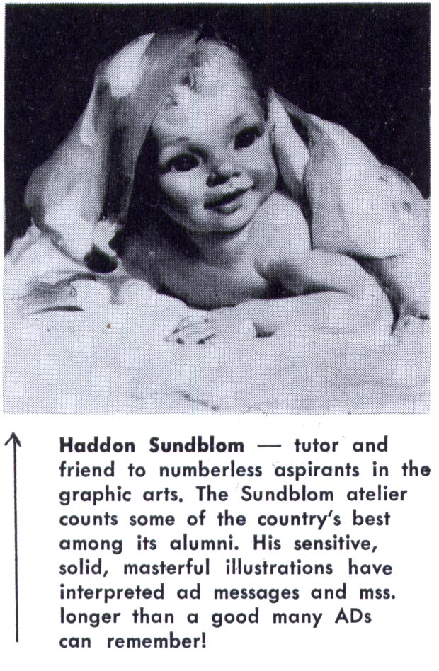
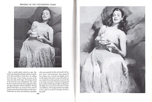
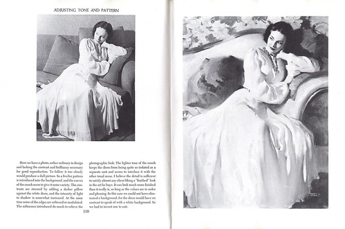
Where better to begin our look at the "New School" than with Coby Whitmore? Whitmore began his career in Chicago at Haddon Sundblom's studio so his roots are actually in the Old School.


But he came to New York during the early 40's and joined Jon Whitcomb at the famous Cooper Studio - where the two men's work would come to epitomize the New School look.

During the late 40's and well into the late 50's, hardly an issue of Ladies Home Journal and Good Housekeeping, the two highest profile and most widely read women's magazines, went by without story and/or advertising art by Whitmore and Whitcomb.


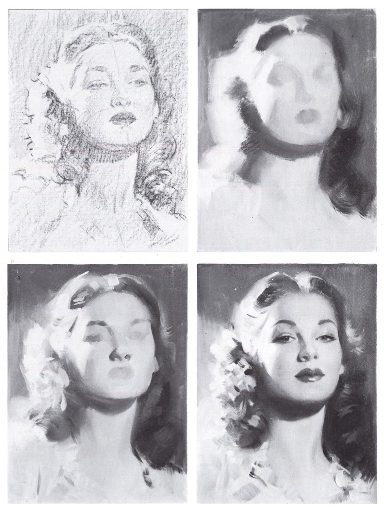
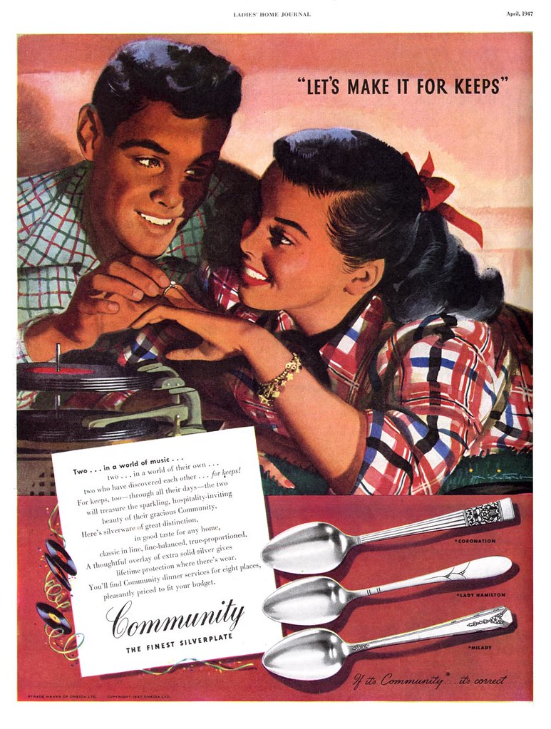
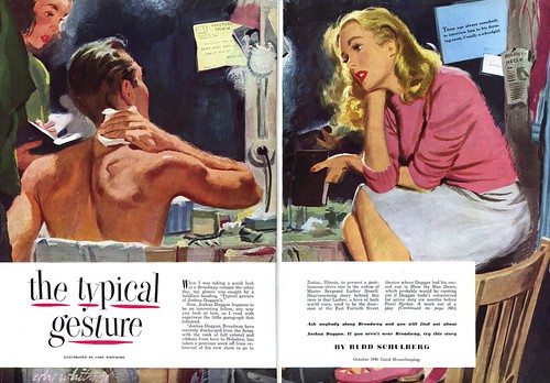
These mi-40's examples(above) still contain a sense of painterly treatment and a clearly defined, "natural" picture plane. But Whitmore's technique begins to hint at what is soon to come. He is not rendering as much "finish" -- the medium seems to no longer be oil, but perhaps watercolour or gouache. There is a sort of drybrush quality and a lack of blending that gives the work a nice vitality.


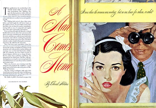
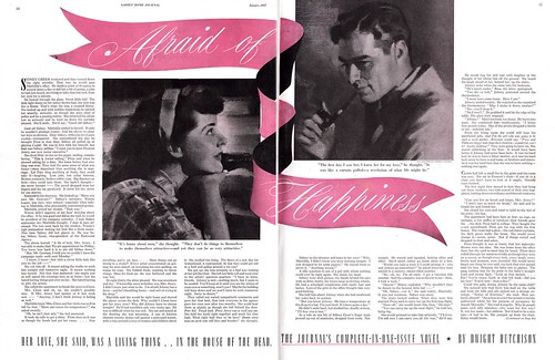
Then, in this 1949 illustration (above), we can see how the artist had begun to explore what would become typical visual cues of the New School style: background environment has been minimized or eliminated,leaving only a minimal amount of supporting props to hint at the location of the scene, the camera angle is deliberately obtuse and the figures are arranged in a visually unusual manner. Limbs, bodies and faces are partially obscured. Painting the entirety of the figure is discarded in favour of letting background and foreground blend together in an interesting arrangement of graphic shapes.

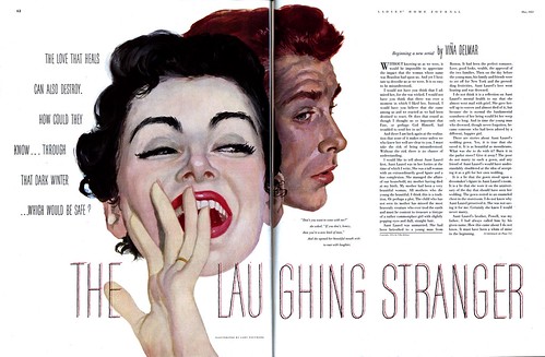
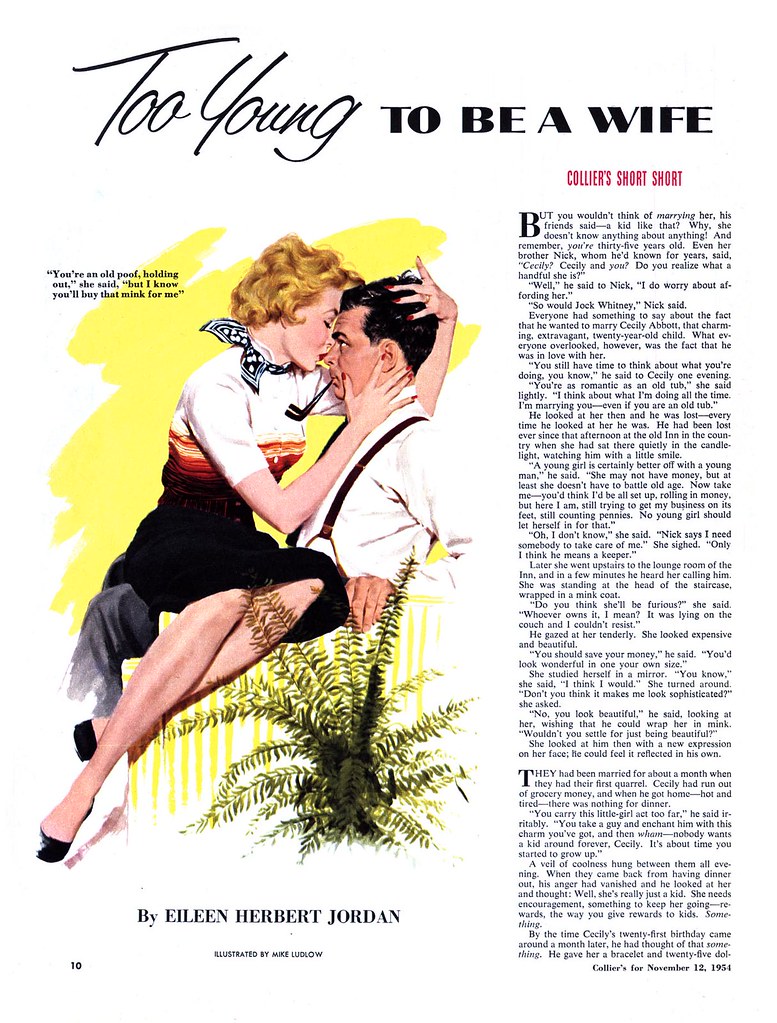
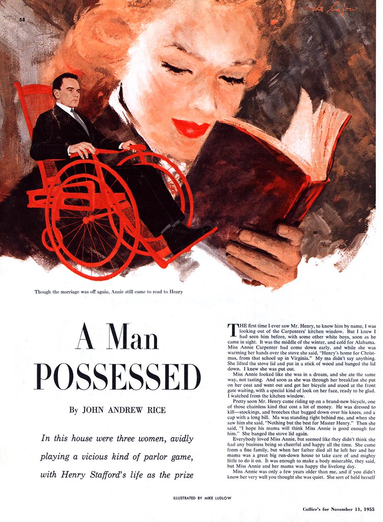
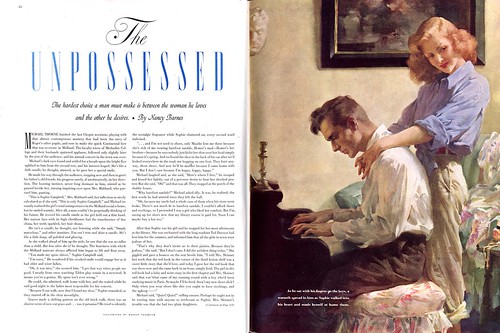
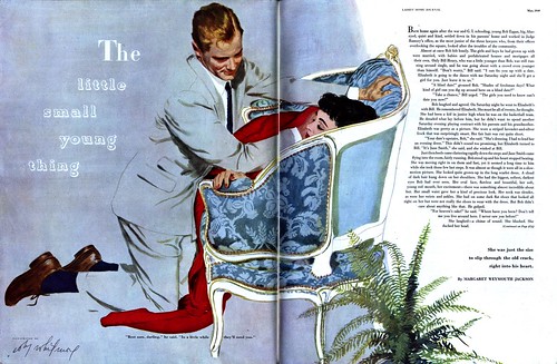
By the early 50's, Whitmore is showing us why the new School artists were sometimes referred to as "big head" artists: here he has stripped the romance illustration down to the bare essentials needed to express emotion and interaction... heads and hands and absolutely nothing else.

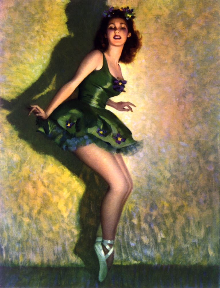
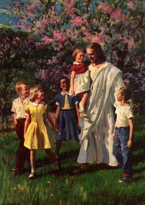
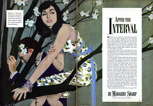
Then, during the mid-50's, what I consider to be the most visually interesting period of the New School style is displayed here with great skill by Whitmore: there are still the occassional fully or partially painted elements, usually the face and hands, and the rest is handled very graphically, with interesting patterning used to define clothing, and human and supporting environmental "props", like the flowering tree in this piece, intertwined into complex graphic shapes.


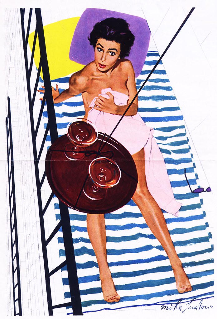
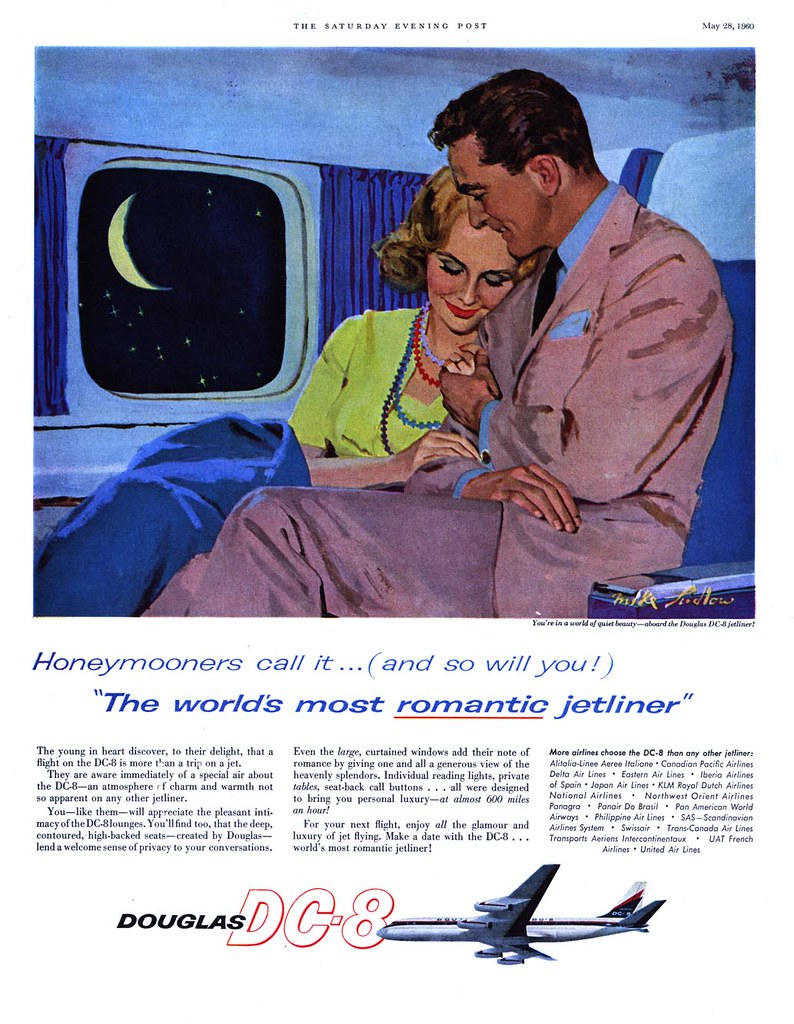
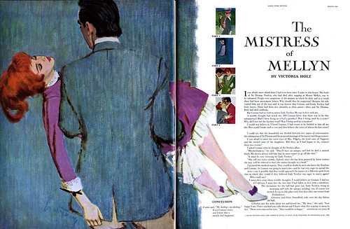
The 1960 piece below is the latest one I have by Coby Whitmore. As photography and decorative illustration styles began to dominate the magazine market, "realistic" illustrators like Whitmore evolved the New School style into a rough, sketchy phase in an effort to remain fresh. It didn't always work. In general, clients asked for less and less of this sort of work and studios like Cooper struggled to remain open.

I'm not sure what markets Coby Whitmore moved into after 1960, but with the drastic drop in magazine assignments many illustrators sought out work in the burgeoning paperback book cover business, others moved out west to participate in the lucrative "western art" gallery scene and no doubt many went into teaching. Of course there was still some work in magazines, but the glorious days of the 1950's, when the New School dominated the printed page, were over.


We've looked at the other titans of the Cooper studio, Jon Whitcomb, Joe DeMers, and Joe Bowler in the recent past, so the rest of this week I'll show you work by lesser known - though still worthy - "New Schoolers".

All of today's images have been added to my Coby Whitmore Flickr set.

Friday, May 11, 2007

The Old School: Actually "The Chicago School"?


A friend emailed me the other day, saying he always thinks of what I call "the old school style" as "the Chicago style" - and that might be an appropriate term. Of the artists we looked at this week, Harry Anderson, Haddon Sundblom and Andrew Loomis all worked out of Chicago.


Even the Formfit ads from yesterday list Chicago as a primary address, adding to the plausibility that the art for those ads was done by Chicago-based illustrators. I mentioned the famous pinup artist, Gil Elvgren in the context of those ads and he too was a Chicago based artist (who had learned how to paint while apprenticing with Sundblom).

Add to that list Joyce Ballentine, who worked out of the Chicago art studio, Stevens Gross and of whom Frederick W. Bouton, VP of Creative Services, JWT, Chicago, writing in the November 1952 issue of Art Director and Studio News had this to say:


Ballentine famously created the "Coppertone Girl"...


But I would consider well known east coast artists like Walter Baumhofer...


...and Tom Lovell (both of whom had roots in the pulps)...


...and Fred/Chaite Studio's Mary Mayo to fall well within the broader range of the "old school" style. In fact, there were a great many artists enjoying tremendous success by painting in the style of the old school.


Haddon Sundblom claimed among his influences, John Singer Sargent, and Frederick Bouton described the look I'm trying to classify in his AD&SN article as "the solid chords of academic realism". For the sake of expediency, that description might be enough. Whatever the case, in spite of the long-enduring popularity and high profile of the old school, there was a change taking place as the 50's progressed.

Next week: The New School

Thursday, May 10, 2007

The Old School: "That Formfit Look"


During all those years Pete Hawley was wowing us with his singularly unique take on illustrating women's undergarments for Jantzen's long-running series of ads, the folks at Formfit chose a more old school approach.


Formfit's ads, which ran in most of the women's magazines (and, for some reason, in the general interest digest publication, Coronet) utilized the skills of a variety of illustrators -- but the look of all their ads closely resembled a lot of the pinup art of the day.


I'm not well versed in the subtleties of individual pinup artist's styles so take this with a grain of salt but among varying degrees of skill displayed in the anonymous Formfit illustrations the really top-notch ones look to me like they could have been done by Gil Elvgren or Joyce Ballentyne.


Having spent so many years in advertising, I find Formfit's marketing strategy really intriquing... it seems to be implying a sexually suggestive message while attempting to conform to the acceptable standards of that sexually repressed era.


Otherwise why would Formfit choose to create ads that were so reminiscent of the pinups of the day? Were they attempting to appeal to their women customers or the husbands of those women? If it was the former, how often did 1950's women see pinup art? And if it was the latter, how often did 1950's men peruse their wive's magazines? Its a little difficult to fathom from the distance of a half a century and decades of more sexually liberal attitudes.

All these images plus several more have been added to my Pin-ups Flickr set.

Wednesday, May 09, 2007

The Old School: Andrew Loomis

I would venture to say, "They owe it all to Loomis."


Before Sundblom, before Anderson, before Joyce Ballentyne, Gil Elvgren and before a host of other practitioners of "the old school style", there was Loomis.


William Andrew Loomis was born in Syracuse, New York in 1892 and studied under the legendary George Bridgeman at the Art Student's League in New York City. By 1915, at age 23, he was already working in a Chicago art studio. Apart from a 20-month stint in the army during WW One, he would spend the rest of his working life in that city, eventually opening his own studio and ultimately becoming an instructor at the American Academy of Art.


Perhaps more importantly, Andrew Loomis quite literally wrote the book on illustration: his Creative Illustration, first published in 1947, is considered by many to be a masterpiece of commercial art instruction. In his introduction to the book, Loomis wrote:

"My purpose is to present what, in my experience, have proved to be the fundamentals of illustration. To the best of my belief, such fundamentals have not been organized and set forth before. So I have attempted to assemble this much-needed information, trusting that my own efforts in the active fields of illustration qualify me to do so."

I found my fourth printing copy about 20 years ago in a Toronto used book store for ten dollars, but a quick internet search for this long-out-of-print book shows me that you'd need to spend a couple of hundred dollars to get a copy today.


Really, this book is an invaluable resource for anyone interested in drawing,painting, design and illustration and I can't understand why it hasn't been reprinted. For those students who can't afford a two hundred dollar book, I discovered a site that offers all of Loomis' books free for download in pdf format.

By the late 1940's, Loomis illustrations in the magazines, like the one below, are rare. I've got a few more, all from Ladies Home Journal, that you can see in my Andrew Loomis Flickr set.


Why did Loomis fade from the pages of America's major magazines? Was he busy teaching? Did he retire? Or perhaps his style was simply a little too old school.

Whatever the case, Andrew Loomis should be lauded for the powerful influence he had, both on the industry and on the many students who learned from this master illustrator - either in the classroom or through his books. Andrew Loomis died in 1959 - and for reasons I can't imagine, it took forty years for him to be inducted into the Society of Illustrators Hall of Fame.

Tuesday, May 08, 2007

The Old School: Haddon Sundblom

While its not my intention to provoke a popularity contest, surely Haddon Sundblom deserves the title of Pre-eminent "Old School" Illustrator of the 20th Century.


Just take a moment to luxuriate in Sundblom's ability to lay down a stroke of paint and have it somehow magically transform into a perfect fold of clothing or curl of hair.


In an article by Robert E. Olsen in the 16th issue of Illustration magazine, Charles Showalter, who worked in Sundblom's studio, said of the artist that it was amazing how he could put so much paint on so fast, with "all the colours, values, lighting, and everything in there."


You can examine Sundblom's amazing illustrations more closely in my Haddon Sundblom Flickr set.

At the Crossroads

While I was searching out the pieces by Sundblom for today's post I came across an interesting confluence -- a crossroads in illustration history:

The same April 1947 issue of Ladies Home Journal that held the Sundblom illustration above of the sad little boy also contained quite a bit of work by a former Sundblom studio artist named Coby Whitmore. Not only did Whitmore do a story illustration just a few pages away from the one by his old boss, not only did he have a full page ad in that issue...


...but further along in that magazine master and student illustrated ads on the same spread. I wonder how the two men would have felt about seeing each other's work juxtaposed like that? While Whitmore was still a few years away from becoming one of the principle drivers of the "New School" 50's style, and Sundblom's days of popularity were far from over, seeing the work of these two highly influential artists in this context helps clarify the transition period between the two schools.


And, as if to close the circle, even further on in that same issue of Ladies Home Journal, this full page ad by Jon Whitcomb (below). I'm not sure if Coby Whitmore had already joined the Cooper Studio by 1947 or if he was soon to join, but he and Whitcomb would, within only a few years of this work, become the twin pillars of the premier art studio in 1950's America and set the tone of romance illustration for a generation.

Harry Anderson Addendum


Yesterday's post on Harry Anderson generated some wonderful responses, including this one from TI list member Aron Gagliardo, from the American Academy of Art:
"Leif,
Looking forward to this weeks "old school" illustrators. Take a look at the Academy's website for an original Harry Anderson (top left)." Thanks for the head's up, Aron!

As well, TI list member Eric Colquhoun sent a note that he had "a couple" of Harry Anderson scans he was willing to share -- so this morning I was wowed by a second message from Eric with nearly a dozen images I'd never seen before...


... including a nice little selection of Anderson's later, relious paintings.


They have all been added to my Harry Anderson Flickr set -- with many thanks to Eric for his generous contribution.

Monday, May 07, 2007

The Old School: Harry Anderson

Last week's look at Canadian illustrators of the 50's reminded me once again about the clearly defined split between those artists who were experimenting with previously unseen styles and techniques and those who were fully immersed in "the old school".


In the States this split was perhaps a little less obvious since the new school of illustrators - most often thought of as "The Cooper Look" illustrators - still painted realism... its just that it was a sort of contemporized, more graphic approach to realism. Many of that "next generation" of artists had trained and apprenticed with the old school illustrators and it took them several years of experimentation to evolve their more modern techniques. But the "old school", fully rendered, "buttery" painting style was still very much in vogue, especially for the first half of the 50's.


Harry Anderson would most definitely be among the top tier of "old school" illustrator/painters. The amazing thing about Anderson is that he got that oil paint look, that "Sundblom style", with watercolour.


Want a closer look at these pieces and a bunch more by this artist? Take a look through my Harry Anderson Flickr set.

Thursday, May 03, 2007

William Winter (1909-1995)


Another very regular contributor to Canada's magazines in the 50's was William Arthur Winter.


Winter may never be considered to have had the artistic stature of a Cahén or a an Arbuckle... but I have to say, I'm extremely fond of his work.


Artists who experimented with a variety of styles and techniques, who had the versatility to try many approaches, have always held a special interest for me - and William Winter was definitely one such artist. (Perhaps, in the small pond of Canadian commercial art, stylistic versatility was a key to survival).


Winter's illustrations often had a sort of lyrical, storybook quality to them - and he seems to have been assigned many projects that involved the portrayal of children. He even wrote and illustrated a June 1954 article in Chatelaine magazine for young parents entitled "Hey Pop - It's Raining Out!" with the credit line "by William Winter, artist and father of two".


Winter's expertise, sensitivity, and interest in drawing and painting children seems to have lead to his later career in fine arts: the Roberts Gallery has a good selection of his work from that period, when Winter focused almost exclusively on stylized paintings of children. Click here to see a page of examples.

The piece below, done in the 1960's for Prudential Insurance, is a pretty good example of Winter's later painting style and suggests that he was still involved with the commercial side of the art business.


There is some biographical information on William Winter at this site.

You can see all of today's images at full size in my William Winter Flickr set.

Well, that's it for our week-long look at Canadian illustrators of the 50's. Of course there were others -- and plenty of them! If you've read this blog for a while you're already familiar with James Hill and my friend, Will Davies. In the coming weeks and months you'll meet some others as well.