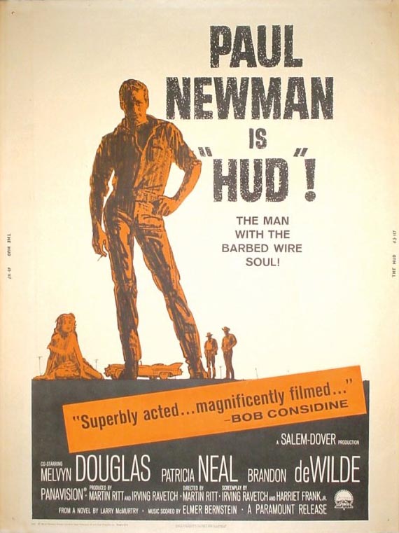
"I was doing work for an agency that had United Artists as a client, and they asked me to do one." The first job went well and lead to more and more movie poster assignments, work that Mitch found both gratifying and lucrative.
When we spoke on the phone last week and Mitch told me he had done a lot of movie posters, I had to confess I was completely unaware of that aspect of his career. "Oh, yeah," he replied. "You know, I did the first James Bond movie, Dr. No."
"You're kidding!" was my startled reaction. Mitch chuckled, "Yeah, it's actually kind of funny: I don't think they had any idea at the time just what a valuable property they had. They actually said to me, 'Don't worry too much about likenesses on this one -- this just has a couple of unknown actors (Sean Connery and Ursula Andress) from England in it' !"

"Of course," Mitch continued, "It was a huge hit... and as soon as they realized that the sexy women were a big part of the draw, they got Bob McGinnis to do the next one. And I want to say unequivocally that I have never for one instant felt the least bit jealous of Bob for that. Bob loved drawing sexy women and he was perfect for those posters. And besides, I was busy working on other films."
Mitch did several movie posters a year, tailing off, he says, about twenty years ago.
I asked if he'd made frequent trips to Hollywood while working on all those assignments but he replied that he did not. "No... never. I did them all from home. The agency would arrange a screening of the film, of course, and afterwards they'd hand me a huge volume of stills and other reference that I'd take back to my studio. And I'd just do my sketches and send them in."
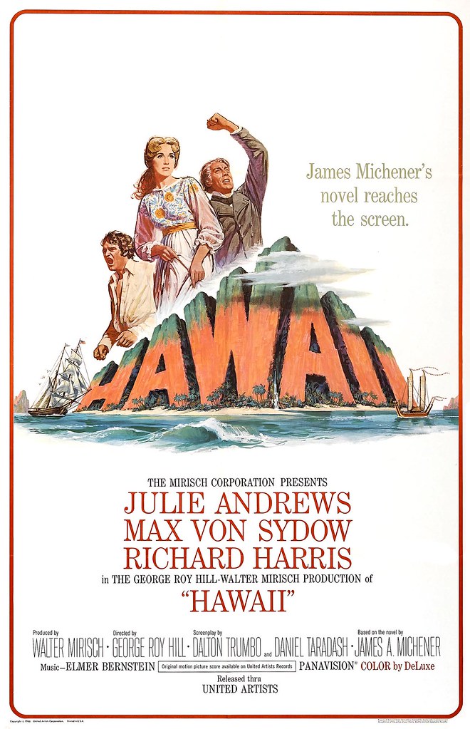
"I never went on location -- with one exception... when I did the poster for the film 'Hawaii', when I actually did go to Hawaii."
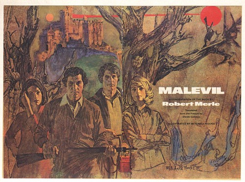
All the while, Mitch continued to produce an endless stream of fantastic paperback covers. "I was an early member of the Graphic Artists Guild," he says, "and one of the things I was asked to deal with was to try to get the price up for paperback covers. The publishers were paying about $300 a cover... and our goal at the beginning was to try to get that number up around $800... and I'm pleased to say that we accomplished that goal in a fairly short time."

During the sixties and into the seventies, Mitch tried working with several different reps, including Tom Holloway ( "He represented Bernie Fuchs and Austin Briggs" ), Bill Neely of Neely and Associates, and Coby Whitmore's brother, Tom Whitmore.
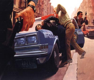
But try as he might, Mitch found it tougher and tougher to land new assignments. His signature style, in all its glorious, crackling roughness, just wasn't grabbing the art directors of the 1970's.
"I found I had to switch to a greater degree of realism. Its what the market was looking for."

Mitch says it was an easy transition. "Back at Fredman~Chaite, at the beginning of my career, I was doing realism, so it was no problem."
The switch in style came with a switch to another, final rep: Joseph Mendola & Associates. And for the last ten years before his retirement Mitch's one steady client was Harlequinn Romance.
At age 85, Mitch has been retired for a few years now - but that doesn't mean he's slowed down...
After our initial conversation I was unable to reach him again with my follow-up questions. I tried a couple of times, but kept getting his machine. But the following day, my phone rang... it was Mitch calling me back.
He apologized for having missed my calls and said brightly, "Sorry about yesterday, I was out all day playing tennis!"
* Many thanks to Armando Mendez and Tom Palmer for generousy sharing their Mitchell Hooks scans for today's post.
* My Mitchell Hooks Flickr set.
Leif!! I can't thank you enough!! The showpiece of my studio (and house!) has always been this giant framed Dr. No original poster! I bought that classic poster about ten years ago and I've never ever know who the artist is. I mean I've marveled at the thing on a daily basis for a decade but never came upon who the artist is (I guess it wouldn't have been too difficult to determine who the artist is). Now I know it's a Mitchell Hooks, someone who I've been a fan of all my life (ya figured I'd have recognized his style).
ReplyDeleteWhat's also great about this poster is that it's an original "quad" poster imported from the UK (Quad posters are considerably larger than traditional size movie posters). But when it arrived, I noticed the words towards the bottom stating "Sean Connery is 007!" was covered with a square of white paper. I called the seller and asked him what the story was behind that and he told me that after Dr. No became a hit in England, Sean Connery was so concerned about being associated solely with the James Bond character that he insisted that every existing Dr. No poster on display in the UK have that portion of the poster covered up (he must have realized lots of Bond movies were in his future). I researched this dubious explanation and found the story to be 101% true.
Anyway, just a bit of useless trivia for you Bond fans out there. :)
Oh, and you can see a pic of the poster (and my art studio) at my myspace/toilgirls page if you're the least bit interested. It's a completely different format than the poster Leif displayed--but same great Mitchell art!!
Sorry for taking up so much space and blathering on like this Leif!!!
Not at all, Les - thanks for sharing that great story! Your infectious enthusiasm is always appreciated around here. :-)
ReplyDelete...the lady on the first one of that "realist" sequence looks like Lady Di...
ReplyDeleteThose monumental letterings!
I think that was a challenge of its own for all those movie illustrators of the time; all those Roman sandal-movies, for instance.
That Hawaii poster, with those letters breaking through the clouds, it looks paramount.
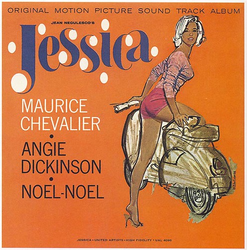
I always liked the "Jessica" artwork. I'm gay, but man she's quite a hottie!
ReplyDeleteI started collecting his illustrations in high school but there has been so little info on him out there. Thanks for this.
ReplyDeleteExcellent article on this great illustrator. Thanks for doing this!
ReplyDelete