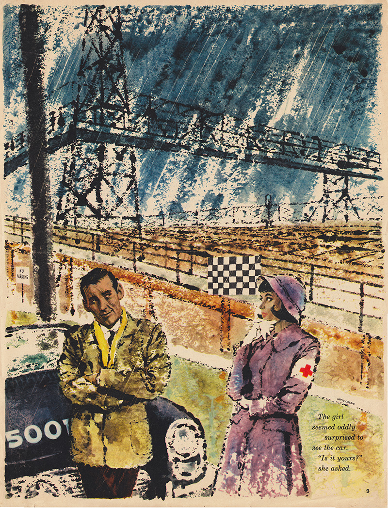
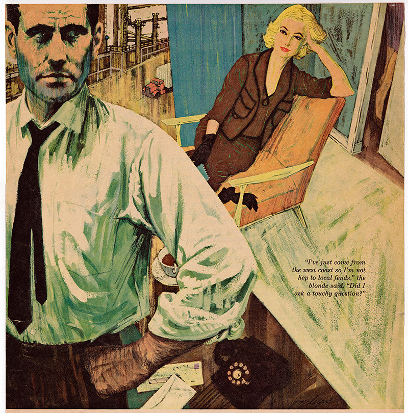
Showing posts with label Gerald Lazare. Show all posts

Monday, August 24, 2015

Postscript: From Illustrator to Painter (The Final Step - Part 2)

By Gerald Lazare

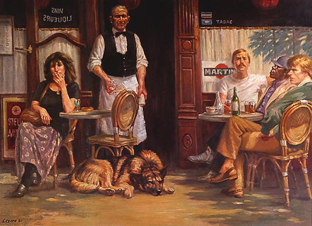
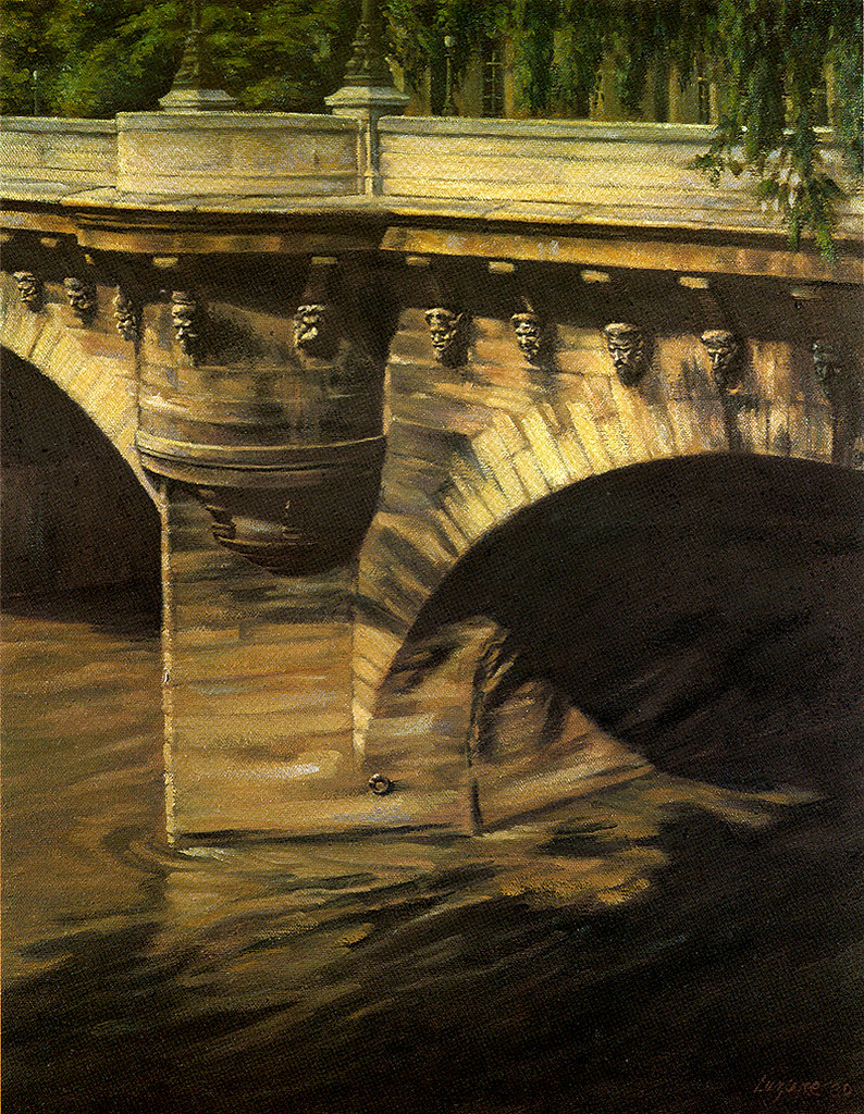
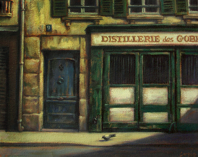
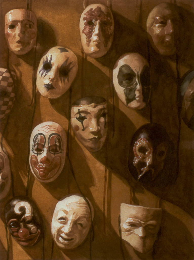
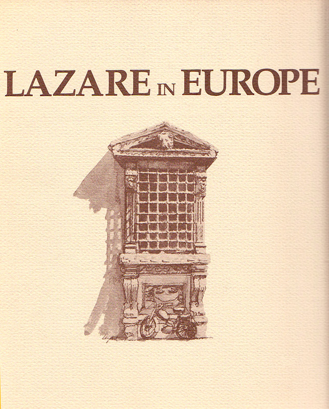
As an illustrator, I loved doing anything with a foreign setting. My ancestors had come from France. In 1979, I made another trip to Europe, starting in Paris to sketch and paint and produce a show. In 1981, I had an exhibition ant the Prince Arthur Galleries hosted by the French and Italian embassies in Toronto. A catalogue was produced in French, English and Italian called Lazare in Europe.
lazareineurope

chienducafe
Chien du Café

PontNeuf
Pont Neuf

RuedeSeine
Rue de Siene

VenetianMasks
Venetian Masks

MarketinVenice
Venetian Market

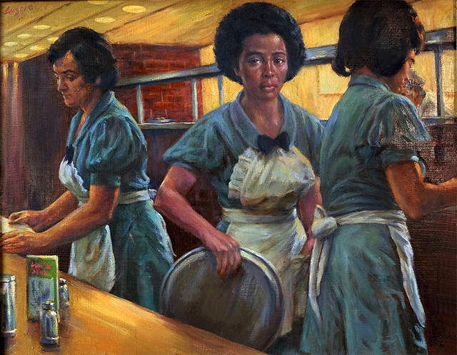
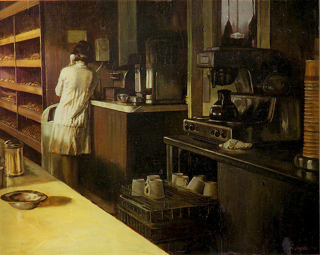
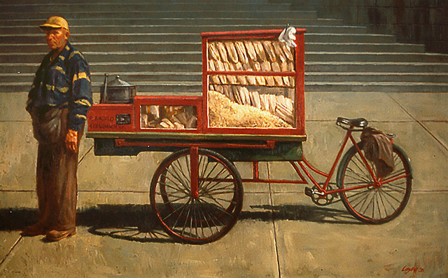
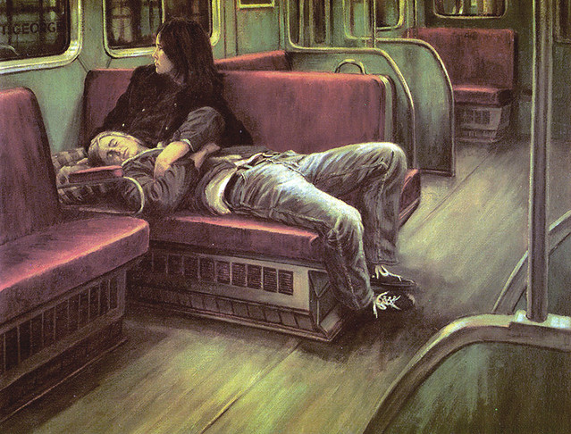
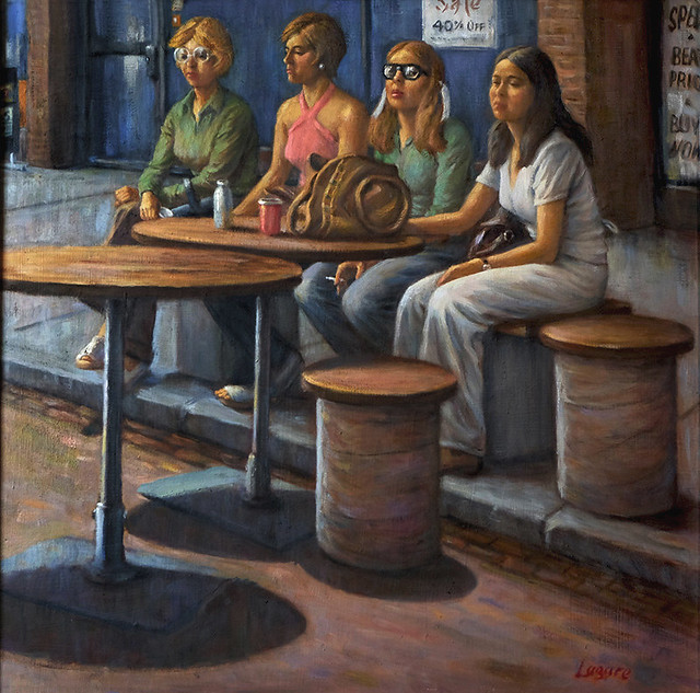
People in the city, often the protagonists in the fiction I illustrated, were all around me, the girls at Murray’s restaurant at the Park Plaza hotel where I had breakfast near my studio and Country Style Donuts where I had coffee. The nearby popcorn man at ROM, people on the subway, teenagers in the mall, they all became my subject matter. What fun! I remember it all with such pleasure! I wish I was back there again. With my pictures I tried to stop it, to capture it in a frame to look at and have forever.

girlsatmurraysfs
The Girls at Murray’s

CountryStyleDoughnuts
Coffee Style Donuts

popcornman
Popcorn Man

StGeorgeStation
St. George

mallratsf
Mall Rats

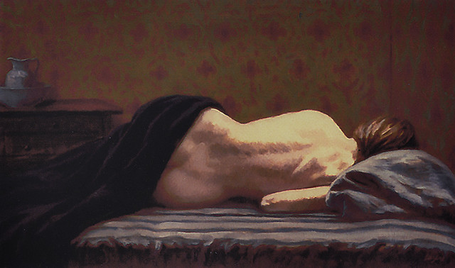
NudeonaMatress
Nude on a Mattress

In the Ottawa Citizen newspaper Cathy Scafter wrote, “His painting of a passenger on a bus, a waitress, musicians in a mall, opens our eyes to the most ordinary marvels. He feels enough empathy for people in the city to depict them with perfect candor." I’ve been painting now for over 35 years, had many shows and awards both here and in the United States. But each new picture is a challenge, an adventure and I still feel that I’m learning.

I’d like to thank Ivan Kocmarek and Leif Peng who still care and remember without their help, generosity and expertise I couldn’t have produced this story.

Gerald Lazare.

Text and images to this series are © Gerald Lazare


* Read Ivan Kocmarek's articles on Gerald Lazare's early career in Canadian comic books here and here.

Wednesday, August 19, 2015

Postscript: From Illustrator to Painter (The Final Step, Part 1)

By Gerald Lazare

StudioSelfPortrait

The story of Artists who both illustrate and paint has a long history. Many illustrators painted and many painters illustrated. One of the 20th Century’s most famous painters, Claude Monet, was a cartoonist and illustrator before The Water Lillies and our own Jack Bush illustrated for decades before he turned to abstraction. Edward Hopper, The great American realist, was an illustrator much of his working life. There are obvious differences between the two disciplines. As an illustrator, you create images that enhance stories by writers for publishers or ads for the business world that promote companies usually, in both cases, working with art directors.


​As a painter, you tell your own story. You make pictures of what you love and what matters in your life and imagination and you do this alone, without direction from anyone else. For some artists this can be problematic. As an illustrator you are secure in a system that asks you to work for them and pays you well to do so. As a painter, you are vulnerable on your own, showing your work, hoping someone will be attracted and moved enough to want your picture.


​When I was a teenager, I discovered the work of the master painters, especially the ones who drew well: Rubens, Watteau, Ingres, Degas, Sargent and many others. They became my hallmark, my school and inspiration. When I was 25, in 1953, I went to Europe for over a year’s study of their work in the museums and earned my living there as an illustrator. When I returned and continued my freelance life as an illustrator, I dreamt of someday being a painter, painting my own pictures and subjects. When I left illustrating to paint in 1974, I was in my 40s and realized, if I didn’t begin to paint then, it would be too late.


​I had more illustration assignments than ever from both the Canadian and American markets and was winning awards in the U.S. I had no idea the future would bring a decline in illustration with the exodus of many magazines and their fiction and the rise of photography and computer technology. With the best wishes of my clients and agent in New York, I changed my course and changed my drawing board for an easel. Within two years I had my first one-man show at the Nancy Poole Gallery in Toronto.

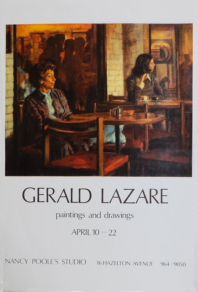
coffeetime
Gallery Show Invitation: “Coffee Break”

It nearly sold out and caught the attention of the critics.

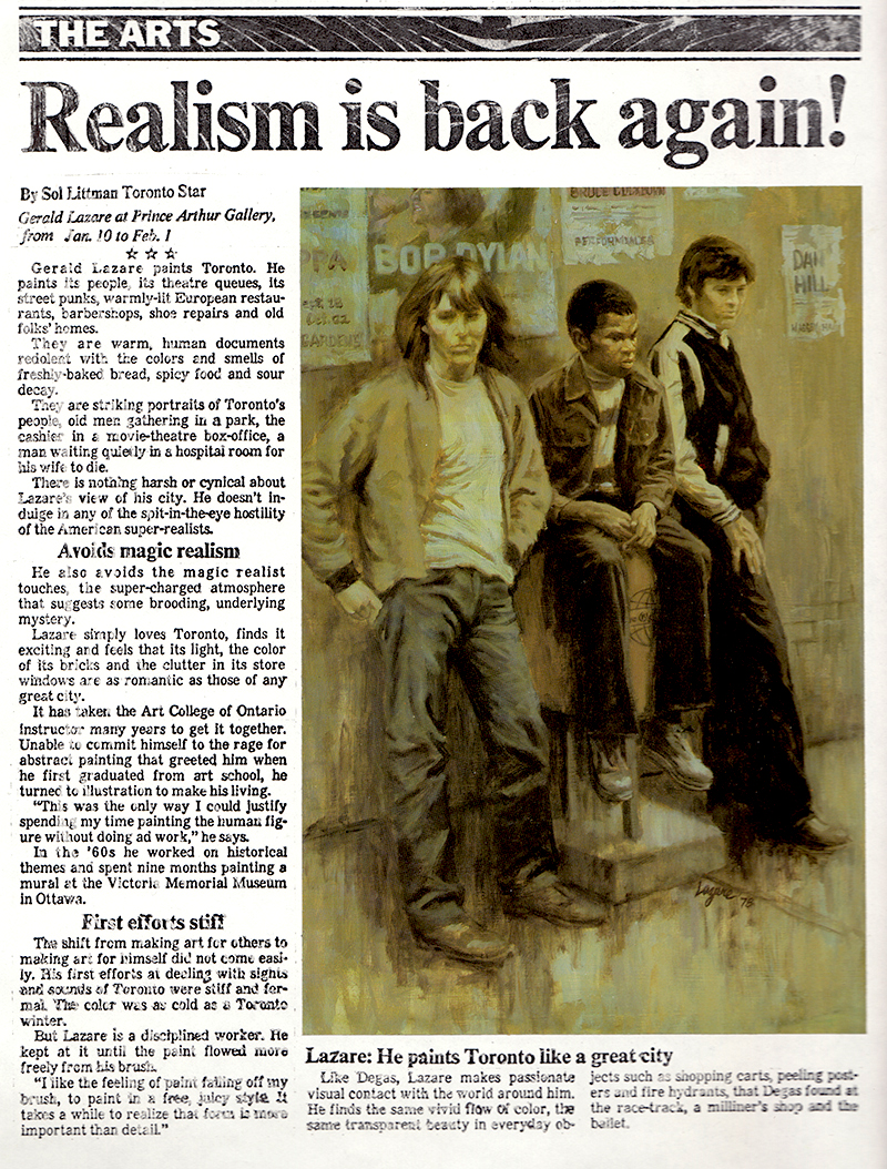
ralismisback
Gallery Show review, Toronto Star, 1976

My years of illustrating added much to my success as a painter. I had learned to compose a picture. I had learned to draw well. I had an understanding of value and colour. I had disciplined myself to work hard. The main change was subject matter… but even there, it carried over to some extent.

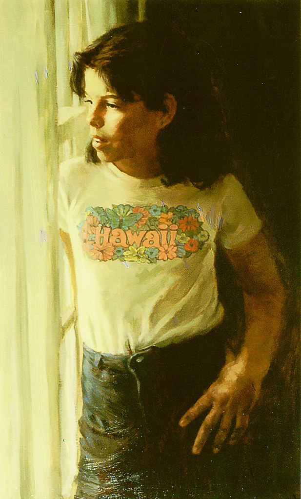
​I had always enjoyed doing faces and portraits and art directors would often comment on that ability. I was advised more than once to consider portrait painting as a career. I enjoyed painting the public, but I soon discovered painting your family and friends was more enjoyable.

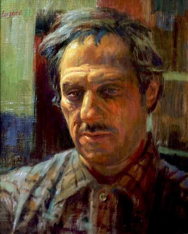
georges
Portrait of George

PortraitofDawn
Portrait of Dawn (Commissioned)

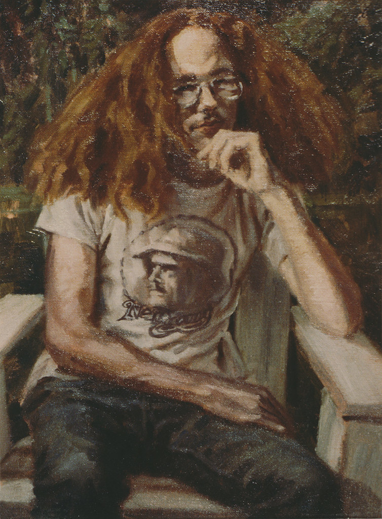
Hair
Hair (Portrait of artist’s son)

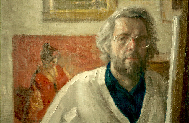
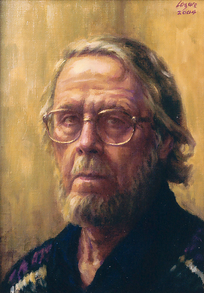
SelfPortrait
Portrait of the artist

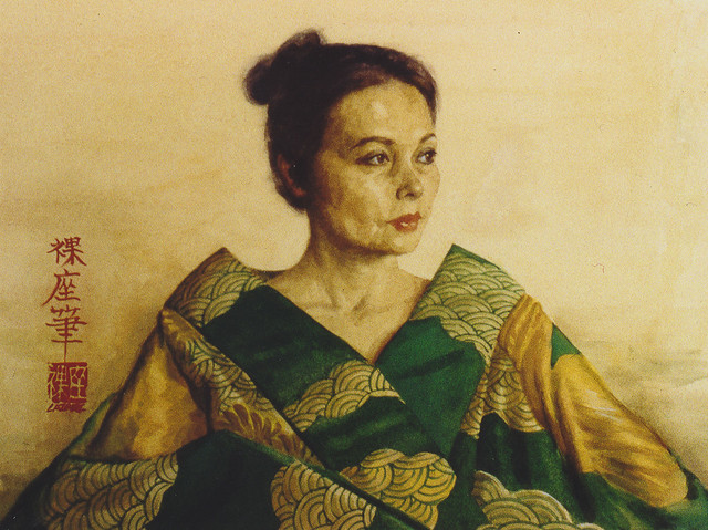
PortraitofSetsuko
Portrait of Setsuko (the artist’s wife)

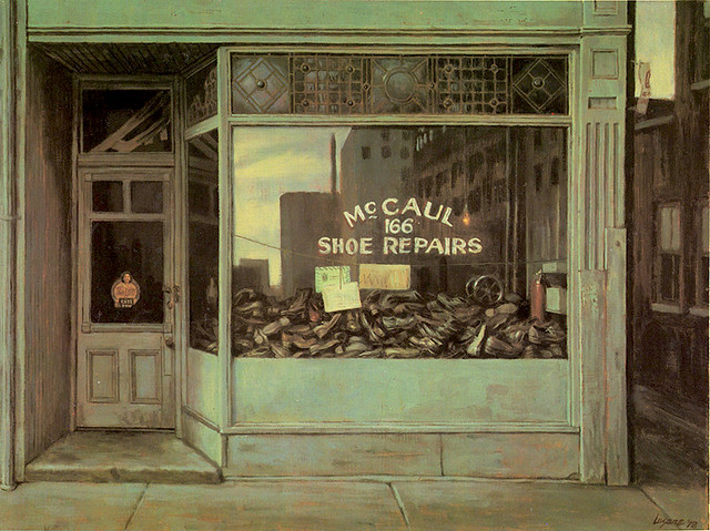
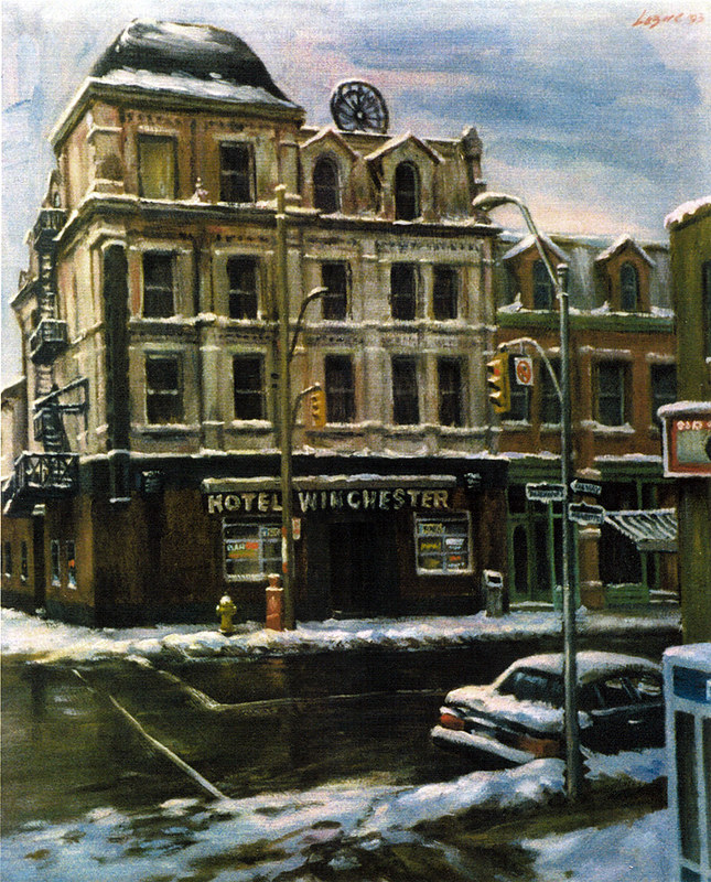
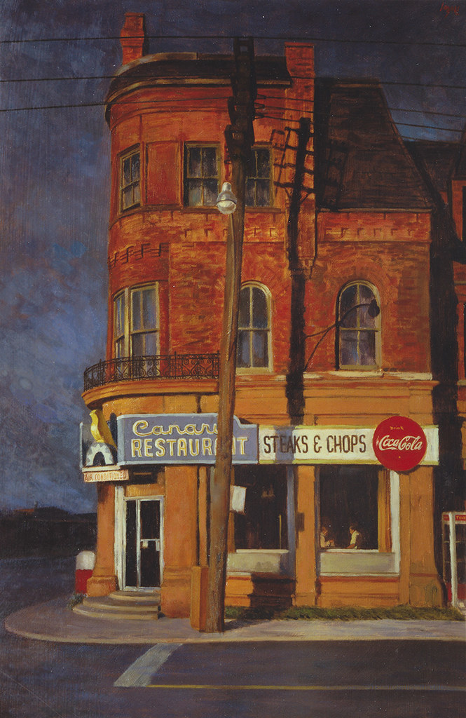
A lot of my paintings include cityscapes. The old Junction where I grew up is still etched in my soul. My parents were storekeepers and my walks to school and back passing the shops and movie theatres and what I later called “street furniture” became my early themes and awakened in me a love of architecture I hadn’t known. In 1992, The City of Toronto gave me a retrospective titled “Painting the City” and quoted me:

"Born and raised in Toronto, I have always been a lover of cities and find the human comedy is played out in infinite variety on a city stage. The way we work, play and build our shelters and giant towers to commerce presents an inexhaustible opportunity for the artistic imagination. I’m drawn to a personal view of the city… the soul of it, rather than historical documentation."

catspaw 004
Cat’s Paw

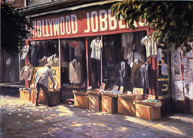
hollywoodjobbers 001
Hollywood Jobbers

WinchesterHOtel
Winchester Hotel

canaryrestaurant
The Canary Restaurant

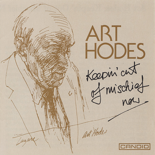
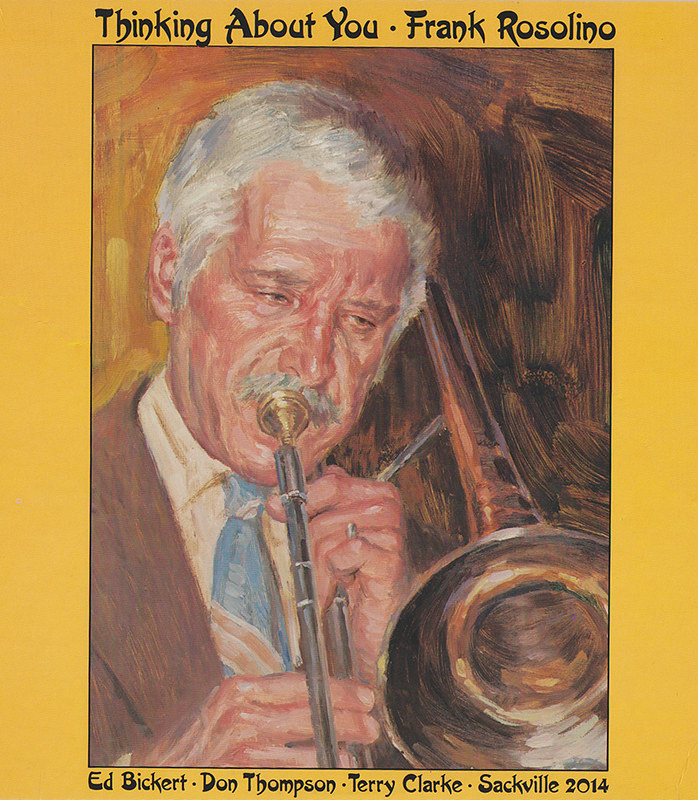
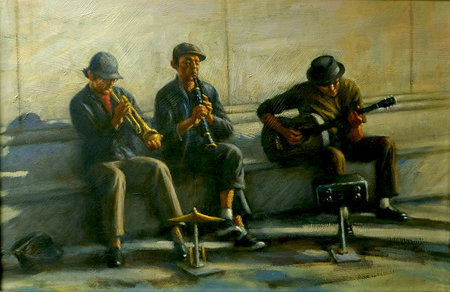
When I was in public school, I discovered the big bands and Jazz. When I was a teenager doing the comics I created Drummy Young, a crime busting band leader. As an illustrator, I did LP and CD covers for Jazz musicians.

ArtHodesCDcover
Art Hodes CD

rosf
Frank Rosolino LP cover

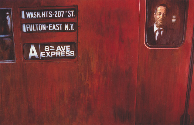
In 1974, for my first show, I painted “Take the A train,” my homage to Duke Ellington, the famous composer and band leader who died that year. It was accepted by the Ontario Society of Artists Exhibition in 1975 and later a print was made and sold to fans and musicians all over the world. Ellington’s sophisticated music has influenced my work and like most musicians, painters are improvisers and composers too.

taketheatrain
Take the A Train

WashingtonSquareRag
Washington Square Rag

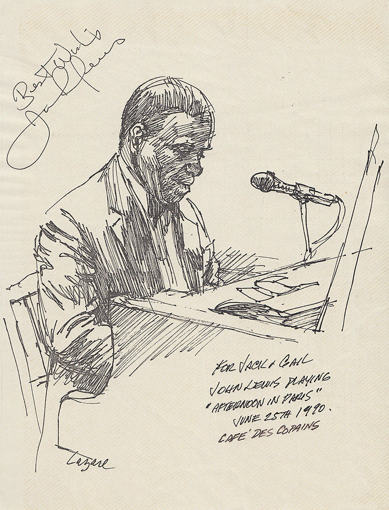
Live music is especially rejuvenating and I’ve spent many hours sketching in Toronto jazz clubs like The Montreal Bistro and Café du Copins ... long gone now.

JohnLewissketch
John Lewis sketch at Café des Copains


Concluded tomorrow.

Monday, August 17, 2015

An Illustrator’s Story – Magazines and Newspapers (Part 2)

By Gerald Lazare


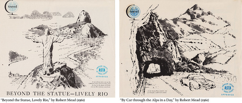
Canadian Homes Magazine had features like travel and gardening still popular features for magazines. Its art director was Art Guest, a lovely gentle man who always had time to chat. They featured a travel spread I enjoyed illustrating and here are two examples:
CanHomesMag

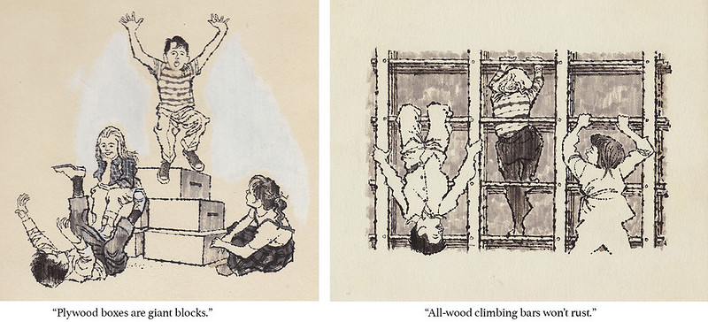
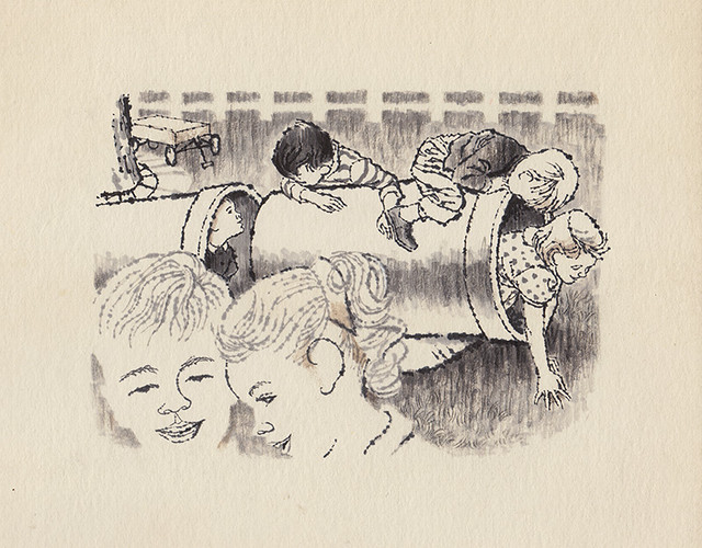
Canadian Homes Magazine was full of ideas for the family. “Backyard Fun for Youngsters,” (1961) was a do-it-yourself article on inexpensive things for kids to play on. Drawing children was a constant requirement for illustrators.
CanHomesMag02
kids3
"Sewer pipe is great for crawling."

The corporate world needed illustration to embellish brochures, ads, and annual reports, to create a climate of confidence in companies of all kinds. Trade magazines had articles helping industries tackle marketing and employee concerns.

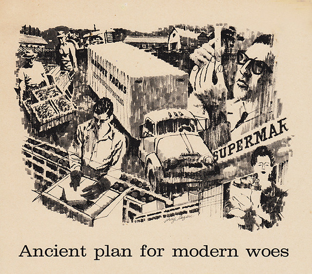
ancientplan
An article on growing produce, processing, packaging, and delivery to supermarkets in one illustration for Executive Magazine by Charles G. O’Neill (1961).
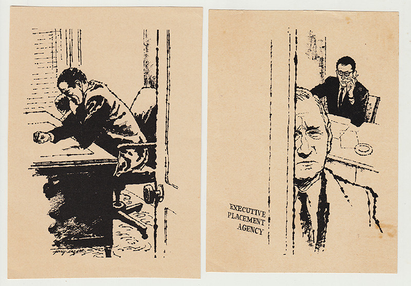
executiveflops
placement
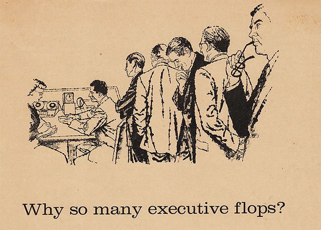
“Why so Many Executives Flop,” by Tony McVeigh, Executive Magazine (1960).

noranda
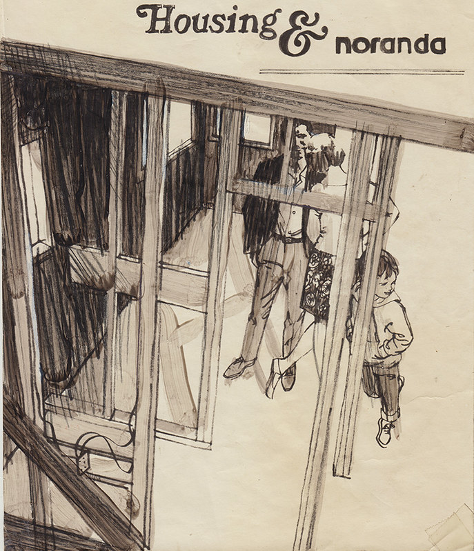
Layout for Noranda on building houses (1960’s)
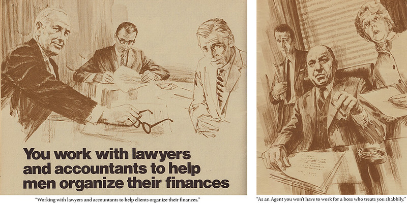
EquitableLifeAssurance
From a brochure soliciting people to work as agents for the Equitable Life Assurance Society of the United States.

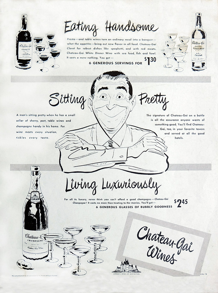
My cartooning ability was still an asset as an illustrator. Magazines often used cartoons to illustrate humorous articles and for companies to promote their products.

chateaugaiad2
A 1950s Chateau Gai magazine ad done while as an illustrator working at Bomac Engravers.

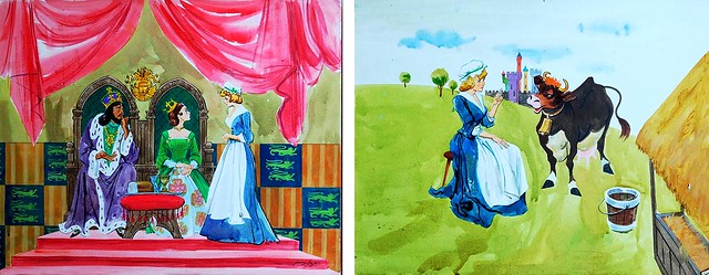
Television graphics for children’s programs were ubiquitous as well. I did numerous assignments for “The Polka Dot Door” TVO Ontario’s award winning children’s show 1971-73.

polkadotdoor
polkadotdoor2
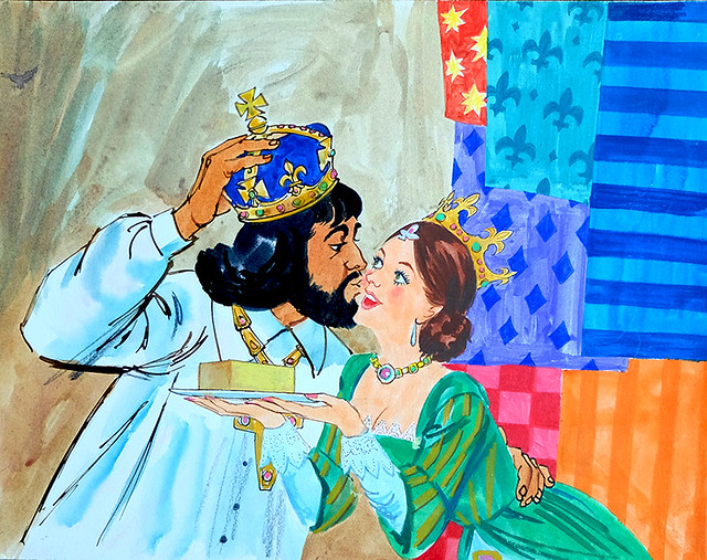
"The King's Butter," The Polka Dot Door, TVO Ontario (c. early '70s)

4 Favourites

An artist always has a few favourite illustrations that, for some reason or other, pleased him more than others he may have done. This is very subjective and is no reflection on the rest of his work or professional competence. Four I liked especially and why.

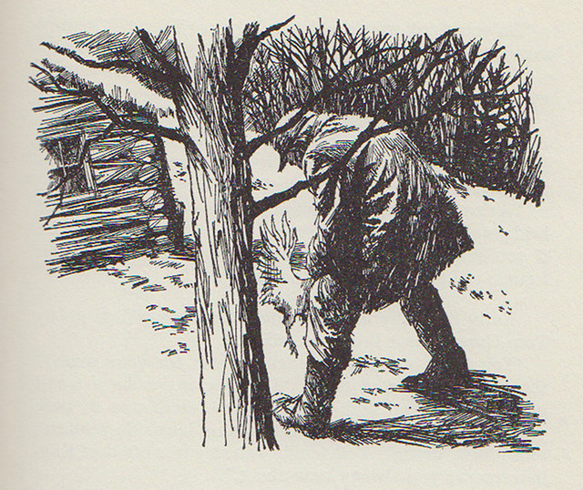
In the McClelland and Stewart book Johnny in the Klondike, two boys watch the villain strangle a chicken. The text reads “Taut with excitement, they watched in horror as the man took the chicken deftly by the neck and gave a quick twist.” This was a bit of a problem. Never having seen anyone actually do this, I had to visualize it. I had a friend act it out minus the bird, which I added later. The arch of his back hid the poor chicken with one leg and tail feathers telling the story and solving a difficult problem. The tree places the boys and reader the right distance from the act.

k2a1
Johnny in the Klondike, McClelland and Stewart Ltd., 1964

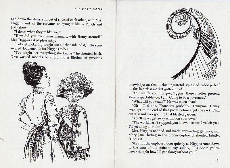
When you’re given a story like My Fair Lady to illustrate, you tend to be a little more focused. The likes of Lerner and Loewe and their adaption from George Bernard Shaw’s Pygmalion challenges you to do your best. Edwardian fashions and the elegance of the plot and charm of the two lead characters Eliza and Professor Higgins are irresistible for any illustrator worth his salt.

lazmflp140-1
My Fair Lady, Four Winds Press, 1967

The final illustration in the book with Eliza and Higgins’ mother plotting to bring him around involved a row with Higgins at the top of a winding staircase shouting down on the two below. By putting Eliza and the mother at the bottom of the left page and Higgins at the top of the right, shouting down across the two pages, I created a feeling of the actual space described in the text.

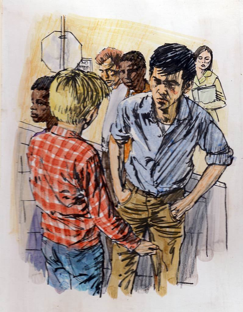
Another assignment from Scott Foresman and Co. was a story called “The Squealer.” It was about a young boy accused of squealing on a very tough gang member who is looking for him to administer revenge. He is approached by the very angry boy in front of his high school and has to plead innocence and convince his adversary. It is the pivotal illustration in the story. After sketching the two boys arguing, I added two other students hearing the commotion and looking over in a concerned way. I felt it added an element of sound to the picture and brought the picture out of the ordinary. I only have the sketch okayed and returned by the publisher for finish. I never did see the published finished art and would love to.

101

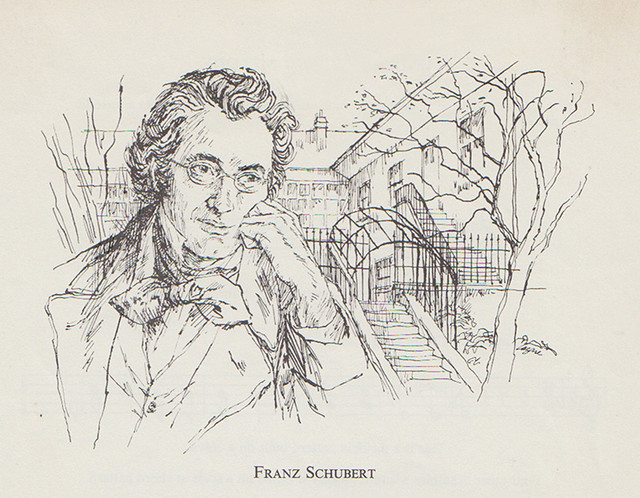
Crosshatch came naturally to me and I’ve always liked things lyrical. The portrait of Fanz Schubert falls into this category. I like it because of its style and mood.

shubert1

When I was barely a teenager, I saw the work of European painters who were great draughtsmen. Edgar Degas, Antoine Watteau, and Augustus John who attended the Slade School in London that stressed drawing in its curriculum. Edmund Sullivan, the great English illustrator and Charles Dana Gibson, the American, were also early favourites whose work I studied assiduously.

I look back on my 20 years as an illustrator fondly and with great memories. It seemed to go so quickly and when my peers awarded me CAPIC’s Lifetime Achievement Award in 1995, I couldn’t have been happier. Since then I’ve been painting pictures for myself for over 35 years, but each picture, whether it be the comics, illustration or fine art has taken me to another place away from the ordinary world into the wonderful possibilities of the imagination.

Next: From Illustrator to Painter (The Final Step)
Wednesday, August 12, 2015

An Illustrator’s Story – Magazines and Newspapers (Part I)
By Gerald Lazare

In the 50’s and 60’s magazines flourished. Television had made its entrance but the print medium still remained strong with lots of fiction and articles to make pictures for. A challenging mix of love stories, westerns, crime drama, business, travel, politics — you name it, needed stand-out graphics that would catch the eye.
lazthegirl
“Blind Spot,” by John Rhodes (1962)

Many new trends and styles came and went and art directors would often demand new directions and expect you to work in a number of styles.

Star Weekly Illos02

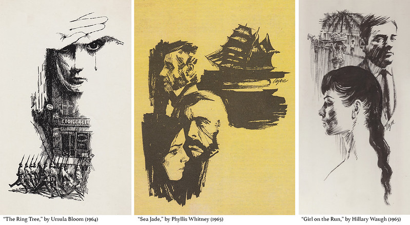
One Art Director who kept my phone humming was Ron Butler with a great smile and easy manner. He was Art Director at The Star Weekly and The Star Weekly Novel, a section of the paper dedicated to fiction. Many great writers had a vehicle for their prose in novella form and they all needed black and white illustrations to embellish them.

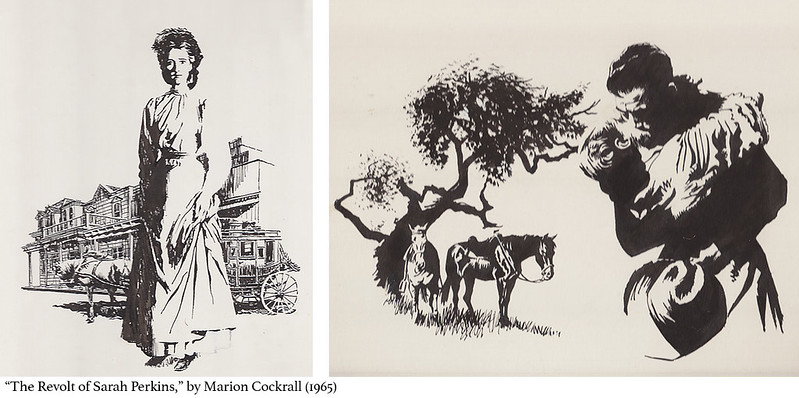
Sarah Perkins

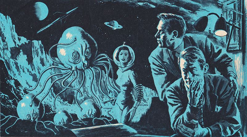
I did many of them for Ron (which you can see both above and below), as did most of the top illustrators of the day. I loved reading the story and choosing a scene to draw and bring the characters to life. Unfortunately few newspapers or magazines contain fiction today. Here are a few more of the Star Weekly illustrations I did for novellas:
lazmadmen2
“Like with a Preacher,” by Ross Annett (1964)
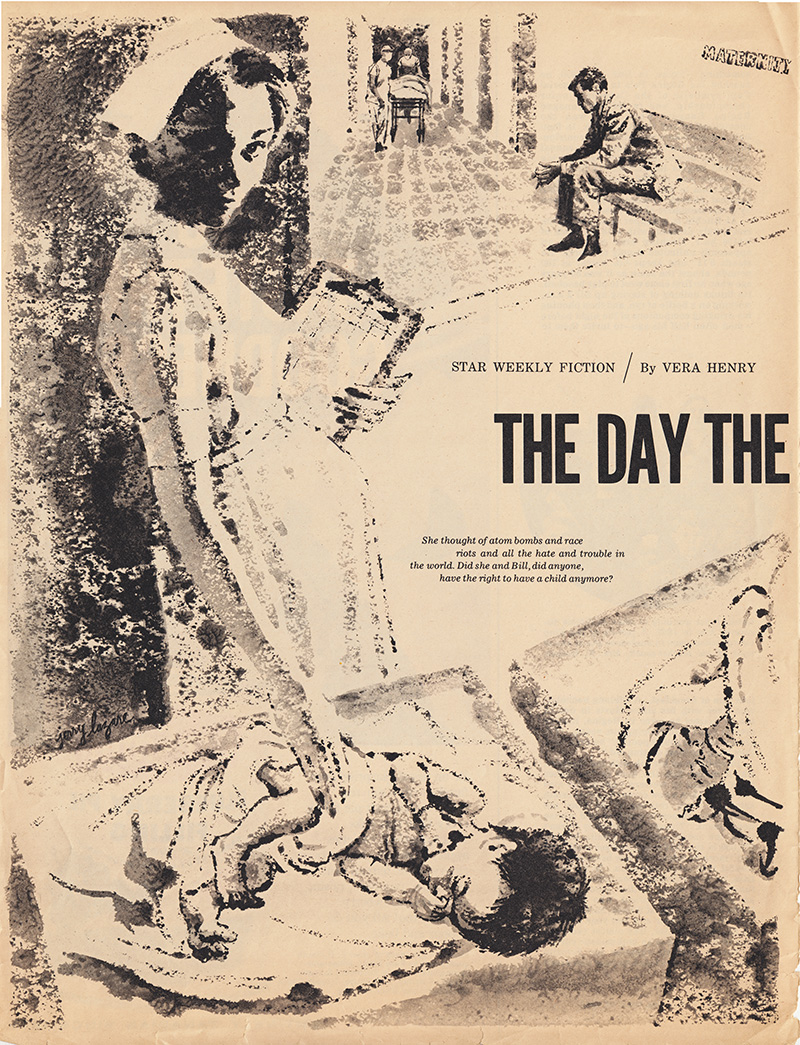
laznurse
“The Day the Bell Rang,” by Vera Henry (1962)
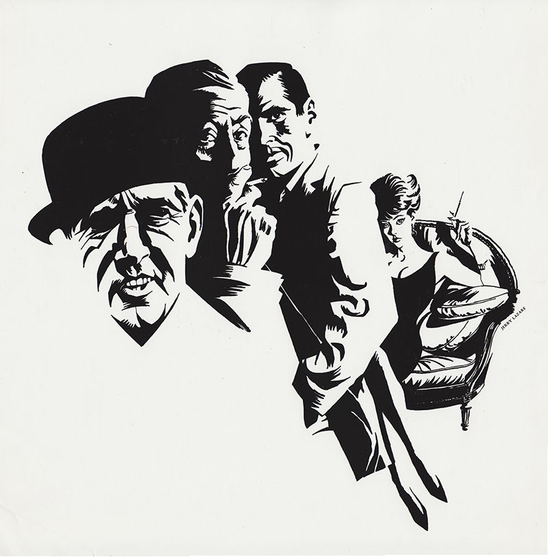
lazbowler
“Final Judgment,” by Pamela Barrington (1964)

Liberty Magazine, owned by flamboyant entrepreneur Jack Kent Cooke, specialized in articles on Canadian crime, Hollywood gossip, disasters, and often paradoxically enlightening stories on Canadian history by Frank Rasky, who also art directed. The Canada policy was highlighted by city names in their titles, such as: “The Vancouver Killer who Trusted his Wife,” “Curious Case of the Murderous Halifax Doctor,” or “Montreal Darling, Cheating Honeybunch, I’ll Murder You.”

lazpsychiatristpeck
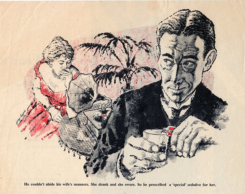
“The Psychiatrist who Caught his Patient’s Craze,” by Dr. Robert Linder (Liberty Magazine, 1956)
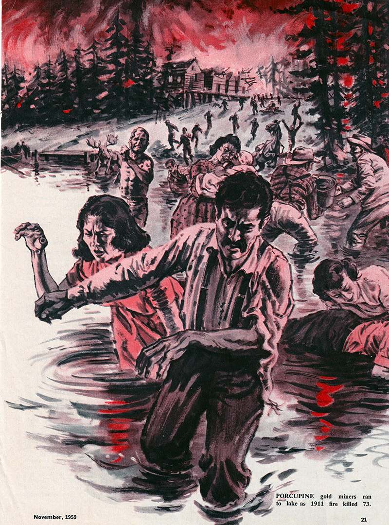
lazfire
“Ontario’s Two Wildest Forest Fires,” by Frank Rasky (Liberty Magazine, 1959)

Hugh Garner, the legendary writer wrote for the magazine and I met him at Liberty Magazine while delivering work, in the same way I met Pierre Berton at publishing houses. When I look back one of the advantages of being a freelance illustrator was all the interesting accomplished people one gets to meet when delivering your work to the offices of clients. Some of them become friends and enrich your life in myriad ways.

lazhalifaxdoctor
“Curious Case of the Murderous Halifax Doctor,” by Alan Hynd (Liberty Magazine, 1960)

A constant dilemma of being an illustrator is the transition from your original art to the reproduction. Your audience never sees the original, but only it’s reproduction on the page.

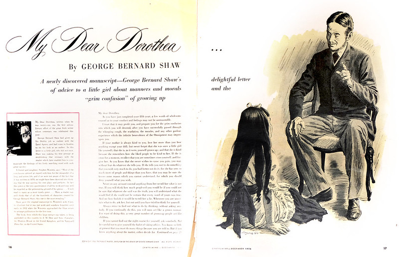
lazshawfull
“My Dear Dorothea,” by George Bernard Shaw (Chatelaine Magazine, 1956)

Before the digital revolution, technicians working on a press with inks, paper, and plates, would pull proofs prior to reproducing your art. The Oxford Dictionary definition of ‘proof’: “printing a trial impression taken from type or film used for making corrections before final printing.”
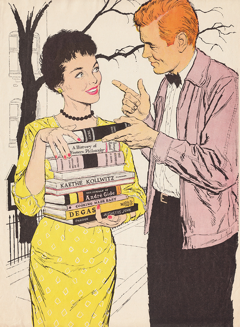
lazbooks
“Yellow, Yellow, Catch a Fellow,” by Margaret Flynn (Canadian Home Journal, 1957)

Depending on many factors, but mostly the skill and dedication of the technicians, the reproduction could be very true to your original or a mess that would make your heart drop. Often it fell somewhere in between.

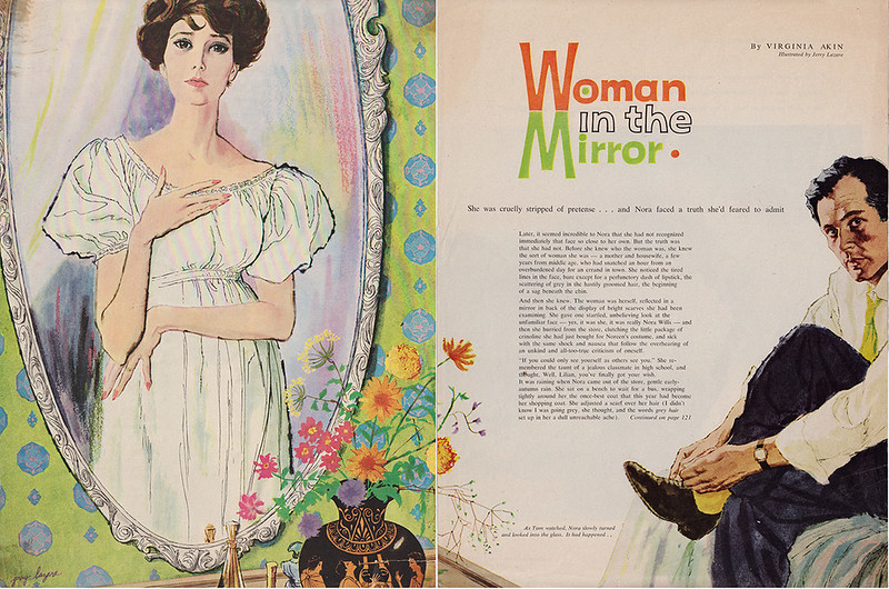
womaninthemirror
“Woman in the Mirror,” by Virginia Akin (1959)

tiethatbinds1
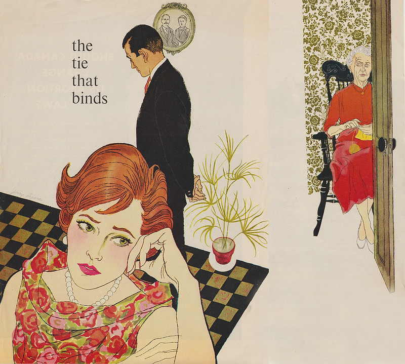
“The Tie that Binds,” by Loretta Burrough (1959)

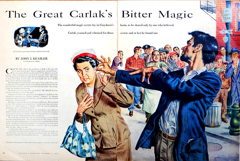
It depended on the art director to okay the proof and thus the final reproduction. One art director who cared about quality was Gene Aliman at Maclean’s Magazine. He was a no-nonsense, serious perfectionist. I often saw on his desk proofs from the painter marked with hundreds of written corrections for the printer to follow. Below is a very early illustration done in 1955 for Maclean’s Magazine. It showed my love for Albert Dorne’s work. His style was very animated with a strong line approach and washes of coloured inks floated on top. He also was an excellent draftsman and this showed up in the way that he drew hands.

lazarecarlak
​“The Great Carlak’s Bitter Magic,” by John I. Keasler (1955)

Later, with my love of painterly illustrators and fine artists, my style became more opaque and painterly.

Continued on Friday...