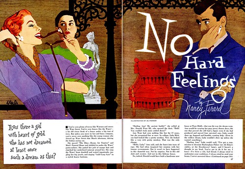
I asked Barbara Bradley to look at this group of illustrations and she had this to say:
Parker never pictured the same two generically beautiful faces, one for a male and the other for a female. Every one of his beautiful people was an individual. Even having been created in an era when standards of beauty were more narrow than now, the beauty of his people varied. They all had personalities. And, their types don't show the passage of time. They'd be neat people if you met them today.
Commenting on "Love Is the Name of the Game" (below), Barbara writes...
"Composed of so many flat areas of color this illustration might at first seem simple in composition. However, it is typical of Parker’s thoughtful control of everything in the picture. We can learn much by studying and appreciating a few of his decisions. A viewer would be intrigued by the figures’ gestures, might realize that the setting is Paris, the time early evening, would know that the people are smart by their clothing and interior setting."
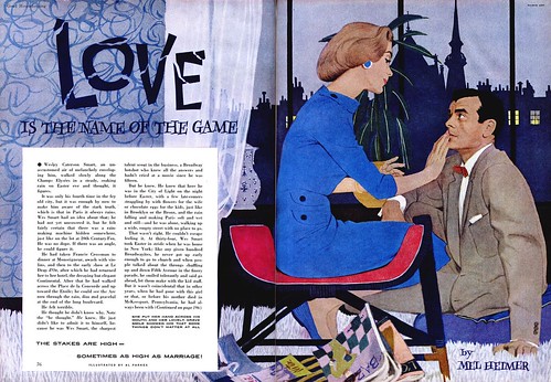
"The darks work together as a mass to hold the lighter figures. is composed of many elements are recognizable holds the lighter figures, yet each is recognizable. His dark hair mostly blends into the cityscape but is held by the light of a window beyond, a window that lends atmosphere at the same time. Another window emphasizes her back a touch more. The magazines break up the mechanical straights of the chair, and, at the same time, add to the story. The accents of red are perfect, bringing warm to a predominantly cool composition and focusing more attention on the people. One can go on analyzing this illustration, the play of verticals, to the horizontals, to the curves, the accent of buttons, of earring, the role of the curtain, and the vase. etc etc, etc. And, one could analyze similarly for just about all of Parker's illustrations. What fun!"
"Face of the Tiger" (below)…one of my all time favorites. The loveliness of the setting, Its beautiful and varied greens, ferns and leaves, delicately rendered lilacs, contrast so effectively with the clues of a missing baby that the implied horror is intensified. Once again, everything is perfect in this illustration. Could any other illustrator have created this with as much sensitivity of storytelling and beauty of design and composition?"

"The broken branch, the bootee on the ground, pacifier and rattle, the disturbed net flying in the breeze and, most eloquent of all, the pillow showing the impression of the baby’s head, the head no longer there: they all tell the story. The more one looks at an illustration like this, the more plusses one finds. The jagged harsh lettering is one more plus. The clever way in which Parker ended the green bleed near the gutter with a branch, then softened the edge with a few leaves and fern. The softening of the pram edge with a blanket, a blanket that helps tell the story, he beautiful design of each branch of lilac blossoms. …Plus, plus, plus! Note how often Parker shows one sock off, one shoe off, one bootee off, etc,. A wonderful naturalness that simultaneously provides neat design and color elements."
"This one is so great and I’ve waxed so rhapsodically about it, I think that you should comment on the rest. The most important thing is that Parker probably designed and executed all of the titles."
"One more comment about "Face of the Tiger". ...The terror is conveyed so well without the figure that the figure doesn’t seem to be as necessary for the story as it is to complete the page composition. I like the way the blue of her dress is repeated in the buggy (or vs versa."
"Incidentally, Leif, you could show dozens of Parker’s illustrations as examples of one thing alone, how cleverly he incorporated spaces for copy in his compositions. He so often made them elements in his page compositions."
I'd like to talk about the design in his drawing itself..every shape, every fold, every line is thoughtfully designed...just as Fawcett's were. That subject, however, would take a lot of writing. The play of straights to curves were masterly. You see some of that in all of the illustrations you selected. What a fascinating combination he was, a superb graphic designer and draftsman all in one."
*Barbara Bradley is an illustrator who began her career in the early 1950's at the famous Cooper studio in New York. She later moved to San Francisco and eventually went on to become the Director of Illustration at the Academy of Art University. Barbara knew Al Parker personally and professionally and I am most grateful for the keen insight she has so generously offered to add to this week's posts. Barbara was recently fêted at The Society of Illustrators in New York. She received the Distinguished Educator of the Arts Award for 2007.
Barbara's fascinating career will be the topic of an upcoming week here at Today's Inspiration but in the meantime, take a moment to visit this blog which was set up in her honor.
*The Norman Rockwell Museum is about to showcase Al Parker's work in a major retrospective. Go to the Rockwell Museum's site for more information.
What a wonderful post with some gorgeous examples. Thanks for sharing this. I'm off to look at some of the sources you reference.
ReplyDeleteFYI... the original 'Face the Tiger' illustration will be in Illustration House's May 31st auction in NTC.
ReplyDeleteI recently found many useful information in your website especially this blog page. Among the lots of comments on your articles. Thanks for sharing. עיצוב לוגו
ReplyDeleteIt is a great website.. The Design looks very good.. Keep working like that!. Photoshop Masking Service You make so many great points here that I read your article a couple of times. Your views are in accordance with my own for the most part. This is great content for your readers.
ReplyDeleteVery informative graphic design article. Happy to read. Thank you for Product image editing tutorial.
ReplyDelete