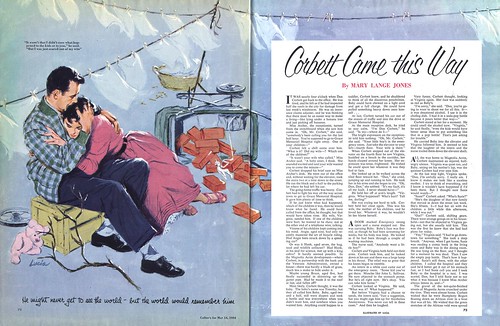
A couple of people this week have suggested that perhaps the illustrators of the 50's who tried some interesting graphic experiments were looking at old Japanese woodblock prints and finding inspiration there. No doubt they were.
Could they have also been looking at comic book art?
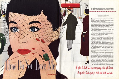
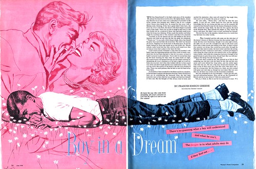
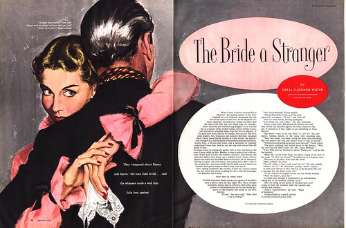
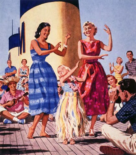
Consider this: a comic book artist working in 1950 would have had to draw many dozens of panels over 20 or 30 pages to earn a few hundred dollars. If such an artist had been working on a romance story, any one of those panels might have come out looking very much like this illustration Mac Conner created for the August 1950 issue of Woman's Home Companion. But because Conner was a highly respected illustrator working in a far more "legitimate" wing of the commercial art business, he was paid many hundreds of dollars for just this one panel.
I'm not trying to disparage Conner - far from it - but isn't it interesting that for many people the merit of artwork depends on the context in which it is presented? Many talented comic artists spent their careers toiling in sweatshop conditions, their work beneath notice - beneath contempt - to many people in the broader public. Yet flip open an old comic of the day and scrutinize any single panel and you'll likely find many a composition every bit as accomplished and lovely as the Mac Conner illustration above.
Fast forward another decade and Roy Lichtenstein's super-enlarged comic book panel paintings were selling out at the Leo Castelli gallery in New York before his first one-man show even opened. Ironically, the fine art collectors that paid dearly for Lichtenstein's paintings would have turned their noses up at the thought of framing Mac Conner's original and hanging it on their wall.
It was, after all, just an illustration.
Both of these pieces and a few others can be seen at full size in my Mac Conner Flickr set.
Celebrating illustration, design, cartoon and comic art of the mid-20th century.
Friday, September 28, 2007
Thursday, September 27, 2007
Walter... Mondrian?
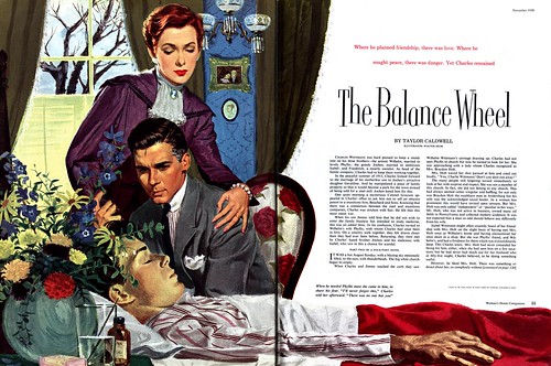
I'm fudging some numbers today in the interest of reinforcing a point. I've been focusing this week on the graphic experiments made by a number of illustrators in issues of Woman's Home Companion during 1950. But the piece Walter Skor contributed to the November 1950 issue, while beautifully realized, really looks rather classical.
His illustration for the May '52 issue of WHC, however, is another story all together.
By riffing on Piet Mondrian for a background motif, Skor provides us with a perfect example of a number of major changes taking place in illustration at that time: the "big head and hands" element, the elimination of traditional background environment, the reduction of props to only those essential to the story, an emphasis toward flat, graphic areas of colour.
Perhaps most importantly, Skor plainly shows us that illustrators were not oblivious to the world of fine art - and the radical new experiments in abstraction taking place there. Skor could hardly have picked a more ideal fine artist to incorporate into his illustration to evoke a sense of modernity for the WHC reader. Mondrian's bright, bold, angular art seems to have been co-opted in all aspects of popular culture of the day, from packaging to architectural design.
And to return to yesterday's point... Al Parker beat Walter Skor to the idea of incorporating modern art into his illustration by two years.
These images can be seen at full size in my Walter Skor Flickr set.
Wednesday, September 26, 2007
The Graphic Frederic Varady
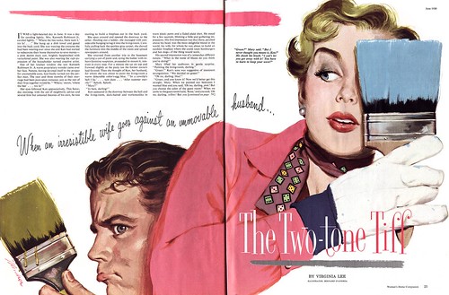
Frederic Varady's June 1950 contribution to Woman's Home Companion really knocks me out! You need to look at the full size version to truly appreciate this gorgeous example of Varady's line art style.
Varady did quite a bit of line art (some of my favourite Vardays are these pieces done for Cosmopolitan magazine) but that doesn't diminish the fact that, once combined with the bold, modern, almost "plastic" colour palette, his illustration above is another great example of the exciting visual experimentation going on at the magazine during that year.
By contrast, the August 1950 illustration below, though still very modern looking for the times, looks rather more dated due to Varady falling back on his more popular painting style.
So why was at least one illustrator in each 1950 issue of Woman's Home Companion trying some sort of experimental graphic approach? There were probably many reasons... and I'll bet one of those reasons was that Al Parker had already done it.
As far back as the mid 40's, when everyone else was still firmly entrenched in the Old School style of picturemaking, Parker was incorporating unusual graphic elements like this into his illustrations. Its often been said that Al Parker was constantly reinventing his style, staying 6 months ahead of his competition, who would invariably imitate the "most popular illustrator in America". Looking at this 1948 piece and this 1949 piece by Parker from Ladies Home Journal, surely Woman's Home Companion's most immediate competition, one has to wonder if the art director at WHC didn't ask his illustrators to try some Al Parker-style graphic experimentation.
You'll find today's pieces at full size in my Frederic Varady Flickr set.
Tuesday, September 25, 2007
Bernard D'Andrea - Graphic Artist
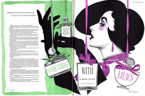
In August 1950, it was Bernard D'Andrea's turn to tackle the "graphic art" assignment for Woman's Home Companion magazine.
He turned in this eye-catching experiment in high contrast illustrative design which is so forward thinking, one could almost imagine Patrick Nagel creating it in the 1980's - at the same time it evokes the era of the Gibson Girl.
D'Andrea remained true to the principles of the New School of illustration: focus on the head and hands, eliminate background environment, use only props relevant to the story, large areas of flat colour that emphasize strong design.
Below is another great example of those principles as rendered by D'Andrea - but this time in his more typical painting technique. It was his WHC contribution from two months earlier. Throughout this run of issues I have, spanning 1948 to 1952, Bernard D'Andrea regularly contributed story illustrations to the magazine. The piece above is the only one I've seen where he attempted this graphic, high contrast approach. In fact, I don't think I've seen another D'Andrea in that style in any 1950's publications.
You may think I'm making too big a deal out of something trivial - but in the context of the times and within the narrow confines of the women's magazine story illustration niche that top piece is genuinely radical!
What inspired Bernard D'Andrea's foray into graphic experimentation? I welcome your thoughts on the matter.
These images can be found at full size in my Bernard D'Andrea Flickr set.
Monday, September 24, 2007
Graphic? Novel!
Something very interesting was going on in the pages of Woman's Home Companion around 1950.
Artists were going graphic.
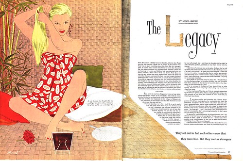
I recently acquired a stack of WHC magazines dating from 1948 to 1952. They all contain the typical 4 or 5 (usually romance) fiction stories that women's magazines carried in those days. Those stories are illustrated by some of the biggest and best names in the illustration business of the day in the usual painting styles, ranging from the Old School approach of Harry Anderson to the New School look of Jon Whitcomb. But only during the year 1950 did the occassional artist, like Dorothy Monet, suddenly cast off their painterly ways and present us with a novel graphic technique like the example above.
Monet did that piece for the May 1950 issue of Woman's Home Companion. By September, she had returned to her more recognizable painting style, below.
What could have inspired this sudden, very forward-thinking shift in visual presentation? It occured in virtually every issue, usually by a different artist each month throughout 1950... then was gone.
This week we'll look at some of those examples and try to figure out what the heck happened.
* Both of today's images can be seen at full size in my Dorothy Monet Flickr set.
Sunday, September 23, 2007
Brenda Wants Your Vote
Brenda Janish loves vintage pinup art. A lot! She's created a cute little video that let's you peek at her massive collection of prints, posters, calendars, ashtrays, - even a toilet seat cover... all featuring pinup art -- and she wants your help: vote for Brenda's video and she might just win 20 grand!
To further entice you to vote for her, Brenda has started an attractive blog where she features art and information about pinup artists like Gil Elvgren, Peter Driben, and K.O. Munson. Brenda offers a free subscriber service, much like the one you can join here, except Brenda will send you a pinup scan every day. Cool!
Friday, September 21, 2007
"It looks pretty rosy in hindsight..."
When Bruce Hettema was interviewing him for his article on the history of Patterson and Hall, Chet Patterson said of Charlie Allen, "Charlie was the best all around illustrator the agency ever had. Better than Stan Galli, and Bruce Bomberger and all the rest."
How does Charlie Allen feel about those days?
"Looking back", says the artist, "the mid-1900's was a great time to be an illustrator...an era when the print media still ruled. Illustration was a small profession...you had to be good to survive. There were magazines, newspapers, billboards, trade ads...all kinds of venues that used illustration...and, like razor blades, they needed continuous replacing."
"The 'Western look' was lead by Fred Ludekens and a bunch of my San Francisco contemporaries.....Stan Galli, Bruce Bomberger, Haines Hall, Willard Cox, Gordon Brusstar, Dan Romano.....and, if I do say, myself. It was partly due to the rugged geography of the west, the 'cowboy' or western tradition, and the need to illustrate for corporations instead of editorial magazines."
"It looks pretty rosy in hindsight....but it represents big time struggles. Job-wise, health-wise, economics-wise, etc.-wise."
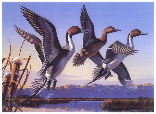
"Finally got some fairly well paying jobs in the early '80s, including the duck stamp prints."
"When the big magazines and even ad illustration (due to soaring TV budgets) bit the dust, a lot of top illustrators were forced to 'head for the hills'....western painting, historical painting, wildlife art (lead by your Robert Bateman), and, as I did, Duck Stamp competitions. Also pheasant, trout, upland game bird art...anything that required a legal stamp on a hunting license. Limited edition prints came into vogue....I've done several...but the trick is to hustle them. Most artists want to create, not sell."
"Change is the only constant", it is said, and the last one third of the century saw huge changes in culture, technology, and communication, which brought print illustration, as we knew it, to near extinction. I feel fortunate and grateful to have been a part of that earlier time when illustration was valued and a part of everyday lives."
"Anyway, technology and a declining market took care of illustration as we knew it. 'Time wounds all heels', or something like that! We're blessed on one common level. It is great to work in a biz that we enjoy doing."
"My thanks to Bruce Hettema who has done a heroic job of assembling, preserving, and promoting the history of Patterson & Hall and the work of its' many talented artists over the years. Also thanks to young people like you, in this digitalized, marginalized, computerized, virtual media world, for recovering and displaying art and illustration as it was in the last century."
*My thanks as well to Bruce, who first suggested that Charlie Allen would make a great subject for Today's Inspiration,made arrangements with Mr. Allen in preperation for the interview process, and provided virtually every scans we've enjoyed this week. As well, many thanks to Charlie Allen for being so cooperative and forthcoming about his career. I can tell from your comments this week that you've enjoyed hearing from him as much as I have.
* All of today's images can be found in my Charlie Allen Flickr set.
Thursday, September 20, 2007
Chas Allen: Same Leopard... Different Spots
I asked Charlie Allen how he dealt with that inevitable time when clients no longer wanted the classic 1950's commercial art painting style he had so thoroughly mastered:
"There were changes, gradually, thoughout those years," he replied. "But the tsunami of the late '60s and the '70s changed everything. We've mentioned the demise of the billboards, magazines, even newspaper illustrations that occurred. Oddly, that followed some technical changes and fads in illustration. Acrylics came into popularity in the '60s and of course illustrators ran away with it....hence the 'swishy' or 'rain' look."
"There were mod looks, hippy looks, and others. Competent illustrators multiplied like rabbits, right at the time the biz folded like a tent."
"Illustrators scattered into teaching, portrait work, limited edition prints, category art, gallery painting....you name it, all kinds of venues. I found enough ad work to stay busy, but noticed the price of illustration going down as the huge inflation of the '70s caused everything else to go up."
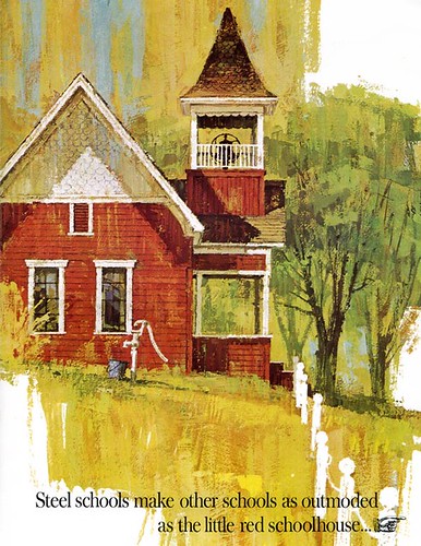
"The US Steel brochure cover of the schoolhouse (below) was a new way of working for me...and I used it a lot later on. Mostly gouache on gessoed board."
" 'Technique' got way too important in those years, however, and illustrators shot themselves in the rear with it. Good sound composition and draftsmanship were neglected. I tried to stay focused on fundamentals."
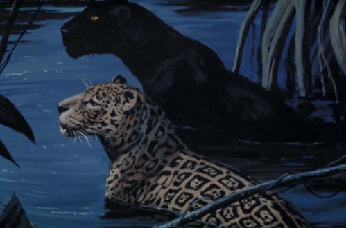
"My style changed as it was needed (you know the old admonition, 'adapt or die'). It got more linear, stylized, and even a bit cartoony at times.....but I always enjoyed trying new things. Still literal....a leopard can't change his spots."
* All of today's images can be found in my Charlie Allen Flickr set.
"There were changes, gradually, thoughout those years," he replied. "But the tsunami of the late '60s and the '70s changed everything. We've mentioned the demise of the billboards, magazines, even newspaper illustrations that occurred. Oddly, that followed some technical changes and fads in illustration. Acrylics came into popularity in the '60s and of course illustrators ran away with it....hence the 'swishy' or 'rain' look."
"There were mod looks, hippy looks, and others. Competent illustrators multiplied like rabbits, right at the time the biz folded like a tent."
"Illustrators scattered into teaching, portrait work, limited edition prints, category art, gallery painting....you name it, all kinds of venues. I found enough ad work to stay busy, but noticed the price of illustration going down as the huge inflation of the '70s caused everything else to go up."
"The US Steel brochure cover of the schoolhouse (below) was a new way of working for me...and I used it a lot later on. Mostly gouache on gessoed board."
" 'Technique' got way too important in those years, however, and illustrators shot themselves in the rear with it. Good sound composition and draftsmanship were neglected. I tried to stay focused on fundamentals."
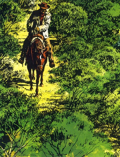
"My style changed as it was needed (you know the old admonition, 'adapt or die'). It got more linear, stylized, and even a bit cartoony at times.....but I always enjoyed trying new things. Still literal....a leopard can't change his spots."
* All of today's images can be found in my Charlie Allen Flickr set.
Wednesday, September 19, 2007
Chas Allen on West Coast Auto Art
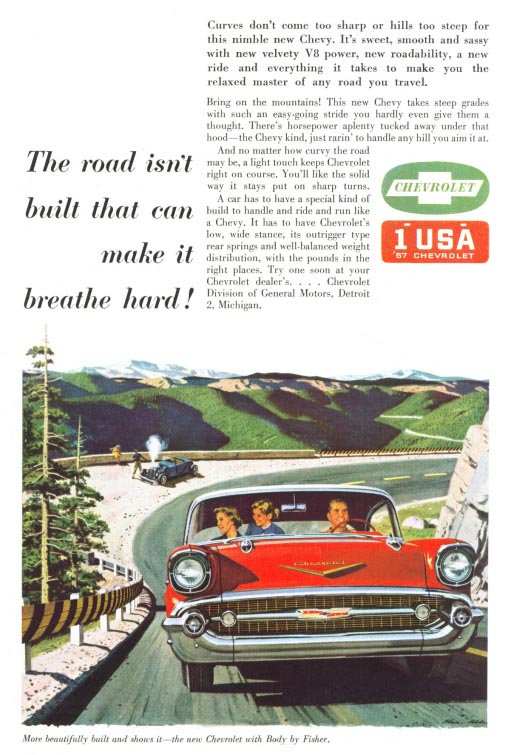
As a rule, it was typical during the heyday of illustrated automotive advertising that artists worked in two man teams: one doing the technical elements (the car or truck) and the other handling the figures and environment. Certainly the most famous automotive illustrators of those times, Art Fitzpatrick and Van Kaufman, and later Bernie Fuchs and Ben Jaroslaw, worked in this manner. Even in Toronto, when Will Davies was illustrating automobile ads for the Canadian market, he worked with a favourite technical artist named Dudley Whitney.
Not so on the West Coast. I asked Charlie Allen about the nature of the auto illustration business in San Fransisco when he, Fred Ludekens, Stan Galli and Bruce Bomberger were regularly setting their signatures to artwork for Chevy and other car manufacturing clients. His informative narrative, full of interesting and amusing anecdotes, begins below:
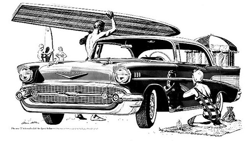
"On auto art.....my first was a Chevy ad, a B&W. [Fred] Ludekens was too busy, and I got it. Sweated blood, sweat, etc. on it.....and it turned out OK. Don't even have a copy today, and wish I had. A lot of my early work was like being thrown into the lake and told to swim for it....when you had just learned to dog paddle. Probably for the best."
My first Chevy full color job came much as the first B&W...a complete surprise. A double page spread, it was a profile side view of a '55 two-toned (pink and charcoal grey) Chevy with the then new 'wrap around windshield. White sidewalls of course. No scene, but against the white background, top hats, white gloves, confetti, serpentine, etc...a celebration or coming out party. Simple, but turned out well."
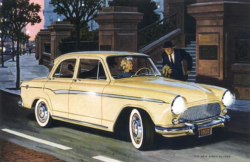
"Later on I did some Mercury and Simca ads, but Campbell-Ewald and Chevy were our main car source."
"You mentioned the AF/VK team. Those guys were phenomenal. No way here....altho' I did paint a Buick station wagon for Stan Galli, that he finished a scene around. He griped about it for years! But, hey, most artists just don't think alike. Also had to 'repair' a Ludekens Chevy job once. He couldn't draw girls for sour apples, and I grudgingly 'improved' his figures. We, that is I, took my own shots of Chevrolets, usually at our local dealership. They were cooperative, but didn't have a clue!"
"I found out early to not draw a car the way it photographed. You had to tuck the wheels, stretch width and length.....but very carefully. Too much was as bad as too little. Detroit liked their cars low, wide and long in those days. When I see one on the road these days, they are true dinosuars."
* All of today's images can be found in my Charlie Allen Flickr set.
Tuesday, September 18, 2007
"From the git-go I enjoyed drawing."
"I was born in 1922 (85 this year) in Fresno, CA", writes Charles Allen. "From the git-go I enjoyed drawing. A couple of efforts, at age 9 when I was fascinated by comic strip artists, are enclosed."
"Like Chet Patterson of P&H (whom you've covered recently) I enlisted in the Army Air Force in 1942 while in college. Served for three and a half years as a pilot during WWII...but unlike Chet, shot down no enemy aircraft. Hard to do in an unarmed PBY Catalina in an air-sea rescue group, Pacific theatre. Main accomplishment, surviving."
"Returned home in 1946, finished college, got married, worked as an ad illustrator for the Fresno Bee, a McClatchy newspaper. Attended Art Center College in L.A. for a year, got a job in 1948 at Patterson & Hall in San Francisco as an illustrator, at the princely salary of $275 per month. In those days, a new car ran about $1,200 and a new home, $10,000 to $12,000, so all was in proportion."
"I learned all along the line...high school, college, Art Center, an ad agency job during college, the newspaper job, and a crash course at P&H in San Francisco, where competition with 'the best in the west' was very, very real. The 'crash course' was actually learning on the job...and in between jobs, practicing on samples. Busy times."
"One of the many reasons I decided to remain in the west with advertising illustration, instead of heading east and editorial illustration [was that] there were so many good illustrators back there, all wanting to do editorial. Advertising actually paid better, and if you could stand the deadlines and pace, almost as much fun. Well, sometimes as much!"
Patterson & Hall was a great learning place and launching pad. I worked for the first ten years at P&H offices in San Francisco, then moved out to my small home studio, mainly to avoid the two or more hours of commute each day."
"Over a roughly 45 year career, about two thirds of my work came through Patterson & Hall, the rest freelance, but P&H was always a loyal sales, support and promotional group over those years."
"I did no editorial or story commissions.....all corporate ads from ad agencies or direct with the company. I was impressed by all the good illustrators and tried to 'think' like Al Parker, Rockwell, Jon Whitcomb, Austin Briggs, etc. Found it way too tiring, and with short deadlines, just did what came naturally. That way you develop a style all your own."
* All of today's images can be found in my Charlie Allen Flickr set.
Monday, September 17, 2007
"Charlie could do it all."
"I was reading a thread in the blog about illustrators being pidgenholed by style," wrote Bruce Hettema to me in an email some months back.
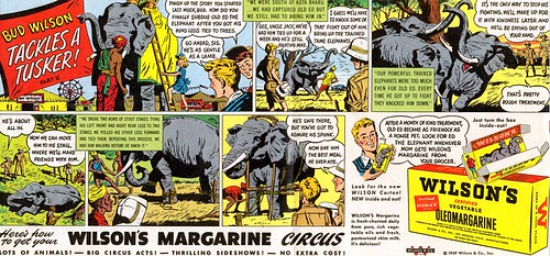
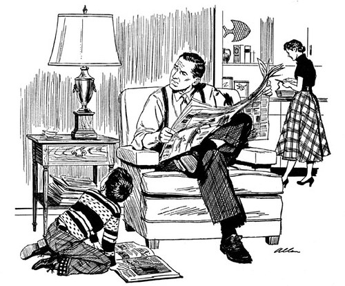
"Here are some samples by Charlie Allen who worked at P&H from 1950 through the 80's and even into recent years on a freelance basis. Charlie could do it all. Cars, beautiful women, rugged men, kids, animals , products - in full color and B/W."
"I think he's one of those unsung greats of illustration, and would make a great future blog subject."
I asked Tom Watson (whose eloquent comments and analysis on a variety of topics have greatly enhanced this blog in recent months) about Charlie Allen... and his enthusiastic reply will serve as a far better introduction to this week's topic than anything I could have hoped to write:
Charlie Allen was one of the top illustrators in S.F., when I started my career in '63. His reputation was huge for his incredible craftsmanship and draftsmanship. His pen and ink drawings were unsurpassed by anyone in the business.
For newspaper reproduction, pen and ink drawings were crisper and had more punch than a halftone reproduction from photography. This was due to the low quality paper stock, cheap plates and mass production printing methods for newspaper's very high volume. Charlie mastered a pen and ink technique with maximum skill and great impact. Using just a series of lines, he could visually create a full range of tones... giving dimension, sculptural volume and a wide variety of lighting effects. Leif, his great command of pen and ink might be an area you can focus on.
He could illustrate something as uninteresting and dry as a hand holding a bottle of whiskey, and it would be a thing of beauty. His people were very real and very carefully and accurately drawn, and when his full color illustrations were very clean. He was the consummate professional advertising illustrator. When Charlie Allen was assigned a job, there would be no doubt, what so ever, that the job would be perfect in every way.
In those early years of my career, I would see Charlie Allen illustrations, (usually in b/w pen & ink or 2 colors) in S.F. published magazines or S.F. newspapers. His incredible skills were so superior to other illustrators, that I could recognize his work, even if they were not signed. In those days they would sometimes delete the illustrator's signature on advertising illustrations, for whatever reason... very annoying to us illustrators, since it was one of our best methods of advertising ourselves. Every time I saw a Charlie Allen illustration, it was a reminder that I had to work harder than ever as an illustrator to continue improving... a real inspiration. For me, he was a beacon of quality in a very competitive small San Francisco market.
Some illustrators, who were into experimental approaches or a more decorative style of illustration, may not have held Charlie Allen in such high esteem as I, but I never personally heard a single criticism of Charlie's work. It seems to me that it's pretty hard to criticize something that has so much going for it... and just because it was not on the cutting edge of illustration in the 60's, didn't seem to matter much. He seemed to always be in demand.
Excellent quality speaks for itself, and Charlie Allen's work was a loud voice in advertising illustration.
My thanks to Tom Watson for his thoughts on Mr. Allen's work -- and to Bruce Hettema for facilitating this week's topic. As you can imagine from reading Tom's words, you have barely begun to see what Charlie Allen has accomplished over the course of his career.
Tomorrow: a look at Charlie Allen's classic 50's painting style.
* Today's images can be viewed at a larger size in my Charlie Allen Flickr set.
Friday, September 14, 2007
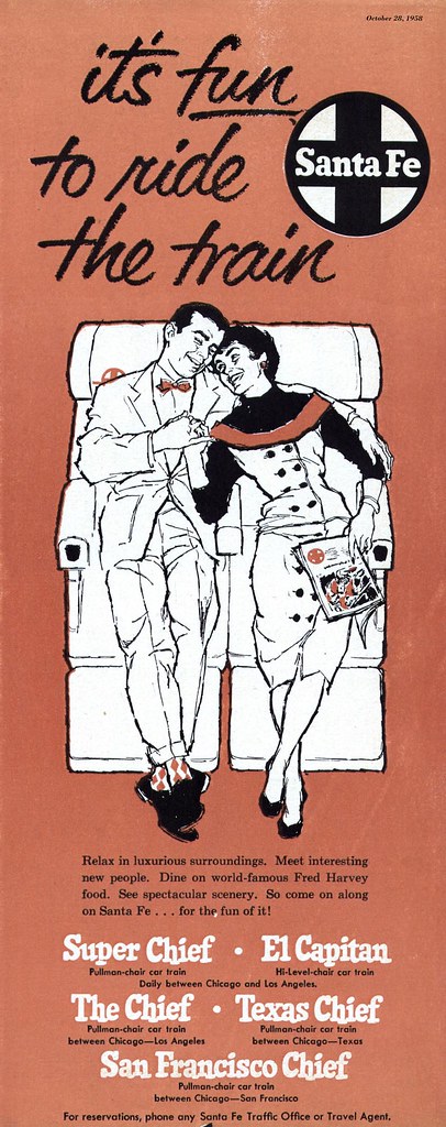
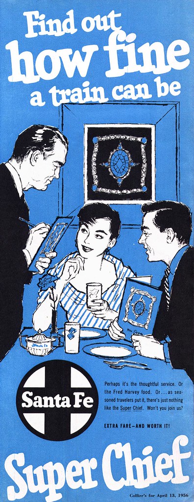
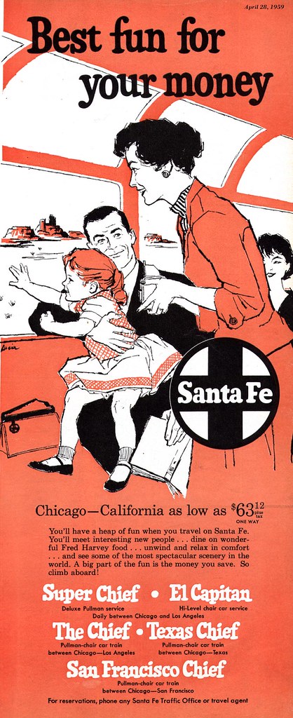
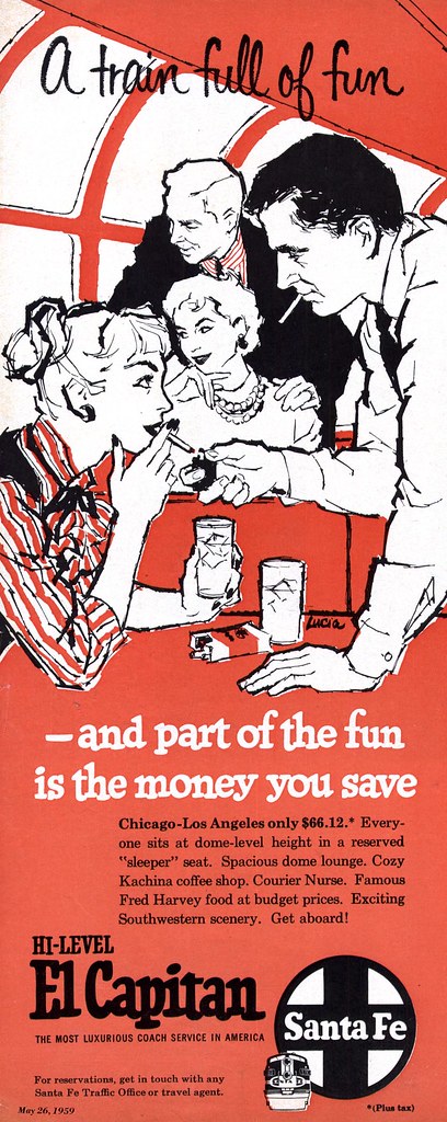
Lucia Lerner: Snapshots from a Passing Train
"Did I mention your site came up somewhere along the line after I put Lucia's name on Google in hopes of finding out if she was still around? And this was probably the first I had thought of her in several years."
That's what Will Nelson wrote in one of his first emails to me as he began relating the story of his early days at Stephens, Biond, DeCicco studios in Chicago in the 1950's.
"All of this brings back vivid memories of the studio and the wonderful experience it was."
"We occupied the top 7th floor on Ohio St. Just a block off Michigan Ave. Next door to the studio was a upstart publishing group with a new magazine called Playboy."
"Barry Stephens constantly sought new samples from all of us to show in New York. I was sent to New York for a couple of months to work on large toy project requiring extra hands. Getting work out of New York was considered a major accomplishment...and Lucia did do well."
"I think [Lucia] may have come from the same previous studio base as Reno (Biondi) and Frank (DeCicco). They had worked together prior to starting SBD."
"Lucia [moved] to the L.A. studio (SBD) when she left Chicago. Dan Toigo (he was featured a few years later in the American Artist magazine for his watercolors) went at the same time. I saw both of them a year or two later at SBD in L.A. while on a vacation trip. As I recall, Lucia was immediately in demand in the high end fashion market...I. Magnin, Bullocks, etc. I assume she fell back on her considerable fashion skills."
"I lost track of her after about 1960. I just don't know if she is still with us or not."
*All of today's images can be seen at full size in my Lucia Flickr set.
Thursday, September 13, 2007
Lucia Lerner: Maverick
"It's only these last few years that I have come to appreciate just how young I was when I was on staff with the Stephens, Biondi and DeCicco Studios," wrote Will Nelson in his first long letter to me. "Through an extraordinary sequence of events I went from Art Center College, Los Angeles, to the SBD studio headquarters, Chicago, in less than six months. I was on staff with a group of artists fifteen to twenty years older than me."
"Being single, I was on my own in Chicago. My time spent in the studio with the staff ended after 5:00. Lucia was an exception...she invited me to some of her friends' poker games."
"She had a male friend at the time whom I only met a couple of times (he was a reporter with the Chicago Tribune)."
"Lucia had a daughter she was raising on her own. She was very private about her so I can't add much more. I think she was about 12 years old at that time... around 1956 or '57... but I can't be sure."
Reading this last part of Will's correspondence felt like a bomb going off.
Having read this week's posts up to this point, I'm sure you must have felt, as I do, that Lucia Lerner was not only an exceptionally talented and successful illustrator, but a strong-willed and confident woman, determined to succeed despite the hurdles of prejudice and chauvinism that she must surely have encountered in the "man's world" of commercial art.
To discover that she was dealing with the additional challenges of being a single mother in 1950's America is truly stunning -- and only makes me admire and respect her all the more.
The dictionary defines a "maverick" as "a lone dissenter, as an intellectual, an artist, or a politician, who takes an independent stand apart from his or her associates." There is no doubt in my mind that Lucia was a maverick.
Younger people may find my emphasis of this point a little odd... but anyone who grew up even as late as the 1970's, as I did, will probably recall how rare it was to know a kid who came from a single-parent household - and the stigma attached to that situation.
Go back another 20 years and try to imagine how daunting it would be to step out the door each morning and face the societal attitudes of America in the 1950's. I think you'll begin to appreciate what I'm getting at.
Knowing now that Lucia Lerner was a single mother, I can't help but look back over her body of work and take note of how often she created scenes of mother and daughter - with no man present. As Tom Watson wrote in his comment on yesterday's post, "perhaps her feminine point of view gave her an advantage on certain assignments".
And perhaps assignments such as these seen here today were all the more meaningful to her considering her unique personal circumstances.
Full size versions of these images can be seen in my Lucia Flickr set.
Subscribe to:
Posts (Atom)