
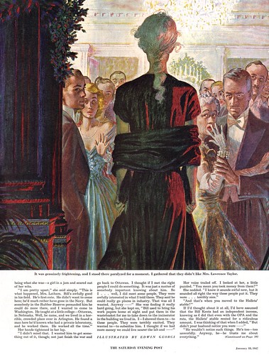
Georgi's illustrations positively shimmer with tiny sparkles of colour - a quality that perfectly suits the sophisticates that so often populate his scenes.
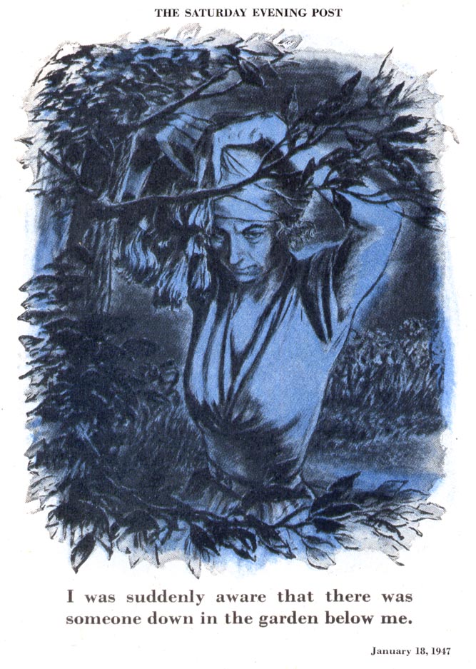
By contrast, when the artist turned in the occassional unadorned spot, like the one below, it was even more startling because it is so 'un-Georgi-like'.
Georgi's powerful design sense should not be overlooked. He used colour, light and shade to create strong contrast in his compositions that catch the viewer's attention, then force closer examination. The eye is compelled to scrutinize the nooks and crannies of each piece by Georgi's sumptuous colour patterning.
My Edwin Georgi Flickr set.
Yeah, I've always been curious about Georgi's color choices. They're just so bizarre and they work really well.
ReplyDeleteI had this one image of a girl in a car, and the sunlight is hitting her at this odd angle and he paints a yellowish gray where you'd think he'd just use a cool yellow. But with the other colors next to it, it reads perfectly well.
=s=
maturg
ReplyDelete