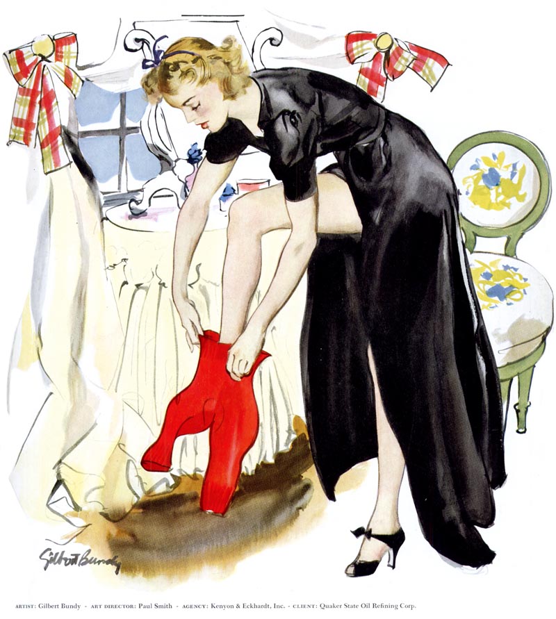
Gilbert Bundy drew very well. We can presume it was on the merit of its lovely, sensitive drawing quality that the Bundy piece below was chosen for a rare full colour presentation in 1940 New York Art Directors Annual (that is to say, I doubt it was selected on the merit of its clever concept!). Bundy's drawing did not, however, earn him an Award of Distinctive Merit.
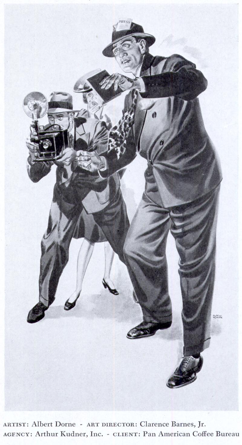
Albert Dorne was also excellent at drawing. He had three pieces accepted for inclusion in that same Annual. None of them received an Award of Distinctive Merit.
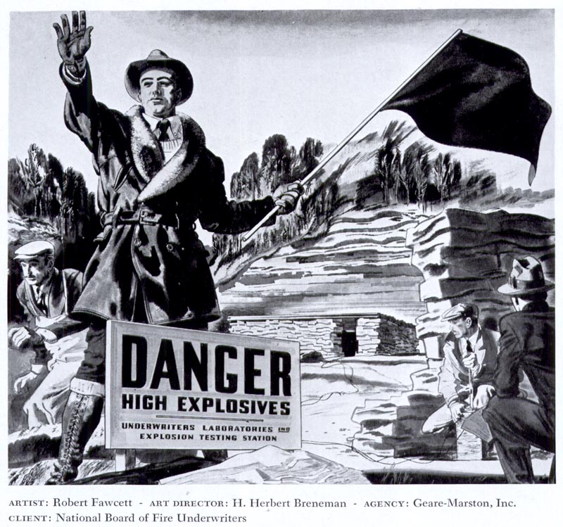
There are a lot of big names in the 1940 Annual: Lyle Justis, Melbourne Brindle, James Williamson, Leslie Saalberg, ...
... and Robert Fawcett, excellent draftsmen all. None of their pieces won The New York Art Directors Club Award of Distinctive Merit for 1940.
But this piece did.
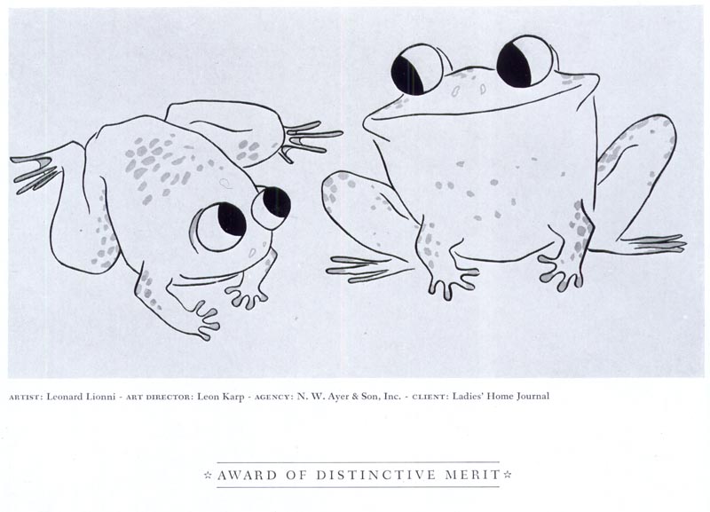
Huh?
Can't say that I don't notice similar trends in some of today's annuals...but to each their own.
ReplyDeleteHilarious post though!
Sometimes simple communicative drawings say more....but in this case it's just a banal drawing.
ReplyDeleteI'm with Francis on this one...
ReplyDeleteI like the frogs better, actually. But I'm surprised the jury did back then.
ReplyDeleteAgree with Francis, I wonder how long it took to draw the frogs!
ReplyDeleteSo,..nothing ever really changes......
ReplyDeleteThere goes my blood pressure....
ReplyDeletehaha! Good post. I'm with Francis on this too.
ReplyDeleteI'm sure you're right that Bundy's "lovely, sensitive" drawing quality was a reason for singling his picture out, but knowing the NY Art Directors of 1940, I'll wager that glimpse of thigh didn't hurt either.
ReplyDeleteI agree with you that the choice of the frogs is baffling, but I figure that a certain percentage of those awards were for sentimental or political reasons. I am equally baffled by some of the recent "Hall of Fame" votes by the Society of Illustrators. There will soon be more illustrators in the hall of fame than out of it. In both cases it's just weird group dynamics that will mystify future generations.
...art directors!!
ReplyDeleteThat last image is killing me... and I'm not trying to say that only representational art should be admired. However... there's such a thing as simple, stylized, graphic images...which can be great, and then there's just a bad drawing.
ReplyDeleteBut I guess you also have to take into account the climate of the industry at the time, so who knows.
i like the frogs. i love all the great illustrators out there but sometimes you gotta go with what's more interesting to the eye.
ReplyDeleteIt doesn't surprise me that a bunch of A.D.s, even in the 40s, would choose a design oriented drawing over a full blown traditional literal illustration for an award. Lets face it, they're generally not into draftsmanship or portraying "in the box" reality for their awards. They have always been more design oriented. However in the 90's, art students learned how to produce computer art, but most couldn't draw worth a damn. After they graduated, they couldn't find good jobs in the ad agencies, because of their lack of communication skills in drawing. As a result, myself and other working illustrators were asked to teach basic drawing classes part time at the Academy of Art in San Francisco. Every student had to take it, regardless of their major. Half the students in class were whiney cry-babies that didn't have a clue why they needed to learn some basic drawing skills... and complained about every assignment. Many art schools were so dumbed down that they no longer had portfolio requirements to enter their schools... just show up with their tuition.
ReplyDeleteIn the past, good draftsmanship was EXPECTED from the successful illustrators of the day, and not something that was unique or remarkable... but simplistic design oriented drawings were considered more "arty" and out of the norm. I was part of a group of 3 judges for an art show, and the other two judges placed little importance on good drawing or traditional painting skills. Actually, if it was well drawn and the more it resembled a recognizable subject, the less interest they had in giving it an award. They were drawn to the "arty" pieces. Unfortunately change alone often trumps substance.
Tom Watson
Thirteen is unlucky....so, must make it fourteen! Right on, with all those 'judgmental' comments....and Tom, as usual, has eloquent commentary on the foibles of the 40's and NYAD judging. My take, ALL judging is subjective....think of Olympic diving, gymnastics, skating, et al. The 'Idol' series, 'Dencing around with the stars', whatever. I never seem to agree with the judges....in fact, accuse most as biased. Bottom line....just do the very best you can, and ignore the pundits!
ReplyDeleteThere's simple and there's banal.
ReplyDeleteBut ask yourself this, which of these illustrations was the more ground-breaking at the time?
And BTW this wasnt a drawing contest was it?
1940? I didn't realize crack had been invented yet. Live and learn!
ReplyDeleteI find the last couple of Society of Illustrators annuals have been consistent but not the Bologna Fair annual or the Spectrum annual.
ReplyDeleteAs for the frogs I think there is a tendency for juries to get excited about trends in illustration, or maybe Kyle2 is right and it was groundbreaking at the time.
There is an interesting thing going on in comic books right now where people are trying to remove all emphasis on drawing skills and place all the emphasis on storytelling. Young artists are still being discouraged from developing strong drawing skills.
On page 76 of that same annual, one can see all the illustrations in the context of the ad they appeared in. After looking at that page, I would have voted for the frogs, too, based on its ability to catch the eye, its congruity with the headline "A Frog , He Would A-Wooing Go", and its humor.
ReplyDeleteLeo Lionni, the illustrator, also won four Caldecott Honors for his children's books.
Having said that, if I had to choose one picture from that annual not for its ability to communicate but for its ability to beautify my wall, it would be a Melbourne Brindle.
Tris Mast & Kyle2 have a point.
ReplyDeleteIn the end it is all about catching the eye.
As far as iconic goes though, the frogs hold zero point zero interest.
Hm. I don't think the frog drawing is very impressive on any of these counts....
ReplyDeleteground-breaking -- Simple drawing had already been popularized by such artists as Ralph Barton, James Thurber, Garrett Price, Gluyas Williams, Peter Arno, etc, many years before this drawing appeared.
eye-catching -- The bold reds, stark blacks, and pretty legs in the Bundy drawing add up to a more eye-catching image.
congruity with the headline -- It doesn't require prize-worthy insight to illustrate a "frog wooing" headline with a picture of frogs wooing.
humor -- The image falls short of its humorous potential. Imagine what Chuck Jones any number of Mad artists might have come up with.
I'd have to go with the "sentimental or political reasons" David hypothesized as to why they chose this image. Maybe the judges welcomed its light romance in that tense, pre-war climate? Maybe they grew desensitized to the sea of more ambitious drawings and saw this one as a breathe of fresh air, mistaking its novelty for merit?
Makes me wonder what won the following year.
Leo Lionni was also an art director (I believe for Fortune Magazine).
ReplyDeleteSmorgasbords forever! Allow me to quote three icons of truth and wisdom: Lisa Minelli....'Life is a smorgasbord, old friend'...(well, close!). Pete Segar and 'Popeye' in the 30's....'I yam what I yam'. Finally, Dr. Seuss....
ReplyDelete'And I will eat them in a rain'
And in the dark. And on a train
And in a car. And in a tree
They are so good, so good, you see!
I do so like
Green eggs and ham!
Thank you, thank you
Sam-I-am!'
I would second Tom Watson's comments. There is little stomach anymore for the hard work that good draftsmanship requires. And more disheartening, to distinguish twixt good & bad draftsmanship requires a good eye and that is something that money can't buy … nor good connections … nor the latest Mac setup.
ReplyDeleteLadies and Gentlemen, that's my best pal! :^)
ReplyDeleteI wanted to officially apologize for my calling the frogs a "bad drawing". I sometimes get caught up in the idea that more realistic drawing is being steadily devalued in our society, but that's not really fair. In reality I think people can appreciate any type of art as long as it speaks to them in some way.
ReplyDeleteWhat I should have said about the frogs is that I personally don't connect with that drawing, but that doesn't make it "bad". I need to remember that as artists we are all confronted with the same pressures, insecurities, and judgements, and we should show everyone else the respect we would hope to receive.
Well put, Keith - no apology necessary, but as a clarification, VERY well put! :^)
ReplyDelete