In 1979, I received a commission to do three marine paintings for Matson Navigation Company for an expensive centennial brochure. In the brochure four illustrators had been commissioned to do two illustrations each. Carl Evers was the first selected, and he was to do the lead off paintings. His first, shown here, was a modern container ship, the ‘Kauai’, entering Hawaiian waters.
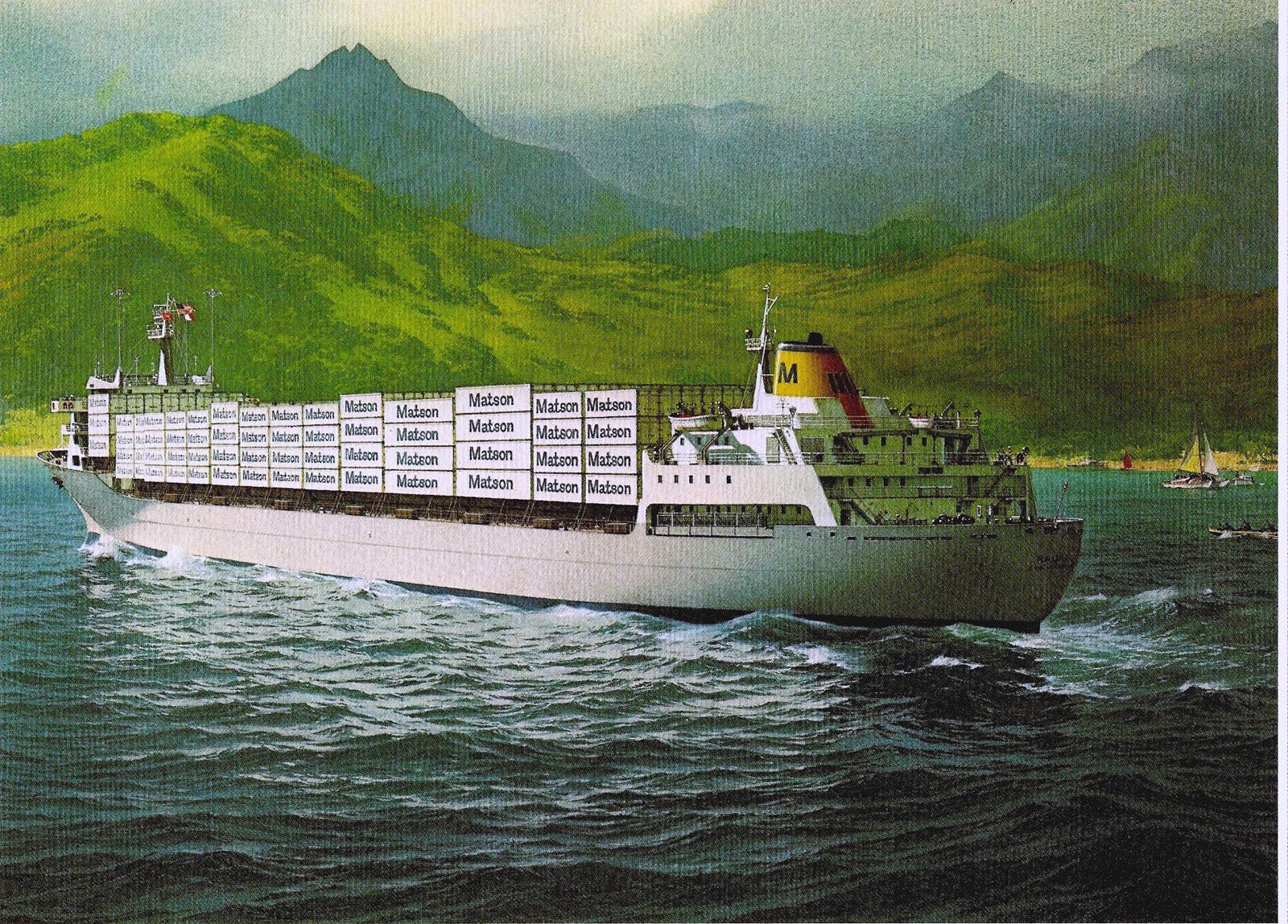
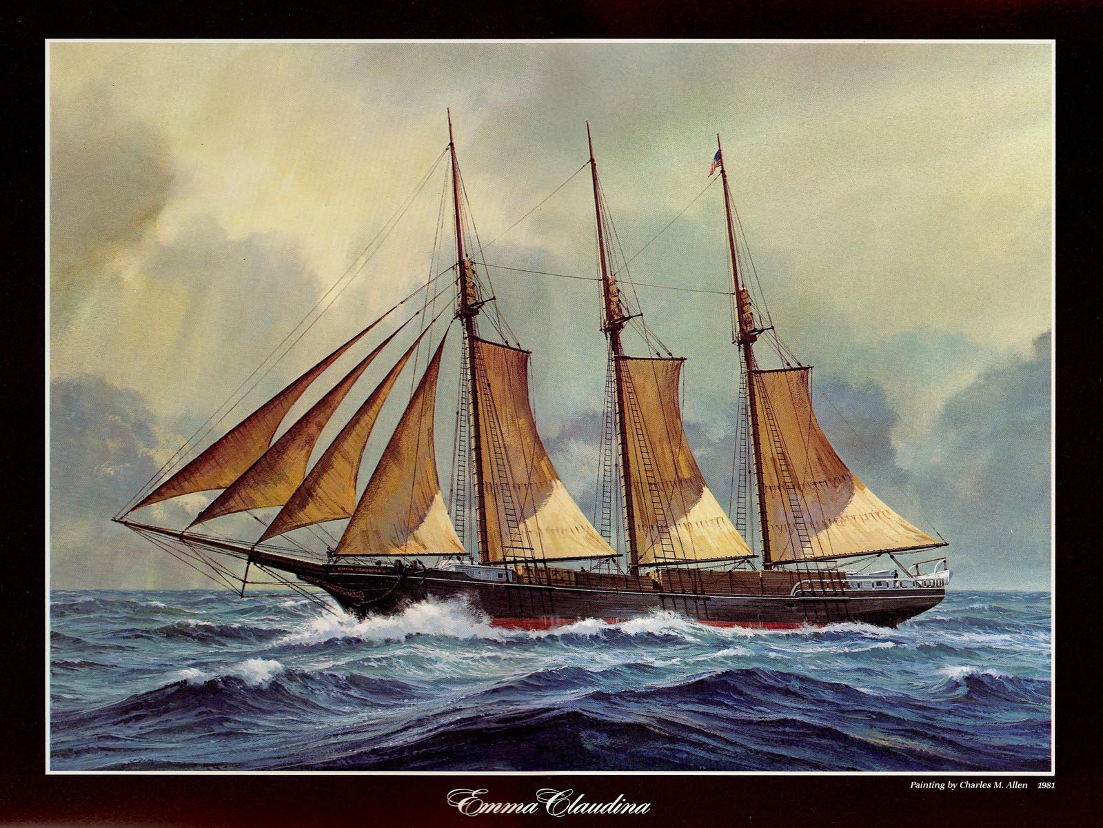
It contained on board dozens of containers each with a small Matson logo that had to be included. Evers was 82 at the time and complained that his hand cramped up badly, and he requested someone else to do the second illustration. I was the illustrator selected, and the subject turned out to be the “Emma Claudina”, Matson’s first sailing ship in 1882. It was a challenging and historic first assignment.
Carl Evers was born in 1898 in Germany, his British father a marine engineer, and his mother an artist. He had early training at Slade School of Fine Arts in London, then later spent several years studying in Sweden before coming to the US in 1947 following the war. His accurate and beautiful work caught on immediately in New York, with advertisers and with commissions from other clients.
These scans, from a soft cover book, “The Marine Paintings of Carl G. Evers”, a Peacock Press/Bantam book* published in 1975, demonstrate his amazing skills at portraying the sea. The reproductions of the paintings and illustrations are beautiful and are too outstanding to not be shared with young digital viewers that haven’t had the opportunity to see some of Evers work.
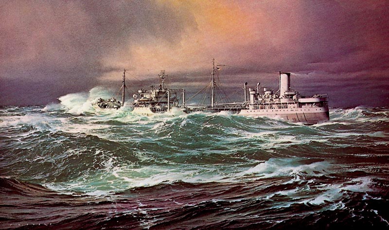
First, one of my favorite paintings displaying Evers’ skills at dramatizing and rendering the ocean is this painting of a Navy oiler in WWII, the 'U.S.S. Kennedec' in rough seas.
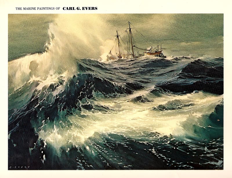
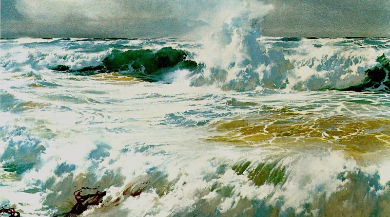
Then as a contrast the next example is titled “Caribean Surf”. I will run out of superlatives early trying to describe these paintings, but this example is a “tour de force” gouache painting of a rough surf.
Compare these to this early clip from my Evers file. It's beautiful work…
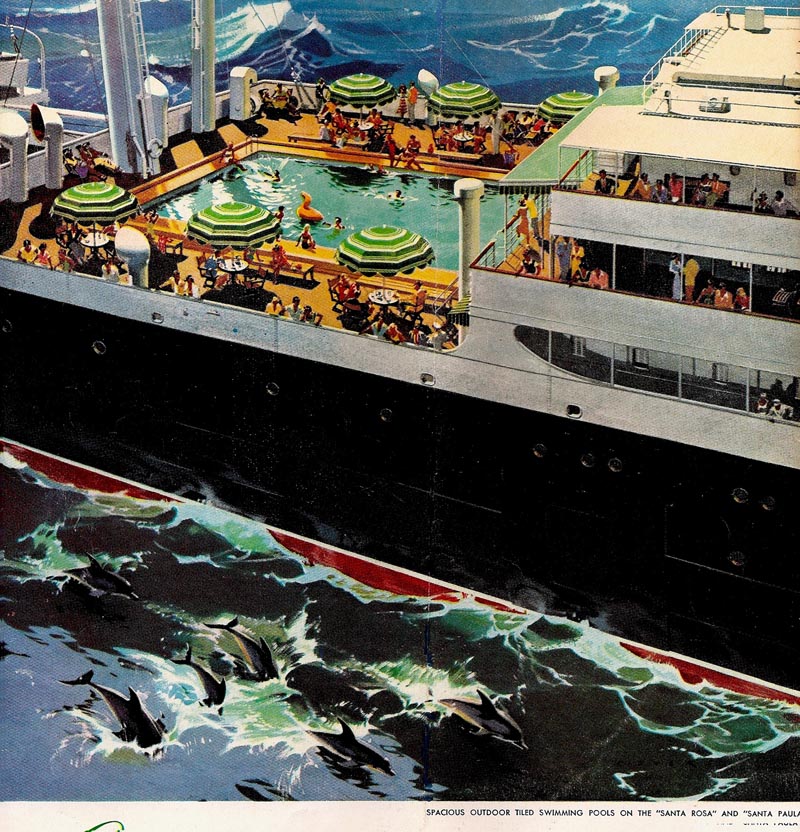
... but not revealing at the time (to me) the amazing scope and talents of Carl Evers.
* My many thanks and credits are offered to the Peacock Press publishers for the opportunity to show some examples of this amazing body of work. - Chas. Allen
Continued later today...
Thanks for sharing this, Leif. It's been years since I was in art school, pouring over his book. Evers had an uncanny ability to paint water.
ReplyDeleteBeautiful work, as you point out Charlie. I particularly like the contrast between his soft wet into wet skies and the white foam in the water, complimented by crisp harder edges and rich dark tones of the vessels, and the sea. I have seen that striking contrast many times while cruising the Mediterranean and Atlantic Seas. Certain times of the day or evening and in stormy weather, it is really breathtaking. Evers captures it with all its drama, besides being an outstanding technician.
ReplyDeleteIMO, that balance of objectivity and subjectivity is the perfect combination for a high quality illustration or fine art painting. It goes well beyond simply photographic realism.
Thanks Charlie and Leif, for another presentation of great illustrations / paintings.
Tom Watson
Thanks to Kyle and Tom for the comments....and as always, Tom, yours is a fine analysis of Evers paintings. To refer back to Edgar Whitney's forceful quips and advice....'You get facts from photographs....you should get art from artists.' Evers paintings are always art. So dramatic and beautifully designed, they make photos almost boring. I've taken hundreds of shots of ocean and surf, especially on the Monterey coast. Beautiful, but always needing the editing, selection, composition and design, and the 'carefree' touch in rendering if used for painting reference.
ReplyDeleteI'm astounded at the results Evers achieves using gouache! Can you shed any additional light on his method? Is he using illustration board or watercolour paper? Winsor and Newton Designers Gouache or something else? Any specific info would be much appreciated, thanks!
ReplyDeletePETE....I agree....Evers control over the gouache medium is astounding. Add to that, his amazing abilility to use and to dramatize waves, foam, ocean water, and skies, to his bidding....well....it's pure talent and hard, thorough work and study. As to technique, and I'm guessing, his paintings and illustrations were gouache, masterfully used in both thick and thin, and done on Whatman illustration board. Nothing fancier. He demonstrates with gouache how the most talented artists, in music, let's say Benny Goodman, can excel over even recognized professionals by miles!
ReplyDeleteThanks, Charlie. It's always amazing to me how some artists can get gouache to look as rich and vibrant as oils. The surface that one works on can make quite the difference. I have yet to find the "ideal" surface myself, as no illustration board has never seemed absorbent enough for my liking.
ReplyDeleteEVER seemed, that is....sorry for the typo!
ReplyDeleteTruly "amazing" artist (and book). Thanks for these 2 posts.
ReplyDeleteThank you all for your contributions on Carl Evers work. I've tried to get the hang of his technique and found working on Arches 300lb rough paper gives me the sparkle on the water as well as the little spume shapes as I brush the strokes on for the sky reflections in a dry brush manner. This is best done over a initial watercolor wash. The color of the sky is most evident in the trough of the wave. Guy Corriero
ReplyDeleteI've got his book. Evers is truly a great artist that expressed far more than photo-realism or illustrative technique. His knowledge to create compositions that resonate with clarity shines a light deep into the soul of fine art. I would put him above Homer & Sargent for his watercolors, and Turner would pay tribute to Evers' stormy seascapes.
ReplyDelete