Thursday, October 28, 2010

Ben Stahl's Beginnings

Ben Stahl was a self-taught artist. He was born in 1910 in Chicago. At age 16, Stahl was exhibiting in the International Watercolor Show at the Art Institute of Chicago (where he later taught and lectured). At age 17 he got his first job in a Chicago art studio as an errand boy.

Stahl58

Like a freight train hurtling down the track, Ben Stahl's early career sped along with singular purpose. Within 5 years he went from errand boy to apprentice to full-fledged advertising illustrator at one of Chicago's top art studios.

Stahl33

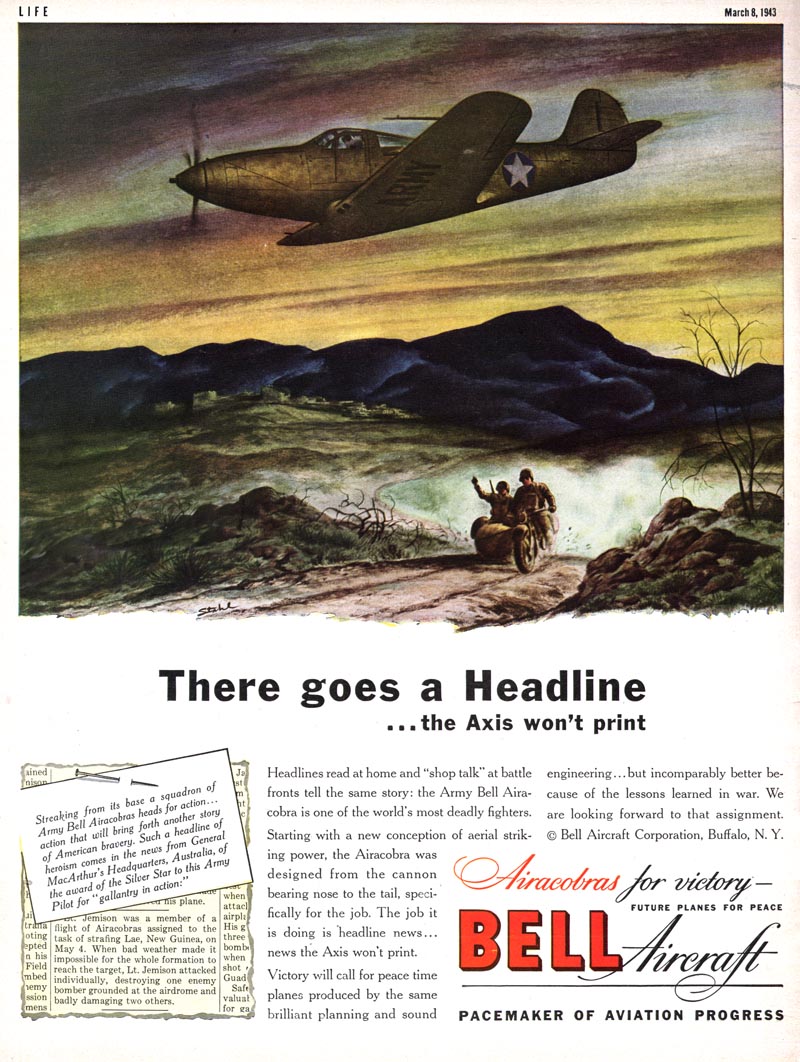
In 1937 one of Stahl's advertising illustrations was noticed by the art director of the Saturday Evening Post. Stahl was subsequently offered the first of what would become over 750 assignments spanning thirty years.

Stahl60

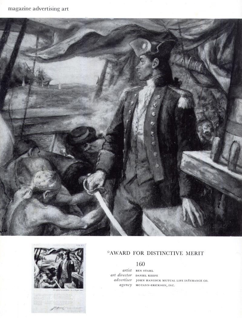
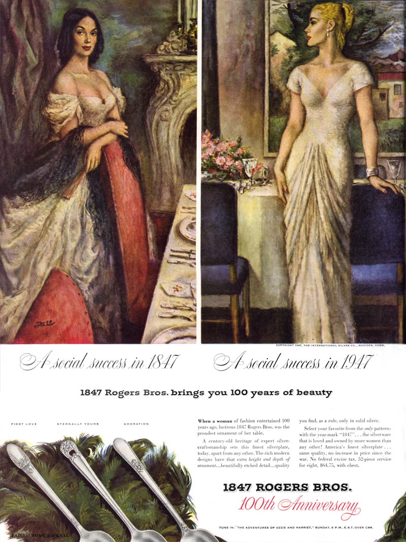
Ten years later in 1947, when the piece below was included in the NY Art Director's Annual, Ben Stahl had moved to Westport, Connecticut where he lived and worked alongside many of America's most successful and well-known illustrators.

Stahl36

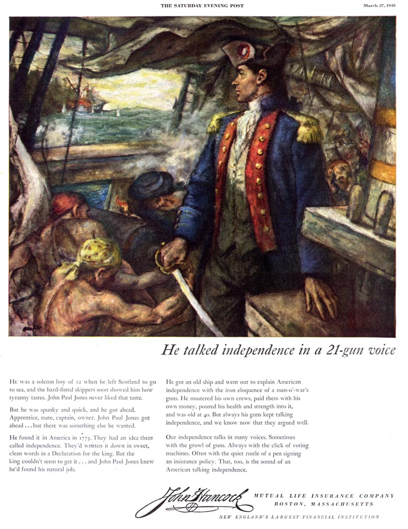
(Here's the same piece in colour as it appeared in magazines that year)

Stahl37

To say the self-taught, former Chicago art studio errand boy had arrived would be something of an understatement.

Stahl30

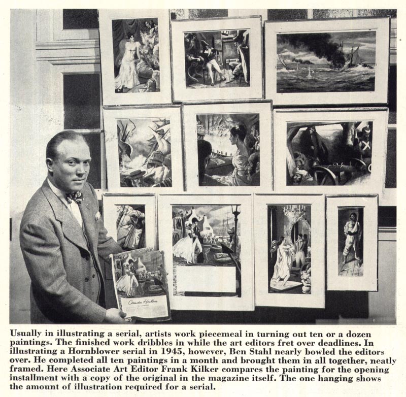
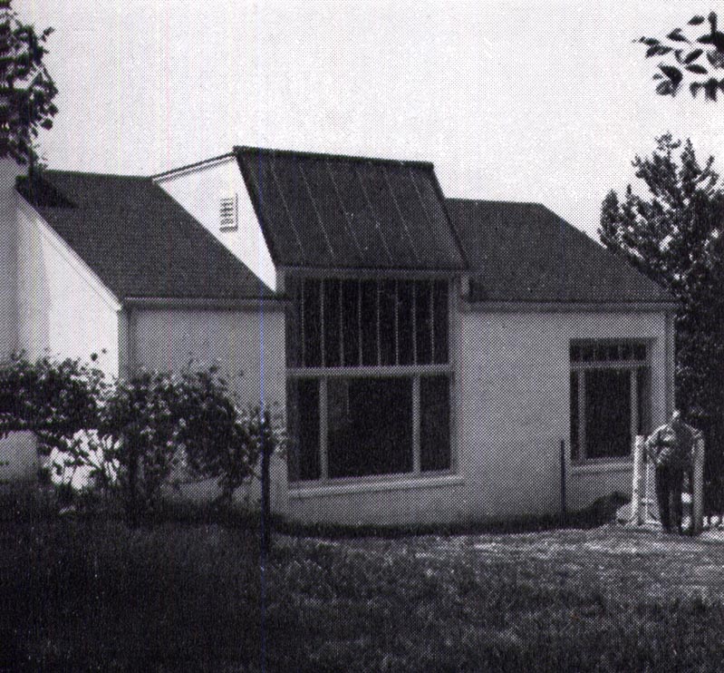
By the time he moved to Westport, Stahl could afford to build a studio behind his house that most illustrators today could only dream of.

Stahl62

It included a shipping room, photographic dark room, library, a separate studio for his assistant, a screened-in sun deck...

Stahl34

... and a built-in doghouse larger than Stahl's former workroom itself.

Stahl61

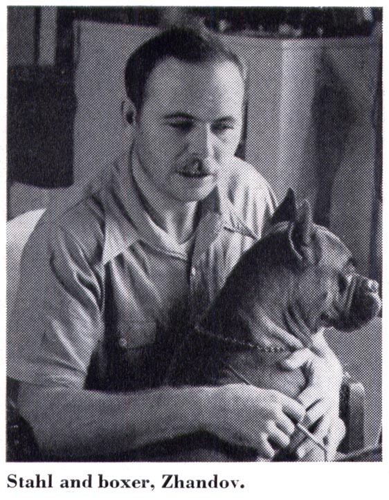
For his profile in Ashley Halsey Jr.'s 1951 book, Illustrating for the Saturday Evening Post, Stahl remarked, "The carpenters who did the job told me that if the doghouse alone were built in New York City, I could have rented it for $100 a month at the time."

* My Ben Stahl Flickr set

Monday, October 25, 2010

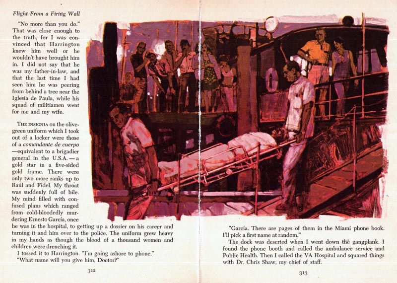
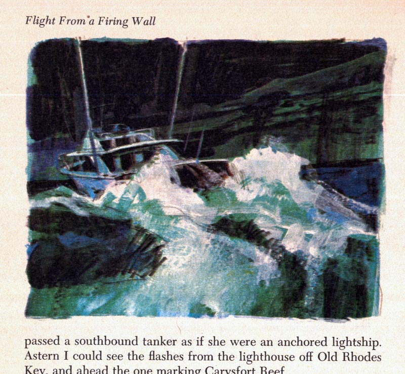
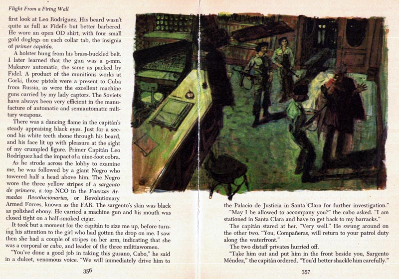
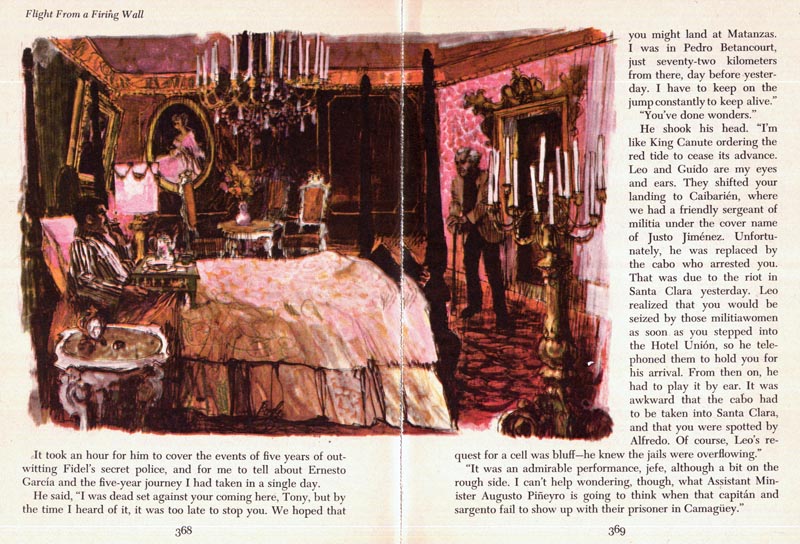
Ben Stahl, Master of Moods

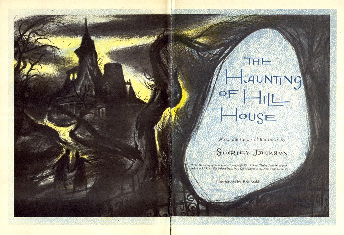
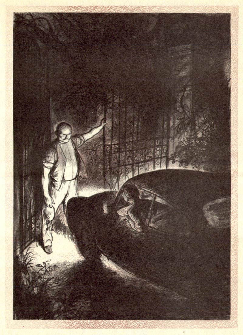
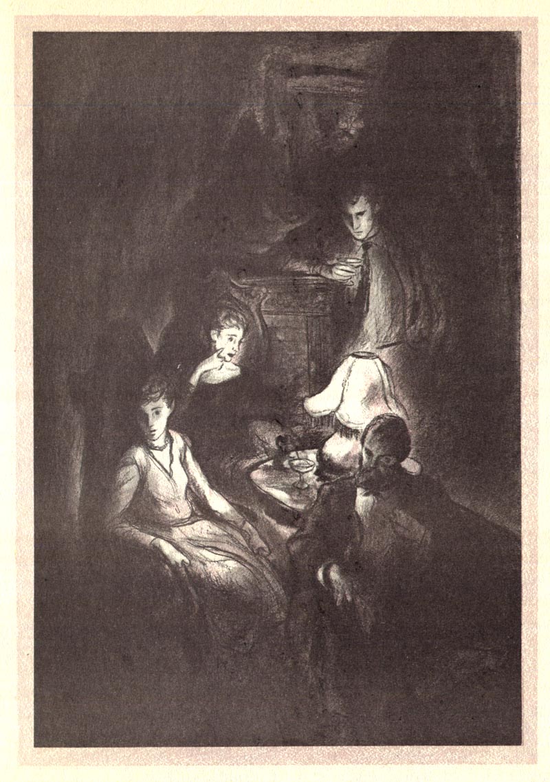
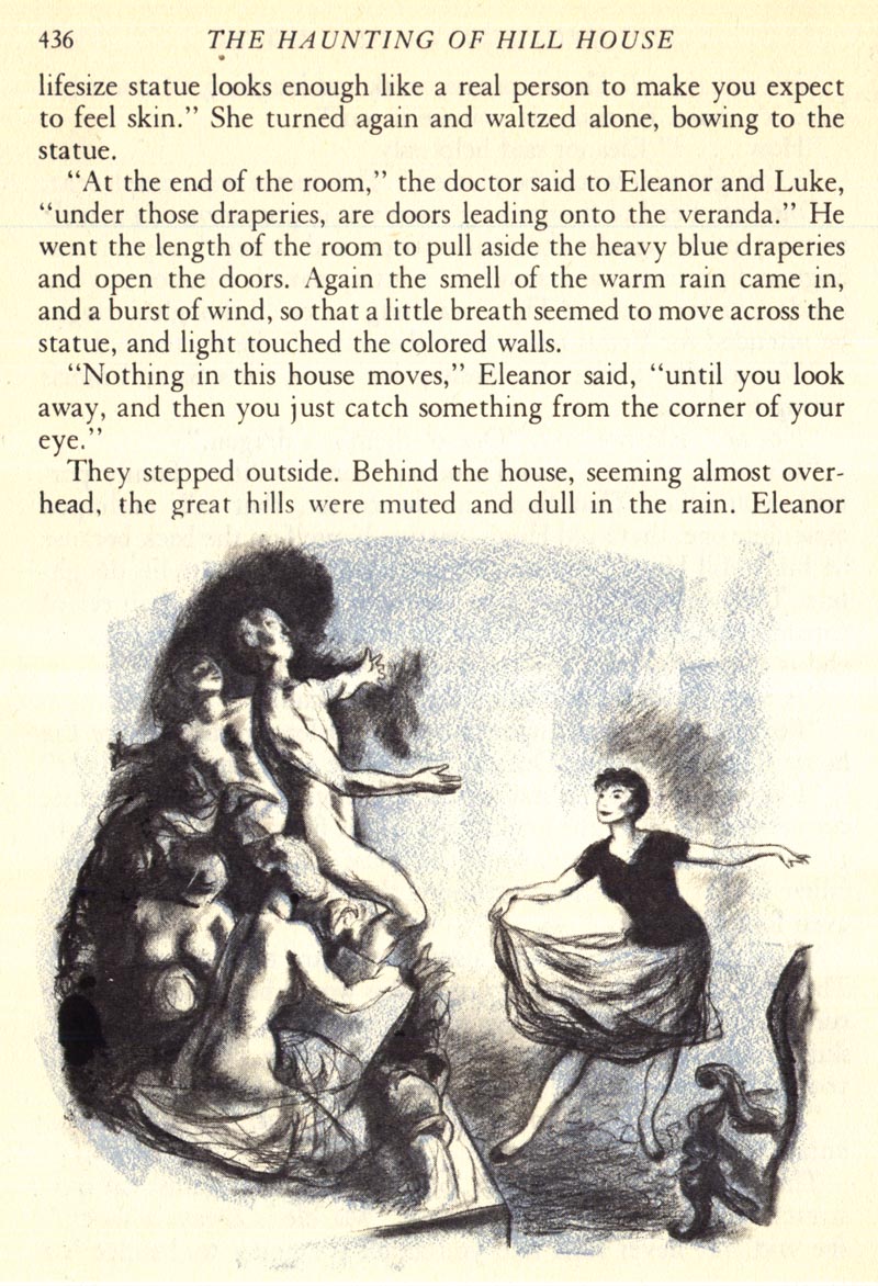
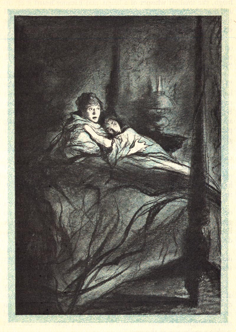
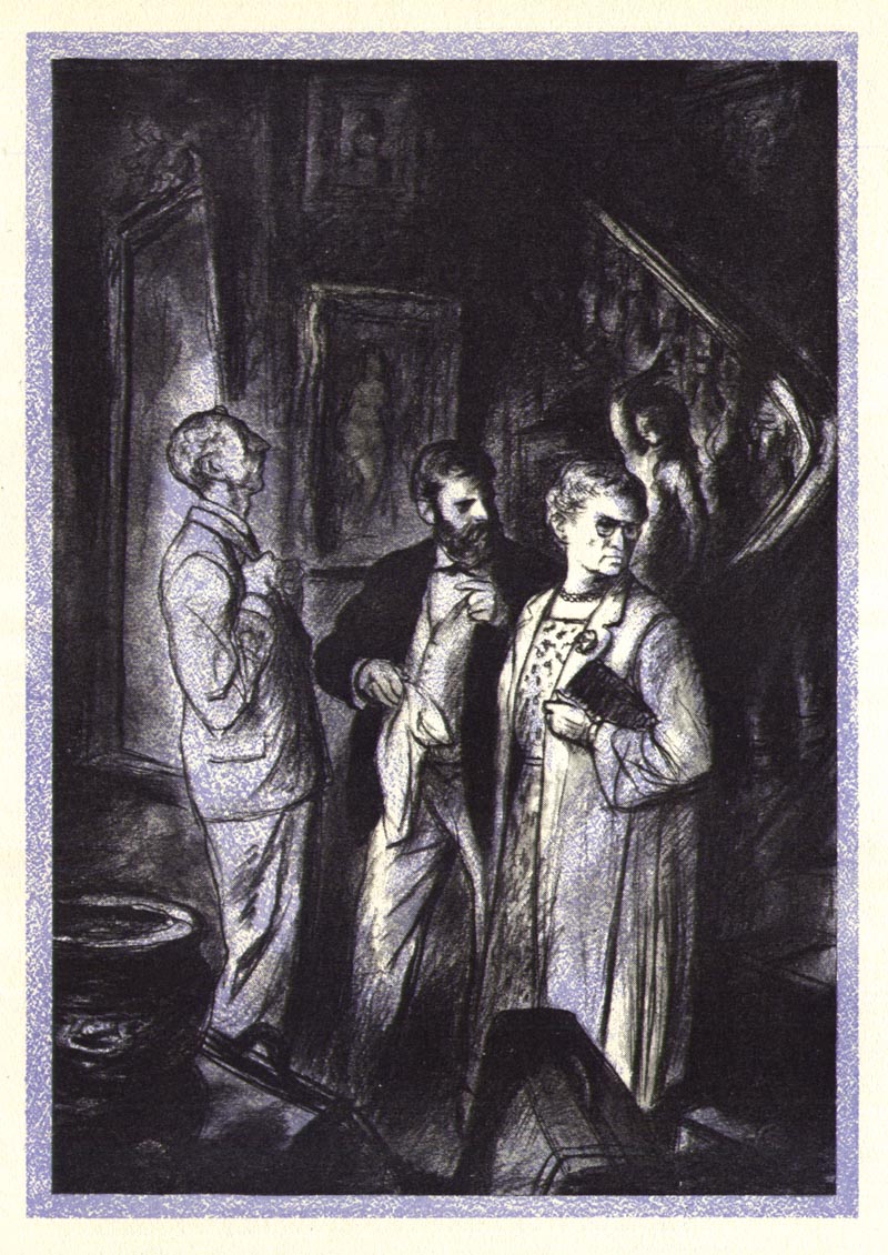
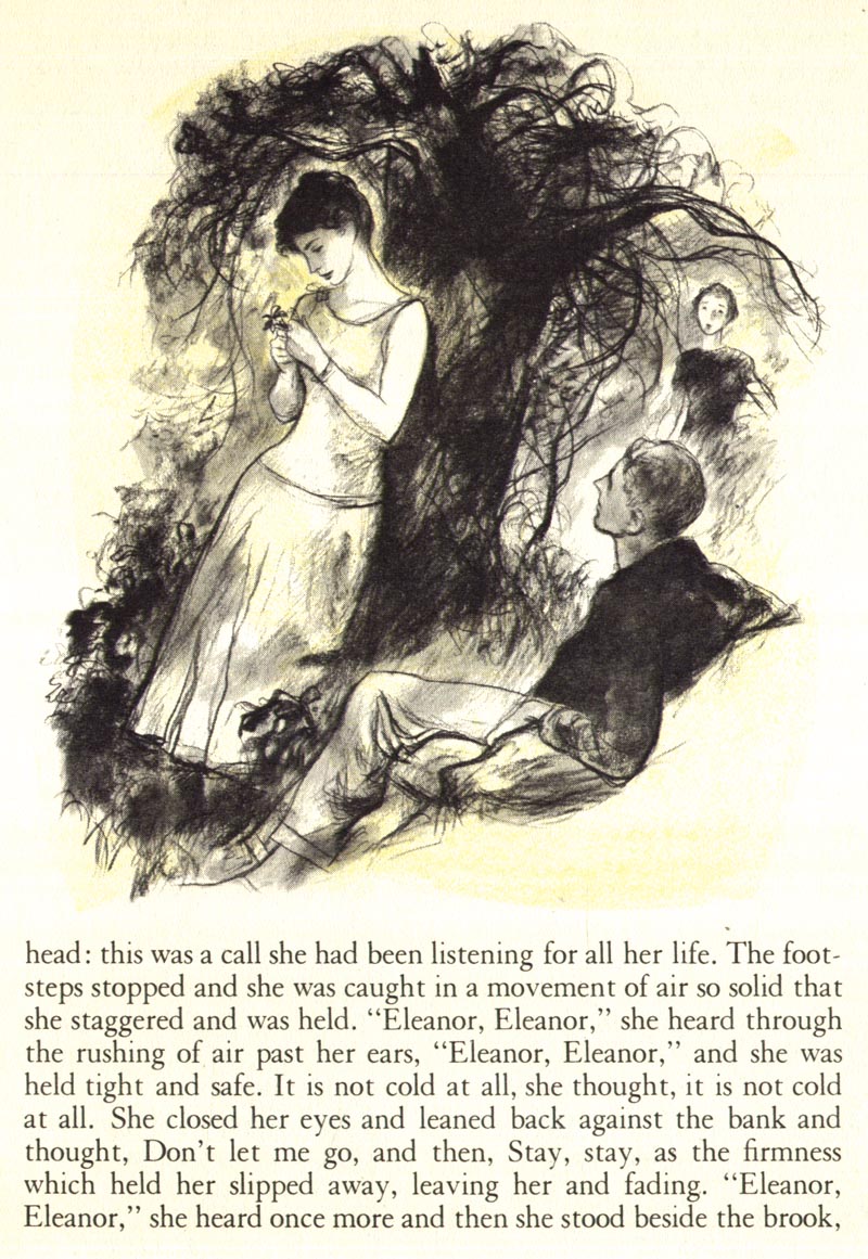
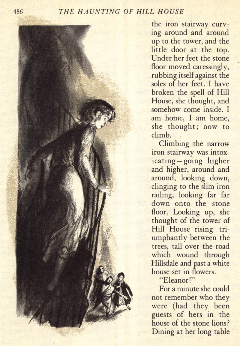
What with it being so close to Hallowe'en, my thoughts turned to Ben Stahl and this wonderful interpretation of The Haunting of Hill House he illustrated in 1960 for Reader's Digest Condensed Books.

Stahl56

Stahl certainly had a flair for creating a moody, atmospheric sense of foreboding in his work, didn't he?

Stahl55
Stahl54
Stahl53
Stahl52
Stahl51
Stahl50
Stahl49

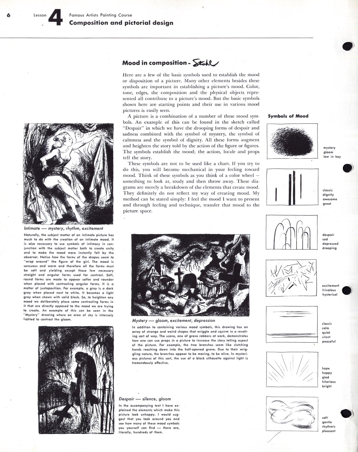
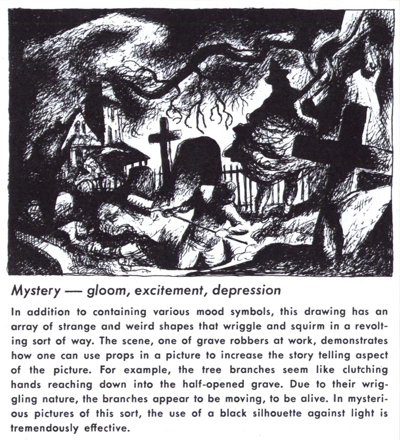
Ben Stahl's expertise at creating mood made him the obvious choice to provide that particular lesson in the Famous Artists Course.

FAS.Ch4Pg6
FAS.Ch4Pg6.detail01

This week we'll take a closer look at the life and work - and many moods - of Ben Stahl.

* my Ben Stahl Flickr set

Friday, October 22, 2010

Neil Boyle, Condensed

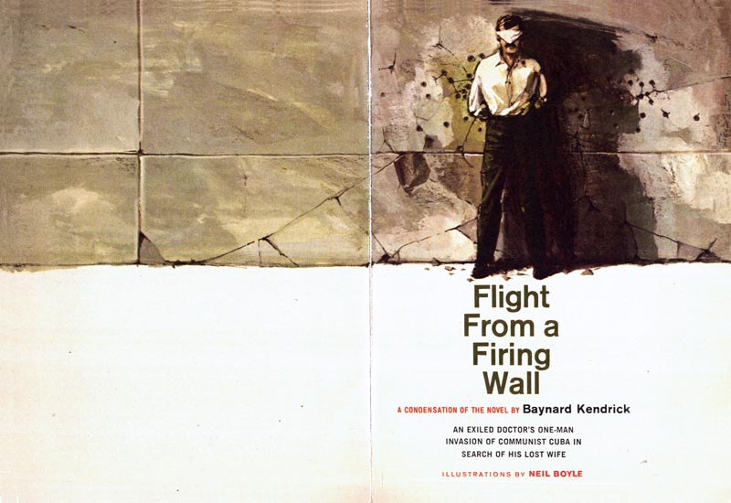
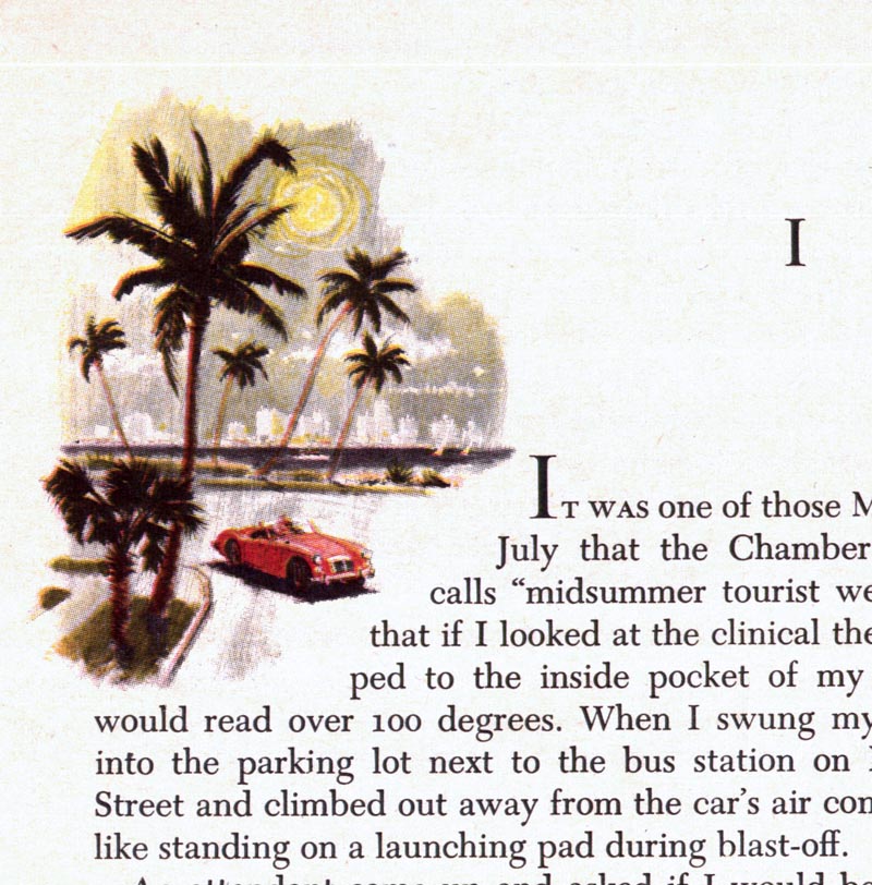
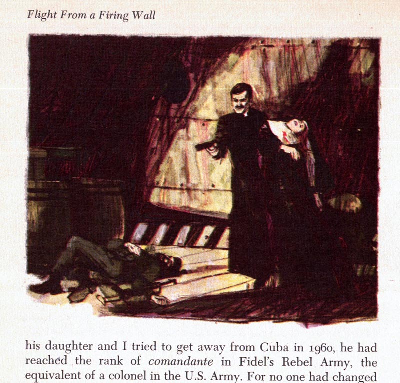
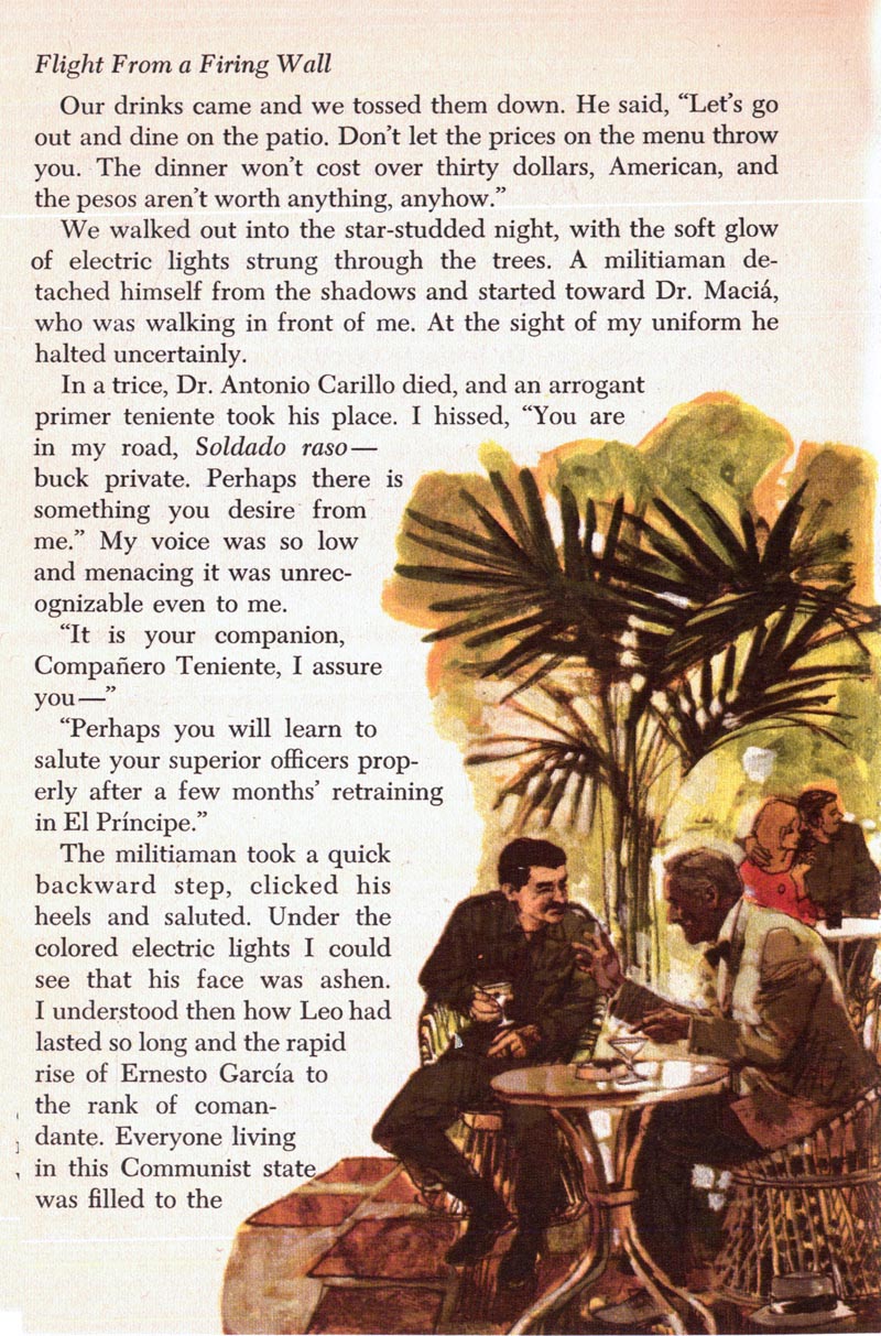
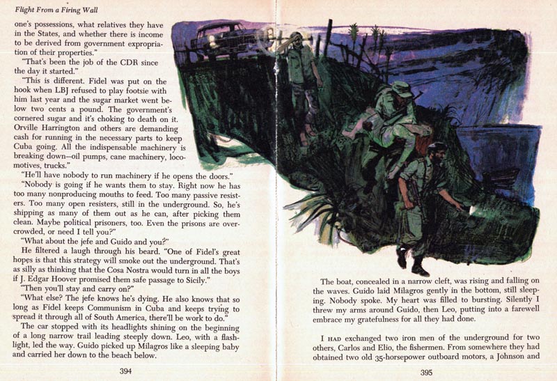
Here's a 1966 Reader's Digest Condensed Books story illustrated by Neil Boyle. I don't know if he did others - this is the only one I've ever found. But he's certainly in great company in this particular volume; it also contains stories illustrated by Bernie Fuchs, Howard Terpning and Francis Marshall! (Don't worry, we'll be looking at those others stories some time soon)

Boyle23
Boyle24
Boyle25
Boyle26
Boyle27
Boyle28
Boyle29
Boyle30
Boyle31

* My James Neil Boyle Flickr set.

Wednesday, October 20, 2010

More of Neil Boyle's Album Cover Art

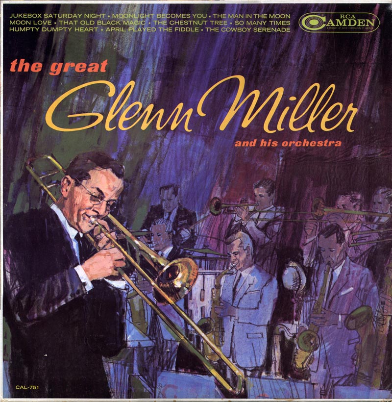
Here's another of Neil Boyle's album covers - this one from 1963...

Boyle18

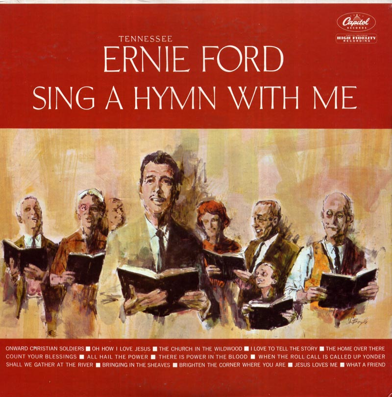
... and another, with just a touch of a cartoony quality to it.

Boyle19

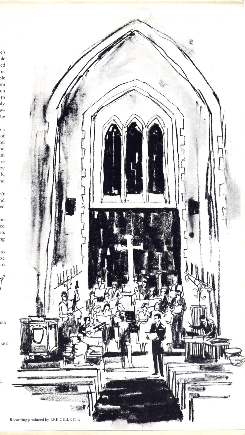
But this second jacket contains an additional bonus; three really nice black and white interior illustrations by Boyle.

Boyle22
Boyle21
Boyle20

And for those who missed it, here's Neil Boyle himself doing a painting demo!


Thanks to Harold Henriksen for the link!

* My Neil Boyle Flickr set.

Tuesday, October 19, 2010

Neil Boyle's "Hansel & Gretel"

Thanks to everyone yesterday for sharing anecdotes, information and links to - and about - James Neil Boyle. I've never had such a fast and thorough response to any illustrator I've showcased. Its great to know that Boyle has had such a positive impact on so many illustrators who studied under him - or who simply appreciate his work.

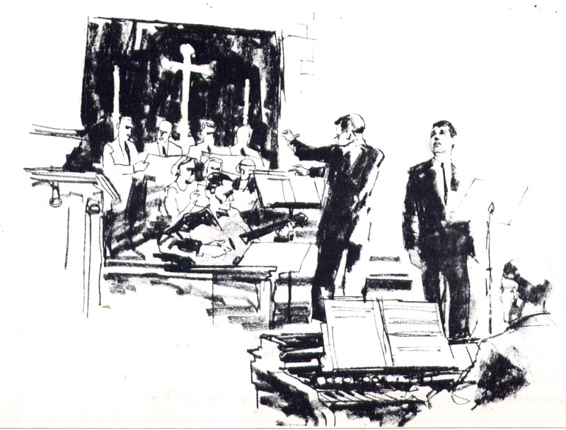
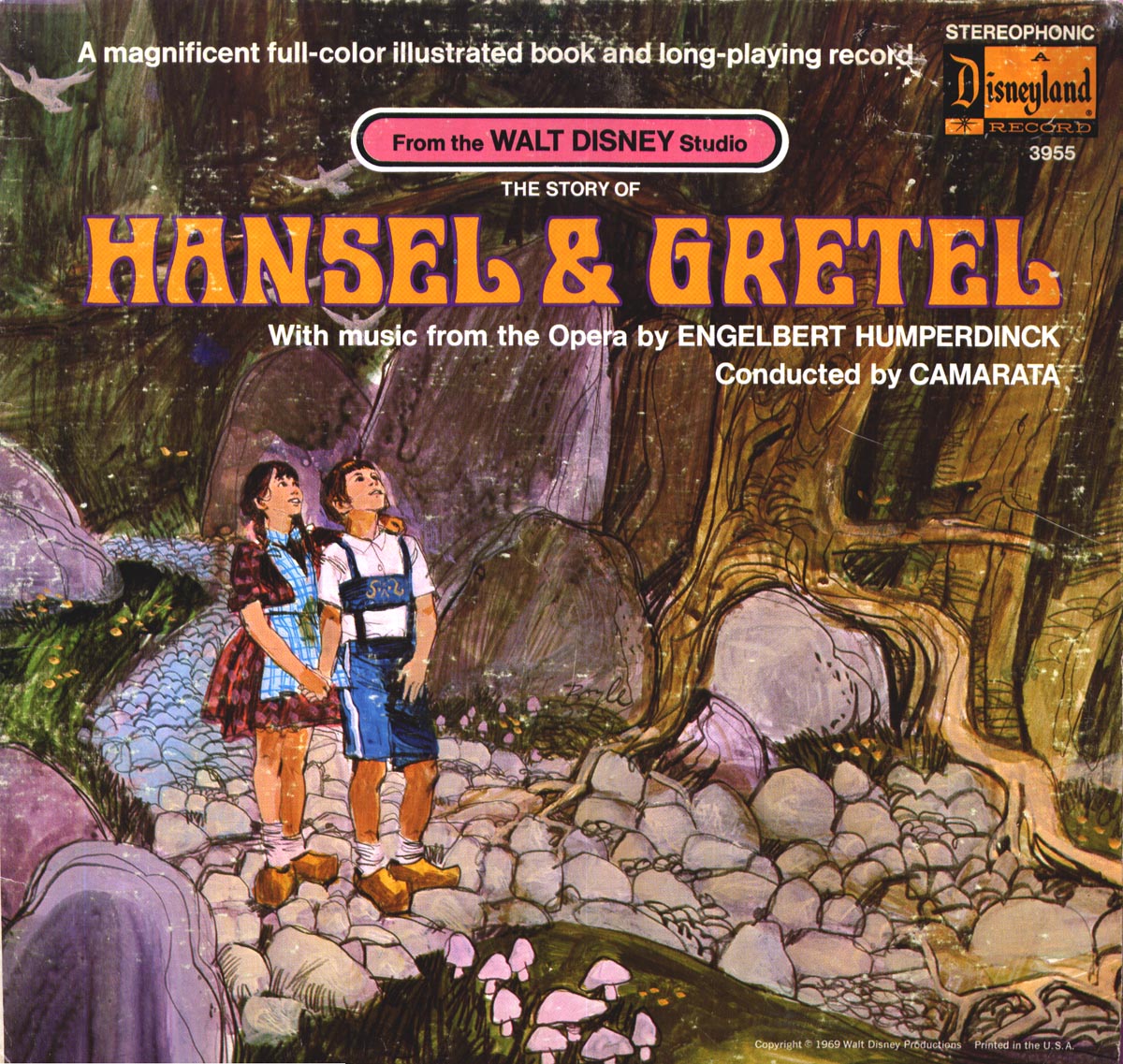
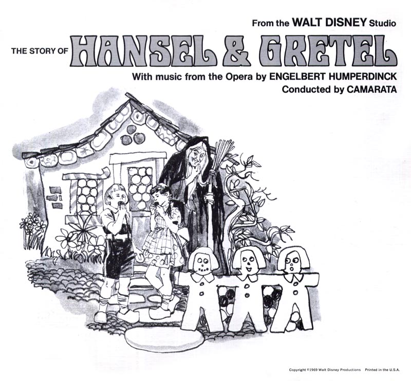
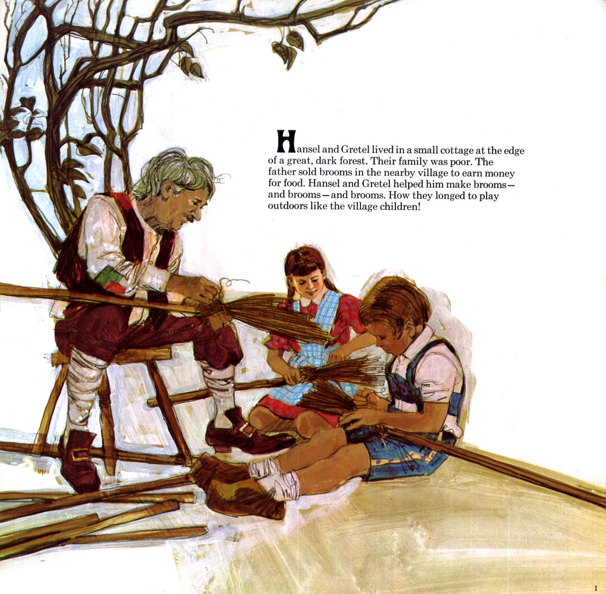
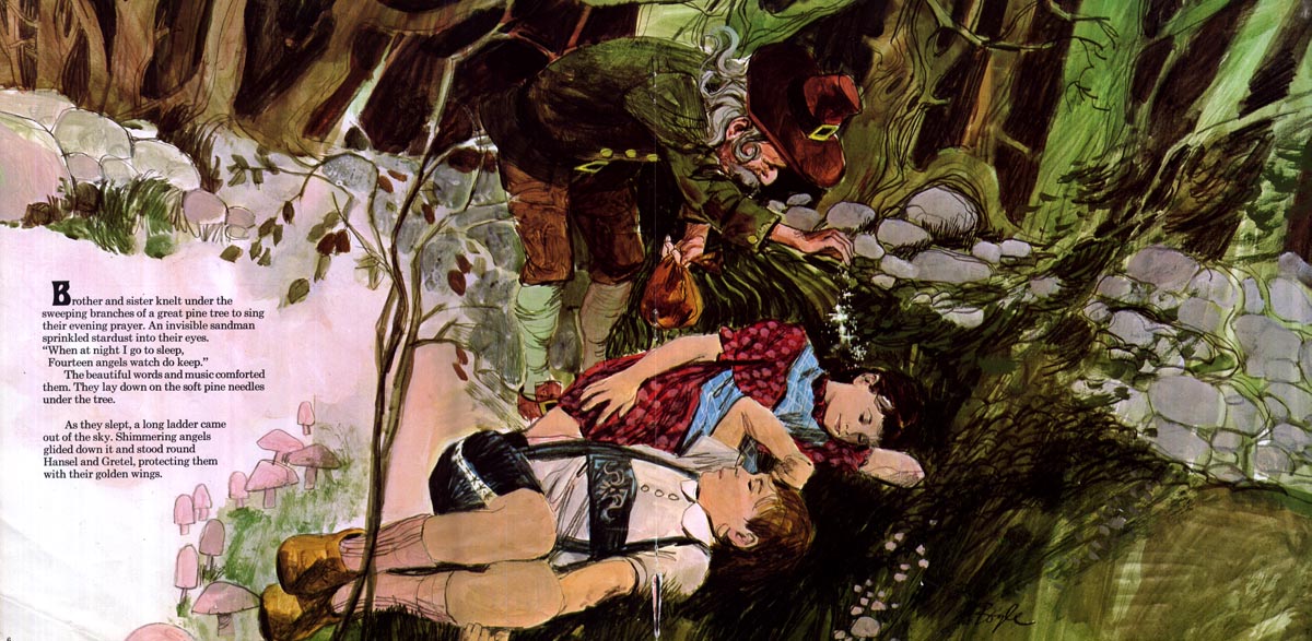
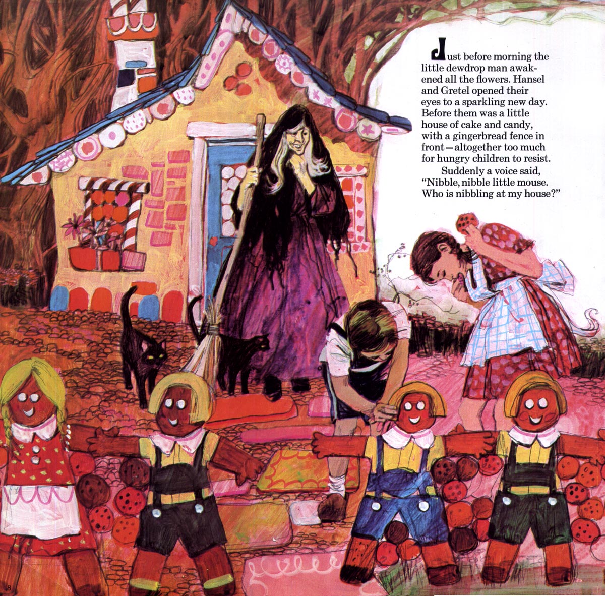
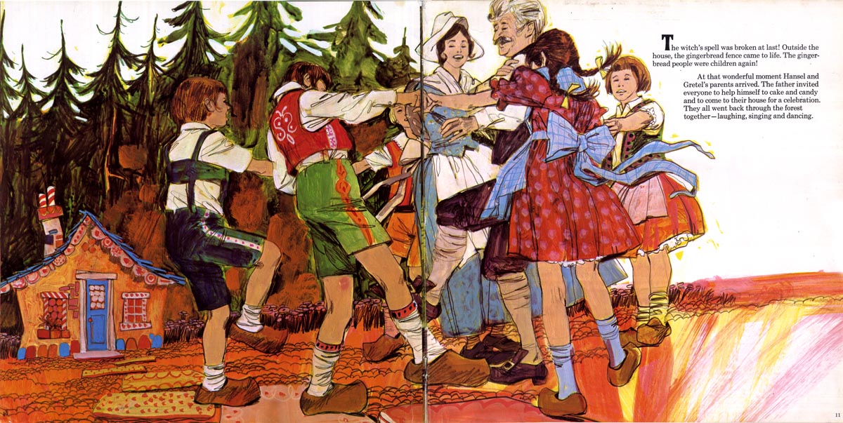
Most of the Neil Boyle artwork I've found over the last few years has been album cover art. Today, a really remarkable thrift store treasure: not only did Boyle illustrate the cover of Disney Productions 1969 children's album, "Hansel & Gretel", he also did all the artwork for a read-along storybook stapled inside. Below, the entire series of images, from start to finish.

Boyle17
Boyle16
Boyle15
Boyle14
Boyle13
Boyle12
Boyle11
Boyle10
Boyle09
Boyle08

* My James Neil Boyle Flickr set

Monday, October 18, 2010

James Neil Boyle: "BSWCA"

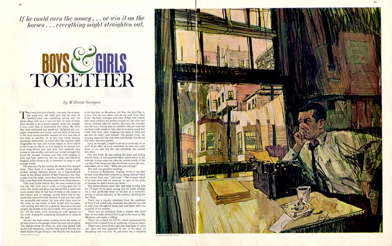
Recently my friend Daniel Zalkus sent me a scan he made from an old 1960s issue of the Saturday Evening Post. The art, by (James) Neil Boyle, is terrific! Daniel wondered if I knew anything about this artist.

Boyle07

As it happens, I know just a little - Boyle is listed in Walt Reed's "Illustrator in America, 1860-2000" and I had posted what I knew (not much) about Neil Boyle way back in January, 2006.

But shortly after my reply, Daniel sent a second message - surprise, surprise - he found a Neil Boyle website, complete with a gallery of Boyle's work, a biography and a photo of the artist!

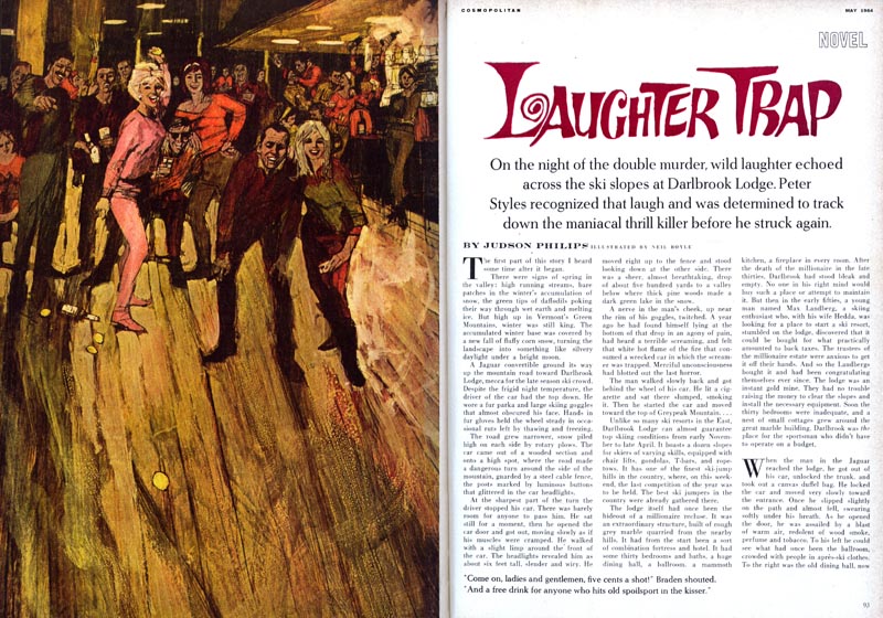
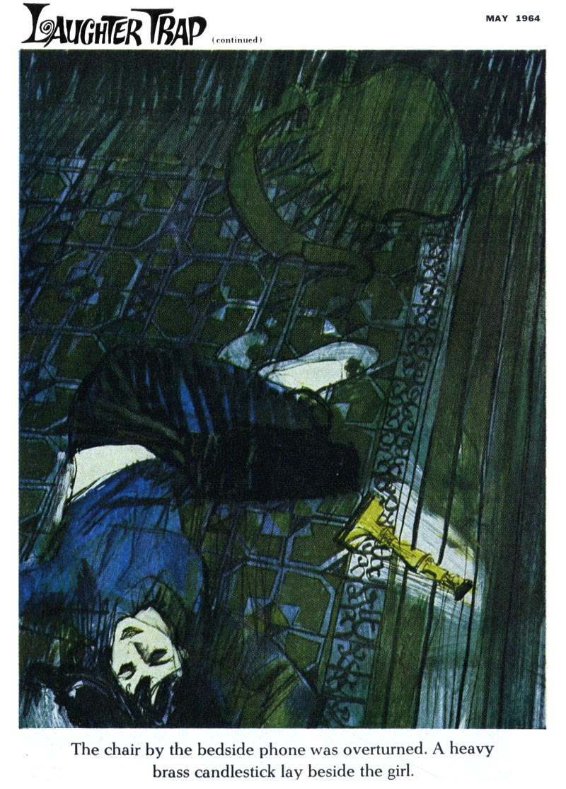
I've been setting aside all the Neil Boyle artwork I've stumbled across hoping that the day would come when I had more information to present it with, and it seems that day has come. Below, two pieces by Boyle from the May 1964 issue of Cosmopolitan.

Boyle05

So why the acronym, "BSWCA" in the title of today's post? Seems Neil Boyle had a sense of humour as well as a flair for illustration.

Boyle05

From the bio on his website:

"When Neil first became interested in being a "fine artist" he noticed that the others all had some sort of initials after their signatures. So he made up his own. BSWCA is an acronym for Big Shot West Coast Artist."

Boyle06

This week, a look at some gems by this very talented "Big Shot West Coast Artist", James Neil Boyle.

* Many thanks to Daniel Zalkus for sharing the scan at the top of today's post - and for his detective work in locating Boyle's website!

* My James Neil Boyle Flickr set

Friday, October 15, 2010

Turning Art for TV into Art for Print

The advent of television didn't just create a new market for artists... it created a new market for art suppliers too. One of the first steps in creating a television commercial is to draw a storyboard. Astute mid-century paper manufacturers quickly began offering specialized pads of pre-drawn frames in the shape of a tv screen.
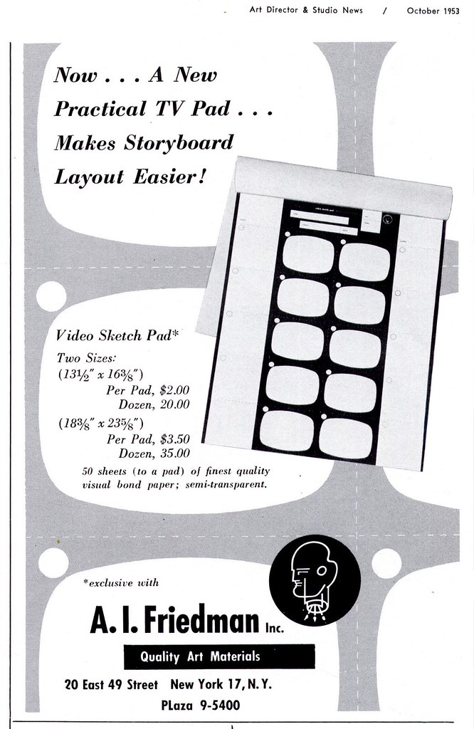
ArtforTV01.jpg

Not wanting to miss out on an emerging market, the Eagle Pencil Company jumped on the bandwagon by extolling the virtues of its coloured pencils for creating presentation - quality storyboard drawings.
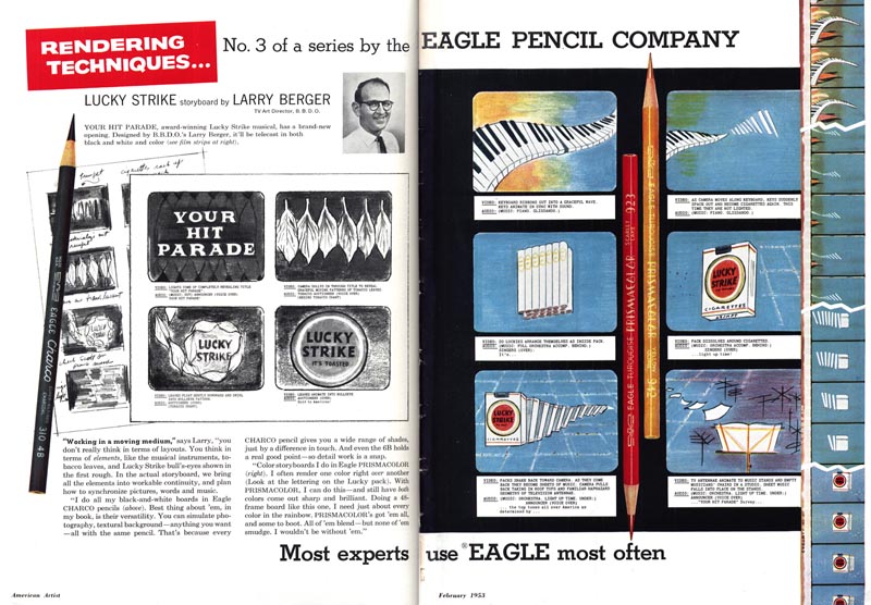
Berger01

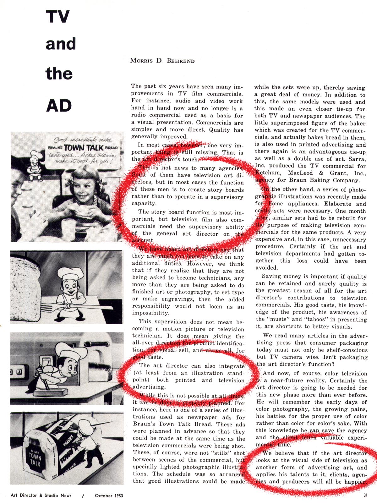
Here's an interesting article from the October 1953 issue of Art Director & Studio News.
ArtforTV17

Not only does it reference the growing significance of the storyboard as a visual aid in the process of making TV commercials...

ArtforTV17.detail01

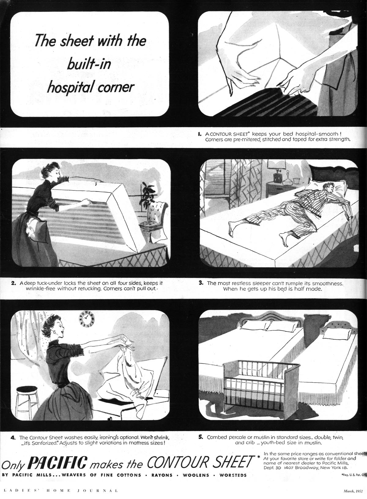
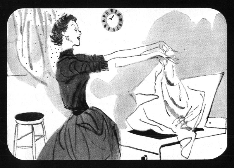
... it highlights a trend in print advertising design that began to appear in the early '50s: the story board as print ad.
Unknown822

Its a trend I noticed over the years as I looked through thousands of pages of mid-century ads and articles in my old magazine collection. But I never really put two and two together until this latest series of posts.
Unknown822.detail01

In the introduction to the Television section of the 1952 NY Art Director's Annual, William Strosahl writes, "The quality of commercials is improving constantly and Art Directors are a big factor in raising the standards of TV advertising. It is big business and may well represent 65% of total billings in the next two years."

That's a massive chunk of revenue for a medium so new that it was, in 1952, only being included as a category in the NYAD Annual for the third time. It made me think, if agencies and their clients were beginning to devote the majority of their time, money and creative effort to producing television commercials, wouldn't they want to reinforce their broadcast message in print? The AD&SN article seems to confirm this strategy...
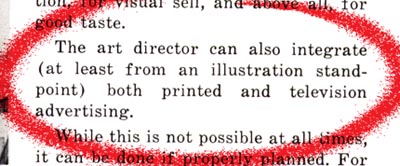
ArtforTV17.detail02

So it shouldn't be surprising to see print ads that look like a comic strip version of a TV commercial -- right down to the curved corners of the classic cathode ray television tube. Though the general public was undoubtably unfamiliar with the term, they were - half a century ago - seeing their first television storyboards.
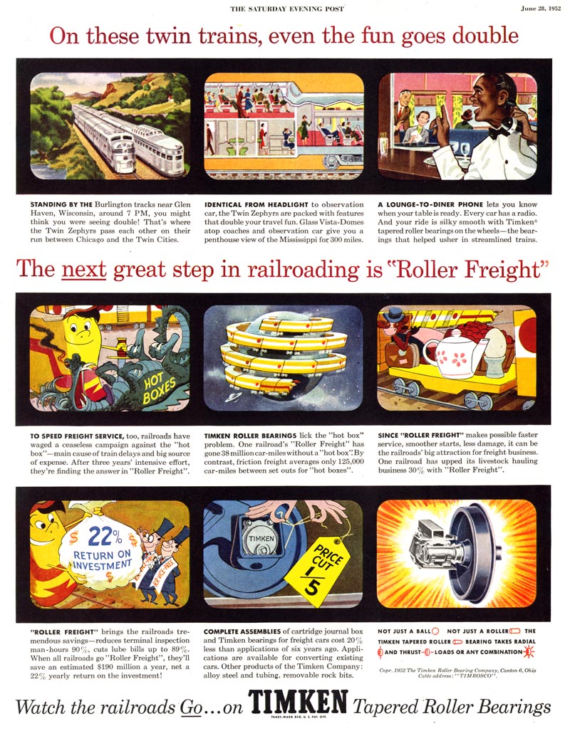
Unknown878

Was new artwork created for these print ads...
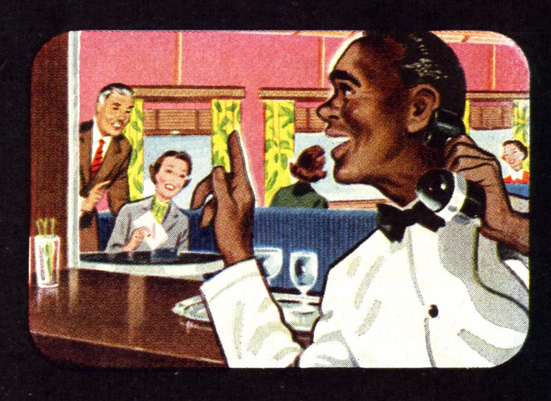
Unknown878.detail01

... or did agencies simply reuse the illustrations commissioned for the TV commercial? I'm really not sure.
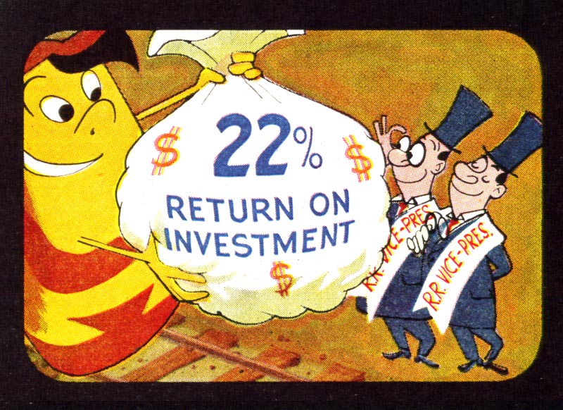
Unknown878.detail02

But the AD&SN article suggests at least some reuse. In the commercial cited in the article the author mentions that "the little superimposed figure of the baker, which was created for the TV commercials, and actually bakes bread in them, is also used in printed advertising and there again is an advantageous tie-up as well as a double use of art."
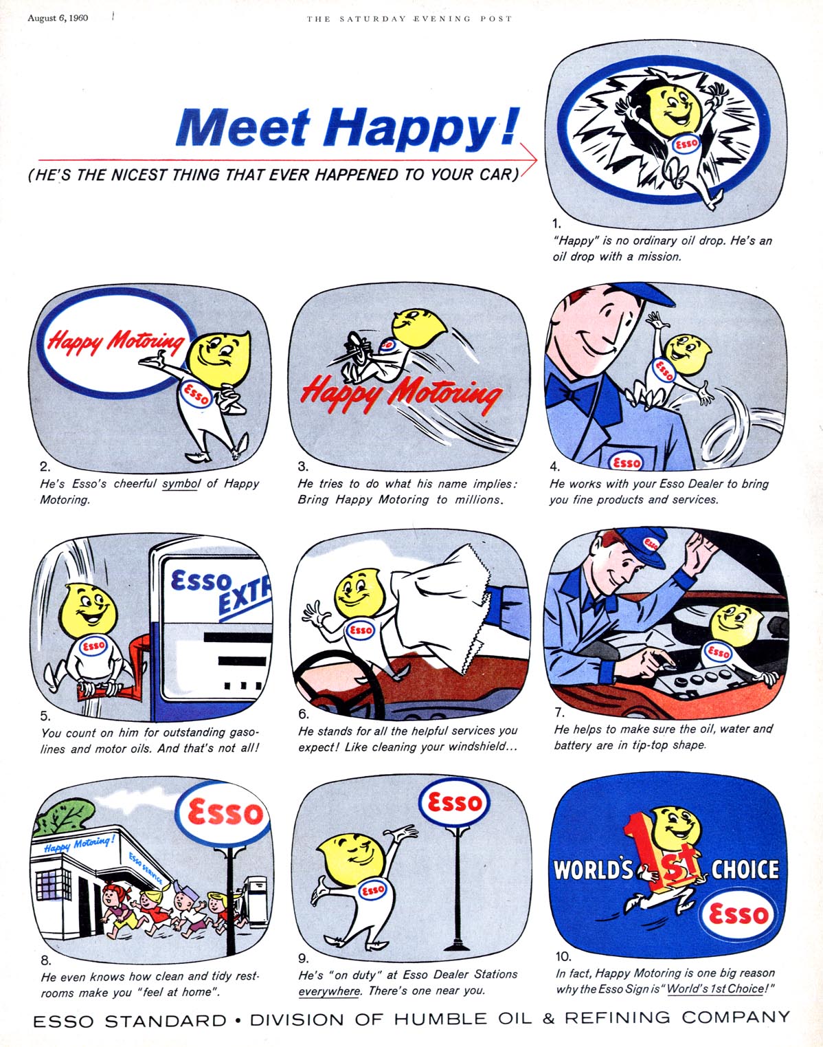
Unknown824

I don't want to suggest that the TV-storyboard-as-print-ad became a huge component of all print advertising - far from it - but its existence (and persistence) simply once again underscores how the game had changed. For the ad business... for the advertiser... and very definitely for the illustrator.

Unknown824.detail01

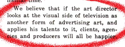
A final quote from the article to conclude the thought ( and this latest series of posts):
ArtforTV17.detail03

* My Art for Tv Flickr set.

* Also, Bruce Hettema has a new post up about illustrator Frank Hoffman on his P&H Creative blog

* And if you've yet to visit (and perhaps participate in) Toby Neighbors' fabulous "collaborative illustration" blog, illostribute.com, this might be a great time to jump in: Toby's latest 'tribute' is to pulp artist Norm Saunders - what fun!

* Finally, be sure to drop by the NCS blog for the latest NCS Spotlight on... Eric Gurney!