Tuesday, January 16, 2007

Big Cat Attack!

Years ago, a friend used to quote me something which, I think, was supposed to have been said by the beat writer, William S. Burroughs: "Guns are bad - but knives are worse... nobody likes to get cut."

To which I would add: "...or be pounced upon by 200 pounds of razor sharp teeth and coiled-steel muscles intent on making a meal of you."
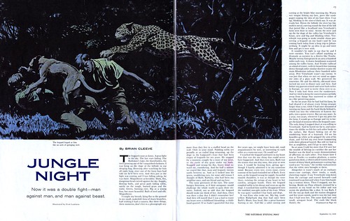

Yes, if you flip through enough old magazines you'll start to see some odd themes emerging... and Big Cat Attacks seems to be one of them. There are plenty of "great white hunter" stories about bears, buffalo and even gorillas - but nothing like the volume of big cat attack stories. We humans seem to have a fear (or at least a fascination) of that particular kind of death hardwired into the kernel of our collective primate DNA.

That was certainly the case for me back in 1973. My Oma had sent me the beautiful Bunter Kinder-Kosmos book from which the image below is scanned. I enjoyed studying the incredible dinosaur paintings in the front 2/3rds of the book... but when I first laid eyes on this illustration of a leaping sabertooth tiger I was filled with anxiety. The fate of the fallen cave man in the bottom right frame was imminently clear to 9-year-old me.


So this week, let's take a look at the man-eaters of the Felidae family and if you like to look at this sort of thing in all its terrifying glory, you can see the full size version in my new Big Cat Attack! Flickr set.

Monday, January 15, 2007

Happy Birthday Martin Luther King Jr.

People of colour were conspicuously absent from the mainstream magazines of the 50's.


So much so that this is the only story illustration I've ever come across in any of the several hundred magazines in my collection that shows an African American and a white person associating with each other in a normal, middleclass lifestyle situation. The only one.

In fact, its one of the only appearances of an African American I've ever seen in a 1950's mainstream magazine illustration or cartoon.

So let's pause for a moment and celebrate the great Martin Luther King Jr. and hope that in spite of the continued racial adversity we face even today, 50 years after this illustration appeared, that we are somehow heading in the right direction - that Dr. King's dream will one day become our reality.

Tomorrow: Our regularly scheduled topic begins.

Friday, January 12, 2007

The Many Techniques of James R. Bingham

Some illustrators, like Jon Whitcomb, build successful careers by doing the same thing really well over and over again. Others, like Al Parker, rarely seem to use the same approach twice - inspiring the entire industry with their fearless experimentation.

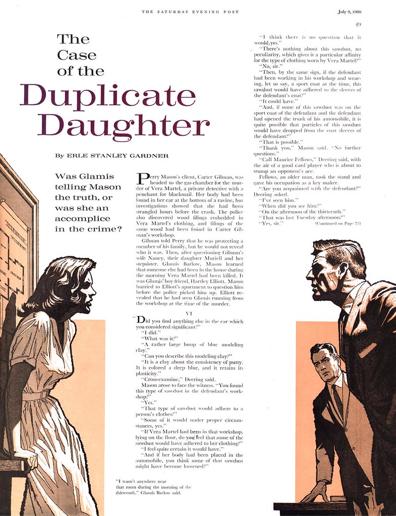
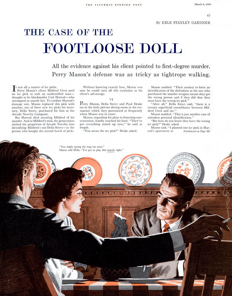
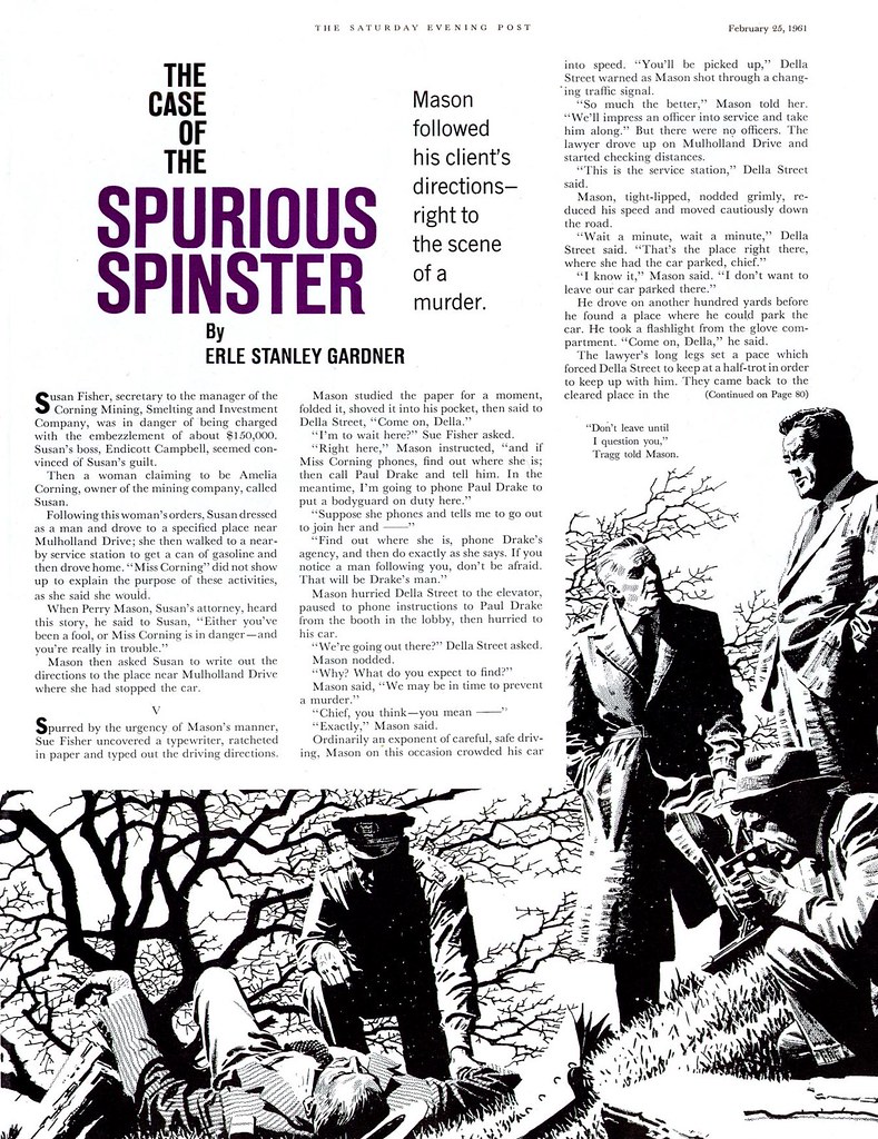
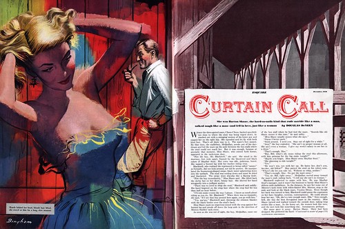
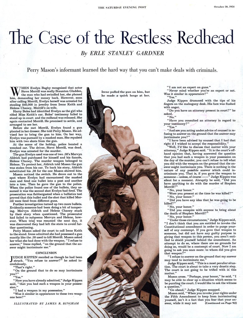
James R. Bingham wasn't a Whitcomb - but he wasn't a Parker either. On Monday I talked about how I got the sense that within the range of his style, Bingham was not afraid to try something new. Take a look at the tremendous variety of approaches shown here:

Whether it was his best known painting style...


or this scrubby, topic-appropriate painting (or is it pencil crayon?) technique,


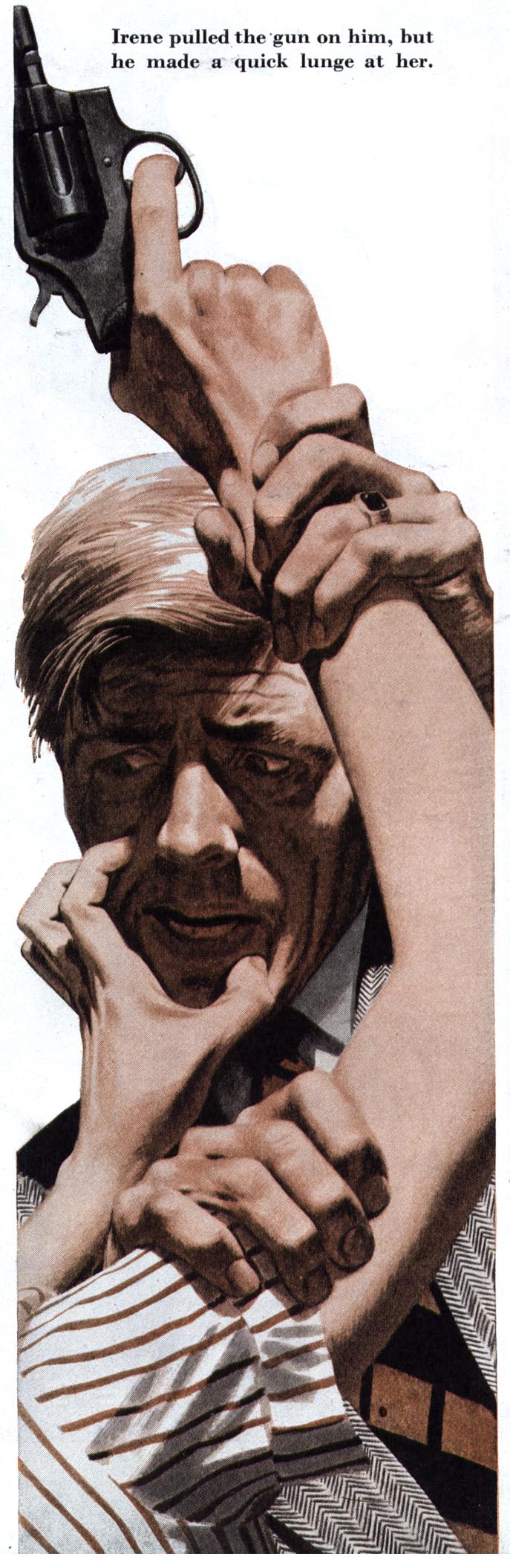
whether it was one of his many different approaches to line art...


...or this startlingly loose, experimental painting technique,


James R. Bingham never failed to evoke a sense of freshness and fun, often surprising the viewer with yet another variation on the theme.

If you have yet to do so, today is the day to take a few moments to go through my James R. Bingham Flickr set and enjoy this top-notch versatile illustrator's range of styles.

Thursday, January 11, 2007

Bingham's Advertising Art: "Realism Plus"

"The January editorial of this magazine [discussed] the move toward realism in advertising and editorial art," writes Stephen Baker in the March 1953 issue of Art Director and Studio News under the headline Realism Plus. "To most clients," he goes on to say, " 'realism' means one thing: photographic reproduction of nature. Art directors, familiar with various techniques, know that this isn't necessarily so."


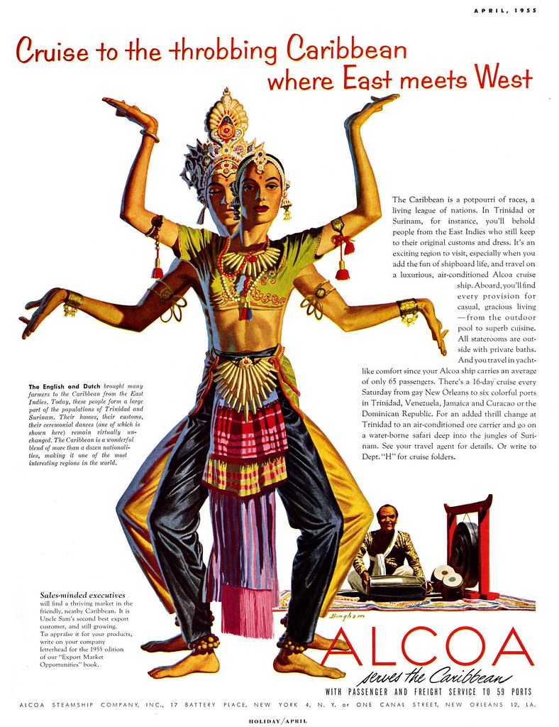
The desire by art directors of the 50's to find interesting and appealing twists on the realism demanded by clients was likely one reason James R. Bingham had so many ad accounts. Bingham's style of realism was not the photographic realism of a Douglass Crockwell or an Earl Mayan. Nor was it the romantic, idealized realism perfected by some of the Cooper artists. Bingham's realism had a sort of super-constructed, designed-to-perfection orderliness. It was "realism plus"!


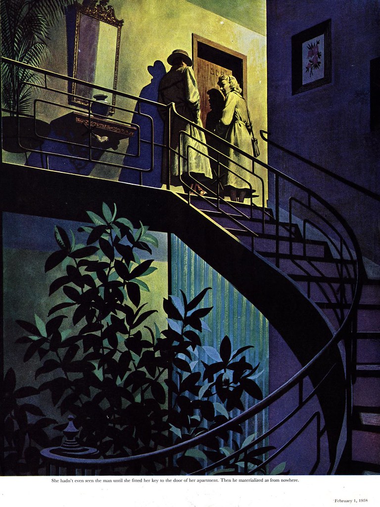
Whether dealing with the natural or the man-made world, Bingham put his distinct style on every element in the artwork world his people inhabited.


This distinction makes even an unsigned Bingham, like the one below, instantly recognizable.


Looking back to the mid-forties (below), when Bingham was painting with a greater degree of naturalism, it only takes a squint of the eye to see his style of a decade later beginning to emerge.


These images have been added to my James R. Bingham Flickr set.
Wednesday, January 10, 2007

How James R. Bingham Did It

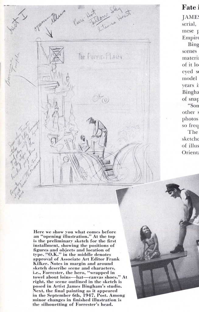
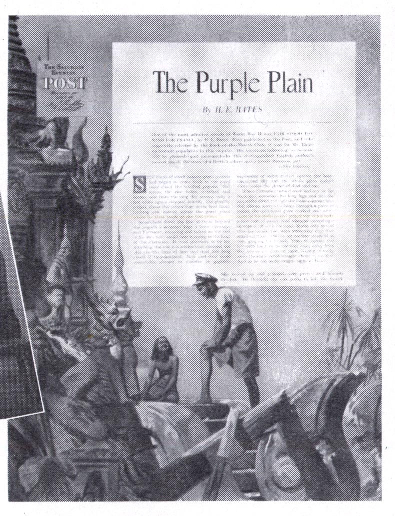
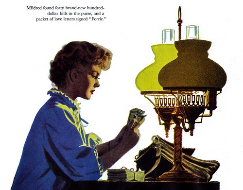
Here's a typical story-set of illustrations James R. Bingham did for the Saturday Evening Post in 1945.

I particularly like the line art with single colour he did on the follow-up double page spread...


In Illustrating for the Saturday Evening Post (see? I told you we'd be using this book a lot), we get some interesting clues to the process Bingham used to put together one of his SEP assignments from just two years later.


Having perused quite a few letters columns in the old magazines in my collection, I can tell you that readers scrutinized the illustrations closely and criticized loudly when details were off. The Post, with millions of weekly readers who came from many backgrounds and experiences, demanded tremendous authenticity from its artists. This assignment Bingham undertook, set in wartime and post-war Burma, shows us the challenges an illustrator like Bingham faced to achieve that level of authenticity.

There were no recent photos available in any private or public archives Bingham could access and it was only through a stroke of good luck that the man he chose to model as the hero in the story had recently served three years with the U.S. Navy in Burma.

That man provided the artist with a stack of photos he could use for reference.

"Some he took himself and some he swapped with other servicemen," the artist explains. "He even had photos of the bombed-out temples that are mentioned so frequently in the serial."


The article goes on the say that another difficulty Bingham experienced during the course of the job was that "the model for the girl was unobtainable after the first three installments."

"This happens so often nowadays as to seem normal."

These images have been added to my James R. Bingham Flickr set.
Tuesday, January 09, 2007

Bingham's Striking Spots

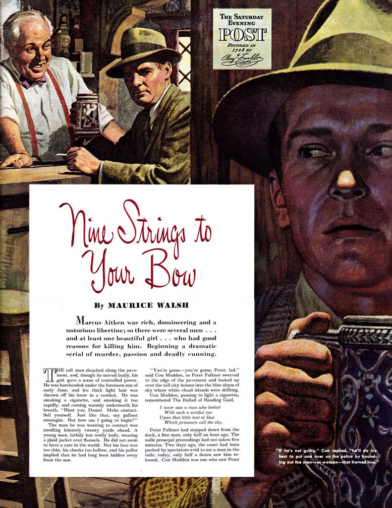
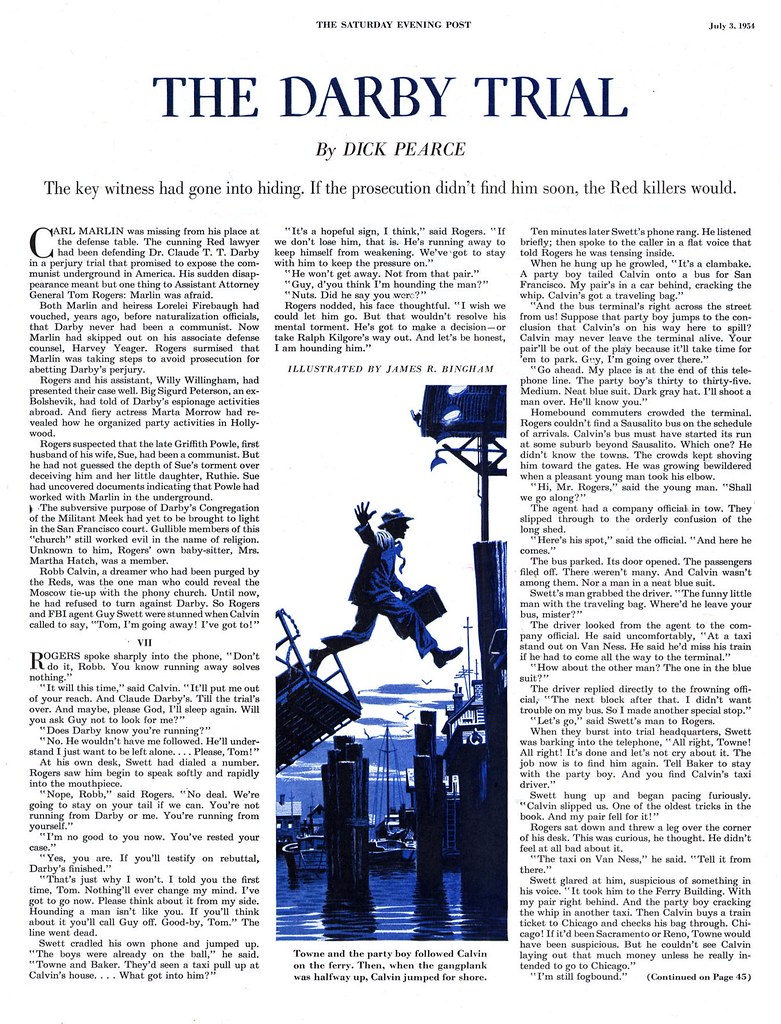
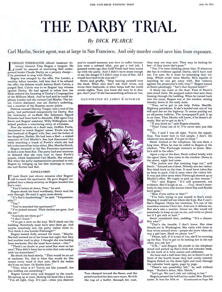
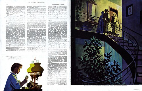
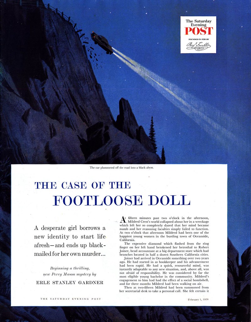
Throughout the 50's, much of James R. Bingham's work for The Saturday Evening Post was detective genre fiction.


These stories were usually serialized over several issues and began with a nice big double page spread to help draw the viewer in. But subsequent chapters were allotted far less visual real estate.


This doesn't appear to have daunted the artist...


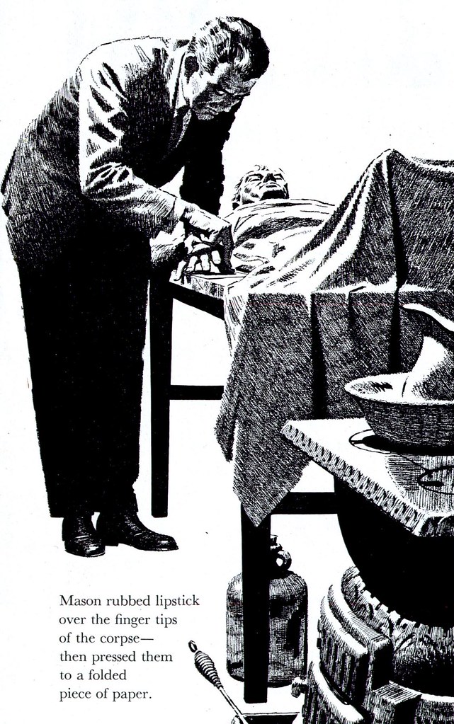
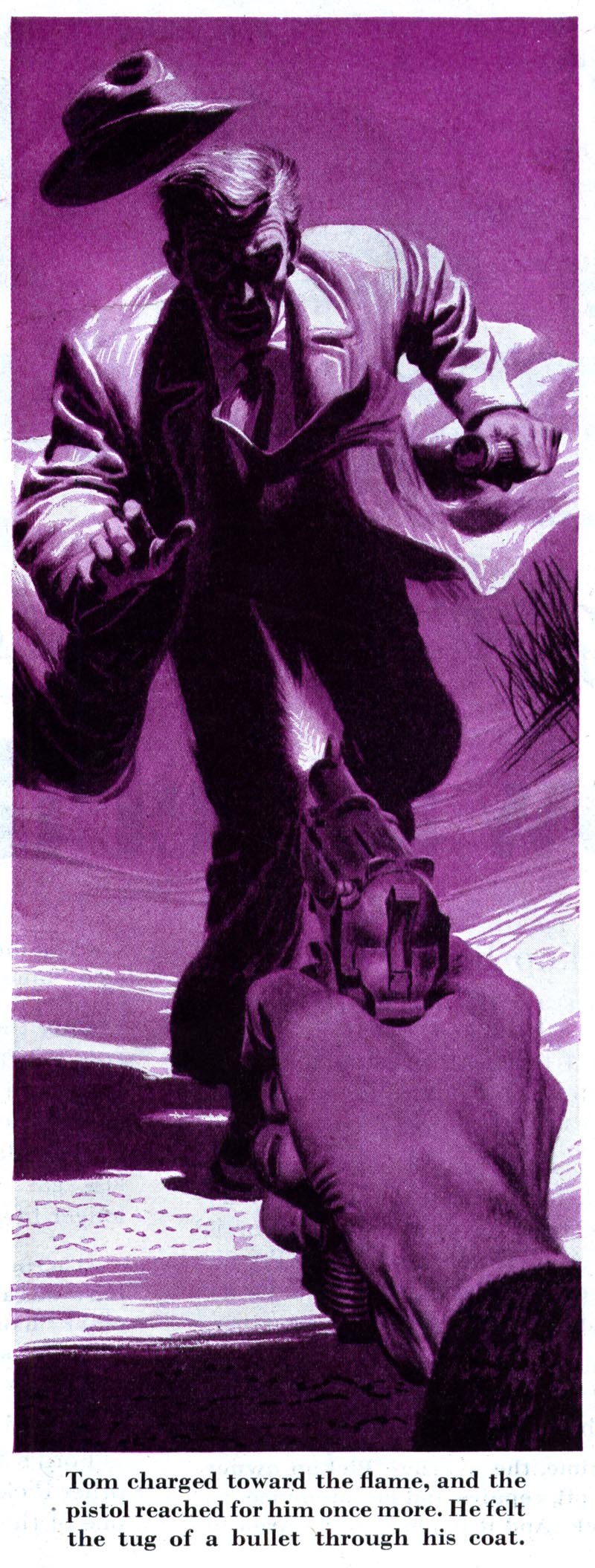
...some of his most powerful compositions are only one column wide and half-a-page high.


He also seems to have luxuriated in a limited colour palette. Black & white plus one colour is a hallmark of Bingham's crime art. It suits his noir-ish approach perfectly.


I love Bingham's stark silhouettes and striking compositions in these long, slender illustrations. They are as worthy of praise and study as his full page pieces.


These images have been added to my James R. Bingham Flickr set.

Monday, January 08, 2007

James R. Bingham (1917-1971)

I love the work of James R. Bingham.


Sometimes I feel badly that - while Today's Inspiration has been around for about five years now - there are so many worthy illustrators I haven't even showcased once. Meanwhile, I've highlighted Bingham's work several times already.


There's something about Bingham's approach that just really grabs me. While firmly rooted in the classic "realistic" approach to illustration, Bingham managed to put his own unique, appealing stylistic stamp on everything he did.


And though he did not adopt the "new direction" to illustration that evolved during the early 60's, he did experiment with a variety of mediums and techniques that presented the viewer with fresh and sometimes startling approaches to similar subject matter. I get the sense that, within his comfort zone, Bingham liked to keep things interesting for himself.


So this week, let's take a look at one of my favourite illustrators of the 50's, James R. Bingham.

These images have been added to my James R. Bingham Flickr set.
Friday, January 05, 2007

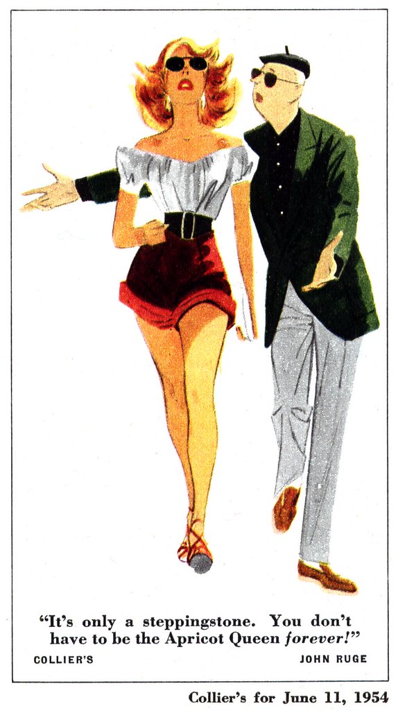
John Ruge, Round Two

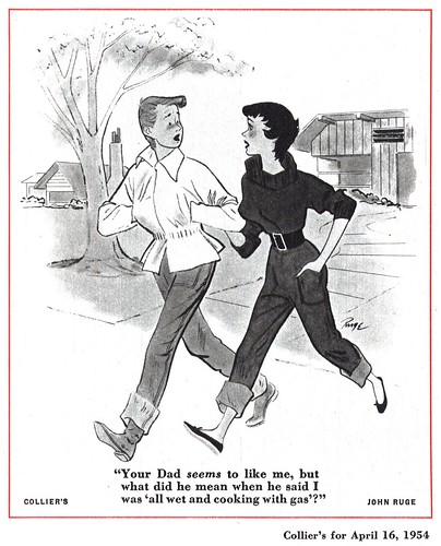
All the world loves a pretty girl... and that point is proven to me again and again, whenever I post an illustration of one - or two - as I did yesterday.When I review how many times one of my scans gets looked at on Flickr, the first day often yields 20 or 30 views. Yesterday's cheesecake cartoon by John Ruge has already been viewed 99 times!"I was totally blown away by this illo - it's classic 50's cheesecake and
I just adore it"
, wrote one TI list member, "I'd love to see more girls by him so if you do have any other treasures please do share them with us."Well, your wish is my command. Sorry, just a little more cheesecake - but hopefully a selection of Ruge's other cartoon subjects will not disappoint.I don't think I'll be back for another look at Ruge any time soon, so this batch will have to do for now. Enjoy!As with yesterday's batch, you can see these images at full size in my John Ruge Flickr set.
Thursday, January 04, 2007

I Got Another Clue!

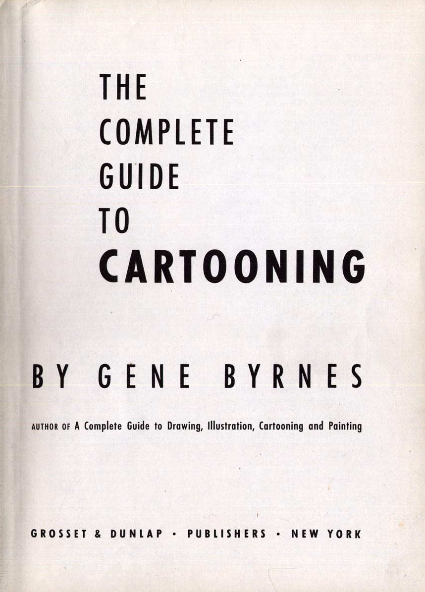
At this time I'd just like to say "Thanks!" to my pal, Drazen Kozjan, for giving me a copy of The Complete Guide to Cartooning by Gene Byrnes.
Drazen dropped by for a visit one day late last year and brought me this amazing book. I will be eternally grateful to him! This baby's chock-full of incredible art and info on a vast selection of classic cartoonist/illustrators. For instance, its got a two page step-by-step by one of my favourite artists: John Ruge.
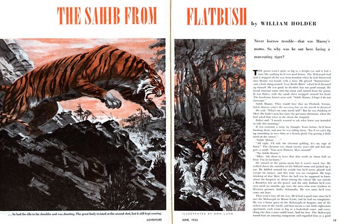
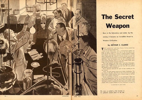
I fell in love with this guy's work the first time I saw it. He did this great illustration back in 1954 for Adventure magazine...
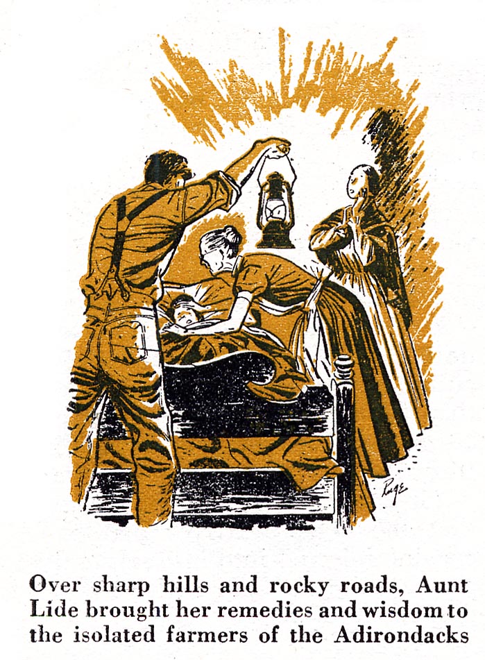
I think it was the fact that Ruge's style reminded me a bit of the ligne claire school of European cartooning that made me sit up and take notice... I was determined to find more work by Ruge. This proved to be a frustrating endeavour. For some time the only other piece I could locate was a tiny spot in Coronet magazine... At the time I didn't have much in the way of Collier's magazines in my collection. Once I added some issues of that publication to the TI vaults, my Ruge archive began to expand. Ruge had a regular gig drawing a silent four panel strip called "Clancy", about the hijinx of a mischievious Irish Setter, for several years in Collier's.This strip, although nice, was a bit of a disappointment to me. It was Ruge's human figure work that I wanted to see more of - and his more illustrative style I really loved.

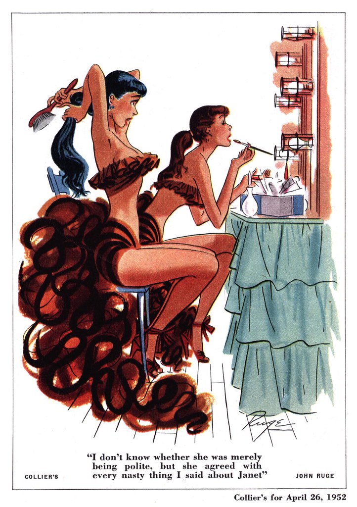
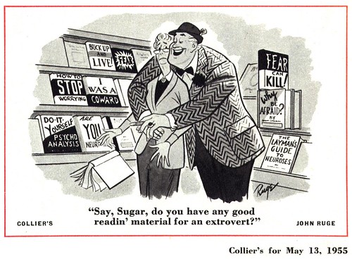
Well Ruge also supplied Collier's with a steady stream of single panel gag cartoons, including quite a bit of exceptional cheesecake!
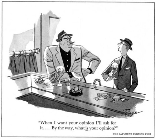
And he wasn't only working for Collier's... I've found a few of his single panel pieces in The Post as well.
More of his "straight" illustration work, mentioned in the tidbits of biographical info in the Complete Guide to Cartooning, still eludes me - as does a comprehensive bio - but I am indebted to Drazen for providing this first clue to the career of John Ruge with his fabulous gift - thanks D!

You can see these images at full size in my John Ruge Flickr set.
Wednesday, January 03, 2007

I Got A Clue!

Isn't it great when you get at least one Christmas gift you were really, really, REALLY hoping for? In my case, that gift was a copy of Illustrating for the Saturday Evening Post.When I posted those hilarious and bizarre gun ads just before Christmas, one well-wishing commentor hoped Santa would bring me a clue. Well Santa, many, many thanks... for bringing me a clue to the long lost details of the careers and lives of so many fantastic illustrators! This book will be an indispensible resource - second only to my copy of Walt Reed's Illustrator in America - when I'm trying to locate background info on the artists we showcase here at Today's Inspiration.
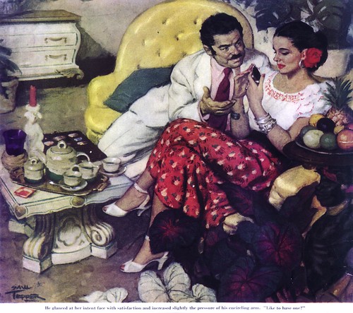
For instance, this fascinating anecdote about illustrator Saul Tepper: that's him posing in the reference photo for the illustration he eventually completed (below) for a 1940's issue of the Post. How cool it is to be able to find out now that, when the story asked for a "plump" model, no modelling agency could provide one! And that the artist spent several evenings in Latin clubs trying to find a Hispanic girl who would fit the bill - and was willing to pose for the artist. Neat!
So thanks to that anonymous commentor and thanks to Santa for bringing me the clue I was hoping to get!

Tuesday, January 02, 2007

Happy New Year! ...Now Quit Doing That!

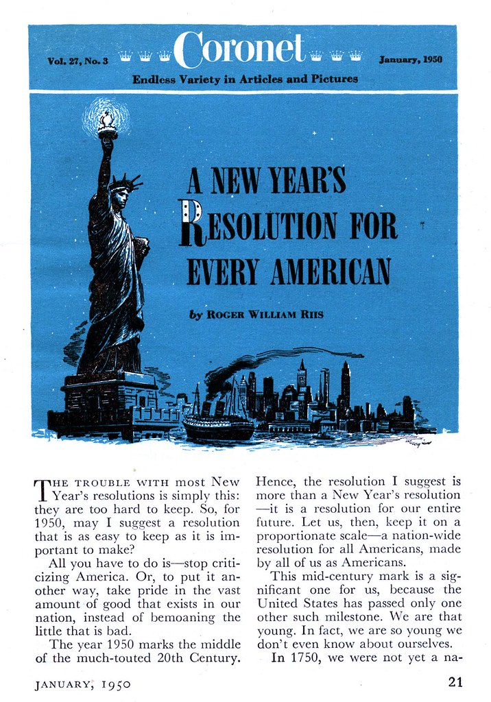
To mark the middle of the 20th Century, Coronet magazine had a New Year's Resolution suggestion for every American...


"Stop criticizing America!"


As if to drive home the point, the inside cover of that issue held this message from President Dwight D. Eisenhower: that Capitalism was the "economic support of every human right [Americans] possessed."


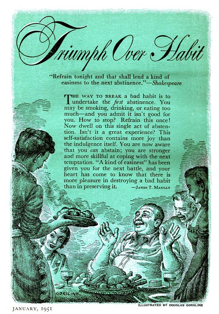
A year later, the editors of Coronet seem to have abandoned such lofty ambitions. There's not even a New Year's theme on the cover of the January 1951 issue. Inside, and only on the second-to-last page, is the one reference to anything New Year's Resolution-ish: a directive, illustrated by regular Coronet contributor Douglas Gorsline, to put back that second (or third?) helping of mashed potatoes. But hey, that's pretty good advice too!


Happy New Year!