Thursday, August 16, 2007

P&S Becomes P&H

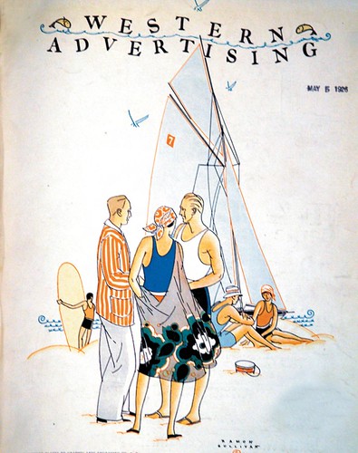
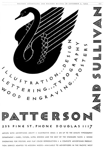
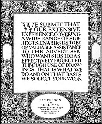
TI list member Bruce Hettema is the owner of P&H Creative Group and the author of an article in the current issue of Illustration magazine on the history of his Petaluma, California art studio, which began life in the 1920's in San Francisco as Patterson & Sullivan.

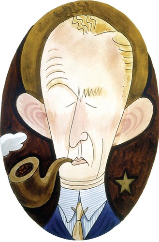
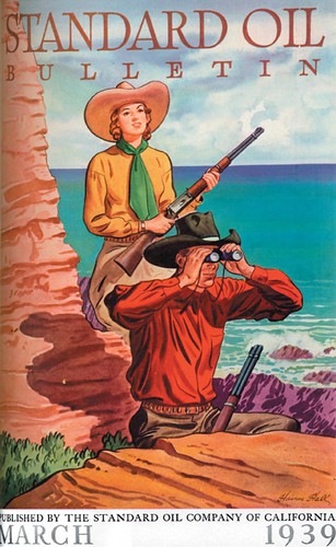
The studio's key artist at this time was W. Haines Hall, who had joined the firm in 1925 and continued to be active in the business through the 1960's.


Haines, along with fellow employee Alton Painter, was a founding member of the Thirteen watercolorists (founded by Maynard Dixon and Maurice Logan). He was also active in the Bohemian Club, producing posters and portraits for their various events.


Seavey's cartoons of the P&S artists often portrayed Haines as the sage arbiter amidst the turmoil and pandemonium of a bustling art studio.


So, after Sullivan left the business in 1939 (or more accurately "the business left him", Hall was J.E.'s first choice to become his new partner.


This quite naturally led to a name change: Patterson & Sullivan became Patterson & Hall.


You can find the full length version of this article in Illustration magazine #19.

Wednesday, August 15, 2007

The Realities of Working in an Art Studio

TI list member Bruce Hettema is the owner of P&H Creative Group and the author of an article in the current issue of Illustration magazine on the history of his Petaluma, California art studio, which began life in the 1920's in San Francisco as Patterson & Sullivan.

"Pat" (Patterson) and "Sully" (Sullivan) ran a tight ship.


They were two business-minded individiuals who were bottom-line oriented, and they constantly pushed their artists to be more productive.

Stan Galli, who Patterson & Sullivan hired right out of the San Francisco Art Institute in the 1930's, remembers fellow art students warning him against going to work at that studio because it was too commercial. "But I needed a job. I needed to make some money, and they paid $40 a month."


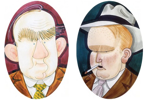
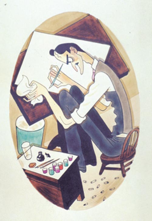
Clyde Seavey (below) was a talented artist at P&S who, in the early 30's, did a series of humorous caricatures of all the P&S artists and a series of cartoons depicting, from the artist's perspective, the grueling existence of a staff artist.


It's an insightful and amusing look at daily life in the agency at that time, which included client demands, creative differences, and squeezing budgets.

You can find the full length version of this article in Illustration magazine #19.

Tuesday, August 14, 2007

P&S: Largest Art Service on the West Coast

TI list member Bruce Hettema is the owner of P&H Creative Group and the author of an article in the current issue of Illustration magazine on the history of his Petaluma, California art studio, which began life in the 1920's in San Francisco as Patterson & Sullivan.

In 1927, on the eve of the Great Depression but still celebrating Charles Lindbergh's historic hop across the Atlantic, P&S was prospering.


It employed more than a dozen artists, each with his or her own specialty: product, still life, automotive, fashion, portraits - you name it. P&S artists could put pen, ink, paper, and brush together to produce ideas and illustrations that virtually leapt off the page to sell products and sevices.


In addition to their illustration services, P&S employed a staff of graphic designers and calligraphic artists plus a comprehensive typographic department. As Patterson & Sullivan's reputation grew, they began attracting many of the country's top illustrators.


In the early years, artists such as John Atherton ( whose work now hangs in museums across the country), Stan Galli, Paul Carey, Jack Painter, Haines Hall, Gib Darling, and Amado Gonzalez worked for the agency.


Tomorrow: The realities of working in an art studio.

You can find the full length version of this article in Illustration magazine #19.

Monday, August 13, 2007

Patterson & Sullivan

When we think of artists - even commercial artists - we often imagine someone working alone in a quiet room, far from the bustle of a typical office environment. But artists - especially commercial artists - have just as often gathered in groups to share studio space, enjoy the social interaction of the busy workplace, and attract more clients by offering a larger variety of graphic arts services that only an expansive studio can provide. Just last week I made reference to a Chicago powerhouse called Kling Studios and we've looked at length at the reknowned New York studio owned by Charles E. Cooper... but what about the West Coast?


TI list member Bruce Hettema is the owner of P&H Creative Group and the author of an article in the current issue of Illustration magazine on the history of his Petaluma, California art studio, which began life in the 1920's in San Francisco as Patterson & Sullivan. Bruce, with the blessing of Illustration magazine editor, Dan Zimmer, has graciously offered to give us an abridged look at the contents of his article this week. My thanks to both gentlemen for sharing this fascinating story, which begins below:


J.E. Patterson came from a big agency background where, as an art director/layout man, you were expected to design the ad, then pass it off to a "finish man" to do the final art - even if he wasn't the best suited artist for the job.

The philosophy at Patterson & Sullivan's new studio was to assemble a capable team of talented artists versed in a wide range of styles. They felt that if they could have the best artists available, they could deliver a better product than the ad agency could produce with its own in-house talent.

The 1920's were halcyon years in California. San Francisco was becoming the West Coast's hub of advertising, and the agency quickly proved to be successful beyond the young artists' dreams. Advertising agencies quickly discovered the benefits of hiring P&S, and soon P&S was attracting high-profile clients such as Southern Pacific Railroad, Dole, Del Monte Corporation, Stanford University, Standard Oil, Matson Lines, and Dollar Steamship Lines.


Tomorrow: A look at the art and artists of Patterson & Sullivan.

You can find the full length version of this article in Illustration magazine #19.

Sunday, August 12, 2007

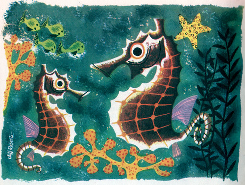
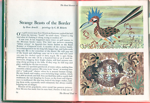
C.H. Roberts & Harry Borgman


After I posted Friday's Ford Times illustrations by Charles Harper, one reader commented that it would be great to see some work by C.H. (Cliff) Roberts and Harry Borgman.


Both artists were also contributors to Ford's magazine for 50's motorists. Though I was unaware of the work of these two gentlemen, I hoped someone out there might be able to educate us with some examples of their art.


Well, thanks to an anonymous donor, we now have all these wonderful scans to enjoy!


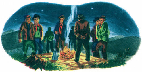
Roberts seems to have worked in many styles...


...and his eclectic approach to flat, cartoony art suggest to me that he might have been a fan of Jim Flora's work.


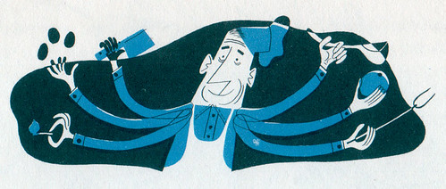
Our anonymous contributor only found one example of Harry Borgman's art (below) but it too is done is an exciting style that leaves us wishing for more.


Many thanks for finding these images, AC, and for taking the time to scan them for us!

Friday, August 10, 2007

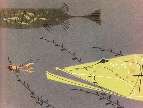
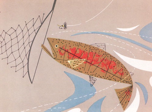
Fishing with Charles Harper

The purpose of this book is quite simple. It is to help American motorists get more pleasure out of recreational opportunities offered by their family cars.


It has been stated–this is probably more of a guess than a statistic–that Americans depend on their motor cars for 80 per cent of their outdoor recreation.


In any event, it can hardly be denied that over the past fifty years the automobile has given us an increasingly greater participation in outdoor activities.


It is a fact that nowadays every trout in America is in danger for its life.


This, then, is a tourist's-eye view of America outdoors, made up of selected articles which appeared during the past few years in the Ford Times and Lincoln-Mercury Times, periodicals which are distributed by Ford, Lincoln, and Mercury dealers as a courtesy to their neighbours and customers.


Modest in purpose, the book may perhaps suggest a concept which stands simple, clear, and understandable ina confused world–the concept of a young, vigorous people at play in a great land.


From "Ford Treasury of the Outdoors", published by Simon and Schuster, New York. Copyright 1952 by Ford Motor Company, Dearborn, Michigan.

*All of these images have been added to my Fishing Flickr set and my Charles Harper Flickr set.

Thursday, August 09, 2007

It's a Matter of Opinion...

... and in my opinion, the typical deep sea fishing illustration, shown from behind the seated fisherman with the magnificent marlin usually appearing as a speck on the horizon, is nowhere near as impactful as the typical freshwater fishing shot we looked at yesterday.


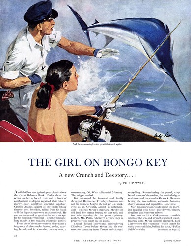
In spite of that, I still love illustrations of marlin fishing - and this week's theme gives me the perfect excuse to show you a few I've been saving up. This one, below, is also interesting because its painted by Wendell Kling.

Kling was certainly an accomplished illustrator -- but more importantly, he owned a massive graphic arts studio in Chicago that provided a huge array of services - including the services of many of Chicago's top illustrators - to the advertising industry in that city. Kling Studios also had branch offices in New York, Detroit and Hollywood. It must surely have been the largest graphic arts services studio in America at that time.


Finally, here's one of my favourite 50's illustrators, Rudy Pott, showing us how to do it right. If the typical marlin fishing shot is from behind the fisherman, then bring the fish right up alongside the boat so we can be impressed by its magnificent size, power and strength as it fairly leaps into our lap!

As a young man, Rudy Pott had high hopes of becoming a western artist, even moving from his native Philadelphia to New Mexico to immerse himself in the surroundings of his chosen subject matter.

But fate had other plans for Pott. Upon his return to Philly he found the market flooded with western artists and the Saturday Evening Post offering steady assignments as the regular artist on author Philip Wylie's tales of a rugged Florida fisherman, Crunch Adams.


I have more to tell you about Rudy Pott... but we'll save that for another time.

For now, take a moment to enjoy all of today's images at full size in my Fishing Flickr set.

Oh! And a quick note to go check out Jack Raglin's photostream on Flickr. Jack has just added several fishing- themed illustrations by the wonderful Enoch Bolles.

Wednesday, August 08, 2007

The Quintessential Fishing Shot

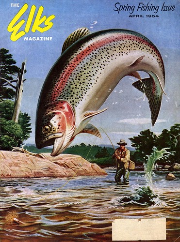
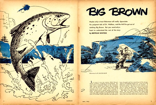
A long time ago, maybe as far back as the time of the cave paintings at Lascaux, an artist wrestled with how to best compose a shot of that moment when the fisherman first sees the fish on his line reveal itself with a mighty leap from the impenetrable depths.

This is what that long-forgotten artist came up with: the "camera" is right there at water level, at the very instant when the fish bursts forth with a violent splash, thrashing with all its might to shake the offending hook. The thrilled fisherman is always small in the distance. He is a bit player to the life-and-death struggle of the fish.


Countless years and thousands upon thousands of variations on a theme later, no artist has ever surpassed that particular composition. The moment you see it you know you've seen it before. It is the quintessential fishing shot.


Here are just three more examples of that shot for you to enjoy. They may all be illustrated in different styles, but the shot remains the same.


Don't dismiss these illustrations just because you've "seen it all before". Looking at the full size versions in my Fishing Flickr set is a rewarding experience!

Tuesday, August 07, 2007

You shoulda seen the one that got away!

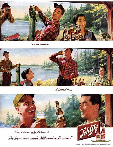
The scene in the Schlitz ad below is remarkably similar to my own experience at my fishing tournament this past weekend. Well, except that there were only guys at the tournament. And we were fishing for bass, not pike. And my winning fish was nowhere near this big.

But hey - we did have quite a few beers! Except none of them were Schlitz. Come to think of it, the scene in the ad below is nothing like my experience at the fishing tournament this past weekend.


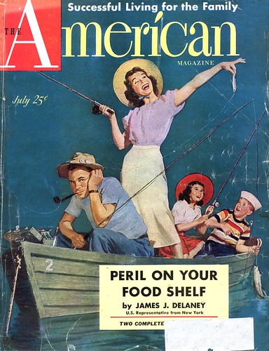
Now this scene below... this is more like my experience at the fishing tournament this past weekend.

Yup... it was, unfortunately, a bad year for catching lunkers. I'm embarrased to admit my winner was only 11" long. In past years at the same location we have brought in nice hauls of small-mouths in the fifteen to eighteen inch range. I don't know what was up this year, but the big bass were just not there.

Still, we all had a great time enjoying the good-fellowship of sharing meals, stories and many laughs with friends not seen since last year -- of course the thrill of the hunt for that elusive prize-winning bass...

...and a lot of beer.

Both these illustrations have been added to my Fishing Flickr set.

Monday, August 06, 2007

Fish On!

Today is a holiday in Canada and I've just returned from spending the long weekend up north with a great group of my pals, enjoying our annual summer fishing tournament which, ahem, I won.


We were fishing for small-mouth bass and this year proved to be one of the toughest we've ever experienced. I'm really not that big of a fisherman... for me, its the whole experience of being with friends and enjoying the great outdoors. And, er, maybe a beer or two.


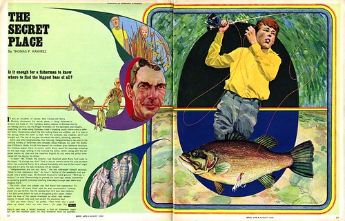
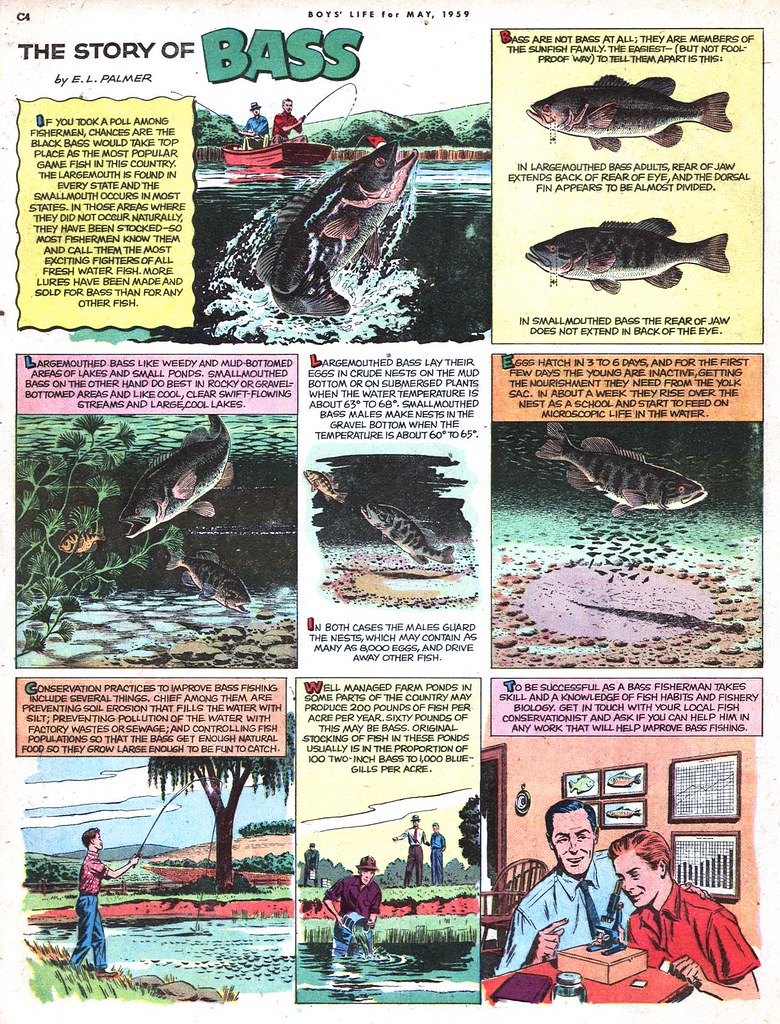
But as I return to the "real world", my thoughts are still on the sights and sounds and experiences of that fishing trip. So this week, let's take a look at fish, fishing and the watery world beneath the waves.

These images can be found at full size in my Fishing Flickr set.

Friday, August 03, 2007

Tom Watson on Coby Whitmore

Once again, Tom Watson has done my work for me. He sent me these Coby Whitmore scans and the following commentary, which is so wonderfully thorough I wanted to share it with all of you. With Tom's permission, I present his look at the later period work of Coby Whitmore:

Since Coby Whitmore is the focus for "Today's Inspiration", I went through some of my old clippings and picked out two rather different techniques and moods by Coby Whitmore... painted roughly around the same time period. It shows just some of the versatility and depth, this great illustrator had throughout his long career. I clipped and saved these and others, when I was a young illustration student around 1959/1960.


The Saturday Evening Post story illustration depicts a beautiful young woman sitting on a porch, deep in thought. Her body language (gesture) indicates distress, tension and even fatigue. The porch and figure are mostly in shade, except for the soft, warm, low late afternoon sunlight just catching the edge of her body. Showing the well shaped female leg was typical of many of his illustrations... and this is no exception. The overall low key (dark) light greatly adds to the mood he wants us to feel. To avoid too much dark grayed down shadow tones, he chooses a bright multicolored striped garment on the woman... which also quickly catches our attention.

This is a classic example of cool colors complimenting warm colors. Whitmore's choice of pose and lighting tells us much about the flavor of the story, but without revealing the motive. We are now seduced into reading the story to satisfy our curiosity. This is not only a high quality illustration but a high quality painting that would look quite appropriate in the finest galleries or museums.
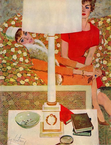

The second Whitmore illustration, I believe is another Saturday Evening Post story illustration. In contrast, the mood is high key (light) bright and colorful, depicting two very sophisticated and refined women lounging in a stylish living room. Typically the women are very beautiful and one is wearing a lavish fur collar and jewelry, indicating class and wealth . We peer past the lamp and end table, and see interesting and well designed pieces of each figure... as though we were eaves dropping. In this illustration Whitmore changes to a flatter more decorative technique, depicting patterns of warm reds, oranges and golds... rather than the more painterly forms of the first illustration. The flat solid shapes of the off white lamp, end table and the end of the couch, contrasts beautifully with the floral pattern on the upholstery. This example shows great design and color taste coupled with excellent draftsmanship... which he developed to the maximum during the 1960's.

He was always coming up with new ideas and approaches... which kept us illustration students running to the newsstand every month looking for the next Coby Whitmore SURPRISE. At that time, only Al Parker was as consistently inventive with creating "Guy/Girl" story illustrations.
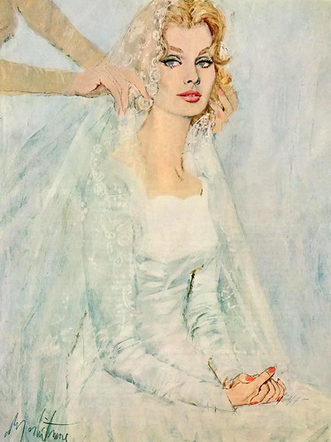

The latest Coby Whitmore illustration that I am sure of is for a 1962 McCall's magazine, which I attached. I thought I had something later, but I'm not sure he was doing much illustrating after that. I also found some interesting information about a little insight on what kind of a guy Coby Whitmore was personally. The following was from an interview Joe Bowler gave within the last 10 years: While working as an apprentice at Charles E. Cooper Studios in New York, Joseph Bowler apprenticed under some of the top illustrators of the 1950’s. Coby Whitmore brought in an illustration for Cosmopolitan magazine, which Bowler matted. He saw the sample Bowler had done the night before and asked if he could take it with him to
Cosmopolitan to show the Art Director. Upon his return, he told Bowler they had bought his sample and to bill them for $1,000. Earning $35 a week at that time, it seemed like a fortune to Bowler. Within six months Bowler’s illustrations were appearing, in three major magazines. He was quoted as saying, “Coby was my mentor in the early days of my career and we becamelife-long friends”.

My thanks to Tom Watson for his time and effort in providing us with this fabulous post!

You can see these images at a larger size in my Coby Whitmore Flickr set.
Thursday, August 02, 2007

This is Coby Whitmore Too!

This is the kind of illustration we typically associate Coby Whitmore with. His paintings of gorgeous women always have an alluring quality of sexuality and strength. No shrinking violets or wide-eyed girl-next-door types here... the Whitmore woman is a worldly woman. And he painted too many to count during his time at the top of the glamorous 1950's New York illustration scene.


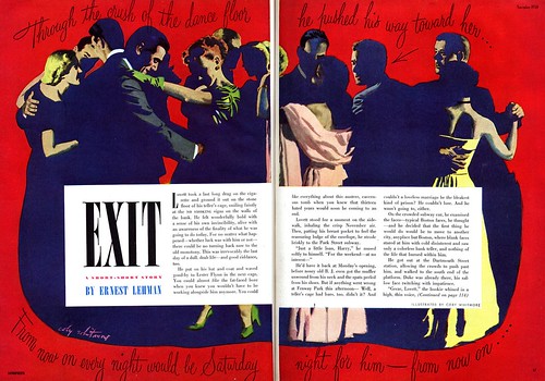
But this is Coby Whitmore too! Frankly, I was shocked to discover just how experimental Whitmore was when I first saw the illustrations below. If I covered the signature you'd never guess that he had painted "Exit".


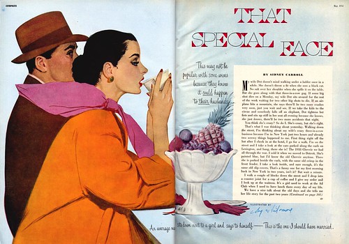
And though the woman in "That Special Face" has a hint of that special Whitmore look, the illustration in its entirety could easily be mistaken for an Al Parker.


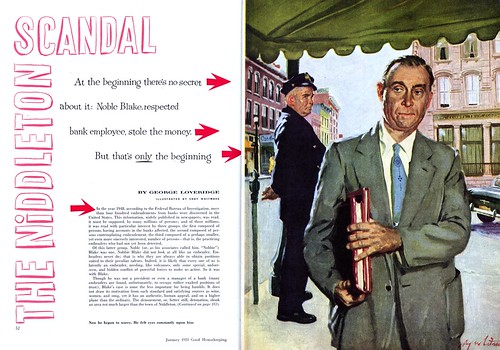
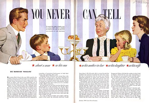
Finally there's this piece from 1955, when Whitmore was probably at the zenith of his glamour girl painting career, when he had moved well beyond the Old School style he learned in Haddon Sundblom's studio -- and all of a sudden he gives us this fully rendered scene, complete with classic small town middle age male characters - and not a New York debutante in sight!


Surely these departures from his more typical subject matter must have been a tonic for the artist - and an opportunity to show his clients and competitors that Coby Whitmore was no one-trick pony.

Take a closer look at these illustrations in my Coby Whitmore Flickr set.

Wednesday, August 01, 2007

Coby Whitmore's Kids

I think its fair to say that when you think of Coby Whitmore you think of beautiful women in stylish clothes... or romantic couples arranged in a hundred variations of "the clinch". What you don't usually think of is kids.


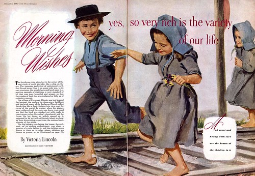
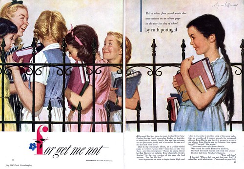
But - surprise - Coby Whitmore was just as adept at drawing and painting scenes from the playful world of children as he was at scenes of grownups engaged in games... of another sort.


Since so many of the past few weeks' posts have focused on the art of illustrating children, I thought we should make a note of Whitmore's expertise in that area as well. Too often illustrators are pigeon-holed by their most popular subject matter. But versatility is the key to success and diversity of subject matter keeps the work interesting.

You can see today's images at full size in my Coby Whitmore Flickr set.