Tuesday, July 15, 2008

Storybook... Cartoon... Illustration?

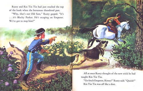
Yesterday I pointed out that the Provensen's had designed and illustrated 'Tony the Tiger' and other cereal box mascots for Kelloggs. They brought their storybook style to the look of the character... but most would agree that Tony is not a storybook character... he's a cartoon character.


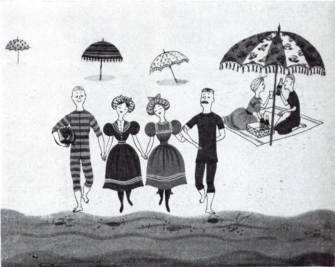
This raises an interesting point I have wrestled with when choosing material for these posts: at what point does the 1950's storybook style become a cartoon style? I think you'll agree with me that there is a distinction. But I'm not really sure where it lies...


I'm not alone in my confusion on this issue. What is 'illustration' and what is 'cartoon' has confounded a lot of people - a lot of artists - for a very long time.


This week on Charlie Allen's Blog, Charlie presents his thoughts on the issue - he and I have been discussing it at length in our correspondences. Since Charlie took the initiative to bring the discussion into a public forum, I thought I'd follow his lead and share my thoughts on the subject.

So let's segue into a new topic that's sort of related to our last one: Storybook... cartoon... illustration... which is which?


Are they all related? Or are they all the same thing?

* My Ads with Storybook Styles Flickr set.
* My Ads with Cartoon Elements Flickr set.

Monday, July 14, 2008

The Provensens: "Something strange and provocative"

No discussion about the innovations and influences of the 1950's storybook styles would be complete without mentioning Alice and Martin Provensen.
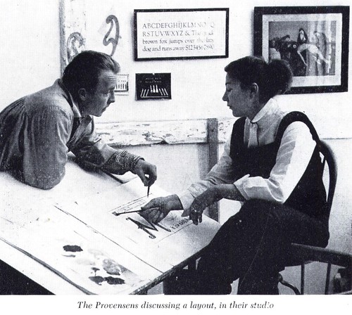

In fact, all the quotes from Henry C. Pitz's 1959 article in American Artist that I referenced over the past week were actually from his article showcasing the talented couple.

"A new flavor has been imparted to our illustration," wrote Pitz in 1959, "something strange and provocative, something that stirs old racial memories and at the same time hints at new exciting forms."

Pitz marveled at the development of the Provensens' style. "Their combined talents are fresh and new, and although their first book is only twelve years old, their contributions have been of delightful importance."

How true. The Provensens initially produced pleasing storybook art that reflected their background in animation.


These early examples from 1948 hardly hint at what was to come in just a few short years.
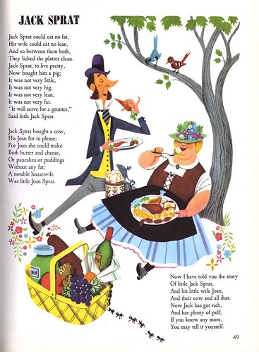

By the early 50's the Provensens' work was beginning to display what Henry C. Pitz called "a fertile stock of invention, and a nagging sense of dissatisfaction [that] has spurred them to observe, study and experiment."
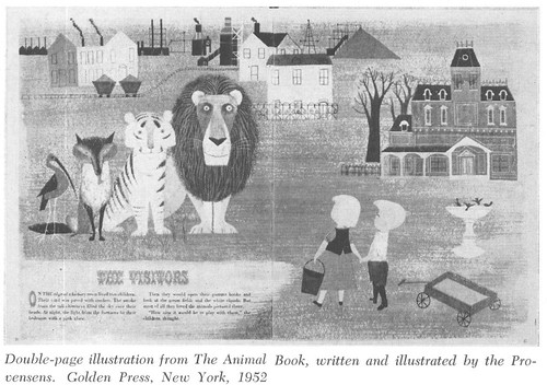

I've posited this past week that the storybook artists influenced popular culture with their stylizations. I could hardly give you a more concrete example of that influence than the Provensens' 1953 design of 'Tony the Tiger' and other cereal box mascots for Kelloggs. The incorporation of the storybook style into mass-marketed packaging and subsequent spin-offs (animated tv ads, print ad campaigns) fused the storybook style to a wide range of visual media and encouraged a broad range of commecial artists to adopt it.

The Provensens, meanwhile, were moving on. "Although they have done advertising and magazine illustration," writes Pitz, "they prefer the less frantic pace and less ephemeral climate of the book field."
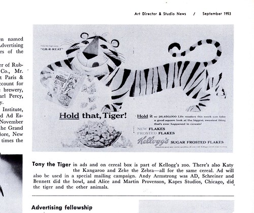

Again, Henry Pitz' remarks perfectly describe the next stage in the Provensens' growth.

"If one must pin an obvious label on their work it would be 'modern', and yet the critic, aware of the long perspective of the world's art would say in the same breath, 'how traditional' ".
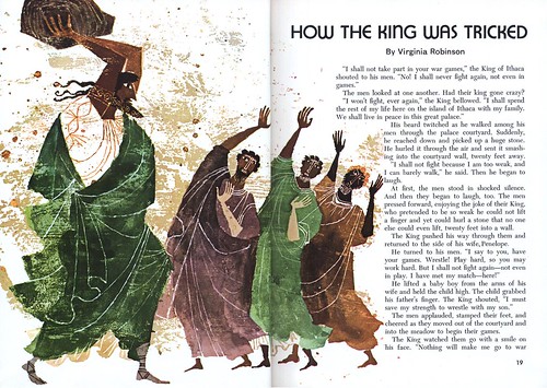

"Their vocabulary of decorative forms and motifs is an extended one, enlarged by scrutiny of many of the world's cultures and made supple by constant practice."


The Provensens were enthusiastically experimental with media as well as style. "They do not have a routine, stage-by-stage method," wrote Pitz. "They begin painting as soon as a design-image has quickened their minds; the first attack may be the successful one, or the fourth or the fifth."
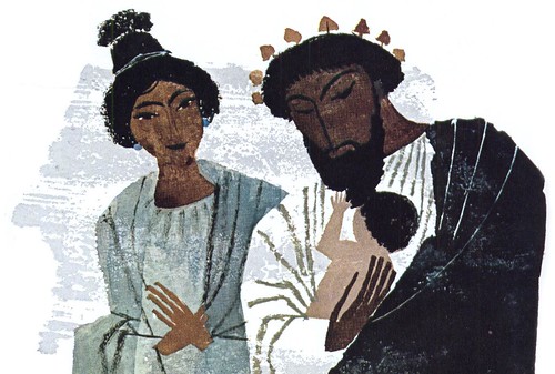

Reinforcing my belief that the next generation of illustrators would be affected by their exposure to the storybook style is this passage:

"Certainly the Provensens' work has grown in power and subtlety. Earlier influences now seem to be entirely absorbed, and their note is independent and confident. In fact, they are having their influence on others now, for they are among the most imitated illustrators in art school circles."

As his article (and this series of posts) draws to a close, Henry C. Pitz confirms what I already knew growing up in a world full of books, cartoons, and packaging imagery that can trace its roots back to the 1950's storybook styles:

"The commercial success of [the Provenses'] books is a heartening sign, for it proves the existence of a sizable audience receptive to excellent picture-making."


"Their success is more than a personal one. It indicates that the more than three decades in upsurge in the American illustrated book has lost none of its vitality, and is reaching a new level of excellence and touching new audiences."

* My Alice and Martin Provensen Flickr set.

Friday, July 11, 2008

Storybook Stylists and their Influence on Animation

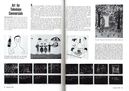
While reading an article in the November 1954 issue of American Artist on "Art for Television Commercials" I was struck by a point I think I have always intrinsically been aware of, but had never fully considered...


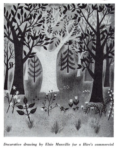
The storybook stylists of the 1950's had a profound influence on cartoon animation, both in terms of character design and the look of settings and props. Their influence was so powerful that decades later, second and third generation animators are still looking back to the work of these early pioneers for inspiration.


Consider this: some of the best known and most beloved storybook artists of the 50's began their careers in the animation industry of the 1940's. Alice Provensen worked at Walter (Woody Woodpecker) Lantz Studios and her husband, Martin, worked at Disney - as did other reknowned storybook artists Gustav Tenggren Aurelius Battaglia and Mary Blair.

The significance of this influence can not be overstated!


If you were born and raised in North America since the advent of television and watched endless hours of old Warner Brothers and MGM cartoons, or grew up as I did on a steady diet of Hanna Barbera's made-for-tv fair, or went to any Disney movies from the 'Aristocats' era, then you'll recognize the similarity of style in the look of the work done by the 50's storybook artists and the buildings, trees, picture frames, chair legs, salt and pepper shakers and a million other props and environments in the cartoons you watched.


Some of you grew up and became animators and illustrators - and when I look at imagery all over the Internet today, on your blogs and websites, its clear that the childhood memories of styles these storybook artists originated still resonate powerfully for a great many of you.

This brings us to one particular storybook artist who stands at the crossroads between storybook and animation art: Mel Crawford.


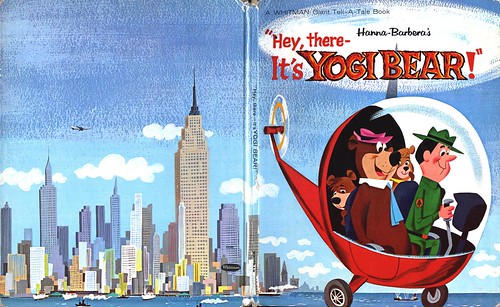
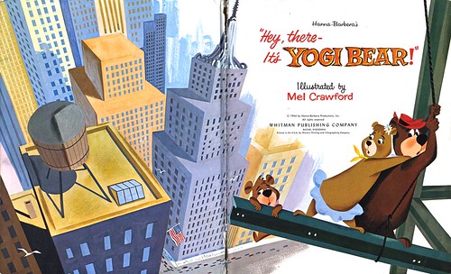
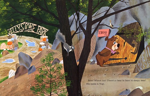
While the other artists mentioned above created styles whose influence can be seen in the work of animators, Crawford brings the process full circle by adapting the animated cartoon back into the storybook format. He understands the technique and stylistic nuances of the storybook artist -- and the cartooniness and dynamic movement and exaggeration of the animator.


Crawford manages to create a hybrid that is the perfect, delightful synthesis of both!


Crawford is an amazingly versatile artist. Though he is best known for his storybook adaptations of tv cartoons (for which he is adored by a legion of illustrators and animators) he is equally adept at realistic illustration.

Some might be surprised to discover that this work below is Mel Crawford, too.


While preparing this post I was thrilled to discover that not only does Mel Crawford have a website, he also has a blog where you can see many more examples of his wonderful artwork.


I'm really running behind this week, but there's more to show on the subject of the storybook style. Stay tuned and I might just fire off a second post later today!

My Ads with Storybook Styles Flickr set.

My Mel Crawford Flickr set.

Wednesday, July 09, 2008

Storybook Styles and the Enlightened Art Director

Henry C. Pitz, in his article in the December 1959 issue of American Artist writes, [The Storybook Style] "is entitled to be called a renaissance, for it has caused a reawakening that has born abundant fruit. It has eclipsed the so-called "golden age" of the eighties and nineties of the past century, and has no real present-day rival in the rest of the world."


Pitz could not have imagined how right he was. As realistic illustration lost ground to the relentless charge of television and photography, the storybook illustrators of the 50's were steering illustration in a new direction that the public likely found more palatable than the sometimes impenetrable work of the avantegardists lead by Robert Weaver.

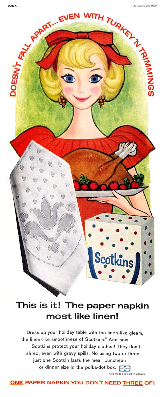
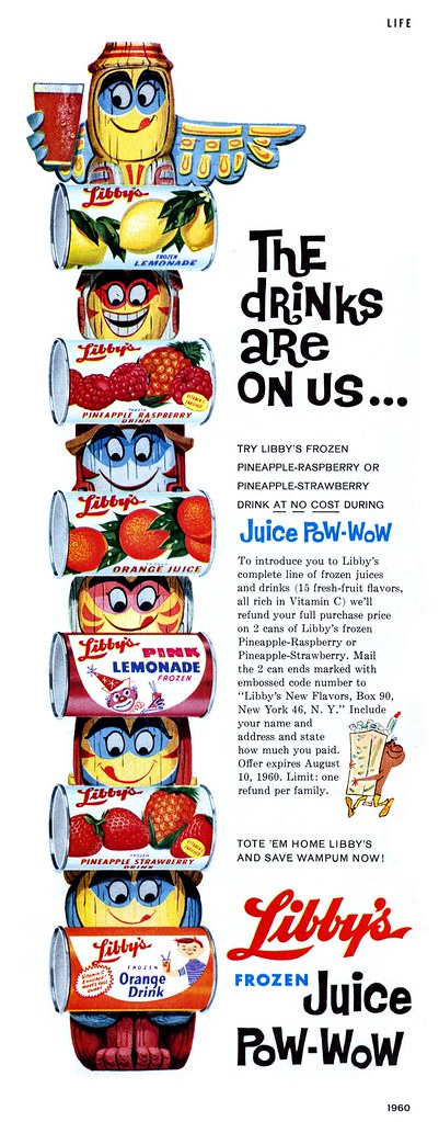
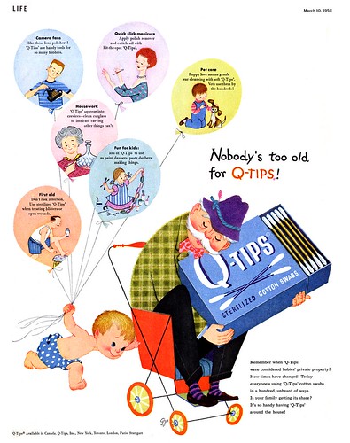
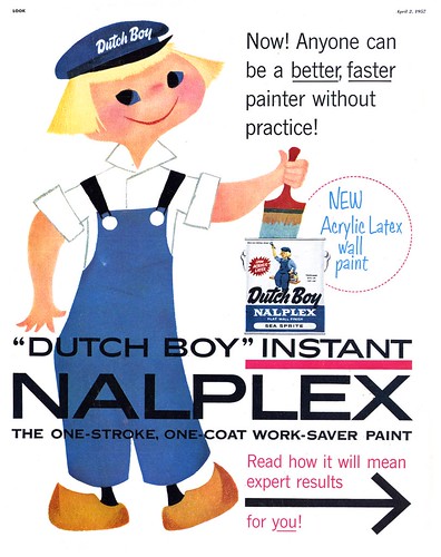
A few enlightened art directors and their clients were early adopters of the storybook style...


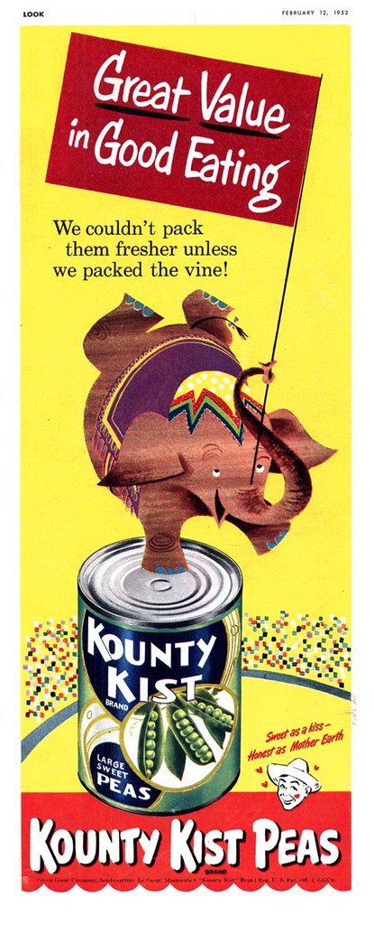
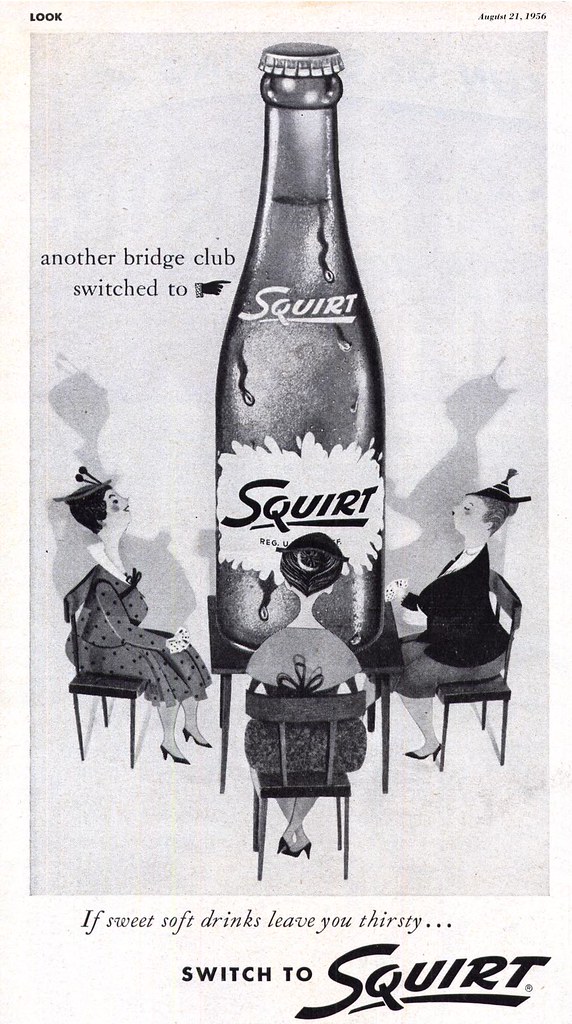
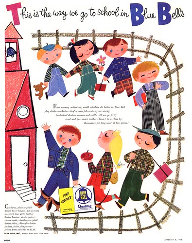
... giving even the most mundane ad concepts an attractive, eye-catching flare that realism (photographic or illustrative) simply could not hope to compete with.


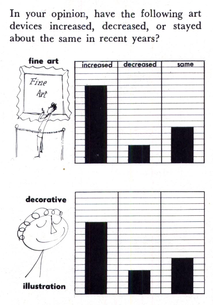
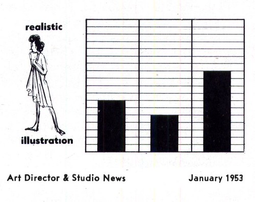
As early as 1953, members of the Art Director's Club of New York seem to have supported the idea of using more storybook styles. An unscientific survey in the January 1953 issue of Art Director and Studio News shows the following cleverly presented results.

Asked their opinion of which types of visiual devises used in advertising they felt were on the increase, most art directors seem to have felt that fine art and decorative art was on the increase...


... as well as more cartoon art and photography...


... while most seem to have felt that realism was, if anything, just holding its ground. This is quite telling.


Art directors are the ones developing concepts for client presentation. If they can convince advertisers to try something different, something that might make their product stand out from the competion, then they can be credited with having played a significant role in more storybook style artwork being presented to the public.

The pieces you see here and throughout this week are but a tiny sampling of clients who were convinced by their art directors to try something other than realism.


"The way for book illustrators has been paved by a growing audience for picture books, particularly among children," wrote Henry C. Pitz. "Americans love pictures, often without discrimination, but that raw appetite has given the book illustrator his opportunity."

"Our book illustrators are a concientious and devoted company, frequently giving much for very little. Certainly no one considers book illustration a road to riches. As a result, there is much less frantic opportunism and obsequious awareness of every breath of fashion than in the fields of advertising and magazine illustration. In a world of snatch and discard, the book illustrator retains some liason with permanent things."


So permanent, in fact, that they have flourished for half a century while many others have come and gone.

See my Ads with Storybook Styles Flickr set for many more examples.

Art Seiden - Master of the Storybook Style

Several illustrators can lay claim to having pioneered the 1950's storybook style, and chief among them would be Art Seiden.


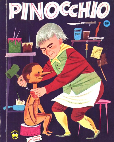
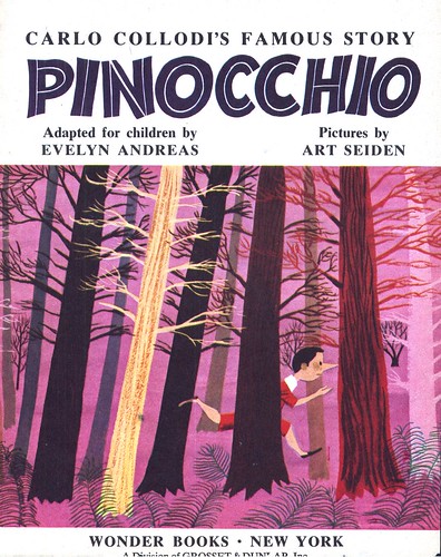
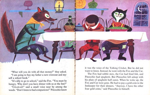
Seiden, who illustrated many children's books during his career, produced the art for Wonder Books' edition of Pinocchio in 1954...


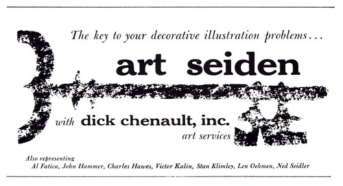
But Seiden was far more than just a storybook illustrator. He did this piece for American magazine in 1951, he had worked for a variety of advertising and editorial clients, including Phillip Morris, Hoffmann-LaRoche, General Motors and Hearst Publications... and his talents were being advertised to a broad base of commercial clients by his rep, Dick Chenault Art Services, in at least one 1953 issue of Art Director & Studio News.


This small space ad doesn't seem to say much at first glance, but actually it provides some interesting clues to Seiden's career and to the illustration business of the time in general:

For instance, in the ad Chenault also lists the other artists he represents. They include Charles Hawes, Victor Kalin and Stan Klimley - all successful illustrators with 'realistic' styles. In fact Klimley had been associated with the powerhouse Charles E. Cooper studio just a few years earlier.


Chenault's decision to highlight Art Seiden among his stable of illustrators suggests that, while the realistic illustration styles still dominated the commercial art field at the time, storybook styles were garnering consideration among ad clients as a forward-thinking alternative.


Note also that the ad describes Seiden as a 'decorative' illustrator...


'Decorative' was a broadly used term for a range of styles that didn't fit the general category of realism. Even cartoonist Roy Doty, in his listing in the 1947 Art Director's Annual describes his work as "humorous decorative illustration".

Certainly Seiden is one of the artists who set the tone for what would become the 'look' of decorative illustration later in the 50's and into the 60's (one need only look at the many props in this batch of illustrations to see the template a generation of decorative artists used in their own work -- a template still being used by a generation of illustrators today).


But Art Seiden's deceptively simple-looking style is actually far more than merely 'decorative'. It may well have been the perfect variation of the popular approach used by many realistic artists during the 50's: that flat, graphic gouache technique incorporating bold, symplified, colourful shapes and patterning.

When the camera began replacing that 'big head', Cooper studio type of realistic illustration, the style Seiden (and others) had fostered provided a stepping stone - a transition point - for the next phase in illustration.

My Art Seiden Flickr set.

Monday, July 07, 2008

The Storybook Style

"The world of book illustration in America has been changing its face for the better during the last thirty years," wrote Henry C. Pitz in the December 1959 issue of American Artist magazine.


"Shouldered aside by the noisier worlds of magazine and advertising illustration, the book illustrators and designers have been given little heed by the critics and writers, but they have brought about an unheralded revolution."


Pitz is correct that the styles being developed by the book illustrators of the 50's were revolutionary... and occasionally, when art directors and clients were feeling particulary bold, the magazine and advertising world even co-opted those style .

Ultimately, the storybook styles would have such a profound effect on a generation of young artists that they may well represent the single most powerful stylistic influence on the face of modern day illustration.


This week, let's look at the early days of the storybook style in book, magazine and advertising art.

My Ads with Storybook Styles Flickr set.

Friday, July 04, 2008

Happy Independence Day!

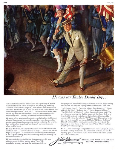
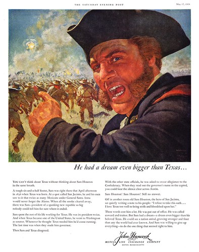
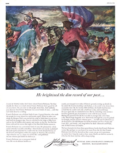
The 'John Hancock' series of ads that Mutual Life Insurance sponsored throughout the 1950's is really one of the finest campaigns that ever ran. Each ad is beautifully painted by a top illustrator, like these below by John Gannam, Harold Von Schmidt, and William A. Smith respectively.


As well, the copy is both entertaining and educational. A brief, beautiful history lesson, courtesy of the advertiser. What a shame no company is running something like this today!


What a great opportunity. Without a doubt, any illustrator working today would love to have such an assignment. (Are you listening, corporate America?)

William A. Smith's son, Rick, told me his dad "always researched the historical projects deeply. He loved to find historical discrepencies in existing depictions of situations he was reviewing."


To all our American friends, Happy Independence Day - and on this day when you celebrate your country's history, take a moment to enjoy these ads at full size in my American Legends Flickr set.

Thursday, July 03, 2008

Austin Briggs: Master of the 'Awkward Moment'

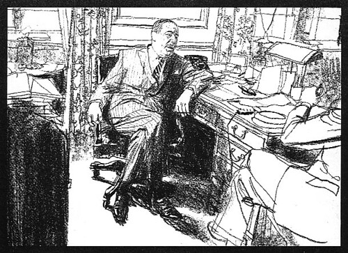
A note arrives from Harold Henriksen, along with the first two scans below:

I thought of a particular Briggs illustration when I read a comment by Barbara Bradley Feb 27th. This is the part of the comment I meant.

"Fuchs pointed out something I’ve never forgotten about Briggs; that he was one of the first to select that natural moment between extremes of an action, often an almost awkward moment".

The Briggs illustration of the person sitting illustrates that comment for me.


The 'awkward moment'? What an intriguing notion.


Happily, many TI list members have been very generous in sharing Austin Briggs scans from their collections with me, so rounding up a few other examples took no effort.


Was Austin Briggs particularly adept at capturing 'that natural moment between extremes of an action' in his work? You be the judge.


* My thanks to Harold Henriksen, Brian Postman, Tom Watson and Michael Lark for providing material for today's post.

* My Austin Briggs Flickr set.
Wednesday, July 02, 2008

Charlie Allen Launches a Blog

Ever since I wrote about his career in this space, I've had the great pleasure on an ongoing correspondence with Charlie Allen. Along the way, Charlie has sent me not only his comments - but more terrific examples of his work than I can count. Yesterday was no exception.

It occurred to me that Charlie has so many great stories and so much amazing artwork to share, he really ought to have his own blog... so I set one up for him, and today you get to read his first post. I think you'll enjoy - and learn from - Charlie's remarks as much as I do. Its a rare opportunity to learn about the West Coast advertising art business of the mid-20th century from one of the top illustrators of those times... a guy who was there on 'the front lines' leading the charge.

Charlie plans to update his posts approximately once a week, so be sure to check in often at Charlie Allen's Blog.

You can always find it in my sidebar links!

Tuesday, July 01, 2008

Happy Canada Day!

Will Davies created this limited edition print of the Canada II before the actual racing yacht was built.


"I'd seen a similar painting done by Bob Heindel and wanted to try something like that." says Will.

The idea originally came from a friend and client, art director Bob McGee, who suggested that the two men do the print as a business venture in advance of the 1987 America's Cup yacht racing series.

"I used photos of the Canada I," Will told me, "and the Captain of the Canada II came out to my studio and explained how all the rigging and so on should be strung."

"There were no shots with people on board, so I had to make up all the figures."

Will remembers Bob McGee moving out West to do paintings of horses not long after this venture. "Bob loved horses and knew everything about them."

The Royal Canadian Yacht Club in Toronto purchased the original painting... but the prints, unfortunately, did not sell well. "I still have a bunch of them here at the house," chuckles Will.

* My Will Davies Flickr set.