Thursday, August 18, 2011

James Hill and "the ability to work with, rather than for, an art director"

From the March 1978 issue of Creativity magazine Hill27 Hill25 Hill26 Hill31 (Above and below: James Hill shares page space in various 1950s volumes of the New York Art Directors Annuals) Hill32 Hill33 Hill24 Hill10.JPG Hill09.JPG Hill22 Hill11.JPG Hill21 Hill30 Hill23 Hill29 Hill20 Hill04.JPG

Monday, August 15, 2011

"Something in the water..."

Have a look at this beautifully drawn 4-panel comic strip;  see how long it takes you to identify what company is being advertised.

  Y&R02.detail04Y&R02.detail03 Y&R02.detail02 Y&R02.detail01

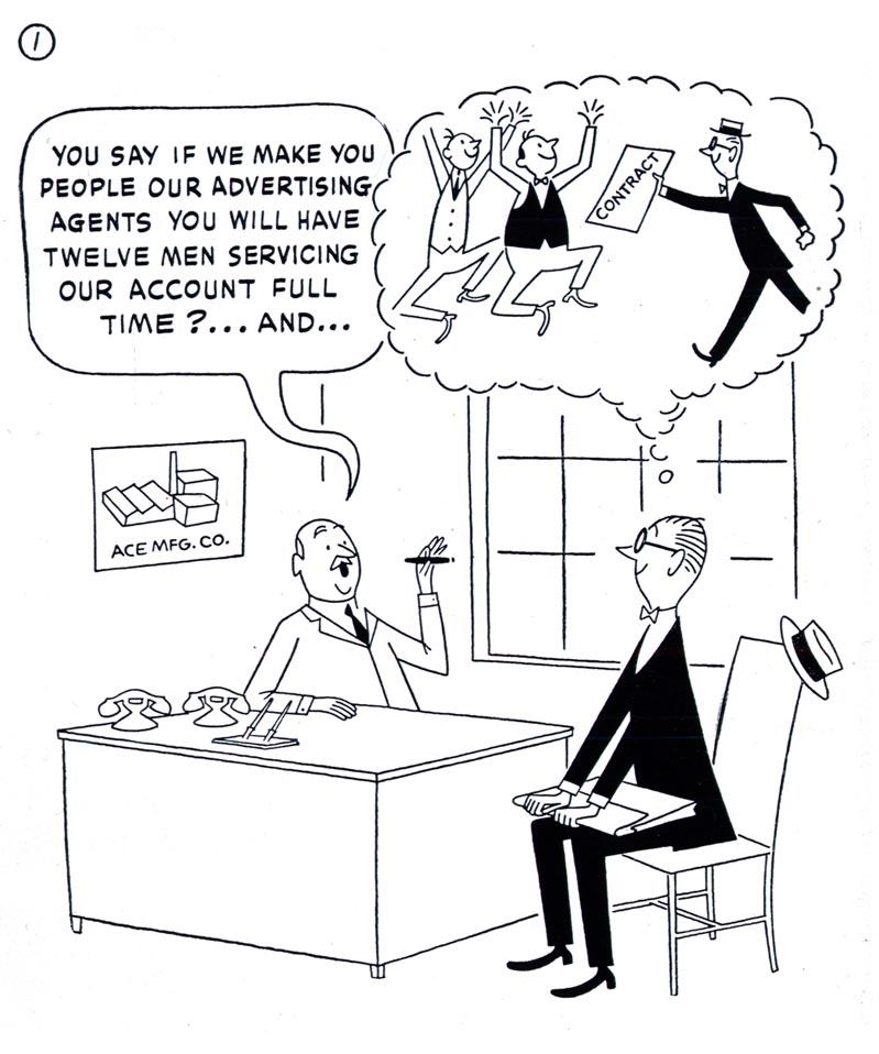
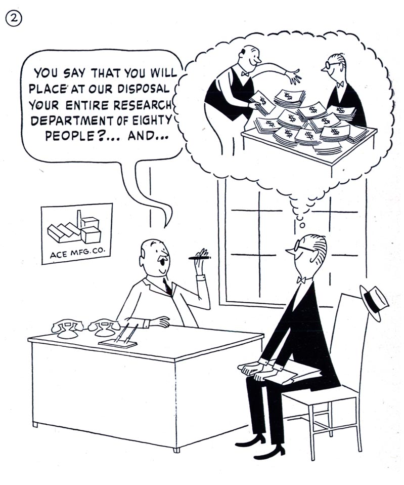
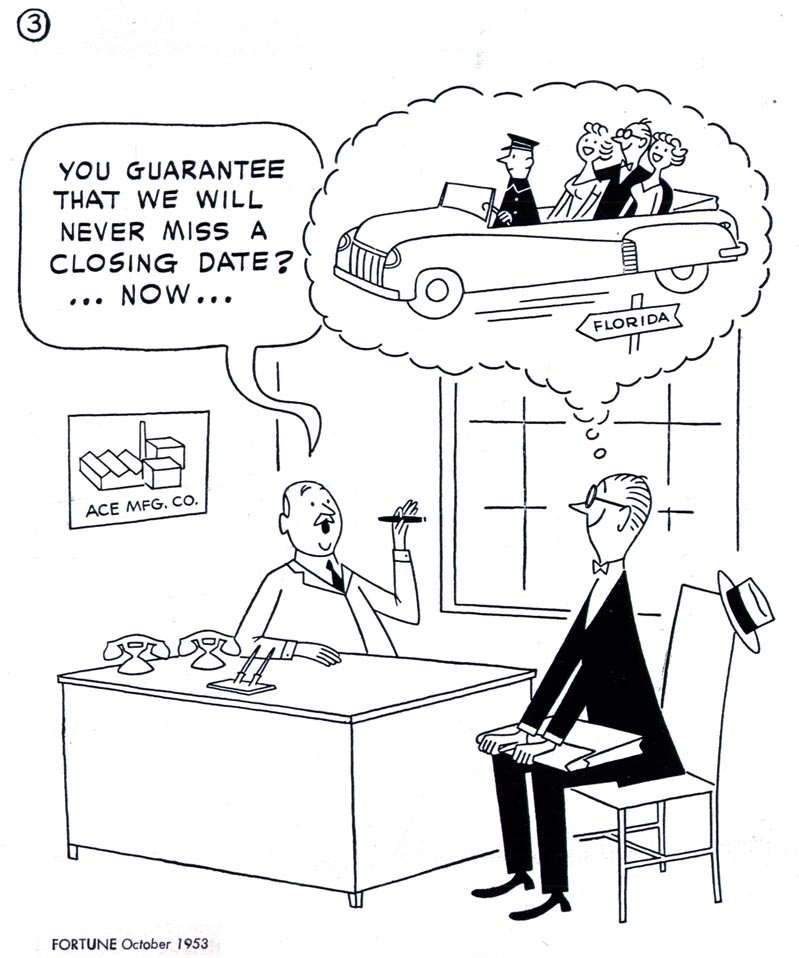
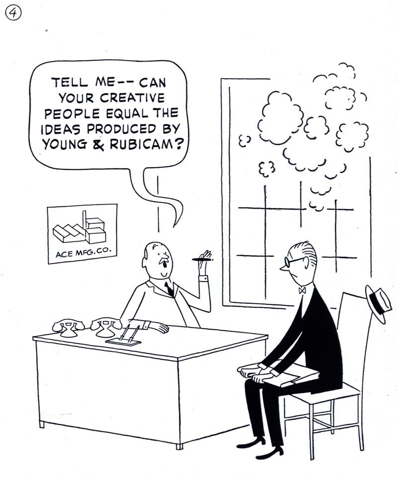
Talk about subtle.  And not even a logo or tagline in sight!

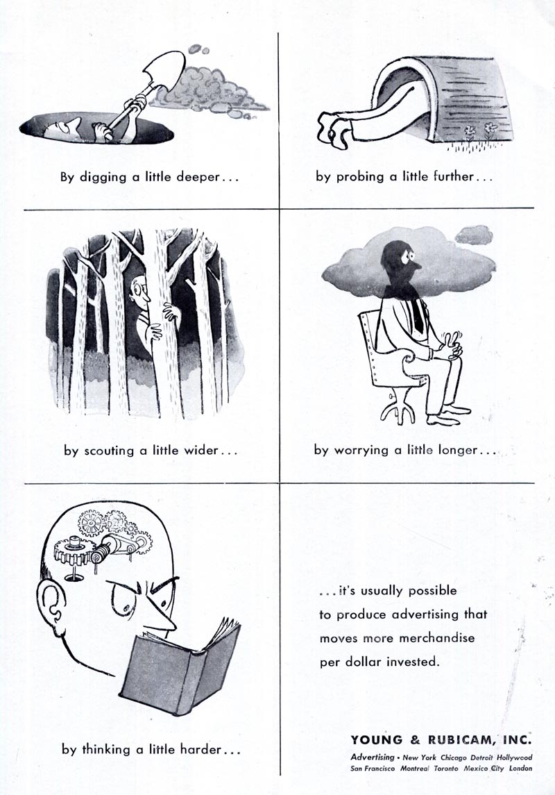
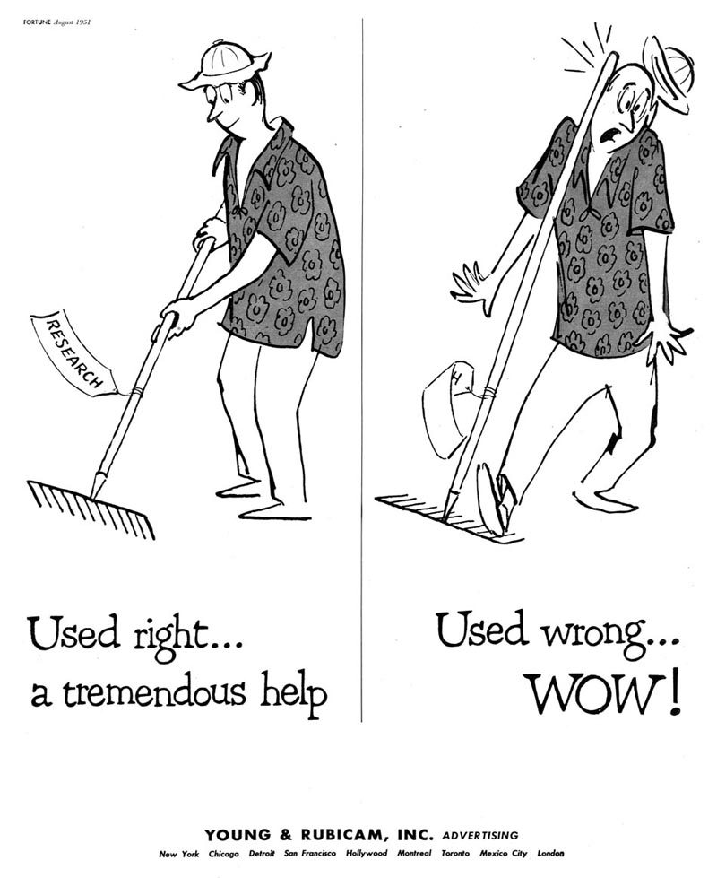
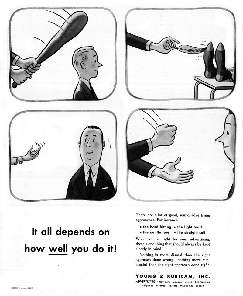
For several years during the 1950s, the Young and Rubicam advertising agency ran ads like these, featuring cartoon art, in Fortune magazine and in the back of each year's New York Art Directors Annual.
  Y&R01

Ever since I first saw them I've had been intrigued by Y&R's commitment to these unique cartoon ads -- curious about what had been their motivation in utilizing this distinctive approach.  Recently, while corresponding with my friend Bill Peckmann, it all suddenly became perfectly clear.

In passing, Bill wrote, "While I'm thinkin' of it - it seems that some of the great cartoonists, Rowland B Wilson, Tom Yohe and Jack Sidebotham (Bert & Harry, the Piels Bros. Beer designer) were all art directors at the Y&R Advertising Agency in the '50's. (I know there are more names but they're not coming to me right now.)"

Y&R03

Bill continued, "There must have been something in the water there or the agency had a style at that time where they only hired art directors who could draw."

Y&R04

Imagine that: art directors who could draw... no wonder the folks at Y&R were so committed to running ads featuring great cartoon art. They could relate because they were cartoonists themselves.  I wonder... are there still art directors who can draw?  Or is that one more reason why illustration has all but disappeared from advertising.

 Maybe today's art directors simply can't relate to the drawn image because they have no tangible connection to the act of drawing.
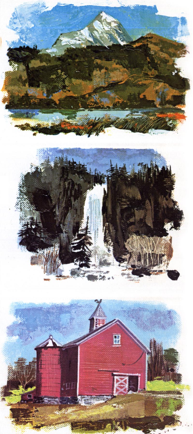
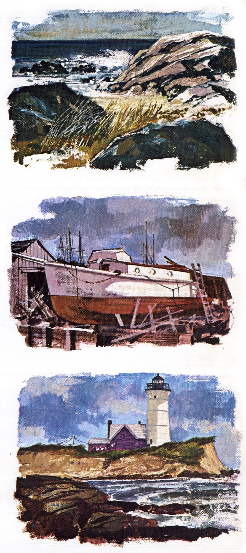
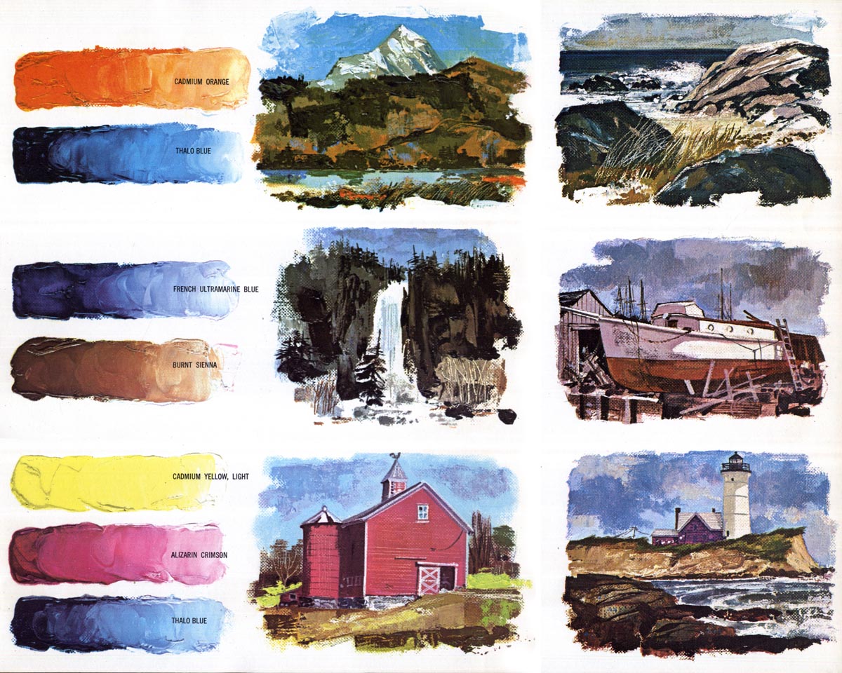
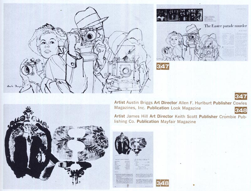
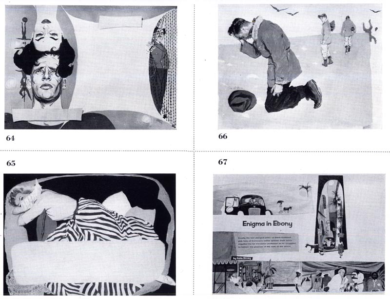
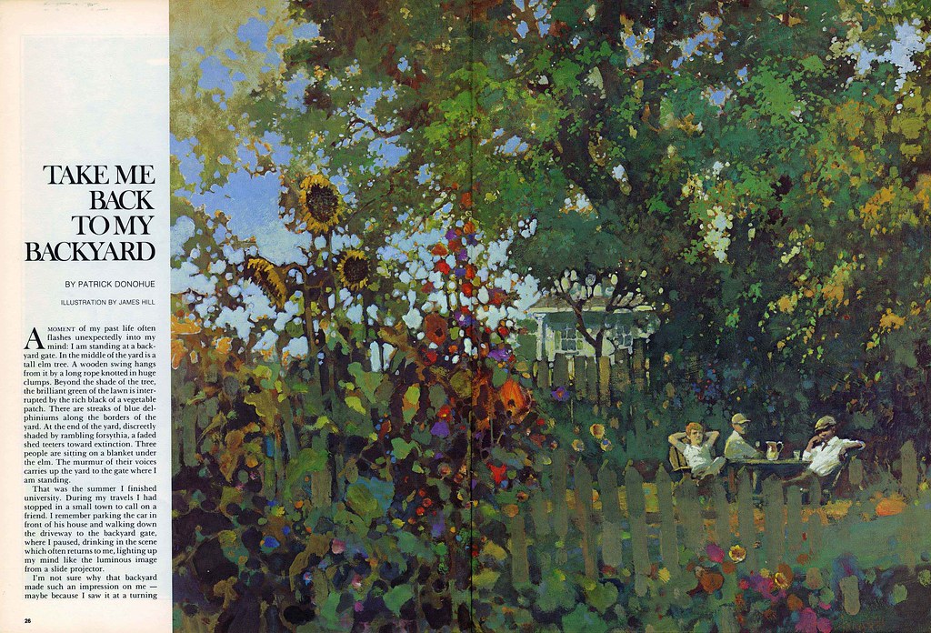
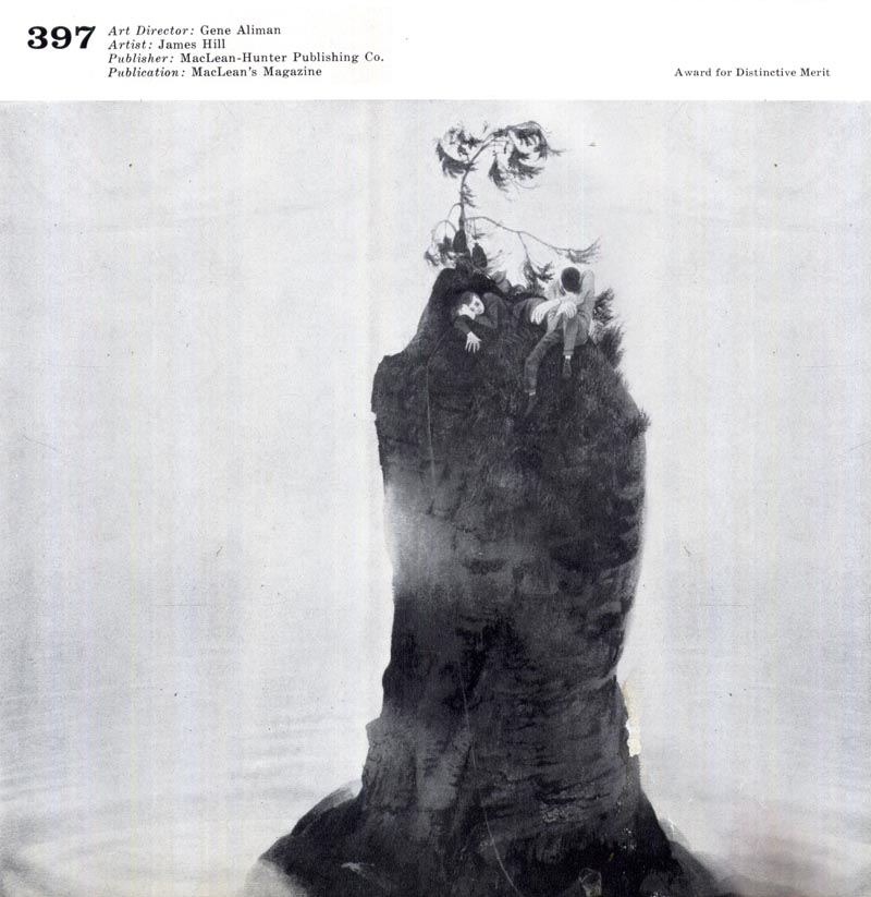
Wednesday, August 10, 2011

Christopher Davis' Seascape Abstraction

Here's another piece by 1960s landscape/seascape painter, Christopher Davis.

  Davis14.detail01
Davis14.detail02
Davis14.detail03

 I love this piece for its beautiful stylization of the subject - a stylization that approaches near-abstraction, in my opinion.

  Davis15

My recent foray into landscape painting has given me a greater appreciation for 'seeing' ... looking that chunk of the world I'm about to paint in a way other than the detailed surface reality that we normally take for granted as we rush busily through the day. Its reminded me to look deeper, more intently at the colour, shape and arrangement of elements as I compose and paint my pictures. These lessons from Christopher Davis reinforce that thinking for me. I hope they inspire you to pick up the sketchbook or paintbrush as well!

Tuesday, August 09, 2011

Seascape Painting by Christopher Davis

Excerpted from The Art of Seascape Painting, © 1965, '66 M. Grumbacher Inc. Davis05
Davis08.detail04 Davis10 Davis08.detail03 Davis06 Davis08.detail02 Davis07 Davis08.detail01 
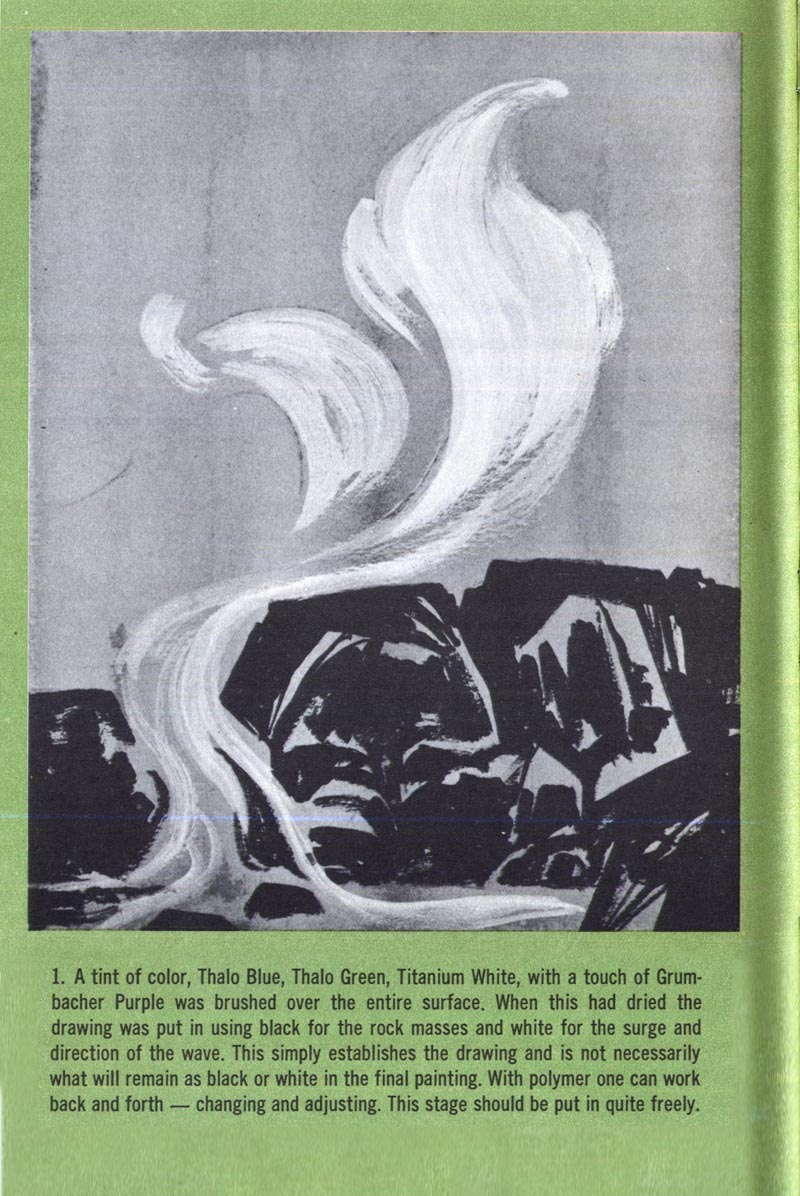
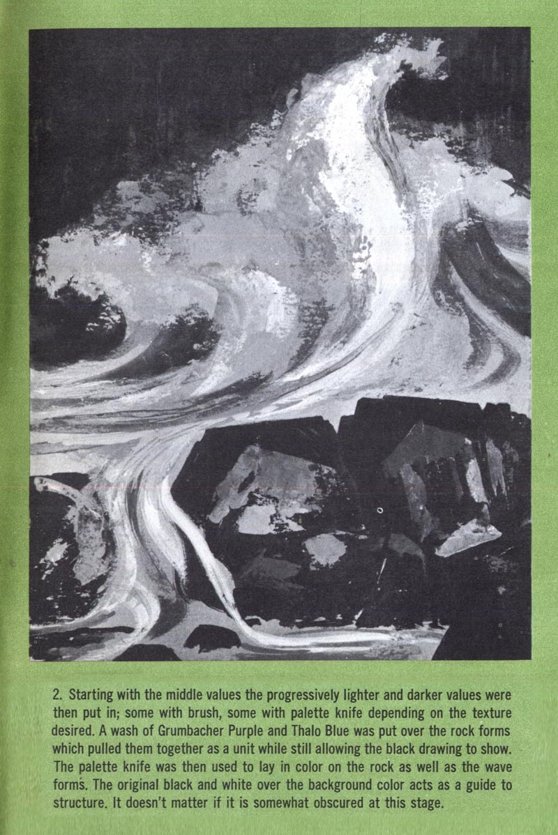
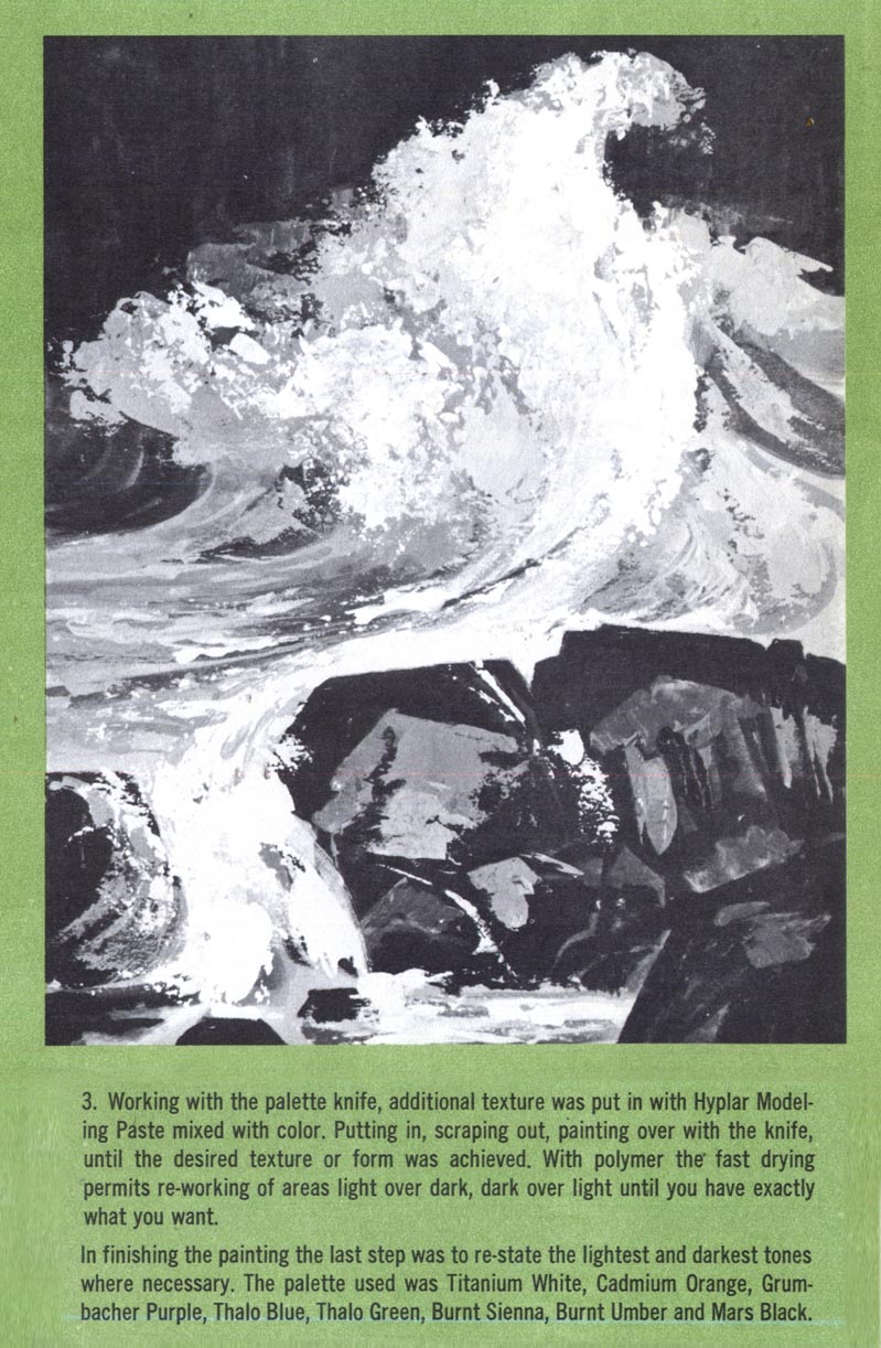
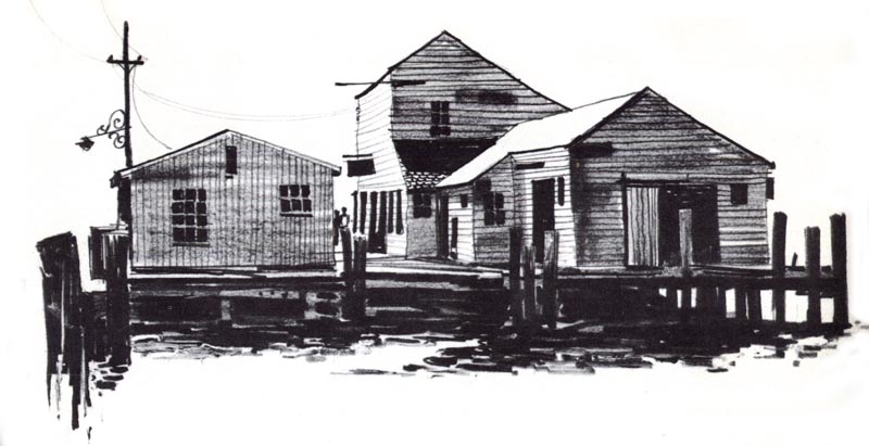
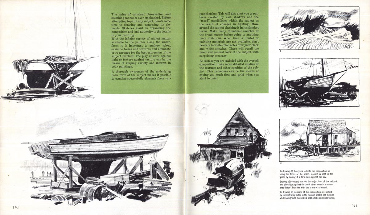
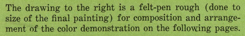
(refers to the sketch below)
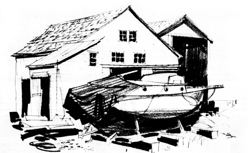
 Davis09 Davis11 Davis12 Davis13

Monday, August 08, 2011

Landscape Painting by Christopher Davis

Two weeks ago I was way up north, nearly an hour's drive above Manitoulin Island, on my summer vacation with a group of friends who are also artists. We spent a week up there at a camp in a tiny community called Whitefish Falls, painting landscapes 'en plein air.'

 I brought along the two Grumbacher Library 'How to Paint..." books I mentioned a little while ago, when we looked at the work of Albert Pucci here on Today's Inspiration.


  Pucci14

Pucci was not the only artist featured in those two volumes... there are also quite a few pages devoted to artwork and instruction from an artist named Christopher Davis. Since landscape painting is very much on my mind at the moment, I thought maybe I'd share some of Davis' work from those Grumbacher books with you this week.

  Davis04.detail02Davis04.detail02

The book explains how these paintings were achieved with a limited colour palette. I found it reassuring that our instructor up at Whitefish Falls, Richard Edwards, taught us to use exactly these same limited colour palettes when we did our paintings each day.

  Davis04

Over the last couple of years, I've been very inspired to watch the progress of a couple of friends, Michael Cole Manley and William Wray, both of whom have been doing some really fabulous painting - often landscapes. (I strongly encourage you to click through the links and have a look at their work!)

Both these gentlemen have given me some excellent advice about how to learn to paint landscapes.  Just the other day Bill wrote about the importance of doing many small sketches before actually beginning to paint the subject, and that advice is confirmed and demonstrated beautifully by Davis in his Grumbacher lessons:


  Davis03Davis03.detail01

Davis03.detail03 Davis03.detail04

Davis03.detail02 Davis03.detail05 Davis03.detail06

Here are a few more pieces by Davis... describing how to paint specific elements within various landscape and seascape settings.


Davis01

Davis01.detail02


Davis02


Whew!  Maybe some day I'll learn to be this good!  Tomorrow we'll look at one of Davis' step-by-step demonstrations and some examples of his finished paintings from the two Grumbacher books.
Excerpted from The Art of Seascape Painting and The Art of Landscape Painting, © 1965, '66 M. Grumbacher Inc.
And in case you're at all curious, here's a link to my own meager offerings from my trip up north.