Wednesday, March 21, 2007

The Hard Boiled Thornton Utz


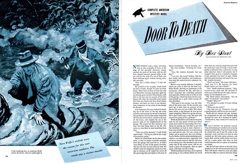
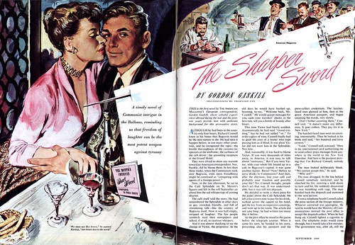
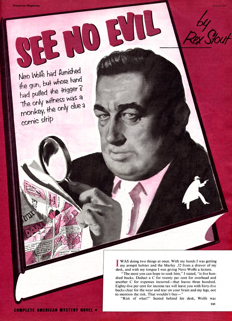
What James R. Bingham was to The Saturday Evening Post's Perry Mason serials, Thornton Utz was to The American Magazine's Nero Wolfe Mystery feature.


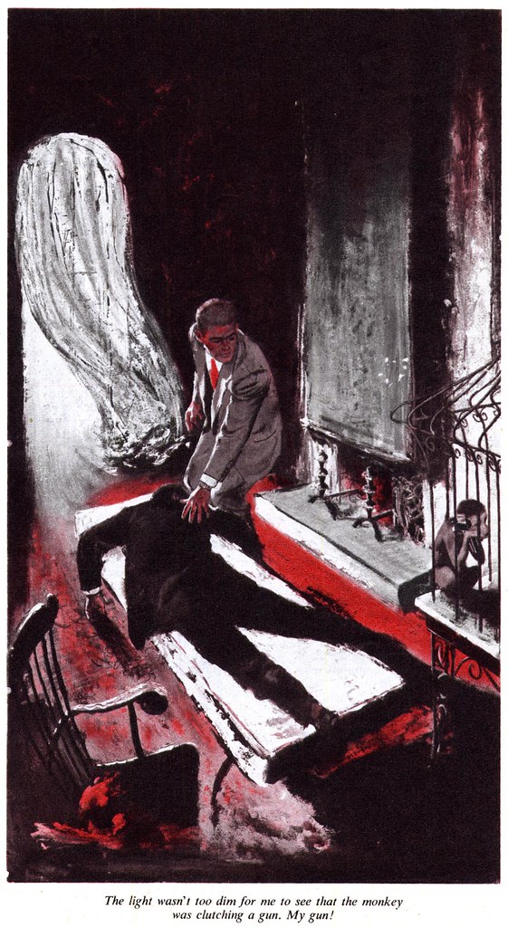
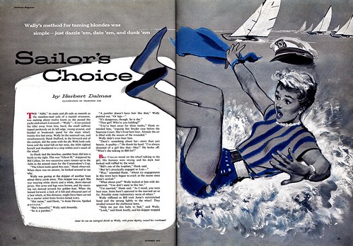
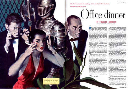
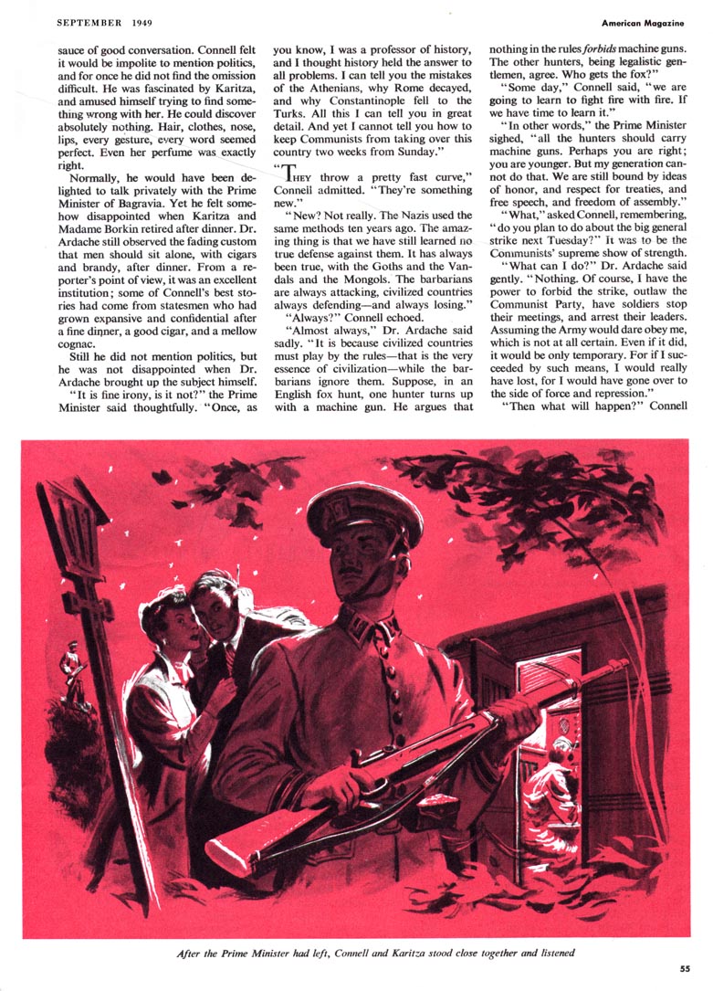
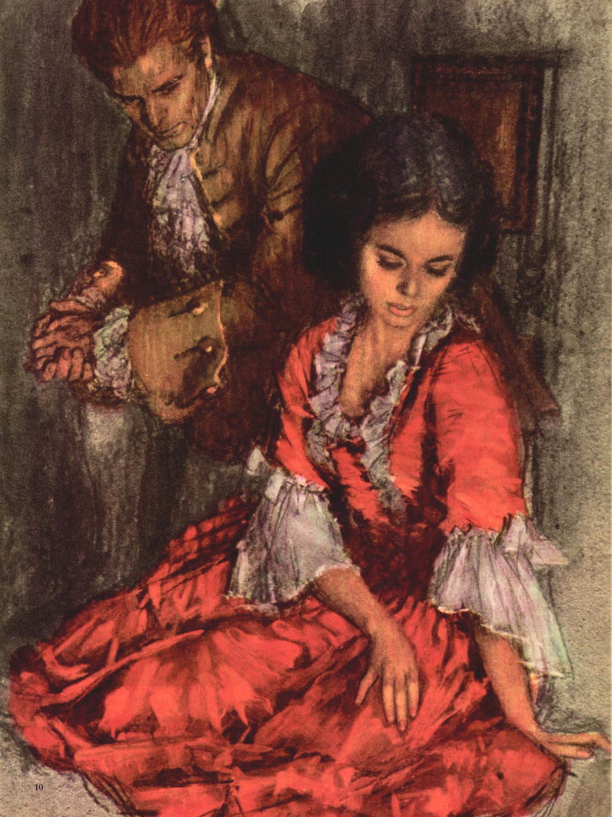
Once again, we see how Utz was able to adapt his style to the subject matter, giving it a distinctly noir-ish, dime novel quality so appropriate to the material.


I'm particularly fond of this last piece, where Utz really gets rough with the paint and begins to display a slight stylization reminiscent of some work Alex Ross did several years later when Collier's magazine picked up the Nero Wolfe series.


These illustrations are well worth examining in greater detail. Take a look at them in my Thornton Utz Flickr set.

Tuesday, March 20, 2007

The Versatile Thornton Utz


From what I can tell, The American Magazine was probably Utz's steadiest client during the late 40's and early 50's. His work appears once and sometimes twice in almost every issue I've seen.


This tells me the editors clearly liked using Utz for story assignments. I would guess that a client hires and rehires a particular artist because they have come to count on a certain predictable style and technique they feel will be appropriate to the assignment. But Utz seems to have enjoyed surpising his clients by trying many different media and rendering styles. I would guess that they gave him so much work because they trusted him and enjoyed the diversity he delivered.


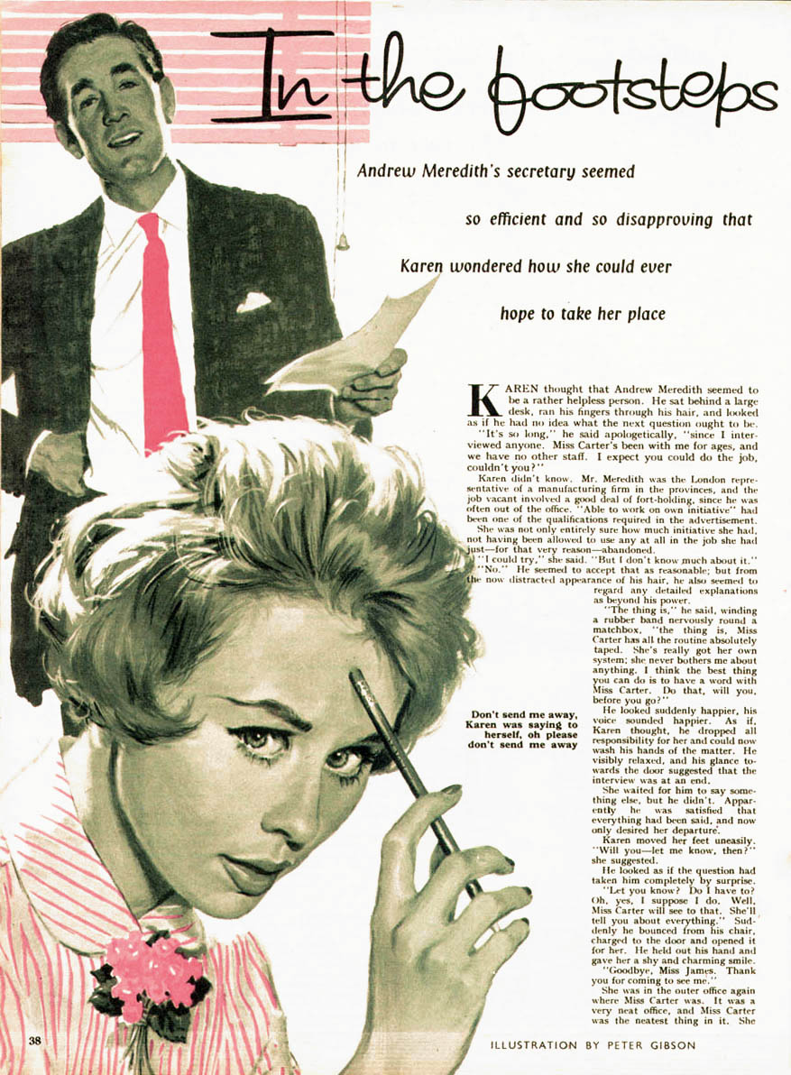
Granted, Utz stayed well within the parameters of the popular "realistic" look of the day, but while his painting technique on yesterday's piece reminded me a little of Ben Stahl, the illustration above has a hint of Tom Lovell while the ones below, done for the same September 1949 issue of American, look like they could have been the work of Perry Peterson. The first piece at the top of today's post, which I especially love, is something else altogether. Utz seems to have painted vigorously and directly onto a box board sort of surface, giving the piece a very graphic freshness that works well with the subject matter. For the second of today's examples, his much tighter, moody technique compliments the melodrama of the stage set-like scene being played out.


But even the broad range of approaches you see here doesn't fully reflect the variety of Utz's styles. Tomorrow we'll look at another side of the versatile Thornton Utz.

For now, take a look at these images at full size in my Thornton Utz Flickr set so you can better enjoy Utz's energetic and diverse artwork.

Monday, March 19, 2007

Thornton Utz (1914-2000)

Looking over many hundreds of illustrations by dozens of illustrators who regularly received assignments from the major magazines of the 50's, one begins to appreciate that certain artists were called upon to prepare visuals for stories with themes or genres the editors felt they were best suited to.


So one could predict that a romance story might be illustrated by, say, Coby Whitmore while a James R. Bingham illustration was more likely to be attached to a crime story.

But then there are those illustrators I like to call "the generalists".

These were the artists that magazine editors assigned to illustrate any number of situations or topics. Of these, the best could stretch their styles and techniques to reflect some aspect of the specific scenario they were illustrating, thus enhancing the viewer's experience on a visceral level.

Among these top-tier generalists, I consider Thornton Utz to be the best of the best.

This week let's take a look at the variety of approaches this talented artist brought to his work.

Friday, March 16, 2007

A Will Davies "How To" - Step 5: Finished Art

Having traced his drawing down onto his illustration board (he preferred Crescent or 5PK board) Will would begin to paint. "I'd look for shapes," he tells me, "that's the way I've always approached it -- finding the shape of an eye, the shape of the shoulder..."


Fifty years later, Will says he doesn't really remember if he had a standard method for doing black and white illustrations like this. He says he likely began by laying in the darkest areas with india ink, then mid-tones with ink wash, and finally his lighter areas. "I used three different white paints, each for a specific purpose,"says Will, "Liquitex white for thin washes (like the reflections on windshields), Opaque (Correction) White for highlights and other very white areas and a third one, I forget now, for mixing semi-opaque midtones. Probably white gouache."

The entire process we've looked at this week usually took Will about two days from start to finish. But of this multi-stage process Will says, "I gave it up later on. I found I liked my drawings better than my finished art. I lost all the zip, the vitality of the drawing, by tracing just the outline onto the board. That's why I began doing my drawings directly onto the board not long after this."

I asked Will how much he got paid for a job like this but he says, "I never knew what they were worth. TDF (the art studio where Will worked) gave me a guarantee - a salary - so I have no idea what they got for the jobs." Will remembers that he typically had several jobs on the go at any given time, including story illustrations for the handful of Canadian magazines being published back then.

"When Chatelaine magazine first came out the salesmen started bringing me jobs from them. But they only paid about $300 for a double page spread so they quickly dropped that stuff. They said, "you can have it." So I did all my magazine assignments directly for the clients. They [TDF] didn't want to know about it."

TDF had been started around 1944 by three partners: Tabler, the artist, Dulmage, the creative director (and, Will says, a real task master who had to give his approval to all finished art before it left the studio) and Feheley, the businessman of the trio. On the phone last night Will told me this amusing anecdote about one particular assignment:

"I was doing an illustration for ladies nylons. A closeup of a pair of woman's legs walking down the street. It was an ink drawing and I was never very good at those. I always had a hard time doing a nice line in ink. I kept having to add white to fix it up. Then I'd have to add more black to fix up the white... I was really struggling with it. It was a mess. Finally I took it to Dulmage for approval, expecting the worst - because he was tough. But he just took one look at it and said, "Now that's about the best use of white paint I've ever seen."

Thursday, March 15, 2007

A Will Davies "How To" - Step 4: Finished Pencil Sketch

By comparing yesterday's pencil drawing with today's we can see that, while the earlier version established likenesses and began defining props and environment, it was more about exploring tonal values that might best work in the eventual finished illustration.


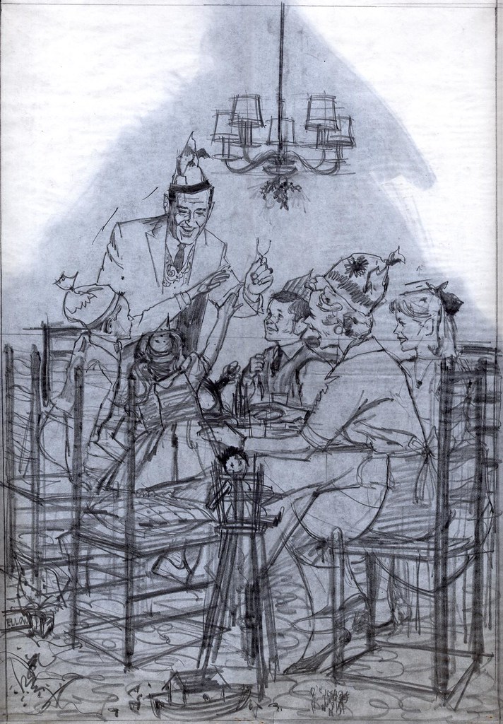
Once that stage was completed to Will's satisfaction, a final sheet of fresh bond paper would be laid on top - this would become the finished pencil sketch shown above. Now all important details of character and environment were clearly defined. Notice though that Will allowed some aspects of the composition to remain deliberately vague and that the drawing has an overall loose and energetic quality.

Will made sure that all the visual information needed was there - but that the drawing did not end up looking static and lifeless - as if it were carved in stone. Will always understood that the mind's eye enjoys filling in missing detail and bringing together loose ends. As well, the looseness allowed Will to continue to explore in the painting stage and prevented the finished art from becoming merely an exercise in rendering.

Finally, the back of the sketch was rubbed with a graphite stick or a 6B (very soft) pencil (you can see the dark shadow of the graphite on the back showing through in this scan). Will would then trace over the sketch with a hard pencil and in this manner transfer it to the illustration board on which he would execute the finished art.

Tomorrow we'll look at the finished illustration.

Wednesday, March 14, 2007

A Will Davies "How to" - Step 3: Rough Drawing

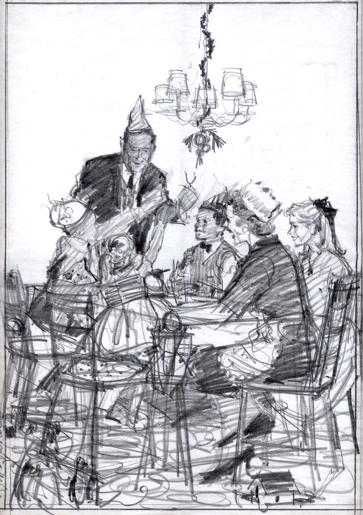
Having reassured himself that his composition was sound, that the figures were arranged correctly, Will would lay another clean sheet of bond paper on top. Now the real drawing would begin.


I asked Will if he would use the Lucie* to trace down the models in his reference photos, assuming that this would speed up the process, but Will says, "No, I never used the Lucie very much. I didn't find that it made things faster -- because then I'd have to correct all sorts of things that hadn't worked out in the photos. I found it was faster to just have my reference photos nearby to look at and then I'd just draw, correcting things as I went along. That was actually faster. And I liked drawing."

But even this third stage was not the final one before Will would begin the actual illustration. Tomorrow we'll look at the finished pencil stage.

* For those young 'uns who never used (or even saw) one, the Lucie - or camera lucida, also known as the Artograph, was a huge contraption of sliding arms, adjustable lenses and angled mirrors used in a darkened room to project a photo at the drawing board at whatever size the artist wanted. He could then trace out the projected elements onto his paper or canvas working surface.

Tuesday, March 13, 2007

A Will Davies "How To" - Step 2: Sound Check

"I always told my students (at OCAD) to give what they were going to draw a lot of thought. Try to see it in your head before putting it down on paper. But - and this sounds like a contradiction, I know - if it doesn't work then throw it out and start again."


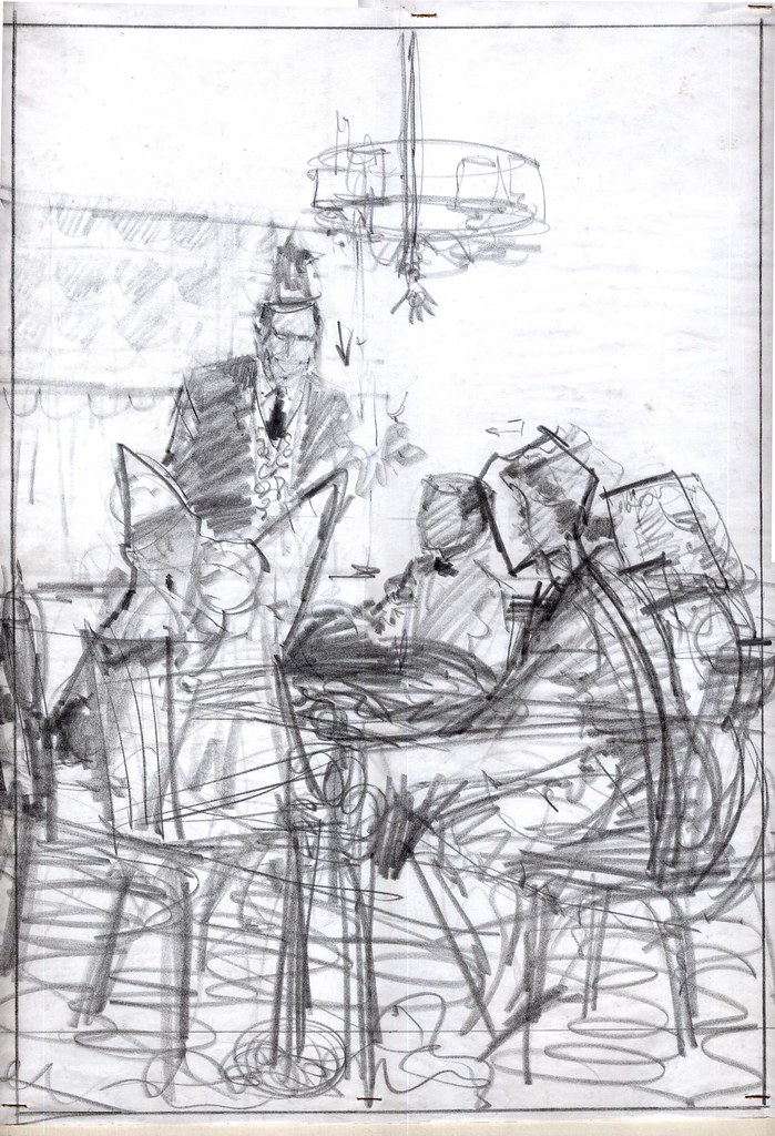
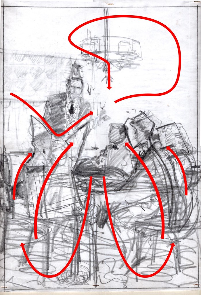
To that end, and in spite of feeling fairly confident with his rough sketch, Will would do a second rough on top of the first to check if his composition was sound. He calls this stage "checking the lines of movement".

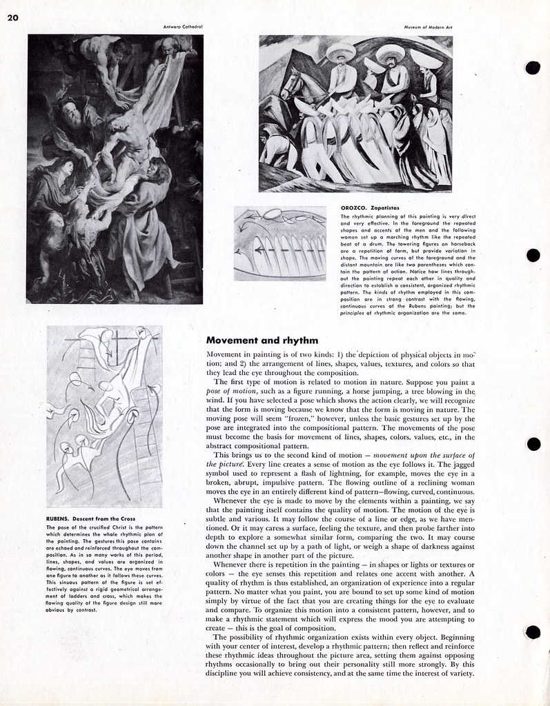
In the Famous Artists Course lesson on 'Composition' we learn that there are two kinds of movement in a painting:

1) the depiction of physical objects in motion

2) the arrangement of lines, shapes, values, textures, and colors so that they lead the eye throughout the composition.


Will would slip his rough under a clean sheet of bond paper and re-sketch the elements of his composition a little more clearly, looking for and emphasizing how the shapes and lines caused the viewer's eye to move subconsciously through the picture and find the focal point.

Again from the FAS course:

Whenever there is repetition in the painting - in shapes or lights or textures or colors - the eye senses this repetition and relates one accent with another. A quality of rhythm is thus established, an organization of experience into a regular pattern.

By superimposing these red lines over his drawing, we can see how Will determined in his second rough that he had indeed established movement and rythm in the overall composition:


This is also the point at which Will would more accurately organize his elements. In the case of this illustration, Will moved some figures so that none of the faces of the people at the table are obstructed by the limbs or bodies of others in the foreground, which, if you scroll down to yesterday's post, you can see was happening in the reference photos.

You can examine these images more closely in my Will Davies Flickr set and my FAS Flickr set.

Monday, March 12, 2007

A Will Davies "How to" - Step 1: The Layout

Some long time readers may recall the series last year on my friend, Will Davies. At the end of that week of posts last May I had a request from Ward Jenkins of Ward-O-Matic fame for a Will Davies "step-by-step". Happily, I can now fulfill that request: Some years ago, several Toronto graphic arts professionals who were tops in their field were asked to do a lecture series at The Ontario College of Art and Design. Will prepared the sequence we'll be looking at this week for that lecture series.
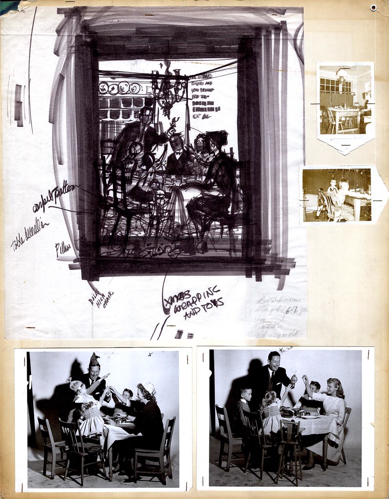

Last week I enjoyed a long lunch with Will, my younger son, Simon and good buddy, René Milot at a restaurant in Toronto near Will's home. After lunch we returned to Will's place for a quiet conversation in which Will generously explained the details of how he worked on commercial assignments in the 50's and 60's. "This is pretty early on," Will remarked when I showed him the photocopies I had brought with me, "Later on I didn't bother with all this. I'd just rough it out directly on the board or canvas and send that over to the client for approval."

Still, this earlier system Will employed represents a valuable lesson in how to properly develop a piece of finished art. And for me at least, even the roughest sketch provides an inspiring example of how a talented hand creates a strong, energetic and sound composition - something we should all thoughtfully strive for in our own efforts.
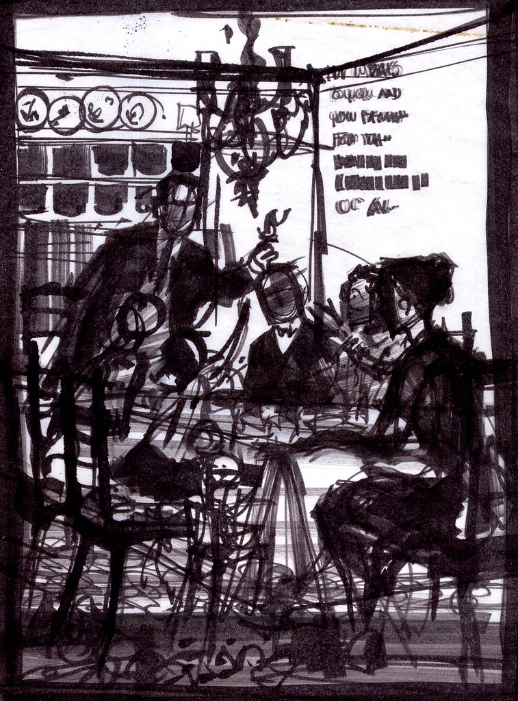

During the late 50's/ early 60's Will did quite a few full page newpaper ads for the major department store chain here in Canada, the Hudson's Bay Company. These ads typically centred around holiday themes - and in this case, it would appear from the notes dashed in on this rough that the theme was "Christmas".
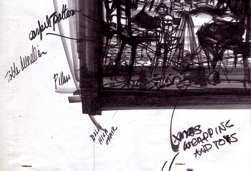

Will says that, although these assignments came to him via The Bay's ad agency, he usually was given the freedom to come up with his own idea for the scenario. "Some people call them thumbnails," says Will, "but I never did thumbnails. I'd think about it for quite a while, doing thumbnails in my head, then, when I finally did do a rough sketch, it looked pretty much the way I wanted it to. Hopefully!"

I asked him if this first rough was done in magic marker but he insisted, "No. Pastel. Magic markers came later - and I hated them." Will told me that he liked the subtlety of pastels. Markers, he says, were too confining. "Once you put a line down, you were stuck with it. I had to use them for a time when they loaned me out to a studio in Detroit. But other than that one time, I never used them."

* In spite of Will's insistence, I still think this particular rough is done in magic marker, perhaps at a later date is preperation for his lecture demonstration.

Once Will was satisfied with the general idea he had sketched out, he then went about preparing to shoot models , props and scenery. "That's Bud Feheley's wife as the mother," Will said, pointing at the lady in the photo.
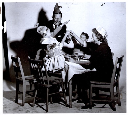

Feheley was the "F" in TDF, the art services studio were Will was employed as top man in the illustration department at the time. "I asked for her for the mother. She had the perfect look. The others are all hired models... no, wait -- that's Kerry, my youngest daughter! I had forgotten about that ... we shot this scene in my home at the time, in Scarborough."
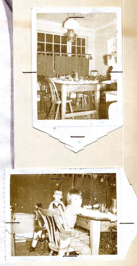

Will says that he would describe the scenario to his models and then have them act it out. He'd then moved around taking shots - sometimes capturing happy accidents that would find their way into the final illustration. "Usually I'd shoot a couple of rolls and end up with one or two good shots - the rest I'd throw out."


For example, the variation above with a teenage daughter instead of the mother that did not make it into the final cut.

You can examine these images more closely in my Will Davies Flickr set.
Friday, March 09, 2007

"A vast amount of this stuff... waiting to be discovered."

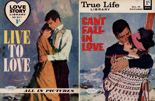
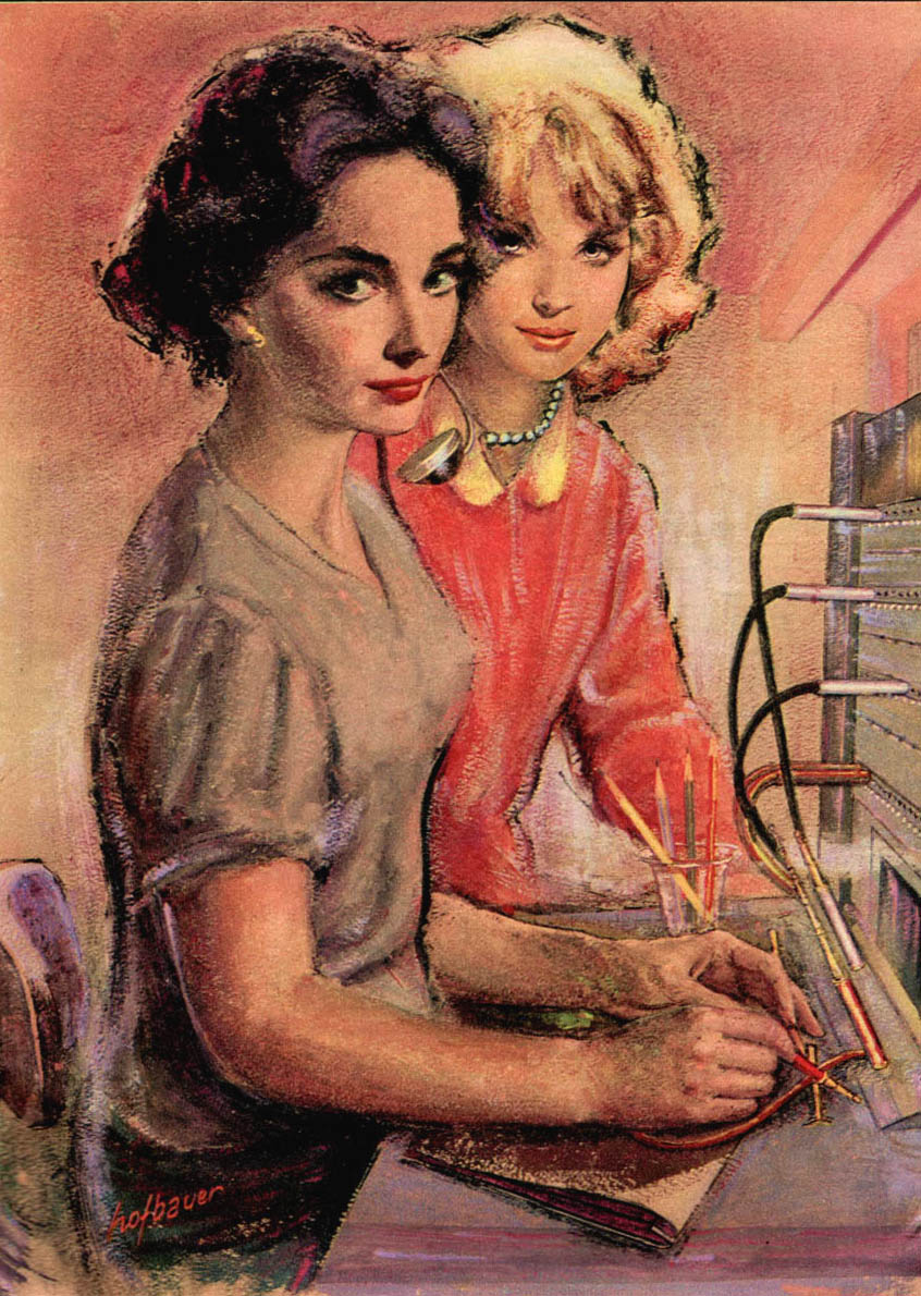
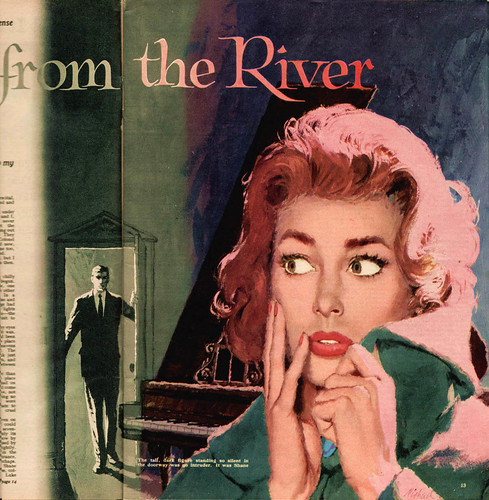
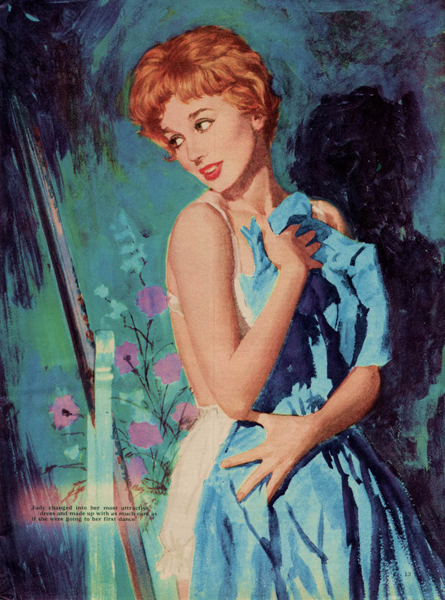
"[This first illo] by Jac Mars is from 21.4.62," wrote David Roach when he sent me the scan below. "Now I may not know anything about most of these people but Mars I do know a little about..."


"he painted covers for several Romance comics over here such as Love Story Picture Library, True Life Library (both published by Fleetway, who also owned Odhams press - publisher of Woman's Realm) and Star Love Stories (published by DC Thomson - Fleetways great rival)."


That's more info than we have at this point about these other talented artists. Hopefully we'll be able to learn more in time.


My thanks again to David for giving us this thorough introduction to what was clearly a robust homegrown market for illustration in England, lasting for decades.


A final tantalizing thought from David: "I was just talking to an industry old timer today and he said that John Bull magazine in the 50's had typically 15 full colour paintings in every issue - by the likes of Wyles , Fancett etc - so as I thought, there's a vast amount of this stuff out there just waiting to be discovered."


All of these images have been added to my British Illustrators Flickr set.
Thursday, March 08, 2007

Frank Haseler - A Puzzle

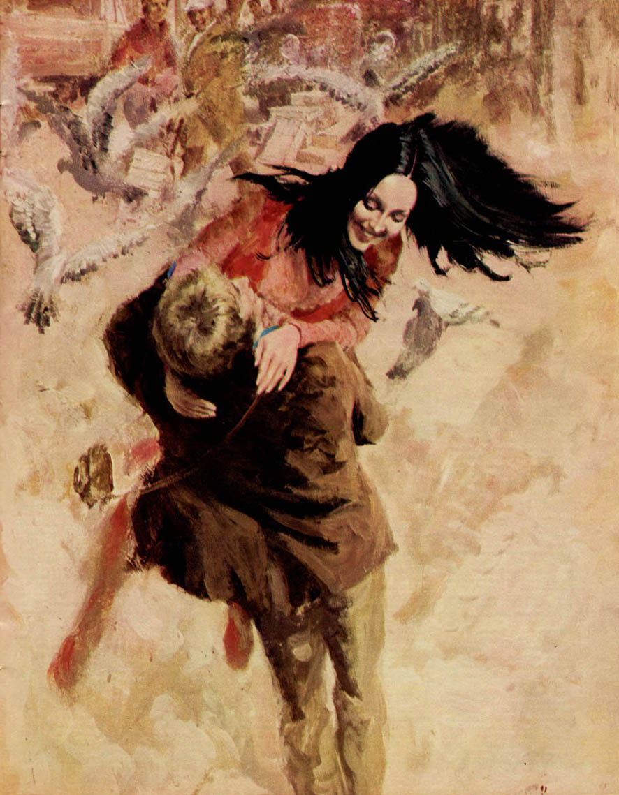
"This little batch is all painted by Frank Haseler ... these are all from a [1972] story called "Paula" - great eh?" wrote David Roach when he sent these scans.


I had to agree. I told David that Haseler's work reminded me a lot of those fantastic covers you can find on old issues of Creepy and Eerie magazines from around the same period.


"The old 70's Warren covers were almost exclusively by Spaniards," David wrote back, "Sanjulian, Enrich and Penalva and yes I can see this chap painting some mind blowing stuff."


Haseler's style really is a departure from the earlier work we've seen this week, isn't it? Perhaps his influences were more European than American...


I final thought from David: "I think Haseler would have fitted in perfectly at Warren - typically for a 60's/70's illustrator he has that fantastically gritty/scribbly/painterly look that so many of them did. Who was he though? What else did he do - it's a puzzle."

All of these images have been added to my British Illustrators Flickr set.

Wednesday, March 07, 2007

More Car Boot Booty

More British illustrations from the fabulous stash unearthed at a car boot sale, courtesy of TI list member David Roach. First, another piece by Walter Wyles...


Then this very pulpy-looking painting by Edwin Phillips, about whom David writes, "I think Phillips might have done several covers for War And Battle Picture Library in the mid 60's but I'm not at all certain - he is known as a paperback artist in the 60's and 70's (westerns I think)."


And finally, a second piece by E. Earnshaw - working in a drastically different technique than he did for the first piece from yesterday's post.


All of these images have been added to my British Illustrators Flickr set.
Tuesday, March 06, 2007

"Uncharted Territory"


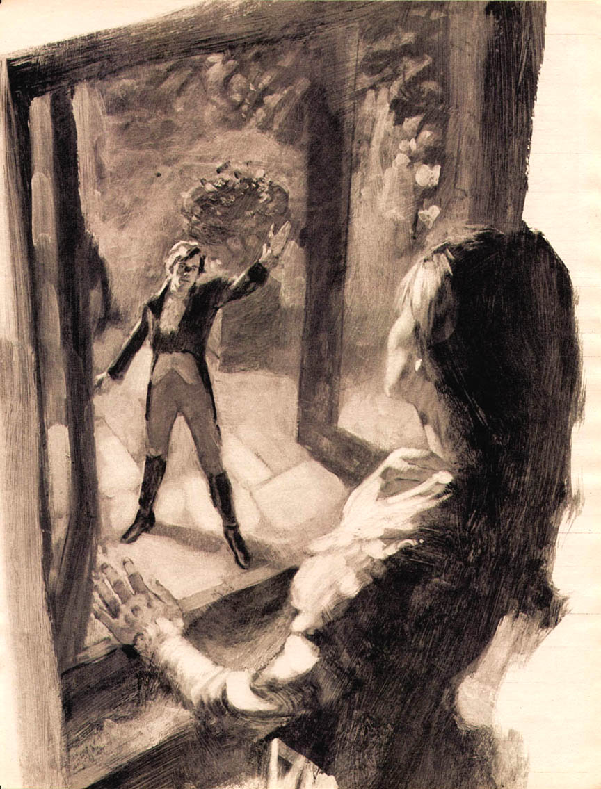
"There's not very much I can say about most of [these] artists," writes David Roach, who provided all these scans. "Honestly this is entirely uncharted territory - I know of no article or interview with any of these British illustrators."


What a shame... because it would be great to know more about the careers of these tremendously accomplished artists. Where did they learn their craft? Who were there primary influences? The Canadian artists of the 40's and 50's found plenty of inspiration in the pages of imported American magazines. Did the British illustrators reference the work of Parker, Whitcomb and Whitmore as well?


With thanks again to David Roach, these images have been added to my British Illustrators Flickr set.

Monday, March 05, 2007

Across the Pond

"This is just from one box of mags which a chum of mine picked up at a car boot sale," wrote long-time TI list member, David Roach, in a note to me last week. "How this little batch survived we'll never know but I'm thrilled they have."


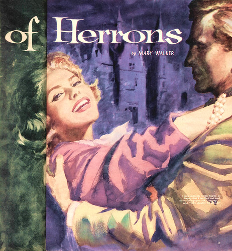
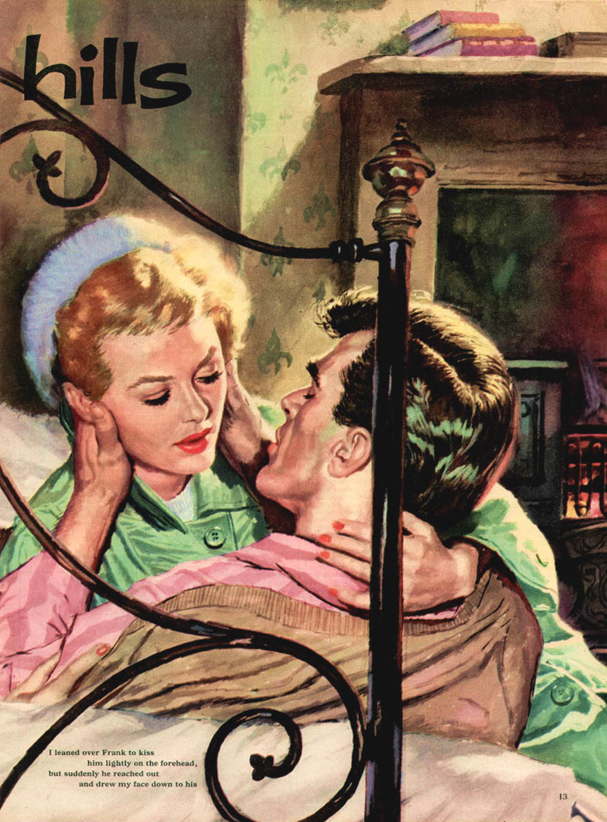
David generously took the time to scan a great huge bunch of illustrations from his recently acquired treasure trove. They represent for us a revelation - "Wow! There were a bunch of very talented illustrators doing romance genre art in England during the 50's!" - and a mystery - "Who the heck were these guys?"


Because, as little info as there is on North American illustrators of the mid-twentieth century, virtually nothing is known (by us anyway) about these British artists.


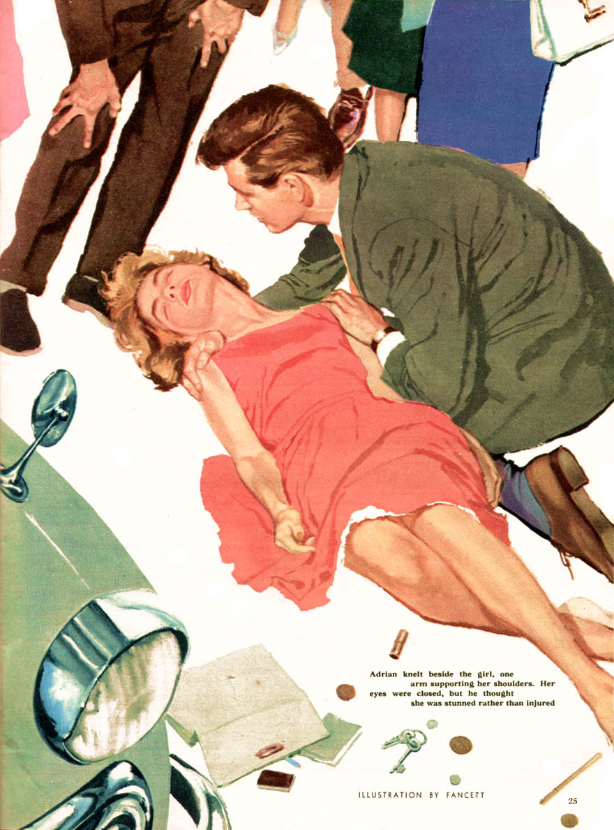
We're hoping that someone out there will recognize the names of artists like Johnson, Walter Wyles and Fancett shown here (respectively) today - and be able to tell us all more about them.

This week: The talented, forgotten British magazine illustrators of the 50's - with many thanks to David Roach!

Friday, March 02, 2007

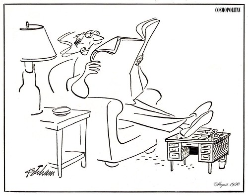
The Art of the Inked Line: Hank Ketcham


When I first became intrigued with drawing funny pictures, I used whatever tools I could find, which usually meant inexpensive ink-dipping pens, the kind you see in post offices and banks.


Louise and [Noel] Bud Sickles dropped by my Connecticut studio shortly after our mutual release from "active duty." I was just getting a toehold on the free-lance market in New York and was anxious to show them samples of my labors. Bud had always been most supportive...he always bolstered my confidence and made me feel good.

I recalled an early correspondence art course from the W.L. Evans School of Cartooning that suggested I start out with a Ladies Pen, the Gilotte #170, manufactured in England. It had a flexible and durable nib, a much different feel than the brush, but with a little practice I soon felt almost comfortable, gliding delicately across the two-ply plate-finish Strathmore. I wanted to show Bud how I was progressing.

"Looks as though you're scared of that pen." he chuckled. "You seem a bit tentative, afraid you might hurt it."


"Well, I guess I don't want to bear down too hard and splatter the ink all over." I wasn't quite sure what he meant.

That copper nib is perhaps the cheapest thing you've got in this studio; if you lose a few, it's no big deal."

He pulled up a stool, sat down, and rolled up his sleeve. "Now, here's what I like to do as sort of a morning warmup: put a new nib in the holder, rub it with a soft graphite pencil, dip it deep into the ink, wipe it clean, dip again, and then attack the drawing paper with a variety of swings, cross-hatches, swirls, and thick and thin arcs like this, bearing down in an effort to actually break the nib. See? Sure, it'll crack, but only under extreme pressure, probably much more than you're willing to exert."


All I could utter was a raspy "Wow!"

Sickles handed me the pen. "Here, give it a whirl. It's not only fun to be freewheeeling, but you'll discover a few new wrinkles and, more importantly, you'll know the outer limits of the pen's performance and not be afraid to vacillate between a lacy thin line and a gutsy swath that looks like a bold brush stroke."


He had me try holding the pen differently, even turning it upside down for a special effect. I was thrilled. Boy, the stuff they never teach you in art school!


From The Merchant of Dennis - The Autobiography of Hank Ketcham
©2005 Hank Ketcham Enterprises Published by Fantagraphics

All these images and several more can be seen at full size in my Hank Ketcham Flickr set.
Thursday, March 01, 2007

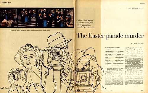
The Art of the Inked Line: Austin Briggs

Austin Briggs once said, "I look for two things [in a picture] - the absolute familiar and as unique a representation of it as I can find."


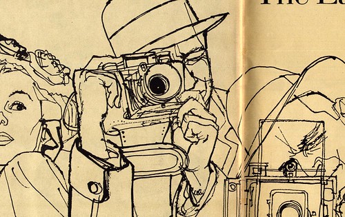
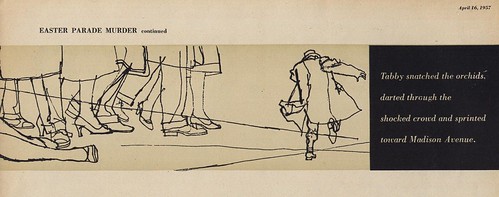
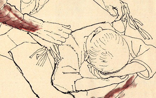
Perhaps it was this philosophy that motivated Briggs to approach these story assignments for Look magazine as he did: all are done as ink line drawings and in that sense seem similar, but Briggs chose to experiment with a unique line quality in each case, giving each one a distinctive character.


I normally bleach the yellow of the aging paper out of my scans but in the case of these images I rather liked the effect so I let it be.

What I find to be so remarkable about these pieces is how fresh and vital they look even today, 50 years after Briggs drew them. A testament to Briggs' tremendous talent and thoughtfulness as an artist.


Briggs said, "I think the artist is, first of all, an eye. And he must give the public an original and striking and informative message."

"[Because the public] is hungry for new aesthetic experiences."


All of these images can be seen at full size in my Austin Briggs Flickr set.