Showing posts sorted by relevance for query tom lovell. Sort by date Show all posts

Monday, April 13, 2009

Tom Lovell: Friends and Influences

Tom Lovell was born in New York in 1908 and grew up in Nutley, New Jersey. He was always interested in drawing. That interest lead him to the painting and illustration department at Syracuse University, where he studied under Hibbard Kline. During his Junior year he managed to land paying work from some smaller New York publishers of 'pulp magazines' doing drybrush illustrations. Lovell felt a great sense of accomplishment to be doing commercial work while he was still a student. By his Senior year he was working steadily for the 'pulps' and besides his black and white drawings Lovell was doing one cover a month in oils.


After graduating with a Bachelor of Fine Arts degree Lovell moved to New York where he shared a studio with Harry Anderson (below). He stayed for two years, but it was the height of the Great Depression and the going was tough. In 1933 he moved home to his parent's place in Nutley and converted a barn on their property into a studio.


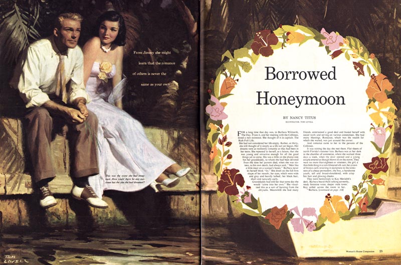
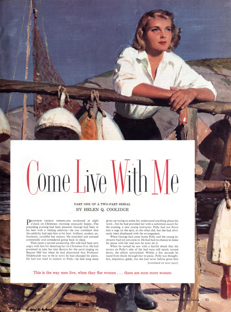
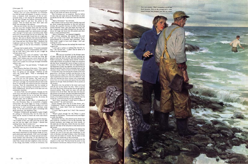
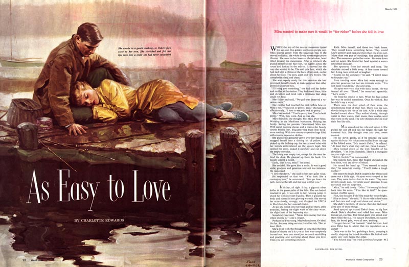
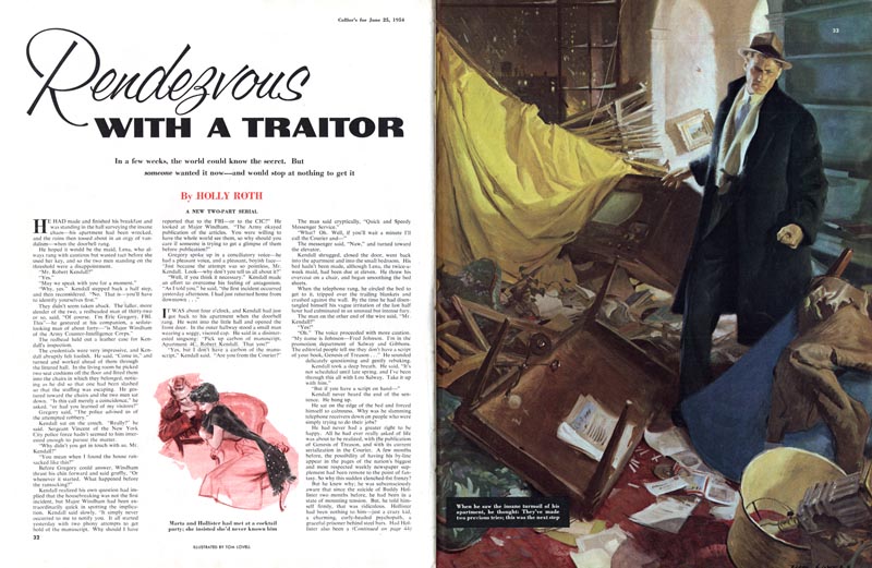
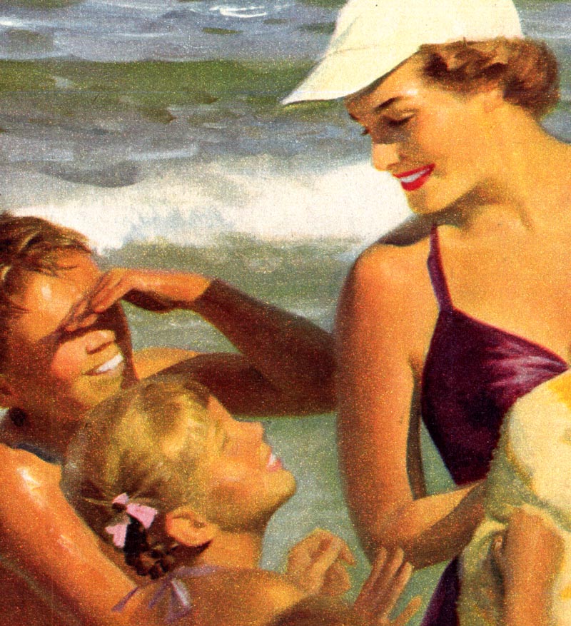
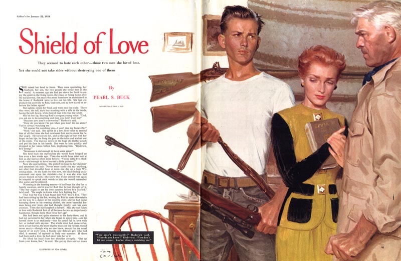
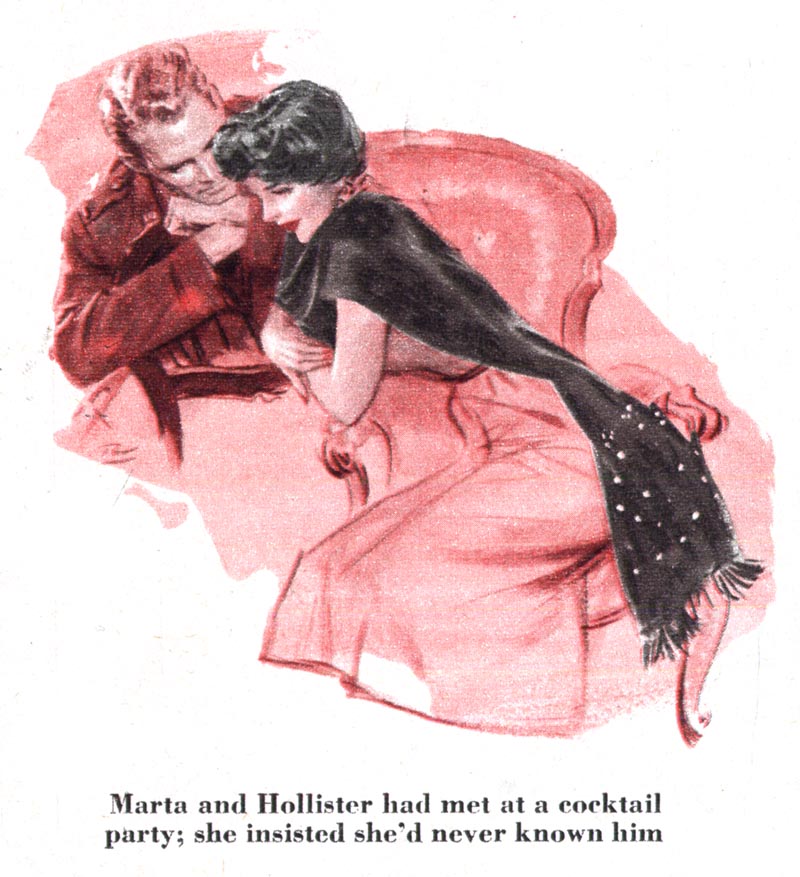
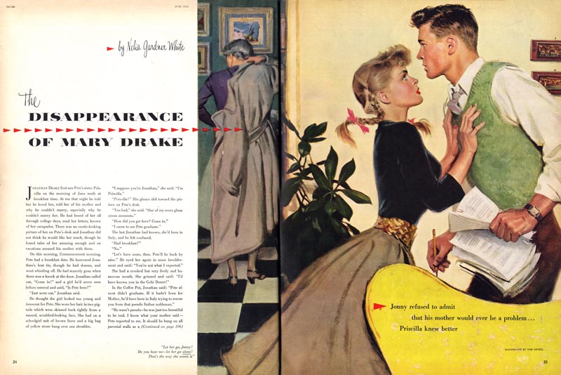
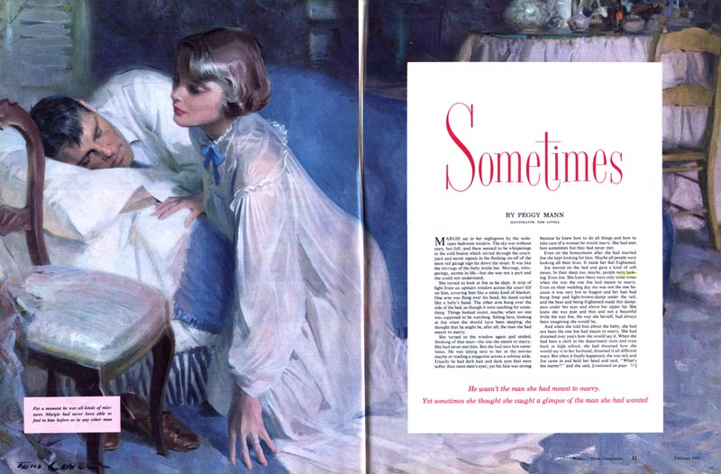
In 1934 Tom Lovell got married. He kept busy with whatever artwork assignments he could find. His first big break came in 1937 when he once again went to New York with a new set of samples and, on the first day of visiting publishers, he landed two assignments - one for This Week and the other for Red Book. Lovell's work caught the attention of other publishers and gradually assignments began coming in from American, True, Cosmo, McCall's, Collier's and, as seen below, Woman's Home Companion.


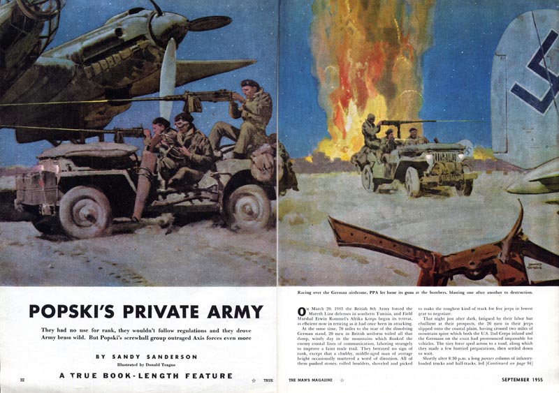
In 1938 the Lovells moved to New Rochelle, New York. Here he met two illustrators who would become good friends and his "unofficial art directors"; Donald Teague (below)...


... and Mead Schaeffer (below). These two accomplished artists, both of whom had already achieved the pinnacle of success for an illustrator of those times (doing work for The Saturday Evening Post) must have been exceptional advisors for Lovell.


Both Teague and Schaeffer had themselves had the guidance of Dean Cornwell, and both were devoted to the master's philosophy of studious research, preliminary studies and trial compositions -- traits they must have passed on to Lovell...


... as will become apparent tomorrow when we look at Lovell's own working methods.

* James Gurney has a new post on Tom Lovell here.

* David Saunders has a photo and biography of Tom Lovell and many examples of his early 'pulp' artwork here.

* My Tom Lovell Flickr set.

Monday, April 06, 2009

Tom Lovell: "...this youthful-looking, soft-spoken man..."

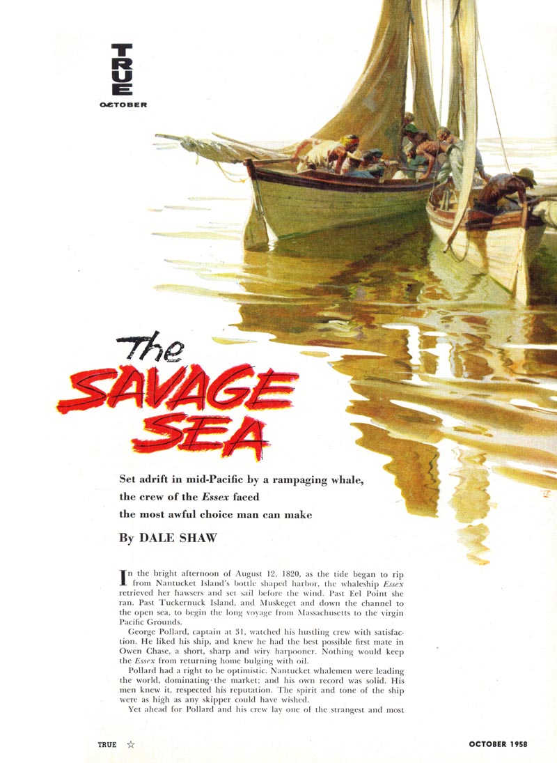
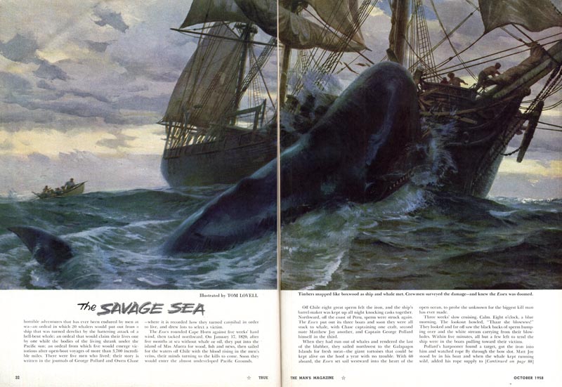
Last week we looked at the work of several artists who regularly did work for True magazine art director, Norman Kent. I didn't manage to get to every artist Kent featured in his September 1954 article in American Artist magazine. Among those whom I regretfully skipped over was Tom Lovell. I've been meaning to do a week on Lovell for a very long while now -- and since Norman Kent wrote a feature piece on him just a couple of years later (December 1956), this seems like an opportune time to do so.


Kent wrote, "Perhaps the greatest compliment we can pay [Tom Lovell] - and one that should cause him no embarrassment when he sees it in print - is that he is as successful with true-life adventure stories as he is with romantic fiction."


Norman Kent had a lot of nice things to say about Tom Lovell... and the article covers some very interesting ground, describing Lovell's meticulous working methods as well as providing the essential biographical details.


So let's (finally!) spend some time taking a closer look at the work of a man Norman Kent described as "this youthful-looking, soft-spoken man [whose] work has an undated look which removes it from the ephemeral and places it in the category of the older and better tradition."


* My Tom Lovell Flickr set.

Tuesday, April 14, 2009

Norman Kent on the "Meticulous" Tom Lovell

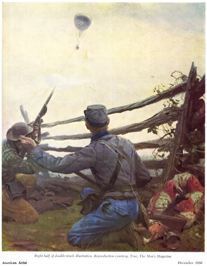
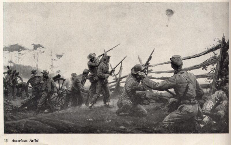
From the December 1956 issue of American Artist magazine:

"There is an explanation for [Lovell's] mature direction: the happy combination of an engaging personality, a thorough grounding in his craft, a dedication to his chosen profession, and workmanlike method of execution."


"When I interviewed him in his handsome studio near Westport, Connecticut, some months ago, I saw many things that added up. Surrounding a job on the easel (and not exposed for my special benefit) were rough sketches, reference books, detailed drawings, and a much-marked manuscript."


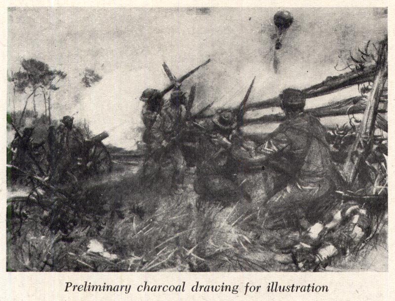
"These little evidences, this concern for thoroughness of research is no pose. For Tom Lovell limits the number of commissions he accepts each year to allow time for his study of the particular problem; time to sit and think; time for numerous roughs, often so abstract only he can decipher them; and time for making a half-scale charcoal drawing in which, as readers can see from the one we have reproduced, all the values are worked out and the final design organized."


"This is the monochrome drawing he submits to the art director, though occasionally he offers two or more. In any event Tom seldom has to make revises, so completely has he projected the idea, the form, and even the illusion of color."


"While developing this charcoal drawing Lovell told me that he constantly thinks in terms of color - its overall temperature and the mood. By using a flexible medium, such as charcoal in which values can be adjusted so easily, the illustrator can anticipate problems of subtlety and contrast before projecting the composition on canvas."


"In Tom Lovell's case this accounts, in large measure, for the freshness and directness his original paintings present which, in turn, is retained in the process engraving and in the printed image."

* My Tom Lovell Flickr set.

*ALSO* A new CAWS is now posted on Charlie Allen's blog.

Friday, April 17, 2009

Tom Lovell "down by the bay"

"Like all illustrators who do a variety of illustration," wrote Norman Kent in the December 1956 issues of American Artist, "Tom Lovell must necessarily gather the documents and research materials from libraries and other dependable sources."


"Over the years he has learned where to obtain these references and to detect authenticity when he sees it."


"To augment this study he constantly draws on a retentive memory, his own independent sketches and paintings made between commissions, and on vacation periods when, like this past summer, he traveled by car to the West Coast and back."


"Whenever possible, for an interior background or a landscape, he goes to an original source and makes a sketch on the spot."


"Lovell's color has light and paint quality while the drawing that supports it is firm and assured. He is a natural draughtsman."


"Tom Lovell has 'the capacity to take infinite pains' and this is his lodestone. This is what makes him tick but none of it, least of all his commercial success, has lessened his primary interest in the art of illustration."

* My Tom Lovell Flickr set.

Wednesday, April 15, 2009

Tom Lovell: Dealing with "the model problem"

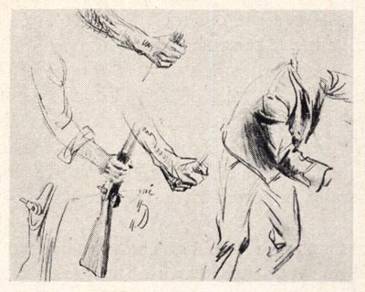
"To help him with the model problem Tom keeps a full-length mirror beside his easel and often poses himself..."


"... to study facial expressions, and to work out bodily actions and details of hands."


"In addition, an attractive wife..."


"... a young daughter,"


"... and a teen-aged, well-built son are often members of his private model agency."


"Also, Westport harbors a number of models whom the large concentration of illustrators use and with these and friends Tom is seldom handicapped for characters."


"Though he uses photography as an assist - sometimes employing the services of a commercial photographer, though more often using the camera himself - his final rendering is a composite of many shots and separate studies."

-Excerpt from Norman Kent's article on Tom Lovell in the December 1956 issue of American Artist magazine.

* My Tom Lovell Flickr set.

Friday, December 14, 2007

A Christmas Convergence - Part 2

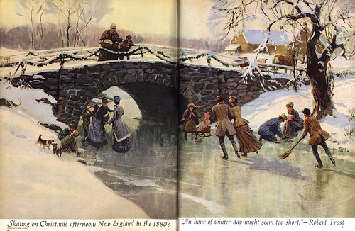
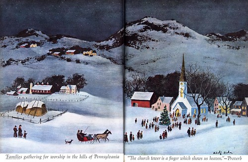
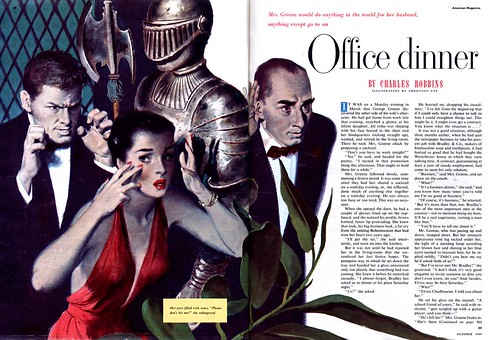
Scroll down to yesterday's post and compare the style of those pieces to the ones you see here and it quickly becomes apparent that today's images are decidedly Old School. McCall's magazine AD, Otto Storch, chose well in selecting Tom Lovell and William A. Smith (respectively) for the two period pieces below. Their classical-looking painterly styles perfectly suit the historical subject matter they were commissioned to interpret.


The only thing is, I suspect period pieces and historical subject matter are just about the only things a magazine art director would have considered these talent artists for by the early 60's. Not the case ten years earlier. Both Lovell and Smith regularly illustrated contemporary subjects for all the major magazines.

What had changed?


In fact, much had changed, as Tom Watson pointed out in his comment on yesterday's post. And even the New School artists were looking elsewhere for work: paperback book covers, album covers, corporate reports, textbooks, subject-specific "fine art" gallery markets. These were the places that still wanted realistic styles in large volume. Magazine and advertising clients were embracing photography with an unprecedented fervor. And when they did call for illustration, it was more likely to be of the sort we'll look at on Monday.


*For the third piece in this historical series from the December '62 issue of McCall's, Otto Storch made an interesting choice to accompany the work of the two well known illustrators, Lovell and Smith. I was unfamiar with artist Adolf Dehn until now, but a quick internet search turned up this thorough biography and many example of his very appealing (what would you call it? "American Primitive"?) style.

Set alongside Lovell and Smith's pieces, I think it compliments the other two artist's work very nicely - and provides a bridge to the Decorative Styles we'll look at next week.

Thursday, April 09, 2009

Sorry Folks...

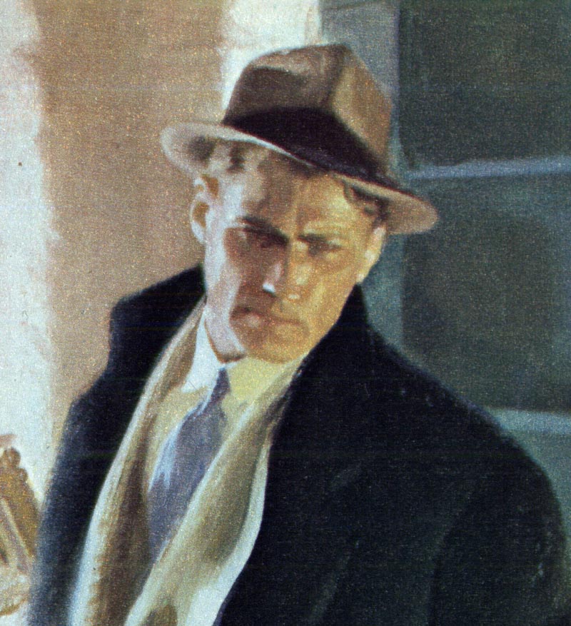
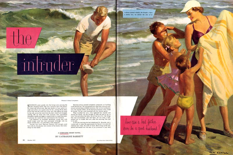
Due to an inordinately heavy work schedule I haven't had time to do my posts on Tom Lovell. I should be back on track on Monday, when we'll pick up where we left off. For now, here are three beautiful pieces by Lovell to tide you over.


Have a great holiday weekend - see you on Monday!

Friday, November 17, 2006

Life During Wartime: Part 5

Babe Lovell was trying to kill himself. He was trying to cave in his own skull against a nearby rock but no matter how much he flailed his head, he couldn't reach it.
This is how the Canadians fought in Italy during WWII: slogging over hill and mountain from one tiny village to the next with nothing but their determination and the worn out equipment cast off by other armies. Doing the dirty work of fighting house to house, room to room, hand to hand while no one helped, watched or, as far as they could tell, cared. Relentlessly ever pushing north, forcing the Germans back.

This is how Babe Lovell found himself fighting for his own death: wide awake and trapped under the rubble of an exploded house, his shoulders pinned under the weight of a heavy wooden beam, his legs pinned under another, his body twisted, broken and bleeding, while fire slowly burnt off his feet and legs. Somewhere above him, through the smoke and dust, wood and stone, his mates and the German soldiers they had encountered were blasting machine guns at each other, oblivious to his screams of agony.

Was this God's punishment for Babe's misspent youth? At sixteen, Babe had heaved a teacher through a glass door at school. He'd had the strap so many times as a boy, he finally stole it. Was this payback for the Italian farmer he had shot and killed during a street fight? Or maybe it was the German soldier he had killed a few days before Christmas of '44. But Babe was already punishing himself for that one. He had plundered the dead man's pack only to discover a letter and toys for the dead German soldier's children. The guilt that came with the realization that his enemy was just a man like him on the other side of this war was punishment enough.

How much pain can one man bear? It depends on the man and, more important than his physical strenghth, it depends on his strength of will. Babe's legs burned for more than an hour before the Germans retreated and a Canadian scout could search for survivors. First he poured buckets of water down through the rubble where the screaming was coming from, then the digging began.

Babe Lovell had spent his whole life in one fight or another and had whipped pretty much anyone and anything that had come at him, but in the end he was beaten by a girl. When May finally found him at the hospital back in England he would not return her embrace. "You can't marry me," he said. "Not like this. Its all changed. I'm a cripple. You shouldn't have come. You'd better go now."

It might have ended there, but Babe had underestimated May's stubborn determination. Though she left the hospital in sadness and confusion, she was back the next day and this is what she said: "Babe Lovell, we are getting married. I love you, and I don't care what you say."

It can be difficult for those of us who have lived only in peaceful lands to fully realize how much others have endured on our behalf. As this Thanksgiving weekend approaches, let's take a moment to appreciate the sacrifices of those who know what it is to live life during wartime.

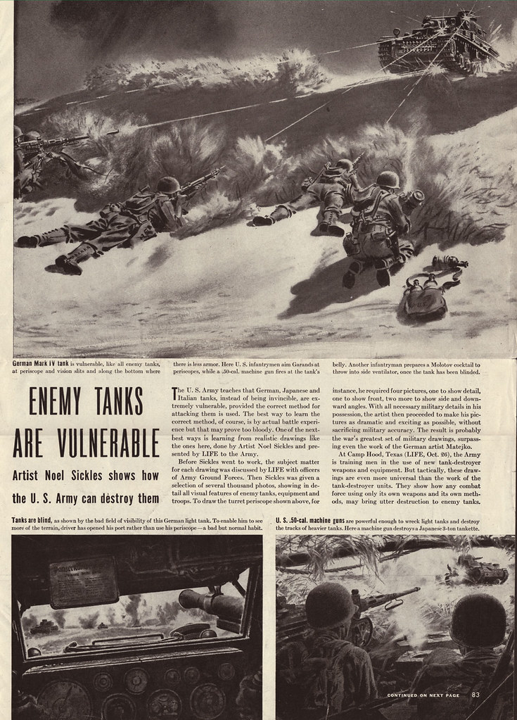
* The accompanying art by Noel Sickles is provided courtesy of Josh Sheppard but was first clipped by AD Don Smollen, who then gave them to Star Wars poster illustrator, Tom Jung, who passed them along to Josh. Josh would like to give credit to Don's 40 years of collecting great classic illustration. You can see these images at full size in my WWII Flickr set.

Tuesday, March 20, 2007

The Versatile Thornton Utz


From what I can tell, The American Magazine was probably Utz's steadiest client during the late 40's and early 50's. His work appears once and sometimes twice in almost every issue I've seen.


This tells me the editors clearly liked using Utz for story assignments. I would guess that a client hires and rehires a particular artist because they have come to count on a certain predictable style and technique they feel will be appropriate to the assignment. But Utz seems to have enjoyed surpising his clients by trying many different media and rendering styles. I would guess that they gave him so much work because they trusted him and enjoyed the diversity he delivered.


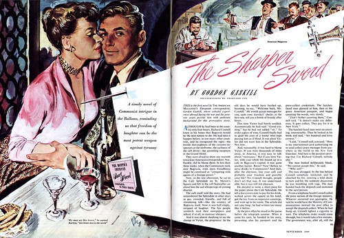
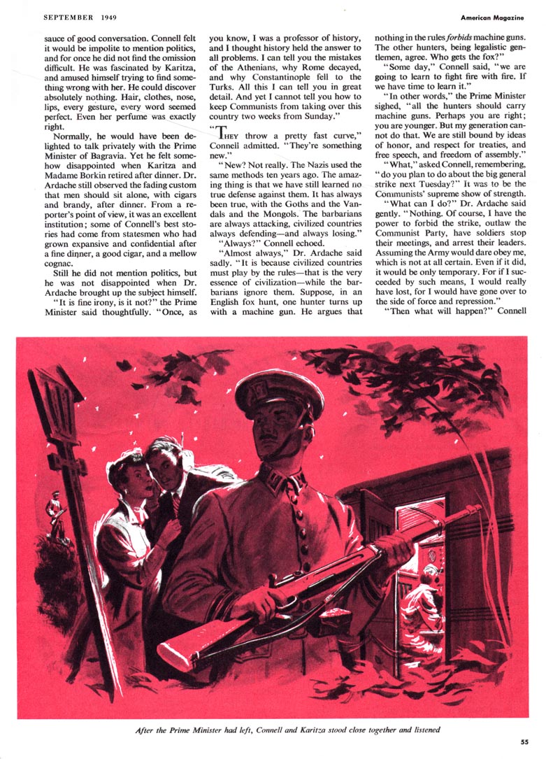
Granted, Utz stayed well within the parameters of the popular "realistic" look of the day, but while his painting technique on yesterday's piece reminded me a little of Ben Stahl, the illustration above has a hint of Tom Lovell while the ones below, done for the same September 1949 issue of American, look like they could have been the work of Perry Peterson. The first piece at the top of today's post, which I especially love, is something else altogether. Utz seems to have painted vigorously and directly onto a box board sort of surface, giving the piece a very graphic freshness that works well with the subject matter. For the second of today's examples, his much tighter, moody technique compliments the melodrama of the stage set-like scene being played out.


But even the broad range of approaches you see here doesn't fully reflect the variety of Utz's styles. Tomorrow we'll look at another side of the versatile Thornton Utz.

For now, take a look at these images at full size in my Thornton Utz Flickr set so you can better enjoy Utz's energetic and diverse artwork.

Friday, May 11, 2007

The Old School: Actually "The Chicago School"?


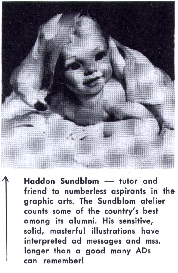
A friend emailed me the other day, saying he always thinks of what I call "the old school style" as "the Chicago style" - and that might be an appropriate term. Of the artists we looked at this week, Harry Anderson, Haddon Sundblom and Andrew Loomis all worked out of Chicago.


Even the Formfit ads from yesterday list Chicago as a primary address, adding to the plausibility that the art for those ads was done by Chicago-based illustrators. I mentioned the famous pinup artist, Gil Elvgren in the context of those ads and he too was a Chicago based artist (who had learned how to paint while apprenticing with Sundblom).

Add to that list Joyce Ballentine, who worked out of the Chicago art studio, Stevens Gross and of whom Frederick W. Bouton, VP of Creative Services, JWT, Chicago, writing in the November 1952 issue of Art Director and Studio News had this to say:


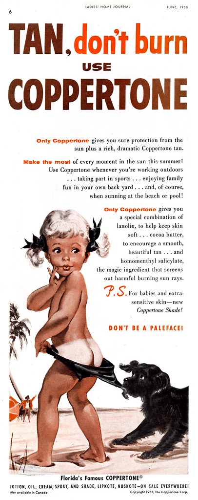
Ballentine famously created the "Coppertone Girl"...


But I would consider well known east coast artists like Walter Baumhofer...


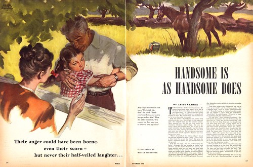
...and Tom Lovell (both of whom had roots in the pulps)...


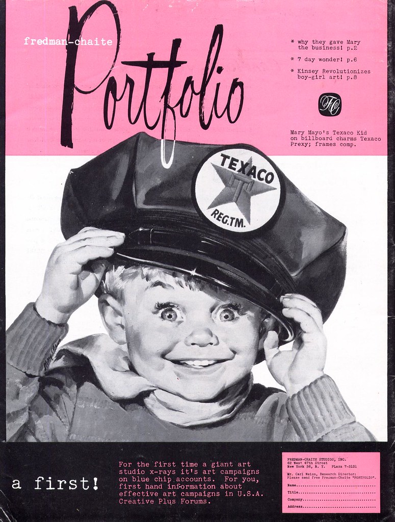
...and Fred/Chaite Studio's Mary Mayo to fall well within the broader range of the "old school" style. In fact, there were a great many artists enjoying tremendous success by painting in the style of the old school.


Haddon Sundblom claimed among his influences, John Singer Sargent, and Frederick Bouton described the look I'm trying to classify in his AD&SN article as "the solid chords of academic realism". For the sake of expediency, that description might be enough. Whatever the case, in spite of the long-enduring popularity and high profile of the old school, there was a change taking place as the 50's progressed.

Next week: The New School

Tuesday, March 31, 2009

An Art Editor Discusses the Manly Art of Illustration

In the September 1954 issue of American Artist magazine, Norman Kent, art director of True - "The Man's Magazine" - talks about illustration.


"The great majority of contemporary magazine illustration is devoted to fiction and concentrates, for the most part, on the romantic boy and girl theme," writes Kent. "True magazine publishes no fiction, however; its stories are written primarily for a male audience and are illustrated in full color. And because they are true stories they must necessarily be as convincing graphically as photographs. By this I do not mean that our illustrators are asked to imitate photography. Quite the contrary; we demand that the painted illustration be unmistakably graphic, since about half of our pages are normally documented with photographs. But since the readers of this magazine form a highly critical audience, well versed in the arts of hunting, fishing and other manly pursuits, there can be no slighting of important detail; no vague passages to cover uncertainties. For this reason numerous illustrators, highly respected for style and imagination so perfectly related to the mood and mode of today's fiction, are unsuited to the exacting technical authority demanded by True."


Sounds pretty lofty. Clearly, Norman Kent wanted to establish that True represented the high watermark of men's magazines and that only the best illustrators were worthy of delineating the "manly pursuits" chronicled in its pages. I can't speak for the writing, but based on the production values and paper quality of True, the status of the many national brands advertised in the magazine, and the top-notch artists who Kent regularly commissioned, I would have to agree. But sharing that top tier were two competitors: Argosy and Outdoor Life. many of the same artists worked for both of these other magazines illustrating largely the same type of articles.
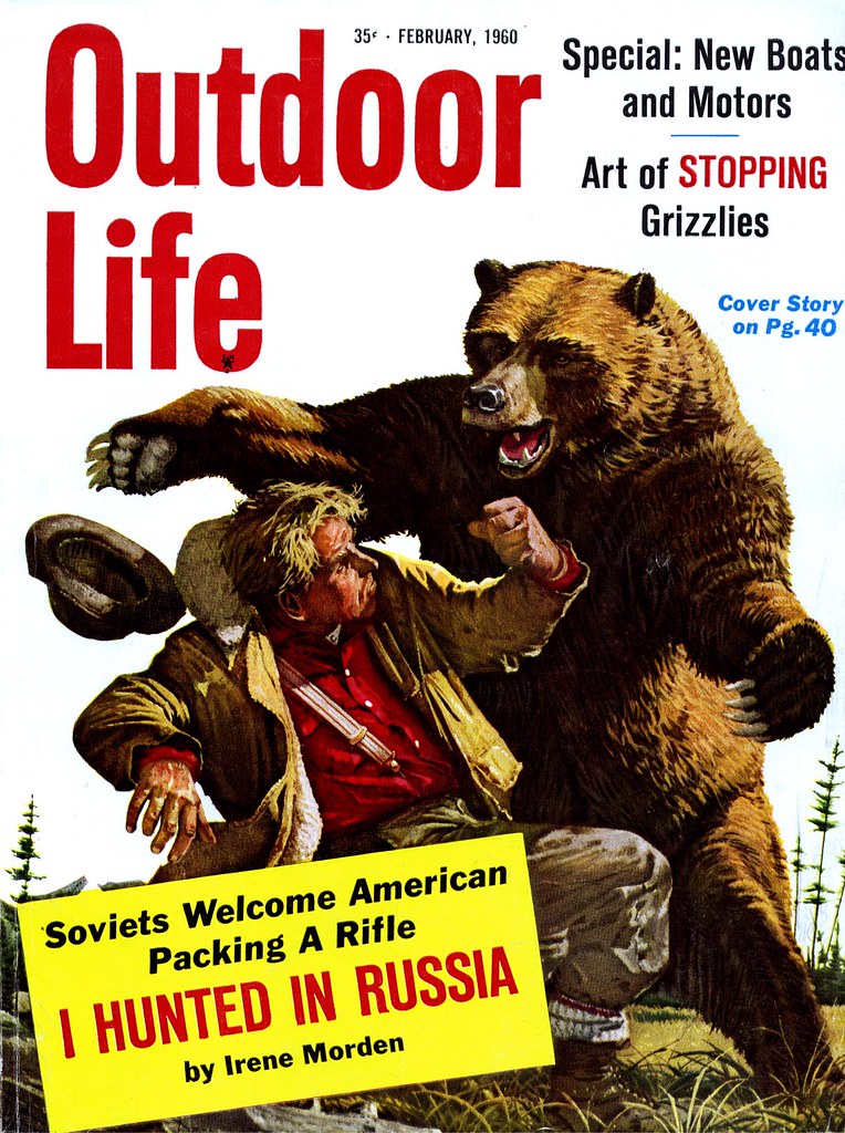

Kent lists some of those illustrators who "are able to meet this test of accurate reporting while they carry over into the area of their commercial commissions the very qualities that mark them as individual artists" :

Warren Baumgartner, Mario Cooper, Henry C. Pitz, John Gannam, Peter Helck, John Pike, William A. Smith, Fred Ludekens, Robert Fawcett, Stan Galli, Bruce Bomberger, Glen Grohe, Tom Lovell, Bill Reusswigg, C.E. Monroe, Jr., and Harold Von Schmidt ( among several others). There's no denying that these really were the exceptional top rank among illustrators most often called upon to interpret scenes of manly action and adventure in the pages of more mainstream, family oriented publications like the Saturday Evening Post and Collier's.

You're unlikely to have found work by any of these artists in the more down market 'men's sweat' magazines, although they were very similar in content (not to mention intent). Recently we spent a week looking at how the editors of Bluebook felt the need to contemporize the look of that magazine. I believe it was their attempt to keep up with competitors like True and Argosy.

As we saw, there was a lot of terrific artwork being done in Bluebook - but the poorer production quality, cheap newsprint, and lesser status of its artists would have made that task daunting. The lack of decent national brand advertisers in Bluebook tells the tale.


Even further down the ladder were the truly lurid men's magazines. Some even sported really great cover art by well established pro's, like this great piece by Frank Soltesz. But generally the interior art, if any, was second rate.
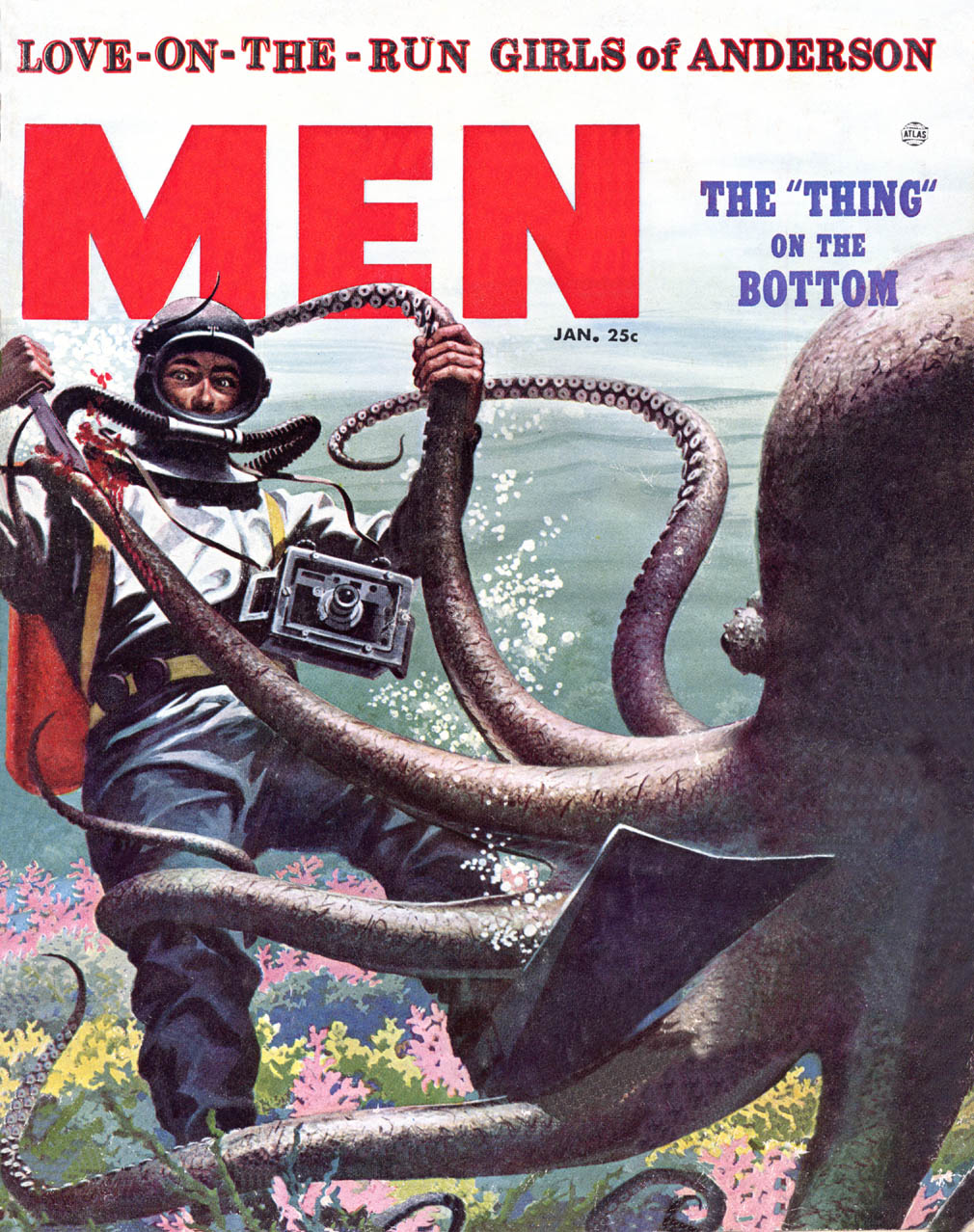

Here readers were less likely to read about hunting and fishing than to linger over crime scene photos of mob hits and tragic domestic disputes. I doubt you'd ever find any of our top tier illustrators even considering an assignment from these mags.
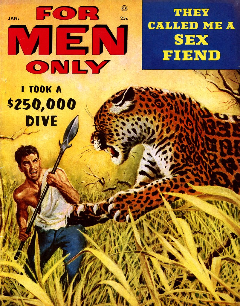

I've taken the time to go into all this background because, despite what might seem at a glance like a negligible degree of distinction among these publications, there was clear hierarchy in the men's magazine market - both in terms of quality and status.

This week, with the help of Norman Kent, we will take a closer look at the True nature of the best in manly illustration.

* And speaking of the best, you'd best be getting on over to Charlie Allen's blog for this week's CAWS!