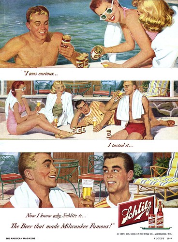
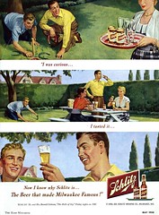
Observed from a modern perspective, the implied storylines can be pretty funny. The scenario below at right, for instance: check out the expression on the reclining guy in the centre panel as he watches his buff buddy in the tight, red trunks quaff that Schlitz. Is it just me or do these fellows share a "special" relationship the girls aren't aware of?
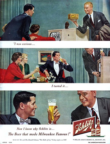
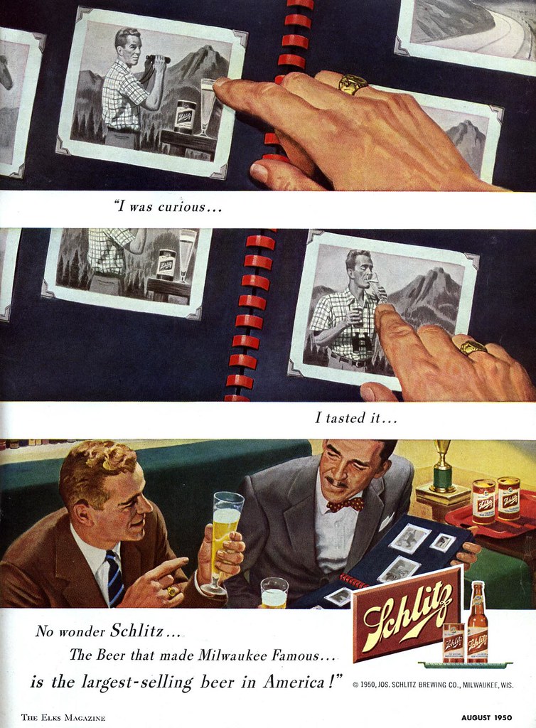
This one below is definitely my favourite. I like the varying shots, and the contasting colour. I like how the class ring is used as an identifying element to let us know who is telling the story (you can just make out the ring in the b/w photos in the album too). There's also a bit more of a painterly quality to the art - its a little less photo-realistic, which I also prefer. The character on the right is also interesting for not being a typical, generic advertising model type - he's even a bit creepy when you really take a long look at him.
 Its an intriguing scenario that, due to its more moody lighting and unusual concept, has an almost... forbidding air about it.
Anyway, this whole series is a really nice variation on the usual approach and a lot of fun to examine in detail - I'm almost reminded of the kind of stuff you'd find in early Mad magazines when I look at these - though I can't explain exactly why.
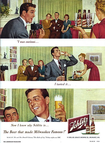
There's a lot to see in these ads, so why not take a look at them at full size in my Beverages Flickr set.
Curious?! Curious about what?, I say.
ReplyDeleteLooks like thinnly veiled home-erotic 1950's advertising, if ya ask me... :))