Some long time readers may recall
the series last year on my friend, Will Davies. At the end of that week of posts last May I had a request from Ward Jenkins of
Ward-O-Matic fame for a Will Davies "step-by-step". Happily, I can now fulfill that request: Some years ago, several Toronto graphic arts professionals who were tops in their field were asked to do a lecture series at
The Ontario College of Art and Design. Will prepared the sequence we'll be looking at this week for that lecture series.

Last week I enjoyed a long lunch with Will, my younger son,
Simon and good buddy,
René Milot at a restaurant in Toronto near Will's home. After lunch we returned to Will's place for a quiet conversation in which Will generously explained the details of how he worked on commercial assignments in the 50's and 60's. "This is pretty early on," Will remarked when I showed him the photocopies I had brought with me, "Later on I didn't bother with all this. I'd just rough it out directly on the board or canvas and send that over to the client for approval."
Still, this earlier system Will employed represents a valuable lesson in how to properly develop a piece of finished art. And for me at least, even the roughest sketch provides an inspiring example of how a talented hand creates a strong, energetic and sound composition - something we should all thoughtfully strive for in our own efforts.

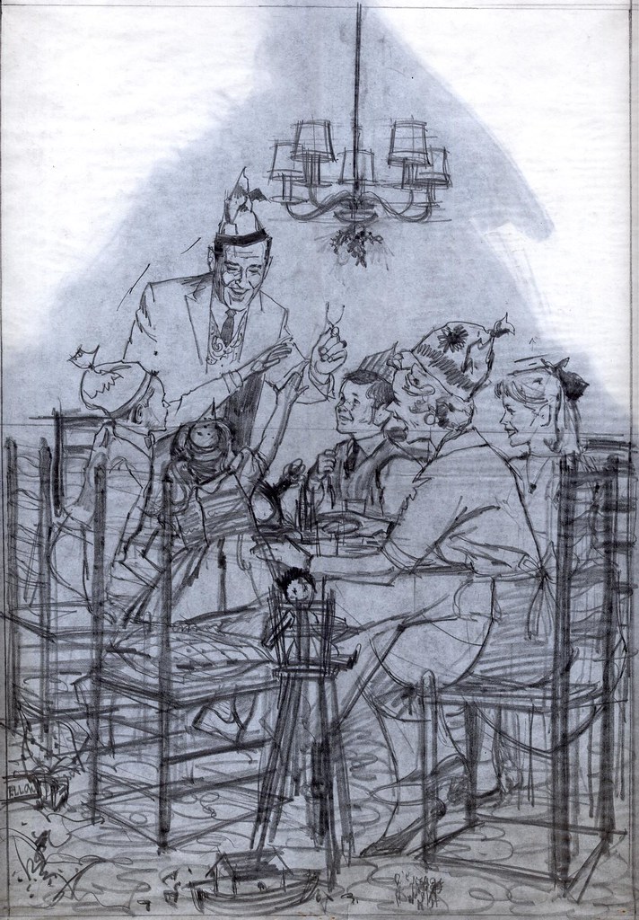
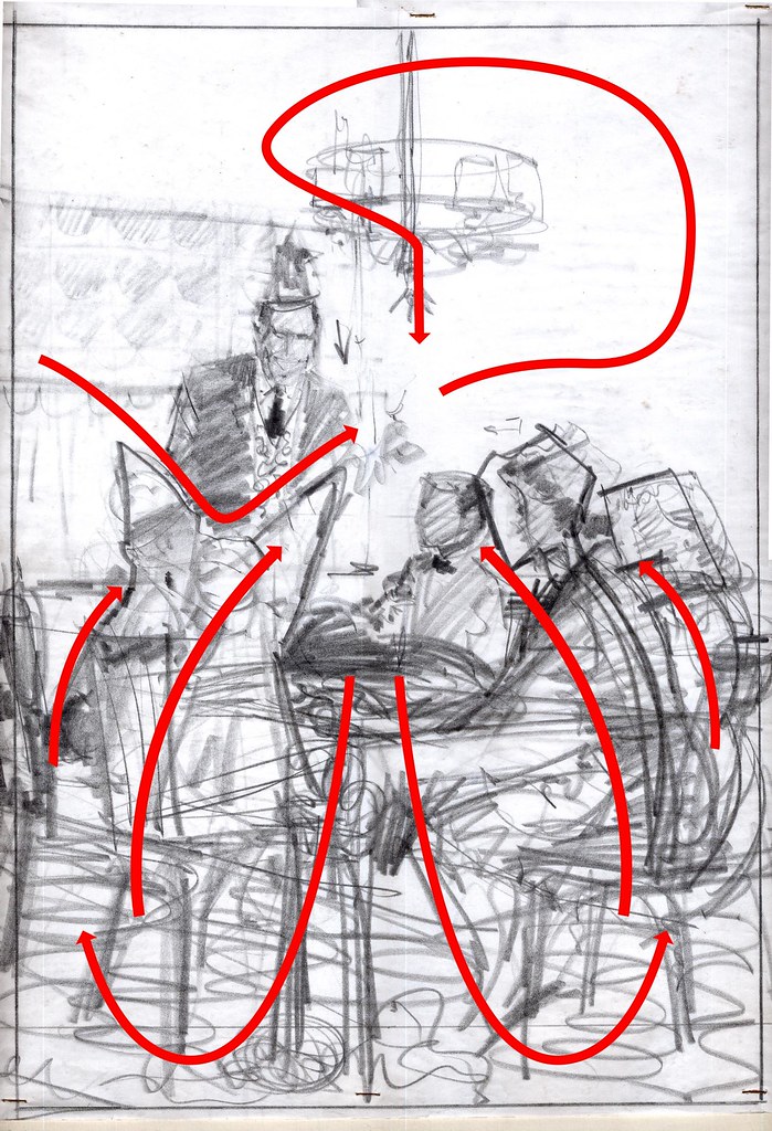
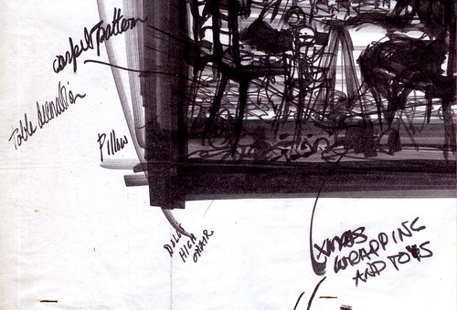
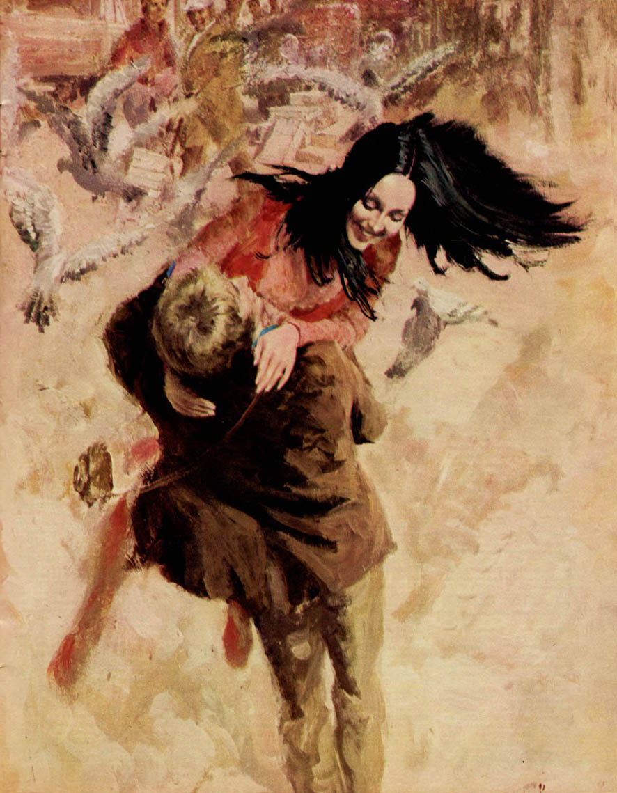
During the late 50's/ early 60's Will did quite a few full page newpaper ads for the major department store chain here in Canada, the Hudson's Bay Company. These ads typically centred around holiday themes - and in this case, it would appear from the notes dashed in on this rough that the theme was "Christmas".

Will says that, although these assignments came to him via The Bay's ad agency, he usually was given the freedom to come up with his own idea for the scenario. "Some people call them
thumbnails," says Will, "but I never did thumbnails. I'd think about it for quite a while, doing thumbnails in my head, then, when I finally did do a rough sketch, it looked pretty much the way I wanted it to. Hopefully!"
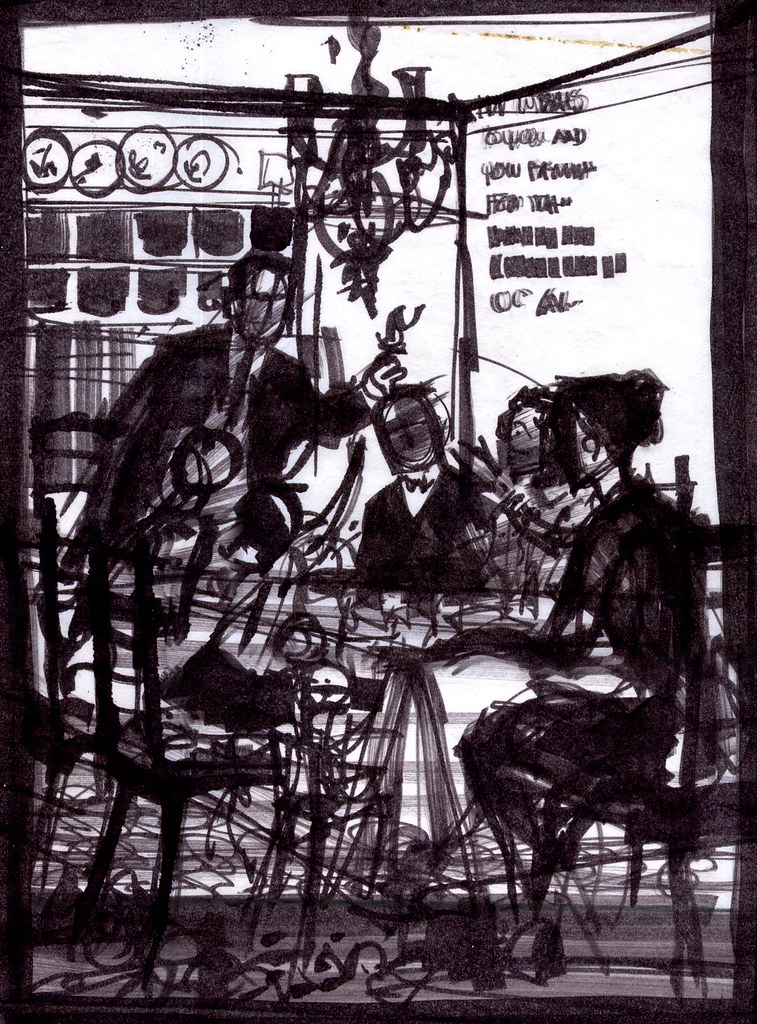
I asked him if this first rough was done in magic marker but he insisted, "No. Pastel. Magic markers came later - and I hated them." Will told me that he liked the subtlety of pastels. Markers, he says, were too confining. "Once you put a line down, you were stuck with it. I had to use them for a time when they loaned me out to a studio in Detroit. But other than that one time, I never used them."
*
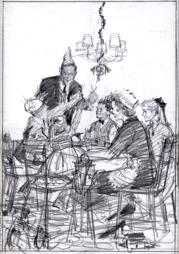
In spite of Will's insistence, I still think this particular rough is done in magic marker, perhaps at a later date is preperation for his lecture demonstration.
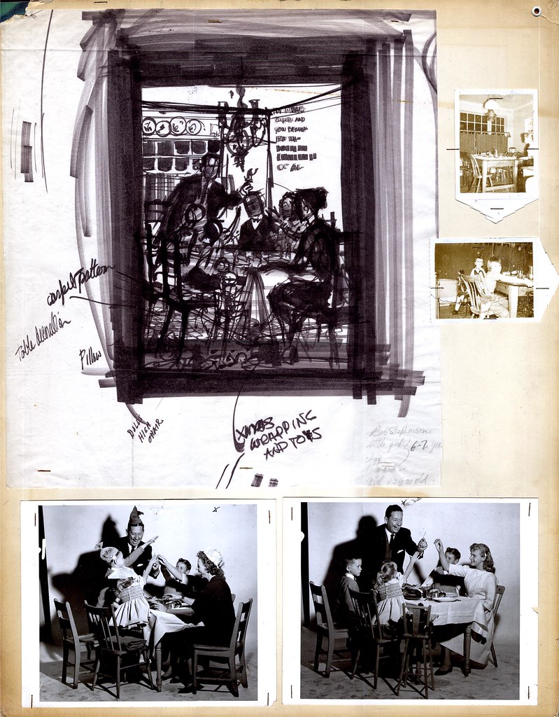
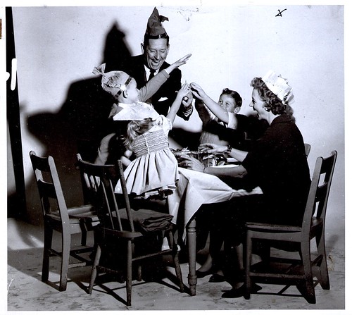
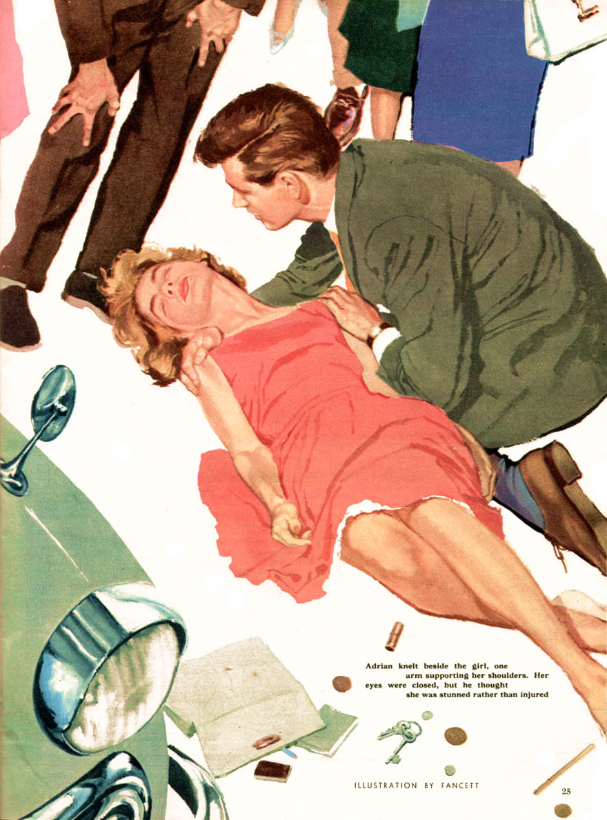
Once Will was satisfied with the general idea he had sketched out, he then went about preparing to shoot models , props and scenery. "That's Bud Feheley's wife as the mother," Will said, pointing at the lady in the photo.

Feheley was the "F" in TDF, the art services studio were Will was employed as top man in the illustration department at the time. "I asked for her for the mother. She had the perfect look. The others are all hired models... no, wait -- that's Kerry, my youngest daughter! I had forgotten about that ... we shot this scene in my home at the time, in Scarborough."

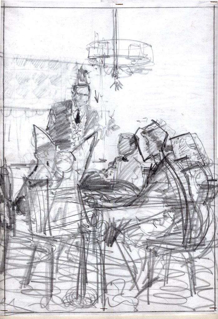
Will says that he would describe the scenario to his models and then have them act it out. He'd then moved around taking shots - sometimes capturing happy accidents that would find their way into the final illustration. "Usually I'd shoot a couple of rolls and end up with one or two good shots - the rest I'd throw out."

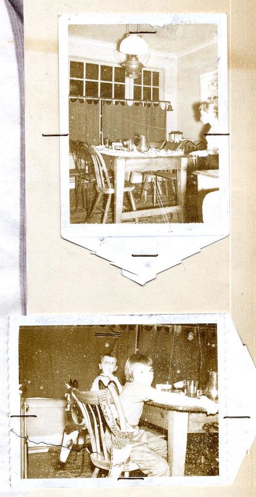
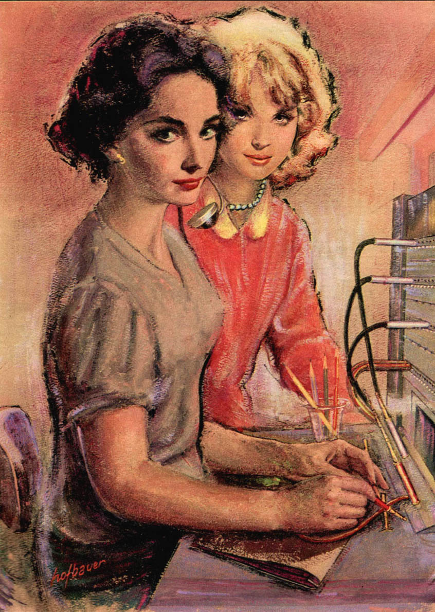
For example, the variation above with a teenage daughter instead of the mother that did not make it into the final cut.
You can examine these images more closely in my
Will Davies Flickr set.