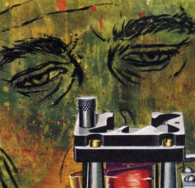
A 1952 Bernard D'Andrea advertising illustration.
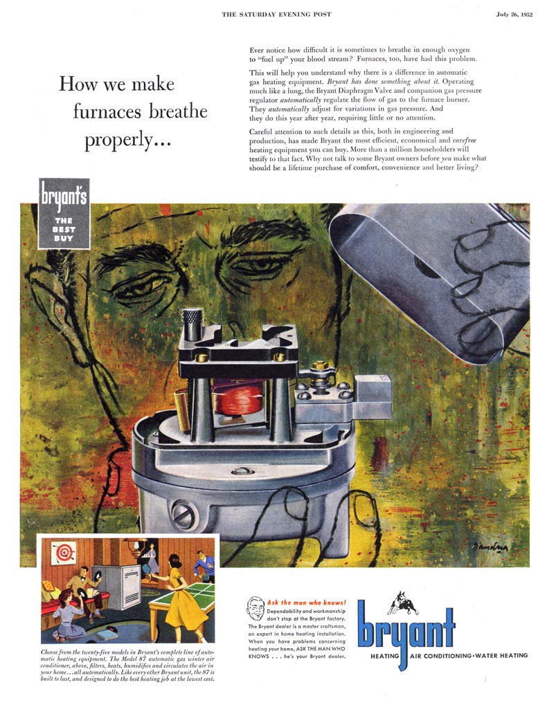
From the distance of half a century and after being exposed to a million stylistic variations, I'm not sure if you can see what a drastic departure this is for an illustrator like D'Andrea. The year is 1952 and he is riffing on elements of abstract expressionism in an ad appearing in the Saturday Evening Post! Its really kind of remarkable.
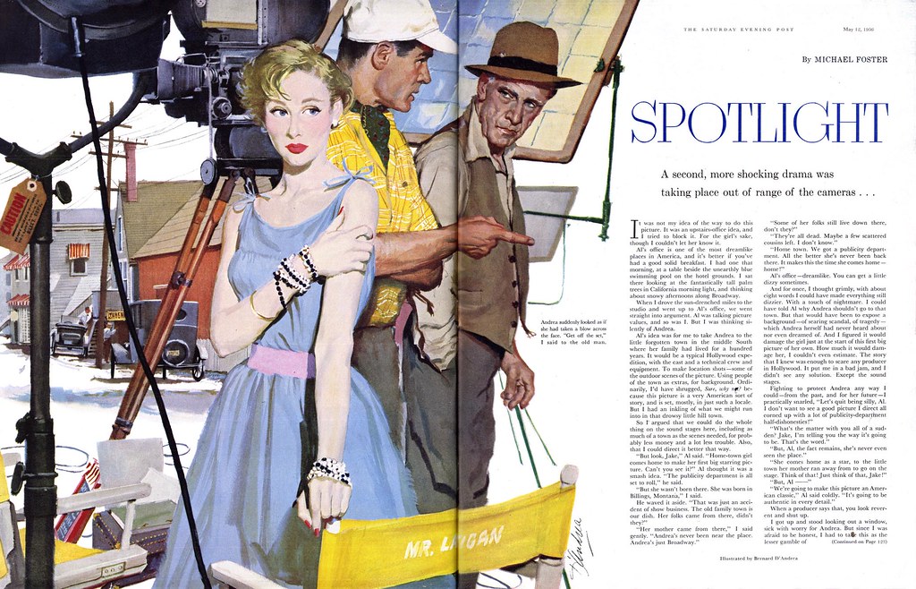
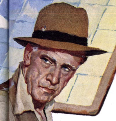
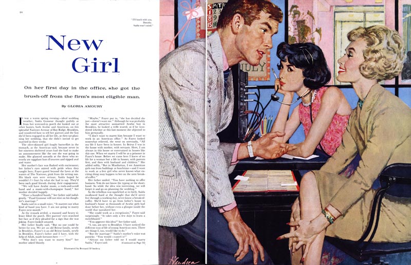
A 1956 story illustration by Bernard D'Andrea for the Saturday Evening Post. During the entire decade the Post rarely employed anything but this sort of literal realism. D'Andrea and the other Cooper artists appeared month to month throughout those years in the Post's pages. And the vast majority of advertising clients wanted nothing other than this same realistic style.
Cooper's other artists rarely diverged from their comfort zone, occasionally taking baby steps by employing a variation in technique, but otherwise sticking to their signature styles steeped in 1950's idealized realism. Bernard D'Andrea had no economic reason to do things any differently.
But he did.
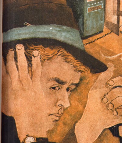
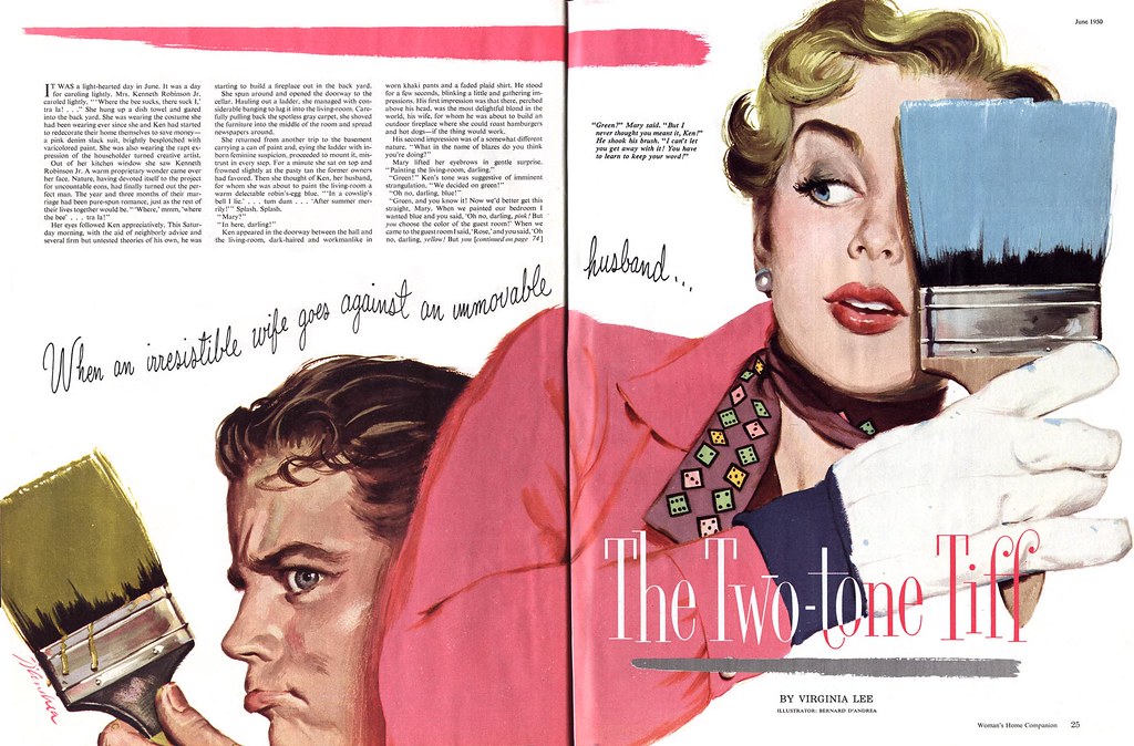
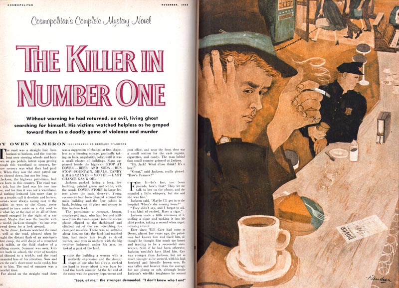
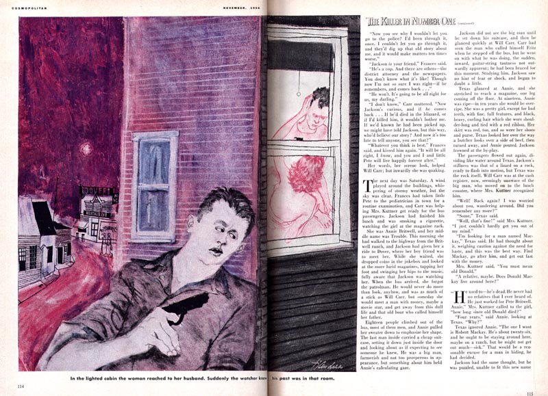
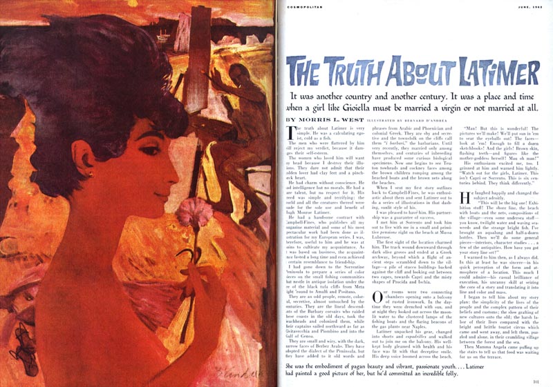
A 1956 Cosmopolitan magazine illustration by Bernard D'Andrea.
Why would Bernard D'Andrea employ such a (for the 50's) radically different style when he had already invested a decade into establishing himself as a top-notch 'clinch artist' at the most high-profile illustration studio in the country?
I believe Bernard D'Andrea had a restless spirit.
I believe he was also a consummate professional. When the Post called with an assignment, he understood that they didn't want him to push the envelope. Here he is in 1959 delivering the same idealized realism as he did a decade earlier to the same conservative client.
Murray Tinkelman, when we spoke recently on the phone, called D'Andrea "a wonderful artist" and "the most gifted draftsman".

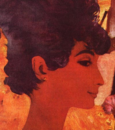
But Murray can also claim responsibility for having tempted Bernie D'Andrea to explore further by taking him to Reuben Tam's painting classes at the Brooklyn Museum. A Bernard D'Andrea illustration for Cosmo, 1962.
What exactly is the signature style of an artist? Is the process of developing your own look the only path to success? Is going down that path liberating... or limiting?
The answers to those questions are as subjective as art itself. The conclusion I hope you draw from this week's series is that there is no hard and fast answer. Each of us creates our own opportunities through our determination to succeed at what we love to do.
Exploring many options can be as rewarding and personal as focusing on one single 'look'.
* My Bernard D'Andrea Flickr set.
For those interested in further investigating the idea of 'signature style' vs adaptability...
* Jack Raglin has written an excellent post examining this topic in the context of Enoch Bolles' career.
* The llustrative Designer, Von Glitschka, participates in a podcast discussion and explains how stylistic diversity has been a key component of his successful career.
IMO D'Andrea was one of the most under-rated... no, under-noticed illustrators of the 50's women's magazine illustrators. His traditional literal technique was as good as the best of them, and he had a wide range of experimental innovative approaches when allowed.
ReplyDeleteI don't know what his peers thought of him, as either a skilled renderer or an innovator. But, I think he was one of the trail blazers that never quite got the credit he was due. He was like the quarterback that could throw as hard, as accurate and as far as any of the top quarterbacks, but perhaps got sacked a little more often and never went beyond the playoffs.
Many of the stories behind these long ago Illustrators will remain a mystery, but it's always fun to speculate.
Tom Watson
There's no doubt D'Andrea was a talent of the first order.Maybe his versatility worked against him and AD's didnt know which 'box' to put him in.All these samples show a tremendous sense of design and color.One of the best.
ReplyDeleteI should emphasize that Bernie D'Andrea may not be as celebrated today as some of his peers, but he was hardly invisible during his heyday and his 'restless nature' has never worked against him. Walt Reed describes him as "always searching for new artistic horizons" and says that he has had "a long and successful career that has spanned the decades" and that he is "the recipient of many awards and distinctive honors for his work."
ReplyDeleteLynn Buckham, Stan Klimley, Kurt Ard, Bob Levering - these are just a few of the talented boy/girl artists who also worked at Cooper during those days. Sticking to one style, being compartmentalized didn't afford them any more opportunity than D'Andrea. Really, that was the point of this week's series and the false assumption that 'restless illustrators' will always have to fight.
Its true that ADs like to pigeon-hole illustrators but I think we do ourselves a disservice when we actively participate in that process. Some illustrators have chosen an alternative path and this week's series was intended to highlight a few successful examples of that alternative.
Bernie D'Andrea is still with us by the way. I hope to spend a week on his career some time soon! :^)
I'm propose that a possible clue as to why illustrators at this period explored contemporary style approaches may be linked to what was happening in the gallery business at the time, in addition to demands from the market itself. His attending Tam's painting classes and incorporating abstract expressionist styling in his backgrounds may have been an attempt to absorb some of that contemporary feel in his work. Any style that becomes fashionable will filter through other mediums as a result of its popularity. It might have been more of a requirement for the job than a personal choice. Artists like D'Andrea had the artistic muscle to make the most of it.
ReplyDeleteThat's an interesting thought, db... you're probably correct. I'm sure there were a lot of factors involved. But one underlying aspect that might be a bit ... uncomfortable for some people is that I don't believe all artists are capable of flexibility and adaptation. That sort of brings us full circle back to the Blue Book posts. Those older artists would have really struggled to adapt to the prevailing style of the 50's - the Al Parker big head, flat graphic thing that all the Cooper artists ran with.
ReplyDeleteThat situation arises decade after decade... hot trend-setting artists burn brightly and influence a generation of their peers... then one day their best clients seem to have stopped calling. D'Andrea began experimenting long before he had to... the Cooper style was working extremely well for him. SEP and other big mags were steady clients, and many of his peers made little effort to push their boundaries. I don't know why he chose to experiment with other styles, but Murray Tinkleman told me he initially blew off the fine art gallery painting stuff saying, "This is a buncha crap!"... then, Murray laughed, he snuck back and began taking classes!
dbclemons brings up some interesting points. I think gallery painting did cross pollinate with illustration more than we might realize. Robert Weaver, John Asaro, Daniel Schwartz, Harvey Schmidt are just a few that were influence by the 50's Expressionists. In reading up on Morton Roberts and Burt Silverman, they were fine artists at heart, but struggled with the idea they were also illustrators.
ReplyDeleteIn art school during the late 50's particularly, the fine arts and illustration departments inter-mingled both in overlapping classes and as friends. We all took life drawing and painting together, and you virtually couldn't tell the difference as to which was an illustration major and which was a fine art major. In those fundamental classes, we were all being given the same theories and influences to learn by.
We were encouraged to use the theory of pure abstraction and apply it when composing and designing our illustrations. Bob Peak is a good example of that blend.
The late 50's and through the 60's was a time for the illustrator to find methods of creating illustrations that would not compete with photograph, which had become quite sophisticated. Even interior decorating used variations on simple abstract shapes such as circles, squares and triangles, as well as bright color combinations. All these rapid aesthetic transitions were symbolizing the "signs of the times".
Tom Watson
Wonderful post. I had seen his work but the work and the man were never crystalized and brought togetherin my mind until now . Thank yOu.
ReplyDeleteAs an illustrator of 20 + years I understand fully the restless spirit. And it is wonderful when an AD and artist can convince the client to try something new. Some make gradual changes like Rockwell with great success.
The technical mastery in the images which are more typical for the time is really impressive. They have a certain charm to them.
ReplyDeleteThe flat style, however, blows me away.
I actually think D'Andrea has a fairly strong individual style. I really love the more experimental stuff.
I love the illustrations of Mr. D'Andrea, especially the one for a story in the October 1978 (Ladies Home) JOURNAL on page 123. The daughter and her mom are so cute. Can you tell me where he got the inspiration for drawing those two people?
ReplyDeleteWhere can I write to Mr. Bernard d'Andrea?
ReplyDelete