Saturday, April 29, 2006

Chiriaka in Technicolor


It must be one of Murphy's Law's: "You'll always find the perfect reference after you don't need it any more". So it is that this great example of Ernest Chiriaka's work for Hollywood magically appeared before my eyes after our week of examining the artist's work.

No matter - that's what weekends are for! And to enhance your appreciation for this aspect of Chiriaka's career, here's one last short excerpt from David Saunder's article in the 8th issue of Dan Zimmer's Illustration magazine:

Chiriacka’s agent showed his work to 20th Century Fox studio chief Spyros Skouras, who hired the artist to paint the movie poster for the first major CinemaScope film, The Robe. Not knowing how to approach this kind of assignment, Chiriacka made a color sketch to suggest a possible design concept, but instead of being commissioned to paint a full-sized finished version, Skouras said, “That’s great! I’ll buy it! I’ll take it just like that. Wrap it up!” And Chiriacka’s preliminary sketch became the final poster for this historic widescreen spectacle starring Jean Simmons and Richard Burton. This blockbuster film saved 20th Century Fox and won four Oscar nominations, and set the 1950s trend in Hollywood for swords and sandals. The innovative technology of CinemaScope was copied by all the major studios, and it temporarily enticed the American masses to turn off their television sets and go out to see the movies.

*You can see this image at full size in my Ernest Chiriaka Flickr set.

Friday, April 28, 2006

Chiriaka's Esquire Girls

His first big success in the slicks was painting two pin-ups for Esquire. They were bound with 10 other pin-ups by six different artists to form a calendar for 1952: “The Esquire Girls—a dozen visions to give the New Year a beautiful start.” This separately bound calendar was printed on card-stock and was “available at newsstands as both wall & desk sized.” Esquire produced this lucrative special interest publication only for sale during the New Year’s season, and featured it in their January issue to announce its release. Chiriacka’s “visions” were apparently the most beautiful because the following year, he was commissioned to paint all “12 timely toasts” for the 1953 Esquire Calendar Girls, and again in 1954, he painted all of the “12 lovely ladies—plus two for good luck—for the 1954 Esquire Calendar.” These pin-ups were boldly signed “E. Chiriaka,” omitting the second “c” to streamline his name for more pizzazz.


Chiriacka is best known today for his famous Esquire pin-ups. His sultry women have the dignity and proportions of a classic statue of Aphrodite. Unsatisfied with the complete perfection of any single model, the artist would hire as many as six different women to assemble his vision of an ideal beauty. They are as exotic and tastefully costumed as a playful strip tease by Gypsy Rose Lee. Their flesh is sculpted in the artist’s jaunty manner, so his women have a rough hewn earthiness. But the major reason Chiriacka is remembered for his pin-ups is simply because they are the major works the artist signed as “E. Chiriaka.”


Once again, my thanks to Dan Zimmer for granting me permission to excerpt David Saunders' text from his Ernest Chiriaka article in the 8th issue of Illustration. If you enjoyed these excerpts and would like to read the entire article, you can order it here.


*Don't forget, all of this week's images can be seen at full size in my Ernest Chiriaka Flickr set. Next week: When he was bad, he was really bad, but when he was good, he was great. Five of the hottest pieces I've ever seen by Coby Whitmore.

Thursday, April 27, 2006

"A Serious Artist!"


This week's narrative is from the 8th issue of Illustration, excerpted with the permission of Dan Zimmer. The text is © David Saunders:

In 1927 the city passed an ordinance to control the black market in the slums, and shops were required to paint the names of the owner and the business on their store windows. The sign companies were swamped with the demand from this windfall. To avoid delays and to minimize the cost for this mandated task, shop owners were happy to hire local talent, so a young neighborhood artist had his first commercial art employment. “I was right there! I could paint lettered signs so I did them by myself. I was 14 years old, but I was their man!”
On weekends the young artist walked five miles up to the Metropolitan Museum of Art, where the admission was free and everything looked great. One day, he noticed a young woman studiously painting a copy of an Old Master, and he asked her how he might also qualify for that privilege. She kindly led him to the director of the Copyist Program and without presenting a portfolio or any proof as an art student, Ernest Chiriacka was generously outfitted with an easel, paints, and canvas and set before a masterwork of his own choice. The only stipulation was that he confine himself to his small rug to keep the area clean. “He told me not to move. I had to remain there and I was not to touch anything. It was great. A city kid like me painting at the Metropolitan Museum! I was a serious artist after that!”

*Just a reminder that all this week's images can be found at full size in my Ernest Chiriaka Flickr set.

Wednesday, April 26, 2006

Chiriaka takes Liberty


This week's narrative is from the 8th issue of Illustration, excerpted with the permission of Dan Zimmer. The text is © David Saunders:

In July 1950 Darcy painted a slick cover “on spec” of his young son Leonard and showed it to an agent. She thought it was great, and sold it to Liberty magazine. Finally, at 37 years old, the real Ernest Chiriacka could proudly sign his full name on his first slick cover illustration. The agent was Celia Mendelssohn, who, along with her brother Sidney, ran American Artists at 67 West 44th Street. They represented many top artists, like Gillette (Gil) Elvgren, for which privilege Chiriacka had to forfeit a whopping 25 percent commission. To everyone’s astonishment, Liberty magazine abruptly folded, along with Chiriacka’s August cover. “I thought, ‘Hey, Holy Cow! I’m on the cover of Liberty! That’s great news.’ And they folded, right then and there, with my cover. It never came out! Gr-r-r! That was a dirty deal! My first slick, and it folds up!” Nevertheless, Chiriacka had successfully passed another stepping-stone, because the check had cleared and the Mendelssohns were convinced that his work was saleable in the slick market. There followed a succession of assignments for interior story illustrations and covers for American Magazine, Coronet, and Argosy.

Tuesday, April 25, 2006

Working for "the slicks"


This week's narrative is from the 8th issue of Illustration, excerpted with the permission of Dan Zimmer. The text is © David Saunders:

EC: I don’t need any glasses to look at these things! (laughter) I can tell you this, there came a time when I didn’t need the model to pose at all! So I used to do these things without the model, and that’s how fast we worked in the illustration business for pulp magazines.
DS: You could only afford to hire a model for the slicks, because they paid better.
EC: Yeah. If you’re working for the slick magazines, you’ve got to have a model. Yeah. You couldn’t fake anything, because in the slicks there’s a story. This is a high-class magazine. It’s not a pulp cover or that sort of stuff. (laughter)
DS: You know, it’s funny. I’ve never heard a slick illustrator call them the “slicks!” My father was a pulp illustrator who never made it to the slicks, and he always referred to them as the “slicks,” but I’ve always presumed he used that term because he was a pulp artist. Like some guy from the poor side of town who says, “Those hot-shots over there have all the luck!” But if that fellow makes it big and moves uptown, he’s not going to call himself a “hot-shot.” So, why would a slick illustrator still call himself a “slick” illustrator after he made it to the Post? Did all the slick illustrators refer to themselves that way after they’d made it to the slicks?
EC: They still used that term because the pulps used pulp paper and the slicks used slick paper. It’s always been the name of the profession. But also, the word “slick” is like the word “star” in the theater world. (Laughs)

Monday, April 24, 2006

Ernest Chiriaka


I always have a link in my sidebar to Dan Zimmer's Illustration magazine, but this week I really need to highlight this great publication because Dan has kindly given me permission to except the Chiriaka article from the 8th issue of Illustration (which you can still order!) written by Norm Saunders' son, David. Many thanks to Dan and I encourage everyone to consider getting a subscription to Illustration ( especially if you have a birthday coming up soon and your wife's not sure what to get you - are you reading this, Wendy? ;-)

The following text is © 2003 David Saunders:

Ernest Chiriacka was born Anastassios Kyriakakos in New York City on May 11, 1913, and lived at 42 Madison Street on the Lower East Side. To imagine the living conditions of this ghetto at the turn of the century, look at the heart-breaking photo-essay by Jacob Riis, “How the Other Half Lives,” which revealed the astonishing hardships of children growing up in these shamefully squalid tenement buildings. His parents, Portia and Herakles Kyriakakos, had emigrated from the mountain village of Xero Cambi in the Sparta region of Greece in 1907. Herakles was an educated young man who had studied to be a Greek Orthodox abbot, but could not adjust to the harsh reality of the bustling slums of New York, where the only jobs for a non-lingual immigrant were unskilled menial labor. Although Hercules performed his 12 heroic labors, Herakles refused to lower himself to work as a dishwasher, shoeshiner, or push-cart laborer. He changed his name to “Harry Chiriacka,” but made no further effort to become an American or learn English, and he fell into the languid despair of drink. Fortunately, his wife Portia was an industrious person who raised six children, supervising their public school educations as well as their attendance in Greek school to learn their native culture and language. Anastassios was their third child. He was called “Tasso” for short, which is pronounced “dah-so,” and is transliterated as “Darcy.”

Sunday, April 23, 2006

In Memory of Joe Brozovich


Joe Brozovich was not the artist of these pieces. During WWII, Joe Brozovich was in the Navy. He took pictures of pin up art that he liked and kept them in the little space that was provided to each crewman, in his locker. These three photos were recently passed along to his grandson, John Chaykowsky, a 24 year old Environmental Graphic Designer and contributor to The Wayfinding Place, by John's uncle and cousin.


John wrote, "Its a running family joke that he took photos of pin-up art when so much more was going on in the world. He literally has dozens of photos like this... But not of his adventures at sea. He said he just really liked the way they were rendered."

"My grandfather, though a mechanic after the war, took the "Famous Artist Course" and I have all those books now. They are pretty interesting and helped shape a lot of my figure drawing."


By a tragic coincidence it was during our email exchange late last week that John got word that his grandfather had passed away.

"Maybe me sending you the photos was some weird sign... I am speechless.

His name was Joe Brozovich.

Please dedicate your post to him."

Friday, April 21, 2006

Bottom of the Ninth


After all these years I'm always amazed that I've featured some illustrators several times while completely ignoring other very worthy subjects.

As this week's look at baseball draws to a close, this piece does double duty as an introduction to next week's look at the work of Ernest Chiriaka. See you then!

*Don't forget - this piece can be seen at full size in my Ernest Chiriaka Flickr set.

Thursday, April 20, 2006

Peak at the plate


By 1967 Bob Peak was well past being the hot young newcomer who had turned the commercial art world on its ear. He had already been named "Artist of the Year" by the Artists Guild of New York in 1961 and would be elected to the Society of Illustrators Hall of Fame just 10 years after this piece appeared in Boy's Life in April of 1967.

Walt Reed's Illustrator in America tells us that Peak had decided early on to stop looking at the work of other artists and focus on thoughtful experimentation from his own unique point of view. Pieces like the one above were the result and subsequently brought him unprecedented success - and countless imitators.

You can see this illustration at full size in my Bob Peak Flickr set.

Wednesday, April 19, 2006

Baseball = Hotdogs!


Like bacon and eggs, like peanut butter and jam, nothing goes together quite so naturally as baseball and hotdogs. Nobody knows why... its one of life's great mysteries. And speaking of hotdogs, there's a great collection on Flickr of all things hotdog. Now, because of Flickr's policy to not recognize anything but photos, my scanned images of hotdog art do not appear to the public - you must sign up for a free Flickr account and join the hotdog group. However, you can see all my hotdog scans in my Flickr Hotdog set.

Today's illustration is by Mauro Scali. Once again, I must plug the good work being done by Thomas over at American Art Archives. There you'll find a short biography of Mauro Scali and a nice selection of scans showcasing a variety of his work, including several pin-ups!

Tuesday, April 18, 2006

It's back where it belongs!

Aahh... that's better. Many thanks to Patric King for helping me get that darn sidebar back where it belongs.

It turns out I was missing a closing tag in my template.

I followed his advice and *like magic* my sidebar is side-barring again.

Thanks Patric!

Sidebar woes continued

My thanks to those who gave me advice yesterday on how to get my sidebar back where it belongs. So far, no luck. I even tried something recommended at the excellent Blogger for Dummies but to no avail. For now, if you're looking for sidebar stuff its waaaaay down there at the bottom of the page. Sorry for the inconvenience.

Rudy Pott (1899-1974)

Noel Sickles once made a sweeping statement dismissing all the magazine illustrators of the 50's for lacking the ability to portray action and adventure. He was, of course, talking about the Cooper "clinch" artists who had come to dominate the pages of women's - and most mainstream - magazines. There were certainly some excellent story artists working during that time, but one who is less well known is Rudy Pott.

I haven't found a lot of work by Pott, but what I have found has always been of the action/adventure type and, in my opinion, a bit reminiscent of Sickles' work. Some artists excelled at quiet romantic scenes while others were called upon for their ability to capture exciting moments of dynamic aggression. Rudy Pott clearly fell into the latter category - with gusto!

Pott did competent but unspectacular art for the Post in the 1940's, but his work during the 50's displays a confidence and maturity that speaks of an artist who has come into his own. Even a non-action scene like the one below has an admirable quality of composition and execution that creates a visual tension even Noel Sickles could have appreciated.

There are eight images you can see at full size in my Rudy Pott Flickr set.

Monday, April 17, 2006

And speaking of flaws...

What the heck's up with my blog?!? My sidebar has become a bottom bar. Its way down there, at the bottom, under all the displayed posts! How'd that happen?

If you have any idea how to fix this, please, let a poor technological luddite know. I miss my sidebar!

The Great American Pastime


No other sport seems to have been represented in story, news and art during the 1950's more than baseball. Boxing was a popular subject, and I've got some great football illustrations by Fred Ludekins. I have one illustration of hockey from an old issue of American magazine. But baseball hit a homerun with the audiences of mainstream magazines during that era. It truly was "the great American pastime".

I love this ad for Goodyear because the artist didn't just show a huge crowd of backs-of-heads. Spend a minute looking at the larger size of this image on my Flickr account. Its really a very amusing piece. I feel like I should know who the unsigned artist was (was it Gilbert Bundy?) and I keep coming back to the fellow on the far right in the - what is it? - a barbershop quartet hat?

Didn't people stop wearing those in, like, the 1920's?

Sunday, April 16, 2006

Flaws

Remember being 11? No? For me it was an age of awakening. A time when I first realized that grownups did not have all the answers and the world was filled with flaws. In my day, much of that first wave of cynicism was informed by the only honest publication willing to speak to young people about the wool adults were trying to pull over our eyes: Mad magazine.

Today, kids can thank the modern master of parody and sarcasm, Matt Groening, for shaping their world view with The Simpsons and Futurama.

Perhaps if I had been born in the internet age, I too would have found an outlet for my 11-year-old opinions in blogging. That's what my younger son, Simon, has done with his new blog, Everything Has A Flaw.

I'm no doubt biased but I find his writing very entertaining - and sort of retroactively enlightening in the sense that reading his opinions about the shortcomings in his kid's world reminds me of where my head was at when I was 11.

Go take a look and see if you don't feel the same way (I especially think you'll enjoy his thoughts on sleepovers) - oh! and do leave a comment - Simon loves to get feedback!

The Easter Bunny Came!

He brought me some real treats, too! Now wait, if you're imagining a fluffy white rabbit with a basket of chocolate eggs, stop for a minute.


My Easter bunny wears glasses and a tie (and smokes a pipe)... what?!? you say, that's absurd? Go take a look at Ken Steacy and imagine a bunch of fantastic old illustrations arriving via your email from him and you'll get the idea. Ken generously contributed these awesome visuals by Noel Sickles and Fred Freeman out of the blue the other day. What an amazingly tasty Easter treat - and less fattening!


Be sure to spend a little time perusing his wares and maybe treat yourself to one of his fantastic collections of illustrative confections. Happy Easter!

Saturday, April 15, 2006

Jack Coggins (1911-2006)


We just lost Jack Coggins in January of this year. What a shame... I had no idea he had still been with us, or how incredibly prolific an artist he was.

These illustrations Coggins did for a 1952 children's book called "By Spaceship to the Moon" blew me away when I discovered a worn copy of the book jumbled in a large bin of used books at the Goodwill.
Coggins02.jpg
I scanned five of them and sent them out to the then much smaller Today's Inspiration group, reshelved the book and that was that until this morning, when I decided to represent them here as a follow-up to last week's series of Ren Wicks spaceship paintings.
Coggins04.jpg
A quick web search for info about the artist turned up something I could never have hoped for: a website detailing Jack Coggins' life and presenting a ton of scans, both of his commercial art and personal paintings!

The site was created by Coggins' family members, David and Alan Coggins and what a loving and worthy tribute it is to an incredibly talented artist.

Go take a look.

Friday, April 14, 2006

Some Day Soon, The Truth May Break


Kinda makes you wonder if Chris Carter had a copy of the November 1952 Coronet tucked away in a drawer when he developed the X-Files, doesn't it? Don't forget, all this week's images have been added to my Ren Wicks Flickr set.

That's all for now from Ren Wicks but drop by this weekend for a neato-cool related series from the early days of Today's Inspiration. Aliens weren't the only ones traveling through space back in the forties and fifties, y'know...

Nobody could ever accuse me of knowing anything about sports but I hear that its the beginning of baseball season (and I am a fan of classic illustration, no matter what the subject matter) so next week; a look at "America's favourite pastime".

Thursday, April 13, 2006

An Eye-Witness Account


TI list member Bruce Hettema, president of P&H Creative adds this piece to the puzzle of Ren Wick's career:

"I've been researching the history of Patterson & Hall (P&H), and I came across this old ad the ran in Western Advertising in 1949 for P&H.
It looks like Ren Wicks was represented by P&H's LA office."


Tomorrow: the conclusion of this week's series by Ren Wicks.

Wednesday, April 12, 2006

Tuesday, April 11, 2006

"A Mild Form of Mass Hysteria"


I haven't mentioned it recently but for those interested in reading a biography of Ren Wicks and seeing a bunch of great samples of the artist's work, check out the excellent American Art Archives.


And once again, these images are available at full size in my Ren Wicks Flickr set.

Monday, April 10, 2006

Saucers Attack!

Illustrator Ren Wicks has always struck me as someone who had a fun career. I can't say I've seen a ton of work by him but what I have seen seems to suggest he got to paint a lot of gorgeous women and sci-fi scenes. That sounds like fun!

I'm going to take a bit of a back seat this week and let author Lawrence Elliot do the talking as we learn if flying saucers are a myth or a menace!

You can see these images larger by clicking on them or at full size, along with some other pieces, in my Ren Wicks Flickr set.

Sunday, April 09, 2006

Sunday Rant

Its a beautiful sunny Sunday morning and I've just returned from a walk in the country with my family and my dog. I decided to check for messages and went to my gmail account. Gmail is a great service. If you're unfamiliar with how it works, its very much like hotmail but from Google instead of Microsoft. There's a sidebar where text ads relevant to key words in your message offer you something related - in my case this means I often see ads related to illustration.

I usually ignore those ads but every once in a while something catches my eye and I can't help but click on it. Such was the case just now when I saw this ad:


Clicking through took me to a site where artists can bid on projects that appeal to them. As an abstract concept I see nothing wrong with this. As a concrete reality I think it is one of the most reprehensible, wrong-headed, and destructive ways any artist could operate. If you're looking to ruin the last vestiges of the profession of commercial artist, nothing could be more effective than to support this business model.

Here's the text from the ad I happened to click through to:

This project is perfect for someone who loves to draw in a realistic style.

"I need 12 different original (full color) illustrations of naughty but CLEAN (not too risque) old fashioned pin-up like girls posing with different types of cars. Your imagination is your only limit - only not too risque - again keep it clean. The illustrations will be used for a newsletter to be sent to people in the automotive industry, so imagine the type of girly calendars pinned up in mechanics' shops - only classier.

I will need to own the copyright to the images at the end of the project so that may I have the freedom to alter them to fit the publications if needed. (So, if your attached to your work, please don't bid. If you're a prolific illustrator and looking for a quick buck, this may be the job for you!"

That last bit about "I will need to own the copyright..." is particularly galling.

This buyer has set the following parameters as well: Estimated budget: $250 (it doesn't say if he means "per illustration") and expected delivery: "within 7 days of project award"

So far three foolish artists have chosen to place "bids" on this project. they all have varying degrees of talent, but what's most confounding is that the one with, in my opinion, the most talent is also bidding the lowest - willing almost to give his work away for a paltry $200!

I'm praying that he means $200 per and not that he's happy to do 12 illustrations at a bit under $10 each.

Even if he is offering to do the work for $200 each that's not enough for 12 full colour illustrations of this complexity in this short a time-span, and here's the critical part, with all rights of ownership relinquished.

I could (almost) see working this fast and this cheap if you're that good and that desperate for money ( although that's an incredibly sad situation if you're as talented as contestant #3 is ) but at least stand up for your right to own your own work.

That way you can resell it in a million possible ways in the future to justify the lousy terms of the original project: print the art on t-shirts, calendars, stickers, mugs, digital prints, sell it to other automotive related publications, offer it to a stock illustration house ( although I'm no fan of those joints! ) but forgodsake don't just give it away for a pittance!

Artists have never been savy business people as a group but the current market seems to be breeding a never-before-seen level of stupid. I know many younger illustrators enter the market with no hope of earning a living, doing illustration in the evening and on weekends while joe-jobbing at something else to pay the rent.

Participating in operations like ifreelance.com and allowing buyers to set ridiculous terms like this only accelerates the race to the bottom and will do nothing to elleviate your poor financial status personally or of the industry as a whole.

Heed my words or start packing, because if this continues your next apartment hunt will take place in Bangladesh.

Saturday, April 08, 2006

Stahl Does Line Art


Nothing earth-shattering but for those who are interested this last minute find might be worth a closer look: a small line art spot by Ben Stahl I just found in Coronet.


I can't say I've come across a lot of line art by Stahl. Magazine ADs of the time seem to have called upon him mostly for his painting skills.

Coronet was a treasure trove of line art during the fifties. Much of it was reproduced at tiny sizes and both the paper and printing were barely a step above pulp quality, but illustrators both reknowned and unknown accepted commissions from the magazine so there must have been a decent enough paychecque in it for them.

I even found one small spot by Austin Briggs.

Friday, April 07, 2006

Ben Stahl - Famous Artist


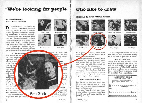
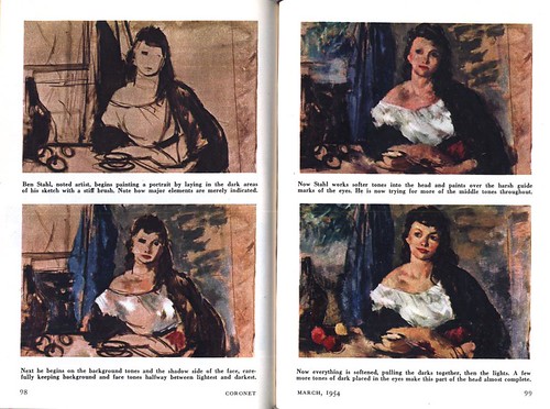
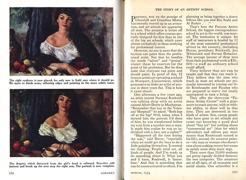
How famous was Ben Stahl? He was one of "America's 12 Most Famous Artists" according to this ad in the March '58 Coronet. Four years earlier Coronet had published an article ("advertorial"?) about the Famous Artists School.

They chose Ben Stahl's portrait painting demo as one of the illustrative elements for the article.

That's quite a compliment considering who some of the other 11 "most famous" artists were!

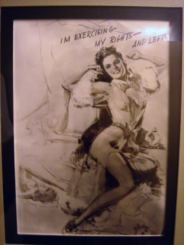
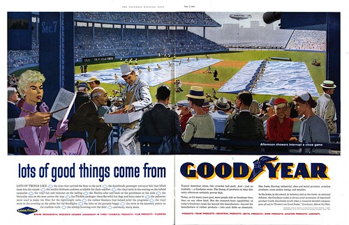
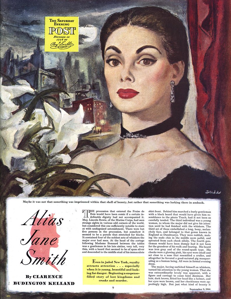
But one of the most curious examples of Stahl's fame I've come across is this ad from the Post:


As odd as this ad concept might seem today it clearly demonstrates the recognition and respect Stahl had with the public at this point in his career.

A TI list member who requested this week's look at Ben Stahl told me this interesting fact via email:

"I have a set of video tapes of an art program [Stahl] did back in the 70's. Something like 24 one half hour shows where he gives demonstrations
and finishes a large canvas from thumbnail to finished painting.

Well, in the video demonstrations, Stahl uses just about every kind of media, pencils, pastels, watercolor, and oil.
Here are a few descriptive notes from the video box for the last five programs in the series:

"Ben Stahl paints a dancer using his fascinating "glue dispenser bottle" technique."
"Mr. Stahl completes a still life with acrylics. He coninues to work on the 19th Century painting on large canvas."
"Mr. Stahl discusses and illustrates form and tonality.
"Ben Stahl completes a portrait using a live model in the studio."
"Ben Stahl reviews all the work from this series, then finishes, signs and frames the oil painting of the man and the woman."

It's been a while since I've watched all the episodes (I keep watching the first tape where he's demonstrating drawing heads and figures in charcoal),
but I think the glue dispenser bottle technique is an Elmer's glue bottle which he fills with some medium like acrylic or ink. Anyway, it's fascinating,
and he gets some distinctive, interesting effects with it.

The large oil is the running theme throughout the series. He starts out by doing several (large) thumbnails, then he chooses one and works that up
to a finished b&w illustration, then does a color comp. and then the final painting in oils.

There is quite a bit of lecture and demonstration on composition and creating forms / breaking up patterns, plus insights into art in general (illustration / abstract, etc.).
He takes a lot a chances with his work, especially on the large canvas. Just when you think the work in progress is getting lost in the abstract, he magically brings
it all back together with just a few brush strokes.

Unfortunately, I'm missing one volume in the six vol. set. I was fortunate enough to find the (incomplete) set listed on e-bay, after seeing reference to it in the Walt Reed Illustrator
In America volume which you mention."

I was intrigued about this video series and checked on ebay in case another copy might be available. No such luck, unfortunately. There was a FAS volume called "How I Make A Picture" by Ben Stahl, but with the bidding already at $66 its a little too rich for my blood.

You can find full size versions of all today's images in my Ben Stahl Flickr set.

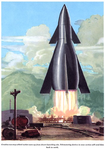
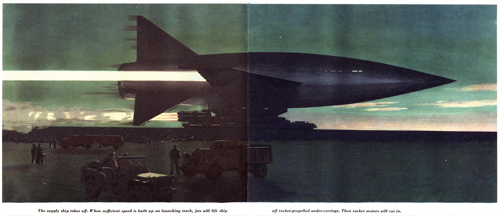
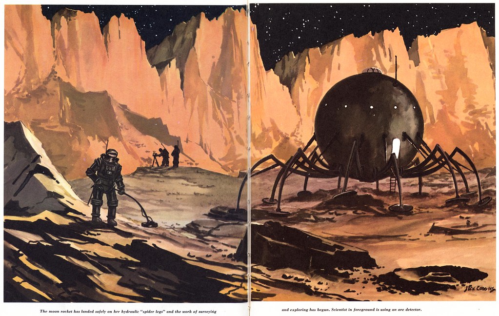
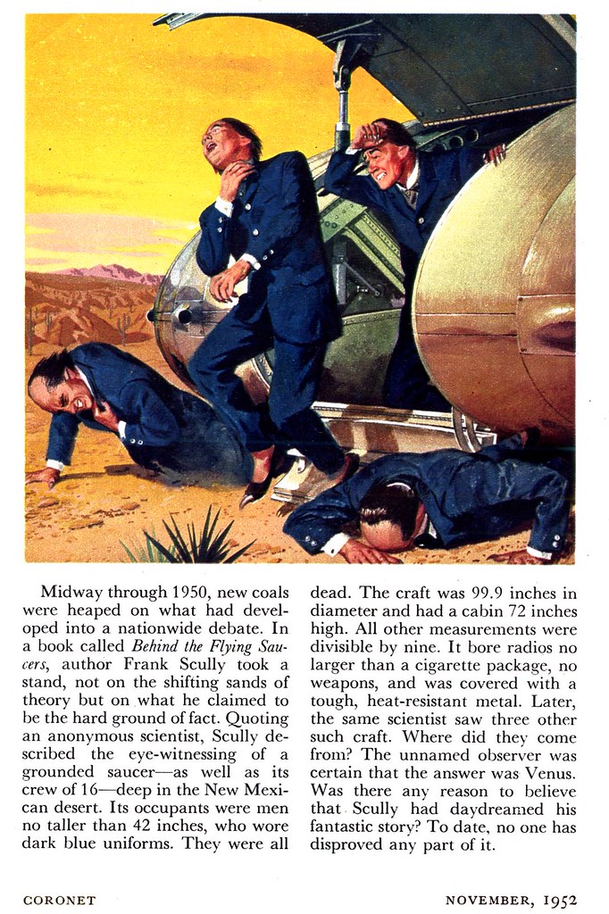
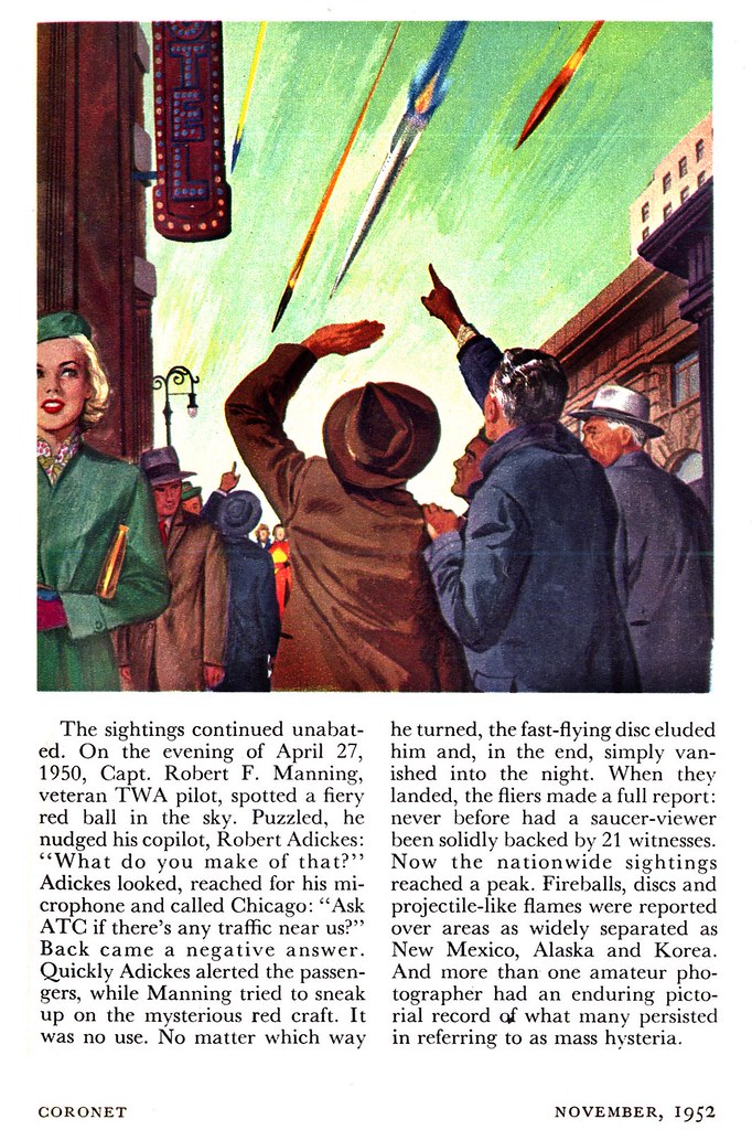
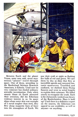
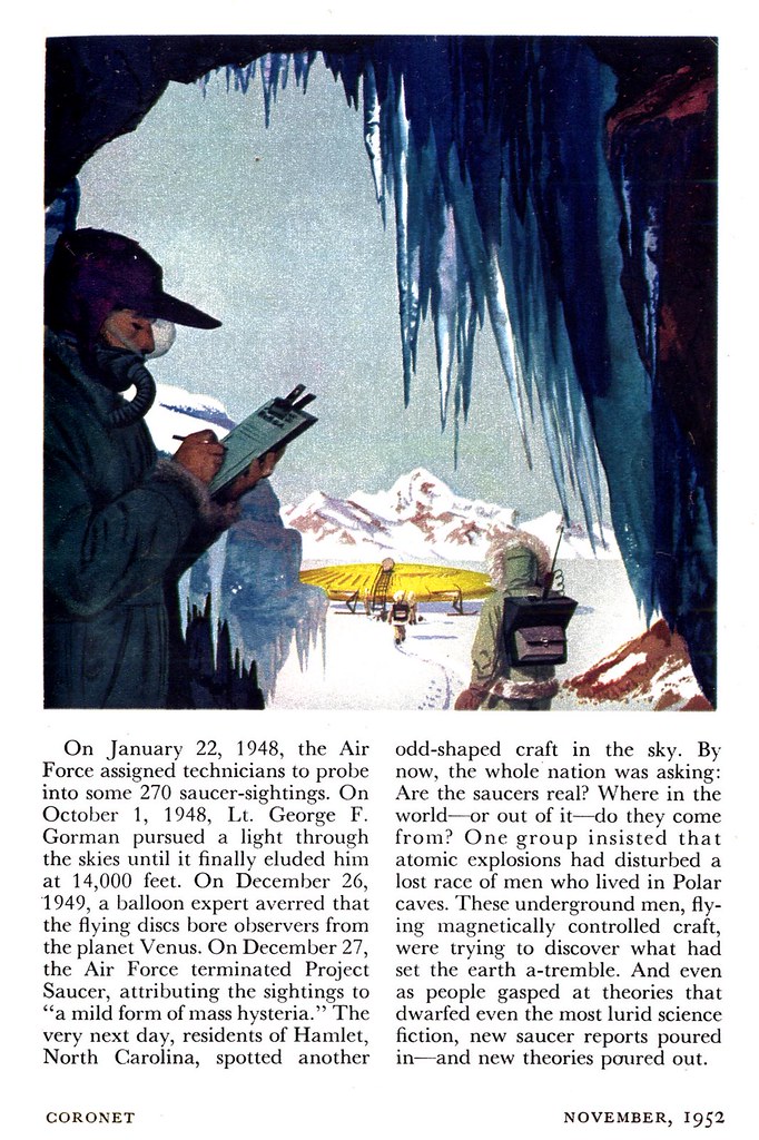
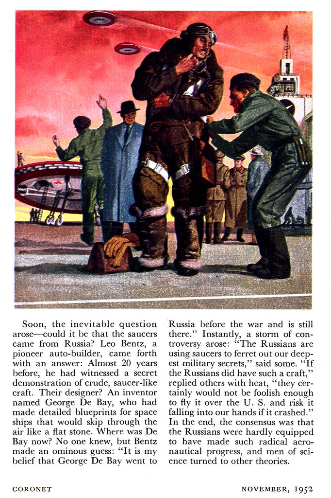
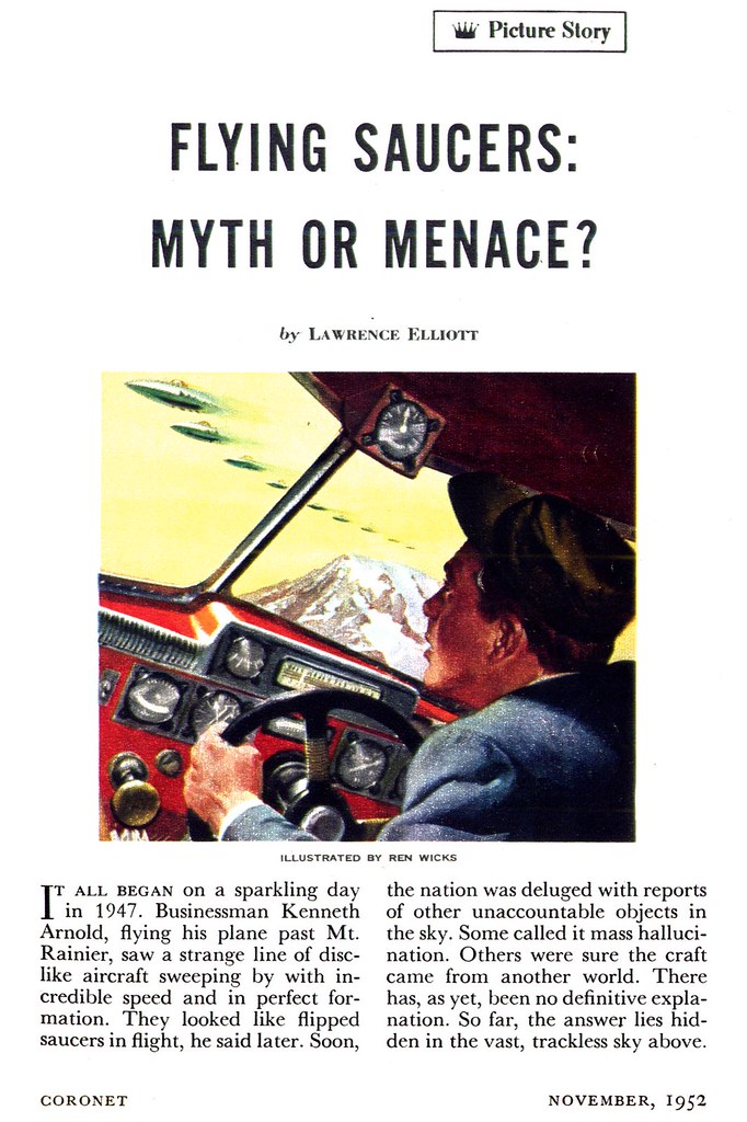
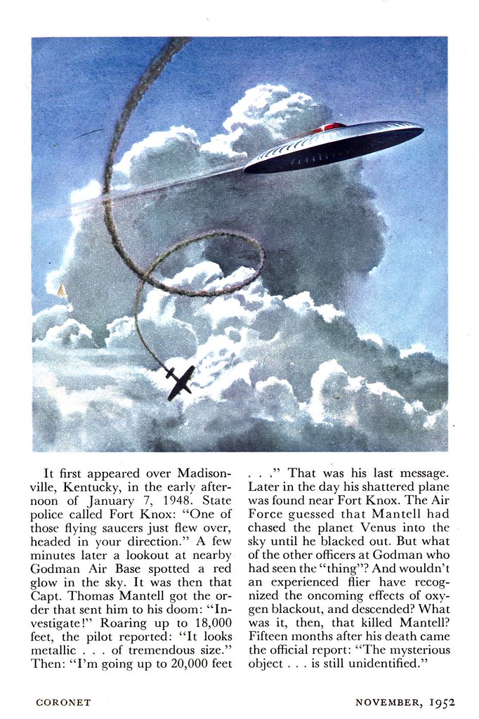
Next week: Ren Wicks answers the question, "Flying Saucers: Myth or Menace?"

Thursday, April 06, 2006

Stahl's Women

Ben Stahl was an occassional contributor to Coronet magazine and as far as I've seen all of his assignments for them were multi-image.

Stahl will be remembered for certain recurring themes and this is definitely one of them: his interpretation of exotic beautiful women.


Actually, this feature shows one of the amusing quirks about Coronet magazine: the editors liked to cloak their more prurient articles in the clothes of cultural acceptability. Coronet always had an undertone of family values religiousity. In spite of that, they regularily published photos of scantily-clad Hollywood starlets and parisienne dancing girls.
That's why Stahl was such a good choice to illustrated these subjects. His interpretation of the female form seems to owe more to Renoir then Elvgren.


You can find all these images at full size in my Ben Stahl Flickr set.

Wednesday, April 05, 2006

Disaster!


Imagine designing an art gallery and then filling it with your own mural-size paintings. Now imagine arriving there one morning to discover someone has stolen all your paintings, literally cutting them out of their frames and making off with them.

Ben Stahl knows what that feels like. You can read about it and see the the images here. The originals have never been recovered.

Tuesday, April 04, 2006

Benjamin A. Stahl (1910-1987)


By the time Ben Stahl painted these pieces for The Saturday Evening Post in 1944 his career was well under way. According to Walt Reed's Illustrator in America, Stahl had begun working as an errand boy and apprentice at a Chicago art studio at age 17. Five years later he was working as a full-fledged staff artist.


Advertising art lead to his being noticed by the Post's editors, who assigned Stahl his first story illustration in 1937. Over the next thirty years he would go on to illustrate over 750 stories for The Post and many other major magazines.