Friday, June 30, 2006

Jane Oliver


One last piece to conclude this week's look at illustrating water: this lovely stylized painting by Jane Oliver. I really like the way the artist shows us the shadows of the dock and the boats, distorted by the movement of the water, on the sunlit bottom of the lake. She successfully gives a nod to this element of realism and still manages to combine it with the almost child-like interpretation of waves as semi-circle patterning in the middle distance.

What really struck me about the piece is how contemporary it looks. It could rest comfortably among other modern pieces in a magazine today, yet was created half a century ago.

I've only ever seen one or perhaps two other pieces by Jane Oliver and unfortunately could locate no information about the artist.

Thursday, June 29, 2006

Briggs on the Beach


What other illustrator but Austin Briggs could have come up with such an interesting concept for this story of a man who has lost his son to a drowning accident? Briggs paints for us a sun-dappled Puerto Rican bay straight out of a tourist brochure - and then we see the two struggling hands in those placid waters.

The image is at first surreal, absurd, even amusing - until we comprehend the full horrifying implication of what we are seeing: "He didn't hear his son's cries until it was too late."

This Saturday Evening Post novelette provides the Briggs aficionado with a real bonus gift... beyond this spread are three more, each featuring three line drawings, for a total of eleven Austin Briggs illustrations in one article.

You can see all those pieces at a good large size in my Austin Briggs Flickr set.

Wednesday, June 28, 2006

Robert Meyers (1919-1970)


Another often overlooked but extremely talented illustrator is Robert Meyers. A regular contributor to The Saturday Evening Post and many other national magazines, Meyers had a one man show at the Society of Illustrators in '55 and '56. But his dissatisfaction with his career as a commercial artist is evident from his statement, "There must be more to life than just being a paint brush."

In spite of such feelings, Meyers' great talent and professionalism is evident in everything I've ever seen by the artist, including this excellent interpretation of water from a July 1954 issue of the Post.

You'll find a few more examples of Meyers' work in my Robert Meyers Flickr set.

Tuesday, June 27, 2006

Graphic Art by Bingham

One of my favourite 50's illustrators is the lesser known though very worthy James R. Bingham.

Bingham had many long, successful series illustration projects, especially with The Saturday Evening Post, and worked most often in a fully painted style. But every now and then he'd blow the doors off by doing a piece in one of his more experimental graphic styles. Here he uses an entirely un-painterly approach (you could almost say it has a paint-by-numbers-kit quality to it) to interpret water.

As startling as this piece is, I was even more astonished when I turned the page and discovered these two b/w with spot colour pieces, looking all the world like they'd been done by legendary comic artist and Sin City creator, Frank Miller - though from fifty years earlier!

Monday, June 26, 2006

Illustrating Water


On his blog, Illustration Art, David Apatoff recently presented a two-part post on painting water, focusing in the second half on illustrator Stanley Meltzoff, who goes so far as to actually paint under water!

I was intrigued by those two posts and thought it might be fun this week to look at how a variety of illustrators from the 50's dealt with water, both above and below the waves, starting with these two monochromatic treatments by two relatively unknown - though certainly accomplished - illustrators from Argosy magazine.

Saturday, June 24, 2006

Irwin Chusid

This week Irwin Chusid, author/editor (with Barbara Economon) of The Mischievous Art of Jim Flora (Fantagraphics 2004) and the forthcoming Curiously Sinister Art of Jim Flora (February 2007), brings us a series of guest-posts showcasing recently seen and rarely seen 1950s commercial art by Flora (1914-1998). More of Flora's mischief can be viewed at JimFlora.com and at JimFloraArt.com. You can contact Irwin at info@JimFlora.com. The Mischievous Art is currently sold out, and will be reprinted with The Curiously Sinister Art. All images are © Jim Flora Art LLC, owned by the heirs of James Flora.

Jiving Teens


The United States in the '50s was symbolized by the Cold War, Marilyn Monroe, Univac mainframes and the NY Yankees. The decade also saw the evolutionary emergence of a species of fleshy tuberous plant life that took root on upholstery -- the Couch Potato. Viewers in 1953 watched an average of five hours a day, which translates into commercial overload. As part of a campaign to draw sponsors to the still-nascent medium, the CBS Television Network produced a cartoon booklet extolling the sales potential of this talking furniture. Flora was hired to illustrate the 7" x 3-1/2" industry-circulated publication, entitled Primer for Prophets.

In single-word alphabet book fashion, P4P depicted the activities of TV-watching Americans during their non-viewing hours (e.g., A = Ate; G = Groomed; Q = Quaffed; S = Smoked), which suggested their purchasing habits. Every page of P4P is a Floralogical gem. His classic RCA Victor LP style is in full-bloom, with sharp features and instantly recognizable idiosyncrasies that scream Flora. Facial features are pointed and angled, teeth fang-like. Characters abound with fried-egg eyes, toucan snouts, and shoes shaped like fingernail clippings.

The "J" page, represented by "Jived," shows a teen couple gyrating near their record changer, with 45s scattered about the floor (giving the heebie-jeebies to vinyl junkies). Though ostensibly human, the teens are genetically Florafied. In paintings and commercial offerings, Flora had a penchant for outsized body parts and bonus legs. Two eyes and one mouth were rarely enough -- Flora often generously doubled nature's standard allotment. Counting on your fingers, Flora-style, would not necessarily produce multiples of five. In "Jiving Teens," an octopedal chick is dating a quintapedal guy. (Their offspring would be arachnids.) That's not all -- these kids are equipped with spare parts. Each seems to have partial -- and disconnected -- lower extremities capable of jitterbugging by some supernatural quirk of anatomical remote control. It's fun -- and disturbing. Which is why we called the first Flora collection "Mischievous" and the forthcoming edition "Curiously Sinister."

When I found Primer for Prophets in the archives, my instinctive reaction was to someday publish a limited edition facsimile reprint. It's a charming Flora rarity, and deserves circulation. Several pages of P4P will appear in the next Flora anthology. The "Jiving Teens" image currently appears on a T-shirt marketed by the Flora family.

Friday, June 23, 2006

"This boy’s gonna be a commercial artist."


I was in the 8th grade [ca. 1927]. I always drew pictures and they used to lend me to the high school to draw pictures for the high school paper. I guess the principal really thought I was going to do something someday, because I was a pretty bright kid. I didn’t start going downhill until high school. As soon as I met girls, my grades went to pieces. A phrenologist came to town and evidently he gave the principal a free pass and she took me there. I remember being in this hotel room and this phrenologist feeling my head! And then he said to her, "This boy’s gonna be a commercial artist." I didn’t know what a commercial artist was. Never heard the term before.

-- Jim Flora to Angelynn Grant (interview), November, 1990


Perhaps the tale is apocryphal. Flora was, after all, a storyteller. But if the above incident really happened (the discredited "science" of phrenology retained an antediluvian flock in the early 20th century), it either speaks well for determining vocation by the bumps on a kid's noggin -- or it was a lucky guess.

After Flora left the Art Academy of Cincinnati in 1939, he cultivated a modest clientele in his hometown, mostly corporate and retail accounts. "I began to do work for Procter & Gamble," he recalled. "Dull, terrible work for point-of-sale things. I would draw people washing diapers, things like that." In the late 1940s, while employed by Columbia Records -- and dissatisfied that he had been promoted away from graphic design -- he began accepting outside assignments. Flora's freelance career took off in the early 1950s after his Mexican caper. Because his mortgage was at stake, he stood at the crossroads of art and commerce. An artist pleases himself; a commercial artist must please a client, and by extension the marketplace. Flora surely faced pressures to compete and to indulge art directors and sales brass, whose own mortgages hinged on the outcome of his graphic problem-solving; consequently, some assignments were less art and more like -- jobs. In a 1998 interview with Steven Guarnaccia, Flora admitted, "When I was freelancing, I had to do a lot of work I wish I hadn’t had to do."


Here are two examples which may or may not have been fun to do, but let's agree they're fun to look at. "You and Your Allergy" appeared in Collier's, August 1956, and "Boston's $50 Million Mile" ran in Collier's, May 1956. No need for graphic forensics. Just admire the master's handiwork.

Thursday, June 22, 2006

The "Rapid-Turnover Freelance Factory"


In 1951, after rumbling back to the US from Mexico in his Hudson sedan, Flora started hustling design gigs to support his growing family (soon to number five children). He landed a Fortune magazine cover in 1952, and revived Coda for Columbia Records that same year. Aside from a short stint as Art Director for a doomed monthly called Park East, Flora was no longer tethered to a corporate desk. He became a rapid-turnover freelance factory, his graphic wizardry appearing in magazines, newspapers, and commercial literature until the early 1980s. (Throughout this period of gratifying commercial success, he continued creating woodcuts, prints, paintings and sketches as a fine art sideline.) His client roster included Mademoiselle, Fortune, The New York Times, Life, Parade, Computer Design, and countless other periodicals. In many cases, especially his pre-1960 oeuvre, all that now exists are foxed antiquarian issues and tearsheets. However, there are hundreds of later mechanical paste-ups in the Flora archives.

He was often called upon to add a playful, even sardonic illustrative twist to journalism on serious topics. He developed a knack for producing cartoonish maps, complex graphs, and visual punditry on science, money flow, geopolitics, sociological trends, technology, and world tremors. (More on this tomorrow.) These strategically plotted mise en scenes often reflected a cynical fascination (perhaps influenced by Rube Goldberg and Boris Artzybasheff) with creeping machinism -- how technology increasingly subsumed the activities of hapless humans. This is abundantly typified by "What is Automation?," which Flora contributed to Collier's magazine in March 1956.

Wednesday, June 21, 2006

Making A Piece of Excitement


The original 1943-45 run of Coda, the Columbia Records new release monthly, seeded a fan base for Flora's impertinent caricatures. His byline appeared in each issue. "Every art director in the country was buying jazz records, and everybody knew my name," he related in a May 1998 interview. "Everybody wanted to be on the mailing list for this little booklet." Flora designed Coda cover to cover. "I took them home and did them," he explained. "This was my fancy, and I wasn't going to let anyone else do it."

The legendary UPA cartoonist Gene Deitch was a Floraphile who became a lifelong friend. "Every week I would make a bee-line for my neighborhood record shop to pick up the Columbia Records release brochures designed by Flora," said Deitch. "His stuff just sent me into a graphic buzz, and I was brazenly imitating his style in my work. Flora eventually came across some of my stuff, and claimed he admired MY work! We met, and he turned out to be the sweetest, most good-humored and good-hearted person I ever knew."

Today's entry features a series of Flora illos from two 1952 editions of Coda. This was the rag's second incarnation, when Flora was jobbed the assignment on a freelance basis. As ever, it appears that his caricatures escaped parental supervision. Does that look like country crooner Lefty Frizzell? Er, no. Are those gospel singers? Beats me. The Mahler Symphony No. 8 earns a pastiche of interlocking shafts, crossbars, and dingbats which, as usual, reveals more about the guy at the drafting table than about the crusty composer. Asked if he listened to the music before designing his devilish LP covers, Flora replied: "If they had something to give me to listen to, they would give it to me. But mostly I just did them from the top of my head, and they gave me a great deal of freedom." He didn't care what musicians thought about his unrecognizable portraits: "I always thought that they did their thing, and it was my turn to do my thing." Suppressing his inner Eulenspiegel was not an option: "All I wanted to make was a piece of excitement."

Tuesday, June 20, 2006

Jim Flora's Coda


In 1943, four years out of the Cincinnati Art Academy, and one year after docking on the east coast, Jim Flora was named Art Director of Columbia Records. His boss, Alex Steinweiss (inventor of the illustrated album cover), had enlisted in the Navy. One of Flora's first directorial fiats was to launch Coda, a monthly new release booklet. Along with catalog details on fresh Columbia platters, Coda contained artist profiles, historical vignettes, and -- most pertinent -- an abundance of Flora visual chicanery. Coda ran from 1943 to 1945, after which it was replaced by The Disc Digest. By then, Flora had been promoted to Advertising Manager, and later to Sales Promotion Manager, positions which afforded him little opportunity to draw. This was a source of creative frustration; Flora was not born to be a bureaucrat. In 1950, having reached his limit of what he called "endless meetings, endless memos, and wrestling with budgets," he resigned, and "bitten by the bug of wanderlust," drove to Mexico with his family in a Hudson sedan. They lived south of the border for a year and a half, mostly in Taxco, amid what he called "picturesque ruins."

After his return to the U.S. in 1951, Flora embarked upon a freelance career in commercial design. One early client was his former employer, Columbia, who hired him to revive and illustrate Coda. A fish-eyed, sax-wailing St. Nick graced the cover of the December 1952 edition. The following year, Flora began designing LP covers for RCA Victor. The Santa handing out those plum assignments was RCA AD Robert M. Jones -- the man who had replaced Flora as Columbia AD in 1945.

Monday, June 19, 2006

Jim Flora (1914-1998)


James (Jim) Flora was one of the defining stylists of 1940s and '50s American commercial art. He concocted dozens of diabolic and hallucinatory record album covers for Columbia and RCA Victor jazz artists. His designs pulsed with angular hepcats bearing funnel-tapered noses and shark-fin chins, who fingered cockeyed pianos and honked lollipop-hued horns. Any vacant real estate was temporary, as Flora cluttered available space with geometric doo-dads floating willy-nilly like a kindergarten toy room gone anti-gravitational. He wreaked havoc with the laws of physics, conjuring up fragmented torsos, levitating instruments, and wobbly dimensional perspectives. His musician portraits were raucous and undignified, featuring piss-takes on such legends as Sinatra, Benny Goodman, Louis Armstrong, and Gene Krupa. Flora once said he "could not do likenesses"--so he conjured outlandish caricatures. Oh--and he was color-blind, which might explain why his subjects' faces were purple, green, or bedspread-patterned.

From 1960 on, Flora made a solid living illustrating for dozens of popular magazines and newspapers. He also authored and illustrated 17 children's books, earning a devoted young following. By that point his work had softened, losing its monstrous flair, which made him even more in demand (i.e., safer, more mainstream) as a commercial artist. It is Flora's edgy, early work that led Barbara Economon and me to undertake a series of books chronicling his first 20 years as a working artist. Vintage Flora album covers fetch beaucoup bucks on eBay. (The original art no longer exists.) His Pete Jolly Duo EP cover is one of the rarest of such artifacts. In fact, it has NEVER turned up on eBay. It was featured in our first book, The Mischievous Art of Jim Flora.

* This week Irwin Chusid, author/editor (with Barbara Economon) of The Mischievous Art of Jim Flora (Fantagraphics 2004) and the forthcoming Curiously Sinister Art of Jim Flora (February 2007), brings us a series of guest-posts showcasing recently seen and rarely seen 1950s commercial art by Flora (1914-1998). More of Flora's mischief can be viewed at JimFlora.com and at JimFloraArt.com. You can contact Irwin at info@JimFlora.com. The Mischievous Art is currently sold out, and will be reprinted with The Curiously Sinister Art. All images are © Jim Flora Art LLC, owned by the heirs of James Flora.

Friday, June 16, 2006

"I really liked him."


Those were Vic Dowd's concluding words about his long-lost friend, illustrator Jack Hearne, when Dowd was being interviewed for issue #55 of Alter Ego magazine by Jim Amash.

I didn't realize it at the time, but I had really liked Jack Hearne's art as a 10-year old kid back in 1974. It was only after I started researching the illustrator on-line that I discovered Hearne had taken over the art chores on what was then my favourite book series, Alfred Hitchcock and the Three Investigators, with volume 18, "The Mystery of the Shrinking House".

Hearne was the third artist to do cover and interior art for the series, following Ed Vebell and Harry Kane .
I had been devouring the series from the first volume and at that age was completely unaware that the art chores had changed hands - infact, I was completely oblivious to the concept that someone had the job of illustrating (or writing, for that matter), the books just "were" - and I just loved 'em!

Its nice to know that one of the first "real" illustrators I was ever exposed to and who's work I admired was also someone Vic Dowd describes as "a very good illustrator" and "a very nice guy."

*All of this week's images can be seen at full size in my Jack Hearne Flickr set.

Thursday, June 15, 2006

"You remember Argosy?"

In his Alter Ego interview, Vic Dowd, speaking of his friend Jack Hearne, asks Jim Amash, "You remember Argosy? Well he [Jack Hearne] was working for the Argosy knock-offs, though I don't remember the names of them."

Dowd is talking about the period shortly after WW II and eventually lost track of his friend when Hearne moved away. Though Hearne must have done work for what Dowd calls "the cheaper men's magazines" around that time he did in fact graduate to being an Argosy contributor by the late 50's.

Yesterday a reader commented that Hearne's style had a powerful macho quality to it and no doubt that quality earned him the assignments first from the Argosy imitators and ultimately from the magazine itself.

Wednesday, June 14, 2006

No Listing for Jack Hearne

Yesterday evening I went downtown to the library. I had hoped Who's Who in American Art might have a listing for Jack Hearne, but no such luck. He's not listed in Illustrator in America or on AskART.com. At this point it seems that if not for Jim Amash's interview with Vic Dowd in Alter Ego, there'd simply be no clue to who Jack Hearne was.

Another detail from Dowd: Jack Hearne "was partially deaf in one ear, which probably kept him out of the service." Kind of ironic that the most extensive example I've found of Hearne's advertising art is this series of military illustrations for Douglas Aviation.

Tuesday, June 13, 2006

"Jack could draw anything.."


So far, the best source of info on Jack Hearne continues to be from his friend, illustrator Vic Dowd, in his December 2005 interview conducted by Jim Amash for Alter Ego magazine:

"Jack could draw anything without research," says Dowd. "The rest of us where using models and photographs, but not Jack. He then went on to do high-powered commercial illustrations for major companies, for which he was handsomely paid."

Dowd tells us that Jack Hearne had worked at the Binder shop, an independent studio that produced and packaged comic book art for publishers during the 1940's. My research on the net turned up this comic book cover from 1945 attributed to Jack Hearne.

Other details about Hearne that Dowd shares in his interview: Hearne attended the Pratt Institute and married a woman he met there. He lived for a time in Westport, Connecticut, "but then he got divorced and moved away, and I lost all contact with him," laments Dowd.

"I'd love to know if he's alive and where he lives if he's alive."

Monday, June 12, 2006

"Jack was the total package"


I'm a huge fan of Jim Amash's interviews with golden-age comics creators in Alter-Ego.
In a recent issue (#55) Amash spoke with Vic Dowd, an artist who worked in comics in the early part of his career before moving into illustration. During the interview Dowd asks, "Have you ever come across the name Jack Hearne?" As I read that it occurred to me that in fact I had come across that name - in this series of ads from Collier's magazine that Hearne painted in 1956.

But that's not the first time I ever saw Jack Hearne's work. Though information on the artist is sparse, we'll learn at least a little about the man Vic Dowd called "the total package."

Friday, June 09, 2006

Crazy in Love

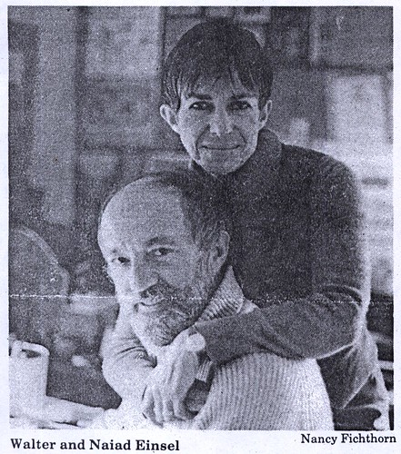
"We were really just crazy about each other," said Naiad.
"it was like a fever," Walter agreed. "It just went on for weeks and months."
"Years," said his wife, smiling across at him.

From a 1989 article in The Advocate

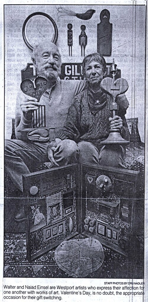
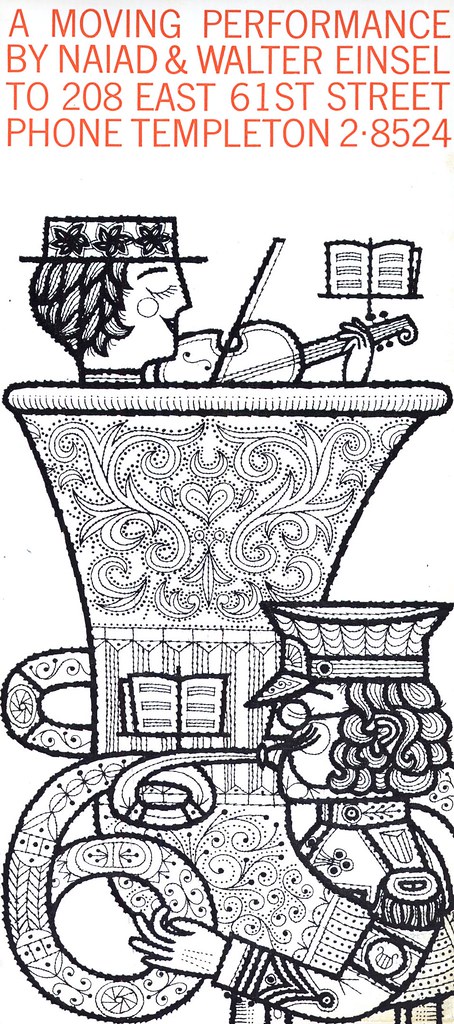
Early on in their life together, the Einsels began making elaborate Valentines for each other. It was a concrete expression of that crazy fever of love they felt for one another. When they still lived in their one room New York apartment, they would put a dividing screen in the middle of the room while they worked on them. "We were on our honour not to peek," says Naiad. Later, in their Westport farmhouse, the screen was no longer needed. Though the Einsels shared a second-floor drawing studio, their desks separated only by an old U.S. Navy map file cabinet, Walter would work on his Valentines in his sculpting studio in the barn.

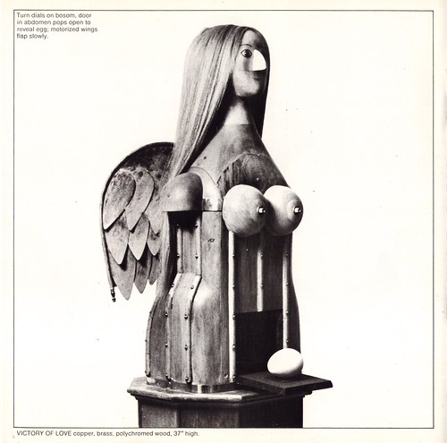
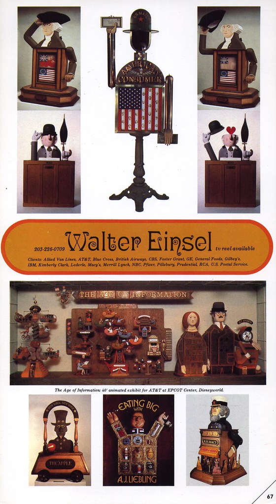
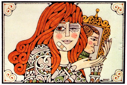
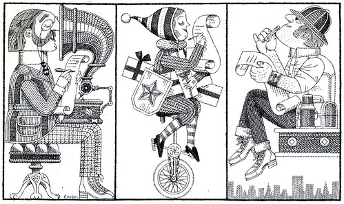
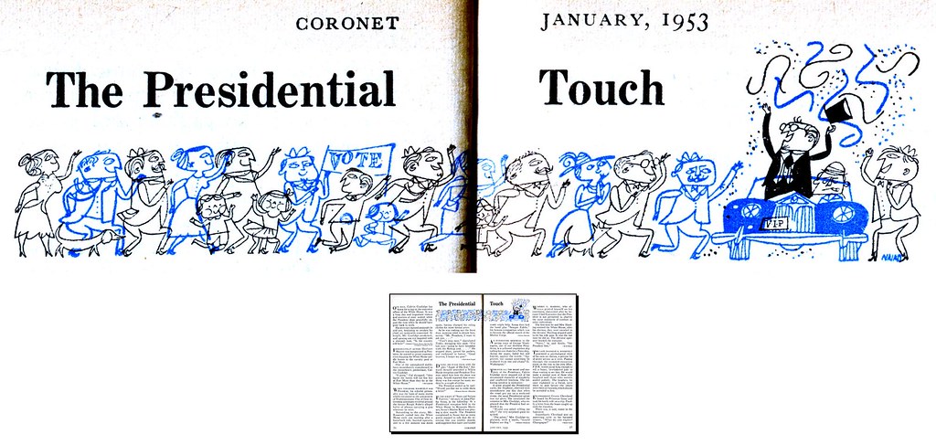
"Each year these efforts became more complex," says Naiad. What started out as collages with old decorations and rubber stamps incorporated into the design, evolved around 1960 into elaborate 3-dimensional sculptures carved in wood, with internal whirling disks and moving parts. This was a result of Walter's interest in engineering and mechanics and took his career in a new direction as he began creating Rube Goldberg-like sculptures for advertising clients in print and television.

Naiad, meanwhile, was hardly resting on her laurels. Among many other prestigious accomplishments is her design and direction of the Westport Bicentennial Quilt. At 76" by 104" and with the assistance of 33 "needlewomen" to do the sewing, the quilt, begun in October, 1974 was finally put on display in January, 1976.

But in spite of their hectic work schedules, the Einsels always found the time to continue creating their Valentines. "Walter and I loved Valentine's Day. It was a big day for us. We loved it more than Christmas. We loved it more than birthdays."

Walter Einsel passed away in 1999.


"When Walter died," says Naiad, "I felt that I had been so fortunate to be a part of his life and his love. I feel very blessed. The memories of all that we had sustain me."

In tribute to those memories and that love, Naiad has been working on a book, A Passion for Love, depicting the nearly 50 years of hand-crafted Valentines that she and her husband exchanged. "I just received some galleys on my Valentine book & I have to concentrate on them now," Naiad wrote to me yesterday as I pestered her with yet more questions.

There are so many moving examples of Naiad and Walter Einsel's tremendous love for each other, but for me, one of the most charming anecdotes is also the very first, again from the article in The Advocate: back in 1952, when Naiad was assistant art director in Promotions at CBS and Walter held the identical position at NBC. They had seen each other's work but had never met...

"I liked his work, because it looked like my own. I had this image of him with a thick German accent who was married to a big German housfrau out of Wagner," she said.

One day, a job opened up at CBS and Walter came over to apply. "I walked in and there was this adorable-looking man," said Naiad. "you know when you're young you picture this knight on a white horse..."

"I wasn't that impressed with myself," Walter interjected, "but I thought you were very attractive."

"Then we both stood there and looked at the floor," said Naiad.

To ease the tension, Walter then put his hand in his pocket and whipped out a hinged nutshell containing a miniature stage set from the opera "La Traviata".

"I thought to myself, 'Ooh, he's really weird; this is a kook...' "

Thursday, June 08, 2006

More Feast than Famine

"There were always ups & downs in freelancing...feast or famine. But there definitley was a slowdown when photography became more popular. It may have been a period when Walter concentrated more on 3-dimensional illustration." I had asked Naiad if the sudden decline in magazine illustration that occurred in the early 60's had impacted her and Walter's workload.

But the 60's ushered in a new era in illustration for which the Einsels were ideally positioned: the rise of decorative styles. As well, Walter had begun experimenting with 3-dimensional moving sculptures ( you can see a couple of them in the photo above ) and in doing so had created a unique and lucrative niche. Naiad described this period in an article she wrote for Northern Light magazine in 1970:

Last summer, when Walter was working day and night on a mechanical sculpture for a television commercial, I was working day and night on a campaign of full-page ads for him along with my own freelance assignments. Since we think so much alike and have such similar tastes, its easy to fill in for each other at any stage.

By this time in their careers, the Einsels had both truly "arrived". They had both done children's books, book jackets, album covers, TV commercials, TV titles, packaging designs, movie posters, and of course, countless magazine illustrations.

As well, they had appeared in Graphis and other design publications, received awards from the Art Directors Club, the Society of Illustrators, The Type Directors Club and AIGA.

Of the inevitable "famine" periods in the life of the freelancer, Naiad says, "We also sent out more self promotion pieces. We had a few agents over the years but we never felt comfortable with them. We always felt better dealing with AD's on our own."

Wednesday, June 07, 2006

"Leapfrogging"

"We met in April of 1952 and got married in June 1953," Naiad said in an article from the Westport News. "We fell in love right from the start and it stayed like that forever. We had so much in common. Even our artwork had similar styles. We were able to help each other, right from the start."

The Einsels employed a method of working Naiad calls "leapfrogging".

"This is especially useful when one or both of us is under pressure of a heavy work load. First we'd sit down and verbally consult, brainstorming ideas. Then I'd draw a little sketch and Walter would add to that and we'd go on and on in this way, refining all the time."The Einsels would sign the finished piece according to who received the assignment.

The 50's were a busy time for the young couple. As well as illustration work, they were starting a family with daughters, Leslie, born in 1956 and Hilary, in '58. During one lucrative assignment from Collier's magazine Naiad recalls, "I just rocked that carriage with one hand and drew a five-page spread with the other."

As well, a big move was coming for the Einsels: by the mid-60's they had traded in their one room New York City apartment for a circa 1853 Victorian farmhouse in Westport Connecticut. West port had long been home to some of America's most famous illustrators, including many of those whose work the teenage Naiad had admired in Seventeen magazine.

"We met some of the realistic illustrators at the Society of Illustrators & a few of them in Westport where they are revered. They were quite a bit older than we were. A lot of them taught at Famous Artists school here in town. We were friendly with Bernie Fuchs, Fred Otnes, Howard Munce, Wendall Minor, Jerry Pinkney, MurrayTinkleman & others closer to our age."

Of those realistic artists she adds, "As a member of the Society of Illustrators I was kept aware of their work & did actually meet many of them & still admired their work but they no longer influenced me."

Tuesday, June 06, 2006

"I liked his artwork because it looked like mine."


Naiad says her Pratt education in Illustration did not prepare her for the working world of a commercial artist. "They didn't help us decide what to put in our portfolios, how to approach art directors, how to conduct an interview. Perhaps more of that was taught in the Advertising Department. I had to learn everything about layout & typography on the job."

I asked her how art directors found out about her. "I ...made cold calls in the early days of my career. I was very shy & nervous & insecure but I was a good actress & I don't think anyone noticed." She took assistant art direction jobs for the security but found plenty of freelance illustration work to do as well. "The freelance work paid better but not much by today's standards. For example, the spots I was doing for the [New York] Times paid $15 each although I slaved over them for days. My job at the Weintraub Advertising Agency paid $75 a week which at the time I thought was great. It paid my monthly rent. When I left CBS I think I was making about $150. I did like the security of a staff job. I was getting good samples for my portfolio too. I also liked the prestige for my resumé."

It was during her tenure at CBS that Walter Einsel came into her life. "We met when he came over to CBS to apply for an opening at a better salary. He didn't get the job. He got me instead."

Walter Einsel was born in New York City in 1926 and graduated from Parsons in 1949. His first assignment was from the New York Times Magazine but, like Naiad, he ended up taking a staff job - in his case, at rival network NBC. "Whenever Walter picked me up at the office," says Naiad, "everyone hastily covered up his work out of fear that the spy from NBC would take back ideas with him."

Naiad and Walter had already been aware of - and were fond of - each other's work . Now they discovered they were also fond of each other. "We discovered we had similar tastes in almost everything - the furnishings and colours of our apartments were interchangeable - we liked the same foods, antiques, people, animals, cars, and politics. So we decided to combine all of this under one roof, and since we liked one another also, we decided on a practical and romantic working arrangement: marriage."

*All these images can be seen at full size in my Naiad & Walter Einsel Flickr set.