Not only did Sickles distinguish himself by quantity - but by quality as well. Is his work more sophisticated than what we've seen so far this week or is it cruder?
Did he run out of time and have to send in his rough sketches...

...or did he conciously choose to present his client with an experimental approach to a classical subject?
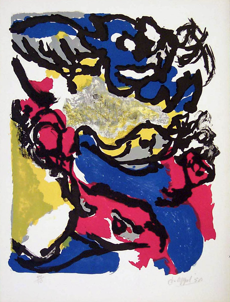
Here's a piece by world-reknowned Dutch abstract expressionist, Karel Appel. Appel painted this piece in 1958 and it will be displayed in a show of his work at the University of Buffalo Art Gallery this spring. We have a huge framed lithograph by Appel hanging over the mantle in our livingroom. His work is in the Guggenheim and other important collections all over the world.
Four years earlier...

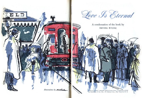
...Noel Sickles did this illustration for Reader's Digest Condensed Books. Is it more or less valid as "art"?


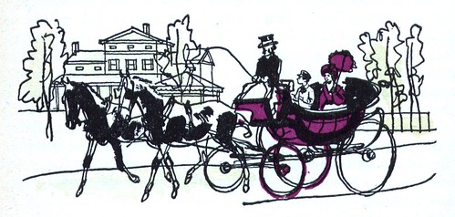
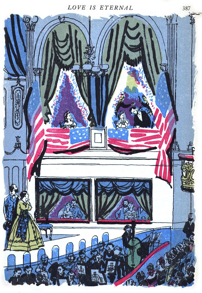
Look at how the lines of door frame in the piece below are visible through the cloth hanging in front of them...
...or how the boardwalk lines can be seen through the legs of the man and the dog. Didn't Sickles have any white correction paint? Didn't the client expect him to hand in properly corrected artwork? Or did he leave those lines on purpose?

Among illustrators both past and present, Noel Sickles is held in the highest regard.
I've been reading the Alex Toth tribute issue of Alter Ego magazine. If you know comic book artists you know that Toth is considered by many to have been among a handful of the most important artists to have ever worked in that artform. Toth reserved his highest praise for only a very few of his contemporaries -- and among those, Toth adored the work of Noel Sickles.

If Alex Toth had seen these illustrations back in 1954 (and he very likely would have), would he have admired them or wondered what the heck Sickles was trying to pull?
Reader's Digest gave Sickles quite a few of these Condensed Book assignments so the editors clearly liked his work. Did these pieces wow them or disappoint them? Did they say, "We've got to get more work from Sickles... this is really cutting edge stuff!" or did they say, "This guy's become a hack."

When you look through these pieces...
...do you think to yourself, "I'll never be this good."

Or do you think, "my six-year old could have drawn this."
One thing's for sure, work like this challenges our preconceptions about "what is art" and "what is quality" and it deserves more deliberation than simply saying, "I like this" or "this stuff sucks."

My site meter tells me over sixteen hundred people have dropped by already this week. I welcome your thoughts on the work above.
Leif, I have learned that whenever I have a problem with a Noel Sickles drawing, I should assume the fault is mine and go back to see what I missed. There are plenty of clues in these drawings (such as that elegantly handled crowd scene in the first drawing) that make it clear Sickles knew what he was doing. But I haven't begun to figure out what he was thinking when he drew that pair of legs coming through the ceiling. Something is definitely not right.
ReplyDeleteI would also say that the Reader's Digest really makes you work to get around their distracting printing. Some of the colors they used are so dark (especially the purples and the browns) that they obscure the black linework. What a shame. I'd love to see the originals of these.
"Noel Sickles did this illustration for Reader's Digest Condensed Books. Is it more or less valid as "art"?"
ReplyDeleteI'm not sure I see the point of your question, Leif. IMO, your showing this... http://farm1.static.flickr.com/250/455352661_f12bdd2d23.jpg out of it's intended context. Sickles never meant for it to be viewed as a final work removed from it's original composition.
"I have learned that whenever I have a problem with a Noel Sickles drawing, I should assume the fault is mine and go back to see what I missed."
ReplyDeleteThat's a great way of describing how to look at Sickles' work, David - and one I will take to heart! Those legs and so many other aspects of this series raise many questions for me -- but knowing what we know about Sickles, I can't simply accept that it could come down to him being lazy, not caring, or even that something could definitely not be right. A lesser artist maybe, but Sickles?
Darrell; you make an excellent point and I appreciate your comment. I'll try to explain my perspective on it:
As I learn more about this period and the artists who worked in it I find that some illustrators sought to escape the confines of the strictly commercial application their work was being put to.
Sickles strikes me as one of those artists. This flower arrangement element caught my eye because of its similarity to Appel's work - and from around the same period! Now, I'm not well educated in art but I think that abstract expressionism was very much in the public eye during this period and that a searching, sensitive artist like Sickles might have considered introducing that sort of experimentation into his work - for the purpose of his own personal growth.
I'm trying to find answers to my questions about why someone as accomplished as Sickles, whose artistic integrity is well documented, would stray so far from his more traditional, refined approach to produce what might be perceived by some people as ...
"crap"!
Removed from its original composition or not, that flower arrangement provides a context for a question I ask myself: was Sickles challenging the fine art community's notion of "art" - or the commercial art community's notion of acceptable commercial art? And how would the public react -- that's something Reader's Digest had to have considered before publishing these pieces.
Every time I think I'm beginning to see the parameters of this period in illustration, something like this series by Sickles comes along and reminds me thaat there was so much going on and that I have a LOT to learn!
I don't know how many people would see this as crap. A different approach than usual, and some strange choices, but not crap. I have no idea why he left that boardwalk line showing through the man's legs, but I have some faith that he did it on purpose. There's so much skill oozing out of the pictures that I can't believe he was being sloppy. Perhaps he thought that the rough, unrealistic look would be more interesting than perfection. Maybe he was being postmodern! ;-)
ReplyDeleteThanks for your comment, Colin; personally I agree with you - but as an example of how others might have reacted, take a look at this post from last year (which, though it is about a different artist, also has Lincoln as its subject).
ReplyDeleteI continue to love and salute you Mr. Peng. This craggy drawing style is the illustration style of my childhood (roughly 59-69). Its the design paradigm that most made an impression on me as I ate up any and all reading material at home and at school (Good Housekeeping, Woman's Day, MaCalls, Reader's Digest, Saturday Evening Post, Look, Life (not so much illustration there I know 'cept in advertising), even Sunset and at school...various textbooks, storybooks and My Weekly Reader.
ReplyDeleteThis was the a major part, equal I think to photo journalism, of the media filter through which I came to make sense of "the world."
I think your Karel Appel comparison is entirely apt...context notwithstanding. Or rather, that contest makes all the difference (geez darrell, Duchamp much?)
All in all, insightful nostalgia as well as marvelous inspiration. I make art as well as teach classes....
I've got a sabbatical for most of the next year. Among other things (like a writing a book) I plan to dig up some old textbooks still packed away in my childhood home. I'll try to find the ones that were the most powerful and resonant with me and scan and send them to you, Leif, as part payback for the great material in your blog.
Thanks for your enthusiastic comment, Prof. E... I look forward to those scans with great anticipation!
ReplyDeleteThis is a great set of images. Thanks for posting them, I enjoyed them and hope I've learned something from them.
ReplyDeleteVery interesting post and comments. Thanks, Leif, for posting these and for your thought provoking and informed commentary. Now about the boardwalk lines through the legs. I also thought them sloppy but then I took a closer look at the house in the background. Check out the relaxed but precise line Sickles used to draw the clabboards. If you've ever tried to draw architectual details you've likely experienced the frustration of presenting sufficient detail without resorting to numbing, mechanical repetition. It's a very difficult balancing act that Sickles has mastered here.
ReplyDelete....thanks,leif...those sickles illos are great!...and i don't have those in my tearsheet collection,so i went on ebay and picked up a copy!.,...
ReplyDeleteFrom Barbara Bradley via email:
ReplyDeleteThank you for all of your showings of Reader's Digest pieces. Feel free to pass on my comments on the Noel Sickles illustrations.
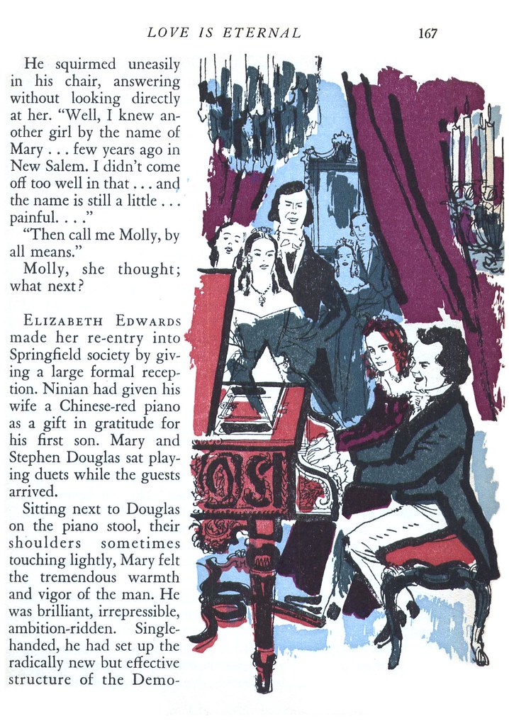
To me, these Sickles' illustrations simultaneously show his fine draftsmanship, compositional sense, and beautiful variety of line and texture from delicate to lush. I delight in the faces and expressions in the slave auction scene. Part of the charm of these illustrations is that in having had to do them quickly in order to produce 17, he didn't have time to fuss. Often, the less time one has, the fresher the brush work. That is the plus. My suspicions that he had to produce them quickly are not caused by the loose indications of flowers but by little things such as in the illustration of tucking their son in bed, in which the mirror makes makes an awkward and uncomfortable tangent with Mary's head, the type of thing he would not have done with time to work out such details in a pencil. And, if he had, the overall results may not have been as fresh.
During the early 1960's while I was an unemployed Art Director on Madison Avenue. I had the honor Of working as a Rep. at a studio Named Frank.H.Koste and associates. One of the great people I represented and knew well was Noel Sickles! He had a style that was unique and was very quick to put it down, and also a teriffic sense of humor.
ReplyDeletePat Taranto N.Y.C.