
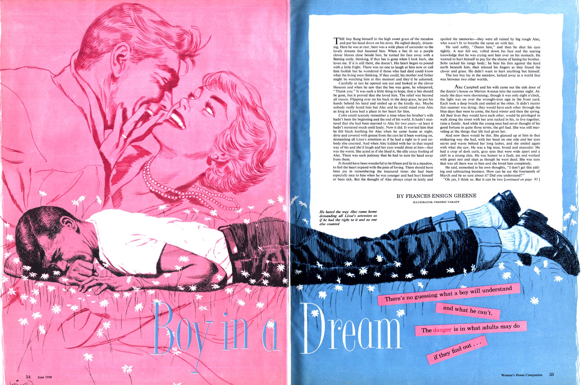
Varady did quite a bit of line art (some of my favourite Vardays are these pieces done for Cosmopolitan magazine) but that doesn't diminish the fact that, once combined with the bold, modern, almost "plastic" colour palette, his illustration above is another great example of the exciting visual experimentation going on at the magazine during that year.
By contrast, the August 1950 illustration below, though still very modern looking for the times, looks rather more dated due to Varady falling back on his more popular painting style.

So why was at least one illustrator in each 1950 issue of Woman's Home Companion trying some sort of experimental graphic approach? There were probably many reasons... and I'll bet one of those reasons was that Al Parker had already done it.
As far back as the mid 40's, when everyone else was still firmly entrenched in the Old School style of picturemaking, Parker was incorporating unusual graphic elements like this into his illustrations. Its often been said that Al Parker was constantly reinventing his style, staying 6 months ahead of his competition, who would invariably imitate the "most popular illustrator in America". Looking at this 1948 piece and this 1949 piece by Parker from Ladies Home Journal, surely Woman's Home Companion's most immediate competition, one has to wonder if the art director at WHC didn't ask his illustrators to try some Al Parker-style graphic experimentation.
You'll find today's pieces at full size in my Frederic Varady Flickr set.
Great stuff as usual. I am a big fan of old school illustration, I love your insights and was wondering if you've ever profiled Jon Whitcomb on your blog?
ReplyDeleteHey, thanks a lot, michael.
ReplyDeleteAs a matter of fact, I did do a week on Jon Whitcomb - and you can check out the posts via these links:
Whitcomb Day 1
Whitcomb Day 2
Whitcomb Day 3
Whitcomb Day 4
Whitcomb Day 5
Took a look at your blog, btw - your paintings look amazing!
thanks! Of course Whitcomb's girls are beautiful, but I also love his sense of design and color.
ReplyDeleteI don't want to push my luck but....any John Gannam????
Not a problem, michael. I have never yet written about Gannam - but I have a nice little Flickr archive of some Gannam paintings here
ReplyDeleteAside from that, if you haven't already done so, check out David Apatoff's post on John Gannam here
thanks for the link, I'd never seen any of that bw Gannam work before.
ReplyDeleteI spent some time browsing your flickr folders yesterday...whoa what a gold mine!
Ha! Yup. ;-)
ReplyDeleteLadies and gentlemen, I am thinking of starting a FB group on American illustration in the mid-century. Would there be any interest here in joining this club? It wouldn't be confined to MID-CENTURY and I am in the inchoate planning stage. Please contact me @ Facebook or @ johnmike1225@gmail.com if you're interested. Thank you very much!
ReplyDelete