Tuesday, July 31, 2007

Coby Whitmore in 1947

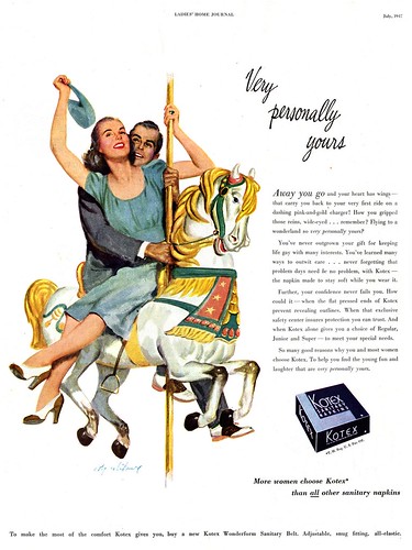
My OCD kicked in after yesterday's post so last night I found myself scouring the few magazines I have from 1947, looking for the P&G ad in which Ken Lay's "Betty" made her appearance.


I found plenty of Coby Whitmore illustrations - sometimes as many as four in a single issue of Ladies Home Journal - but no sign of "Betty".

What my search did reinforce was just how popular and prolific Whitmore was with both editors and advertisers during the late 1940's. Think about it: how many illustrators today or even back then could flip open a national magazine and see their signature on four illustrations throughout a given issue?!


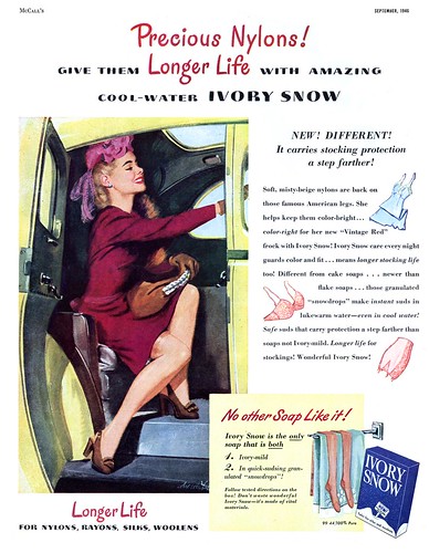
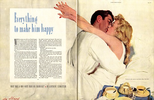
Upon expanding my search to issues from '46 and '48 I did find this ad below for Ivory Snow (a Proctor & Gamble product) with a Whitmore signature attached. Could Ivory Snow have been the product for which Coby Whitmore painted "Betty"?


These pieces have joined plenty of other late 40's Whitmore illustrations in my Coby Whitmore Flickr set. Why not take a few minutes to go enjoy the work of this mid-20th century master?

Monday, July 30, 2007

Coby Whitmore's "Betty"

Received in Friday's email:

Thank you very much for maintaining your website of illustrators! Thanks to you, I was able to identify an illustration I found.

My name is Ken Lay and I'm an art director in Cincinnati. I worked for a design firm called Hulefeld Associates that started in 1939. They had been in the same building for about 50 years. The company was bought out in 2002 and the new company promptly moved us out of the old building. During the move, I found this illustration under a bunch of old "office art" that had found it's way to the basement over the years.
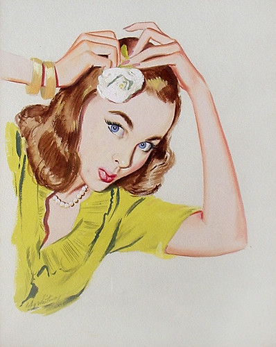

It was all being pitched in the dumpster, but "Betty" was obviously a fine piece of art and very charming to boot, so I saved her. The back of the frame also had a wonderful inscription:

"Merry Christmas, Frank (Hulefeld) and may this encourage lots of good work in 1947. Coz"
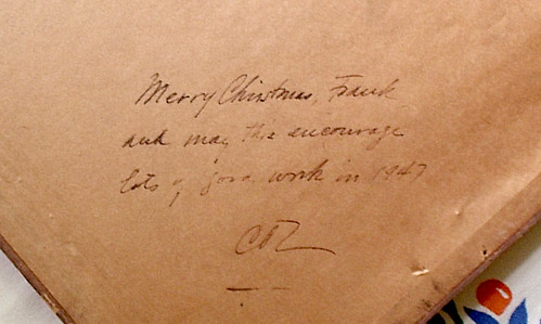


There was a signature, but it looked to me like "Cody Whitney." The name "Coz" on the back was also confusing. A couple of weeks ago, my wife and I were staring at her, and she said "I think it's Whitmore." so, I started googling "Whitmore" and variations of "Cody" (Cosby, Coby, Corey, etc.). Finally, up comes your site with "M. Coburn Whitmore" and Betty's creator was found! We collect antiques and paintings and were thrilled to see Betty came from such a respected figure in illustration.

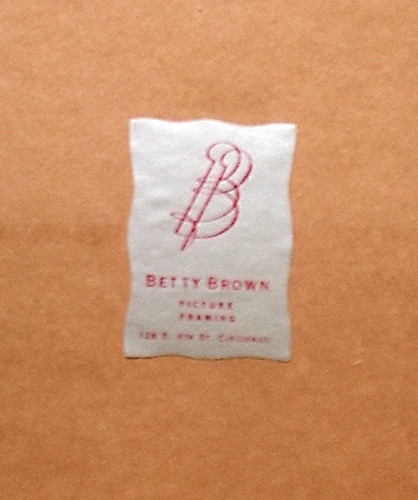
We call her "Betty" after the framers label on the back-- "Betty Brown Framing"

We have tickets to the Antique Roadshow which is filming tomorrow in Louisville, KY. We're taking Betty to see what they say about her.

We'd love to have the ad or short story she originally appeared in. Hulefeld Assoc. did a lot of work for P&G, so I imagine it was for a cosmetic product or toiletry of theirs.

I know it's asking a lot, but if you could post Betty's story to see if your readers have ever come across her, I would appreciate it and would be happy to pay for the sheet.

Update! Ken emailed me this morning with the following:

Thought I'd give you an update on Betty's adventures. We enjoyed the Antique Roadshow, and despite waiting in a very long line, got Betty in front of a Roadshow appraiser. The appraised value was $800-1200!

Based on the estimates we'd seen for his larger illustrations, we figured $300-500. It was a nice surprise, though she'll remain where she's been--watching over our kitchen.

Well readers? Any thoughts...?
Friday, July 27, 2007

Tying Up Loose Ends: Dom Lupo


Not long after my week of posts about Dom Lupo, I was received a comment on the blog from Dom Lupo's daughter, Sue. "Dom is still painting from his Ramona, CA home where he does watercolors. He is thrilled to see so much interest in his work and amazed at your collection."

This was exciting news! Soon after, I was corresponding with Dom himself and his lovely wife, Maxine. At my request, Dom kindly wrote a detailed account of his career and today I'm honoured to share it with you. Dom Lupo, in his own words:

Just before graduation from High School in Waltham, MA, where I was born in 1919, the Boston chamber of commerce ran a contest for seniors to advertise Art Week in Boston; whereupon, I won a one year scholarship to the “Child Walker School of Design” in Boston. Following that year, the art school awarded me another three year scholarship.


In 1954 I was voted in as a member of the elite “Society of Illustrators” in New York where I still retain my membership.

Because of the interest I had in my own growing profession, I was influenced by and especially appreciated the artwork of Fred Ludekins, Al Parker, John Falter, Joe Bowler and many others of that same period.

When World War II started, I joined the Marines and was assigned to aerial photo unit VMD-254. Following four years in the service, Harvey Kidder – my best friend and artist who attended art school with me – and I moved to New York City to seek our fortunes.


Harvey and I both affiliated with the agency of Sutton and O’Brien.

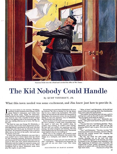
(An example of Harvey Kidder's work from the mid-1950's below)


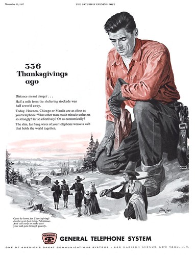
For the next fifteen years I worked on advertising and fiction illustrations for accounts such as General Telephone and Phelps Dodge Company. In 1963 I had a new agent, Jerry Benzinger, who asked me if I had ever done any golf art. I said “no.” Following that, he got me the job anyway and I worked exclusively for “Golf Magazine,” with my artwork appearing in every issue for the next 25 years. This was the best break of my career. I also worked for “Golf Digest” for a few years and during that period I illustrated over 30 golf books for touring professionals of both the PGA and LPGA.


In 1974 I was asked by the World Golf Hall of Fame to produce a painting of the original 13 PGA members. A few years later I produced a painting of the original members of the LPGA.


Still working for Golf Magazine, I moved to California in 1978 for the health of my wife, Mary, who had multiple sclerosis. Unfortunately, Mary died in 1981. All of my four children back east supported my staying in California. Four years later I married my professional friend, Maxine Van Evera, an author and member of the LPGA, who was living nearby and teaching at the San Diego Golf Academy. Together we revised a book she had written that is now in its 2nd edition with the title of “How To Master A Great Golf Swing” and a forward written by Sports Psychologist, Dr. Jay Brunza.” We’re both extremely proud of the success it continues to have.


Thanks again for your on-going interest in that glorious period of illustrative artwork. Although retired from illustrating, I continue to enjoy the world of art by doing watercolors and portraits. I've often said, I've made a living out of something I love that they've paid me to do.


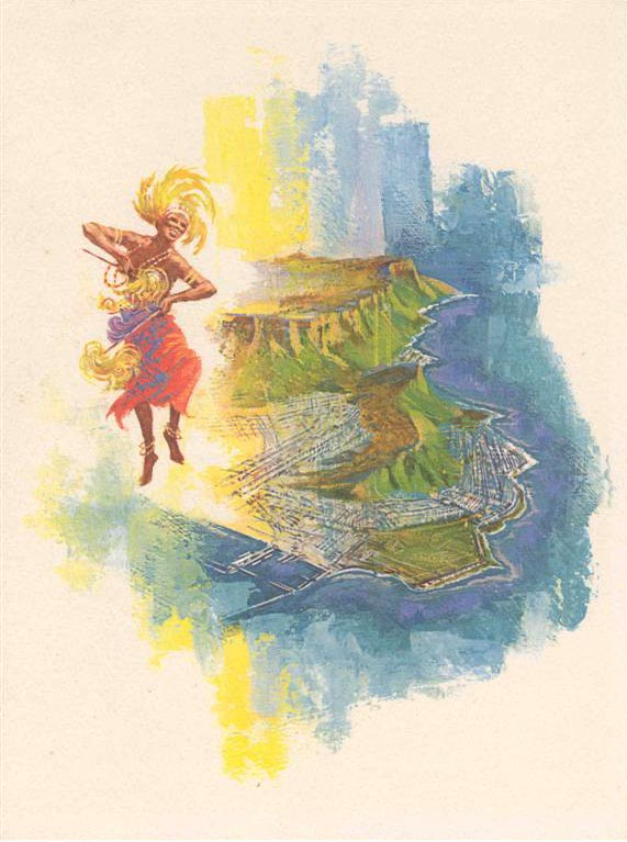
* A note of thanks to Bill Vinson and Ginger Q. Casey of Moore-McCormack.com for granting me permission to use the final three illustrations in this post.

You can see all of today's images (with the exception of the Harvey Kidder piece) in my Dom Lupo Flickr set.

Thursday, July 26, 2007

Tying Up Loose Ends: Illustrating Cute Kids

Two guys named Tom have recently joined the Today's Inspiration mailing list and both of them sent me email replies during last week's look at "illustrating cute kids" that I wanted to share with everyone. These gentlemen did the heavy lifting for me today so my thanks to them both for giving me the day off!

First, from Tom Johnson, a longtime fan and collector of Al Parker's work, comes this generous contribution of scans featuring cute kids as rendered by the man Cosmopolitan magazine described as "the illustrator of our times."


"I remember the Mother/Daughter covers from growing up in the 50's", writes Tom Johnson, "thanks to my Mom's subscription to LHJ. I bought a couple at a garage sale , probably 25 years ago and went about collecting them all (there are 36 LHJ M/D covers from 1939 through 1955) and 1 M/D cover he did for the Famous Artists magazine."


"When I got them all collected ( before Ebay) I went on to the AA ads and anything else I could find."


Next comes this interesting analysis from retired West Coast illustrator, Tom Watson:

Thought you might find the 2 attached illustration comparisons of identical subject matter, but handled in 2 distinctively different ways. One is Mary Horton's boy eating an apple in an apple tree house, which you posted a few days ago. The other is an almost identical situation of a boy in an apple tree house eating an apple and reading a book, by Paul Nonnast for a 1950 Prudential magazine ad.


Horton's illustration is more of a decorative stylized design statement for a 2 page spread with simplicity of detail. The emphasis is on the carefully designed silhouette of the apple tree, which is in full shadow contrasted with the sunlit house and yard below. Behind the the well designed shape of the tree is a contrasting pale blue sky and light yellow green yard, emphasizing the the overall tree shape. The boy is somewhat understated in importance, and the real focus seems to be on the overall energy and whimsical mood that is cleverly depicted. The charming touch of a squirrel on a limb and birds in flight, add to the cheerful mood.


Nonnast's illustration is soothing and quiet, and shows great clarity, strong academic drawing and a very skilled painterly quality overall. It is more defined with a three dimensional reality that was characteristic of the 40's and 50's style. The leaves show clarity yet depicted with looser brush strokes. There is a wonderful glow of both dappled and direct sun light throughout the scene. The boy is definitely the point of interest. Both paintings have red roofs on the house below, which is in keeping with the red/green complimentary color scheme of both paintings.

Different styles and personal points of view, depict very different moods. The point I would like to make is that selecting the right illustrator for the right job results in the the right message for the viewer. I admire both illustrations equally, because of their individual approach and excellent illustration qualities.

My thanks to both Tom Johnson and Tom Watson for their enthusiasm for mid-20th century illustration and generosity in sharing of their knowledge and scans with the readers of this blog.

All of today's images can be found in my Cute Kids Flickr set.

Wednesday, July 25, 2007

Tying Up Loose Ends: Mike Ludlow

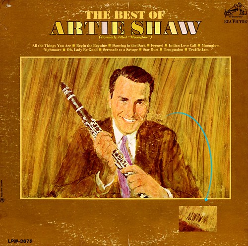
Way back in February of 2006 I posted an album cover and expressed my frustration at not being able to decipher the artist's scribbled signature.


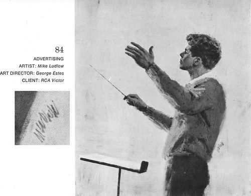
Thanks to a visitor to my Flickr archives, Harold Henriksen, we now know for sure that the artist is Mike Ludlow. Harold graciously sent me the scan above from the 1966-67 Illustrators Annual.

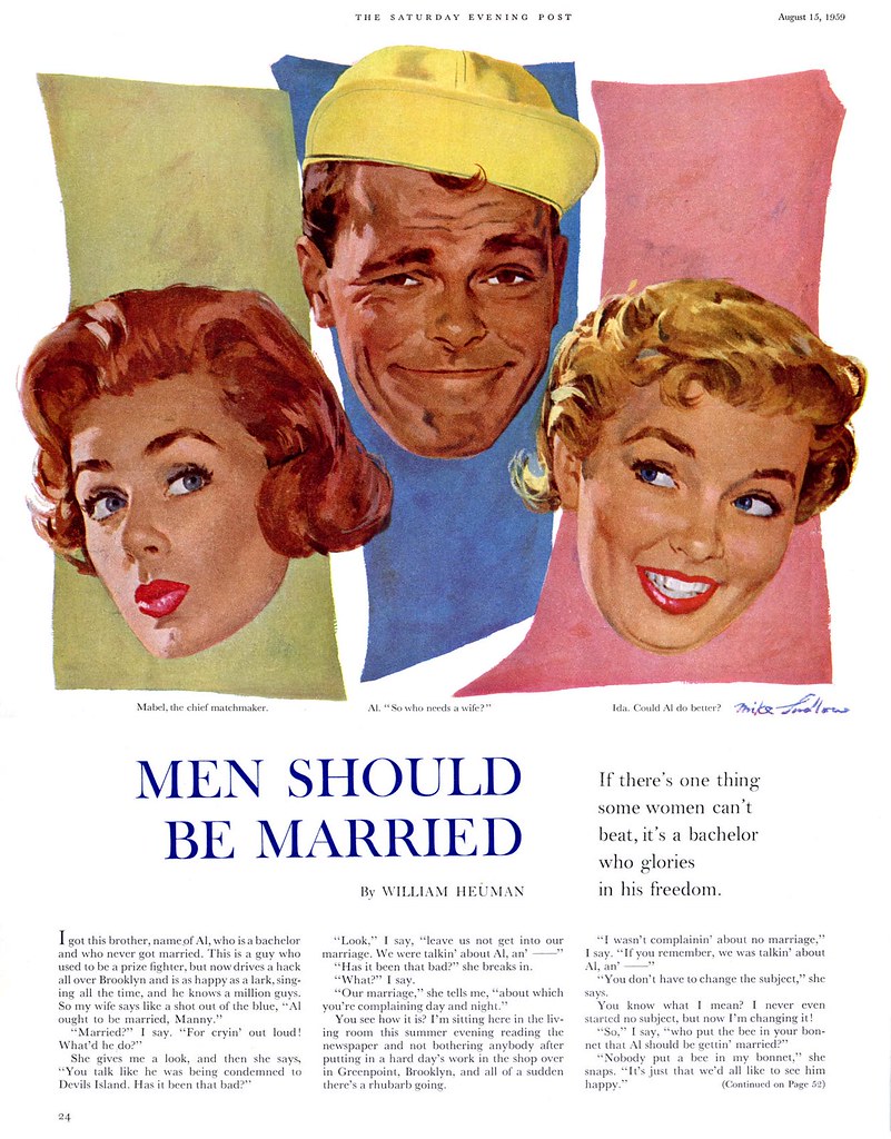
Until about 1960, when he was still receiving projects from The Saturday Evening Post, Ludlow was working in his familiar 50's-era gouache technique and painting the easy-to-read signature you can see below.


But as magazine assignments dried up in the 60's, Ludlow seems to have established a steady client in RCA/Victor records. With the change in time and venue came a change both in style and signature for Ludlow.


His painting style became even more rough and energetic, reflecting a major trend in illustration during the 60's as practiced by many of the 'realistic' artists who had dominated the business in the 50's.

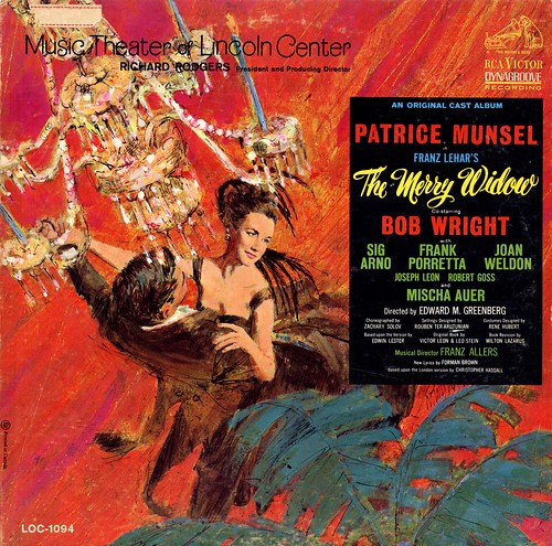
The 1964 piece below shows just how daring Mike Ludlow became in just a few short years. His slashing, scribbling style and bold colour scheme transport the viewer into the midst of the whirling, festive atmosphere of the ballroom scene he portrays for us. Ludlow tightened up in painting the girl's face - making sure to get an accurate likeness of the star of the play, I suppose - and the result is a bit like a camera effect, with a tight focus on what is clearly the most important element of the larger image.


And that new, modern Ludlow scribble signature? There it is, partially obscured by the bottom of the black type box, along the edge of a palm frond.
All of these images are now in my Mike Ludlow Flickr set - and many thanks to Harold for solving this mystery!

Tuesday, July 24, 2007

Tying Up Loose Ends: Cute Kid Artist "A.S." is...

Arthur Sarnoff!

I have to thank my Flickr friend Glen Mullaly for solving this mystery for me.


What's really bizarre is that I had initially posted an "A.S." illustration and another piece clearly signed "Arthur Sarnoff" together back on Father's Day and never made the connection. Doh!


I found quite a lot of artwork and information on Arthur Sarnoff at various websites. There's a bit of biographical info at askart.com. The American Art Archives has a tremendous selection of Sarnoff illustrations (including several wonderful Karo Kid ads). And you can see some of Sarnoff's later work (and even buy one of his originals) at The Illustrated Gallery.


For those who are fans of pinup art, there's a baker's dozen of fresh, hot lovelies by Sarnoff at the Virtual Pin-ups Art Gallery.


Another weird coincidence: the very day I posted about the mysterious "A.S.", I received the scan above from Ranger Bob asking if I could make out the signature at the bottom left. I tell ya, its like the spirit of Arthur Sarnoff was trying to guide me in the right direction....

All of the images above (and all the "A.S." illustrations previously seen here) are now in my Arthur Sarnoff Flickr set where you can view them at full size.

Monday, July 23, 2007

Tying Up Loose Ends: More by Allan Kass

Readers of this blog often do a lot of the detective work that helps us identify unknown illustrators and otherwise give context to what is unfortunately an era in the history of illustration that suffers from a lack of thorough documentation.

This week I thought I'd take a moment to thank all those diligent folks and to go back through my emails and post the images and info they've sent me.

Back in April we looked at some remarkable advertising illustrations for the British Vauxhall done in a style very reminiscent of the work of Robert Fawcett. A visitor to the blog, Harald, helped identify one of the illustrators from the Vauxhall series as Allan Kass. Harald kindly sent me this scan below which he took from the 1961 Illustrators Annual.


Coincidently, I recently came across yet another Vauxhall ad. Could this also be the work of Allan Kass?


For now we'll say "yes" - and hope to discover more information about this talented artist in the future. My Google Image Search turned up one other example of Kass' work at Plan59.com

You can get a closer look at these images and Allan Kass' other Vauxhall ads by clicking the 'All Sizes' tab above each image in my new Allan Kass Flickr set.

Friday, July 20, 2007

Mary Horton's Cute Kids

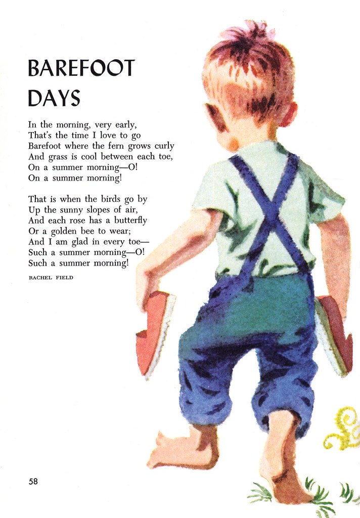
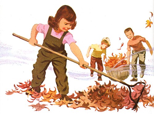
Mary Horton's work appears in many of the 1964 volumes of the Childcraft encyclopedia/textbook series.


At first glance, because it is such understated work, one might dismiss it as being that sort of bland textbook art not worth a second look. But take a moment to linger over the details - or lack of them - and you quickly realize that Horton completely understood how to reduce the elements in her work to the bare essentials and still retain a wonderful authenticity. The important information is all there. "Reduction" is the toughest skill for an illustrator to master. Too often we become bogged down in superfluous surface detail that actually detracts from the beautiful simplicity of the core of our work.


Ten years earlier, when Horton did the advertising piece below, she was not quite there. You can see the beginnings of the style she will mature into a decade later... but the cute factor is lacking, isn't it? Horton had not yet fully grasped the nature of the formula we've been looking at all week: how to draw a cute kid.


Bingo! Who couldn't fall in love with this poor little waif?


And when you see a piece as well composed and visually interesting as the one below, you know you're looking at the work of an inspiring illustrator.


Take a closer look at the full size versions of these illustrations in my Mary Horton Flickr set.

Thursday, July 19, 2007

Pete Hawley: King of Cute!

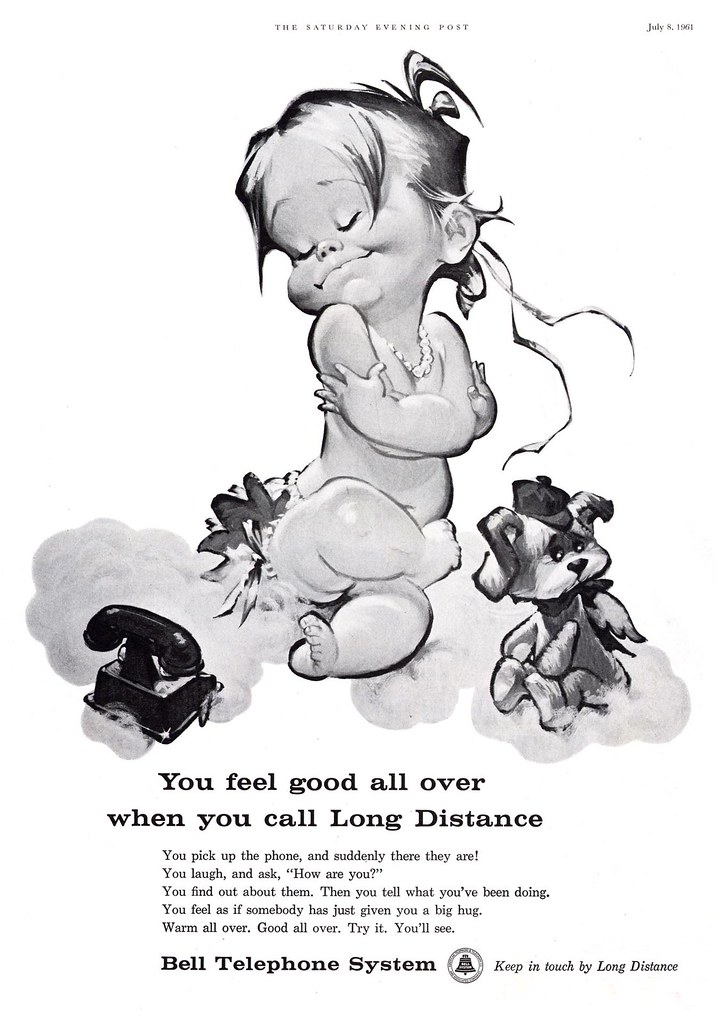
If God bestowed The Magic Cute Pencil upon any one illustrator of the twentieth century it must surely have been Pete Hawley. Cute wasn't a formula Hawley had worked out and applied to his drawing style... it was as natural to him as breathing.


From his earlier period Jantzen pin-ups to his 50's era advertising work (below), to his movie posters and beyond, every man, woman, child and critter Pete Hawley drew had an impish grin and a pixie-twinkle in their eyes.


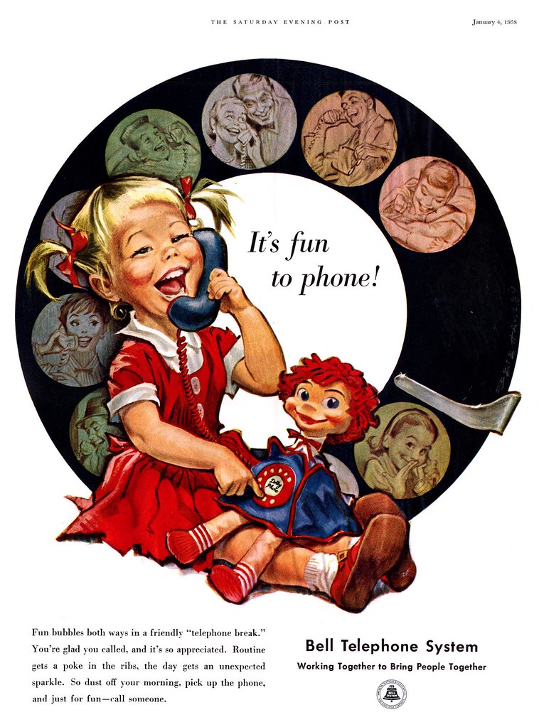
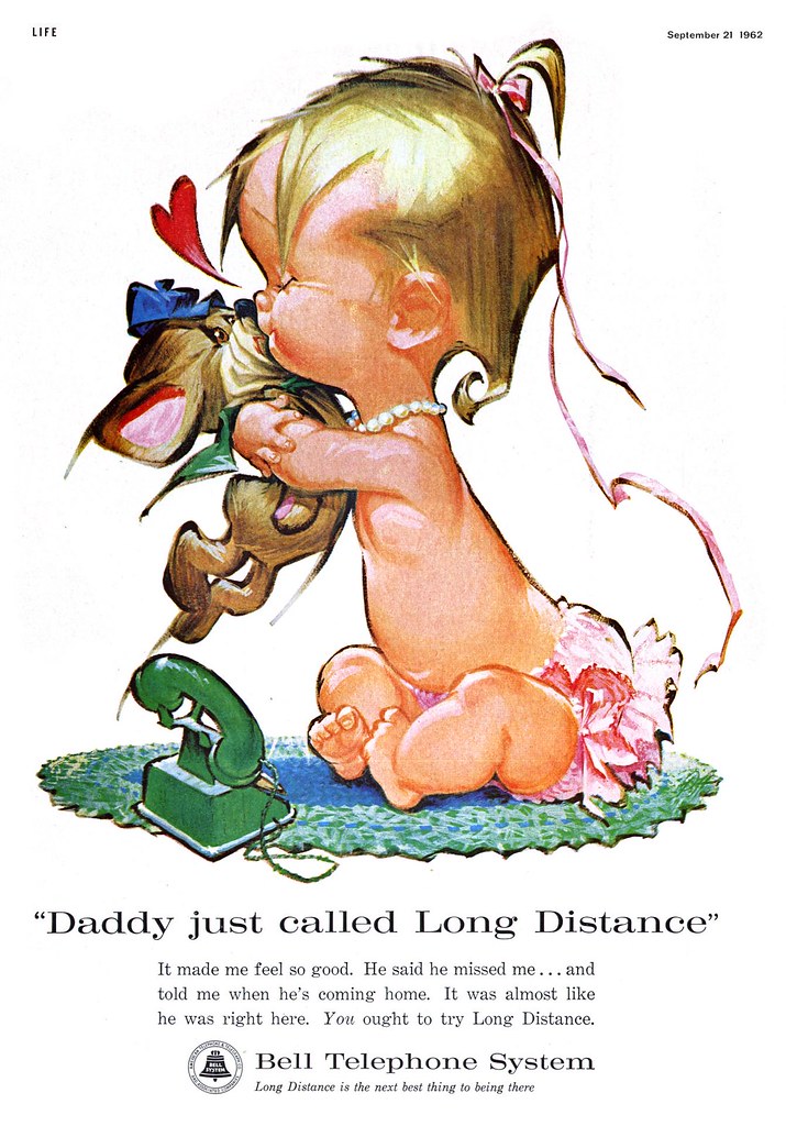
That singularly cute quality must have been the reason that Bell Telephone chose Hawley for their high profile long distance ad campaign which ran over several years at the end of the 50's and into the early 60's...


...and no doubt those ads must have brought Hawley to the attention of The American Greeting Card Company. Though biographical information on Hawley is still sketchy, we know now that he spent the last decades of his career doing hundreds and hundreds of cutey-pie paintings for the greeting card behemoth.

If you grew up in the 1970's like I did, you probably held dozens of Pete Hawley illustrations like this one in your hands every Valentine's Day - and didn't even know it.

And in regard to Hawley's work for AGC, I've got some very interesting Pete Hawley news I'd love to share with you... unfortunately I'm not at liberty to reveal it just yet.

For now you'll have to satiate your cute tooth by dining on the images in my Pete Hawley Flickr set.

Wednesday, July 18, 2007

"A.S." : Cute Kid Artist Extraordinaire

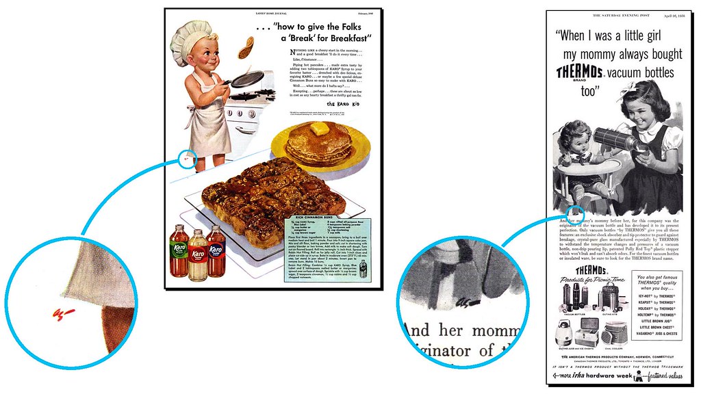
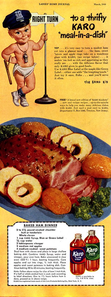
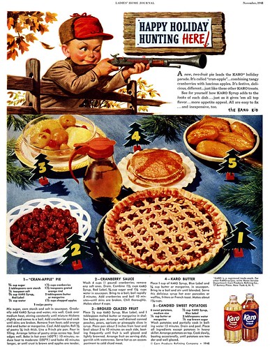
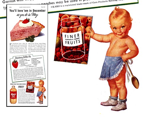
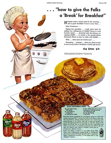
For quite a while now I've been setting aside these ads featuring the ultra-cute Karo Kid. The artist managed to develop a formula for drawing a kid that is so cute it almost becomes... unsettling. I knew I'd have to present these ads to you eventually and what better time than "Cute Kid Week"?


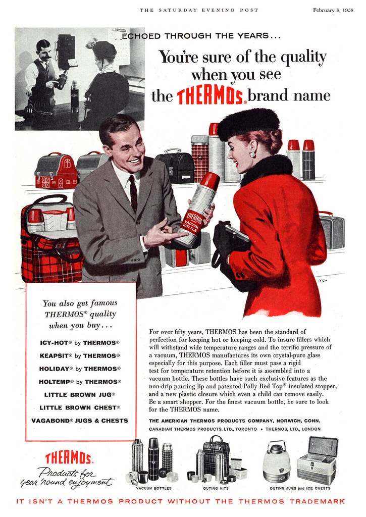
And then - wow! As I was scanning these ads for today's post I suddenly noticed that tiny initialled signature, "A.S.", and realized that this was the same illustrator who did the Thermos ad from Monday (and no doubt the other Thermos ad I featured a few weeks ago). It was one of those neat moments in my ongoing study of the history of mid-twentieth century illustration when two pieces of the enormous puzzle fit together!


Whoever "A.S." was, this illustrator sure could paint cute kids! And, as is often the nature of a career in commercial art, may well have been a specialist in that specific subject matter.


Since those Thermos ads appeared about a decade after these Karo Kid ads, we have the unique opportunity to see how "A.S."'s style evolved. Quite nicely, I think.


His Thermos kids have a touch more realism - while still being very commercially idealized - and the more painterly approach lends them an appealing softness.


You can get a closer look at all of "A.S."'s illustrations at full size in my Cute Kids Flickr set.

Tuesday, July 17, 2007

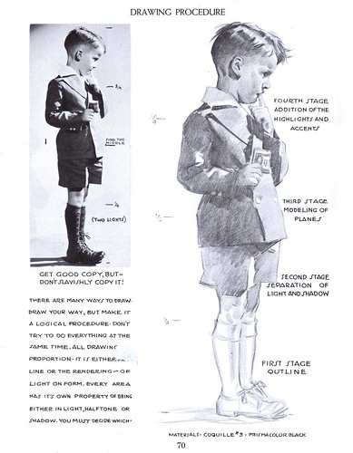
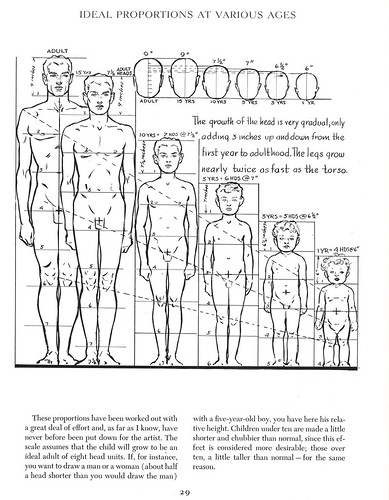
Drawing Cute Kids: Lessons from the Masters

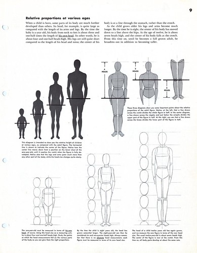
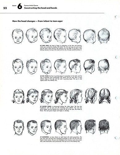
After yesterday's comments and suggestions (thanks to everyone who chimed in!) I thought it might be advisable to go "back to school" for a little refresher course in drawing kids. Here are a couple of pages from Andrew Loomis...


...and from The Famous Artists Course, some excellent and more detailed advice from Albert Dorne.


Want to study these lessons more closely? Take a look at the full size versions in my Cute Kids Flickr set.

Monday, July 16, 2007

Cute Kids Are Tough to Draw!

I had to draw some cute kids today for an assignment and let me tell you, after nearly twenty years of doing this professionally I still can't draw cute kids.


Its actually something that's come up a few times among my circle of illustrator friends... how come our kids always end up looking like horribly distorted little adults?

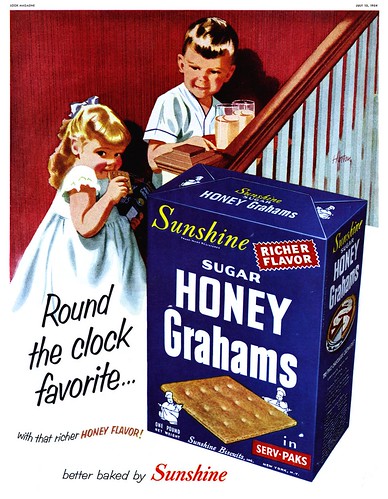
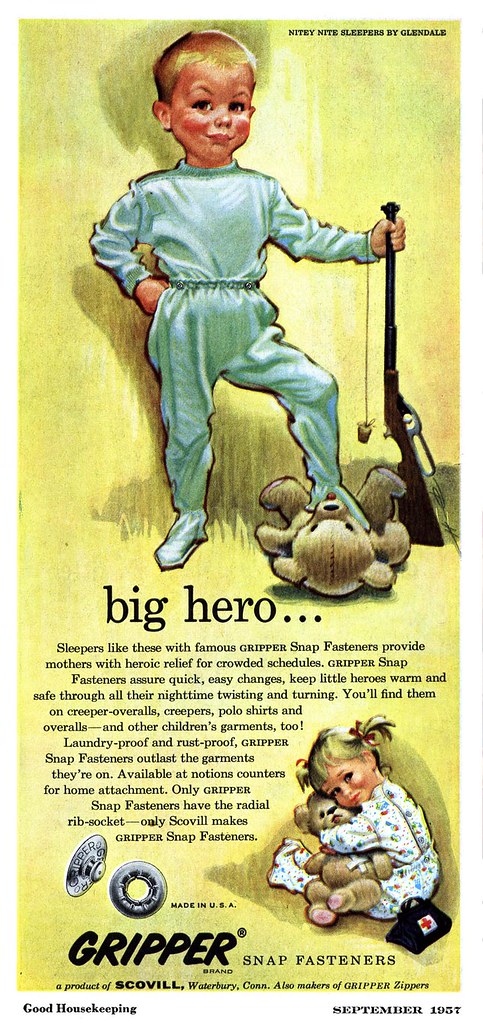
So I thought it might be fun to take a look this week at some classic illustrations of cute kids - some that work really well, some that maybe don't - and throw 'em out there for your inspection, analysis, criticism, comments - whatever. Why does this one work so well while that one doesn't? What are your theories or advice on how to draw cute kids? Any horror stories from your personal experiences having to draw kids?


This week, in an effort to make this blog a little more "interactive" I pose the question: "how do you draw a cute kid?"

Inquiring proportion-challenged illustrators want to know.


Determined to get a closer look at these scans? Go to my new Cute Kids Flickr set.