Friday, October 23, 2009

Praise for the Little Things: Naiad & Walter Einsel

Unless you've been reading this blog since its early days you probably don't know about the husband and wife illustrator team of Naiad and Walter Einsel.


When I first wrote about the Einsels I didn't know just how many illustrators were married to illustrators, or how often those couples worked together... but still, with perhaps the exception of the Provensens, no other artist couple I've come across had so seamless a working relationship as Naiad and Walter.


About their working method, which Naiad called "leapfrogging" she wrote, "This was especially useful when one or both of us was under pressure of a heavy work load. First we'd sit down and verbally consult, brainstorming ideas. Then I'd draw a little sketch and Walter would add to that and we'd go on and on in this way, refining all the time."

The Einsels would sign the finished piece according to who received the assignment.


Occasionally, when I'm flipping through my old magazine collection, I'll come across a little spot here or there and know immediately that it is the work of the Einsels. This is always a happy moment for me... their meticulous, distinctive style is so charming that even the little things are a delight to behold.


Here are two projects by Naiad which were recognized for inclusion in the 1957 New York Art Director's Annual.


I wish we had them as colour reproductions, but for now these will have to do.


I haven't corresponded with Naiad since I interviewed her in early 2006, but I was pleasantly surprised to discover there is now a Naiad & Walter Einsel website! When we were corresponding Naiad was busy putting together a book that collected the many hand-made valentines the couple created for each other over the course of their long and happy marriage. I'm thrilled to see that the book is now available.

For those who never read the original series of posts I wrote about the Einsels, here are the links. You won't regret taking the time to view their beautiful artwork - and the story of their lives together is about as nice a love story as you could ever hope to find:

A Calling Card for All the World To See
"I liked his artwork because it looked like mine."
"Leapfrogging"
More Feast than Famine
Crazy in Love

* My Naiad & Walter Einsel Flickr set

Thursday, October 22, 2009

Praise for the Little Things: Paperback Book Cover Art

I don't make much of an effort to collect paperback book covers... but occasionally I stumble upon a few in a used book store and - if they are cheap enough - I pick them up. Last summer, while coming home from a fishing trip at a friend's cottage, I found a tiny stash that looked interesting and was priced right: 25 cents each.


One reason I've largely ignored paperbacks is that they often have no illustrator credits. This frustrates the heck out of me. The cover above is gorgeous - but its could have been done by any one of dozens of talented illustrators of the mid-20th century. My OCD inclinations kick into high gear when I'm confronted by artwork I can't catalogue! Grr!


Another frustration is the lousy reproduction quality one often finds on old paperbacks. The images above and below seem slightly out of focus, don't they? That annoys me to no end. They would be a lot more rewarding to study if they were sharper looking.

The one below is signed "Barye", whom I've been discovering was Phillip Baryé, an illustrator of a million-billion paperback covers, almost every one of which featured at least one fetching gal in a state of semi-undress. If Barye's covers were taken as a snapshot view of history, one would have to conclude that manufacturers of women's clothing in the 50's had not yet perfected any type of button, zipper or clasp.


Here's another gem I found for a quarter. I think that tiny signature near the sprawling lady's bare foot says "McGinnis", meaning this would be by Robert McGinnis, who also did tons of paperback covers (often featuring ladies, sprawling or otherwise).

What's interesting is I found a similarly sprawling lady - definitely by McGinnis - on Flickr... and although that piece is from 2 years earlier, its painted in a much more sophisticated manner. Hhmmm.


And finally, the last of my fishing trip finds: a beautiful paperback cover by Sandy Kossin. This one's from 1960, but don't let the fairly traditional, literal style fool you. Sandy was not the sort of artist who got stuck in a rut when it came to style.


And that gives me the chance to re-present some of his other paperback covers we've looked at before...

Believe it or not, the cover below is also by Sandy Kossin - and from just one year later than the one above. If that isn't a little remarkable to you then I don't know what is!


When I asked Sandy about that cover he said, "I am constantly amazed at the new attention to my paperback covers, mostly emanating from your blog. THE LAST TEMPTATION OF CHRIST was done twenty five years ago or more for Bantam, of course, and the art director was Len Leonni, one of the few people with artistic taste and power. He agreed with my concept of using a technique borrowed from the Masters..."Just give me a great piece of art."

"I don't remember doing a color sketch of the piece. Probably not. I just find I can enjoy doing a spin-off like this, since I learn from concentrating on the artist and extracting enough information that allows me to do it my way. This was obviously Christ and Judas painted in gouache with background colors mixed with Elmers Glue or acrylic matte liquid. Yes, the editors and Leone loved it. (I hope your reproduction isn't as dark and dingy as shown here)"

One day, out of the blue, Sandy sent me the scan below - again, in a variation of style - and when I pressed him to tell me more about his influences he wrote back, "I do give a lot of credit for any drama and design I use to David Stone Martin and Shahn. Ben Shahn, who I never met, but was alive while I was in art school, opened my eyes to not only shape-making, but the use of 'layers' of color over underpainting, and the judiscious use of color."

"DSM was also alive back then, and was a great influence on my line, which emulated Shahn's line which had that same stop-and-go quality which was useful in keeping a drawing from being fast and slick. No, never met the man, but again, his use of line and design made him the icon he became. In fact, his clients would not let him "grow" and change his style, which eventually led to his dropping out of the business."


"Growing" and having the freedom to change one's style was obviously always an important facet of how Sandy Kossin went about making pictures. Its the key to why his paperback covers never became derivative or tediously formulaic. At the end of one message Sandy wrote, "Most other paperback houses knew what I did, so I was given a lot of leeway in my concepts. And I was lucky enough to be assigned their number one books."

"Any more questions?"


* Sandy Kossin wrote a long and lavishly illustrated article about his career in Illustration magazine #25

* My Sandy Kossin Flickr set.

* My Paperback Covers Flickr set.

Wednesday, October 21, 2009

Lowell Hess: In Praise of the Little Things

A couple of weeks ago I showed you a series of covers from 1950's issues of Boys' Life by Lowell Hess. I talked a little about how Lowell, as a boy growing up in Oklahoma, had always wanted to work for Collier's magazine, and how he eventually did 3 covers and many interior illustrations for that magazine. Lowell had a great relationship with Collier's AD, Bill Chessman, who called Lowell his "Number One Fireman" because he always seemed to come up with an interesting and entertaining illustration idea for those stories Chessman was struggling with.

Lowell's work for Chessman lead to an opportunity to do additional spots for Collier's Cartoon Editor, Gurney Williams. Collier's ran a regular humorous column called "48 States of Mind" which required several postage stamp-sized cartoons each week. Around 1950 or '51, Williams offered Lowell the chance to do a few of these spots.


Unfortunately, because of their small size, they are the sort of thing one might pay very little attention to when reading the column or flipping through the magazine. You get the sense that the AD's intention was not much more than to break up a large field of dull grey type with a little bit of decorative colour.

But look closer...


There are wonderful details,


amusing concepts,


and great character design...


... invested In real estate not much larger than your thumbnail.


Gurney Williams obviously thought so too.


In his scrap books of old printed samples, Lowell had carefully clipped and saved many of those tiny spots. Among them he enclosed a post-it note about the assignment for Williams, indicating that he had produced a year's worth of them for Collier's.


Here, for your amusement - and inspiration - are a few more (blown up big enough to properly appreciate).


* My Lowell Hess Flickr set.

Monday, October 19, 2009

Rockwell to Parker: Praise for the Little Things

Back in July we looked at a fan letter Norman Rockwell wrote to Al Parker and wondered about the piece that had so moved Rockwell to pen what was only the second fan letter he ever wrote to a fellow artist. Having not been able to locate the image in my old magazine collection I had long since moved on.


Little did I know that David Apatoff had enlisted the aid of the inimitable Jaleen Grove to hunt down that image at all costs. This past weekend I was surprised and delighted to receive the scans below, along with a note from David and Jaleen:

"Since you are the one who introduced me to the Rockwell letter and you raised the issue, it seems fitting to hand this image back to you to complete the circuit with your readers." wrote David.


"It is not at all what I expected, and I still want to think a bit about why this particular picture moved Rockwell to write. At a minimum, I give Rockwell credit for being more open minded than I would have supposed."

Jaleen added, "I too am wondering what exactly Rockwell was awed by. A strong composition, yes - I like the vase shape echoing the figure - and the radical angle of the pole, and maybe even the model's weird pose - but I don't think I would have paused in page-flipping had I not known about Rockwell's letter."


Jaleen, who has the great fortune to spend some time each month with Walt Reed at the Illustration House, happened to be there at the time of her writing:

"Walt just walked by," wrote Jaleen, "and I solicited his opinion."

"He figures Rockwell had been meaning to write Al for a long time and just found the issuing of this picture to be a convenient moment. Walt says he went to a talk Rockwell gave "quite a few years before" 1948, when Al was just starting out. There, Rockwell praised Al, particularly for the "small things he did" - like that pipe on the window ledge, the odd pose. Walt thinks it looks spontaneous enough to have been done from life."


David brought the discussion to a conclusion with this well-reasoned theory:

"After a little reflection, I guess I would refine my thoughts on the Rockwell fan letter as follows: By the time Rockwell wrote that letter he had spent nearly 40 years painting with oil paints on large canvases. He worked 6 days a week using a laborious, 15 stage progress with a variety of chemicals and drying agents. Despite Rockwell's magnificent achievement, he must have looked somewhat wistfully at the young Al Parker painting light, spontaneous, unconventional paintings with water based casein and gouache on small illustration boards. I'm sure Rockwell couldn't help but think about all the time he had spent waiting for paint to dry over the last 40 years, and all of the airy brush strokes, such as Parker's, that had been buried in layers of underpainting. The new world of illustration would be one where far less time was spent on implementation and far more time was spent on the imaginative and conceptual parts of the job. I'm guessing Rockwell understood the potential significance of that changing ratio. Parker didn't ask for permission to change the world, he took it. And I think Rockwell must have respected that, too. So perhaps this letter is symbollic of Rockwell's blessing for the future of illustration."

"It's all rampant speculation, of course, but Jaleen and I were both struck by the fact that Parker's illustration didn't seem like the kind of dazzling artistic performance that would inspire the second fan letter of Rockwell's life. On the other hand, if you look at the white space, the stream of pages that integrate the illustration by flowing from the background for the story's title into rough pencil sketches in the illustration itself, the unusual angle on the woman, the conspicuous brush strokes left in place-- Rockwell must have felt like the last neanderthal peering out of the woods at this strange new life form, the cromagnon man standing in the glen. I think it is a measure of Rockwell's quality as a person and an artist that he didn't think, "In my day, artists really had to work..." nor did he think, "If I were starting out today, I could be so much more prolific and have so much more fun...." He didn't even think, "how many brain cells have I lost by inhaling turpentine fumes for the past 40 years?" No, he thought, "what a wonderful, lively new aproach." That's someone who truly loves art."

How about you, dear reader... what do you think?

*ADDENDUM* Tom Watson sent a comment that requires a visual accompaniment, so for those who have been following th]e flow of the discussion, you might want to read the comments section first, then return here to read and consider the following...

Tom writes, "When I saw the Al Parker 1948 LHJ cover, it reminded me of the Norman Rockwell 1939 Saturday EP cover, painted over 9 years before Parker's cover. Both have vignette figures, and both have type designed around the figures. This was quite advanced for 1939, and I'm fairly certain Rockwell designed and lettered the type as he did on occasions for other illustration assignments."


"IMO, it is as innovative in concept and well designed as Al Parker's version. I can't say for sure that Parker was influenced by anything Rockwell did, but this would be a remarkable coincidence, if he was unaware of Rockwell's innovative designing of figures and type, which was not just a one time shot. I think Chad Sterling was accurate in his assessment of Parker's LHJ cover- "The image of mother and daughter for example is very reminiscent of a Rockwell illustration in composition and spirit". I hope you agree with me, that in spite of Rockwell's corn-ball subject matter, his creativity wasn't so behind the times.. for a "Neanderthal". ;-) "

"I think posting the comparisons would be interesting to your viewers."

* There's more to see and read as this week's CAWS "goes wild" at Charlie Allen's Blog

* And the long lost artwork of a Toronto illustration legend is finally unearthed at Storyboard Central

* Finally, with Hallowe'en fast approaching, get in a ghoulish mood with Simon Peng's twisted tale, "Something Gory" at Leifdrawing 101

Friday, October 16, 2009

NORMAN ROCKWELL’S ILLUSTRATIONS FOR THE ADVENTURES OF HUCKLEBERRY FINN, Part 4

Comments by Tom Watson

Illustration #7

Sitting lower and looking up into her eyes, a sympathetic Huck consoles “Miss Mary Jane”. Again Rockwell portrayed the emotions of the human condition, through posture, gesture and expression. The edge lighting on the figures and chairs (from the windows), adds to the mood , and delicately defines their features. This scene shows the tender side of Huck, as Miss Mary Jane appears sad and upset. Hearing her crying while packing her trunk, he consoles and asks her what the problem is. Rockwell depicts another well tailored and carefully manicured composition. Everything works to bring us into the subject matter. The stripes in the carpet and the nearly white window light on each side function to contain the figures in the center.. at least they appear at first glance to be centered. But, actually they are just left of center, avoiding a static symmetrical composition.


Notice one chair is a high back rocking chair, and the other, a backless stool. This gives variety and becomes a design advantage. To give variety to the rigid geometric shapes in the room, Rockwell angled the trunk and then echoed the nearly white windows in the lower portion of the illustration, with a small light shape inside the trunk. To give reality, he carefully adjusted the position of the window shades.. one slightly lower than the other. The picture frame and slip of paper under the corner of the frame on the wall, is another vintage Rockwell touch. Once again, every element functions to create a well conceived and well balanced illustration.


Illustration #8

Rockwell changed his color scheme in this illustration, and repeated the gold and amber tones, similar to the first illustration. He subtly indicates a rustic appearing interior, probably in the kitchen area. In this case, he wanted our attention to go straight to the subject (the snake and Aunt Sally), without hesitation. Unlike the last illustration, this is an action pose, and is obvious what is taking place. IMO, with a little information in the background, it could easily work as a Saturday Evening Post cover. The posture and attitude of the main figure is not a mystery here. And, Rockwell makes the most of it.


Notice how the spoon stops her from falling out of the picture. Theoretically, the bowl and spoon landing on the floor would scare the snake away, but fear and panic knows no logic. This is a classic example of effective counter change.. Aunt Sally’s head and hands reversed out of a dark background, while the snake reversed out of the light tone of the floor.. the two most important elements in the illustration. Notice Aunt Sally’s dress is darker than the floor, yet lighter than the dark gradated background toward the top. Just a key portion of Huck and Tom show behind her arching body. As Rockwell read the story or manuscript, I suspect he formed a visual image in his mind, of each character and each situation. This, no doubt, was the easiest part of portraying each illustration. The result however, is a unique combination of two master storytellers. If only Mark Twain could have seen Norman Rockwell’s contributions to his great classic novels. Twain’s inspiration on Rockwell is quite evident in these remarkable story illustrations.

* Tom Watson is a retired West Coast illustrator, art director and educator. He has been a frequent contributor to Today's Inspiration and his storyboard work for film was a subject of a post on my other blog, Storyboard Central. Many thanks, Tom, for an interesting, informative week!

This week's images are © MBI/Heritage Press, 1940 and are used with the permission of the Norman Rockwell Museum. This past summer the museum featured the grand opening of a traveling exhibition, American Chronicles: The Art of Norman Rockwell.

Stephanie Plunkett, Chief Curator of the Museum would like readers to know that the Museum does travel an exhibition of signed lithographic prints from the Tom and Huck series to other museums and cultural centers. Stephanie writes, "We do have two upcoming bookings for that exhibition that are listed below, so perhaps your readers will have the opportunity to visit if they live in the region."

Here is the information about the traveling exhibition:

Norman Rockwell's Tom Sawyer and Huckleberry Finn

Nova Southeastern University, Fort Lauderdale-Davie, Florida
November 14, 2009 through January 29, 2010

Averitt Center for the Arts, Statesboro, Georgia
March 12, 2010 through May 7, 2010


"It also might be interesting to note that the original paintings for the series are in the collection of the Mark Twain Museum in Hannibal, Missouri. The originals are beautiful. A study from the series will be on view in our upcoming exhibition, Norman Rockwell: Behind the Camera, which opens on November 7, 2009."

Thursday, October 15, 2009

NORMAN ROCKWELL’S ILLUSTRATIONS FOR THE ADVENTURES OF HUCKLEBERRY FINN, Part 3

Comments by Tom Watson

Illustration #5

I find it interesting that this is the only outdoor scene that Rockwell chose to illustrate. Perhaps it is because he may have preferred painting indoor scenes... it occurred to me that he seemed to have chosen to paint more indoor scenes during the bulk of his career. This illustration has a very theatrical feeling to the two standing figures. The tall thin gawky guy on the left is vintage Norman Rockwell. I have seen that gesture of the back arched and the fingers to the chin in many of his illustrations. It is a look of curiosity and wonder that is a difficult expression to suggest, but Rockwell was the master of expressions and gestures. Had he not been an illustrator, he probably could have become an actor or director, because he knew the visual aspect of the human emotion. Few illustrators had as clear an understanding of effective expressions and gestures in their illustration, than Rockwell. I believe it is one of the main ingredients that set him apart from other famous illustrators. He kept distilling down (editing) his concept, until he was convinced he had exactly the right facial expressions and body gestures.


Depicting a somewhat exaggerated stylized effect, we look down on the raft, which is on a diagonal, giving a sense of forced perspective. Rockwell counter changed the lighter tones of the standing figure’s heads, from a very dark green tree shadowed background. He indicates just enough information to disclose a general location.. the raft, water, shoreline and foliage. The interesting period clothing is reinforced by the exaggerated gestures of the two men. The man with the beard is telling a ridiculously untrue tale to the other man. Rockwell depicts an effective overlap of figures.. showing only key parts of Huck and Jim, who are being entertained in the background. The color combination is similar to Rockwell’s last illustration, variations on blue greens with red accents.. an effective choice, and a compliment to each other on the color wheel. He would occasionally apply the latest scientific theories of color and composition to his illustrations, to try and avoid being stale.


Illustration #6

While attending an illustration class back in the late 50’s, I did a painting from a model dressed as a ballerina, sitting on a stool with a potted plant and a dress form next to her as compositional props. I left a lot of deep blue open floor showing in nearly half of the lower portion of the illustration (influenced by Degas ballerina paintings). When I thought I was finished, the instructor looked at my painting, picked up a letter size sheet of paper, walked over to the model stand and tossed the paper on the floor.. then turned to me and said.. “Now, suggest that paper in your painting, and your done”. I followed his lead, and it made a big difference in improving the overall composition. It was just the accent I needed, but didn’t know it until he pointed it out. Had I thought of this illustration with the pink blossoms on the open floor space, just maybe it would have sparked the idea of placing an accent on the floor in my painting.. regardless, it made me more aware of analyzing the ingredients and possibilities of a composition.


The pink blossoms on the floor, was the perfect accent for a large expanse of dark blue green carpet.


The geometric horizontal blinds, casket and molding, play very nicely with the organic freeform shapes of the figures. The blinds anchor the focal point of the two heads. The red handkerchief is an important accent, spotlighting the men.. and an indication that they are grieving.


spotlighting the men.. and an indication that they are grieving. The stark nearly white wall and light pants, are a nice counter change to all the darks. The two chairs add a sense of authenticity and also function as design elements. Rockwell effectively contrasts various shapes to create just the right mood and atmosphere for the scene.


Illustrated in 1940, it had a more modern approach to the composition, in spite of the period clothing. Rockwell was often more contemporary in his approach and solutions for his story illustrations than his Saturday Evening Post covers, or advertising illustrations, but he remained a life long literal illustrator and always paid attention to detail in his character development.

* Tom Watson is a retired West Coast illustrator, art director and educator. He has been a frequent contributor to Today's Inspiration and his storyboard work for film was a subject of a post on my other blog, Storyboard Central.

This week's images are © MBI/Heritage Press, 1940 and are used with the permission of the Norman Rockwell Museum. This past summer the museum featured the grand opening of a traveling exhibition, American Chronicles: The Art of Norman Rockwell.

Stephanie Plunkett, Chief Curator of the Museum would like readers to know that the Museum does travel an exhibition of signed lithographic prints from the Tom and Huck series to other museums and cultural centers. Stephanie writes, "We do have two upcoming bookings for that exhibition that are listed below, so perhaps your readers will have the opportunity to visit if they live in the region."

Here is the information about the traveling exhibition:

Norman Rockwell's Tom Sawyer and Huckleberry Finn

Nova Southeastern University, Fort Lauderdale-Davie, Florida
November 14, 2009 through January 29, 2010

Averitt Center for the Arts, Statesboro, Georgia
March 12, 2010 through May 7, 2010


"It also might be interesting to note that the original paintings for the series are in the collection of the Mark Twain Museum in Hannibal, Missouri. The originals are beautiful. A study from the series will be on view in our upcoming exhibition, Norman Rockwell: Behind the Camera, which opens on November 7, 2009."

NORMAN ROCKWELL’S ILLUSTRATIONS FOR THE ADVENTURES OF HUCKLEBERRY FINN, Part 2

Comments by Tom Watson

Illustration #3

When I first saw this illustration, I was a little puzzled as to what was going on. Of course, a story illustration is often most effective when it entices the reader to read the story without revealing too much. And, perhaps that was Rockwell’s motive in choosing this unusual scene in the story.


The odd looking dark spot on the floor is a “hair-ball, which he (Jim) had took out of the fourth stomach of an ox, and he used to do magic with it”. Jim is listening for the hair-ball to talk to him. The composition shows a stove top and a strong vertical stove pipe that quickly lead us up to Jim and Huck.


The diagonal lines of the floor boards also direct our eye towards the main subject matter. Rockwell often showed small portions of background props. In this painting they are bleeding out of the top of the illustration, but identifying a general location. His color scheme is primarily warm muted neutral tones with a few small red accents in key areas.


The limited colors add to the mood of the event, eliminating any visual distraction that might reduce the focus on Jim, Huck and the hairball. With the support of Mark Twain’s detailed writing and his own well honed insight and knowledge, Rockwell felt very comfortable portraying period illustrations, and identifying with the common people in America was his stock and trade.


Illustration #4

This illustration has some of the vertical characteristics (floor boards, chair back and chair legs) that the last illustration had.. but less pronounced. The black cat functions similar to the previous black stove. It anchors the entire scene within the vertical page. This time Rockwell only showed two structural props, the two chairs. The background is simply a dark tone gradating into the light floor boards. He resists even showing the molding or corner where the wall meets the floor.. breaking it down to just the important essentials of the scene.


For each scene, Rockwell carefully evaluated as to what elements to include and what to leave out. Notice the stripes on the red dress and a suggestion of a white print on the green dress, which gives variety to otherwise all solid tones.


The angle of the slats on the back of the rocker follows the angle of the women’s head, which is looking directly at the focal point. The top of the bonnet, forearm and the straight vertical line of Huck’s back (who is dressed as a girl), are effective horizontal and vertical directional lines that also lead us to the focal point.


And, the character of Huck’s bare feet is a telltale clue at his attempt at looking like a girl.


Again Rockwell weaves together a tight knit composition, which all elements, color, tones, patterns and shapes fit together into a functional solid composition. Virtually all these illustrations are quite loose and painterly in the foreground and background areas, centering our attention at the all-important and more defined focal point.

* Tom Watson is a retired West Coast illustrator, art director and educator. He has been a frequent contributor to Today's Inspiration and his storyboard work for film was a subject of a post on my other blog, Storyboard Central.

This week's images are © MBI/Heritage Press, 1940 and are used with the permission of the Norman Rockwell Museum. This past summer the museum featured the grand opening of a traveling exhibition, American Chronicles: The Art of Norman Rockwell.

Stephanie Plunkett, Chief Curator of the Museum would like readers to know that the Museum does travel an exhibition of signed lithographic prints from the Tom and Huck series to other museums and cultural centers. Stephanie writes, "We do have two upcoming bookings for that exhibition that are listed below, so perhaps your readers will have the opportunity to visit if they live in the region."

Here is the information about the traveling exhibition:

Norman Rockwell's Tom Sawyer and Huckleberry Finn

Nova Southeastern University, Fort Lauderdale-Davie, Florida
November 14, 2009 through January 29, 2010

Averitt Center for the Arts, Statesboro, Georgia
March 12, 2010 through May 7, 2010


"It also might be interesting to note that the original paintings for the series are in the collection of the Mark Twain Museum in Hannibal, Missouri. The originals are beautiful. A study from the series will be on view in our upcoming exhibition, Norman Rockwell: Behind the Camera, which opens on November 7, 2009."

Tuesday, October 13, 2009

NORMAN ROCKWELL’S ILLUSTRATIONS FOR THE ADVENTURES OF HUCKLEBERRY FINN Comments by Tom Watson

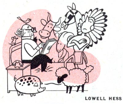
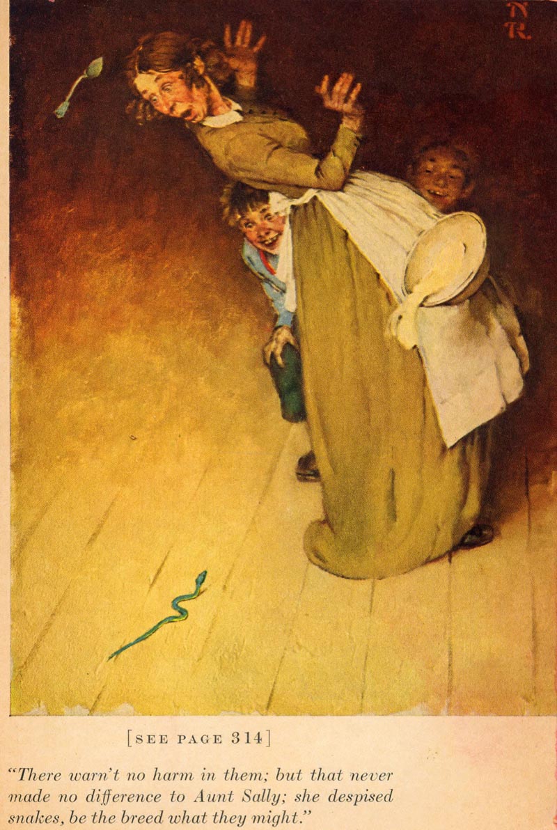
* TI list member Tom Watson returns this week to continue the series of posts he began this past summer, analyzing Norman Rockwell's illustrations for Mark Twain's Tom Sawyer and Huckleberry Finn - thanks Tom!

Four years after Norman Rockwell illustrated “The Adventures of Tom Sawyer” written by Mark Twain, he illustrated “The Adventures of Huckleberry Finn”, also written by Mark Twain and published by The Heritage Press in 1940. The following scans are directly from the pages of my original edition collection. I grew up seeing reproductions of Norman Rockwell illustrations in magazine ads, story illustrations, calendars, posters, a book on his life, both Mark Twain books and of course his Saturday Evening Post covers. His drawings and paintings were the major source of inspiration and influence on my early desire to be an illustrator. The illustrations below represent some of my favorite Norman Rockwell illustrations, and this is how I see them.
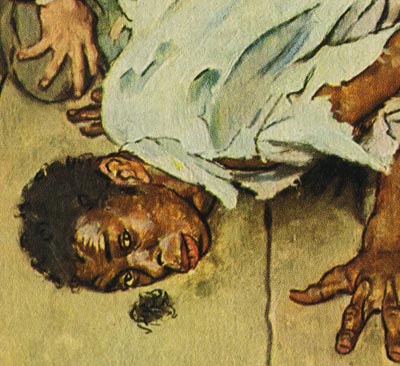
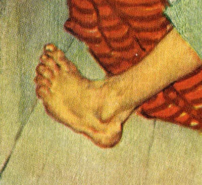

Illustration #1.

Norman Rockwell often used a more or less monochromatic color scheme (one major overall tone) for both his Tom Sawyer and Huckleberry Finn illustrations, adding accents of bright color in key locations.. and this illustration is no exception. Using oil paint on canvas, it appears Rockwell first stained his canvas with a yellow ochre or perhaps a raw sienna tone, letting it show through his thick over painting.. especially along the bottom edge. Establishing the overall warm amber and golden tones of the finished painting. He then allowed his brushstrokes to show where he loosely applied thicker paint. He resolved the character and enough detail of the two figures, but let the rest of the painting be more loose and suggestive.


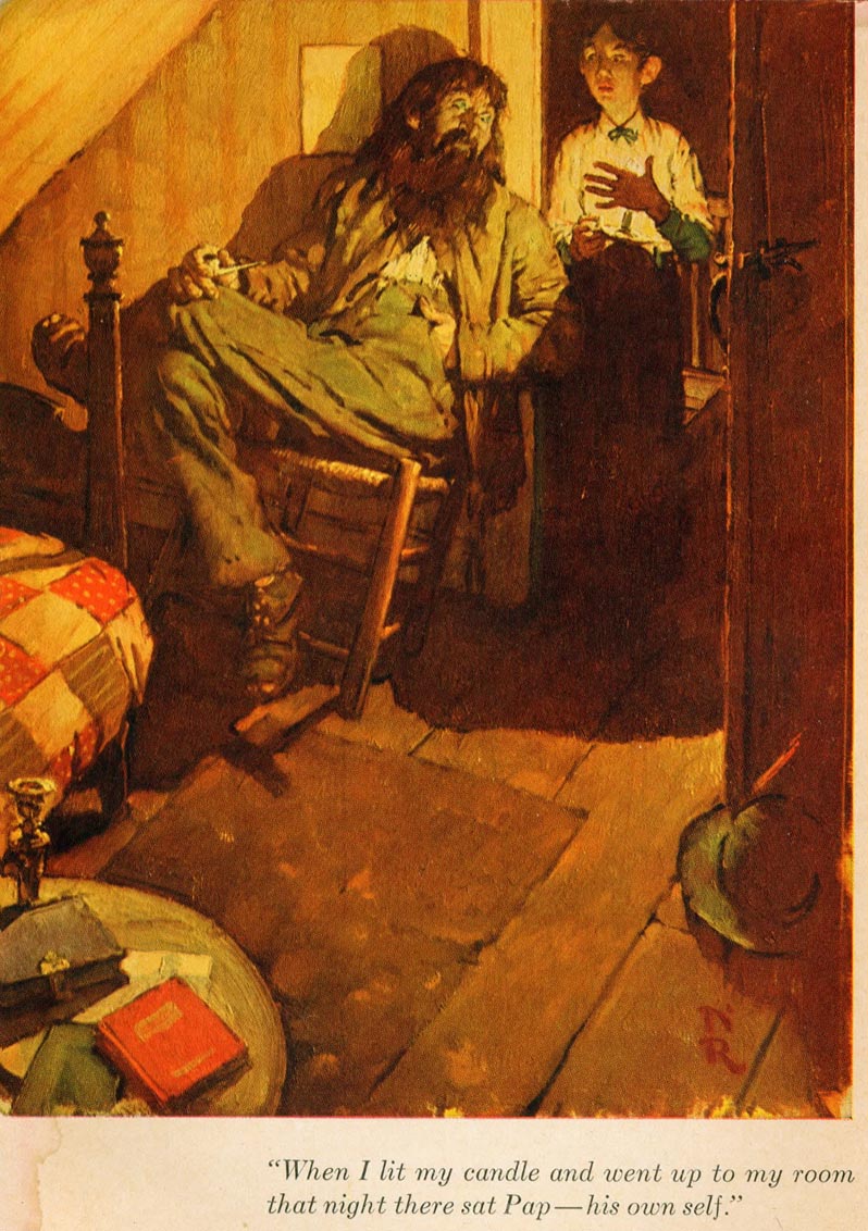
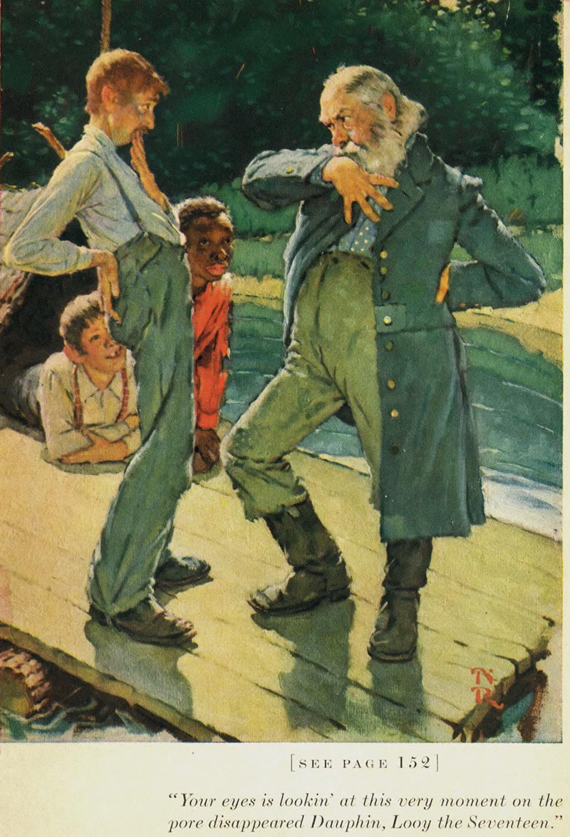
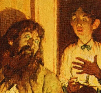
Huck tentatively enters his own bedroom, as his estranged father arrogantly awaits Huck’s arrival in a “confrontational mood”.


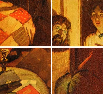
Rockwell shows a strong sense of depth through his composition.. the bed spread, the carpet and the floor boards lead our eye toward the two figures. The door and hat on the floor stop our eye on the right side, and the bedpost and diagonal ceiling stop our eye on the left side, directing our attention to the two figures. Rockwell was very clever at using props that greatly helped develop the composition and color accents, as well as create authenticity and interest.. like the round table with books, paper and candlestick, and the hand quilted bedspread. The hat on the floor and the book were mentioned in the story, but Rockwell chose where they would be placed to in the composition. Rockwell mentioned in his book “My Adventures As An Illustrator”, that illustrating Mark Twain’s stories were relatively easy for him, because Twain was very descriptive. This well connected and strongly organized composition leads us from the red book and the table top, up the candle holder to the bedspread, up the bed post and over to Huck’s father, who is also visually connected to Huck. We then follow the door down to the hat, which has a hint of a red feather (another color accent) in the band.


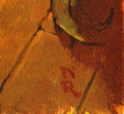
And then, almost as an exclamation point, Rockwell signs his initials below the hat, ending a nearly complete circle.


Every element of the painting, including the shadow and light pattern from the candle, is carefully planned and executed to create a strong visual story telling painting. Even the white framed rectangle on the wall helps contain Huck’s father’s head. The attitude and character of his father, slouched in the chair in a casual manner, is typical of Rockwell’s attention to attitude and gesture of his subjects. Rockwell always fleshed out the essence of the reality of his characters.
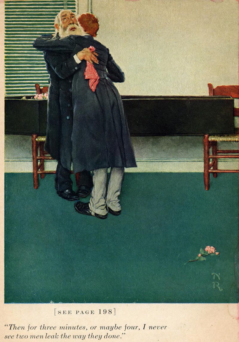
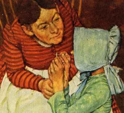

Illustration #2
.
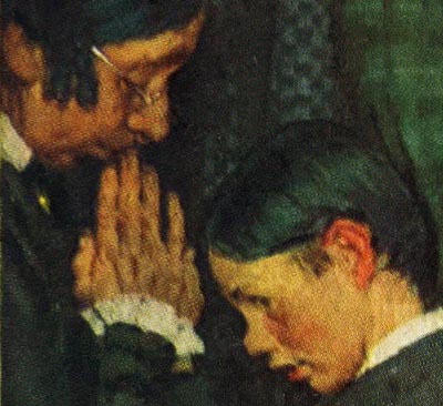
Almost every element and line in this composition is vertical, emphasizing the vertical direction of the page. With a similar approach as the first illustration, we look into a door opening at the center of interest. The light colored door on the left, and the door frame with a small portion of the wall on the right, isolate the two figures in contrasting dark tones inside the closet.


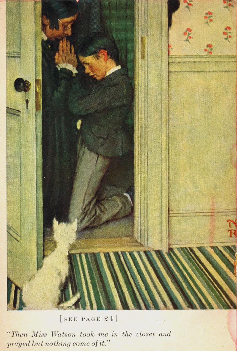
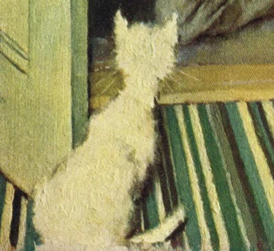
Rockwell effectively adds a white cat, curiously peering into the closet, with his tail curled around and pointing back towards the subject. He used dogs and cats, not only to add authenticity and charm, but as important design elements. The cat also compliments the profiles of the two figures, and gives an added touch of humor to the scene.


Rockwell had a motive for every choice he made in his illustrations, and applied intellectual logic to create his well thought out compositions. The strong diagonal lines in the carpet relieve the vertical and horizontal lines of the door, molding and wall. And, also helps direct our eye toward the two figures in the closet. The play of geometric (architectural straight lines) and organic (curved freeform) shapes are quite evident in this illustration. Notice the subtle decorative wallpaper design.


Again, he used a simple limited color scheme, blues and greens with a few soft complimentary red accents. A touch of white describes Huck’s shirt, and to a lesser degree his socks, and the woman’s sleeve and collar.


A life long student of the art of picture making, Rockwell used many effects he studied from the great old masters in museums. After the 1940’s, he was accused by some critics and artists alike, as being old fashioned and not “inventive” or “creative enough”. I smile when I witness the immense popularity, understanding and appreciation of his work today.. while virtually all those early critics have vanished with little trace.

* Tom Watson is a retired West Coast illustrator, art director and educator. He has been a frequent contributor to Today's Inspiration and his storyboard work for film was a subject of a post on my other blog, Storyboard Central.

This week's images are © MBI/Heritage Press, 1940 and are used with the permission of the Norman Rockwell Museum. This past summer the museum featured the grand opening of a traveling exhibition, American Chronicles: The Art of Norman Rockwell.

Stephanie Plunkett, Chief Curator of the Museum would like readers to know that the Museum does travel an exhibition of signed lithographic prints from the Tom and Huck series to other museums and cultural centers. Stephanie writes, "We do have two upcoming bookings for that exhibition that are listed below, so perhaps your readers will have the opportunity to visit if they live in the region."

Here is the information about the traveling exhibition:

Norman Rockwell's Tom Sawyer and Huckleberry Finn

Nova Southeastern University, Fort Lauderdale-Davie, Florida
November 14, 2009 through January 29, 2010

Averitt Center for the Arts, Statesboro, Georgia
March 12, 2010 through May 7, 2010


"It also might be interesting to note that the original paintings for the series are in the collection of the Mark Twain Museum in Hannibal, Missouri. The originals are beautiful. A study from the series will be on view in our upcoming exhibition, Norman Rockwell: Behind the Camera, which opens on November 7, 2009."