I made a mistake in my previous entry about Coles Phillips. He did work for Janzten in 1921, but the example that’s been printed in several places (including twice in Michael Schau’s monograph “All American Girl”) is so bland and unexciting that I became blind to its existence.
A more accurate statement would be that Phillips illustration for Janzten wasn’t the risky, envelope-pushing illustrations elsewhere that so many artists later remembered. There’s no mistake there. Phillips was quite the influence to those who came later, as was Barclay and Petty and all the rest who would work for Janzten, including Hawley.
What earlier artists were influences and subsequently informed another artist’s work is fascinating stuff to all of us, but many times frustrating because how it shows up later can run the gamut from the plainly obvious to the absolutely invisible.
And there’s no mistake that then Hawley was in mid stride and full bloom, early 50s, he was unique.
But that’s not the way he started. The earliest examples of Hawley I’ve seen (before 1940) are very cartoony, more so than any other mainstream magazine illustrator of the time where naturalism ruled, closer to children’s book illustration or perhaps comic strips, than it was to the few cartoon-style mass market illustrators of the era like Hurst (probably the most pronounced and who took a whole decade to loosen up), Gilbert Bundy (who came from humor magazine cartoons) or Frederic Varady (a former European fashion illustrator). Hawley did cartoon-styled propaganda that is not out of place with what the Disney and Warner animators were producing for the war effort. Where that came from in Hawley’s background and training is anybody’s guess.
Yet once he works for Janzten, the roots are more obvious and probably required. This 1943 Janzten ad for Hawley, like the previous billboard, the girl is so stylized in a Petty-Vargas manner she is almost unrecognizable as his work; as before, the guy is much easier to identify. Note too the slug signature rather than the personalized script signature he would use later on

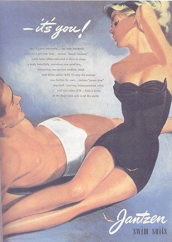
Janzten had other illustrators work different aspects of their promotions. Post WWII, it often picked big name realistic illustrators like Parker and Sundblom to do the road side billboards in the suburbs and used fashion illustrators when the ads appeared in high fashion magazines like Vogue and Harper’s Bazaar. It seems Hawley became the bread and butter guy, the one whose work appeared in the mass market,
 the general interest magazines with the largest circulation of both men and women and sales catalogs because his work could cover so many bases. The Petty influence, the geometric construction of the figure and streamlined composition, the pronounced foreshortening of limbs, the face abstracted with closed eyes,
 generic wide open smiles, stayed with Hawley throughout his prime period, especially noticeable in the ads which stressed the detailing of the suit itself. I think some J.C. Leyendecker is there too. In ads where you can see the underpainting, you can see Hawley using Leyendecker’s widely admired “open vibrant shadows” to model the figure.
Hawley could do the cartoons too, the simple boy-girl gags that Hurst, Hawley’s immediate predecessor, had done for Janzten. As Hawley’s tenure at Janzten grew, and the need for fresh ideas arose, you see him doing set ups that went further and further into fantasy and whimsy than Hurst had ever attempted—from simply guys watching a single girl approach or lie on a blanket to scenes of swimsuit naiads adorning buoys or riding dolphins, to catching a mermaid or seeing a domesticated mermaid set out bathing trunks to dry on a clothesline.
His last period at Janzten, say 1955 to 1959 (I’ve never seen a ’60 ad myself), I think of as being his most “Hawley-stylized”—large open eyes
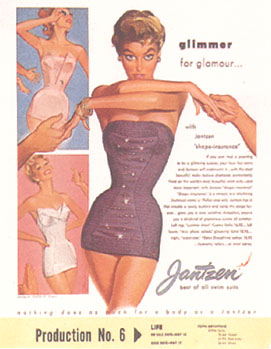 with most of the pupil and iris visible, dark eyebrows and lashes that sell the expression, simple, solid forms with overlapping, exaggerated posing and outlines but only the simplest articulation to indicate bends and joints.
The 60s would be different for other reasons.
Wow. This is great. Laying out a timeline helps me learn how he evolved better. It's not enough to just be able to see the differences and say, "oh yeah here he was just starting out and his strokes with stiff and unsure...and then he loosened up here."
ReplyDeleteThanks, this has a been a lotta fun!
=s=
I think there is a definite streak of Enoch Bolles that runs through some of Hawley's work, especially the black & white Jantzen illos of women in outrageous poses (which certainly describes Bolles). The illo of the girl with a big hat looks a lot like some of his Breezy Stories and Film Fun covers from the late 30s and early 40s. It seems as if he is borrowing freely from a variety of sources in this work.
ReplyDeleteHhhmmm, that's an interesting thought, jack. I wonder if Hawley kept some Bolles art handy for inspiration? I never made that connection, because Hawley's women are so wispy, waifish while Bolles' girls are always so much more cherubic. But I do see what you mean about the placement on a stark white background.
ReplyDelete