Friday, March 31, 2006

Ward's Words


I'm so pleased to have Mighty Ward Jenkins guest writing as we wrap up this week's look at Ads with 50's Storybook Styles.

But wait, did I say "wrap up"? As luck should have it, Dan Goodsell who started it all on monday graciously turned in an extra write-up for a late-breaking ad I felt was too perfect for him. Tune in this weekend for a "bonus track" at Today's Inspiration!

My biggest bearhug to all the kool kats who helped me out this week: Dan, Eric, Drazen, Steve and Ward - many thanks for a job very well done!

Art for the Domestic Goddess

I'd like to start off by giving Leif a big hearty thank you for allowing me offer my humble two cents to this week's Today's Inspiration theme. I think that this is a great idea and would love to see Leif do this more often. Like the others before me, I am in no way a true "historian" when it comes to this sort of thing. I simply love the illustrations and artwork from the mid-century era and love to talk about it. So, here goes....

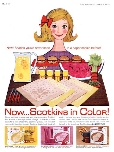
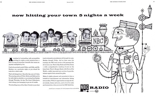
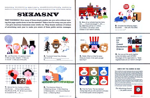
I collect quirky ephemera from the 40's, 50's, and 60's. The more quirky, the better. One of my favorite things to collect are cookbooks, booklets, pamphlets, and any sort of paper item that is home and kitchen related that showcases fun and jovial illustrations. Most of these illustrations are small, but too the point -- simply adding illustrative garnish to what are usually dull and boring subjects: listings of ingredients and measurements for a multitude of recipes, or step-by-step guides for mundane household errands. And with what could be a synergistic element with the cookbooks and such, ads and articles in women's and family magazines often employed these same type of illustrations.

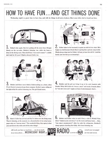
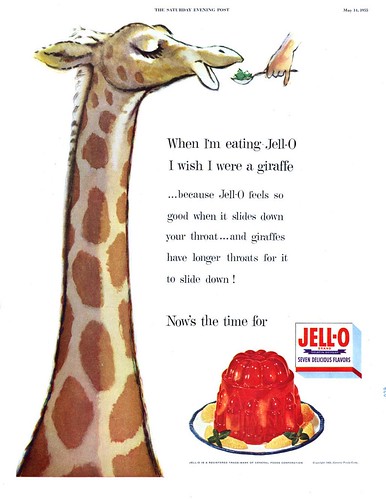
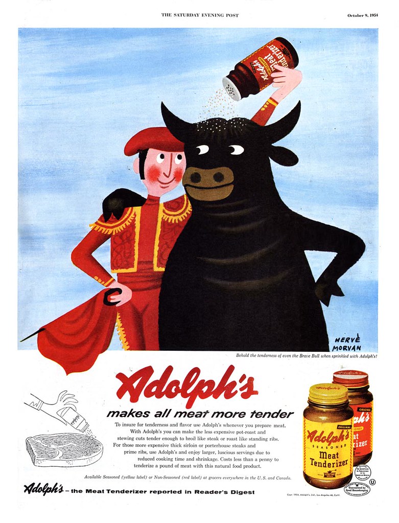
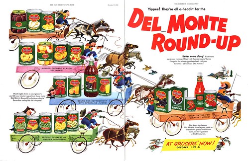
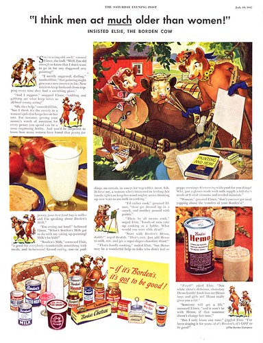
It's so easy to look back on all this and find these ads and cookbooks very amusing because of the naive and simplistic nature that the artwork
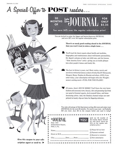
seemed to be trying to convey for that time. Every woman (and the occasional male chef) is grinning from ear to ear, completely full of gusto and glee and oh so very happy to be slaving away for their brood. And to top it off, every woman is wearing her favorite tea length dress while immersed with said slaving. Something to be said for style, I guess.
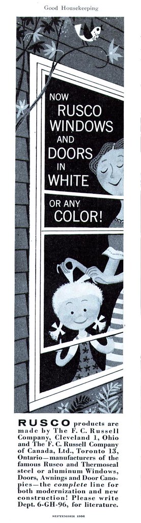
Looking back, it almost seems like subtle propaganda with ad agencies and household product manufacturers trying to make the "typical" housewife job seem easier than it really was. To take her mind off the fact that it's WORK that she's doing and that this is her destiny -- she should be HAPPY and filled with JOY that she's doing all this for her dear ol' hubby and munchkins. (A thankless job, no less.) Propagating an idealized home life with no worries, no stains, no odors to worry about.
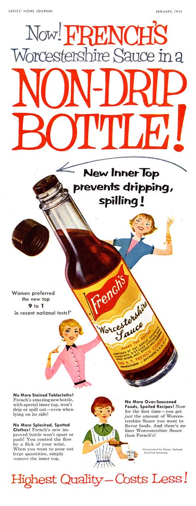
There are some great examples here with the simple shapes, stylized characters, and childbook-like gaiety in all the poses and colors (even the black and white ads). But why on earth feature storybook illustrative styles into kitchen and home advertisements? Why, to lure in the next generation, of course. Making cooking and cleaning seem fun was a way to pull little Jane into the mix -- hook, line and sinker. Start 'em out early, I guess.

You can see some of my own ephemera collection in my Flickr sets: Fun Ephemera, and 1956 Home & Garden Decorating Book. Also, if you're into mid-century children's book illustrators, be sure to stop on by The Retro Kid. It's a swell thing.

Thursday, March 30, 2006

More Ads with 50's Storybook Styles


I've uploaded another batch of Ads w/ 50's Storybook Styles and another guest writer , illustrator Steve Mack, shares his thoughts with us as we see a very concrete example of this week's topic: an ad drawn by reknowned 50's children's book illustrator J.P. Miller...

Mack on Miller


First a thank you to Leif for asking me to contribute a short write up on an artist I admire so much. Also, Thanks to the previous posters for enlightening me so far this week.

Above is the wonderful illustrated work of John Parr Miller. J.P. Miller has heavily influenced my style of illustration. I think it’s easy to see the charm of his work because his work is all about simple “charm”. He is a master designer, illustrator and craftsman. Every shape is considered (just look at that wonderful bucket) and every color is bright and powerful. To me his style is the benchmark of the Little Golden Book style. Though his illustrations seem deceptively simple it is never easy to boil down a subject. Ask any illustrator who has attempted this style. It involves refining and more refining to achieve that “simple” structure. This apparently did not come easy to J.P. Miller. He was a perfectionist with his work. His books were often turned in late past deadline so that he could achieve the level of quality he expected of himself. Some of his Golden Books are still in publication today and this serves as a testament to the long hours he spent “getting it right” and proving great illustrated design is timeless.

John Parr Miller 1913-2004

J.P. Miller links:

Cartoon Brew – A definitive write up On J.P. Miller from his Brother
Fun All Around – Eric Sturdevant’s collection and tributes
Jingle Bells A Golden Book by J.P. Miller – Some scans of mine from a cherished J.P. Miller Golden Book

Wednesday, March 29, 2006

J-E-L-L-O!

Sensing their target market, Jello ran an extensive ad campaign during the mid-fifties employing this pleasing children's storybook style.
I've managed to accumulate quite a raft of those ads and have added them to my Ads w/ 50's Storybook Styles Flickr set. A second group with a slightly different but still related theme will be added tomorrow.

Meanwhile, Drazen Kozjan enlightens us about another illustrator directly below...

Kozjan on Morvan


Leif asked for my thoughts on some images that he sent me and that I was inspired by and I chose this image by French artist and designer Herve Morvan (1917-1980).

Its too bad Morvan didn't do lots of children's books because I would love to have them on my shelves, and I'd love to read the story of this Matador and Bull, but he did create a large body of movie and advertising posters to enjoy.
I'm a big fan of Morvan's . I love the clarity of his designs, the uncluttered compositions , the subtle use of texture and the unique sense of humour that comes through in his images. Not to mention the simple, sophisticated, bright colours that are always inventively used. Though aspects of my own work is influenced more by other artists , I always look at work like this to remind me how powerful (and difficult) it is to make interesting and simple images that still have a warmth
and originality to them. No wasted lines here.

A large monograph was published in France in 1997 called Herve
Morvan-Affishiste.

I've included some various images on my blog here

Tuesday, March 28, 2006

All-Around Fun with Eric

I've added seven more scans to the new Ads w/ 50's Storybook Styles Flickr set.
As we continue with this week's theme, illustrator Eric Sturdevant shares his insight on the subject with us...

The KISS Principle


I'd first like to thank Leif for inviting me to participate in this week's theme and for exposing me to the inspiring work of Saul Mandel. For the record, I don't consider myself a "50's storybook illustration" authority. I'm definitely more of a fan than an expert. But, not wanting to be left out...

Saul Mandel: The KISS Principle

Keep It Simple, Stupid...

Design and simplicity are emphasized in these playful illustrations from Saul Mandel. The liveliness in his design is carried out with variety and expressiveness in the shapes and minimal line work, while maintaining consistency of style. No easy task. In the hands of a lesser artist, this approach could come off as cold, dry, and boring. But not here. These exude warmth and humor, and in a deceptively simple way, they convey their message.

In a similar vein to Mandel, some children's book illustrators that I've featured on flickr and at my blog are Aliki, Janet LeSalle, and Abner Graboff.

Enjoy!

Eric

Monday, March 27, 2006

Ads with 50's Storybook Styles

This weekend my Ads with Cartoon Elements Flickr set passed the 10,000 views mark.
I still can't get over how phenomenally well received that set of images has been. With that in mind, I decided to create a related set, Ads with 50's Storybook Styles, to accomodate the many beautiful examples I've found that don't quite fit the first set. I'll be adding about half a dozen or so images to it each day this week.

As much as I love this type of illustration, there are others who are far more authoritative about it. I thought it might be fun to ask some of those folks to guest write this week's posts - and they kindly obliged! Today, 50's packaging art historian and Mr. Toast creator, Dan Goodsell, takes the helm. His post begins immediately below...

At Grocers' Now!


The 1950's were a time of growth in the US & Canada as
grocery stores become supermarkets. To fill up those
supermarket shelves, companies like Del Monte had to
constantly expand their product line. With this
expansion there came a need to expand the marketing of
these products
. So the advertising agencies would
create campaigns like the "Del Monte Round Up". This
Round Up would occur in both print ads and in large
in-store promotional banners and signs
.

This campaign employed an illustration style that has
it's roots in children's storybooks and Disney
animated films. It was not just simple cartoon line
art, but instead fully painted art with bold colors
and shaded dimensional forms. To accentuate it even
further the products were rendered in a photorealistic
style. This makes for a piece of illustration that
just stampedes off the page.

As a lover of food advertising art, I find this type
of work to the be the beginning of the golden age of
advertising that lasted into the early 1970's. But
these guys started in it all the 1950's with a body of
work that continues to inspire and amaze.

Saturday, March 25, 2006

Briggs Addendum

While flipping through some old Saturday Evening Post mags today I came across this great little anecdote about Austin Briggs at the back of the May 9, 1953 issue:

A short piece in the "Keeping Posted" column about the process by which the artist arrived at the final composition for his story illustration therein, and one of his pencil roughs - apparently sketched on location, so to speak.

The Saturday Evening Post often ran these entertaining little "look behind the scenes" articles about their artists...

Its pretty fascinating to see the extent to which Briggs went to achieve the desired effect. If you'd like to read this short article, you can find a legible sized version here. Just click on the "All Sizes" tab.

Friday, March 24, 2006

Briggs Condensed

Briggs31.jpg
Like a lot of other illustrators, Austin Briggs did a great many illustrations for Reader's Digest Condensed Books. This wealth of beautiful imagery might have escaped notice if not for the generousity of a Today's Inspiration contributor who wishes to remain anonymous. As well, Drazen Kozjan shares another Briggs article, this one from "Illustrating for the Saturday Evening Post" - thanks again, Drazen!

All this wonderful stuff is now available at larger sizes in my Austin Briggs Flickr set.

Finally, some readers may not know that for a time during the 30's Austin Briggs was the artist of Alex Raymond's newspaper comicstrip, Flash Gordon. And speaking of Alex Raymond and Flash Gordon (how's that for a segué?), go take a look at David Apatoff's current post over at Illustration Art for a fascinating discourse entitled " THE BATTLE BETWEEN GOOD TASTE AND GOOD ART".

Thursday, March 23, 2006

Briggs, and Briggs alone.

Briggs24.jpgI'm way off schedule today and no time to post a proper write-up but my buddy Drazen Kozjan sent me a real gem yesterday:
A section from the book "22 famous painters and illustrators tell how they work" on Austin Briggs. Those pages are now uploaded and available in my Austin Briggs Flickr set for those who are interested. Just click on the "All Sizes" tab to see a version of each page large enough to read. The interview with Briggs is fascinating.

Many thanks, Drazen!

Wednesday, March 22, 2006

This,Then, Is the Story of a Crime


Crime and other "action drama" stories is where Austin Briggs really showed his chops. Unfortunately, between his many advertising jobs and his many editorial assignments featuring regular folks doing regular thing, Briggs' action pieces are not as plentiful as one would wish for.

That's why this story from Good Housekeeping both pleases and disappoints: The opener has that wonderful over-the-top dramatic quality, worthy of a hard boiled detective novel. But the large follow up seems almost pedestrian by comparison. Considering the subject matter, a police take down, the middle horizon composition with all subjects pretty much full figure, middle distance, on the same plain, could have been so much more exciting. Instead it comes off rather like a newpaper photo of a police arrest, lacking in dramatic staging.

* A reminder to new readers that these images and many others by Briggs can be seen at larger sizes in my Austin Briggs Flickr set.

Tuesday, March 21, 2006

Briggs and the Big Brass Bed


There's that brass bed again. At least Briggs can claim to have thought of this composition first. Perhaps his was even the piece that inspired the others who came to the big brass bed after him...

I decided to dig around and see if I had the issue of Good Housekeeping which immediately followed yesterday's - to see if Good Housekeeping had received any letters of outrage from its less open-minded readers. Remember, that illustration appeared two years prior to the 1953 release of the film "From Here to Eternity". From what I understand all that rolling around in the surf between Burt Lancaster and Deborah Kerr had America's parental units in quite a lather... and as best as I can remember there hadn't been any breast-nuzzling in that scene. But no, it turns out Good Housekeeping did not print letters to the editor.

They did however have this beautiful (if rather more sedate) line-and-tone illustration by Briggs.

Monday, March 20, 2006

Austin Briggs (1909-1973)


What the heck was up with Austin Briggs in 1951?! Not only does he paints a naked male butt for Cosmo, but he takes "the clinch" romance scenario way past "torrid" and all the way up the scale to "erotic". This is what one might call "pushing the envelope".

Just take a look at this piece (take a long lingering look) and marvel at how thoroughly successful and accomplished it is in every way - Briggs has rendered a true masterpiece evoking a sense of true passion that must have taken the breath away from every woman who flipped open the magazine and set eyes upon it back in 1951.

I think its as powerful an image today as it was 55 years ago.

Saturday, March 18, 2006

Flickr has flaws

As much as I love my Flickr account, its not without its complications: I discovered this past week what it means to be NIPSA'd.

There are a bunch of great folks on Flickr who are scanning and sharing vintage ephemera with the hopes of keeping all these long forgotten visuals from being lost forever. Flickr is a great site for storing and organizing and sharing all this stuff but in its current incarnation Flickr is not intended for anything but photos.

This policy means that unless you are a member of a pool like the one I co-administer, Mid-Century in Print, you cannot see any of the images the NIPSA'd contributors have added to the pool. In my case, the nearly 600 images I have contributed to Mid-Cent are invisible to you if you have not joined the pool.

You can still see these images in my photostream but then you're not seeing all the images contributed by others unless you hop over to the pool - or to the other contributors photostreams.

This is probably starting to make your head spin!

Until Flickr Central comes up with a new policy this is just the way its going to be. So if you want to see everything in one place, open a free Flickr account and become a member of Mid-Century in Print!

The Boingboing Effect

Whew! It was a crazy week here at Today's Inspiration. We were the lucky recipients of two mentions on boingboing.net: first for my Flickr set of Ads with Cartoon Elements, then a day later for this past week's look at "Nekkid Ladies" as it was described.

What's it mean to get boingboinged? Well, since beginning the Today's Inspiration blog, a little over 14,000 visitors have dropped by. An average of 120 have been loyal daily readers. In the two days after being linked by boingboing over 15,000 people clicked through to check us out - more than the grand total of all visits in the previous 4 months! Since then about 1,600 people came by for another look on the following day.

How many will stay with us is yet to be seen, but if even only a handful remain, that would be great. If you are a new reader, or if you went to the extra effort of joining the Today's Inspiration mailing list, welcome!

So far we know you like cartoons and naked ladies... but the 50's offered a lot more in the way of beautiful illustration. Please feel free to email me with your requests for topics or specific classic illustrators you'd like to see featured. And I encourage everyone to post your comments. Whether comical or critical, your feedback is important to me - I'd love to know what you think about Today's Inspiration!

Friday, March 17, 2006

One for the ladies


...and for at least some of the gentlemen as well, no doubt.

I don't have a very large sampling of Cosmopolitan magazines from the 50's so I couldn't say if an early moon rising was a regular occurance in those pages but I have to say this is the only example I've ever seen of this phenomenon.

Leave it to Cosmo art editor Frank Eltonhead to choose illustrator Austin Briggs to render the bare essentials. No other illustrator of the time could better present Cosmo's readers with such a manly man. Its fun to imagine what sort of image might have emerged from Cosmo regular Jon Whitcomb's paint brush by comparison!

With this image we conclude our look at the naked 50's - but this piece by Briggs provides the perfect segue to introduce next week's topic: Austin Briggs - and if you think today's illustration was risqué, wait 'til you see what I've got in store for you on Monday!

Thursday, March 16, 2006

Parker au Natural

Al Parker was no stranger to illustrating the nude female form. He's probably my favourite illustrator from the 50's... but in my opinion his naked ladies leave something to be desired.


Where Coby Whitmore or Mike Ludlow are at their best depicting female sensuality, Parker seems incapable of idealizing the fairer sex. His interpretation always strikes me as being just a bit too firmly rooted in reality.

But maybe I'm being unfairly critical. Other artists excelled at painting women; "the kind men like". Keeping in mind that Parker's nudes appeared in women's magazines, perhaps his more realistic representation of the female form made his women more relateable for readers of those magazine.

Al Parker's take on the female body might be considered a more progressive interpretation because he did not 'glamourize' his women. Did Parker in fact excel at painting women; "the kind women like"?

Wednesday, March 15, 2006

Sunbathing...Bad Idea!

Did women of the 40's and 50's not realize that stripping in the bushes for a little sun-bathing or a skinny-dip would lead to disaster? Men are scoundrels and will think nothing of stealing your clothes so they can oggle and laugh.

Those cads!

Not only that but artists seemed to be lurking in every shady copse, waiting for comely young things to disrobe so they could "paint their portrait". James R. Bingham wasn't alone in this pursuit - Coby Whitmore was at it, and even up here in Canada, our own Bruce Johnson was out hiking through the bush, doing some not-so-still life drawing.

And here I thought streaking started in the 70's!

Tuesday, March 14, 2006

Aah, the fluffy white bath towel...


...saviour of many a "lightly-clad" young lady back in 1953 - at least that was the case in the pages of the Saturday Evening Post.

Gentlemen seemed always to be dropping in unexpectedly back then, just when a girl was stepping out of the shower or lounging around in the "all-together". Very disconserting. I asked yesterday, what must the readers have thought of all this lascivious behaviour? Surely the editors and art directors were risking raising the ire of their audience in the less cosmopolitan regions of the country.

Check out these letters to the editor regarding a Coby Whitmore illustration of a bikini-clad girl from the late 50's. And consider that the first letter comes from Scarsdale, New York!

Its heartening to see the editor's cheeky response doesn't back down one bit. Hooray for the defenders of the lightly-clad ladies!

Sunday, March 12, 2006

This is NOT your mother's women's magazine


Oh, wait a minute... yes it is! I have a confession to make: back in the early seventies when I was ten or eleven, I might have snuck the occasional peek at my mom's Cosmopolitan magazines.

There were ladies in their underwear in there!

Of course by 1974 the sexual revolution was well under way. Halter tops were getting shorter and mustaches were getting longer, people were streaking and Playboy bunny logos were multiplying like, well, bunnies on t-shirts, keychains and even mudflaps. Nudity was not exactly a big deal. But I had regular access to that great teacher of popular cultural history, the television rerun, and therefore had a very thorough understanding of what life had been like for mankind during the decades before my birth: from Ward and June to Rob and Laura to Fred and Wilma, it was pretty clear that men and women slept in separate beds, never went to the bathroom and kept their clothes on 24 hours a day.

Or did they?

Did young boys of the forties and fifties ever flip through their mom's icky ladies magazines and find themselves suddenly confronted by something like this? Just what the heck were those straight-laced, God-fearin' folks in America's heartland looking at in filthy rags like Good Housekeeping and The Saturday Evening Post?

This week we'll, ahem, take a closer look.

Saturday, March 11, 2006

A Weekend Treat

McGinnis28.jpg
Mike Vosburg has generously provided us with this wonderful weekend treat: a nice selection of pencil sketches by Robert McGinnis! I'm still hoping to hear back from Mike on how he came by these sketches... his email said he got them from the artist himself. Sounds like an interesting story. For now, you can check out the whole batch in my Robert McGinnis Flickr set. Many thanks, Mike!

Friday, March 10, 2006

James Hill


This week we've been looking at the American farming tradition and since Canada is part of North America, I think I can validly include this piece by one of my country's greatest 20th century illustrators; James Hill.

Its thanks to my friend, Dan Milligan, that I had the opportunity to spend a few hours over lunch one day several years ago with Jimmy Hill. Dan clearly had tremendous respect and admiration for his former teacher at The Ontario College of Art ( now OCAD ) and I'll always be grateful to him for inviting me along to experience James Hill first hand. Hill had become a legend in the Canadian graphic arts community many years earlier, not only for his tremendous talent, his success in that mecca of commercial art, New York, but also for his many antics and his fiery temper.

That day he was in great spirits, having come through a long, difficult and mostly self-inflicted dark period. Lunch was filled with laughter and light, and many outrageous anecdotes from Jimmy's long and illustrious career. I'll always remember that day with great fondness.

You can see a small sample of Hill's work in my James Hill Flickr set but I especially recommend reading the article on the artist here.

Thursday, March 09, 2006

M Ramus' Big World


This ad extolling the virtues of farm mechanization suits the time in which it appeared perfectly, and the choice of M Ramus to illustrate this concept should have been the ideal one... but fails to deliver to the same degree that his Shell ads do. Let's hope it was due to client interference, and not the fault of the illustrator. I have only a few examples of M Ramus' work, but his pleasing style and the sense of scale he brought to his compositions always caught my eye.

Ramus is another one of those illustrators who has left no trace of a biography, only a small body of work for advertising clients during the 50's - and this curious variation of style: throughout the 50's Ramus showed his cartoony side with a series of line illustrations for the Saturday Evening Post that are entirely unlike his painterly advertising style.

As well, a Google Image Search turned up this excellent war-time poster for The Women's Army Corps.

Tuesday, March 07, 2006

Pigs Are Funny

In the realm of picture-making, certain rules have emerged over time and from accumulated experience. One of them is this: if you want to make an otherwise ordinary scene amusing, add a pig. Why? Because pigs are funny. Why? Nobody knows - they just are.
Compare the ad above by H Miller with the one yesterday by Ben Prins.

If the lady in the Prins ad had been trying to corral a pig instead of some loose chickens, you know you would have smiled the minute you set eyes on it.

Another rule of picture-making: The only thing funnier than just a pig in a scene is someone falling down in a pig sty. Why? You know why.

Ben Kimberly Prins (1904-1980)


Back in 1945, still a few years before America's mass exodus from its decaying urban centres into freshly minted suburbs, companies like Barret tried to appeal to the country's rural and small town population:

"America's farm-to-market network of highways needs attention - and needs it badly."

The message was clear; farmers needed good roads to ensure the country could eat. By 1960, with urban sprawl well under way and America now deeply, madly in love with the car, the paving industry had abandoned the farm to chase after the commuter class. See this ad, illustrated by Robert Fawcett or this one by Bill Fleming as examples.

Illustrator Ben Kimberly Prins was six years into his career as a freelancer when he did the Barret ad above. He had previously been an art director at BBDO, after an extensive education at Pratt, The Art Student's League and The Grand Central School of Art. Among his teachers were George Bridgman and Dean Cornwell. The Barret ad looks to be heavily referenced from photography and is really well done, but this other piece by Prins, reminding me a bit of the style of children's book illustrator and author Robert McCloskey, captures the character of small town American archetypes more effectively.

A member of The Society of Illustrators and The Art Director's Club, Prins enjoyed a long career illustrating covers and features as well as advertising for many major magazines.

Monday, March 06, 2006

The American Farming Tradition


Farming motifs were very popular in magazines in the years after WWII. There are three illustrations in the July 19, 1947 issue of Saturday Evening Post of dairy farming alone.

I expect that's because rural and small-town America made up a very large percentage of magazine readers in those days. In his excellent article on Bernie Fuchs in the current issue of Illustration, author David Apatoff provides us with this anecdote about the illustrator Robert Fawcett:

'...Fawcett used to scold his fellow illustrators about their responsibility to audiences in small towns across the country, asserting "we represent the only view of art and beauty that millions of people get to see."'

Clearly, the editors and publishers understood that point - as did their advertisers.
From covers like this one by John Atherton, to ads for sparkplugs, the idealized American farming tradition was regularly and well represented. This week we'll take a look at how illustrators of the day interpreted that heritage.