Thursday, February 28, 2008

The Incursion of the Avant-garde: A Philosophical Rift Begins

Some truly thought-provoking comments this week. If you haven't already done so, I encourage you to go back to the previous posts and read them. The discussion going on there reminded me of an incident from early on in my career...


My friend and fellow in-house storyboard artist at O&M Toronto, Dan Milligan, had been asked by one of the AD's at the agency who also taught at OCAD to substitute teach her interpretive illustration class for a few weeks while she was out of the country. Because it was a large group, the AD had also asked her friend, Anita Kunz, to co-teach the class with Dan.

But when Dan and Anita presented themselves to the students for the first time, and it was suggested that half the group go with Dan and the other half go with Anita, what should have been a simple arrangement turned into a huge conflict.


Apart from a tiny handful of students, almost everyone began stampeding towards Anita.

Now you could rationalize that given the choice between a (then) unknown storyboard artist or an award winning 'celebrity' illustrator you would have rushed Anita with the rest of the group. But personally, I think something else was going on (and the comments Dan endured from the students who grudgingly joined his group in the end confirm my suspicions):

Nobody could imagine enjoying an advertising assignment. They all wanted to express their unfettered creativity - and presumed that Anita's group, doing an editorial assignment, would allow for limitless personal expression.


I believe you can trace the origin of this philosophical rift to the work of the first generation of 'Avant-gardes'... and the early adopter art directors who hired them.

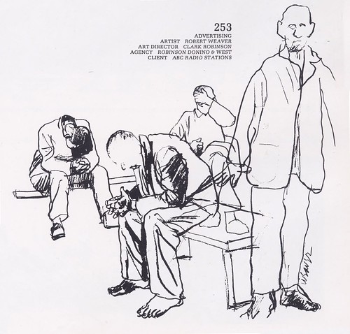
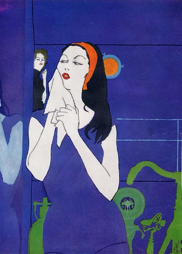
Yesterday David Apatoff commented that Robert Weaver was tormented by the fact that he had had to "compromise" his creative vision by working as a an illustrator - in essence, as a 'hired gun' - and that there were some fellow illustrators who were sympathetic to that perspective.


This way of looking at the profession seems to me to have been entirely alien to the previous generation of illustrators. From what I've read and from the conversations I've had with those who were there, the goal of just about every art student was to get paid to draw (not a bad prospect) and exert as much creative influence as was possible, considering the collaborative nature of the commercial art business.

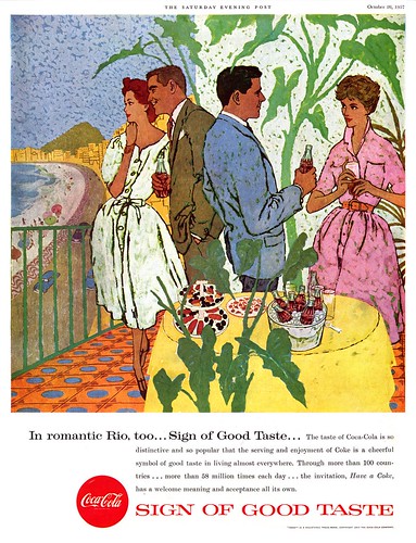
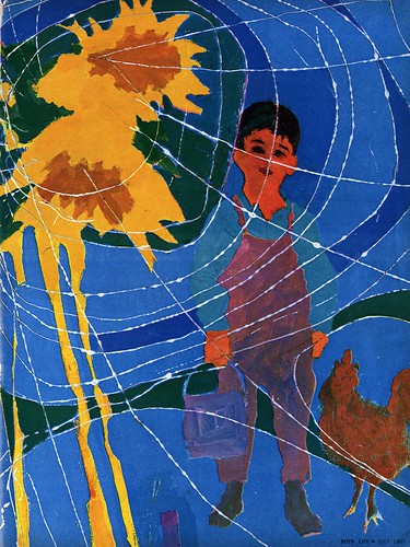
Looking at the editorial - or 'story' - art of the 50's, there is a general sense of traditional, acceptable, well-crafted restraint to the work - even when the subject matter is volatile. Even the most forward thinking illustrators like Al Parker seemed to have set certain parameters... certain boundaries that simply could not be crossed.


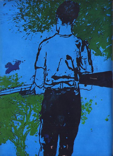
But beginning with the Avant-gardes - and I would say continuing to this very day, the idea of having total creative freedom (and I'm going to go out on a limb and suggest, even freedom from the constraints of craft) has been seen by a faction within the illustration business as a more acceptable - and even nobler - attitude than the traditional approach to commercial art.


I'm hardly in a position to judge. Like I said at the beginning of the week, I like a lot of the work we're looking at in these posts, even though I have to admit that I don't neccessarily understand it. But in regards to the broader public (and ultimately, we are talking about work produced for consumtion by the general public), no doubt some would say, "why would I want to pay somebody all that money for something my 5-year-old could draw?"

Is this were unfettered creativity leads? And if so, how does it make for viable commercial art?


This post will be continued... tomorrow.

Wednesday, February 27, 2008

The Incursion of the Avant-garde: Marvin Friedman

Perhaps by the time Marvin Friedman produced these pieces for Boys' Life magazine in 1969 the actual incursion of the avant-garde illustration movement had ended, and the idea of combining both commercial and fine art sensibilities in mainstream illustration was simply an accepted approach in any illustrator's repetoire.


Still, its a little surprising that artwork like this had penetrated far enough into the popular culture that it was considered entirely appropriate for an audience quite a bit less sophisticated than that of , say, Fortune magazine or Esquire.


Marvin Friedman, born in 1930, had studied under Henry C. Pitz at the Philadelphia Museum School of Art before beginning a career in illustration that found him working for most of the major magazines in what Walt Reed, in his book, "The Illustrator in America", calls "a direct, reportorial manner."


I would go one further and add, "with a heavy dose of vigorous, expressionistic influence".


To me, Friedman's work is a good example of the middle ground between the radical fringe of Robert Weaver and the commercial acceptability of Bernie Fuchs or Bob Peak.


Not to put too fine a point on it but there is enough literal interpretation in Friedman's work here to make it more palatable to a general audience than there is in Weaver's art. But it still isn't as pretty or idealized as the work that Fuchs and many others from this period were producing.


The thing all of these artist had in common was that they were exploring ways to differentiate their work from that of the photographers who were capturing an ever growing share of the assignments. With that in mind a piece like the one below, which might initially be dismissed as looking like nothing more than the early stages of an underpainting, takes on a new light.


And this is the great contribution of the avant-garde movement: this first wave set illustrators free to explore their potential, to create the most honest work they could make and, hopefully, to enlighten and inspire art directors to see the merit in illustration as a still viable communications tool.


There is a wonderful collection of Marvin Friedman's later work at Marvin Friedman.net
The images can be viewed at a nice large size so you can better appreciate their complexity and detail.

My Marvin Friedman Flickr set.

Tuesday, February 26, 2008

The Incursion of the Avant-garde: Robert Weaver

If Jack Potter's illustrations stand on the edge of the avant-garde, then Robert Weaver's work must surely represent the leap over the precipice.


Considering what was the typical, broadly accepted style of illustration in the 50's, its hard to imagine work like this finding a home in any major magazine of the day.

But Robert Weaver began his career in 1952 and according to his biography at the Norman Rockwell Museum, he "produced powerful illustrations for such noteworthy clients as Esquire, Fortune, Sports Illustrated, Life, Look, The New York Times and Columbia Records" during the 50's (as well as the 60's and 70's).


The article there confirms what I was saying yesterday about this new breed of illustrators having one foot in the commercial art studio and the other in the fine arts gallery when it states, "Weaver was among the first to wed fine art to applied illustration" and goes so far as to call him "the godfather of the new illustration."


Weaver taught at Syracuse University and the School of Visual Arts for some 30 years, and these illustrations from the January 1960 issue of Fortune magazine are likely a good example of what he meant when he told his students, "stop being conceptual and get back to looking at things, at the details...to observe light and color and pattern."


Personally, while I can honestly say I respect Robert Weaver's philosophy and can appreciate the artistic merit in his work, I can't really say I "like" a lot of what I've seen so far (which I admit is not that much). Yesterday, an anonymous reader left a comment that, when Bernie Fuchs came on the scene, many art directors considered his work representative of the transition in illustrative style. In his article on Fuchs in Illustration #15, David Apatoff talks about how some art directors would not use the artist because his experimental techniques looked "a little too modern."

But now that we can look back and see a broader view of the landscape from a greater distance, one has to wonder; if Bernie Fuchs encountered resistance because his work was too experimental, how in the world did the likes of Robert Weaver fit into the scene at all?

Fuchs' work seems so much more accessible and yes, likeable, to me. I would guess the general public felt the same way since he became so widely imitated and so successful.

Robert Weaver on the other hand created work that I find kind of impenetrable and difficult to like. Perhaps that was his intention. I really don't know...


In spite of my confusion I suspect that what Robert Weaver did by leaping into mid-air was show others that it could - and should be done. Someone must take the daring plunge - and survive - to give others the courage to follow.

Illustrators needed to find a way out of the box that photography had trapped them in, and it was avant-garde pioneers like Robert Weaver who showed them the way.

* My thanks to Tom Watson and Dan Zalkus, who both provided art and information for today's post. Dan also made me aware of this facinating Robert Weaver slideshow of sketches from a 1962 Sports Illustrated assignment.

My Robert Weaver Flickr set.

Monday, February 25, 2008

The Incursion of the Avant-garde: Jack Potter

"Those of us who have been accustomed to the robust and vigorous styles of American illustration from the early days or Pyle, Remington and Homer and enhanced by that distinguished company of contemporaries in Rockwell, Cornwell, Von Schmidt and Helck (space limits the mention of more), may have reflected with diffidence and uneasiness on the recent incursions of a new stylistic development in the art of the newer illustrators and one of their prototypes, Jack Potter."


So begins an article on Jack Potter in the December 1958 issue of American Artist magazine.

I must whole-heartedly agree with the sentiment expressed in that first paragraph.


If you who read this blog ever feel like you're listening to someone who knows what he's talking about, believe me, I'm learning right alongside of you. Much of what I write here is based on a combination of the scant research materials available on the history of illustration and my own observations and intuition.

Beyond that, we have been fortunate to have the benefit of having many far more knowledgeable folks generously share their insight and personal experience with us.

But this week, I have to confess I feel really out of my depth.


Because as much as I like a lot of the work we'll be looking at this week, I feel I lack the education in fine art that would allow me to speak in any sort of informed way about these artists I am labeling "the Avant-gardes".


So once again, employing mostly observation and intuition, I must say that I think this group of artists, rejecting to a certain degree the mercenary circumstances of the industry they chose to work in, tried to find a new path -- a situation that meant their work often looked like it had one foot in the commercial art studio and the other in a fine arts gallery. Their attitude toward their work seems to confirm this idea: Jack Potter, for instance, is said to have entirely rejected the notion of working from photo reference - a practice that had become de rigeur among the artists of the Cooper studio and their peers. Potter only worked from the live model and sketches done on location - hardly the typical approach of the average commercial artist.


From American Artist:

"As a young artist whose earlier influences were hardly more prosaic and mundane, the glittering experience of meeting the smart, crisp world of good taste and style gave him all the modern surface manners but left him thirsting for concepts. To reinforce this need, he attended night classes in the now-defunct, fine-arts Jepson School. Under the inspiration of Rico LeBrun, he formed the basis for his convictions and the integrity of his direction."


"Compare Jack Potter to the older line of illustration and he does not fit the mold. Place him with the newer illustration and he fits the description easily. He may not be 'moderne' but he is modern; he may not be 'contemporary', but he is contemporaneous. If he scorns the trend to the functional and the modern styles, it is because this is not art."


"What I'm after," said Jack Potter, "is something else. The world is chaotic. People are searching for love, for themselves. What I want to create is the thing that is the better part of you!"

*My thanks to Dan Zalkus, who studied under Jack Potter, for providing the article from American Artist and most of the scans you see in today's post.

There is a thorough article about Jack Potter in Illustration magazine #18.

My Jack Potter Flickr set.

Friday, February 22, 2008

A Furniture Holiday

I have a confession to make: I devised this week's theme, "a look at various illustrations from Holiday magazine", just so I would have an excuse to show you these beautifully painted - but absolutely absurd - furniture ads.


What in the world was the Broyhill Furniture Company thinking when they ok'ed this bizarre concept?

"Honey, whattaya say we drag everything out of the livingroom and set it up on a windswept cliff in the dead of winter - and then sit out there!"

Now there's an idea that'll really appeal to the furniture buying public.


But surreal concept aside, these ads really are beautifully illustrated - and illustration is afterall our raison d’être, isn't it?

The same August 1960 issue from which I scanned these three ads also contains the spectacular Bernie Fuchs ad below (although my scan is from a July 1960 issue of the Post) and I couldn't help but marvel at how influential Fuchs had become on the look of illustration in the short time that he'd been on the scene.


I don't think Bernie Fuchs illustrated these oddball furniture ads... but compare his auto illustration to these furniture ads and you can see his influence in the anonymous illustrator's work.

In his epic retrospective of Bernie Fuchs' career for Illustration magazine #15, David Apatoff wrote about how "for years, Bernie set the style for American illustration and attracted many followers."


In this series you can see the work of one of those artists David called "the Bernie Fuchs imitators".

How to categorize today's images... "Bizarre ad concepts"? "The virtues of indooor outdoor carpeting"? With a wink and a nudge, I am placing these pieces in my Architecture and Home Decor Flickr set.

Thursday, February 21, 2008

An "Avant-garde" Holiday


I now think of the period around 1960, from which all of today's images are taken, as the "transition period": when photography was supplanting illustration in magazine advertising and editorial - even as the total number of assignments was diminishing along with the page counts of those magazines.


To compete in this changing marketplace, illustrators who wanted to make their mark - and art director's determined to have their projects stand out from the crowd - needed to present the public with something other than traditional realism.

Enter the "Avant-gardes": Jack Potter (at top), Phil Hays (below), Tom Allen (at bottom) and others began capturing the imagination of the industry even as it seemed to be turning its back on illustration in general.


This is a group of artists who still had roots in the previous decade of commercial art. You can see its influence and the respect they had for it in spite of the "distortion" in their work. An article in the December 1958 issue of American Artist about Jack Potter says of the artist, "Art for him is not manner, style, or trend. Art is a search for the significant in life, for expression in form, for self-realization in work. For him, his illustration is art... it enhances and distinguishes Jack Potter as it serves his clients." (Italics mine)


There is an important message in that passage... one that applies as much today as it did in 1960.


Consider today a preview of next week's topic, when we'll look at several "Avant-gardes" in greater detail.

Wednesday, February 20, 2008

Realism Takes a Holiday

Here's a Bell Telephone ad from the April 1960 issue of Holiday magazine illustrated in that pleasant, generic style I always think of as 'retro'.


You know you've seen this style before - its often been used for travel ads - and 13 years earlier in the pages of the same magazine a different illustrator used a similar style for this Union Pacific ad below. Of course there are nuanced differences that reflect some 1940's characteristics and perhaps in a small way, the personality of the artist... but I place it in the same general retro category.


I'm sure you could find many examples of the same style from decades earlier (with subtle variations) - and you still see it being employed by illustrators today. Why, when so many other styles have come and gone, does this one keep resurfacing time and again?


Some years ago I read a fascinating book called "Understanding Comics" by Scott McCloud. One interesting concept McCloud discusses is "amplification through simplification": taking a realistic image and simplifying it - making it more 'cartoon-like' - to amplify an audience's ability to relate to that image.

For instance, the simplified, faceless couple enjoying a horseback ride at a dude ranch (below) could represent a great many people - and therefore a great many people could imagine themselves in the saddle when they look at the image.


"By stripping down an image to its essential 'meaning', an artist can amplify that meaning in a way that realistic art can't," writes McCloud.

The ultimate example of this symplifying process is, of course, the symbols of a man or woman on the door of a public washroom. Stripped of all realistic characteristics, the essential meaning of those symbols is emminently clear to anyone.


While different styles of illustration have come in and out of fashion, the 'retro style' stands the test of time because it fulfills this essential purpose as an "information graphic".

Todays images can be seen at full size in my Travel Flickr set.

Tuesday, February 19, 2008

Here's Harvey's from Holiday

This neat series of Harvey's Bristol Cream sherry ads ran in various 1960 issues of Holiday magazine.


I really like the rich, saturated colours, strong compositions and well drawn subjects the anonymous artist employed in all three of these ads.


One thing I'm unsure of is the medium these pieces were done in... although I have a sneaking suspicion that this might be magic marker on bond paper. As mentioned in an earlier post, when magic markers first became popular, it was not unheard of to see illustrators use them for finished art as well as layout work.

Something about the way the colours interact here, especially in this last piece makes me think these ads are done with markers.


No idea who the artist is... so these pieces will for now be filed in my Beverage Ads Flickr set.

Monday, February 18, 2008

Let's Take A (look at) Holiday!

After the past two fairly intense weeks here at Today's Inspiration, first with Tom Watson's analysis of Sandy Kossin's "Bay of Pigs", then Barbara Bradley's thorough examination of her career and the role of women in the illustration business, I thought perhaps it might be time for a little holiday.

And how better to approach that than with a look at some illustrations from Holiday magazine?

So let's start with this great, classic 1953 watercolour piece by John Pike.


From what I've seen, relatively few 1950's illustrators worked in watercolour. In fact, when I see a really obvious watercolour technique in a 50's illustration, I immediately look for John Pike's signature. That's what I did when I first saw the ad below: assumed it must be by Pike.


But then I spotted this signature which reads, I think, "Wegner"(?)


Not a name I've come across before... but clearly an accomplished watercolourist. And then I found a second ad in this series.

You know, technique aside, I really love the audacity of these ads. The credit must surely go to the AD who designed the series. Just the idea of sticking a giant animal's face in the foreground (and choosing not particularly attractive or cuddly animals) was a daring move that makes these ads jump out and grab the viewer.


And the torn paper motif, sort of clichéd after many years of overuse, would have still been a novel design element back in 1960, I think. These are fun ads... and I like 'em!

My John Pike Flickr set.

My Wegner Flickr set.

Friday, February 15, 2008

The 70's, the 80's... and the Academy

My heartfelt thanks to Barbra Bradley for her fascinating, informative narrative this week. I can tell from the many comments we've had that you've all been enjoying Barbara's art and words as much as I have. Her story concludes below:


The continuing drop off in illustration in the 60’s, 70, and 80’s certainly affected me, along with most illustrators. On returning to the Bay Area, I had a great rep, Dick Danner, who kept me busy into the early 60’s, when he, seeing the handwriting on the wall, quit the business entirely. I continued to get some work through long-term clients and their recommendations. However, it really slipped in the mid 60’s. That was OK as I was getting more involved at the Academy. In the late 60’s, I began doing a lot of Point-of-purchase work, mostly for Dole, C & H, Del Monte. (The Hawaiian Kids live on, still bringing me welcome royalties.) As so much of this work featured children, it was a natural for me. It continued through the 70’s.


As food companies began cutting back on POP and I on neat jobs, the proportions between illustration and the Academy also changed. Developing the Department took a greater proportion than free-lance. Though I did take on a lot of profitable, enjoyable, but unglamourous work during the 80’s, much of it illustrating food and animals for packaging, I no longer sought work.

After retiring as director of Illustration in 1992, though continuing as advisor and teaching one class, there was time to do what I wanted to do. My problem was that, after having assignments and deadlines for so many years, I had a difficult time working on my own. I did a few paintings that are acceptable and playing with watercolors brought me the Amish plate job. I spent several years doing designs for Willitts Designs Native American Children. These combined my love of drawing with that of research. My greatest pleasure from art was in sketching on location, many sketches of which are in my book.


Teaching post-retirement drawing workshops,(at Disney, Pixar, and one in England), made me realize that even some professional artists wanted to know more about what I had been teaching for years. That decided me to begin my book about drawing illustrative figures. For over three years, that book was my baby, I thought of it as a legacy. I did over 900 drawings and a worked out copy and drawings for every page. Only 600 were used which was OK but copy changes and the book design were less fortunate. I was not happy. Just about then, my son’s daughter was born. The book became a book and I was content for it to merely have value.


About women in art

I’ve been wanting to say more about women with careers. Women are now respected as income earners. A married woman can buy a car without her husband countersigning a loan application. Years ago she couldn’t, even if her income were greater. She can buy disability insurance without a limitation of 10 years for permanent disability, determined on the premise that women are more inclined to malinger.


The worst enemy to a woman’s career is her nature. We women want it all, the career and the family. it is so difficult to rise to the very top and hands-on raise a family. We are so often torn between our female instincts and our professional work. We want to do it all for and with our families, and as well as possible. I liked to cook, sewed curtains and clothes for my daughters, and had to make every birthday cake special (volcano, banjo, merry-go-round, nightgown for a pajama party, Darth Vader, whatever). Time off should be in doing samples but I’d too often find another project.

Still, in my day, illustration, being a stay-at-home career, was a great field for a woman. Most women are great jugglers. I would put a wash on the board, then a wash in the machine. Today, because most illustration jobs are full time in the entertainment industry, not free lance traditional. Illustrating children’s books is an exception, but they are seldom as lucrative as advertising was.


I once read a comment by a celebrated British physician that she likened herself to a three–legged milking stool. She needed all three legs to keep in balance. Added to my family and illustration, teaching became my third leg. In my case, however, the length of the legs changes as outside circumstances changed. When I illustrated more than I taught that was fine. But, when I began teaching as much as I illustrated, I was frustrated. As directing the Illustration Department took more time, the proportions reversed and that was fine, too. In later years, I often felt guilty and sometimes regretful, thinking that I had owed it to my ability to do more productive with my art than I had been. But, when I saw how many Academy illustrator alumni (so many of whom are now my friends and many co-teachers), became successful, making their livings doing what they loved to do, I came to believe that teaching was perhaps what I was really born to do. The humbling comments on the surprise Blog begun last year (see link below), took care of any remaining doubts or regrets.


Barbara Bradley received the 2007 Outstanding Educator in the Arts Award from the Society of Illustrators. She is the retired Director of Illustration at the Academy of Art University. The Academy has created a blog, thankyoubarbarabradley.com in her honor. She is also the subject of an in-depth interview and related article by Neil Shapiro in the current issue of Illustration magazine.

My Barbara Bradley Flickr set.