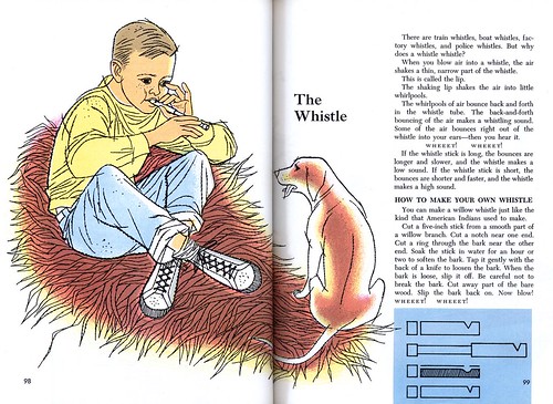
Most of us know about the wild west of the American frontier from books and movies... but how many can claim to have been born and raised in such an environment? Fletcher Martin was born in 1904 in the town of Palisade, Colorado, population 300, into a family that would eventually number seven children.
Martin's restless father had been heading for the Klondike when he found his calling: he returned to Leadville, Colorado, married his sweetheart and started a local newspaper. Over the course of his childhood and early teens, Fletcher Martin would see his father move the family to several tiny western towns and start up or purchase a town paper. When the Martin children were not attending classes in various one room school houses, they became the staff of Martin senior's hand-set, hand-fed newspapers. Here young Fletcher Martin received his first exposure to art. In those remote parts, the ads in his father's newspaper for cigarettes, farm equipment and Ford motor cars and the posters around the town announcing visiting circuses and rodeos were the only printed matter available.

It was a school chum's drawings of bloody cowboy-and-indian battles that began Fletcher Martin's career as an artist. Intrigued by his friend's 'magical' skills, Martin decided to try his hand at depicting similarly savage scenes.
Martin's teens, like those of any young person's in that time and place, were filled with farm chores and family duties. He learned every aspect of the printing business but he also worked with horses and cattle and in orchards and fields. When a rare spare moment came, he spent it sketching. In yet another small town, the village of Kamiah, Martin was exposed to his first "real" professional artist... a drifter who did a brisk business in the local barber shop selling primitive paintings for two dollars a piece. The townfolk, in those days before mass entertainment and visual overload, were dazzled by his wizardry.
Another series of moves brought the Martin family to Seattle. At age thirteen, with America entering the First World War, Fletcher Martin found employment at a seven-dollar-per-week job as a "printer's devil" with a firm that produced gaudy outdoor advertising posters. Beyond the technical skills the young teenager acquired, Martin learned about colour and composition from the garish, eye-catching prints of trapeze artists, bucking broncos and other carnival imagery produced by the artists who designed and cut the big basswood printing blocks used in the shop.
In spite of this direct exposure and his interest in art, by age 16 Fletcher Martin had still never been to a museum or seen a single first-rate painting. His father once again moved the family to another hamlet - Craigmont, Idaho - and purchased another local paper. But eventually the young Fletcher Martin heard adventure calling him. He worked in the mountains on a surveying crew, drove a mule team and harvested wheat, he operated a projector in a movie theatre and finally, he ran away from home and lived as a hobo, harvesting fruit.

After a failed attempt to return home and finish high school, Martin spent a year drifting around the North-west. He worked in fields, lumbercamps, printshops and on highway construction jobs. All the while he was sketching - though mostly pornographic images to amuse his companions. He rode the rails, including the "rods" - the horizontal bars under freight cars where a man can find just enough room to lay down and hang on for dear life. Through all of his adventures, good and bad, he refused to beg. Years later he said, "None of this was real hardship. Everything was so exciting or potentially so. It was freedom, movement, change, life, color, and drama. It was ...awful and wonderful."
But during the dark times of the 1922 Depression, out of work and without prospect, Fletcher Martin succumbed to the lure of a Navy recruiter's promise of food and shelter. Lying about his age, the 17 year old signed up. Within a year he was facing a summary court-martial and then, later, a deck court-martial which resulted in a trip to Panama in the brig.
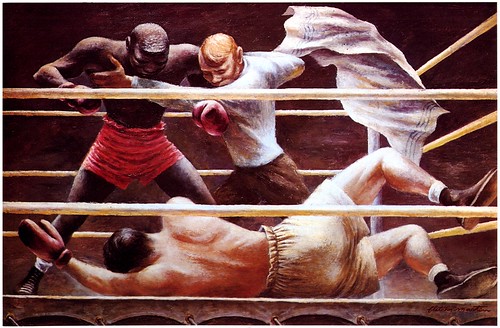
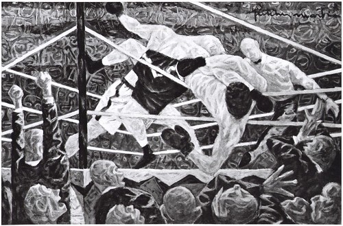
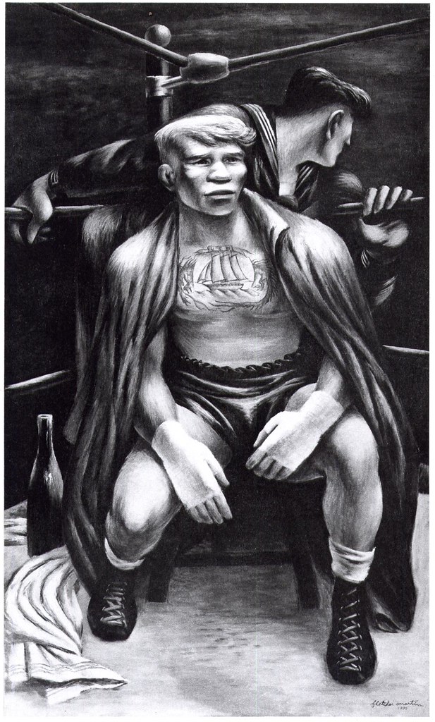
Martin was a U.S. Navy signalman and during the following three years he visited Pago Pago, Australia, Hawaii, the Caribbean and New Zealand. Off duty he became a light-heavyweight boxer with the fleet.
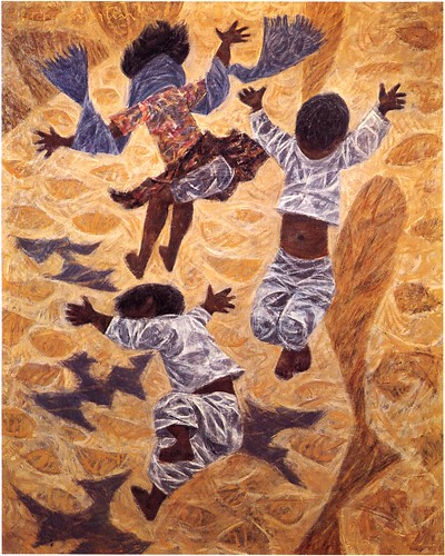
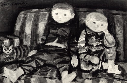
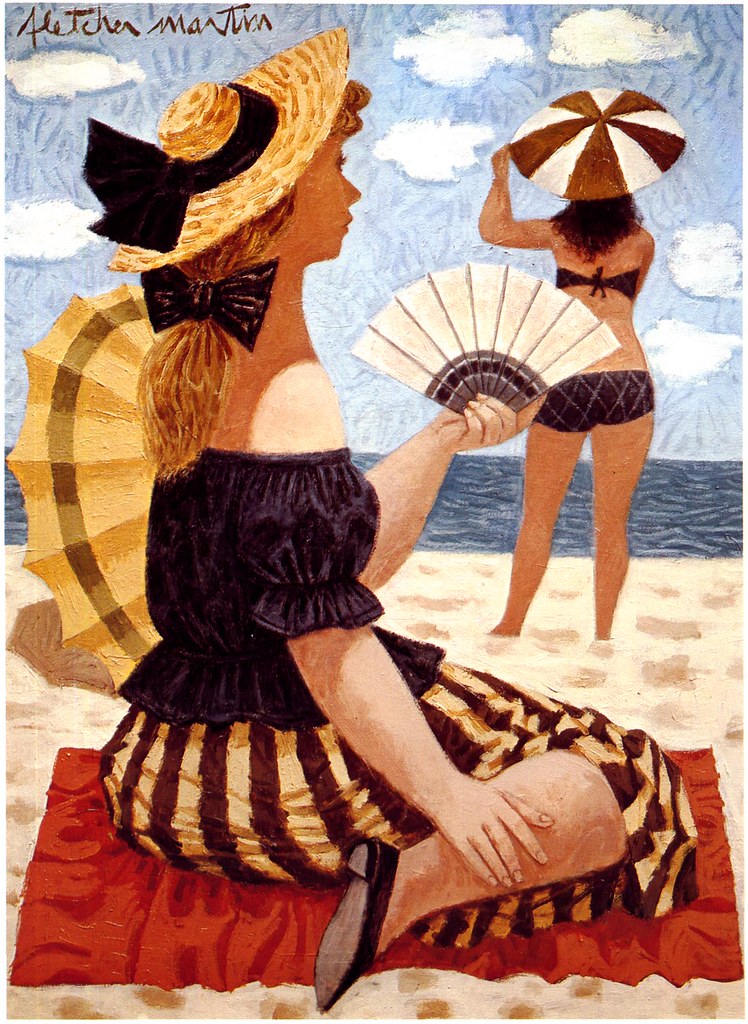
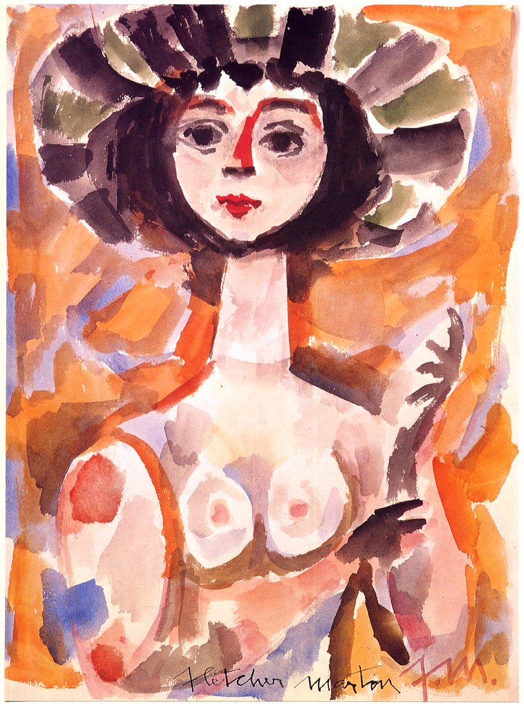
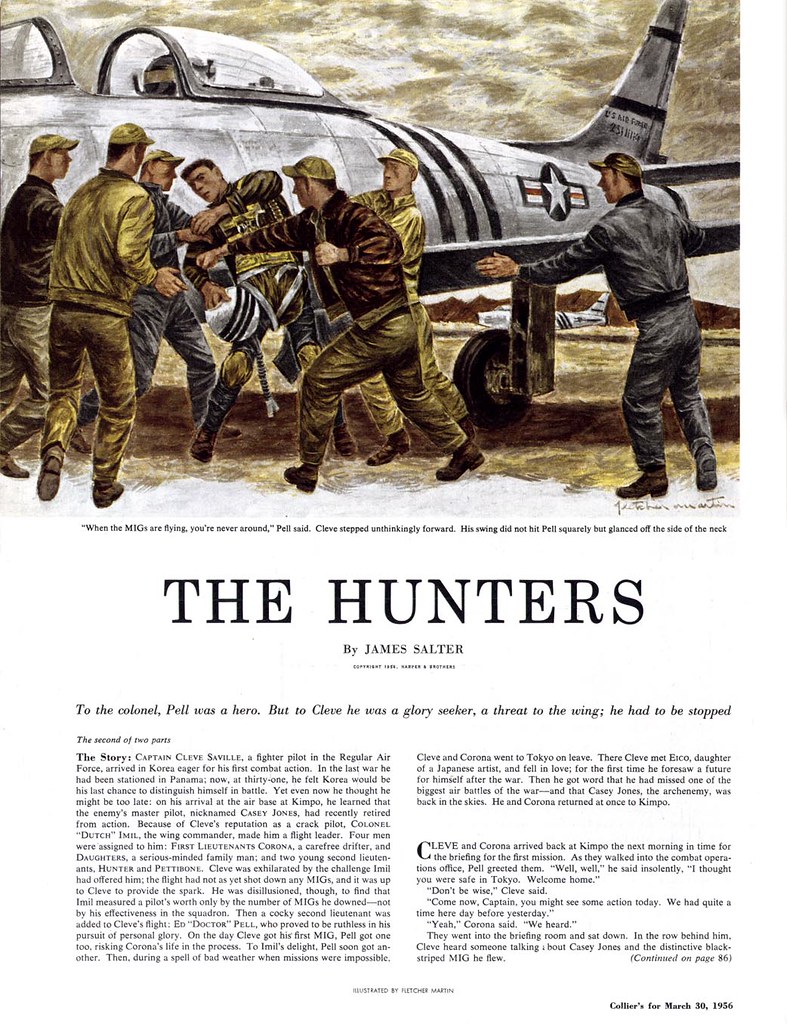
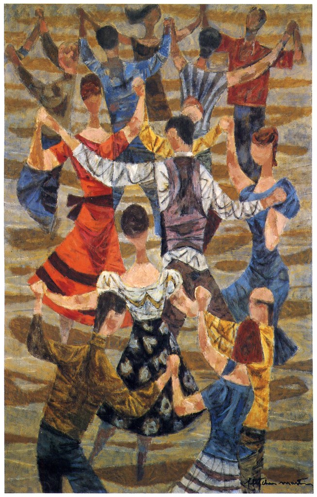
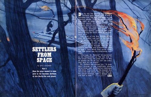
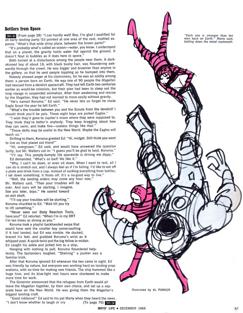
 * From the book "Fletcher Martin" © 1977 Harry N. Abrams Inc.
* All of today's images can be seen at full size in my
Fletcher Martin Flickr set.