Tuesday, January 31, 2006

"M. Erath"


That's the tiny signature near the bottom right-hand corner, in the Winter quadrant of this 50's era record jacket.

Not a very common name, and one I had never heard of in the context of children's book illustrators. Google image search turned up three pieces by a Margaret Erath, who won Best in Show from the Southern Arizona Watercolor Guild in 2000, 2002, and 2003. I tried contacting the guild but have so far recieved no reply.

Another quick search of the Arizona White Pages turned up a Margaret Erath, age 76, living in Tuscon, Arizona - but the number was unlisted. Could this be the same M. Erath who painted this lovely interpretation of the four seasons nearly half a century ago? And is there more work by M. Erath out there waiting to be discovered?

Only time will tell.

For those interested in childrens record jacket art, this great site has many scans!

Monday, January 30, 2006

Great Illustrations - A Quarter Each


Its amazing what you can still buy for 25 cents. A half-century-old record with a great illustration on the cover, for instance.

Artist Neil Boyle (1931- ) was previously unknown to me, but I quickly found three albums illustrated by him in various local Goodwill stores and second-hand shops. Turns out that the Society of Illustrators (LA) has heard of Boyle, though... he received a Life-Time Achievment Award from them - among his many other honours, according to Walt Reed's "Illustrator in America".


Lee Youngman Galleries, just one of seventeen galleries that represent Boyle's work, offers this biography:

"Neil Boyle, of Fort Macleod, Alberta, Canada, first studied at Banff School of Fine Arts. He continued his studies at Chouinard and Art Center School of Design in Los Angeles. He is a successful illustrator, having done work for many major publications and corporations such as The Ford Motor Company, Rand Corporation, Reader's Digest and Cosmopolitan. Four of his works were chosen by the U.S. Postal Service for the commemorative Bicentennial stamp series, "Contributors to the Cause", and over forty of his works have been chosen for the U.S. Air Force historical exhibits in the Smithsonian and the Pentagon and Traveling Show.

Neil Boyle has taught at Chouinard Institute, Art Center School of Design, California State University Long Beach, and California State University, Northridge.a partial list of Boyle collectors include ABC Television, Atlantic Richfield, Chrysler Corporation, Cosmopolitan Magazine, Ford Motor Company, Franklin Mint, Gardner Ranch in Santa Barbara, Golden West Broadcasting, Good Housekeeping, IBM, La Costa Spa, Ladies Home Journal, Melissa Manchester, NASA, Saturday Evening Post, Willie Shoemaker, Universal Studios, Walt Disney Studios, Capital Records, and RCA.His recent awards include an "Award of Excellence" from the Oil Painters of America, Alan Wylie award from the Federation of Canadian Artists' Faces & Figures, third place in the figurative Painting in the California Art Club's Gold Medal Show, and Artists' Choice Award at the Southwest Art in the Wine Country Show."

You can find a few examples of Boyle's more recent work at their site.

Friday, January 27, 2006

One thing leads to another...


...and by clicking on a small link on the right side of the site I told you about yesterday I was instantly transported to this site, where I found a mind-boggling number of old magazine cover scans. Scroll about half-way down the page for the links to each gallery.

Really, its almost too much!

But the weekend is coming so you may have the time to enjoy an almost endless stream of illustrations from the covers of Ladies Home Journal, Collier's, Cosmo, Good Housekeeping - the list goes on and on.

Try not to hurt yourself.

Next week: A look at some cool old record jacket illustrations.

Thursday, January 26, 2006

From an earlier time


For those who enjoy illustration from a slightly earlier time, I stumbled upon a fantastic resource in this remote corner of the 'net: a site devoted to pulp author Ellis Parker Butler.

"Working from his home in Flushing (Queens) New York, Ellis Parker Butler was -- by every measure and by many times -- the most published author of the pulp fiction era."

Who knew? But what's of even more interest to us is that the author(s) of the site have generously included a cover gallery of magazines in which Mr. Butler had articles published.

From "Adventure" to "Youth's Companion", from 1893 to 2003 ( how'd he do that? ) there are 605 covers to peruse so be prepared to set aside a few minutes... this could take a while!

Wednesday, January 25, 2006

Fun All Around


Ford Times, originally uploaded by Eric Sturdevant.


Eric Sturdevant has a superlative blog called "Fun All Around" where he examines the more stylized classic illustrators, with an emphasis on children's book artists. I'm always amazed by the gold Eric manages to dig up, and his accompanying commentary is fun and informative. If you want some fun all around, click here.

Love looking at pictures but no time for words? Visit Eric's Flickr sets for even more fun!

Tuesday, January 24, 2006

Go Away!


I don't have any other info on the artist known only as Lucia so I thought I'd use my remaining entries this week to send you to other neat places on the 'net that are classic-illustration related. Check in each day for a cool link then go away!

For starters, I found this great resource of old scanned ads at Duke University's Ad*Access website. "images and database information for over 7,000 advertisements printed in U.S. and Canadian newspapers and magazines between 1911 and 1955" is how the site describes its content and believe me, they ain't kiddin'!

I've only begun to wade through their collection ( I find the navigation a bit odd ) so I can't give you a thorough description of what you'll uncover. The collection of advertising comic strips has been particularly interesting to me.

Sunday, January 22, 2006

The Mysterious Lucia


Back when there were only about twenty Today's Inspiration list members, I found this first piece, signed "Lucia". I thought it was so great, I immediately sent it out to the group. I didn't know much about illustrators from the fifties back then, but I knew enough to catagorize this Lucia with the likes of Coby Whitmore, Joe Bowler, and Joe De Mers.

Lucia was clearly adept at painting georgous women in romantic settings. His work had a lively roughness, a sketchiness - that textural quality - that was emerging during the mid-fifties among the top boy/girl illustrators, especially those at the Cooper studio in New York.

But with no listing in "Illustrator in America" and with my most knowledgable contacts unable to shed any light on who he was, Lucia remained just a signature on the occassional magazine ad I came across. His accounts included Gibson greeting cards, Orlon textiles, and the Santa Fe rail line. For the longest time I thought he was strictly an advertising illustrator, then more recently I discovered pieces like this one, proving that he also had done editorial work - though none for The Saturday Evening Post, that I've seen.
Here, he even demonstrates a flare for the kind of collage-y experimentation that Al Parker introduced and everyone else imitated during this time. I found pieces in Collier's, American, and Better Living, always signed ( or even just credited ) with that single name: Lucia.

Like so many others, his magazine career seems to have ended with the arrival of the sixties. No doubt he went on to the largely anonymous world of paperback book and record jacket illustration. I'm hoping someone in the know will read this and shed some light on the mysterious "Lucia".

Friday, January 20, 2006

"Thus the Frontier Vanished"


An apt title not only for the article shown above, but also for the time and place in which illustrators like Thomas Vroman worked. Stylized illustration of the sort Vroman pioneered is so common today, its hard to remember how singularly unique it was at a time when ninety-nine percent of all printed illustration was based on realistic representation.

With the arrival of artists like Vroman, Jan Balet, and others in the mid-fifties, the frontier of contemporary, stylized, decorative illustration vanished.

Next week: A look at one of my favourite, intriguingly mysterious illustrators: the artist who signed his work "Lucia".

Thursday, January 19, 2006

"Tom... is an unbelievable talent."


Dean Graves is the president of Vroman Graves Associates in Tampa, Florida. Here's what he has to say about Thomas Vroman:

"Tom, like his late friends Norman Rockwell and Andy Warhol, is an
unbelievable talent. Dare I say "master"? To an untrained eye, a full
appreciation of his use of color, abstract design, and pure composition is
missed.

He is one who's work will not be fully recognized until he is gone."

This piece from The American Tradition is my favourite of all the Vromans I've seen so far. I think it trancends decorative illustration ( though retaining that quality very successfully ) and truly evokes a sense of mood and story for that time and place while employing a masterful "use of color, abstract design, and pure composition".

Wednesday, January 18, 2006

"We can see how much history Vroman had to learn"


I took a second look through the April '56 issue of Collier's in which the series "The American Tradition" began and found this photo of Tom Vroman,

along with this short passage:

"Thomas Vroman, the artist who will do a decorative painting for each of the articles in The American Tradition, says, "For the painting of Lincoln, I had to do a lot of research to find accurate material on such matters as the burning of Richmond, the Capitol Building, Fort Brady, Generals Lee and Grant, uniforms and ordnance of the time and John Wilkes Booth, who was left-handed, you know."

No, we didn't know, and on studying his painting, we can see how much history Vroman had to learn."

And you can see the entire article, along with full size versions of these pieces in my Thomas Vroman Flickr set.

Tuesday, January 17, 2006

"Tom Vroman is a renowned artist..."


Here's something I learned about Thomas Vroman:

"During World War II, Tom applied his artistic talents to highly unique projects needed to fulfill the direct requirements of General Eisenhower, General Bradley, General John Lee and others. He was a member of an elite team assigned to the Intelligence Unit of the European Theatre Headquarters. Tom's paintings have been selected by the U.S. Information Agency, State Department to tour Russia in exhibitions, and his work has been exhibited in France, Denmark, Germany and Switzerland. He has taught at the University of the Arts and Temple University."

From Vromandesign.com

Monday, January 16, 2006

Great Art or Disgusting Garbage?


Until two weeks ago I had never heard of Thomas Vroman nor seen any of his work, as far as I know. But once I stumbled upon it, I was immediately captivated. At once primitive and sophisticated, Vroman's work would not be out of place in a contemporary magazine. We must certainly credit the editors at Collier's for choosing Vroman to illustrate their series, "The American Tradition", of which this was the first installment.

But I can almost understand how a reader could have had this visceral reaction to Vroman's work:

Art is a funny thing. Volumes have been written analyzing its nature but ultimately, our interaction with it is entirely subjective.

Related to this, a fascinating post on David Apatoff's Illustration Art blog. I encourage you to go read, think and comment.

Saturday, January 14, 2006

Thank you!


My thanks to Armando Mendez, who concludes his fascinating take on Pete Hawley today directly below this quick note. If you have never yet explored Mando's incredible website, do so now - you won't be disappointed!

I just wanted to thank everyone who has commented and contributed to this week's look at the mystery that is Pete Hawley. I'm very happy to provide a forum for our mutual interest in illustration from this period, but I feel greatly privileged to have your support and assistance in ensuring Today's Inspiration achieves its potential. Thanks to your participation, we are building a community and ensuring that this worthwhile artform continues to flourish.

I'm especially grateful to The Girdle Zone for contributing so many fine scans to this week - be sure to explore the treasure trove of photography, illustration and related commentary at http://www.girdlezone.org/

Also, thanks to Ken Steacy, who promises to have a new website up and running soon that will be of great interest to Today's Inspiration members. You'll hear about it here as soon as I do!

Three Pete

Photography and Illustration engage in a tug of war in the 50s for supremacy in the nation’s magazines, for most part of the decade, an even battle with Hawley leading the charge.

Peter Gowland, one of the most influential of the post war Southern California glamour photographers, says he was profoundly affected by popular illustration of the day and though he doesn’t mention Hawley specifically by name, it’s clear he is referring to Hawley and Janzten in his “how to” books he begins producing in 1953 when he talks about a pin up novice must learn an illustrator’s “poster effect” of contrast and focus to be successful.


Hawley, for his own part at the time, was among the many of the artists Esquire magazine rotated in the magazine and calendar after the war, a list that shows how accomplished and high the standard was at the time-- Thornton Utz, Fritz Willis, De Mers, Robert Patterson, Ward Bracket, Walter Popp, Ernest Chiriaka, Eddie Chan, Al Rossi, and Mike Ludlow, just to name a few, all incredibly top notch!—and how those artists were working away from pin up in many other corners of the illustration industry, including a shrinking market in magazines, but a robust opportunity in expanding paperback and men’s adventure covers, movie posters, and record sleeve art.

The photograph-illustration influence cuts both ways, how one side was responding to the challenge and which side would be the ultimate winner. Hawley’s painting of a young woman in a aerodynamic one piece, hands down by her side, perhaps knee deep in still water, unsmiling, face upturned but eyes closed in ecstasy, owes more to Russ Meyer’s glamour photography of his wife Eve and Diane Webber than it does to prevailing illustration trends of the mid and late 50s. In 1957 “Gidget” is published and followed two years by the movie starring Sandra Dee and bikinis and beaches, Southern California and surfing become national trends and photography takes over chronicling the trends. Illustration all but disappears in swimsuit ads by 1960.


Yet there were the children and babies to fall back on, always so evident in Hawley’s work, winged cherubs and darling snub-nosed tykes, bored little brothers and sisters holding suntan oil or a towel while the adults flirt, sprites in blackface causing havoc or outrageously cute pets or small animals run amok. These touches added the Hawley twist, that touch of humor his work had that other glamour illustrators didn’t. By 1958, it seems this became Hawley’s most recognized and distributed work. He markets his own line of greeting cards and the Hawley enormous eye style becomes a booming business in its own right.

But when it became just the unrestrained kids and cute babies, for me, it’s just too much.

I’ll close with this. Is this Pete Hawley?

“Don Lewis” first appeared, as far as I can tell, in 1966 in the pages of Playboy magazine’s quarterly periodical for Playboy Club members, VIP, with six cartoons spread over two years of the club’s trademark waitress Bunny.
Lewis thereafter made just four more appearances in the magazine, late 1966-1968, pin up cartoons. The earlier Bunny cartoons shown here, the keyholder cartoon is dated July 1965, are very tight, done in gouache and watercolor, much tighter than the last three examples in the magazine seemingly done in a loose, offhand watercolor.


I can find no other mention of Lewis anywhere, in any facet of American illustration or art, from the 30s to the 70s, and no other example except those ten cartoons. (Can any list member help here?) So, if that’s true, it’s likely a pseudonym. Hawley used pseudonyms a lot, wouldn’t it make sense to use one in this instance, especially if his name was associated in the 60s with brand name baby or child-like impossibly cute big eye art? Does it look like Hawley? I think it does. The angular, corseted, small waist, the expert handling of the limbs that is both simple and gorgeous. Note the way the Bunny costume shimmers. Whomever he or she may have been, that artist was no slouch.


And the eyes, hollowed out without an iris but big and outlined. Gosh, that says Hawley to me.


Could it someone else, there were so many good artists then who had the requiste chops. Yes. And I admit, sometimes I waver. One day I’m convinced it’s him. On others, not so sure. (Five of the bunny cartoons were auctioned off by Playboy in 2002, the most coveted going for just under $4000).

He is such a mystery. Once I saw a Gwen Verdon or Rita Moreno (I think) Broadway musical soundtrack album that had a sparkling mid 50’s, top-of-his-game signed illustration by Hawley. I regret I didn’t buy it right then. Yet a year or so later, for the same title, I saw a different illustration by an un-credited artist straining to look like Hawley as much as possible but not quite managing it.

What’s up with that? I spoke with Shane about it and he had seen it too. Weird.

Friday, January 13, 2006

It ain't over...


...'til we say its over! The response to this week's look at Pete Hawley has been enthusiastic, to say the least. Due to my brief mid-week hiatus, a bunch of Hawley material did not get posted in time. So I will be making blog entries on the weekend as well to catch us up - be sure to check in for more treats!

And speaking of treats, Armando Mendez continues his narrative on Pete Hawley just below...

That’s Pete Hawley Too


I made a mistake in my previous entry about Coles Phillips. He did work for Janzten in 1921, but the example that’s been printed in several places (including twice in Michael Schau’s monograph “All American Girl”) is so bland and unexciting that I became blind to its existence.

A more accurate statement would be that Phillips illustration for Janzten wasn’t the risky, envelope-pushing illustrations elsewhere that so many artists later remembered. There’s no mistake there. Phillips was quite the influence to those who came later, as was Barclay and Petty and all the rest who would work for Janzten, including Hawley.

What earlier artists were influences and subsequently informed another artist’s work is fascinating stuff to all of us, but many times frustrating because how it shows up later can run the gamut from the plainly obvious to the absolutely invisible.

And there’s no mistake that then Hawley was in mid stride and full bloom, early 50s, he was unique.

But that’s not the way he started. The earliest examples of Hawley I’ve seen (before 1940) are very cartoony, more so than any other mainstream magazine illustrator of the time where naturalism ruled, closer to children’s book illustration or perhaps comic strips, than it was to the few cartoon-style mass market illustrators of the era like Hurst (probably the most pronounced and who took a whole decade to loosen up), Gilbert Bundy (who came from humor magazine cartoons) or Frederic Varady (a former European fashion illustrator). Hawley did cartoon-styled propaganda that is not out of place with what the Disney and Warner animators were producing for the war effort. Where that came from in Hawley’s background and training is anybody’s guess.

Yet once he works for Janzten, the roots are more obvious and probably required. This 1943 Janzten ad for Hawley, like the previous billboard, the girl is so stylized in a Petty-Vargas manner she is almost unrecognizable as his work; as before, the guy is much easier to identify. Note too the slug signature rather than the personalized script signature he would use later on
haw6.jpg
Janzten had other illustrators work different aspects of their promotions. Post WWII, it often picked big name realistic illustrators like Parker and Sundblom to do the road side billboards in the suburbs and used fashion illustrators when the ads appeared in high fashion magazines like Vogue and Harper’s Bazaar. It seems Hawley became the bread and butter guy, the one whose work appeared in the mass market,haw3.jpgthe general interest magazines with the largest circulation of both men and women and sales catalogs because his work could cover so many bases. The Petty influence, the geometric construction of the figure and streamlined composition, the pronounced foreshortening of limbs, the face abstracted with closed eyes, generic wide open smiles, stayed with Hawley throughout his prime period, especially noticeable in the ads which stressed the detailing of the suit itself. I think some J.C. Leyendecker is there too. In ads where you can see the underpainting, you can see Hawley using Leyendecker’s widely admired “open vibrant shadows” to model the figure.

Hawley could do the cartoons too, the simple boy-girl gags that Hurst, Hawley’s immediate predecessor, had done for Janzten. As Hawley’s tenure at Janzten grew, and the need for fresh ideas arose, you see him doing set ups that went further and further into fantasy and whimsy than Hurst had ever attempted—from simply guys watching a single girl approach or lie on a blanket to scenes of swimsuit naiads adorning buoys or riding dolphins, to catching a mermaid or seeing a domesticated mermaid set out bathing trunks to dry on a clothesline.

His last period at Janzten, say 1955 to 1959 (I’ve never seen a ’60 ad myself), I think of as being his most “Hawley-stylized”—large open eyes with most of the pupil and iris visible, dark eyebrows and lashes that sell the expression, simple, solid forms with overlapping, exaggerated posing and outlines but only the simplest articulation to indicate bends and joints.

The 60s would be different for other reasons.

Tuesday, January 10, 2006

Another Piece of the Pete Hawley Puzzle


TI list member Ken Steacy graciously added another piece to the Pete Hawley puzzle late last night when he emailed me these fantastic four scans from his collection along with this note:
"Pete Hawley is a real fave of mine - I started collecting his Valentine's day cards decades ago, and his Jantzen ads are awesome. Whilst working for Carlton in the sixties he did some moonlighting under the name KWATZ and painted a groovy set of puzzles - the boxes currently adorn the stairs to my studio!"
As if that weren't enough, a short while later, Ken sent a second email with another rare treat: this shot of the original Pete Hawley art from a 1953 movie poster called "The Girls of Pleasure Island". Thanx Ken! You can now see these pieces and more in my Pete Hawley Flickr set.

I'm grateful to everyone who generously shares their scans, their time and their knowledge so we can all enjoy and learn more about classic illustrators like Hawley - and speaking of which, TI list member Armando Mendez begins his fascinating take on Pete Hawley and Jantzen artists just below...

Monday, January 09, 2006

That’s Pete Hawley!

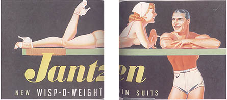
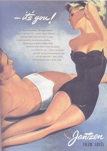
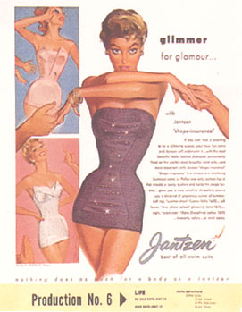
Jantzen ad, 1940's, by Earl Oliver Hurst

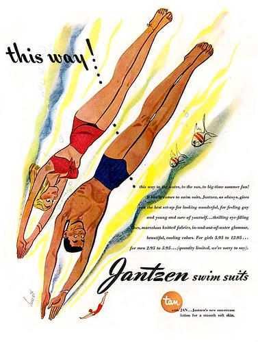
First, a caveat: When I started my full Golden Age-Good Girl Art illustration website in 1999, one of the earliest visitors was then-Warner Brothers animation character designer Shane Glines, an on-again, off again list member here at TI and creator of several very influential and popular Illustration related boards and sites, including his latest—CartoonRetro, asking me if I had any bio/career info on Pete Hawley. I told him no but replied whatever you find out, please let me know too. Over the years since, through email and when Shane gets a rare chance to attend SDCC, we’ve talked about Hawley. Shane has not only has assembled a formidable collection of the full spectrum of Hawley’s work but was able to track down the surviving family. Shane told me, as sadly so often is the case, by the time he discovered the family’s whereabouts, the artist had passed away just several years before.

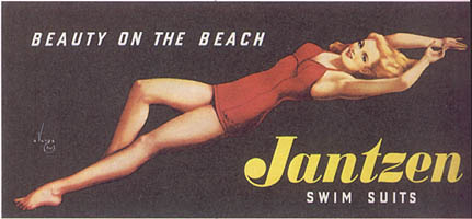
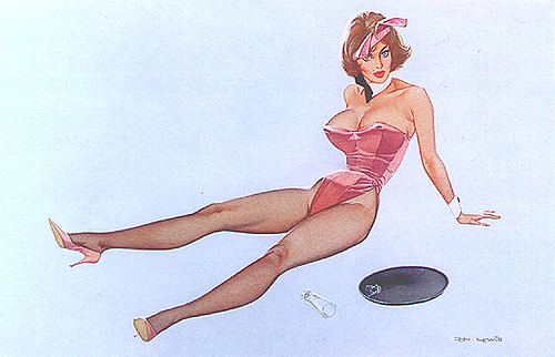
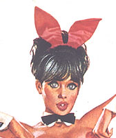
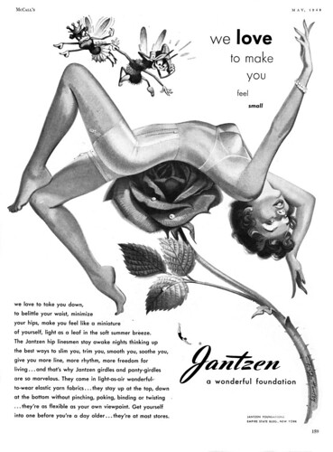
Fortunately Pete Hawley had a quite legible script chop so even though he’s a mystery man with a four decade long career, he has always been collected by artists and fans. And that’s mostly for his 17-year association with Janzten. He had a very distinctive style, one that successfully mixed selected cartoon elements with more realistic modeling and rendering, so his illustrations are easily marked by his charming, sexy, smiling, active girls, sometimes startling and striking composition, likable men, and a cute pet or two. I’ve often had the experience of looking through some throwaways, a stack of $1.00 LPs for example at a garage sale, and spotting an unmistakable unsigned piece and saying “That’s Pete Hawley!” as if it were worth thousands.

And to me, and I guess most of the people who belong to TI, it is.

Let’s start with Janzten and swimwear illustration in general.
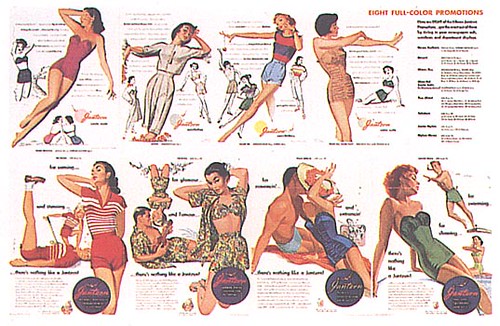
Janzten and its intense competitors to the south, Cole of California and Catalina Swimwear, both in Los Angeles, employed the cream of the crop of girl art illustrators in America for over 40 years: McClelland Barclay, George Petty, Alberto Vargas, Jon Whitcomb, Al Parker, Earl Oliver Hurst, Hawley, Joe De Mers, Haddon Sundblom, Ren Wicks, and fashion illustrators Rene Gruau and Tod Draz, just to name some I have seen and remember. The reason was simple. Illustrators were able to present the suit, the girl, and the surrounding beach environment in an immediately appealing way that photography, for many reasons, could not match for some time.

The first artist to make a name doing swimwear illustration was Coles Phillips, an artist who did not do any work for Janzten or any other swimwear company before he died in 1926, but through his post WWI magazine covers, his illustrations for sunburn ointment Ungentine, and his undergarment ads, really set the pace in what was tastefully attractive to both men and women. Coupled with his late style translucent watercolor technique, the result was revolutionary for the times and tremendously popular and influential, according to one advertising history, “pushing the line of what was acceptable further and faster” than was previously thought possible. 
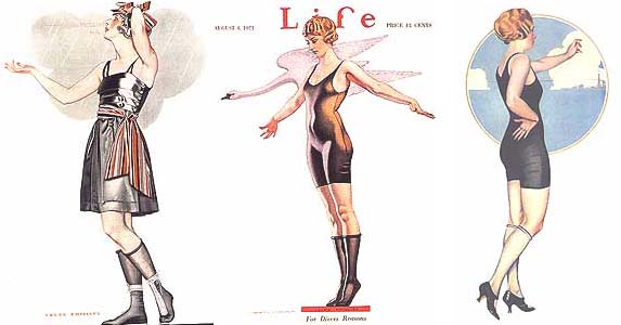
The trio of illustrations here show just how quickly Phillips managed the feat: Life covers for 1919 and 1921 and a “Class Girl” pin up made for the US Naval Academy’s yearbook The Lucky Bag, published in 1922. In the last example, admittedly for a very select and limited male only audience, Phillips’ illustration thumbed its nose at every publishing taboo of the era: the rear point of view so that the back of the legs could be seen, the single piece suit, rolled stockings and high heels, make up. It is hard to find an artist who was active in that period or reaching maturity then who has not mentioned Phillips as being an enormous influence.

Three of those artists who have mentioned Phillips prominently, McClelland Barclay (1923), George Petty (1936), and Alberto Vargas (1941) would work for Janzten, and their work shows that the successful swimsuit illustration had to appeal to both men and women. A large part of the appeal was the singular, spicy interaction between the sexes. 
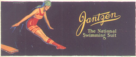
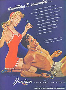
Although this example shows a Barclay from 1923 with only a single, somersaulting female, Barclay was known for the high energy and glamour the young people in his illustrations enjoyed. In Barclay’s Janzten pieces (roughly 1922-28?—unfortunately I don’t have suitable images to scan), the featured girl plays volleyball, dives off a board while others watch, water skis, runs toward a beach towel campsite chased by admiring men, all California Girl beach clichés now but hardly the case at the time. One social history says the goal of the generation “was to look and act like a Barclay ad.” George Petty’s Janzten pieces (first contacted summer of 1933, published 1935-1940) became a national phenomenon. 
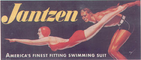
Reid Austin, author of the book Petty and other profiles, says Petty’s success at Janzten “was predicated on his ability to draw a convincing and appealing male. His Janzten ads and billboards are models of Streamlined interaction of male and female figures.” Austin also reveals that Petty would use different media—gouache and airbrush for the female, watercolor and airbrush for the male—so there would be different textures and feel to each. Sadly, Vargas never could render a convincing male throughout his career and that hurt his chances for replacing Petty at Janzten. Even though Esquire editor David Smart was heavily pushing Vargas as part of the contract feud with Petty in 1941, to the tune of free ad pages in the magazine and calendar, the Varga Girl Janzten print ads for the year show bizarre, clumsy, almost embarrassingly done male figures accompanying the girl.

And that brings us full circle back to Hawley and his start at Janzten.
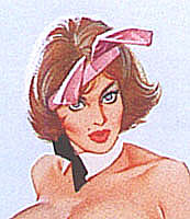
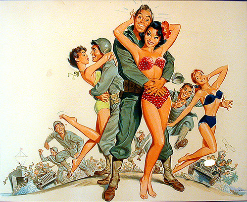
Note the female in this 1943 billboard “Girl of His Dreams” pretty much looks Petty-Varga streamlined, pneumatic, and leggy, as undoubtedly the assignment and the Pin Up era required. But there’s a hint of something else.
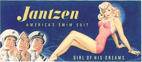
The girl has jewelry on, a bracelet on both her left wrist and left leg and looks straight at the viewer. She’s not going anywhere near the water. And those guys know it. The three officers at lower left, commissioned officers but regular, next door guys—think Mickey Rooney in Andy Hardy Falls in Love dealing with a young Lana Turner or Jack Lemmon in Mr Roberts--have the same impish bemused expression and look. Her vanity is just part of her charm. Notice the large open eyes and emphatic, dark eyebrows. On everyone.
The thrilling appeal both men and women enjoy, a thrill akin to flirting. A great looking cute girl but the admiring guy too. An average Joe that sees the humor in sex appeal and happily accepts it.

That’s Pete Hawley.

Who was Pete Hawley?


I can tell you this much: Pete Hawley is no longer with us.

That's a shame, because his work has left an indelible imprint on the American pop psyche. From Frank Frazetta's bodacious babes to Wally Wood's bad-ass babies, you can find a lick of Pete Hawley's confident, energetic and entirely unique drawing and painting style here, there and everywhere - even in the local convenience store of your youth.

It would have been nice to know who he was, how he lived, what his influences were. His career spanned many decades, his instantly recognizable style was the face of many national ad campaigns, he created illustrations for advertising, record albums, movie posters, and greeting cards. As the years rolled by Hawley went from defining sophisticated sexiness for Jantzen to cornering the market on kitchy cuteness for American Greeting Cards.

But no written history seems to exist for this singularly influential artist.

Walt Reed, author of "The Illustrator in America" graciously replied to my emailed query with these intriguing tidbits:

Unfortunately, I never met Pete Hawley, nor turned up any biographical information about him. He was represented by Steven Lion, Inc. of New York and had lived in Rieverside, Conn. A brief checklist of some of his clients:
Bell Telephone System '58 to '61.
Jantzen, Inc. '43- '60
Gripper Fastners '56-'59
Serwell '59-'62
Heinz '39-42'
Sun Oil '47
Skyway Luggage '55
Florida Citrus Commission '51
McGreger '53
Form Fit '54
This just scratches the surface, sorry about the scarcity of bio info.
Sincerely,
Walt Reed

So with little to go on, I decided to take a different tack, and ask TI list member and Rules of Attraction author Armando Mendez to give us his thoughts on Pete Hawley's work.

His commentary begins tomorrow.

You can find larger versions of today's image plus several other pieces by Pete Hawley in my Flickr set, but there are many more Jantzen girdle ad scans at the wonderful website, The Girdle Zone.

Friday, January 06, 2006

A Garden of Faces


I want to thank David Apatoff of Illustration Art blog for generously providing me with the narrative for this week's TI focus on Robert Fawcett. Its been fun and informative and certainly the many emails I've received privately this past week concur with me - many thanks, David!

"For a change of pace, Fawcett occasionally liked to do a more traditional illustration of a sedentary group of people seated around a table or watching a speaker. The sport for Fawcett in such pictures was not to work out some complex design or innovative composition, but simply to come up with a garden of faces and expressions. Sometimes he went to comical extremes, as with his illustration of paunchy retired generals or his illustration of crusty English lords. In the illustration below, Fawcett's wife is on the far left and Fawcett is sixth from the left (with the moustache)."

Don't forget, you can see this image at its full size in my Robert Fawcett Flickr set.

Next week: As mentioned before, a look at the work of illustrator Pete Hawley. Many thanks to all the helpful folks who contacted me with leads on where I might find some info about Hawley. So far he remains a mystery but who knows, perhaps something will materialize by Monday morning!

Thursday, January 05, 2006

When He Illustrated Westerns


David Apatoff of Illustration Art blog continues his narrative on Robert Fawcett:

"Although Fawcett was most famous for his pictures set in English
drawing rooms, he also painted a number of illustrations from the wild
west. When he illustrated westerns, Fawcett was adamant about doing
it his way. He was once offered a highly lucrative commission to
paint cowboys for the hit musical, "Oklahoma!" but found that he was
not happy with his own efforts. He concluded that he was not suited
to paint theatrical cowboys, with pink shirts and flamboyant outfits,

and he returned the job to the client with the suggestion that they
find a different kind of illustrator. Most other illustrators would
adapted their style to suit the job. Not Fawcett."

These two images have been added at their full size to my Robert Fawcett Flickr set.