Tuesday, October 31, 2006

Happy Hallowe'en!

Forget those tiny bite-size excuses for a chocolate bar kids get on Hallowe'en these days...
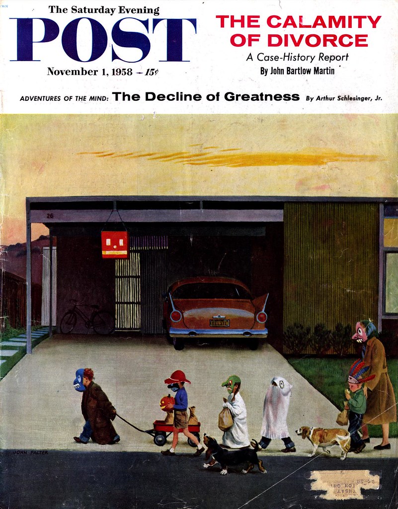
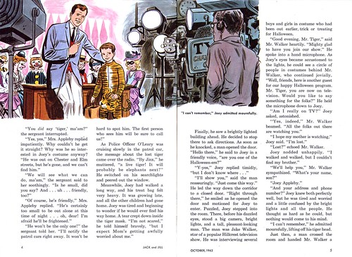
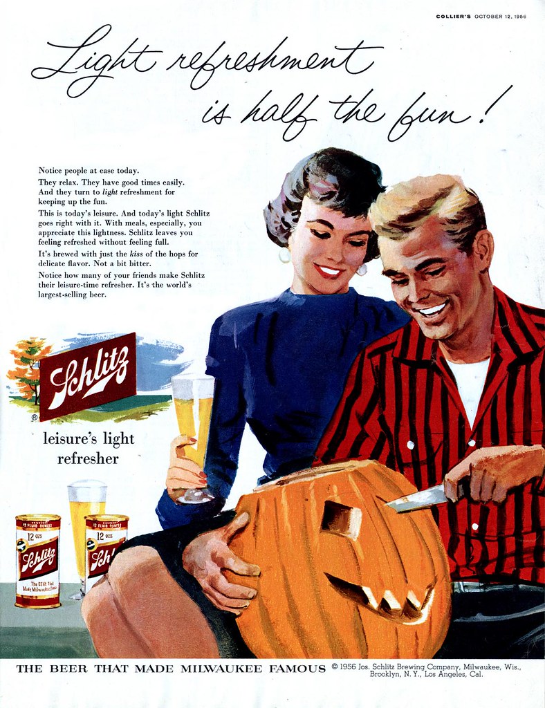
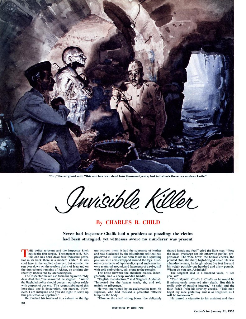
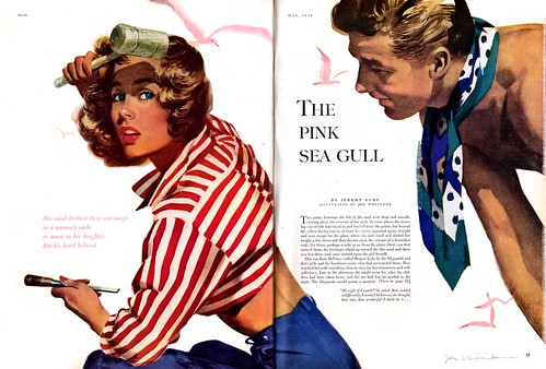
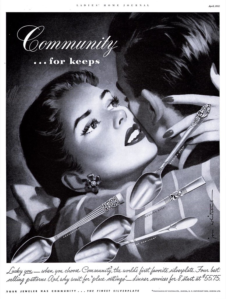
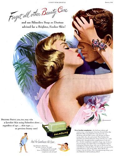
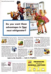
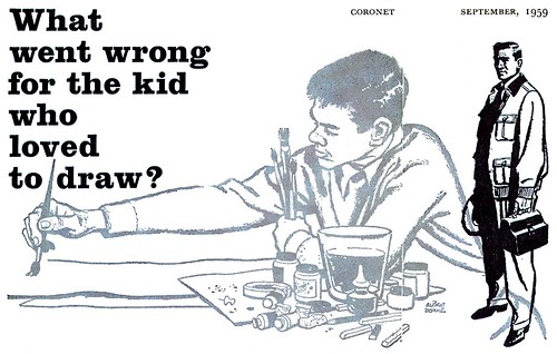
...apparently, back in the 50's, moms were handing out full size Baby Ruths and Butter Fingers! Dang! I knew I was born in the wrong era. Not to mention the wrong country... we never had Baby Ruths or Butter Fingers up here in Canada - we just saw the commercials beamed up from nearby Buffalo, New York during our Saturday morning cartoons. Zagnuts, Almond Joys, Hundred Grand bars; how we Canadian kids coveted them, all so near yet so impossibly far away...

The other cool thing about Hallowe'en in the 50's: no expensive and uncreative licensed character costumes. All you needed was to cut a hole in one of mom's best bedsheets and to jam a hollowed-out pumpkin on your head and you were good to go. Sure, the smell in there must have been pretty funky but that's a small price to pay for full size chocolate bars (and a helluva lot better than wearing your old red sleeper with the ridiculous rabbit ears).

You'll find all of this year's (and all of last year's) Hallowe'en illustrations at full size in my Retro Hallowe'en Flickr set.

Monday, October 30, 2006

We're almost there!

Remember when you got to wear your costume to school and parade from class to class? I always loved that!When I look at this illustration by John Falter, I'm reminded of the stripped-down environments Charles Schultz used to draw his Peanuts characters into during the early years of his strip: the shoebox houses, inconsequential trees and indoor/outdoor carpet lawns, devoid of landscaping, that represented 50's suburbia. here Falter presents us with a more fully realized version of Charlie Brown's world.

John Falter(1910-1982) has never been one of the illustrators of the 50's that I really get worked up about. But here he has captured a quality of typical childhood experience that is so astute and understated that it is spectacular in its mundanity.

Friday, October 27, 2006

Pepsi Does Hallowe'en

I may prefer Coke, but if I had been around in the 50's, I'd probably have been a Pepsi drinker - just on the strength of their decade-long ad campaign.Coke ads from the 50's are hoplessly stodgy compared to the seemingly endless supply of fresh, modern, stylishly sexy ads for Pepsi that flowed out of the Cooper (and other) studios.

I've scanned quite a few, and should probably organize them into their own set, but for now, you'll find them peppered throughout my Beverages Flickr set.

Thursday, October 26, 2006

Is this Tom Hall that Tom Hall?

Remember Jack and Jill magazine? I used to flip through it at the doctor's office as a kid in the early 70's.I say "flip through it" because I never actually bothered to stop and read anything in Jack and Jill. Nothing of interest there to this 10-year-old Marvel Comics fanatic.

But to this 42-year-old classic illustration fanatic, Jack and Jill magazine is suddenly very interesting - mainly because this Hallowe'en issue from 1962 contains a story illustrated by "H. Tom Hall". Could this Tom Hall be that Tom Hall?Certainly the style is similar ( dare I say "generic"?) enough to have been done by the same artist - but let's face it, there could have been several artists named "Tom" and "Hall" working in the commercial art industry at any given point in time.Still, I've noticed that quite a few mainstream magazine illustrators who had more than enough ad industry work in the 50's started producing children's book and textbook art in the 60's, when their traditional markets were in decline.

Want to take a closer look so you can draw your own conclusions? Go to my Tom Hall Flickr set and click the "All Sizes" tab above each image.

Wednesday, October 25, 2006

Tom Hall Carves a Pumpkin

When we looked at beer advertising I mentioned illustrator Tom Hall having done a lot of these Schlitz ads. Here's another one, this time with a Hallowe'en theme.
Tom Hall was one the first artists I took notice of when I became interested in 50's illustration - but I was always frustrated that I couldn't find any information on him. Though he was no Robert Fawcett or Austin Briggs, Hall typifies for me the journeyman illustrator who produces reliable, solid commercial art. I've always had a lot of respect for this kind of worthy craftsman, and have always been a little miffed that artists like Hall have gone unrecognized.

Then this ad for Kling Studios of Chicago in a 1952 issue of Art Director and Studio News provided at least a piece of the puzzle.
So now we know what Tom Hall looked like, that he was a Chicago illustrator at the massive Kling Studios, and though I was well aware of his advertising work (plenty of which you can find in my Tom Hall Flickr set) its news to me that he did editorial illustration because I've never come across even a single piece.

I wish the folks at Kling had included a little more biographical info in their write-up on Hall, but for now, that information remains a mystery.

Tuesday, October 24, 2006

Not exactly a Hallowe'en picture...

...but hey - its got a 4,000 year old petrified corpse in it, right? Close enough.This scary picture is by John Pike.

Monday, October 23, 2006

The Countdown to Hallowe'en

Hallowe'en is almost here and that gives me the opportunity to take a bit of a break from researching and writing.As we begin the countdown to Hallowe'en, here's a scary picture by Henry C. Pitz (1919-1973). There's an incredibly thorough biography of Pitz on line, so I won't bother going into details - you can check it out for yourself.

Want to take a closer look at this piece? Go to my Henry C. Pitz Flickr set and click on the "All sizes" tab above the image.

Friday, October 20, 2006

Whitcomb's Boy Toys

I think Jon Whitcomb could not have drawn a rugged male character to save his life. Whether he dressed them in street clothes......or in goofy costumes......or nearly nothing at all, Jon Whitcomb seems to have applied the same formula for idealization to his boys as he did to his girls; they are all homogeneously cute.

Consider this "Jon Whitcomb's Page" from the February '53 issue of Cosmopolitan: its kind of amusing that Whitcomb went to the trouble of hiring all these different models to pose for him. When you look at a finished work, could you tell which guy was which, really?Of course guys only served in a supporting role to the real focal point of any Whitcomb piece (the girl) but its worth making note of because, as the most visible women's magazine illustrator of the time, Whitcomb was a powerfully influential force on a generation of female magazine readers. His interpretation of the ideal male lover was almost certainly co-opted by thousands (millions?) of young girls and women across America.
Or maybe its entirely coincidental that the generation of American females that grew up in the 40's and 50's started buying their daughters millions of Barbie and Ken dolls in the 60's.

Finally, here's one really unusual piece: one of the latest I've ever come across by Whitcomb, its from 1960. Its unusual for many reasons, not the least of which is the detailed environment - something Whitcomb rarely got involved with. As well, it seems to be painted on canvas with oils or acrylic; again, not typical for Whitcomb. The people are shown in full figure, very unusual for the king of the "big head" school of story illustration. But the most unusual thing about this piece is the uncanny resemblance the man bears to Jon Whitcomb himself. I think the artist painted a self-portrait here! For a 54 year old man, he looks surprisingly...cute.
All of today's scans can be seen at full size in my Jon Whitcomb Flickr set.

Thursday, October 19, 2006

Mr. Whitcomb Goes to War


Good propaganda art is as much about design as it is about illustration. Colours and shapes must be strong and well arranged. The design should be simple but attention grabbing. The message should be clear and compelling: "See and obey!"

By the time World War Two began, Jon Whitcomb was already a master propagandist in the art of love. As a commissioned Lieutenant j.g. in the Navy, first serving in mine sweeping duty, then with the public relations department in Washington, then as a combat artist in the Pacific theatre, Whitcomb showed his chops as a propagandist in the art of war.Whitcomb, self-admittedly not a strong painter, did have an excellent sense of design, and those who would dismiss him by comparison to some of his contemporaries might do well to consider this: strip away the veneer of romance his clients demanded of him and you can see why his work is so effective.
You'll find all these images at full size in my Jon Whitcomb Flickr set.

Wednesday, October 18, 2006

Valley of the Barbie and Ken Dolls

Here's something I've rarely come across: a crowd scene by Jon Whitcomb. You're not likely to see many of these. Jon Whitcomb had found a new approach to storytelling, one that would be so successful that it would change magazine illustration for much of the 50's, and come to be known (somewhat derisively) as the "big head look".
No one describes this approach to composition better than does my friend Armando Mendez on his excellent website, The Rules of Attraction: Whitcomb's illustrations most often involved "zooming in on people--mainly pretty young city girls for large format magazines aimed at a feminine audience --and everything else in the picture became design not narrative elements." As well, Whitcomb's models were "transformed by idealization formulas Whitcomb and [Al]Parker, with others like Haddon Sundblom, made standard throughout the industry."Whitcomb found this formula so successful, he used it not only in story assignments, but in countless ads...They are so common in women's magazines from the 40's and 50's that I stopped marking them for later scanning.


Whitcomb was enjoying not only unprecedented exposure for his work but as a public figure as well. His celebrity status is apparent in this October '53 issue of Cosmopolitan magazine, which gave him six pages to discuss his choice of models - all actors or performers from television, Broadway or Hollywood. Its interesting to see how Whitcomb applied his formula for idealization when the model's photo is set next to his drawing. And notice also that once again, its all about the head-shot.

Returning to the crowd scene at the beginning of this post; remember the Famous Artists School lesson from last week on designing a crowd scene as described by Albert Dorne? Jon Whitcomb was also one of the twelve founding faculty members at the school. Which lesson in the FAS binder does Whitcomb teach? "How to Paint a Head in Wash". Of course.

You'll find all of today's images at full size in my Jon Whitcomb Flickr set.

Tuesday, October 17, 2006

The Darling of the Ad Biz

Norman Rockwell may be remembered today as "America's favourite illustrator", and there's no disputing that Al Parker was the great innovator, but in terms of visual dominance, Albert Dorne was the darling of the ad biz in the 30's and 40's and Jon Whitcomb holds that title from the late 40's and into the 50's.

Last week I explained how I would regularily come across two and three pieces by Dorne in a single issue of The Saturday Evening Post from the early 40's. As his presence drops off in late 40's issues of various magazines, only one illustrator can match his numbers: Jon Whitcomb. This is what these two artists have in common... they most effectively interpretted the America in which they lived to reflect the cultural style and values that advertisers felt would sell to the public.
Dorne's America was still a country of small towns and old-fashioned hominess. His work reflects a sensibility of tradition, a slower pace, his people are individuals with distinct visual characteristics and idiosyncracies. But as the Second World War ended, America began a massive paradigm shift. The atom bomb had brought another explosion with it - the baby boom. This brave new world was being populated by young , beautiful people of the future - an urban and suburban population that was building a thoroughly modern society based on an instruction manual their parents hadn't had access to: television. Suddenly the cult of celebrity was becoming that much more influential. Youth and beauty and modernity and sophistication were that much more desirable - and Jon Whitcomb had figured out the visual formula for success. For the next decade, as Dorne had done before him, he would set the bar for a slew of imitators.

You'll find all these images at full size in my Jon Whitcomb Flickr set.

Monday, October 16, 2006

The Heir to Dorne's Throne: Jon Whitcomb


What's this? How could Albert Dorne's American-as-apple-pie mom in the kitchen lose her crown to Jon Whitcomb's Hollywood-starlet-in-the-boudoir? Why would I call Whitcomb the "heir to Dorne's throne? In terms of style and subject matter, you wouldn't typically place Jon Whitcomb next to Albert Dorne - but listen; these two illustrators had more in common than you'd notice at first glance. This week we'll look at how Jon Whitcomb supplanted Albert Dorne as the most popular illustrator in America.
You can find these images at full size in my Flickr Photostream.

Saturday, October 14, 2006

An Extra Dash of Dorne

Its the weekend so pull up a hot cup of Sanka and enjoy a few extra pieces of Albert Dorne art I had left over from this past week's posts. You'll want to go to the full size version of this ad to enjoy the details in this comic strip-style ad.

Another of the multitude of Frigidaire ads Dorne painted - this one with amusing little spots that need to be seen up large to be fully appreciated.

And finally, a couple more from the 50's, when Dorne's output had dropped off substantially as his duties to The Famous Artists School increased exponentially.
I've got one more Imperial Whisky ad by Dorne - but I'm saving it for Christmas. Sorry. But don't forget, there are 37 Dorne scans that can be viewed at full size in my Albert Dorne Flickr set. Enjoy the weekend!

Friday, October 13, 2006

Step by Step with Albert Dorne

Albert Dorne's crowd scenes are always awe-inspiring. I posted a couple earlier in the week, and was saving this one for today.
My friend, David Apatoff (who's always excellent blog, Illustration Art is required reading for anyone who visits this site) must have been reading my mind, because a couple of days ago he emailed me the scans below. "I'm forwarding you a short article with some examples of Dorne's great drawings of a crowd scene," wrote David, "hopefully you can make something of these."
So here we have a real treat: a behind-the-scenes look at how a master illustrator designed a complex composition. Many thanks to David for his generosity in contributing this delightful and informative article!

To read this article and see Dorne's sketches at full size, go to my Albert Dorne Flickr set, click on an image, then on the "All Sizes" tab.

Thursday, October 12, 2006

Albert Dorne - President

I wonder if Albert Dorne was contemplating the fate he managed to avoid when he drew this ad. In reference to the time before his illustration career, he wrote, "At 13 I quit school to support my family, and did pretty well at it."
During his teens Dorne had been a newsstand manager, an office boy for a movie theatre chain (and a salesman for a different movie chain), a shipping clerk and a professional fighter (he won his first ten bouts and was flattened in the eleventh, which knocked some sense into him about the best route to becoming an artist not being via the boxing ring).
"All through [the] years, young artists have come to me for advice on their own art careers," wrote Albert Dorne. "That's how the idea for the Famous Artists Schools was born."In 1948, the year Albert Dorne drew this ad for Frigidaire, he and 11 colleagues founded the Famous Artists School, with Dorne acting as president. Dorne's ambition to help cultivate the careers of struggling young artists would mean the virtual demise of his own as a commercial artist.In the early 60's, Dorne launched the Famous Writers School and The Famous Photographers School- evolving the correspondence school empire with 50,000 students around the world and a gross income of $10 million a year."My job as president of the schools takes at least twenty four hours a day," wrote Dorne. "I now do about two pictures a year - to keep my franchise."

"My only hobby is the Famous Artists Schools, " he wrote, "and my ambition is to make my school the most respected institution of its kind - anywhere."

All of today's images can be seen at full size in my Albert Dorne Flickr set.

Wednesday, October 11, 2006

The Determination to Succeed

Think success is just about talent? Think again.
By the late 30's and early 40's, Albert Dorne, who as a child had quit school to work quite literally around the clock seven days a week to support his mother and siblings - then a teenage wife and baby as well - and who had never found the time to pursue his dream of going to art school, had so many high profile illustration assignments that there were not enough hours in the day to fulfill all the requests.
How did Dorne get his foot in the door? By the time-honoured method of volunteering.

Dorne offered to work for free as a general studio assistant, sweeping floors and delivering packages - or whatever else was needed - to a working commercial artist. Writing about those early days in his life, Dorne says, "[Meanwhile I] worked as a shipping clerk at night so we could eat - besides my family, at 16 I had a wife and daughter."After a year of this, Dorne writes, "I got a paying job at another studio and from then on I was on my way - and its been wonderful ever since."
In 1930, Albert Dorne landed an advertising comic strip assignment for Life Bouy soap. He created Mr. Coffee Nerves for Postum and did more strips for Post Cereals and Camels cigarettes and others. By the time he did the piece at left, in the mid-1940's, it wasn't unusual to find two or three pieces by Dorne in an issue of the Saturday Evening Post. But around this same period, an idea was forming in Dorne's mind, one that would catapult him into the most ambitious move of his career - and force him to all but give up his chosen profession.

These images can be found at full size in my Albert Dorne Flickr set.